In the previous chapter I described the cover Champion #9 (July 1940) as the first joint work by Simon and Kirby. In the same month the two also worked on the title story for Blue Bolt #2. But their working method for Blue Bolt was different then the Champion #9 cover where Jack did the pencils and Joe did the inking. For Blue Bolt Joe and Jack would each work on different pages of the same story. This was probably an expedience that allowed a story to be completed in a shorter period of time. Working jointly on different pages would be a practice that Joe and Jack would use for a time before Kirby ended up doing nearly all the drawing.
Even Joe agrees that Jack was an exceptional artist. But it would be a mistake to attribute the good pages to Kirby and the poorer ones to Joe. Frankly I believe that this is an error that some experts have fallen into. Instead we should look for features that are characteristic of the particular artists. There are some devices that Kirby used often like a bad guy sailing through space from the hero’s punch, or the use of exaggerated perspective on a figure. Simon, or anyone else trying to copy Kirby, would include these but would not do it as successfully as Jack. Other Kirby traits, such as square fists or finger tips are all too easily copied and should not be relied upon. Finding Joe’s touch can be a bit more difficult. But there are some traits that crop up both in these pages and the work that Joe did before.
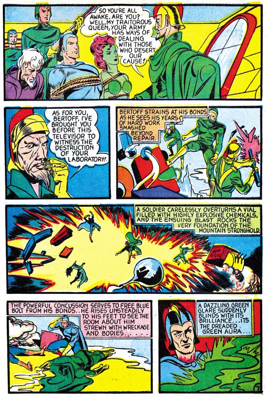
Blue Bolt #3 (June 1940) “The Green Sorceress Reforms” page 7 by Jack Kirby
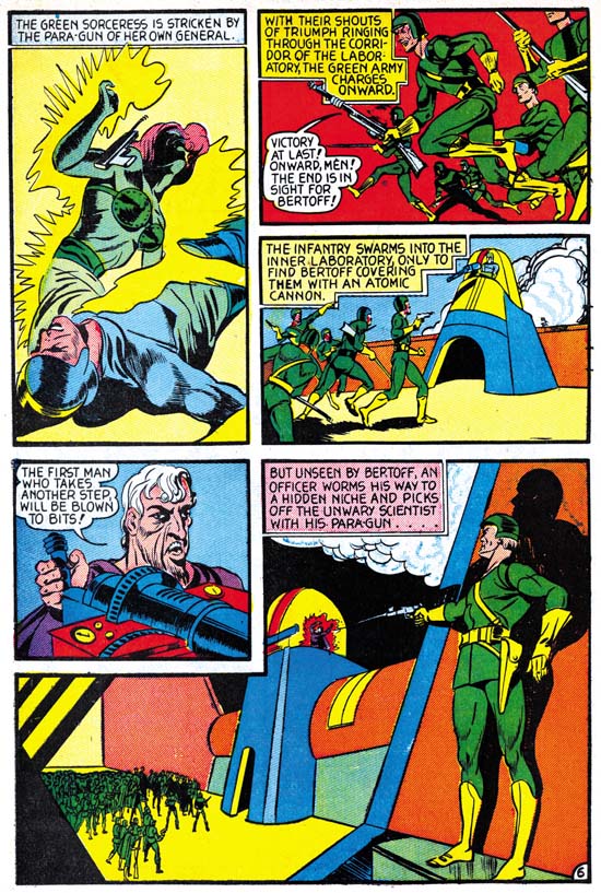
Blue Bolt #3 (June 1940) “The Green Sorceress Reforms” page 6 by Joe Simon
With both Jack and Joe working on different pages of the same stories it is understandable that there would be adjustments made so that the final product would have a more uniform look. We do find Joe beginning to change his drawing style to be more like Jack’s. In Blue Bolt #1 Dr. Bertoff has a scruffy look but when Kirby drew him he had was more nobler. As we see in the above images from Blue Bolt #3 Joe began to draw the Doctor more like Jack did. What we do not see in these jointly drawn Blue Bolts is any attempt by Jack to adjust his style to conform more to that of Joe Simon.
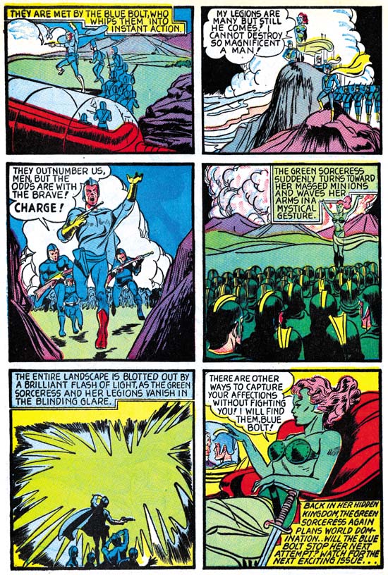
Blue Bolt #3 (June 1940) “The Green Sorceress Reforms” page 10 by Joe Simon
In the previous chapter I mentioned page 10 as having a panel that seems to have been the source for the cover of issue #3. I also said that although Greg Theakston (The Complete Jack Kirby, 1917 – 1940) attribute this page to Kirby, I was not so sure. Now that that I look at it again I still believe that this page was penciled by Simon. But I say this not as a criticism of Greg, but as an example of the problems faced when trying give credit for these pages. Often there really is not enough distinctive traits on a single page to make a confident attribution. In this case I find the rock formations more like Joe did in Blue Bolt #1 then those by Jack. The eyes of the attaching soldiers seem to be in the classic angle style that Joe used.
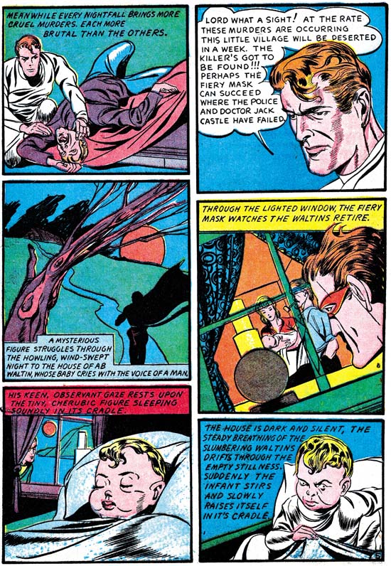
Daring Mystery #6 (September 1940) “The Legion of the Doomed” page 5 by Jack Kirby
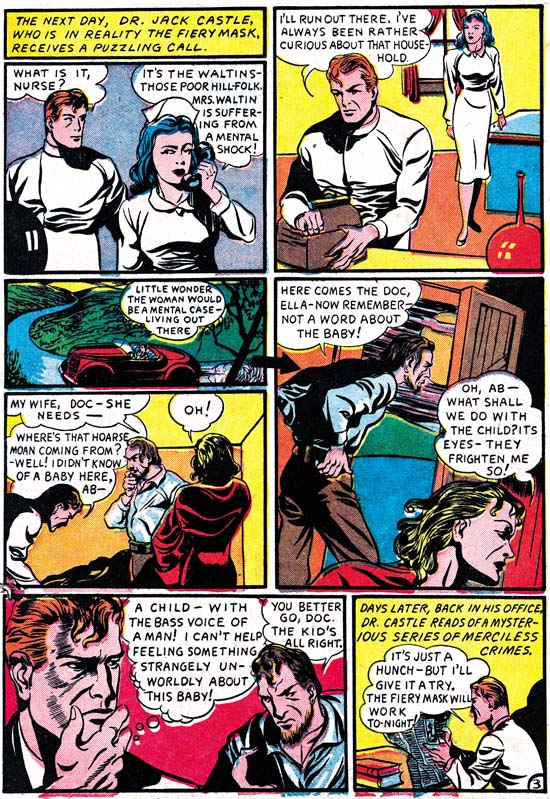
Daring Mystery #6 (September 1940) “The Legion of the Doomed” page 3 by Joe Simon
From the Fiery Mask story from Daring Mystery #6 we find further examples of Joe adjusting his work to appear more like Jack’s. However certain Simon traits such as the angular eye/eyebrow construction can still be seen. Look at the unmasked hero from panel 2 of page 5 by Jack and compare it with the version on panel 6 of Page 3. I believe this shows that Joe is starting to get pretty good at mimicking Jack. Of course it is possible that Jack did some work on a page otherwise done by Joe. In cases like this I do not know how to be certain.
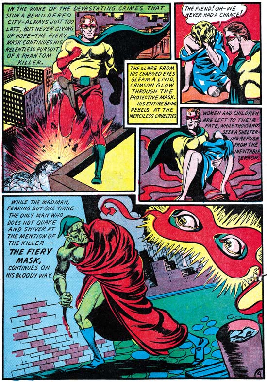
Daring Mystery #6 (September 1940) “The Legion of the Doomed” page 4 by Joe Simon
Page 4 of Daring Mystery #6 is interesting as an example of how often Joe would use swipes. Scholar Stan Taylor has sent me some scans from Flash Gordon by Alex Raymond. From these it can clearly be seen that three of the four panels of this page have swipes from Raymond’s Flash Gordon. I posted one of them in my footnote to my last chapter. Because of the differences between the cover of Blue Bolt #3 and Raymond’s panel of Flash Gordon running, it might be unclear whether Joe really used it as the source. But the similarity between Raymond’s work and the running man on this page leaves no doubt that Joe used this particular Flash Gordon example for swiping. The scans provided by Stan show the same exact poses as those Joe did on this page. But in none of these cases does Joe copy the details from Raymond. For example Joe’s demon is just an ordinary man when done by Raymond. Although there are some examples in the Fiery Mask story from Daring Mystery #1 where Simon was particularly close to his Hal Foster source material, generally Joe simplifies and alters the original. There does not seem to be any attempt by Simon to make himself out to be another Hal Foster or Alex Raymond. Some are critical of any comic artist that uses swipes, I do not share that opinion in all cases. With Joe it only bothers me when his copying does not integrate properly, which unfortunately in these early years is sometimes the case.
Also of interest from page 4 of DM #6 is panel 5. This almost splash-like panel has a large floating mash with eyes. This is a varient of the floating heads that Joe Simon would use from time to time. As I have said before this sort of thing does not seem to be something that Jack favored.
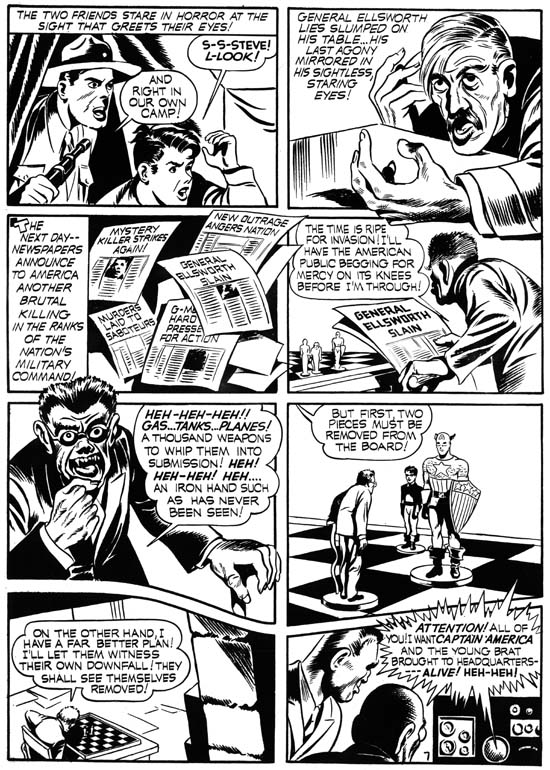
Captain America #1 (March 1941) page 7 by Jack Kirby
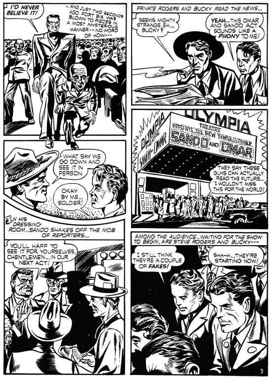
Captain America #1 (March 1941) page 3 by Joe Simon
Generally in this blog I prefer to use images taken from the comics or from original art. Very little original art of Captain America by Simon and Kirby still exists. I suspect that no art from CA #1 has survived. But Joe has copies of the flats from the first Captain America issue. Flats were made from the original art without color with each flat showing the four pages laid out as they would be printed on one side of sheet of paper. They are the next best thing to the original art so I could not resist using them as my examples both Joe and Jack’s penciling from this comic classic.
Work on Captain America included the use of a number of assistants. Among the task that these extra hands provided was helping with the inking. This introduces even more variation to the look of the art above that caused by joint penciling work by Joe and Jack. Perhaps because of these new inker or maybe because Joe is better at mimicking Jack, but some of the Simon touches such as those angular eyes have disappeared. However there are other distinctive traits used by Simon. For instance look at Bucky in panel 3 of page 3 of the Sando and Omar story. Notice how his lower face projects, I think of it as a muzzle affect. This will sometimes be seen again in Joe’s work for children and occasionally women. But Jack does not give his children the same sort of muzzle.
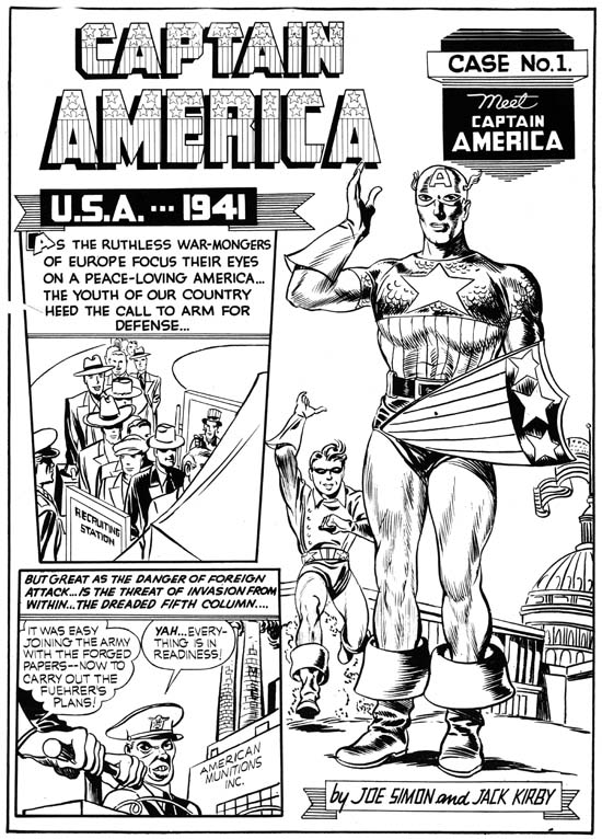
Captain America #1 (March 1941) “Introducing Captain America” page 1 by Jack Kirby and Joe Simon
Pretty much the entire origin story of Captain America was drawn by Kirby. But I feel that there is one exception, the large standing figure of Cap on the first page. I find the square-ish face and the pose in general to agree with Joe Simon’s style. Even the inking seems different from that of the rest of the story. But the figure of the running Bucky has all the Kirby touches.
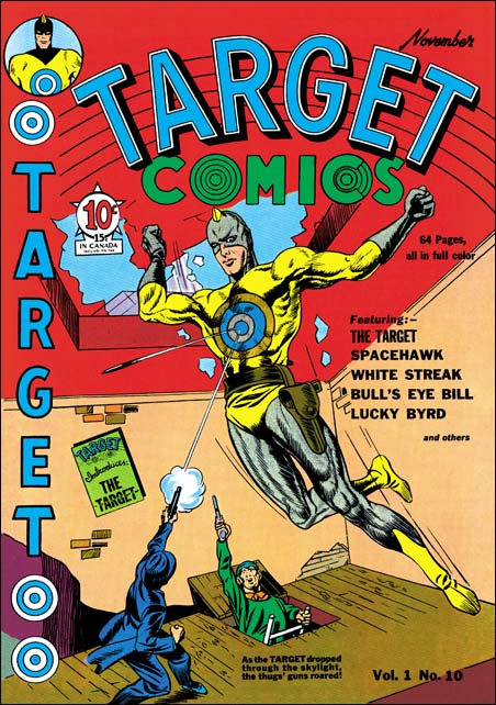
Target Comics #10 (November 1940) by Joe Simon
Although Joe may not have penciled any stories during the time period we are examining here, he did some covers. There was a time that many attributed the cover for Target #10 (November 1940) to Jack Kirby. Now I believe it is generally recognized that this cover was actually done by Joe Simon. Like a number of Simon and Kirby covers from this period, the central figure of the Target is more finely inked then the background figures. This cover illustrates a common practice that Joe often followed, distorting reality in order to better tell the story. Joe presents the Target further forward then the skylight he had just crashed through. This was undoubtedly done to make the hero the largest and most important figure of the cover. The criminals under attack are still towards the back where logically any bullets they shot would not be able to bounce off of the front of the Target’s chest as depicted. I admire these sort of pictorial distortions, too much adherence to realism and logic can detract from a comic book cover. Having said that, Target #10 is not among my favorite Simon covers. One problem I have with it was probably not Joe’s fault, the colorist used red for most of the broken skylight where it should have been white with purple streaks. This makes it more difficult to recognize that the Target has crashed through the skylight. A more serious problem is the rather distorted perspective to the room that detracts unnecessarily from the subject of the cover. But the major drawback is the hero seems posed more to offer himself as a target then to be attacking the villains.
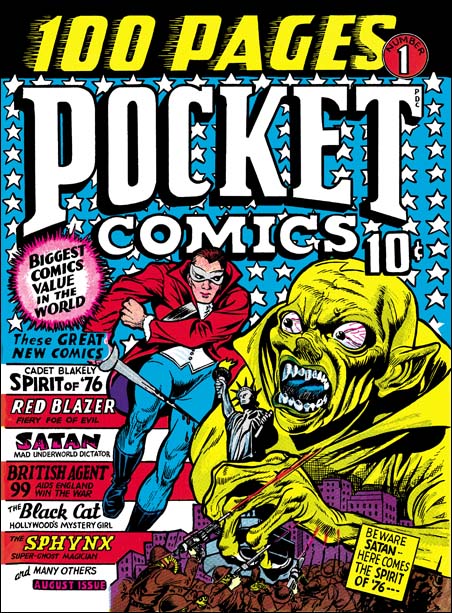
Pocket Comics #1 (August 1941) by Joe Simon
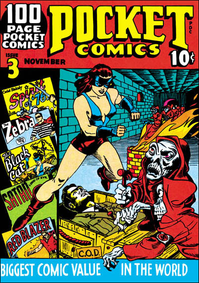
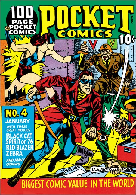
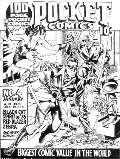
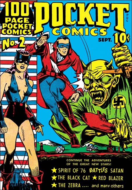
The Target #10 was prior to Simon and Kirby’s work on Captain America. Several months after the start of Captain America Joe Simon began to provide some covers for Al Harvey’s new Pocket Comics (#1, #2 and #4). These covers are unsigned but Simon has stated that he did #1 among others. Although Pocket #1 is in a different style from earlier covers, once before we have seen Simon change styles and we will see him do it again in the future. The three covers are so similar to one another that there is little doubt that they were done by the same artist. The drawing of the face for the Spirit of 76 has the same square jaw as some of Simon’s previous work. Attribution of these covers to Joe Simon seems reasonable given the evidence we have.
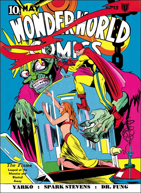
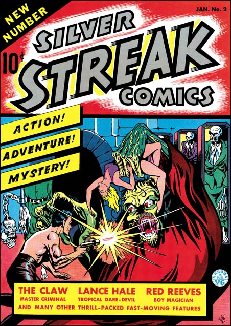
For Pocket #1 (August 1941) Simon uses a small area very effectively. Satan, a villain with his own feature in the comic, towers over and threatens New York City. He is attached by an army, but their small size leaves little doubt that they will not be very effective. Indeed Satan’s attention is drawn to the approaching, and also oversized, patriotic hero the Spirit of ’76. As in other of Joe’s covers, size is used as an indication of importance and is not meant to be literal. The depiction of Satan owes more to previous covers by Joe (Silver Streak #2 and Wonderworld #13) then it does to the villain’s appearance in the story.

Pocket Comics #2 (September 1941) by Joe Simon
The cover for Pocket #2 follows the same formula as used in #1. A large Satan is attached by a diminutive and ineffective force (in this case a navy), while the oversized Spirit of ’76 comes to the rescue. Also included is another scene with an oversized Black Cat. This really is not a bad cover but when compared to its predecessor it looks inferior. Despite having more area to work with Simon’s drawing is simpler. The changes to Satan may make him more like the character in the story but they also unfortunately make him seem less threatening. Finally the Spirit of ’76 has a running pose that suggests he is not truly running toward Satan.

Pocket Comics #4 (January 1942) by Joe Simon
Joe’s contribution to the cover of the last issue of Pocket Comics is one of his masterpieces. On the face of it looks like Simon has turned to a realistic depiction for the Spirt of ’76 and the Black Cat. But has he really? The hero strikes down a foe, but how could that be since the Nazi is behind the Spirit of ’76 who is running forward? The Black Cat smashes through the bars of a window in the center of the room to prevent another Nazi from stabbing the patriotic hero in the back. But could the heroine entering in the middle of the room really be able to grab the arm of a foe towards the back? But Joe could not have told this story as effectively if he had adhered to a more realistic presentation. The inking, which I believe to be by Joe, is bold and assured. There is some crosshatching like the Fox covers, but most of the inking was done using a brush.
Simon and Kirby’s association with Timely, and Captain America in particular, would end and they would begin to work for DC. But there was a gap of a few months before S&K would appear in Adventure and Star Spangled. Coincidentally Al Harvey’s pocket sized comics books venture would fail at the same time because their small size made them too easily stolen. It would also take a few months before Harvey would return with normal sized comics. Some of the covers for the relaunched Harvey line will be the subject of my next chapter.


