Author Archives: Harry Mendryk

Early Jack Kirby, Chapter 1, Lighting and the Lone Rider

I have previously done a serial post on The Art of Joe Simon. It would be great to produce an outline of Jack Kirby’s art and how it evolved over the years. However the sheer volume of Kirby material makes such an approach impracticable. Although probably not completely accurate, my database shows that between 1942 and 1957 (that is from the start of working for DC until the time Jack started doing freelance work without Joe) Kirby did 5593 pages of art compared to 184 by Simon. To avoid the problem of an over abundance of work I will instead do some serial posts each focusing on particular periods, this one will be on Jack’s early years. As when discussing Joe Simon’s early work, I am faced with limited access to the publications, they are both rare and expensive. But hopefully I can provide enough to give a general idea of Jack’s early work.

Jack Kirby became a staff artist for Lincoln Features Syndicate in 1936 and stayed there until 1939. Most of his strips can be described as comic humor (for example Socko the Seadog, a take-off of Popeye). Jack also did a lot of “real facts” art (for instance Your Health Comes First). Unfortunately I do not have access to any of this work. Those truly interested in this very early work can find it in the recently published “The Comic Strip Jack Kirby” by Greg Theakston. However some of Jack’s syndication work included some strips with more action and, even better, some of these got reprinted in comics. One, Lighting and the Lone Rider was a daily that appeared in January and much of February 1939. This material was reprinted in Famous Funnies #62 to #65 (September to December 1939). Jack used a number of alias during these early years, here he signed them as Lance Kirby.
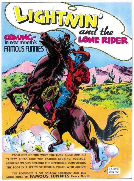
Famous Funnies #61
Famous Funnies #61 (August 1939) advertisement

Prior to running the strips, Famous Funnies #61 ran a number of advertisements announcing the appearance of the Lone Rider in their next issue. One ad is particularly important in that it took up a full page. Prior to teaming up with Joe Simon, Jack never did any comic book covers. This full page ad is the only thing we have to compare with some of Joe’s early covers. Like a cover this ad was meant to attract readers, although in this case to the purchase of next month’s issue. One would expect great effort to make this ad interesting and exciting as possible. Instead we find a rather lack-luster piece of comic art. Joe’s earliest covers were much more interesting. As we will see below when we examine his story art, it is not a question of Jack’s lacking artistic skill. One possible explanation is that all his previous work on syndication strips just did not prepare him for the challenges of a single larger piece of comic art. Another suggestion is that already at this early stage of his career, Kirby had developed a preference of story telling over cover art.
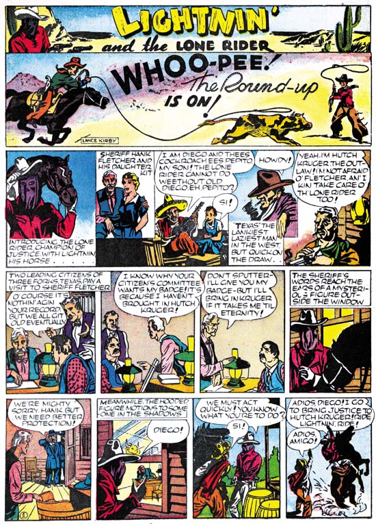
Famous Funnies #62
Famous Funnies #62 (September 1939)

Daily syndication strips require a different story telling pattern then that found in comic books. Whereas a comic book advances the story page by page generally 9 panels to a page, daily strips must tell the story a strip at a time with usually 4 panels. Further a comic book story is meant to be read in one sitting. A daily strip is read one strip at a time over a period of weeks or months. A strip artist must be careful to keep each day’s installment interesting or risk loosing his audience. Jack uses his first strip to just introduce his characters. Frankly I am not sure this was necessary or even a good idea. It probably would have been better to just get the story going and let the cast show up as required. But most peculiar is that there are two characters, Pepito and Texas, that do not appear in the story that follows.
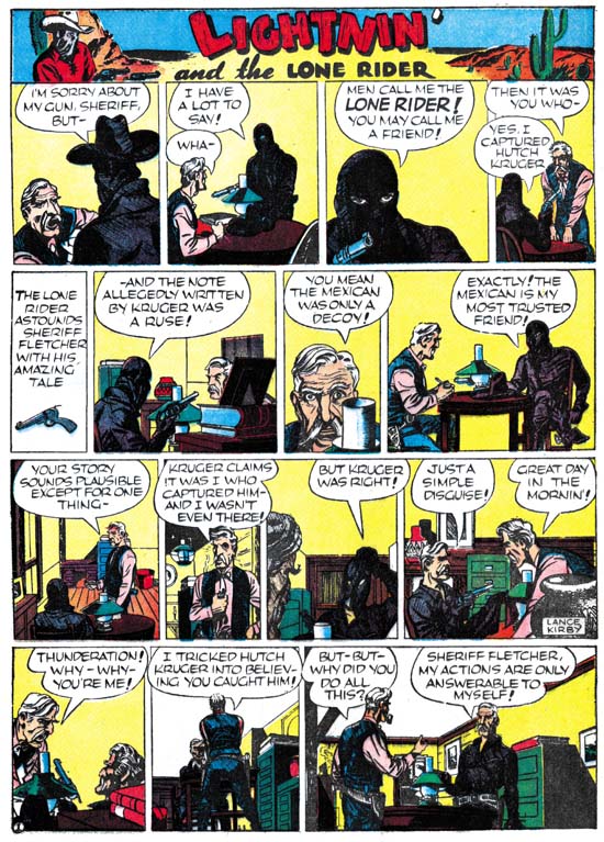
Famous Funnies #65
Famous Funnies #65 (December 1939)

After the first strip, Jack does a good job of telling his story. To be honest the plot itself a bit unrealistic, but if the readers wanted realism they would not be reading a comic strip! The Lone rider uses his side-kick Diego to lure the old sheriff safely out of the way. Meanwhile he goes off to single-handedly capture Hutch Kruger and his gang. But he does so disguised as the old sheriff so everyone is convinced that the sheriff is the hero. All great stuff but then Jack does something very odd. He has the Lone Rider explain the whole plot to the sheriff. This means that for days at a time the reader is presented with what he already knows. For a daily syndication strip this would be a big mistake. The funny thing is the parts of the story that are flaws for a daily strip just do not have the same effect when you read the entire story at one time. Jack was already beginning to think of stories in a bigger way then a daily strip could adequately handle. As for his writing, even at this early date you can already see Jack’s writing style emerge. Take the last panel with the sheriff question and the Lone Rider’s reply:

But, but why did you do all this?

Sheriff Fletcher, my actions are only answerable to myself!

Jack would use this sort of laconic and enigmatic response throughout his career.
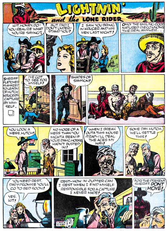
Famous Funnies #64
Famous Funnies #64 (November 1939)

This is not fully developed Kirby art. Fight scenes in particular lack the classic Kirby touch. But even with the small panel size and poor printing quality of Famous Funnies you can see Jack’s talent begin to shine through. Look at the beat-up Hutch in panel 2 of the third strip above, what a miniature masterpiece.

If you remember I said that Kirby introduced two characters, Texas and Pepito, that did not appear in the story. Well The Comic Strip Jack Kirby includes some Lone Rider strips that were never published. In it we find Texas, so in the beginning Jack was already setting things up for next story line. There is also a young boy that Texas calls “little Pete”. At first I thought that Jack had changed his mind about using Pepito so that he changed the character from Diego’s son to that of a rich man. But on reflection it occurred to me that Jack might have been setting up a Prince and the Pauper sort of switch between Peter and Pepito. Unfortunately Jack did not proceed far enough with the story for us to ever know. Although Jack never completed his second story line he did return to do some more work on Lighting and the Lone Rider. But there is a reason I want to discuss that work in another chapter.

Simon and Kirby Meet the Shield

I am doing a guest blog posting tonight at Comics Should Be Good called Simon and Kirby Meet the Shield. Check it out.

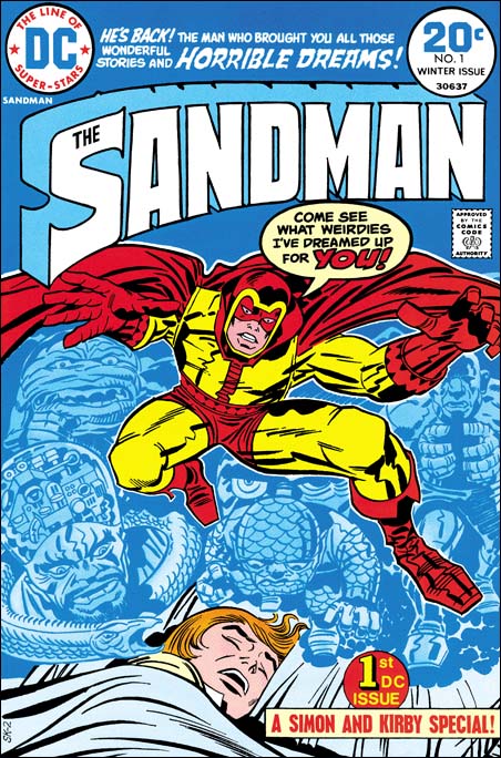
Featured Cover, The Sandman #1

The Sandman #1
The Sandman #1 (Winter 1974) by Jack Kirby

This is my last post about Simon and Kirby covers selected as their favorite by participants of my recent contest. I saved this particular one for last because it was, at least for me, the most unexpected. When I think about the Simon and Kirby collaboration I think about the period from when they first teamed up in 1940 until the work they did for the Adventures of the Fly in 1959. There were some S&K work published later like Blast Off and Harvey’s Fighting American. However this was not new truly new work but earlier work that just had not been published before. From 1960 on Joe and Jack had gone their separate ways, that is until Sandman #1 in 1974.

In 1970 Kirby, dissatisfied with his treatment by Marvel, had signed up to work for DC. Here he started to create his New Gods opus. But Jack wanted more then just to draw these comics. He desired to initiate new titles and then hand them over to other artists. What Jack wanted was to produce these comics. In effect to return to the type of business arrangement he had during his collaboration with Joe Simon, but to do this by himself. However Jack was not successful in this endeavor. He never managed to pass the drawing chore to anyone else and worse yet some of his titles were cancelled. Jack continued to work for DC but the arrangement was not the same. Although he still was more then just another artist, he started to receive direction from DC’s Carmine Infantino. It must have been a bitter disappointment for Jack. Even more so when Joe Simon started to also work for DC in an arrangement very much like the one Jack had failed to development. Joe was more then just an editor, he was producing his comics for DC.

With both Joe and Jack now working for DC, it must have been an obvious idea to Carmine to have them team up once again. After all Simon and Kirby had a number of great successes in the past, why not see if they could re-create their old magic? Of course with Jack living in California and Joe in New York, there was no question of the same type of collaboration that they had previously. I have been told that there is a cover proposal for the Sandman drawn by Jerry Grandenetti. If that is true it would suggest that originally Sandman was Joe Simon’s idea as Jerry was one of the artists doing work for Joe. (I have seen another Sandman cover reported to be by Joe Simon, but that is clearly a misattribution because it is not in Joe’s style.) The credits for the comic give Joe as the scripter and Jack as editor and drawer. You can see that the cover for Sandman #1 has a job number, SK-2. The same job number was used on the first page. Well the SK obviously stands for Simon and Kirby. But if that is true why the ‘2’? Does that suggest there was a previous piece of artwork given the job number SK-1?

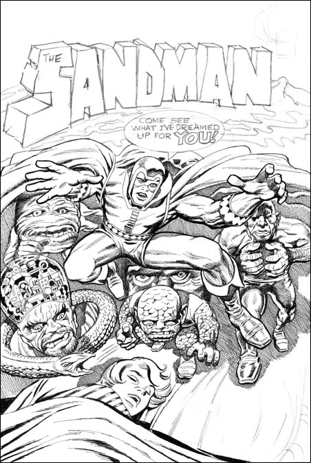
The Sandman #1
The Sandman #1, unpublished cover by Jack Kirby and Joe Simon

There is another version of this cover that was actually inked by Joe Simon. Joe has said that this the original cover that was rejected by DC because of all the “hay” (crosshatching). That may very well be true, but I also wonder if perhaps Jack was unhappy with some of the liberties that Joe took. For instance Jack’s square finger tips were rounded off in Joe’s inking?

With the type of distribution at the time it is hard to be absolutely sure how well comic books really sold. But it appeared, at least to Carmine, that The Sandman had been a big success. However issue #2 had a cover date of April 1975. This suggest that the original was planned as a one shot but that with its success more were published. However succeeding Sandman issues were not Simon and Kirby collaborations. After a brief revival for one issue, the Simon and Kirby team had again ended and would not produce any further comics.

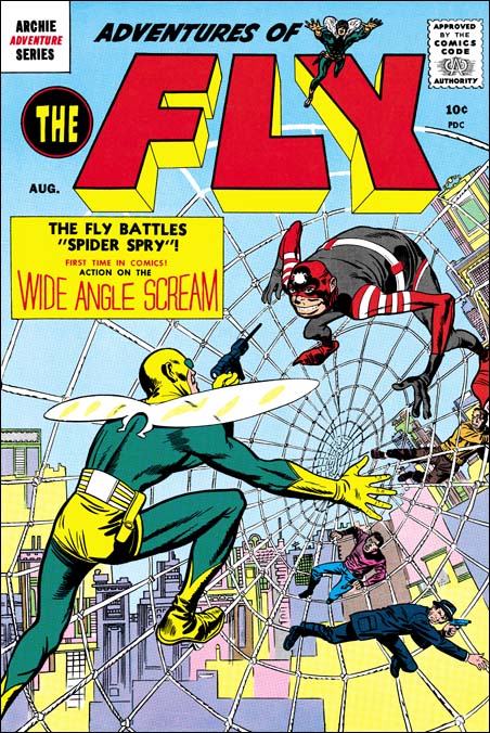
Featured Cover, Adventures of the Fly #1

Adventures of the Fly #1
Adventures of the Fly #1 (April 1954) by Jack Kirby

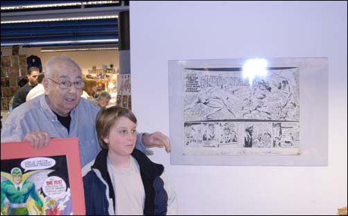
One of my contestents in my recent contest picked The Adventures of the Fly #1 as their favorite Simon and Kirby cover. I have previously written about Adventures of the Fly in Chapter 10 of The End of Simon and Kirby. There my main conclusion was that the Fly comics were not true Simon and Kirby productions. Joe seemed the main driving force in constructing these comics and he made use of other artists besides Jack. Having said this I hasten to add that Jack seemed to be primarily responsible for the final appearance of the Fly. The costume is very different from the Silver Spider by C. C. Beck whose story was the basis for the creation of the Fly. Rather the Fly seems largely based on Night Fighter, an unused creation that was probably originally considered for S&K’s publishing company Mainline. Although the origin story for the Fly was largely based on Beck’s penciled version that Joe provided Jack, the other stories Jack did seem to be his own. Included in one was a double page splash. The original art for this wide splash is still in Joe’s personal collection. It a beautiful piece of work with no signs of any cut and paste. That being the case along with the fact that the splash has one extra figure, the cover must somehow be based on the splash.

Joe Simon and Fly splash
Photo of Joe Simon with splash page at Big Apple Con (4/3/04)

As far as I know the original art for the cover no longer exists. This is unfortunate because it might provide hints what method was used to transfer the art from the splash and rearrange it for the cover. As pointed out by Kirby scholar Stan Taylor the Fly comics contain a number of swipes from figures originally drawn by Kirby. Some of the original art for these still exist and clearly they were not done by using stats or any similar photocopying device. However when the line art for the Fly on the cover is compared to the splash page much of the inking, including some rather fine spotting, is the same. There does not appear to be any inking present on the splash that is absent on the cover. On the other hand the cover Fly has some spotting that does not appear on the splash. In particular the outlines have been made thicker on the cover. A lot of the lines for the web and the background do not actually touch the figure. I present a close-up of the cover line art (red) over the splash. The alignment and size adjustment are not perfect but it should give you the idea. From all this I have little doubt that Jack did the splash page, it was inked (not by Kirby), then Joe had some stats made, assembled the cover, and finally retouched and expanded the inking. Joe had previously used stats to help create covers, but for the Fly #1 cover it was a much more intricate procedure.

Adventures of the Fly #1
Part of the splash overlaid with the cover line art (in red)

Featured Cover, Bullseye #5

Bullseye #5
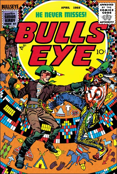
Bullseye #5 (April 1955)

This is another selection made by a participant of my recent Featured Cover Contest as their favorite Simon and Kirby cover. I had provided an image of it before in my serial post The End of Simon and Kirby but it is such a great cover that it warrants repeating. When discussing Boys’ Ranch #4 (see my previous post) I said that all the covers for that title were so good that I would be hard pressed to pick my favorite. Well S&K did a good job on the Bullseye covers but there is no doubt in my mind that issue #5 is the best.

In the origin story we learn that Bullseye got his name not just because of his skill with weapons but because of a target pattern that an Indian foe had branded onto his chest. All but one cover (#6) featured this target pattern prominently as part of the design of the cover. But for issue #5 S&K took it even further by turning the pattern into an Indian theme, as if it was some sort of flattened decorated teepee. Then added to this was one of the dramatic hand-to-hand combats that Jack had ever drawn. Clearly this unique cover is one of Simon and Kirby’s greatest masterpieces.

Boys’ Ranch and the Fighting American were probably the most obvious Simon and Kirby titles to reprint. But beyond a doubt Bullseye is a title that deserves the same honor. An interesting hero, great stories and lots of Kirby. Unfortunately it has not received the treatment that Marvel gave the other mentioned titles. But hey, I have not given up hope that some publisher will recognize what a classic Bullseye was.

Featured Cover, Boys’ Ranch #4

Boys' Ranch #4
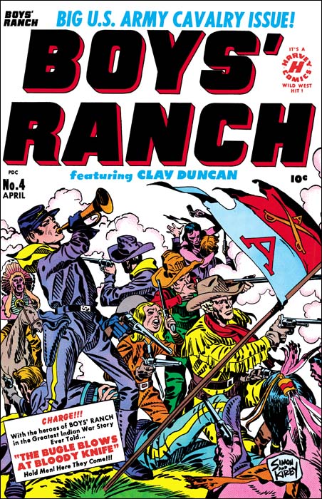
Boys’ Ranch (April 1951) by Jack Kirby

I lament so often about the fact that various Simon and Kirby productions have not been reprinted that is nice to be able to write about Boys’ Ranch. Although there are other comics I sure wish would be available again, if I had to pick a single S&K title as most worthy of the reprint honor it would be Boys’ Ranch. Fortunately Marvel already has published it in a nice volume. It is out of print but shows up often on eBay and at comic conventions. It has not gotten too pricey and deserves to be in the library of any Kirby fan. Not all Simon and Kirby productions were actually drawn by Jack as the studio used a number of talented artists. However a lot of Boys’ Ranch truly was penciled by Kirby, although not as much as claimed by many authorities. We can blame the failure of Stuntman and Boy Explorers on the comic glut. The downfall of the Mainline titles can be laid at the anti-comic sentiments among many adults at that time. For Boys’ Ranch we have no similar explanations and we must accept the fact that they just did not sell well enough. That reflects on the times not, in my opinion, the product.

Boys’ Ranch followed the general practice of S&K productions in having Jack Kirby pencil all the covers for the title. As far as I am concerned not a single cover for the title is anything short of a masterpiece. I am not sure how I would manage to pick my favorite, but one of my Featured Cover Contests participants did and he choose issue #4. With a main cast of three boys and an adult it is not an easy achievement to give them all prominence on a cover. But then add some soldiers and Indians to the mix and it might be an insurmountable task for many artists. But Jack was not a typical comic book artist and he overcomes these challenges with such ease as to make the viewer unaware how hard it really is. What exciting action Jack has provided. Although only four Indians are actually presented we are made aware of the fierce struggle that is occurring. One soldier is on his back, obviously seriously wounded, while another continues fighting but is unable to stand. A third soldier in the background has entered hand to hand combat with an Indian foe and appears about to loose. This is all in midst of a cloud of smoke from all the shooting. It all brings to mind Custer’s last battle. Actually in the cover for issue #4 one boy, Dandy, does get special treatment. He appears prominently on the left while the other three form a triangle on the right. Dandy stands pausing from his firing to blow the bugle. This is the reason for his prominence because it is a reference to the story title “The Bugle Blows as Bloody Knife”. Our heroes are defiant but will they face an end similar to Custer? Of course originally you were meant to buy the comic to find out. I will give a subtle hint, the Boys’ Ranch title ran for two more issues.

What is R. Crumb and his publisher thinking?

national crumb
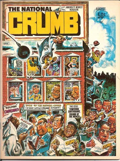
The National Crumb (August 1975)

Let me introduce my post with something that the Simons have released:

SIMON SEZ: ROBERT STOLE MY CRUMB

R. Crumb’s autobiography, authored by Mr. Crumb and Peter Poplaski, includes the unauthorized use of the cover of a Simon Studio publication from 1975 entitled The National Crumb.

“The National Crumb had nothing to do with R. Crumb,” Joe Simon states.”The publication was produced by my studio and edited by Jim Simon. The team of cover and design artists is prominently displayed on the contents page of The National Crumb but conveniently ignored more than 30 years later and attributed to Mr. Crumb.”

“The cover art of The National Crumb is not by Mr. Crumb and it has no resemblance to Mr. Crumb’s work,” Simon adds. “I do not understand why he is taking credit for it.”

The full page reproduction of The National Crumb in Mr. Crumb’s biography offers no authorship notice, implying it is the work of R. Crumb. The work in also listed in Mr. Crumb’s art index as Crumb’s creation, clearly but falsely indicating the art is by R. Crumb.

Joe Simon–co-creator of the iconic superhero Captain America–and head of the Joe Simon Studio has produced many properties over his long career, ranging from comic books to advertising to political campaign materials to covers for publications such as The New York Times Sunday magazines to the United States Olympics. Satire/parody properties from the Joe Simon Studio include the long-running SICK MAGAZINE, SOMETHING ELSE MAGAZINE, the afore-mentioned THE NATIONAL CRUMB, TEEN-MAN, THE CHRONICLES OF HUCKLEBERRY FINK, HECTOR PROTECTOR, and various paperbacks, annuals, and licensing products going back more than 65 years.

Simon properties have been licensed by major entertainment companies, including Time-Warner/DC Comics, DreamWorks, Batfilms, Marvel Entertainment, Archie Comics, Harvey Famous Worldwide, Hearst Entertainment, and HarperCollins Publishers.

“We are required to constantly keep watch over plagiarism and unauthorized use of our intellectual properties,” notes Jim Simon, who also oversees licensing.

The Simons have retained the law firm of Tedd Kessler, P.C., to protect their rights. The Simons comment that it would be a sad event if two members of The Comic Book Hall of Fame, Joe Simon and R. Crumb, who currently share space in a national museum exhibit, face each other in a court of law.

I have got to say I find this whole thing absolutely bizarre. R. Crumb is a significant and talented artist and I can understand someone trying to copy his style. But the cover to The National Crumb is nothing like that style. Normally when writing about misattributions I try to analyze the work itself, or at least provide examples to support my position. But in this case it just seems so unnecessary.

A new book on Captain America for young adults

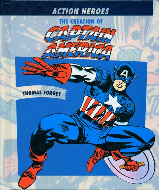
The Creation of Captain America

There is a new book out called “The Creation of Captain America” by Thomas Forget. This book is intended for young adults. Hard covered (I think they call it library bound), relatively thin (48 pages including glossary, bibliography and index) with excellent printing. It outlines the creation of Captain America by Joe Simon and Jack Kirby. The cover for Captain America Comics #1 is illustrated but I have to admit I prefer my own restoration. Joe Simon commented on the appearance of Cap #1 was “that cover sure got a lot of traction”. This book provides the history of the Captain America comics story lines from the early days until today. It combines this with some discussion of some social influence on Cap stories, such as the effect of the Vietnam War or Richard Nixon.

Joe Simon had not heard about this book so I brought him a copy. He did have some criticisms. For instance he did not like the use of colored background fields skewed at an angle with the page. He also objected to the use of the word “flopped” when the book talks about some of the early unsuccessful comic book creations. It was not the reporting of these failures that bother Joe, he just felt “flopped” was not a word that he would expect a writer to use. There was one paragraph that Joe particularly liked:

After working with Eisner and Iger, Kurtzberg next worked at Fox Features Syndicate, owned by Victor Fox. While Kurtzberg was working there, a man named Joe Simon came to fill the position of artist and editor. With Simon’s arrival, Captain America’s “parents” were finally joined together.

Joe also commented about the Kirby drawing on the cover feeling that it was a not a good idea to show the back of Cap’s shield. I do not think Joe was really being critical of Jack Kirby’s work. Every time I have heard Joe talk about Jack it was with great admiration of his enormous talent. But when it comes to things like covers Joe always seems to have his own view about how they should be designed. Joe did not dwell on these criticisms, instead he was rather pleased with the book and thought it was a good job.

There was one comment in the book that I asked Joe about. When comparing Joe’s background with Jack’s:

Simon, however, was raised in a middle-class environment.

I have seen similar remarks in other articles and books. Some have even said Joe had gone to college. So I asked Joe if he would describe his early family as middle-class? Joe said absolutely not, in fact during much of his early life their family did not have their own home, living with various relatives instead. Joe said his father (whose name was Harry) was a tailor who did freelanced and sometimes worked as a cutter in factories. His mother’s was a button hole maker by trade. Some considered his father as a troublemaker since he often helped in union organization. On one occasion Harry Simon and Harry’s brother started a factory that made jackets. It was short lived as the brother ran off with the money. Joe said that he never knew the full story but felt there was more to it because his uncle was back in a few months and there was no hard feelings between the two former partners. Once Joe had told me the story that he was a boy scout but his family was too poor to buy the uniform. Instead Harry Simon made one for his son. Joe never went to college, after high school Joe get a job at a newspaper to help support his family. There was one important difference between the Simon’s background compared to that of Kirby. Joe’s parents had immigrated from England and therefore had no problems adjusting to their new homeland’s language. Joe said that it was Jack Kirby that initiated this idea of Joe’s supposedly more affluent early history.

Let me take a momentary diversion to announce a stealth contest. I will not be repeating this announcement. I have a single copy of “The Creation of Captain America” signed by Joe Simon. Anyone interested can email me at hmendryk at yahoo dot com. You know the drill replace the at and dot with the appropriate symbols. In a week I will pick the winner at random.

This book was published by Rosen Publications and is costs $29.95. It is one of six titles for a series called “Action Heroes”. Here are all the titles and links to Amazon:
Captain America
The Fantastic Four
The Incredible Hulk
Iron Man
Spider-Man
X-Men

However the web page for Rosen Publications indicates that the Hulk and X-Men books have not been published yet. I have not seen the other titles but the art on the covers to Fantastic Four and the Hulk look like they were done by Jack Kirby. There is no doubt that the Cap book cover is Kirby art.

I find it interesting that these six titles all belong to Marvel. Also that this series is about comic book creations while ABDO Daughters published a similar series on comic book creators. Both series are for younger readers. I do not think this is a coincidence, I am sure Marvel somehow orchestrated this. I do not know about you but when I go to comic book stores or conventions I do not see many youngsters. Although the big money is in the superhero movies and merchandise they spawn, how long can you make those movies if you do not have a comic reading public? Marvel could have published these books themselves but their distribution would be the wrong places. A much better way to reach a young, and more importantly a new, audience is to use publishers that already specialize in that market.

Featured Cover, Foxhole #5

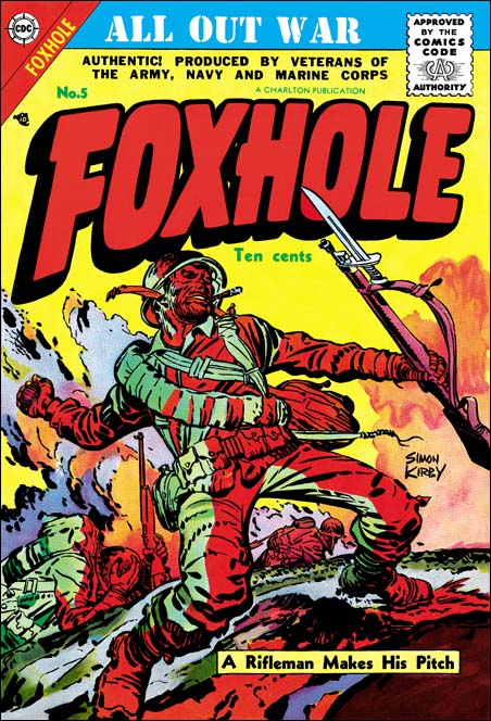
Foxhole #5
Foxhole #5 (April 1954) by Jack Kirby

This was another cover selected by someone in the recent Featured Cover Contest as their favorite Simon and Kirby cover. I have previously commented on the general excellence of Mainline’s Foxhole covers. I noted that these covers particularly showed exceptional coloring and suggested that Simon or Kirby may have been more directly involved in producing the color guides. Foxhole #5 was published by Charlton but shares these characteristics. Although I describe it as a water coloring effect, Foxhole #5 looks like it was actually done by airbrush. Now if the color separation from the color guide was done by a photographic technique, this would suggest that perhaps Joe might have been responsible since he was adept at using the airbrush while Jack was not. However for comic books color separation was usually done by hand by someone at the printers. So the use of airbrush for the coloring of Foxhole #5 was likely not to have been done by Joe.

Foxhole was the only real war genre that Simon and Kirby had produced. I exclude Boy Commandos because that is really more of a kid gang comic. It is regrettable that Mainline had failed as Foxhole along with Bullseye were really exceptional comics. That is not to disparage In Love or Police Trap, but S&K had done a lot of crime and romance work so the loss of those two titles is not as significant. Regrettably the original Foxhole and Bullseye comics are pricey so it is unfortunate that they have not received the sort of reprinting that Boys’ Ranch and Fighting American had. Super Comics did do reprints of both in the 60’s but without the original covers. Some of these are still be found at reasonable prices and are well worth it even if there are not a lot stories actually drawn by Jack Kirby.

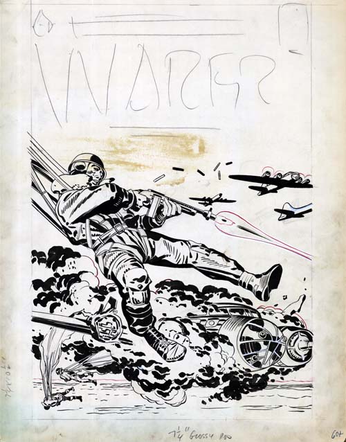
Warfront #28 original art
Warfront #28 (January 1956) original art

Although S&K did not produce any war comics other then Foxhole, they were involved in covers for some of Harvey’s Warfront. I have posted on two of these covers (#28 and #29) in a chapter of The End of Simon and Kirby. Some believe that Warfront #30 and #34 were also drawn by Jack Kirby, but I am inclined to disagree. I have seen the original art for #30 and #34 and, like the cover art done by Kirby for Harvey romances, the art was done on Bristol board. This board is rather thin, unlike the thicker Illustration board that were previously used for Simon and Kirby productions. Interestingly the original art for Warfront #28 was also done on Illustration board. Further the art and especially the inking style is much closer to Foxhole and other Mainline comics. Particularly look how the lower leg and both forearms are spotted by large puddles of black that leave just small un-inked areas. Finally the #28 cover depicts a scene from a story called “Hot Box” published in Foxhole #2. Because of this I believe that the art for the cover of Warfront #28 was an originally unused one meant for Foxhole #2.

The red lines on the original art were used to indicate limits to a colored area. The red lines were not supposed to show up as line art on the black plate, but somehow this was ignored when the cover was actually published. The positions of the two right planes and one bullet shell were shifted on the published cover. The brown stain is from rubber cement which suggests that the art once had something pasted in that position.

Featured Cover, Fighting American #1

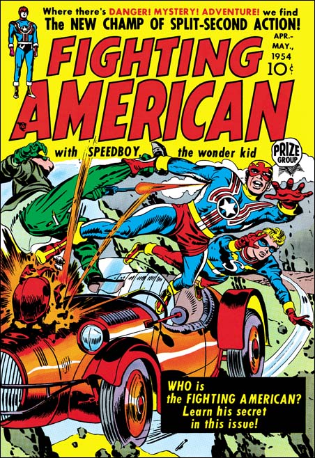
Fighting American #1
Fighting American #1 (April 1954) by Jack Kirby

It is easy to see why one of the entries for my recent Best Simon and Kirby Cover contest was Fighting American #1. The cover shows a race car flying off a cliff. It that was not bad enough the engine is exploding. Fighting American and Speedboy leap to safety with Fighting American pulling along another man by his leg. Surprising the man shoots a gun at his would be rescuer. This scene takes up pretty much every inch of the cover below the comic title. I cannot see how Simon and Kirby could possibly have added more excitement to the cover. The art was done when, in my opinion, Joe and Jack were at their peak. Just look at the exaggerated perspective that Kirby uses, it is amazing. No doubt about it this is one great piece of cover art.

Fighting American was obviously Joe and Jack showing how Captain America should be done. They had created Cap in 1941 but only did the first 10 issues, less then one year of work. Timely continued to produce Captain America without S&K up to issue #74 (October 1949) which was re-titled as Captain America Weird Tales. Timely must have known that they were about to end the title because the single Cap story showed the definitive end of their long time nemesis, the Red Skull. I say definitive because although the Red Skull had been shown supposedly killed before this time the story shows him in hell. There was a Captain America Weird Tales #75 (February 1950) but Cap did not actually appear on the cover or in any story.

Coincidentally the demise of Timely’s patriotic hero marked the period of the rise of Joe McCarthy. McCarthy lead a crusade against all the communists that he said had infiltrated the U.S. government. McCarthy’s “investigations” can best be described as a modern day witch hunt. But that was not so obvious to Americans at the time as can be shown by the fact that a Gallup poll taken in January 1954 showed McCarthy had a 50% approval rating. It is only a guess, but perhaps all of McCarthy’s talk about Communist infiltration brought back to the Atlas company thoughts of their previous success with their superheroes. After all if their hero line was was so financially successful fighting the Nazi’s during the war, perhaps it might occur again using the same heroes to fight the Communists. Whether that was thinking or not, Atlas re-launched the Human Torch, Sub-Mariner and Captain America in Young Men #24 (December 1953). It takes three to four months to produce a comic and so the earliest cover date following YM #24 appearance would be March or April 1954. April is exactly the date that appears on the cover of Fighting American #1. The timing is too perfect, could Joe and Jack saw that their old creation had reappeared? This could have prompted them to rush their own patriotic hero out hoping to take part in the superhero revival.

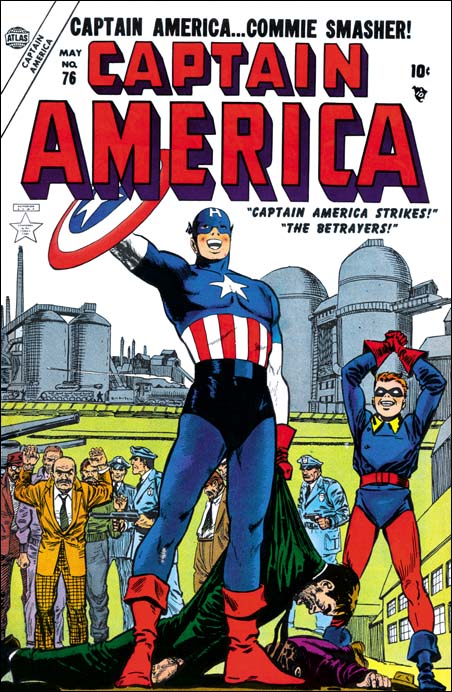
Captain America #76
Captain America #76 (May 1954)

But Joe McCarthy’s rise did not go unopposed. On March 8, 1954 Edward R. Murrow did a segment of “See It Now” critical of McCarthy and his tactics. On June 9 during one of his Senate investigation meetings Joseph Welch addressed McCarthy with the line “Have you sense of decency, sir, at long last?” On June 10 Senator Flanders introduced a resolution to condemn Joe McCarthy. On December 9 1954 the condemnation of McCarthy was passed by the Senate. At this point Joe McCarthy had been pretty much discarded on the rubbish pile of history where he belonged. I do not suggest that McCarthy’s downfall had any affect on the Atlas superhero revival attempt. No I think that the termination of this revival with Human Torch #38 (July 1954) can be blamed on the fact that they were really poor comics. (Sub-Mariner Comics continue until issue #41 dated October 1955 due to a hope of a movie deal). But although I do not think McCarthy’s fall affected Atlas much, it may have had an affect on Fighting American. That title had started out as exciting superhero fare but by issue #3 (August 1954) had turned to humor. The timing is just right for Joe and Jack to begin to see what McCarthy was really about and to change their comic accordingly.

Before closing this post I would like to comment on the artist for the cover of Captain America #76 shown above. Both the GCD and AtlasTales attribute it to John Romita. John Romita did do a lot of the art for Captain America during this revival attempt. For instance he signed the covers for Captain America #77 and #78. Although unsigned, some of the art inside Cap #76 appears to be by Romita. But I find it hard to believe that John was the artist for the cover, Captain America just looks like he was done by a different hand. In an interview of John Romita by Roy Thomas from Alter Ego (volume 3 #9) both seem to indicate that they do not believe the cover for #76 was by Romita either. However the suggestion that John makes in the interview that it may have been done by Carl Burgos or Joe Maneely seems even less creditable. Unfortunately I do not know enough about Atlas artists to suggest an alternative. In the interview John mentions that Stan Lee often had art rework done by whatever artist had stopped by at the office at that time. John particularly suggests that Cap’s smile on issue #76 might be an example of that. But perhaps for Cap #76 the rework was much more extensive.