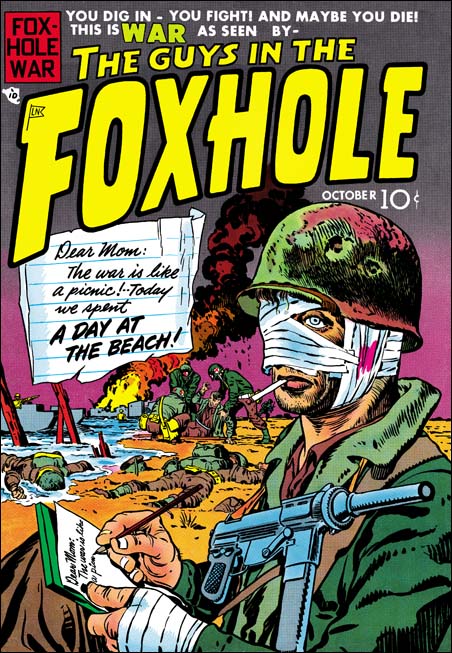
Foxhole Comics #1 (October 1954) by Jack Kirby
I guess you can expect that some of my posts in the near future will be based on Foxhole. I am currently restoring the contents of this Mainline and then Charlton title. As I do so I am reminded just how great these comics are. Like I said in a recent comment, I believe that Foxhole is a sadly neglected Simon and Kirby masterpiece. The original comics have become rather pricey and the Super Comics reprints are not that easy to find. It would seem that Foxhole really deserves to be collected together in a reprint volume. Their only drawback is that there is not a lot of Kirby art in them, although what is there is quite good. However the other artists that work for S&K are at their best.
The premise behind Foxhole was that the stories were told by men who had actually served during a war. This does not mean that the stories were realistic, this was the ’50s after all. What you do get are features that are not your typical war stories. You might think when starting to read a story that it was something more appropriate for Black Magic or Young Romance. Then the story will take an unexpected turn and you realize that it really does belong in Foxhole. Most stories are rather short, usually five to seven pages long. But despite their brevity the stories still do not seem rushed. Kirby drew one story that had only two pages and it was still great.
The Foxhole covers were all done by Jack Kirby (but these were not used for the Super Comic reprints). Well that is except for Foxhole #7 which frankly does not seem to have anything to do with Simon and Kirby as none of the included artists worked for them. As I have previously discussed, I find these Foxhole covers just incredible pieces of comic book art, some of Jack’s best work. That is except for the Foxhole #6 which is one of those rare examples of a boring Jack Kirby cover.
The cover for Foxhole #1 is not quite like the other Kirby masterpieces Foxhole #2, #3, #4, or #5. This is largely because it has been shown, by I believe Tom Morehouse, to be a swipe from a painting. But you can understand why S&K choose this painting to copy from, it certainly is a striking image. The wounded soldier writing a letter on a beach with medics aiding a casualty in the background along with some other warriors lying face down beyond the need of any medical attention. It is fortunate that the Comic Code had not yet begun, because I am sure this cover would not have passed their censure. Despite the adverse publicity some of their comics received after the publication of “The Seduction of the Innocents”, Simon and Kirby generally did not have problems with the Comic Code. But there was one the original cover for Foxhole #4 featuring a dead soldier hanging upside down from a tree that the Comic Code rejected and was never published.

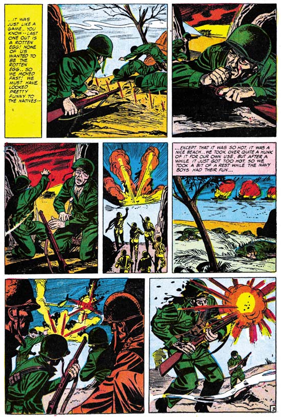
Foxhole #1 (October 1954) “A Day at the Beach” by unknown artist
I have not had the time to find the original article showing the source that this cover was swiped from (I do so need an index for the Jack Kirby Collector). It would be interesting to see if that source somehow provided the theme “A Day at the Beach”. That was the title used for the story that the cover was based on. Or was it the story that was based on the cover? In any case the story was drawn by another artist. I am not sure who the artist was but I wish S&K had picked someone better. It is not that the artist was bad it is just that most of the artists used in this title were so much better and the story really deserves a superior artist.
It has often been said that Kirby did layouts for the artists that worked for the S&K shop. I do not completely deny this as a possibility. On the other hand I do think it is necessary to make comparisons between a particular piece and contemporary work drawn by Kirby. Had Jack done a layout you would expect to see similar visual techniques used in telling the story. An artist might swipe a particular figure or even a panel from Kirby, but any similarity to Jack’s work that stretches over a number of panels is more likely to be due to the use of layouts. I have been making these comparisons as I restore the Foxhole comics and so far I have found nothing that suggests that Foxhole stories were done by artists working from Kirby layouts. This is most obvious in the action scenes such as the one I show above. I will return to this topic in my next Foxhole post where I will provide further examples including some drawn by Jack.
“A Day at the Beach” is a well written script based on the premise of a soldier writing to his mother. The irony of how the soldier describes to her what he is doing compared to what is actually occurring is nicely done. He is trying to convince her that he is safe but we know that he is anything but that. At the end of this story we see our hero marching off with his company in the direction pointed to by a road sign for Anzio. It is interesting that the writer of this story felt that such a simple reference would be sufficient for the readers. Even though those readers would have been too young to remember the actual events, I am sure the writer was correct to believe they would know about Anzio. Now after Korea, Vietnam and two Gulf wars I am not confident that many would recognize the name. I am ashamed to admit that although the name Anzio was familiar to me, I had to look up on the Internet to find out what it was about. Anzio was a controversial campaign by the Allies in Italy during World War II. Casualties were very high and not much ground was take. However the Germans were forced to divert much of their resources from the other Italian front and thus Anzio did help to bring an earlier end to the Italian campaign.


Hi Harry, you wrote;
I have not had the time to find the original article showing the source that this cover was swiped from (I do so need an index for the Jack Kirby Collector). It would be interesting to see if that source somehow provided the theme A Day at the Beach. That was the title used for the story that the cover was based on. Or was it the story that was based on the cover?
The source of the painting by Joseph Hirsch, which is entitled “High Visibility Wrap”, is a book called MEN WITHOUT GUNS with text by DeWITT MACKENZIE (War Analyst of The Associated Press) and descriptive captions by Major CLARENCE WORDERN (Medical Department of the United States Army) published by The Blakeston Company in 1945. My copy, which was originally owned by a public library still has the stamped sign-out sticker and the first entry is March 16, 1945 so this may have been a book Kirby first come across in 1945 while recuperating in the Army hospital. Jack, who’d done his share of sketches while in the service certainly would have been drawn to it as it is illustrated by 137 plates from the Abbott collection of paintings owned by the United States government. 9 years later, when looking for a cover to replace an earlier version he’d done (which S&K opted not to use, possibly because it showed a G.I. being hit by a bullet in too realistic a manner) Jack either went to his public library or had a copy in his personal picture morgue (as he did with a copy of FORTUNE magazine from 1939 from which he swiped the covers to Police Trap’s first two issues) and used this book as his source. I have no doubt of that, as not only the main figure, but the background figures you mentioned were swiped from the cover of the book and the soldier face down in the sand may have been inspired by another painting, also by Joseph Hirsch in it called “Non-Combatant”. As for which came first the cover or the story, it was most certainly the cover. The original penciled cover is also entitled “A Day At The Beach” and I believe it was meant to stand alone as all the other Kirby Foxhole covers were. The filler was added later.
Tom,
Thanks for the information. So although the cover is a swipe the idea of “A Day At The Beach” seems to have been S&K’s.
But I am not clear why you feel that the cover clearly came first. In any case I think you are incorrect in a couple of statments. The original cover for Foxhole #1, although looks appropriate for a beach landing, does not actually include that title. Second not all the other Foxhole covers were stand alone. The cover for Foxhole #3 was related for the story “Office Upstairs” as it clearly is marked as such and both include the death march. Also the original cover for Foxhole #4 also had a corresponding story.
Harry
It’s times like these that I regret having sold my comic collection as my memory is not as reliable as I’d like so I stand corrected on the stand alone covers. I wonder, though, why they didn’t have stories in all issues that related to the cover. That, I suppose is why I feel the covers came first. As far as the original cover to Foxhole #1 (which fortunately I own so I don’t have to rely on my memory), while it does not have the title written on it per se, it does clearly have the outline of a letter drawn on the left-hand side so it appears the idea was there all along.
Pingback: Growing up Kirby: The Marvel memories of Jack Kirby’s son | Hero Complex – movies, comics, fanboy fare – latimes.com
Pingback: Growing up Kirby: The Marvel memories of Jack Kirby’s son | Ancient Roman Coin Blog
Pingback: Growing up Kirby: The Marvel memories of Jack Kirby’s son | Happy Fathers Day