
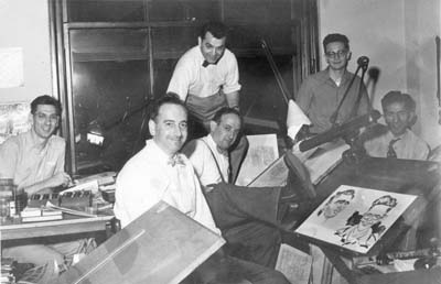
Simon and Kirby studio Left to right: Joe Genalo, Joe Simon, Jack Kirby, Mort Meskin, Jimmy Infantino and Ben Oda. Caricatures (probably drawn by Joe Simon) of Marvin Stein and Jimmy Infantino.
September 1947 saw the launch of a new comic book produced by Simon and Kirby for Prize, Young Romance. From this point on until they launched Mainline Comics, Simon and Kirby would concentrate their efforts on producing comics for Prize. Work for Hillman would continue but in lesser numbers until finally being finished with My Date #4 (cover dated January 1948). More importantly for the topic of this post, Ben Oda would become the chief letterer for Simon and Kirby productions. And there were a lot of comic features to letter. For the period covered in this chapter (September 1947 to July 1954) and excluding titles that Simon and Kirby or their studio artists had no hand in there were 1757 features to be lettered for a total of 11,281 pages. While my calling this period an Oda monopoly is not literally true, Ben would letter at least 10,718 of these pages which is 95% of them. (Actually more because I no longer have access to a few Black Magic issues).
Which brings me to the question on how I am confident that Ben Oda lettered these pages given that lettering credits were never supplied in them. Fortunately there is a studio photo graph taken from this period (see above). In it we find all the people who worked in the bullpen with the exception of Marvin Stein who was probably the photographer. Among them is Ben Oda. The photograph is not dated but the art that Mort Meskin is working on can be identified as “His Dancing Teacher” which would end up with an October 1951 cover date. As Oda is the only letterer in the photograph we can be pretty certain he would do the lettering for that feature. Using “His Dancing Teacher” as a base, I then worked both forward and backwards to establish what was lettered by Oda and how that lettering changed over time.
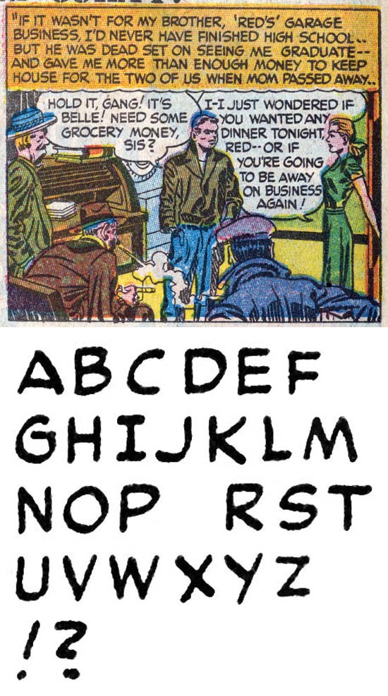
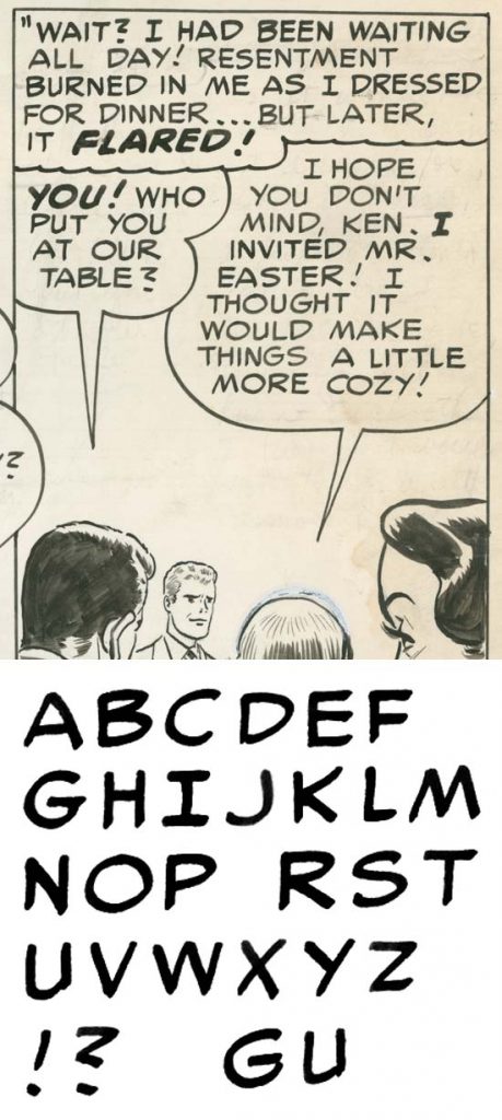
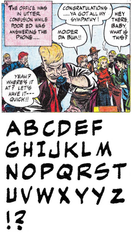
Justice Traps the Guilty #4 (May 1948) “Queen of the Speed-Ball Mob” by Ben Oda
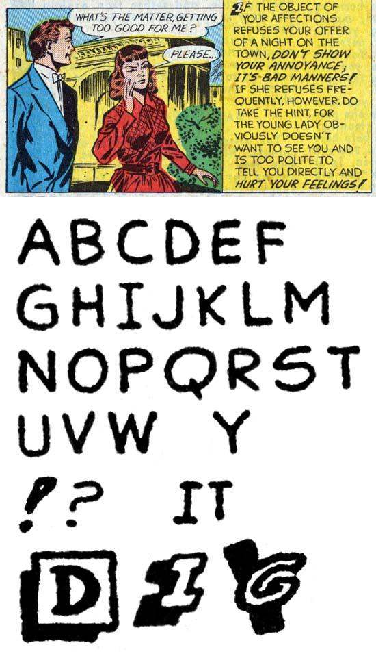
The last example I provided of Ben Oda lettering was cover dated May 1947. In truth not much has changed. The horizontal stroke for ‘G’ barely goes to the right of the curved portion, if at all. The ‘J’ still has no serif on its top and the lower portion is wide with only a slight curve. The biggest change, and even there it is not much, is in the question mark where the bottom portion extends backward a little more to form almost a ‘2’ shape but with the upper region a little more angular. Standard lettering for both captions and balloons with italics limited to bold lettering. As a rule Oda does not use drop caps in his captions but there were some exceptions in Young Romance #1 (“Misguided Heart” “Summer Song”).
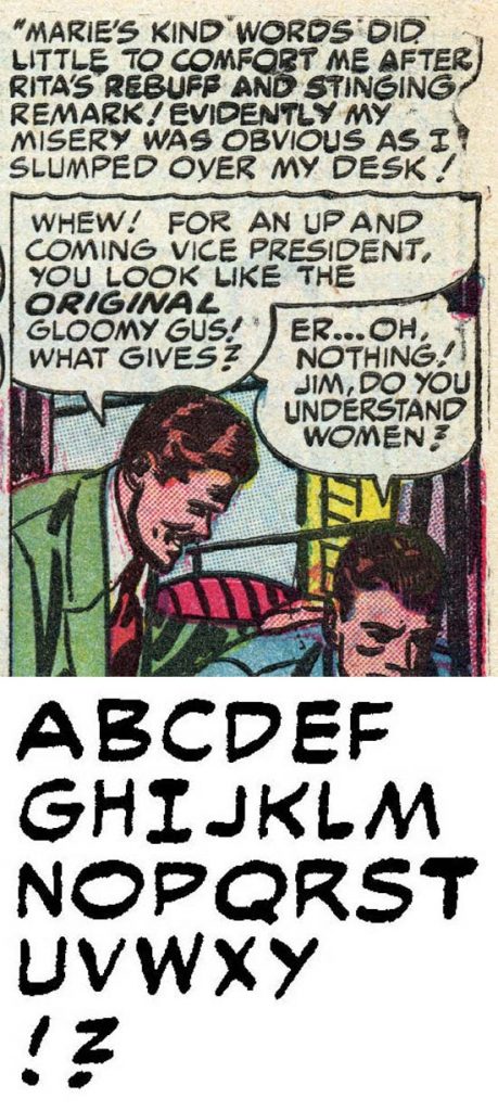
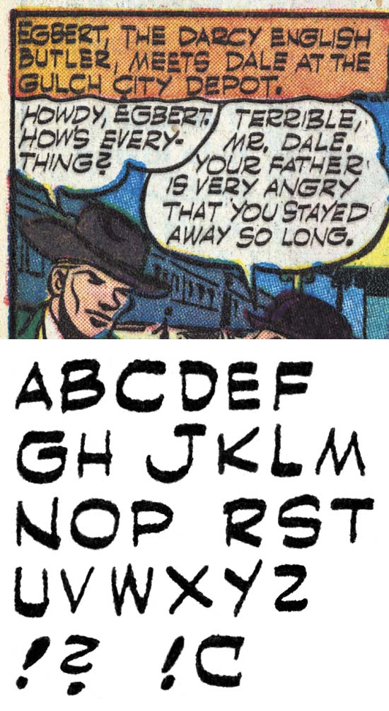
Young Romance #10 (March 1949) “Mama’s Boy” by Ben Oda
Almost a year later, the lettering largely has remained the same. The ‘U’ often shows a small serif by extending the right vertical arm just slightly below the bottom curve. I am convinced even in the earlier lettering by Oda he wrote ‘U’ as two strokes; a left one with a vertical bar curving into bottom section and a second vertical bar on right. However previously Oda was careful to end the right bar where it met the curve portion so that no serif was formed. Now Ben entered a period where he often provided a small serif on his ‘U’. Another slight change is to the letter ‘D’ where the lower portion curves up more than the upper portion curves down. However experience has shown me that this is not unusual for letterers besides Oda. So it must be used with caution and never used by itself to identify Oda. The most significant change is in the question mark which as progress from an almost ‘2’ shape to become more angular to approach more of a ‘Z’ with the lower bar sloping down. But Oda is not a machine and this description is for the mean of the examples. Some still look like the shape seen a year ago and some with a form that will be found later.
Young Romance #19 (March 1950) “That Kind of Girl” by Ben Oda
Yet another year later Oda’s serif on the bottom of the right vertical bar on the ‘U’ has become even more obvious. The difference in slopes of the lower and upper curved portions for ‘D’ have become more extreme so that the rightmost portion is higher up. Most significantly the question mark has become more like a ‘Z’ with very angular transitions and an almost horizontal lower bar. But again there is some variations in Oda’s question marks.
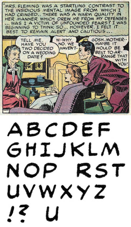
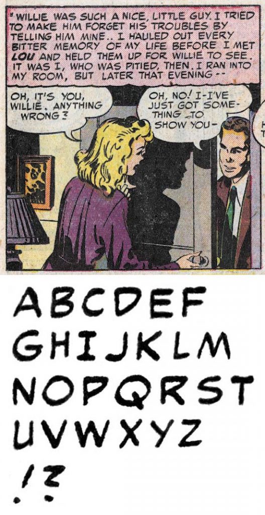
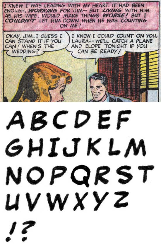
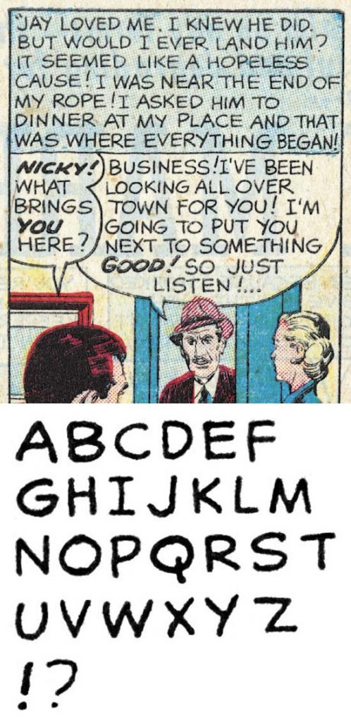
Young Romance #30 (February 1951) “Weekend For 3” by Ben Oda
At this point the serif on ‘U’ has all but disappeared. A small serif can be formed by extending the horizontal bar of ‘G’ slightly to the right, but it is so small it probably was not intentional. I have provided an single example of ‘G’ on the bottom line that shows how Oda executed it as two separate strokes. The question mark has become even more angular and more like a ‘Z’ with the bottom sloping down slightly.
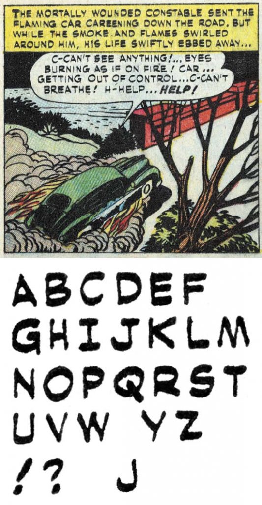
Young Romance #38 (October 1951) “His Dancing Teacher” by Ben Oda
We have now reached the lettering for the Mort Meskin art that I used to start my investigation of Ben Oda lettering. By coincidence it is here that Oda’s question mark is most like a ‘Z’. The difference between the upper and lower portions seen in ‘D’ can also be seen in ‘P’ and ‘R’.
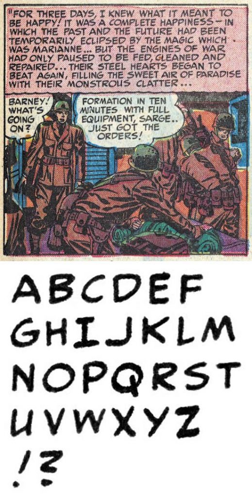
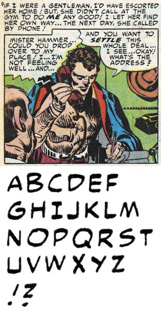
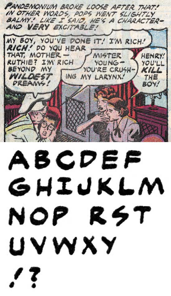
Young Romance #45 (May 1952) “The Things I Didn’t Know About Him” by Ben Oda
Not much change but I just wanted to provide another later example of Ben Oda lettering.
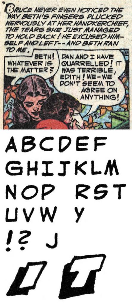
Young Romance #53 (January 1953) “That Girl In My Corner” by Ben Oda
One final example of Ben Oda during the period covered by this chapter. Not much has changed except ‘U’ often has a bottom portion that is almost flat.
As mentioned previously, Ben Oda lettered 95% of the pages for Prize during the period covered by this chapter. He also lettered almost all of the pages for Boys’ Ranch that Simon and Kirby produced to Harvey in 1950 and 1951. But It pays to examine some of the letterers who did the other 5%.
Young Romance #2 (November 1947) “My Broken Heart” by Bill Draut
Like he did earlier for Harvey, Bill Draut would do his own lettering for the features he drew for Young Romance #1 and #2 along with Justice Traps the Guilty #1, all from late 1947. Draut’s lettering really has not change much from the work he did for Harvey. It’s most distinctive feature remains the hook shaped lower portion of ‘J’. Bill is erratic in whether he supplies a serif to the upper part of ‘J’ but he usually is consistent within a story. Draut’s ‘S’ is also somewhat distinctive with is straight and horizontal middle portion. Note the shape used for ‘D’, ‘P’ and ‘R’. As I mentioned before a number of letterers exhibit this feature. At least in “My Broken Heart” Draut seems undecided as to which for of ‘Y’ to use. After these startup issues were done, Draut’s art would usually be lettered by Ben Oda and we will not see him letter his own work again for some time.
Prize Comics Western #77 (September 1949) “Black Bull Bulldogs a Bandit” by Dick Briefer
Dick Briefer was another artist who would letter his own work. Mostly Briefer worked on Frankenstein Comics and the Frankenstein features from Prize Comics. Those were not Simon and Kirby productions and will not be discussed here. Prize Comics would turn into Prize Comics Western and while it is not clear if Simon and Kirby were its editors they were examined as part of my investigation. Briefer did some art and letters for Prize Comic Western #69 (May 1948 “Rod Roper”), #71 (September 1948) and #77 (September 1949 “Black Bull Bulldogs a Bandit”). He also drew and lettered three features for Charlie Chan #5 (February 1949 “The Antique Burglar”, “Murder On Ice” and “The Dude Ranch Hold-Up”) which was a Simon and Kirby production. Briefer is a very inconsistent letterer. In the example above balloons are done in italics while captions are not. In some others he did everything in italics and in others all in standard lettering. His variations for individual lettering and over all appearance makes it easy to distinguish Briefer from Oda.
Young Romance #26 (October 1950) “Hired Wife” by Sir
Justice Traps the Guilty and Headline from issue #23 were Simon and Kirby productions. But at some point it seems to have been passed on to others. The postal statement for Headline #49 (March 1950) and Justice Traps the Guilty #25 (April 1950) lists Nevin Fiddler as the editor. Except for the initial Simon and Kirby issues of Headline and Guilty, Ben Oda would dominate the lettering as he did in the other Simon and Kirby titles. However under the new editors other letterers would make appearances. I will not be discussing all of them, some came and went quickly. Others were around for more features and one I nick-named Sir would even letter a Simon and Kirby production, the “Hired Wife” that I use for the letter set above. Sir shares Oda’s tendency to push ‘D’, ‘P’ and ‘R’ up, as well as providing a serif to the bottom right of ‘U’ (which Ben was also doing at this time). Sir can be distinguished from Oda by his more angular ‘G’ were the horizontal stroke meets with the lower right portion with no sign of a vertical. Sir is a little erratic on whether he supplied a small serif to the top of ‘J’ but in any case his has a distinct hook. Finally the question mark do not have the more distinctive ‘Z’ shape of Oda’s with the lower stroke is much shorter than Oda from this same time.
Justice Traps the Guilty #31 (October 1951) “335 Days of Terror” by Georgie
Georgie is another unidentified letterer found in Justice Traps the Guilty from July 1951 to April 1952 (oddly he was never used for Headline). The hook provided to ‘J’ is distinctive from Oda while the small vertical serif at its end is distinctive from Sir. Even more significant is the question mark which lacks a lower vertical or horizontal portion. Georgie usually supplied a serif to the top of ‘J’ but not always. Georgie used simple drop caps in his captions that were only slightly larger and bolder than the rest of the letters.
Young Romance #55 (March 1953) “The Other Woman” by Sid
Sid only did the lettering for two Simon and Kirby features both appearing in Young Romance #55 (“Heartless” and “The Other Woman”). Because he worked on so few Simon and Kirby productions, I would certainly have neglected writing about Sid if he lettered at a time covered by other chapters of this series. But during this time of Oda predominance, it is worth pondering why Sid was used. The two features Sid lettered were not only used in the same issue but were also done by the same artist who was not one of Simon and Kirby’s regulars. This suggest that the work was picked up by Simon and Kirby already lettered. Possibly some unused art from another publisher’s discontinued title or perhaps something lettered by the artist himself.
Sid has the same upward tilting for ‘D’, ‘P’ and ‘R’ and although I had not mentioned it before the longest axis of ‘O’ sloping upward is also often found in other letterers. One thing more distinctive for Sid is his ‘J’ with a unusually shorter lower portion that in itself has only a slight curve but which is attached to the vertical at an acute angle. Sid usually provides a serif to the top of ‘J’ but not always. His ‘G’ has a small but distinct vertical portion with a right angle attachment to the horizontal bar. The ‘S’ is similar to Bill Draut’s with a straight and horizontal mid section. The question mark is most distinctive having a shape almost like an ‘S’. Sid would use shadow and geometric drop caps.
Young Romance #39 (November 1951) “Marvin’s Pearl” by unidentified letterer
I have not bothered to provide a nick-name for the letterer used for “Marvin’s Pearl” as he was used only this one time. What is specially unusual here is the artist for this piece as a Simon and Kirby regular, Mort Meskin. This is the only occasion where Meskin was not lettered by Oda in a Simon and Kirby production. Although there were a few times other letterers would be used for Meskin’s art in Justice Traps the Guilty after that title passed to other editors. It is possible that this is Meskin lettering himself. Mort sometimes got help from others so perhaps someone else lettered it for him directly. In any case with just a single example it is hard to be sure and so it remains an interesting anomaly.
Young Romance #63 (November 1953) “Mock Marriage” by unidentified letterer
There is another case similar to the previous one, that is a letterer who was not Oda who would letter just 2 features both drawn by artists regular to the studio (“Mock Marriage” by John Prentice from Young Romance #63 and “Speed” by Bob McCarty from Young Love #51 both November 1953). Since two different artists were involved we can be certain that they were not the letterer. This letterer’s most distinctive feature is his question mark. His horseshoe shaped ‘U’ is also distinctive and reminiscent of that by Jack Kirby.
Young Romance #63 (November 1953) “Good Manners” by Marty
There was one artist that drew a number of “fillers” for Simon and Kirby romances. Fillers are short pieces used when just a page or two is needed to complete a comic book. In the case of this artist many are half a page. All but one of these fillers was for “Good Manners” which almost but not quite became a regular feature. Since all this work is done by the same artist and all using the same letterer it might be thought that he was lettering his own work. However we will see in the next chapter the same letterer was used for the work by another artist. So I have supplied the nick-name Marty for this letterer and will explain what I think is going on in the next chapter.
Marty uses a ‘M’ with vertical outer strokes and the inner stokes not quite reaching the bottom of the letter. However towards the end of his work for Joe and Jack he adopted the more standard ‘M’ with sloped outer strokes and inner lines reaching the bottom. Marty also uses a ‘Y’ with a vertical lower portion, a ‘G’ with a distinctive vertical portion at right angles with the horizontal stroke, a ‘J’ with lower portion distinctly curved, a ‘S’ with a horizontal mid section, an angular exclamation point sometimes with an unfilled section and finally a question mark with a short but basically vertical lower section. Oddly Marty adds serifs to ‘I’ whenever it is the first letter of a word such as “IT”. Marty uses various drop caps some of which are quite distinctive.
Battle Cry #4 (November 1952) “The Treatment” by Howard Ferguson
We last saw Howard Ferguson doing work on Stuntman and Boy Explorers. His lettering continued to appear in various Harvey titles up to November 1948 but that was all inventoried features left over from the sudden cancelling of Stuntman and Boy Explorers. It is not known why Ferguson was not involved with Simon and Kirby’s earlier work for Hillman and Prize. Howard can be found lettering for Avon (March 1949 to October 1950) and later for Stanley Morse (May 1952 to February 1954). We can be especially sure this was Howard’s work because in some cases he actually signed it making it a rare example of golden age lettering credits. The GCD also has him doing some work for Gilberton and Seaboard Publishing but I have not been able to verify that. Unfortunately I cannot provide my usual letter sets because I do not have access to the comics and the scans in the Digital Comic Museum are of too low a resolution.
The GCD attributes to Ferguson some of the Hillman and Prize work that I credit to Ben Oda. This is understandable because their lettering is quite similar. As I mentioned earlier, I have traced Ben Oda’s lettering from a story that I can confidently credit to Oda. But the two can be distinguished. Both have a similar ‘J’ with the lower portion only slightly curved and at right angles to the vertical arm. Earlier in his lettering Ferguson would sometimes add a serif to the top of ‘J’ and sometimes did not. However at this stage a serif would consistently be supplied by Ferguson while Oda did not. Their question mark have a similar ‘Z’ shape but when the upper and lower arm deviate from the horizontal they slope down when done by Ferguson and slope upward when lettered by Oda. Finally Oda as a rule does not use drop caps or banner captions (except in Young Romance #1) while both are common in Ferguson lettering.
Mister Mystery #15 (February 1954) “Nightmare” by Howard Ferguson
Lettering S&K Chapter 1 The Beginning
Lettering S&K Chapter 2 Timely, DC and the War
Lettering S&K Chapter 3 Return from the War
Lettering S&K Chapter 5 Mainline and the Studio End
Lettering S&K Chapter 6 Post Studio
Lettering S&K Chapter 8 Conclusion
Lettering Checklists:
Alias
Draut, Bill
Ferguson, Howard
Kirby, Jack
Oda, Ben
Simon, Joe
Pingback: Lettering S&K Chapter 3 Return from the War | Simon and Kirby
Pingback: Lettering S&K Chapter 2 Timely, DC and the War | Simon and Kirby
Pingback: Lettering S&K Chapter 1 The Beginning | Simon and Kirby