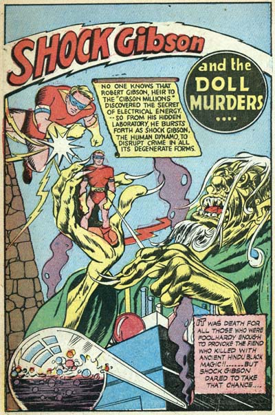
Al Harvey must have been a great salesman. With the failure of his concept of pocket-sized comic books you would have thought that would have been the end of Harvey’s publishing career. Instead not only did Speed Comics return in April as a regular size comic, Harvey took over publishing Champ Comics in May, and then even more surprising Green Hornet in June. Al would turn again to Joe Simon, and now Jack Kirby also, to help with the covers.
Starting with a cover date of April 1942 and ending in December are a series of 14 Harvey covers that were obviously done by Simon and Kirby (Speed #17 to #21 and #23; Champ #18 to #21 and #23; and Green Hornet #7 to #9). I say obvious, because they were done at the same time as Simon and Kirby were producing work for DC and all this work show the two forging their own unique style.
But none of the Harvey covers are signed by Joe or Jack. Instead some bear the signature of Jon Henri. Joe has said that he came up with this name. Joe used Henry as a middle name and he liked Jon so much that he gave that name to his first son. The Jon Henri signature appeared on five covers (Champ #18 and #19, Speed #17 and #19, and Green Hornet #7). While Kirby penciled three of the signed covers (Champ #18, Speed #17 and Green Hornet #7), Simon inked all of them. The two covers that Jack penciled and inked (Speed #18 and Green Hornet #9) were unsigned. So while it is probable it was Joe that actually signed as Jon Henri, it was not a pseudonym for him alone.
A new idea was used by Harvey for his re-launched comic book line. As announced on some of the covers, “read the thrilling story behind the cover”. Postal regulations required comic books to include two pages of text. In these Harvey comics the text feature would be a story based on the cover art. While in theory it is possible that Joe and Jack would read an already written story and illustrate it, that does not seem likely. Generally the story pretty much faithfully depicted the cover art, but Simon and Kirby had a long history of deviating from scripts provided. Further, the covers are typical Simon and Kirby works, it does not seem likely that the text writers would have scripted such ideal Simon and Kirby scenes. No it seems much more probably that Joe and Jack did the covers based on their own ideas and the writer then tried to fit a story around the cover.
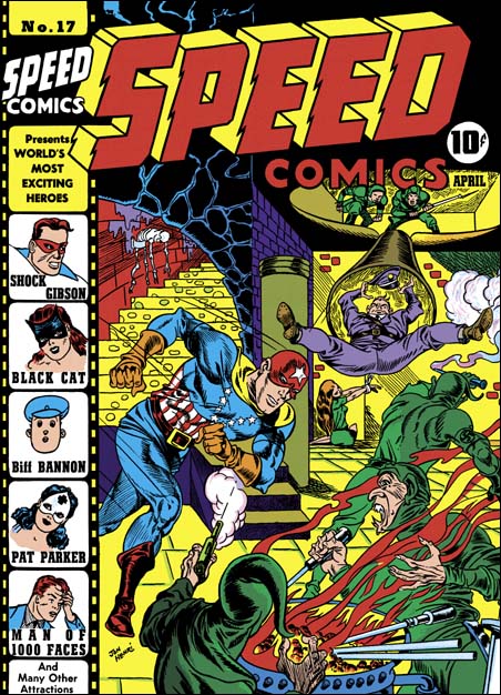
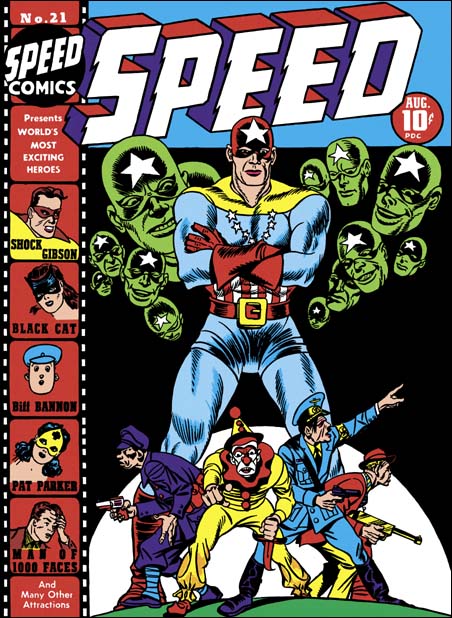
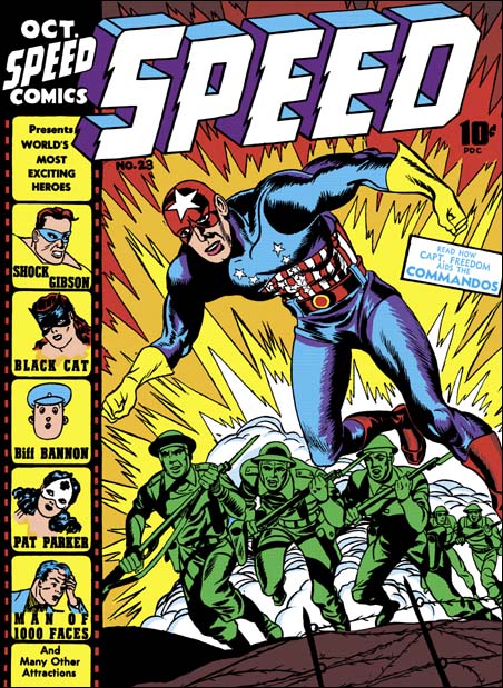
Speed #17, Joe Simon (pencils and inks) and Jack Kirby (pencils), April 1942
When Harvey resumed publishing, Simon and Kirby were working for National. Joe and Jack’s version of Sandman was out in March , their version of Manhunter and their own creation the Newsboy Legion came out at the same time as Speed #17, and their creation Boy Commandos would come out in October. National was even using the Simon and Kirby name on their covers. It was pretty unusual at that time to use the creator names to promote the comic. Even so Joe and Jack would do covers art for Harvey. But they would not sign these with their own names. Instead some of the work is signed Jon Henri. I don’t believe that anybody in the industry or at National was fooled by this. I think the real reason that they did not use their own names is that Simon and Kirby had now become a brand name. It is one thing to give Al Harvey a helping hand, it is another to compete against yourself.
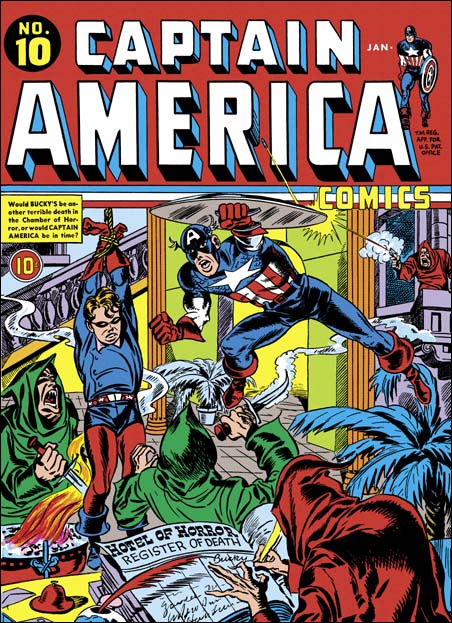
Captain America #10, Jack Kirby (pencils), January 1942
Even though published by Harvey, this is very much a Captain America cover. Compare it to Captain America #10 which even has similar hooded figures. The art style is closest to what had been done at Timely. But the typical Simon and Kirby art had already appeared and National and would also show up on all the later Henri covers. I suspect that this cover was actually done just after leaving Timely and before their work at National gave birth to a true Simon and Kirby style. The overall composition is not unlike a classic Al Schromberg. Despite all that is going on, Simon and Kirby seem to handle it well and present a clear story.
Penciling for the Speed #17 cover was primarily done by Joe Simon. But the forced perspective shown in the two figures at the top as well as the man falling down the chute is in the typical style of Jack Kirby. Although he was quite good at mimicking Jack, Joe never quite mastered Kirby’s perspective (no other comic book artist did either).
This cover there is a peculiar inking pattern in the chute and the ceiling of the room above it. A similar inking style appears on the splash page that Al Avison did for Pocket #1. I have seen it in “Red Skull’s Deadly Revenge” from Captain America #16, again penciled by Al Avison. However I have also seen something similar on the covers for Champion #8 (pencils by Joe Simon) and #9 (pencils by Jack Kirby). Both the Champion covers were inked by Joe Simon and date before he had met Avison. I have seen Lou Fine use a similar inking pattern, so it was just a inking mannerism that several artists adopted.
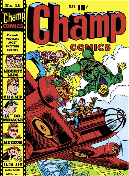
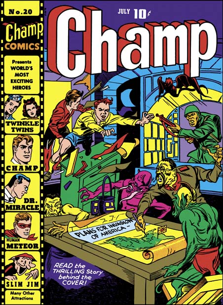
Champ #18, Jack Kirby (pencils), Joe Simon (inks), May 1942
Joe and Jack had done three covers for this series when it was published by Worth under the title Champions. Now the line was being done by Harvey after his unsuccessful pocket comics. Here and in the comics published at the same by National, we find the start of the real Simon & Kirby style. I believe the reason this happened now is that before at Timely there was a large crew working on Captain America. But initially there was probably only Joe and Jack at National. This really forged their collaboration. The Captain America covers were exiting but now Joe and Jack have taken it to a new level. Forget about how the Liberty Lads managed to get into this aerial fight. Who cares how one of them is able to slug a Jap off the plane with the propeller in between them? What matters is the story of the daring rescue of our capital from the Japanese menace. How could a kid possibly pass this cover up without at least stopping to see what was inside. Unfortunately the comic book stories did not, could not, live up to the cover. For that the comic reader would have to buy National’s Adventure or Star Spangled comics. However the text piece, “the story behind the cover”, explained the events of the cover. Just not in so dramatic a manner.
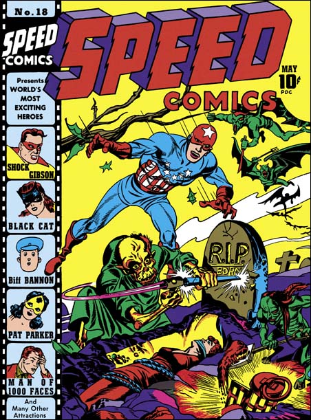
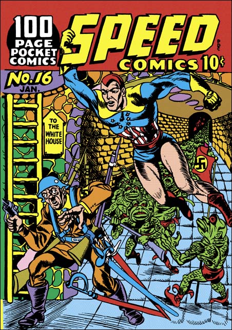
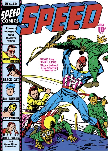
Speed #18, Jack Kirby (pencils and inks), May 1942
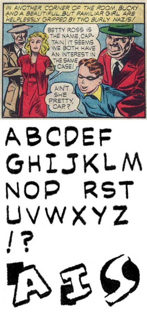
A damsel in distress. A fiend finishing off a gravestone just before performing the final act. But have no fear, it’s Captain America to the rescue. But wait, where’s Bucky? But wait again, that’s not Captain America! Captain Freedom was Speed Comics’ patriotic hero. In the hands of Jack Kirby, Captain Freedom would look even more like Captain America then he already had. It must have brought some satisfaction to Simon and Kirby that they could still show how Cap should be done.
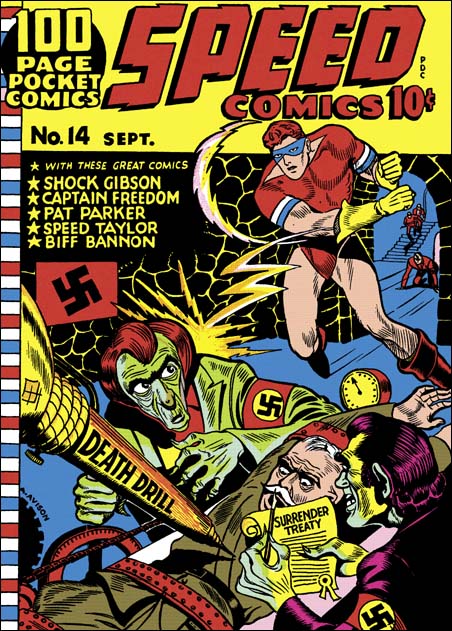
Captain Freedom first appeared in Speed #13 with a cover date of May 1941. This was before Al Harvey was publisher for Speed. According to Joe Simon, Irving Manheimer (president of Publisher Distributing) did the publishing of Speed Comics then. The distributors loved comics at that time. Captain Freedom was created by Franklin Flagg, do you think that could be a pseudonym? Once Captain America become a big seller, copy-cat patriotic heroes became abundant. But even so, Captain Freedom seems particularly close in design to Captain America. Similar placement of red and white stripes, a circle of stars replaces a single star on the chest, and shoulder pads replace mail armor. The “skull cap” is similar particularly to the Cap in Captain America #1. And of course the rank of Captain is shared by both.
What makes the similarity surprising is the Captain America #1 was cover dated March while Speed #13 is dated May. Comics typically took about a month to create, a month to print, and another month to distribute. But that would put the creation of Speed #13 to at best a month before Captain America #1. So we seem to have a case of an obvious copy-cat patriotic hero created before the original hit the new stands. The answer lies in advertisement used to promote the Comicscope. I covered this in detail in another post (The Comicscope and Captain America).
This Speed #18 cover was primarily penciled by Jack Kirby. The inking turns out to be his as well. That is not to say Joe Simon had nothing to do with the cover, just that I have not been able to detect any contribution he may have had.
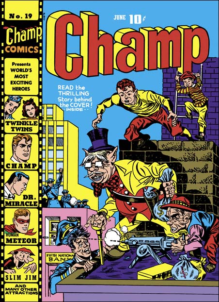
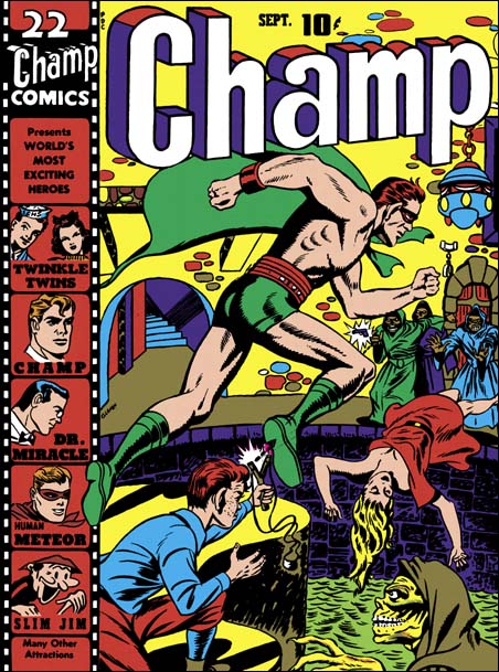
Champ #19, Joe Simon (pencils and inks) June 1942
This is one my favorites of the Harvey covers. Once again there is a Jon Henri signature, but this time it was Joe Simon doing the pencils. It is amazing to see how well all the pieces of the story are present. The robbed bank, most of the policemen ineffectively on the other roof, the single policeman in the correct location is about to be taken care of by the crooks before they make their get-away. That is except for the Liberty Lads approaching unseen from the back, about to save the day. What a masterpiece. “The story behind the cover” text fills out the story, but is not half as exciting as the cover art.
Joe could work in a style close enough to Kirby’s that to this day many are fooled. But he had his own vision too and I am a bit surprised that so many experts still attribute this cover to Kirby. I suspect many use aesthetics to distinguish the two; for them if it is one of the better covers Jack must have done it. Jack did most of the penciling and Joe acknowledges that Kirby was an incredible artist. But I am here to tell you that Joe Simon is a lot better artist then many give him credit for.
Jack Kirby was the master at this almost 3D effect and although others tried to imitate Jack I do not believe I have ever seen anyone completely succeed. So when I see such a successful job as on Champ #18 (and also on Champ #20) I feel pretty confident that Jack Kirby was responsible. The one Liberty Lad about to leap on Champ #19 is not quite an exaggerated perspective (although still rather well done). But the lack of exaggerated perspective does not mean it was not done by Jack.
The Liberty Lads on Champ #19 are not only younger they also look familiar. That is because they seemed based on Gabby and Scrapper from the Newsboy Legion. Although in the past it was generally believed that Kirby did not swipe, more recently examples of Kirby swipes have been well documented particularly by Tom Morehouse in TJKC. But why would Jack have to swipe the Liberty Lads on Champ #19 but not on the other four covers? To me the Liberty Lads swipes are more likely to be evidence of Joe’s involvement than Jack. One features that suggests Kirby is the square fist of the policeman on the far roof. Square fists are easily recognized manner used by Jack. But it is so obviously that there is little doubt that Joe Simon would see it also and it would not be hard for Joe to adopt it himself. But note the stiff, straight arm of that same policeman, that does not look like Jack’s work.
By this period Joe Simon has advanced beyond the use of just two expressions that he had learned when he started comic book work (as described in The Comic Book Makers)
Slits for eyes, unless the character was to register astonishment or horror – and then the eyes become circles. Heavier lines for the eyebrows, raised for bewilderment, slanting down toward the nose for anger. One line for the upper lip. A heavier line, indicating a shadow, constituted the lower lip.
But there are some expressions that Joe uses more frequently than Jack. One is having both eyebrows raising as they approach the mid line. The policeman trying to climb onto the roof in Champ #19 is a good example of this eyebrow rendition.
The master criminal and his diminutive partner on Champ #19 are rather unique. To me they more represent the visual humor that Joe will later show in features like the Duke of Broadway then the type of humor Jack would do. Actually the cover as a whole seems more humorous then suspenseful.
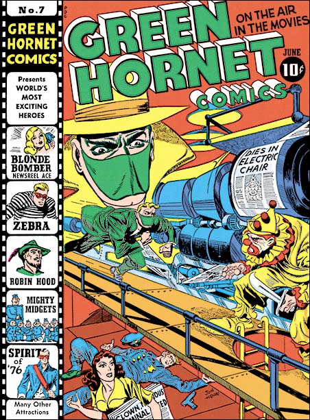
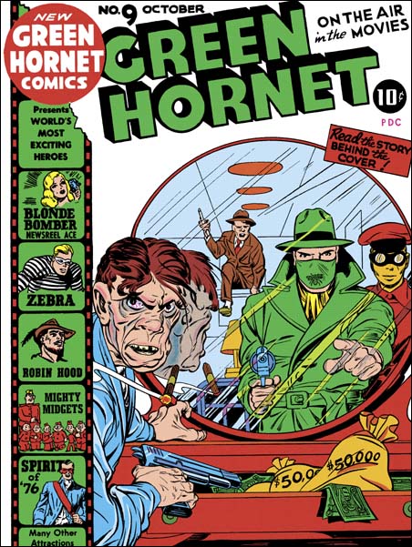
Green Hornet #7, Jack Kirby (pencils), Joe Simon (pencils and inks), June 1942
I love the way Simon and Kirby make a cover tell a story. The Green Hornet is rushing to attach a killer clown. If the clown carrying a wicked knife wasn’t enough, the lady on the lower level carries a newspaper with headlines that are hard to make out completely but clearly includes “CLOWN … CRIMINAL …”. Behind her is a fallen policeman, his gun laying at his side, obviously the Green Hornet will be taking on one tough clown. The press above is printing the front page for the latest edition declaring “DIES IN ELECTRIC CHAIR” with a picture of the clown, certainly printed ahead of time because the clown escaped before facing his execution. The Green Hornet had better be careful because this clown has nothing to lose.
The Green Hornet cover for June is a bit of a puzzle. The floating head looks like it was done by Joe Simon, The killer clown and the running Green Hornet seem to be Jack Kirby’s hand. The rest of the figures have bits of both. My take on this is that it was original penciled by Jack without the floating head. Joe added the large head and maybe touched up some other parts. Truly a joint effort. Once again signed as Jon Henri.
The inking on this cover includes irregularly patterned “hay” that we have seen before on the cover to Speed #17. As discussed there, this pattern was used by both Al Avison and Joe Simon (among others). While I do not see any inking touches on the Green Hornet #7 cover that look like Avison’s hand, I do find traces that look like Joe’s inking.
The “story behind the cover” for the issue is unusual in that it is not a very good match for the cover. In it there was no confrontation between the Green Hornet and the Clown in front of a newspaper printing press. Even more important there is no mention of the Clown having died in the electric chair. Green Hornet #7 differs from the other Harvey comics in that the text story is continued in the comic strip feature “The Green Hornet and the case of the Murdering Clown”. It is the comic book feature where the Clown somehow returns from the electric chair and where there is a fight between the Green Hornet and the Clown placed among newspaper printing presses. So despite the title of the “story behind the cover”, the text story is actually a prequel to the cover and the comic book feature is actually the story for the cover.
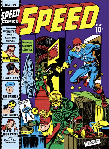
Speed #19, Joe Simon (pencils and inks), June 1942
June is Joe Simon’s months since he did both Champ #19 and Speed #19. Both signed as Jon Henri. To me the give-a-way that this is Joe’s penciling is the depiction of the Japanese impersonator. The whole idea of the Japanese setting up to disguise himself as Captain Freedom only to be interrupted by the real thing that seem to me to be something Simon would come up with. Captain Freedom’s fist is square like Jack Kirby would do it. But Joe had inked Jack’s work and was familiar with these sort of traits. The Japanese impersonator has the peaked eyebrows that Joe seems to favor.
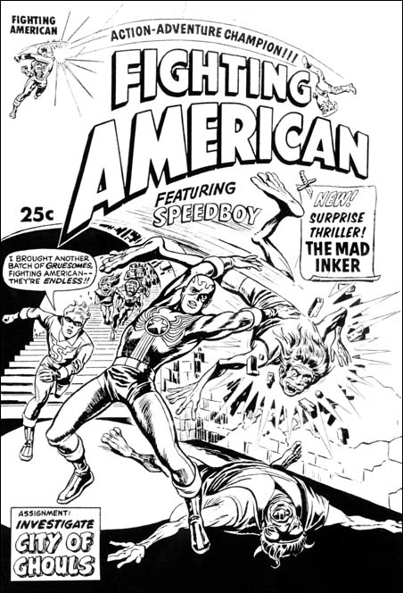
Harvey’s Fighting American #2, Joe Simon (pencils and inks), 1966
This Speed cover depicts a horde of Japanese soldiers coming down a flight of stairs and entering the room. Actually this is not too unusual at the time. Compare it to the cover for Speed #17 penciled in parts by both Joe Simon and Jack Kirby where it is Captain Freedom who enters from a stairway. Al Avison used it once (Speed #14) but with fewer enemies. The unidentified artist (Speed #16 and Pocket #3) also had the horde of advancing enemies, but lack the stairs. But after this period where this motif seemed somewhat popular, I don’t remember Simon and Kirby ever returning to the enemies entering from stairway motif. But surprisingly it shows up much later in art Joe Simon did which I believe was meant to be the cover for Fighting American #2 by Harvey meant for 1966. The art has a smaller number of enemies but it does show the stairs.
Champ #20, Jack Kirby (pencils), Joe Simon (inks), July 1942
The hits keep coming. So many of the covers that Simon and Kirby did for Harvey are just amazing. But this one is another of my favorites. The exaggerated perspective in the Liberty Lads are a signature style for Jack Kirby, so he is the primary penciler. Simon and Kirby literally demonize the Japanese foe. This sort of thing would not be considered politically correct today, but during that war artists worked under a different standard.
I have seen penciled on the margins of the original art that this was inked by Al Avison. But that sort of notation is suspicious. There would be no reason for leaving such notation when the art was original created and used. I have seen an awful lot of S&K art and only on one other page have I seen a similar annotation as to the inker of the work. I strongly suspect that these notes were made by subsequent owners or art dealers. In any case at this time Avison was at Timely working as their primary artist for Captain America. As such he was very busy and it is unlikely he would have time to do this inking. No, the inking looks like Simon’s work to me.
Speed #20, Jack Kirby (pencils), Joe Simon (inks), July 1942
I think this is Jack’s penciling because of his typical exaggerated perspective. Captain Freedom is a true superhero, he has super strength and can fly (or perhaps he is just jumping great distances). But on all the Speed covers that Jack and Joe did they both portray Harvey’s patriotic hero more normal, sort of like they did Captain America.
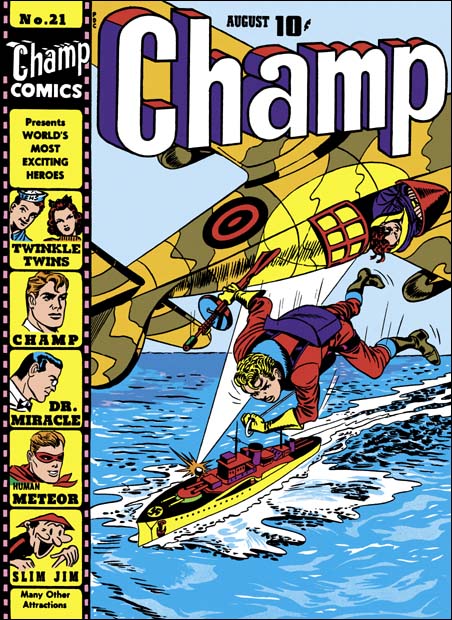
Champ #21, Jack Kirby (pencils), Joe Simon (inks), August 1942
This cover shows one of the Liberty Lads ejecting from a plane flown by his partner. I am not sure where the boy left the plane, it looks like a one seater. Nor is it clear why the plane had to fly upside down. The plane’s camouflage does not seem effective as the ship’s spot light has been trained on it. The bailing Liberty Lad is just about to open his parachute. It is not at all clear how he is going to attach the ship armed with only a machine gun and with no possibility of surprise. But this sort of logical analysis really is pointless with these Harvey covers, bravery trumps logic.
The baling Liberty Lab is not in exaggerated perspective, but still seems to have the Kirby touch. So I believe Jack was the primary penciler.
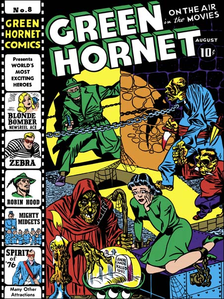
Green Hornet #8, Joe Simon (pencils and inks), August 1942
Although I cannot provide any source, the damsel in distress looks an awful lot like she was originally done by Will Eisner. It would appear that for Green Hornet #8 Joe resorted to the use of swiping that was so prevalent in the start of his comic book career. The Spirit had been published as a newspaper insert for some time so Joe was certainly aware of it. However my search through the DC archive editions has failed to reveal any possible sources for the lady on Simon’s cover. The Green Hornet’s two opponents look like Simon creations. Note their similarity of their checks and jowls with that found in the Hitler from Speed #21 (August), the smaller villain from Champ #19 (June), and the sketch of Hitler in a Zoot suit. Yes Joe used swipes for this cover, as he so often did, yet he has created a very original composition.
The cover tells a story, as just about all Joe Simon covers do. A lady is held captive, terrified of the future revealed in a crystal ball by a truly gruesome witch. But the background shows the Green Hornet arriving to the rescue. But our hero must be careful to negotiate the obstacles separating himself from the damsel in distress, a pit at his feet and a chain stretching across his path. As we follow the Green Hornet’s eyes we find it is no ordinary chain as it ends with a collar on what is the not quite human equivalent of a guard dog. A very effective guard indeed as shown by his blood stained knife. The guard is intent on preventing the Green Hornet from interfering while his diminutive companion’s concentration remains on fulfilling the crystal ball’s prediction of the woman’s fate.
Simon makes effective use of props to heighten the drama. A drip covered candle provides an eerie touch to the scene, it is a device that Simon and Kirby would introduce often for such an effect. A spot light seems to come from someplace low off our field of vision. It is a very selective spot light indeed, no shadows are cast by the legs of the two subhuman figures. However shadows are cast by the hand-held knife, the chain and the Green Hornet himself. All the shadows that would provide drama to the scene, as always realism is not as important as telling the story. The spot light also aids the composition, diagonally dividing the two darker fields occupied by the villains. The captive is not in the spot light but is highlighted by it, visually connecting her to the hero. It may not have anything to do with Joe, but the colorist use of a green dress also effectively links the damsel with the hero.
Joe Simon may not have been as talented a penciler as Jack Kirby, and some will say that he depended too much on the use of swipes. When it came to laying out a cover and making it tell a story, few at the time were his equal. Green Hornet #8 was truly a thrilling cover. But Joe was not content with just drama, he also included humor, albeit a dark humor. There is a similar touch of black humor in Joe’s cover for Champ #19. Here Simon scatters cob webs about the place as part of the effort to give a dingy look to the scene. How many artists would then turn around and attach webbing from the staff to the witch herself? My favorite piece of humor in this piece is how the beastly guard leads his small partner by the hand, as if he is taking part in a “take your child to work” day. This type of humor is an early manifestation that would fully blossom when Joe was editor of Sick magazine.
Like the rest, this issue includes a text article to tell “the thrilling story behind the cover”. What is interesting about the text story for Green Hornet #8 is not what it adds to the understanding of the cover, rather how it deviates. In the story the lady is held captive in a building across the street from the offices where the Green Hornet’s alter ego works as a newspaper reporter. Nothing in the story suggests that woman was held in the sort of dungeon that the cover portrays. Rather the story describes her place of confinement as a small room adorn to look like a fortune telling shop. In the story there is a fortune teller whose crystal ball reveals a fatal future for the beautiful captive, but without an indication that the soothsayer was an ugly witch. The short tale includes two “toughs” without giving the impression that they were almost subhuman. Neither is described in the story as small as the one shown on the cover depiction. Nor does the story mention the use of knives by the toughs. I find it hard to believe that an author presented with a copy of this exotic cover art would have written this more mundane story. More likely Joe was given a verbal outline of the story and embellished it to make a more interesting cover. As such this cover deviates from the practice used for “story behind the cover” of other covers.
Speed #21, Joe Simon (pencils and inks), with a little help from Jack Kirby?, August 1942
The pointing hand of the clown looks like it was done by Kirby. But only that small detail does. The Japanese, the clown, Hitler and the gangster in a small circle, cluelessly looking for Captain Freedom is just the sort of visual humor I come to expect from Joe Simon. And Captain Freedom towering over them, as well as all his floating heads, seem to me to have been done by Joe’s hand. So I make Simon as the primary penciler.
It is wonderful to see all the different approaches to a cover Simon and Kirby did for Harvey. But actually that was true with Joe and Jack during all their collaboration. They always seem to put great effort to make their covers stand out from the rest of the crowd on the racks.
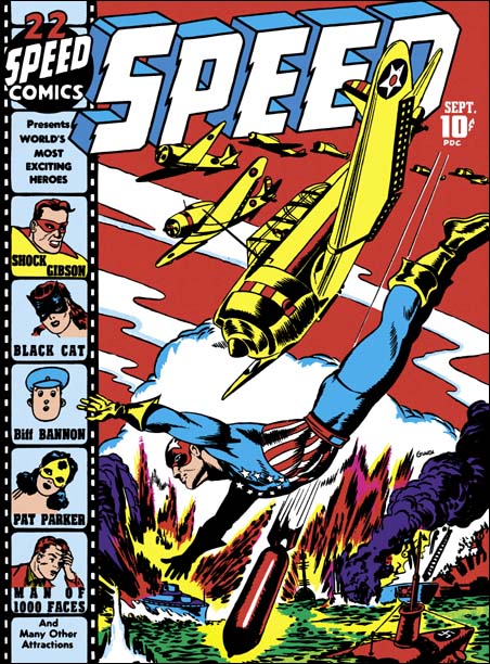
Speed #22, Joe Simon (pencils and inks) September 1942
I once provided Joe Simon with copies of my restoration of two stories from Daring Mystery #2 (February 1940). One was signed as Gregory Sykes and Joe revealed that in high school he and his friends sometimes used another name and his was Gregory G. Sykes. But the conversation did not end there. Joe also said that as a comic book artist he thought he had used three pseudonyms. He knew two of them (Jon Henri and Gregory Sykes) but could not recall the third so he felt he might have been mistaken. As Joe did not remember these Daring Mystery stories at all, he began to read them with much interest. At one point Joe stopped and chuckled, he said that in the Phantom Bullet story he had used the name Nelson Glaven for one of the characters. Nelson Glaven was the alternate name for Ned Gibman, one of his high school friends. I immediately recognized the name Glaven.
The cover to Speed #22 was signed Glaven. I had never talked to Joe about this cover since I had already decided (incorrectly) that he did not do it. Still I always had thought it was an excellent piece of comic art and had wanted to know more about the artist. However my search for more information on Glaven always came up empty and I had concluded it was a pseudonym. Now Joe has provided the information to link him to the Glaven alias. Actually I should have known better when I previously felt that Speed #22 was the wrong style for Joe Simon. I have been saying for some time that Joe could and did adopt different styles.
Speed #22 is a great cover. The planes diving out of formation leading to a similarly diving Captain Freedom and then to a bomb is very effective. This sort of formal device and the more static layout it provides is not the sort of thing usually found in covers by Simon and Kirby. But Joe did experiment with different compositions from time to time and this apparently is an example of that. Simon seem to deliberately adopt a different style for this cover however the misty clouds are a feature that Joe would sometimes use. The inking is done with a brush in a manner very much like the inking of some of the Jon Henri covers, particularly the form lines (see the inking glossary) on the airplanes and the boots.
Champ #22, Joe Simon (pencils and inks) September 1942
This issue is unique among the Champ covers we have examined in that the Human Meteor has replaced the Liberty Lads. The cover has the appearance of being constructed from a number of different swipes. The hooded foe in the lower right corner came from Lou Fine’s Wonderworld #7 cover. The lady being thrown into the pool seems unnatural. Her hair and general pose looks more like she is lying down rather then falling. I am sure she was taken from someplace. I cannot identify other swipes but that is not to say there were not any. The Human Meteor and his young sidekick both have large ears that are not quite placed on the head correctly. This unusual treatment of ears viewed from the back is also a characteristic of Jack Kirby at this time. But the anatomy and pose of the Human Meteor just does not otherwise look like Jack’s work.
Like he did for Speed #22, Joe seems to adopt a different style for the Champ #22 cover. The design does not match that of Speed #22 but the style is similar. Joe’s Glaven pseudonym and the art style seems to be done to make Harvey’s bullpen seem bigger. Simon has spent much effort in the inking, particularly for the Human Meteor, resulting in a beautiful cover. My only complaint is that cover does not tell as clear a story as Simon’s covers usually do. It the Human Meteor leaping to save the damsel from drowning or to fight the hooded villains?
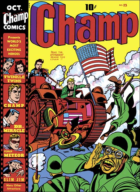
Champ #23, Jack Kirby (pencils) and Joe Simon (inks) October 1942
The Liberty Lads in action one last time, at least as done by Simon and Kirby. Some of the forced perspective, especially in the thrown Japanese soldier, have the distinct Kirby touch. More importantly the Liberty Lads have the wild hair that is very much a Kirby technique. The foreground figure turning and calling to the viewer is a rare device that shows up from time to time in work by Kirby even up to the period where he was working on monster comics for Marvel. So he is probably the primary penciler.
The art shows a good compositional touch of contrasting the foreground with the background. The Japanese soldiers with their pistols and rifles do not stand a chance against the Liberty Lads with their tank and machine gun, not to mention their most powerful weapon of all, the American flag. The US tank has just demolished the Japanese vehicle so badly that it one can no longer make out what it was. Even the cloud of smoke raised by the tank and machine gun completely overpowers the puny gun smoke of the only Japanese soldier still fighting. The Japanese do not stand a chance against the might of the US. Of course this comic came out in August 1942 at a point where America was doing rather poorly against the military forces of Japan.
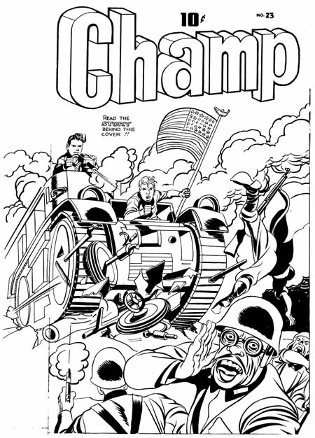
Champ #23 original art with stats removed and some reconstruction of the flag
The original art for the Champ #23 still exists but without the original stats. One surprise is what there was art under the stat of the film strip showing the “exciting heroes”. Line inking of the art has been done but no spotting inking. Obviously it was a mistake to do art that would not be shown on the final cover, but the mistake was corrected before the final inking was done. Another surprise is that the original flag was replace with a differently arrange flag stat. This was probably done because the original version was crude to say the least. On the margin is a note to fix the flag and there is also a rough sketch how the flag should look. Because the flag stat was oriented differently from the original version, application of white out and some re-inking was required.
Speed #23, Joe Simon (pencils and inks) October 1942
Captain Freedom springs to action one last time, at least as done by Simon and Kirby. A striking war cover with explosions and advancing troops. A good cover but, in my opinion, not one of Simon’s best efforts.
There are a couple of errors to the cover art for Speed #23. Captain Freedom is missing his shoulder pads. This error also occurs on the cover of Speed #18, one which Kirby did both pencils and inks. Jack is famous for errors in getting costumes correct but this is unusual for Joe. However it is understandable in that it makes Captain Freedon’s costume even more like that of Captain America. The second error is actually common to all the Simon and Kirby Speed covers (Speed #17 – 23); Captain Freedom’s thighs and knees are covered in blue pants. This is surprising because previous and subsequent Speed covers get Captain Freedom’s leg coloring correct. Even the interior Captain Freedom story art is colored properly for the issues where it is wrong on the cover. Typically coloring was up to the publisher, but seeing that only the Simon and Kirby colors have the error it is quite probable that Joe and Jack did the color guides. The blue leggings also make Captain Freedom look more like Captain America.
Green Hornet #9, Jack Kirby (pencils and inks) October 1942
Green Hornet #9 is another of my favorite Harvey covers (along with Champ #19 and #20). Jack Kirby’s touch is all over this one. In it he uses the mirror to great effect. The crook is so started by seeing the Green Hornet in the mirror and has turned so quickly to confront him that his cigar and its reflection still hang in the air. Although the crook is reaching for his gun, the Green Hornet already has the drop on him. However the mirror reveals to us that yet another gun carrying foe is climbing into the room behind them. This device of a gun carrying foe, or sometimes the hero, sneaking in through a window or door was used by Simon and Kirby a number of times while working for National. But the thing is, if we can see the crook in the mirror should not the heroes?
Well the cover says “Read the story behind the cover”. From the story we learn that the crook by the dresser is the Jackal and the gun carrying foe is Dapper Dan. The key passage reads:
Just as he was gloating over piles of money in his drawers, he heard stealthy steps creep toward him. Instinctively he reached for his automatic and glanced at the mirror. It was the Green Hornet!
“Keep jour hands from that roscoe!” the Green Hornet ordered.
The Jackal scowled and obeyed. But when he looked at the mirror again, his spirits rose. Hefting an automatic, Dapper Dan was coming through the fire escape window.
Dapper Dan was just as visible to the Green Hornet and Kato as he was to the Jackal. Almost unperceived, Kato moved sidewise, and as Dapper Dan set a foot into the apartment, Kato turned around. Then Dapper Dan found himself sailing through the air toward the wall, which he struck hard with his head. He fell on the floor without a groan.
It was jiu-jitsu carried to perfection.
The original art for this cover still exists and it was up for auction by Heritage a few years ago. It reveals there was more to the art that was either covered up by stats (of the “film strip” and the title) or painted out with white-out. The now missing parts are interesting but frankly superfluous. Whoever made the decision to remove them was absolutely correct. The finished cover is much more focused.
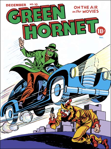
Green Hornet #10, Joe Simon (pencils and inks), Jack Kirby (pencils) and an unidentified artist (inks) December 1942
Simon and Kirby would do the last of these Harvey cover in October (Green Hornet #9). Champ #23, Speed #23 and Green Hornet #9 would be the last of the Harvey covers that can safely be attributed to Joe Simon and Jack Kirby. Champ #24 and Speed #24 for November were clearly done by other artists. But I have long been puzzled by the cover art for Green Hornet #10 (December 1942). My conclusion now is that this cover was started by Simon and Kirby but perhaps finished by some other artist.
The criminal clown similar to that by Jack for Green Hornet #7. Further the costume is also a close match to the one on the cover of Speed #21 done by Joe. But the inking does not look like is was done by either Joe or Jack and so I suspect that was done by another artist. The Green Hornet and car look like they were penciled and inked by Simon but is possible some of it was also done by another inker as well. The background scenery is reminiscent of some of the Fox covers Joe had once done. It is a dynamic composition weaken somewhat by the disparate inking styles. I suspect that it was a rush job by Joe and Jack that was finished by someone else.
With the war and the draft going on, Joe and Jack knew that eventually they would have to do military service. In anticipation of that, they began to create a stock pile of work to be used by DC while they were away. They certainly had helped their friend Al Harvey to get his new publishing company going but Joe and Jack needed to concentrate on their DC work. However Simon and Kirby would return to do work for Harvey after the war.