Category Archives: Topic

Featured Story, The Vision from Marvel Mystery #24

In my serial post on “Early Jack Kirby” I commented that I regretted that I only had a few scans of The Vision from Marvel Mystery Comics. I find those that I have very enjoyable provided that to do not let some of the logical inconsistencies bother you. I believe the only way to enjoy any superhero story is to not take them too seriously. Actually I rather enjoy the inconsistencies.
Marvel Mystery Comics #24
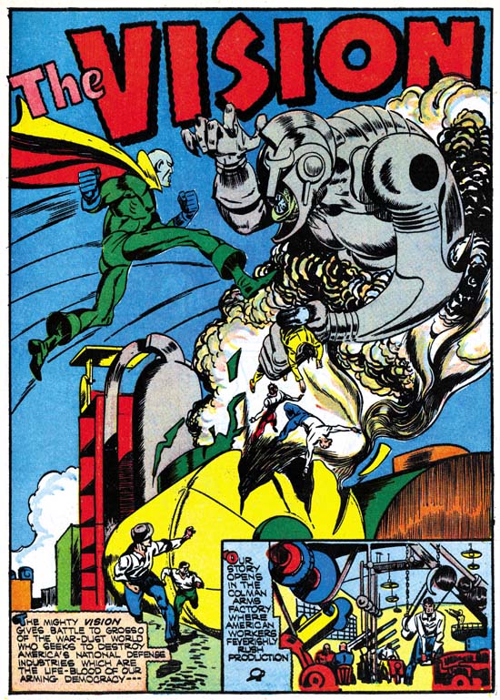
Marvel Mystery Comics #24 (October 1941) The Vision by Jack Kirby page 1

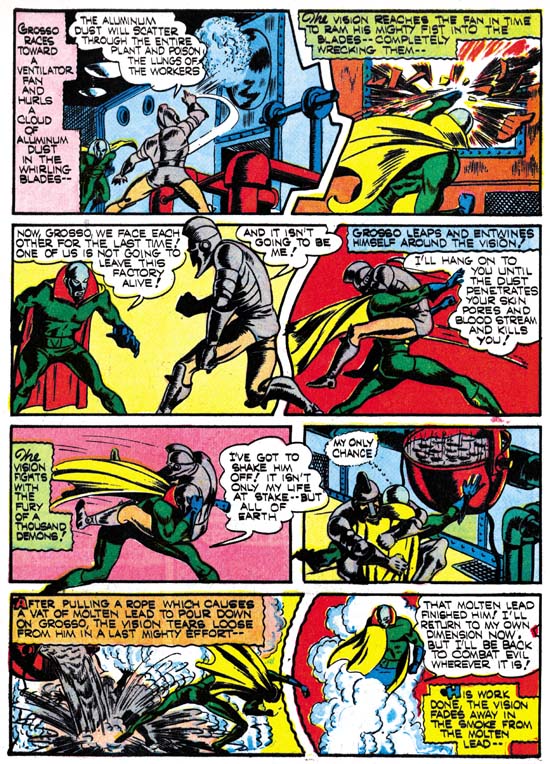
The Vision lives in another dimension, entering and exiting this one through smoke. The sole purpose of his visits to Earth seems to be fight evil, which despite the war going on in Europe and Asia, somehow only occurs in America. In this story his foe is someone the Vision is already familiar with. It is Grosso from the war-dust world who has a similar mode of transportation as the Vision only instead of smoke uses metal dust. Grosso comes from a world that relishes war and he has decided that our dust free world would be a suitable place for his people to live and easy to conquer. Grosso method is to enter a weapon factory via the metal dust they produce and destroy it. The Vision soon detects the presence of Grosso’s evil and enters into battle with him. Grosso does seem to have some advantages. One is that he is able to control how fully he is in this dimension. When Grosso is only partly in our world the Vision is unable to touch him. Grosso is also able to use metal dust as a weapon or even a poison.

But the biggest difficulty that the Vision faces is that he does not know where Grosso is going to attach next. The Vision puts on a hood and some glasses as a disguise and gets hired at the largest factory expecting that Grosso will turn up. He tells his employer that he hides his face because it was disfigured when a factory was destroyed by Grosso. The ability of the Vision to appear as a normal mortal that was seen in the first Vision story now seems gone. Also surprising is that nobody seems to make any comment about the disguised Vision’s green hands. Of course in the end the Vision soundly defeats Grosso. It would even appear that Grosso was killed, but we all know how often a good villain stays dead.

This Vision story came out toward the end of Simon and Kirby’s stay at Timely and it shows. Included are lots of irregularly shaped panels, figures that extend beyond the panel edges, running figures with legs stretch out to an unrealistic degree, and square fists. The splash page is particularly effective. Note how over large the figures of the Vision and Grosso are. Such use of over sized figures was not typical for Kirby through most of his career. On the other hand Joe Simon did use large figures from time to time both before teaming up with Jack and after their split. Covers create by Simon and Kirby at Timely never used this motif but over sized figures occur often in their Timely splashes.
Marvel Mystery Comics #24
Marvel Mystery Comics #24 (October 1941) The Vision by Jack Kirby page 7

Check out the dialog from the third panel on page eight.

Vision: Now, Grosso, we face each other for the last time! One of us is not going to leave this factory alive!

Grosso: And it isn’t going to be me!

I have to admit I had to read it several times before I could convince myself that they got it right. It reminds me very much of the script in another story that Jack drew about years later from Tales of Suspense #92

on last panel of page 9

Cap: Okay mister, I’m ready for you! So let’s wrap it up. Only one of us is gonna walk out of here under his own steam…

on first panel of next page

Cap: and it won’t be me!

In this case comes out wrong no matter how many times you read it. Because the story was done by the Marvel method it is not clear whether this snafu should be blamed on Jack Kirby or Stan Lee. Despite the fact that the Vision and Cap stories were done about 20 years apart, the similarity between these two scripts make me suspect that it was Jack who came up with Cap’s goof-up.

Boy Commandos Ashcan

Recently on the Kirby List scholar Stan Taylor queried about a Boy Commandos ashcan that appears in the GCD. I am not sure what the proper Internet etiquette is so I do not want to link directly to GCD’s image of this ashcan. So to get the most out of what I will write here, it would be best to make a new window and following my link to GCD and search for Boy Commandos. You will end up with 3 results, one of which is clearly marked ashcan. Although the GCD lists two ashcans (1 and nn) an image is only provided for #1.

Ashcans are used by comic publishers to secure the copyrights to a comic book title. I have heard some people say it is to get the trademark, but I believe you have to register trademarks not secure them by publishing them. But I am not a lawyer so I could be wrong. Anyway only a few copies of a particular ashcan would be made and none would be sold. Generally existing artwork would be used, and the inside story might not even match the cover. Ashcans are typically black and white, without color. I have never had the opportunity to closely examine an old ashcan but since Xerox did not exist during the golden age I suspect the are made from stats. If so they could not have taken long to make, in fact they were probably made using whatever stats that were available on hand. Once an ashcan comic served its purpose the copies could be discarded, hence the name ashcan.

Detective Comics #68
Detective Comics #68 (October 1942) by Jack Kirby

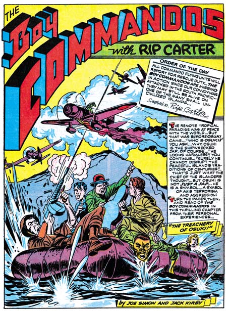
The Boy Commandos ashcan is dated Sept./Oct. and there is a copyright below for 1942. Notice that there is no trademark indication so at least in this case copyright seems to be the purpose. Stan’s original question was had the art for this ashcan cover been published before? By a coincidence I had recently borrowed Joe Simon’s copy of Detective Comics #68 for scanning and could verify that the cover was the same as the splash page for the Boy Commandos story in that book. There are some differences, mostly in all the paste-ups. The main difference in the artwork is a group of planes that appear at the top of the splash page show up on the center right on the ashcan cover, and one of the planes was left out in the ashcan version. The splash page appears to be the original because you can still see on the ashcan an abrupt stop to some smoke where the left edge of one of the paste-ups had been. The planes where moved because they would have been covered by the title of the ashcan. Some smoke lines were also added on the ashcan in a manner very different then what was done on the rest of the art.


Detective Comics #65 (July 1942) by Jack Kirby and Jerry Robinson

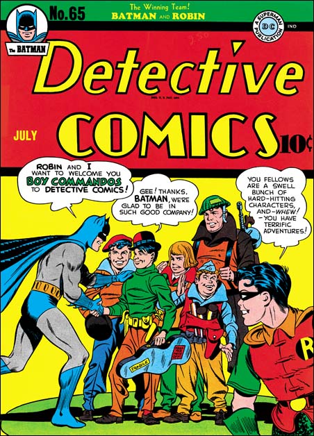
My original reaction to this ashcan was that DC was just trying to cover their basis and protect copyrights in case they ever decided to actual publish a Boy commando comic. I thought that it was probably too early for DC to realize that the Boy Commandos were a hit. The Boy Commandos were introduced in Detective Comics #64 (June 1942). They were a backup story to a comic whose principal feature was Batman. Judging from the date and art of this ashcan it was made only four or five months after the first Boy Commandos story. That means that when the ashcan was made the first story had only been out on the newsstands a month or two. I did not think that would be enough time for DC to realize that it was successful enough to warrant its own magazine.

Boy Commandos #1
Boy Commandos #1 (Winter 1942) by Jack Kirby

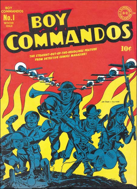
What convinced me that my original impression was wrong was the logo. The ashcan cover does not use the same logo as the splash page. I have not seen all the early Boy Commando stories but all that I have seen use the same logo. The logo for the ashcan is instead the logo that would be used on the actual covers for Boy Commandos Comics. I do not think DC would have gone through the trouble to make a proper logo for the comic if they did not think they were actually going to create a book to use it on. Even in the short time the Boy commandos had been out there must have been some sort of response that convinced DC that the feature deserved its own title. Joe Simon has always said that Boy Commandos was a top seller. Sandman and the Newsboy Legion, other Simon and Kirby features for DC, never got their own titles.

The Comicscope and Captain America

I previously posted on the part that the Comicscope played in the early copying of Captain Freedom from Captain America. But in that post I was still left with a question about how the owner’s of Comicsope got an image of Captain America before the release of his first issue. In the light of new information I will be reviewing the entire issue again but for those interested in what I had to say originally here is a link to my previous post.

Wonderworld Comics #13
Wonderworld Comics #13 (May 1940)

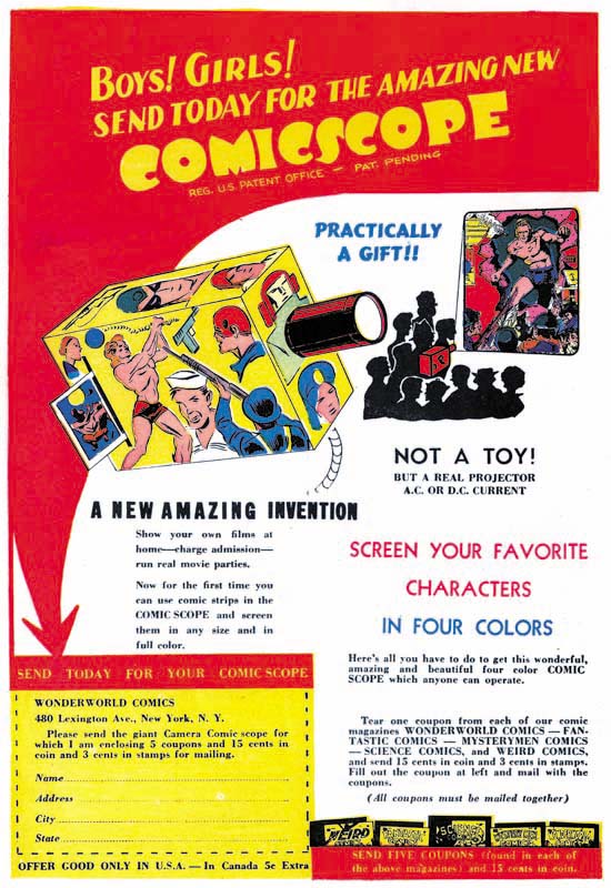
The Comicscope was the creation of Victor Fox and Bob Farell, or at least they filed for the patent. If you are interested it how the Comicscope actually worked please see another post that I wrote, there is no reason to repeat that here. Victor Fox was the owner of Fox Comics and Bob Farell has been described by Joe Simon as Victor’s right hand man. However the Comicsope business was separate from Fox Comics. If I read the patent correctly, Victor handed off the rights to the Comicsope to Bob. Still as they were involved with both enterprises, it is not surprising that there was a special relationship between Fox Comics and the Comicsope. Early advertisements for the Comicsope that appeared in Fox Comics were actually promotions for those comics. Kids who wanted to get a Comicsope had to send in not just money, but also coupons clipped from five different Fox Comic titles. This promotional aspect of Comicscope ads disappeared in later issues of Fox Comics. Joe Simon has said that Comicsope received free advertisements in the Fox Comics. Note that in the ad shown above image projected on the wall is of Samson, one of Fox Comics characters. This makes sense since the whole purpose of the Comicsope was to project comic images and what better image to show then that of a Fox Comic hero.

Daring Mystery Comics #7
Daring Mystery Comics #7 (April 1941)

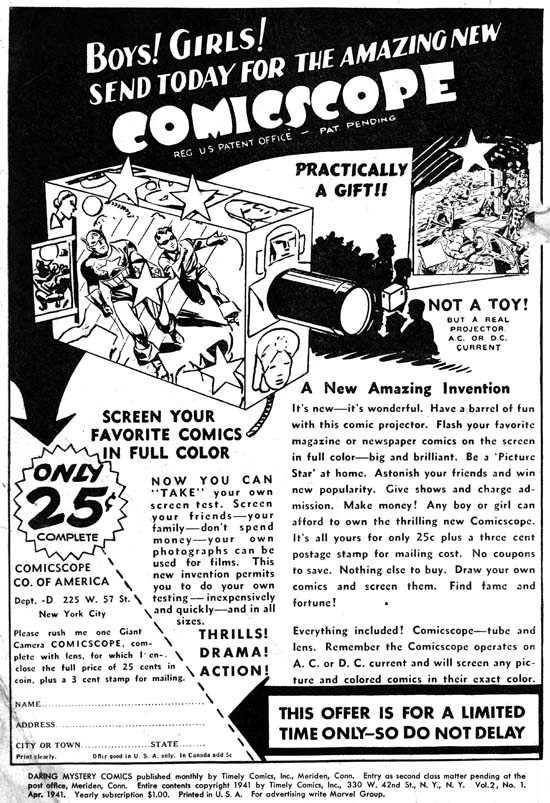
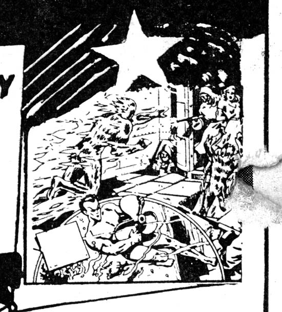
As I said the Comicsope was really not part of Fox Comics so it is not surprising that they might want to advertise it in the comic books of other publishers. One was Martin Goodman’s publishing company which today is referred to as Timely. But is understandable that Timely might object to a advertisement that included an image of another company’s hero, in this case Samson. So the ad was reworked to include Timely heroes. In the advertisement above you can see Captain America has been placed on the side of the Comicscope. This was done rather crudely with parts of previously images still showing. The image of Samson being projected was also replaced. It is a little hard to make out in the scan of the entire page above, but as you can see in the close-up below the new projection is of the Human Torch and the Sub-Mariner.

Daring Mystery Comics #7
Daring Mystery Comics #7 (April 1941) close-up

The Comicscope ad that I show above is the new information I mentioned at the beginning of this post. It is from the inside front cover of Daring Mystery Comics #7 (April 1941). Daring Mystery was one of Timely’s less successful titles. It was supposed to be a monthly publication, but in fact its schedule was rather sporadic. The previous issue (#6) was cover dated September 1940. So although the ad was actually published after the release of Captain America Comics #1 (March 1941) work on it may have begun much earlier.

There are good reasons to believe that this Comicscope ad was done earlier then indicated by its cover date. The version of Cap portrayed is that used for the first issue, notice the triangular shield and “skull cap” headpiece. These features were changed for all subsequent Captain America Comics, including that for issue #2 that also was cover dated April. The projection of the Human Torch and Sub-Mariner includes Toro. Toro was introduced in Human Torch Comics #2 (Fall 1940).

Speed Comics #13
Speed Comics #13 (May 1941)

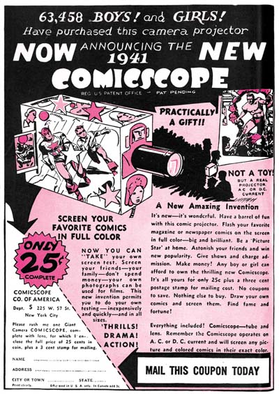
Farell would also go to Irving Manheimer to have his Comicscope advertisement placed. Irving Manheimer was president of Publisher Distributing. Although Manheimer’s business mainly dealt with distribution he also published a few comic book titles, including Speed Comics. The Comicscope advertisement would appear in Speed Comics #13 (May 1941). Once again the ad was altered, returning Samson as the projected image replacing Timely’s Human Torch and Sub-Mariner.

Speed Comics #13
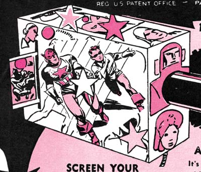
Speed Comics #13 (May 1941) close-up

But the image of Captain America on the side of the illustrated Comicscope remained in the ad. While the Timely ad was in black ink only, the Speed advertisement was printed in two colors (black and magenta). Notice that the colorist, working without a color guide, made a mistake in Captain America’s uniform. Flesh color was added to the legs. Presumable the colorist mistook Cap’s shorts to indicate that he had bare legs.

Speed Comics #13
Speed Comics #13 (May 1941) Captain Freedom, page 1

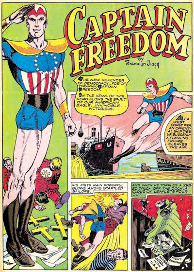
Unlike Goodman, Manheimer was probably not bothered by showing other comic publisher’s heroes in the Comicsope advertisement. In fact it looks like he took advantage of the information he gained from the ad. For Speed #13 was also the issue where Captain Freedom was introduced. The correspondence between Captain America and Captain Freedom is obvious. Similar placement of red and white stripes, a circle of stars replaces a single star on the chest, and shoulder pads replace mail armor. The “skull cap” is similar particularly to the Cap in Captain America #1. And of course the rank of Captain is shared by both. Captain Freedom also has bare legs, but this is only in common with the mistaken colorist’s rendition of Captain America for the Comicsope advertisement.

Captain America Comics #1 has a cover date of March while Captain Freedom starts with a cover date of May. It took at least three months to get a comic book published; one month month or more working on the art, a month for printing and a month for distribution. That being the case Captain Freedom was created at least a month before Captain America Comics #1 hit the stands. But with knowledge gained from the Comicsope ad, Manheimer would be able to get a jump on the competition and produce his own Captain America knock-off.

Irving Manheimer would shortly sell off his comic titles to Al Harvey. Al Harvey was a good friend of both Joe Simon and Jack Kirby. In fact Harvey had asked Joe Simon to come join him and invest in his new publication company. Joe declined, he probably felt he would do better with the share of the profits from Captain America that Martin Goodman promised him. But the promise was not fulfilled and Simon and Kirby would eventually leave Timely to go to work with DC. But they also did some moonlighting, including doing some covers for Harvey’s comics. It is one of those ironies that having created the phenomenal Captain America, Joe and Jack would end up doing some of the best art for Captain Freedom, a knock-off of their own creation.

Green Hornet #9 (October 1942)

Green Hornet #9
Green Hornet #9 (October 1942)

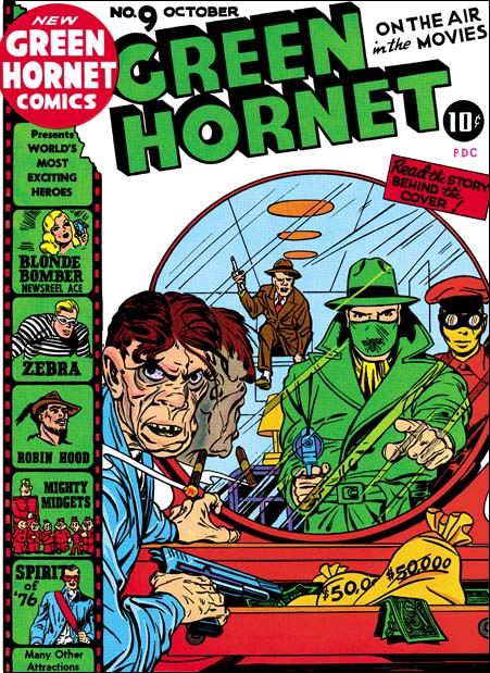
When I started this Simon and Kirby blog one of the first subjects I posted about were the Harvey covers done by Jack and Joe. These comics are rare and generally in poor condition and so these covers are not often seen. But they are some of my favorite covers. I have not forgotten to finish up that series of post, but I do not have access to two of them (Speed #22 and Green Hornet #8) and two others are technically very challenging to restore (Speed #23 and Green Hornet #9). Well I finally have restored GH #9 and I am sure the reader will agree it was worth the effort.

Green Hornet #9 is another of my favorite Harvey covers (along with Champ #19 and #20). Jack Kirby’s touch is all over this one. In it he uses the mirror to great effect. The crook is so started by seeing the Green Hornet in the mirror and has turned so quickly to confront him that his cigar and its reflection still hang in the air. Although the crook is reaching for his gun, the Green Hornet already has the drop on him. However the mirror reveals to us that yet another gun carrying foe is climbing into the room be hind them. This device of a gun carrying foe, or sometimes the hero, sneaking in through a window or door was used by S&K a number of times while working for National. But the thing is, if we can see the crook in the mirror should not the heroes?

Well the cover says “Read the story behind the cover”. This was one of the clever ideas that some of these early Harvey covers used. The text story, required to insure a low cost delivery by the U.S. Post Office, was based on the cover, or perhaps it was the other way around. From the story we learn that the crook by the dresser is the Jackal and the gun carrying foe is Dapper Dan. The key passage reads:

Just as he was gloating over piles of money in his drawers, he heard stealthy steps creep toward him. Instinctively he reached for his automatic and glanced at the mirror. It was the Green Hornet!

“Keep jour hands from that roscoe!” the Green Hornet ordered.

The Jackal scowled and obeyed. But when he looked at the mirror again, his spirits rose. Hefting an automatic, Dapper Dan was coming through the fire escape window.

Dapper Dan was just as visible to the Green Hornet and Kato as he was to the Jackal. Almost unperceived, Kato moved sidewise, and as Dapper Dan set a foot into the apartment, Kato turned around. Then Dapper Dan found himself sailing through the air toward the wall, which he struck hard with his head. He fell on the floor without a groan.

It was jiu-jitsu carried to perfection.

Green Hornet #9
Green Hornet #9 original art

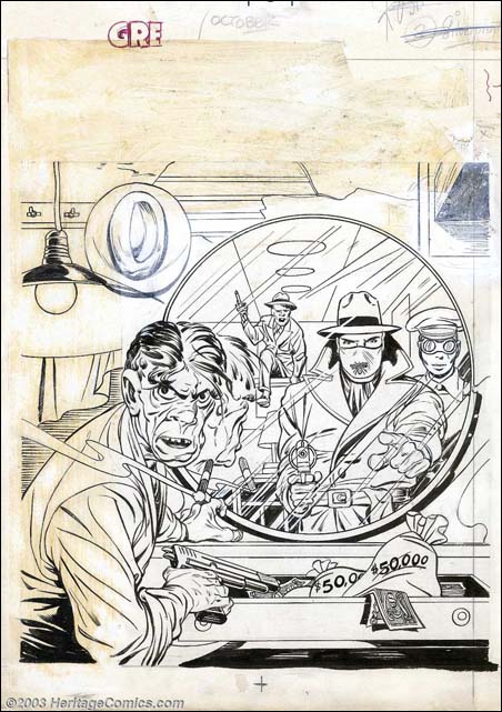
The original art for this cover still exists and it was up for auction by Heritage a few years ago. It reveals there was more to the art that was either covered up by stats (of the “film strip” and the title) or painted out with white-out. The now missing parts are interesting but frankly superfluous. Whoever made the decision to remove them was absolutely correct. The finished cover is much more focused.

Some experts and scholars also attribute part or all of the Green Hornet #10 to Kirby. I presume this is because of the use of a criminal clown similar to that by Jack for Green Hornet #7. But to me this more like swiping. Although it is conceivable that Kirby might return to the idea of a killer clown, I doubt he would have used for GH #10 a costume so similar to that from GH #7. Further the folding of the clown’s costume has a flair unlike how Jack would handle it. The killer clown also shows up for the cover of Speed #21. That cover looks like it was done primarily by Joe Simon and it would not be surprising to find Joe using the same costume. But I do not see Joe’s hand in the art for GH #10. The car, the Green Hornet figure and the overall composition do not remind me of either Jack or Joe. I therefore do not accept Green Hornet as by either Simon or Kirby.

Simon and Kirby Meet the Shield

I am doing a guest blog posting tonight at Comics Should Be Good called Simon and Kirby Meet the Shield. Check it out.

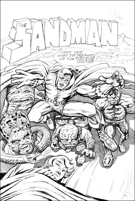
Featured Cover, The Sandman #1

The Sandman #1
The Sandman #1 (Winter 1974) by Jack Kirby

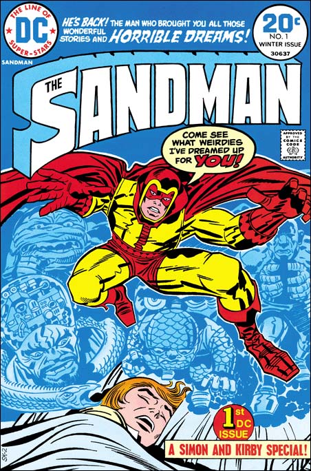
This is my last post about Simon and Kirby covers selected as their favorite by participants of my recent contest. I saved this particular one for last because it was, at least for me, the most unexpected. When I think about the Simon and Kirby collaboration I think about the period from when they first teamed up in 1940 until the work they did for the Adventures of the Fly in 1959. There were some S&K work published later like Blast Off and Harvey’s Fighting American. However this was not new truly new work but earlier work that just had not been published before. From 1960 on Joe and Jack had gone their separate ways, that is until Sandman #1 in 1974.

In 1970 Kirby, dissatisfied with his treatment by Marvel, had signed up to work for DC. Here he started to create his New Gods opus. But Jack wanted more then just to draw these comics. He desired to initiate new titles and then hand them over to other artists. What Jack wanted was to produce these comics. In effect to return to the type of business arrangement he had during his collaboration with Joe Simon, but to do this by himself. However Jack was not successful in this endeavor. He never managed to pass the drawing chore to anyone else and worse yet some of his titles were cancelled. Jack continued to work for DC but the arrangement was not the same. Although he still was more then just another artist, he started to receive direction from DC’s Carmine Infantino. It must have been a bitter disappointment for Jack. Even more so when Joe Simon started to also work for DC in an arrangement very much like the one Jack had failed to development. Joe was more then just an editor, he was producing his comics for DC.

With both Joe and Jack now working for DC, it must have been an obvious idea to Carmine to have them team up once again. After all Simon and Kirby had a number of great successes in the past, why not see if they could re-create their old magic? Of course with Jack living in California and Joe in New York, there was no question of the same type of collaboration that they had previously. I have been told that there is a cover proposal for the Sandman drawn by Jerry Grandenetti. If that is true it would suggest that originally Sandman was Joe Simon’s idea as Jerry was one of the artists doing work for Joe. (I have seen another Sandman cover reported to be by Joe Simon, but that is clearly a misattribution because it is not in Joe’s style.) The credits for the comic give Joe as the scripter and Jack as editor and drawer. You can see that the cover for Sandman #1 has a job number, SK-2. The same job number was used on the first page. Well the SK obviously stands for Simon and Kirby. But if that is true why the ‘2’? Does that suggest there was a previous piece of artwork given the job number SK-1?

The Sandman #1
The Sandman #1, unpublished cover by Jack Kirby and Joe Simon

There is another version of this cover that was actually inked by Joe Simon. Joe has said that this the original cover that was rejected by DC because of all the “hay” (crosshatching). That may very well be true, but I also wonder if perhaps Jack was unhappy with some of the liberties that Joe took. For instance Jack’s square finger tips were rounded off in Joe’s inking?

With the type of distribution at the time it is hard to be absolutely sure how well comic books really sold. But it appeared, at least to Carmine, that The Sandman had been a big success. However issue #2 had a cover date of April 1975. This suggest that the original was planned as a one shot but that with its success more were published. However succeeding Sandman issues were not Simon and Kirby collaborations. After a brief revival for one issue, the Simon and Kirby team had again ended and would not produce any further comics.

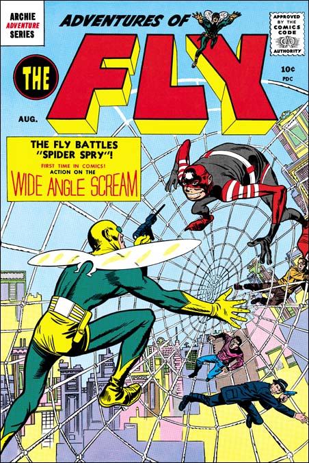
Featured Cover, Adventures of the Fly #1

Adventures of the Fly #1
Adventures of the Fly #1 (April 1954) by Jack Kirby

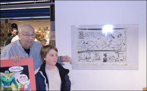
One of my contestents in my recent contest picked The Adventures of the Fly #1 as their favorite Simon and Kirby cover. I have previously written about Adventures of the Fly in Chapter 10 of The End of Simon and Kirby. There my main conclusion was that the Fly comics were not true Simon and Kirby productions. Joe seemed the main driving force in constructing these comics and he made use of other artists besides Jack. Having said this I hasten to add that Jack seemed to be primarily responsible for the final appearance of the Fly. The costume is very different from the Silver Spider by C. C. Beck whose story was the basis for the creation of the Fly. Rather the Fly seems largely based on Night Fighter, an unused creation that was probably originally considered for S&K’s publishing company Mainline. Although the origin story for the Fly was largely based on Beck’s penciled version that Joe provided Jack, the other stories Jack did seem to be his own. Included in one was a double page splash. The original art for this wide splash is still in Joe’s personal collection. It a beautiful piece of work with no signs of any cut and paste. That being the case along with the fact that the splash has one extra figure, the cover must somehow be based on the splash.

Joe Simon and Fly splash
Photo of Joe Simon with splash page at Big Apple Con (4/3/04)

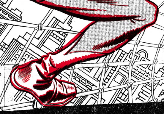
As far as I know the original art for the cover no longer exists. This is unfortunate because it might provide hints what method was used to transfer the art from the splash and rearrange it for the cover. As pointed out by Kirby scholar Stan Taylor the Fly comics contain a number of swipes from figures originally drawn by Kirby. Some of the original art for these still exist and clearly they were not done by using stats or any similar photocopying device. However when the line art for the Fly on the cover is compared to the splash page much of the inking, including some rather fine spotting, is the same. There does not appear to be any inking present on the splash that is absent on the cover. On the other hand the cover Fly has some spotting that does not appear on the splash. In particular the outlines have been made thicker on the cover. A lot of the lines for the web and the background do not actually touch the figure. I present a close-up of the cover line art (red) over the splash. The alignment and size adjustment are not perfect but it should give you the idea. From all this I have little doubt that Jack did the splash page, it was inked (not by Kirby), then Joe had some stats made, assembled the cover, and finally retouched and expanded the inking. Joe had previously used stats to help create covers, but for the Fly #1 cover it was a much more intricate procedure.

Adventures of the Fly #1
Part of the splash overlaid with the cover line art (in red)

Featured Cover, Bullseye #5

Bullseye #5
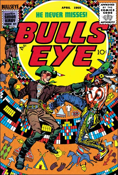
Bullseye #5 (April 1955)

This is another selection made by a participant of my recent Featured Cover Contest as their favorite Simon and Kirby cover. I had provided an image of it before in my serial post The End of Simon and Kirby but it is such a great cover that it warrants repeating. When discussing Boys’ Ranch #4 (see my previous post) I said that all the covers for that title were so good that I would be hard pressed to pick my favorite. Well S&K did a good job on the Bullseye covers but there is no doubt in my mind that issue #5 is the best.

In the origin story we learn that Bullseye got his name not just because of his skill with weapons but because of a target pattern that an Indian foe had branded onto his chest. All but one cover (#6) featured this target pattern prominently as part of the design of the cover. But for issue #5 S&K took it even further by turning the pattern into an Indian theme, as if it was some sort of flattened decorated teepee. Then added to this was one of the dramatic hand-to-hand combats that Jack had ever drawn. Clearly this unique cover is one of Simon and Kirby’s greatest masterpieces.

Boys’ Ranch and the Fighting American were probably the most obvious Simon and Kirby titles to reprint. But beyond a doubt Bullseye is a title that deserves the same honor. An interesting hero, great stories and lots of Kirby. Unfortunately it has not received the treatment that Marvel gave the other mentioned titles. But hey, I have not given up hope that some publisher will recognize what a classic Bullseye was.

Featured Cover, Boys’ Ranch #4

Boys' Ranch #4
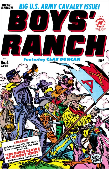
Boys’ Ranch (April 1951) by Jack Kirby

I lament so often about the fact that various Simon and Kirby productions have not been reprinted that is nice to be able to write about Boys’ Ranch. Although there are other comics I sure wish would be available again, if I had to pick a single S&K title as most worthy of the reprint honor it would be Boys’ Ranch. Fortunately Marvel already has published it in a nice volume. It is out of print but shows up often on eBay and at comic conventions. It has not gotten too pricey and deserves to be in the library of any Kirby fan. Not all Simon and Kirby productions were actually drawn by Jack as the studio used a number of talented artists. However a lot of Boys’ Ranch truly was penciled by Kirby, although not as much as claimed by many authorities. We can blame the failure of Stuntman and Boy Explorers on the comic glut. The downfall of the Mainline titles can be laid at the anti-comic sentiments among many adults at that time. For Boys’ Ranch we have no similar explanations and we must accept the fact that they just did not sell well enough. That reflects on the times not, in my opinion, the product.

Boys’ Ranch followed the general practice of S&K productions in having Jack Kirby pencil all the covers for the title. As far as I am concerned not a single cover for the title is anything short of a masterpiece. I am not sure how I would manage to pick my favorite, but one of my Featured Cover Contests participants did and he choose issue #4. With a main cast of three boys and an adult it is not an easy achievement to give them all prominence on a cover. But then add some soldiers and Indians to the mix and it might be an insurmountable task for many artists. But Jack was not a typical comic book artist and he overcomes these challenges with such ease as to make the viewer unaware how hard it really is. What exciting action Jack has provided. Although only four Indians are actually presented we are made aware of the fierce struggle that is occurring. One soldier is on his back, obviously seriously wounded, while another continues fighting but is unable to stand. A third soldier in the background has entered hand to hand combat with an Indian foe and appears about to loose. This is all in midst of a cloud of smoke from all the shooting. It all brings to mind Custer’s last battle. Actually in the cover for issue #4 one boy, Dandy, does get special treatment. He appears prominently on the left while the other three form a triangle on the right. Dandy stands pausing from his firing to blow the bugle. This is the reason for his prominence because it is a reference to the story title “The Bugle Blows as Bloody Knife”. Our heroes are defiant but will they face an end similar to Custer? Of course originally you were meant to buy the comic to find out. I will give a subtle hint, the Boys’ Ranch title ran for two more issues.

What is R. Crumb and his publisher thinking?

national crumb
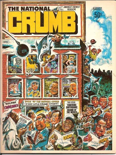
The National Crumb (August 1975)

Let me introduce my post with something that the Simons have released:

SIMON SEZ: ROBERT STOLE MY CRUMB

R. Crumb’s autobiography, authored by Mr. Crumb and Peter Poplaski, includes the unauthorized use of the cover of a Simon Studio publication from 1975 entitled The National Crumb.

“The National Crumb had nothing to do with R. Crumb,” Joe Simon states.”The publication was produced by my studio and edited by Jim Simon. The team of cover and design artists is prominently displayed on the contents page of The National Crumb but conveniently ignored more than 30 years later and attributed to Mr. Crumb.”

“The cover art of The National Crumb is not by Mr. Crumb and it has no resemblance to Mr. Crumb’s work,” Simon adds. “I do not understand why he is taking credit for it.”

The full page reproduction of The National Crumb in Mr. Crumb’s biography offers no authorship notice, implying it is the work of R. Crumb. The work in also listed in Mr. Crumb’s art index as Crumb’s creation, clearly but falsely indicating the art is by R. Crumb.

Joe Simon–co-creator of the iconic superhero Captain America–and head of the Joe Simon Studio has produced many properties over his long career, ranging from comic books to advertising to political campaign materials to covers for publications such as The New York Times Sunday magazines to the United States Olympics. Satire/parody properties from the Joe Simon Studio include the long-running SICK MAGAZINE, SOMETHING ELSE MAGAZINE, the afore-mentioned THE NATIONAL CRUMB, TEEN-MAN, THE CHRONICLES OF HUCKLEBERRY FINK, HECTOR PROTECTOR, and various paperbacks, annuals, and licensing products going back more than 65 years.

Simon properties have been licensed by major entertainment companies, including Time-Warner/DC Comics, DreamWorks, Batfilms, Marvel Entertainment, Archie Comics, Harvey Famous Worldwide, Hearst Entertainment, and HarperCollins Publishers.

“We are required to constantly keep watch over plagiarism and unauthorized use of our intellectual properties,” notes Jim Simon, who also oversees licensing.

The Simons have retained the law firm of Tedd Kessler, P.C., to protect their rights. The Simons comment that it would be a sad event if two members of The Comic Book Hall of Fame, Joe Simon and R. Crumb, who currently share space in a national museum exhibit, face each other in a court of law.

I have got to say I find this whole thing absolutely bizarre. R. Crumb is a significant and talented artist and I can understand someone trying to copy his style. But the cover to The National Crumb is nothing like that style. Normally when writing about misattributions I try to analyze the work itself, or at least provide examples to support my position. But in this case it just seems so unnecessary.