(May – July 1952, Black Magic #12 – #14)
As in Chapter 19 of The Art of Romance, Mort Meskin was the most productive artist for Black Magic drawing a total of 30 pages. Bill Draut was particularly active and draw 21 pages. The third and fourth places was held by an artists new to the studio; Bill Walton with 14 pages and Bob McCarty(?) with 10. Jack Kirby takes a surprising fifth place having provided only 9 pages. Kirby was the only artist who drew covers for Black Magic so three of those pages were covers with the remaining 6 pages from a single story. However we shall see Jack had a hand in other aspects of the title. Still it is a continuing mystery why Kirby, renown for his fast drawing, was so unproductive lately and especially during the period covered in this chapter. The rest of the art was provided by three artists each providing a single piece; George Roussos (4 pages), Al Eadeh(?) (2 pages) and 3 pages by an unidentified artist who used J. G. as initials.
Unfortunately John Prentice does not appear in any of the Black Magic issues covered in this chapter. Simon and Kirby did not use Prentice in Black Magic as much as some of the other studio artists. This certainly was not because Prentice was poor at the horror genre. Not only do I think he did a good job in Black Magic but he was clearly better than some of the artists that were used. I suspect the bias had more to do with how well Prentice did in the love titles that S&K preferred to assign him romance work.
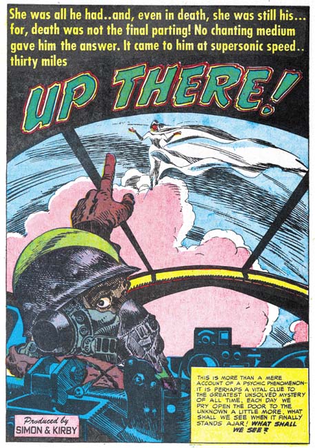
Black Magic #13 (June 1952) “Up There”, art by Jack Kirby
I always want to include at least one Kirby story in all my serial posts, but this time there is only one to choose from. Still it is a great story and was recently included in Titan’s “Best of Simon and Kirby”. Of course picking the best from Simon and Kirby’s repertoire is always a difficult decision since they did so much great stuff in all genres.
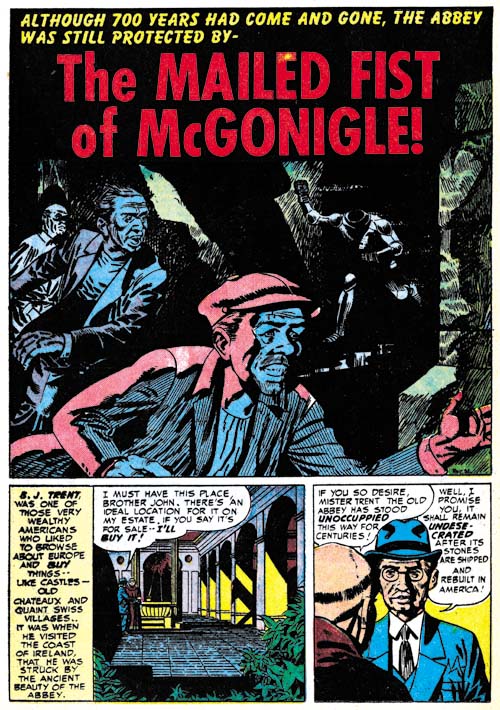
Black Magic #14 (July 1952) “The Mailed Fist of McGonigle”, art by George Rossous
I am sure I have said this before, but George Roussos is not among my favorite Simon and Kirby studio artists. His artwork is a bit too crude for my tastes. With that said I often find his use of blacks very interesting especially when he uses them in a splash such as in Black Magic #14 (July 1952) “The Mailed Fist of McGonigle”. Perhaps the greatest weakness in this particular splash is that it is easy to overlook the running figure in the background as an empty suite of armor.
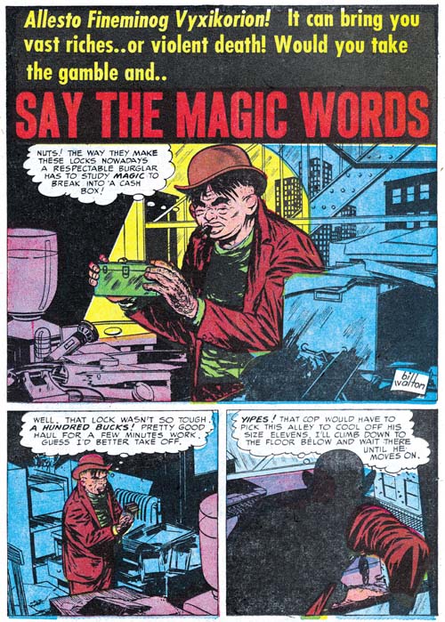
Black Magic #12 (May 1952) “Say the Magic Words”, art by Bill Walton
When I wrote Chapter 19 of the Art of Romance there was one story whose artist I could not identified but felt looked very familiar. Had I reviewed the work in this chapter of the Little Shop of Horrors I would have been known immediately who it was since both Black Magic stories by Bill Walton are signed. Fortunately all was not lost as sharp eyed Ger Apeldoorn recognized the correct attribution right away. Bill has a tendency to shorten the height of his faces and in his three quarter views to place the eyes at an angle. Walton will be making regular appearances in Simon and Kirby productions for a while so there will be amply opportunities to see examples of this work.
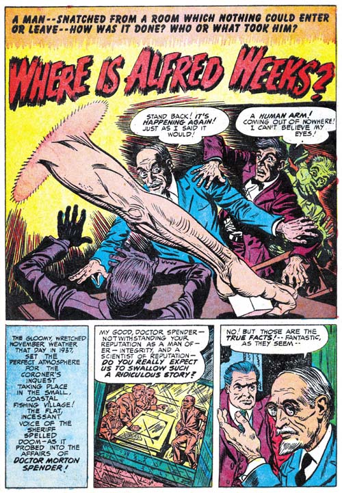
Black Magic #13 (June 1952) “Where is Alfred Weeks?”, art by Bob McCarty(?)
The June issue of Black Magic provides the first appearance of another artist that will regularly show up in Simon and Kirby productions for a time. The problem is he never signs his work and the only reason I have questionably attribute the art to Bob McCarty is because of some similarities to that artist works from 1954 (McCarty also did not sign his work but Foxhole was the only Simon and Kirby comic that provides some of the credits). However there are some differences between the art that might mean that they were not done by the same artist or that his art had evolved. One of the most distinctive features of the art in “Where is Alfred Weeks” as compared to McCarty’s art in Foxhole is the use of oversized eyes (not particularly obvious in the image I supply above). I will continue to questionably attribute this work to McCarty but I hope that I will resolve this issue, at least to my own satisfaction, as I proceed with these serial posts.
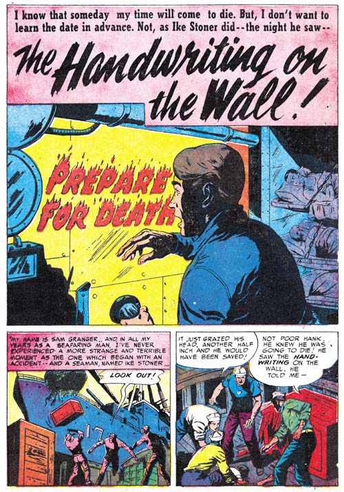
Black Magic #13 (June 1952) “The Handwriting on the Wall”, art by J. G.
“The Handwriting on the Wall” is an unsigned piece but there are some similarities to a story from Black Magic issue Black Magic #9 (“The Man in the Judge’s Chair”) that signed “J. G.”.
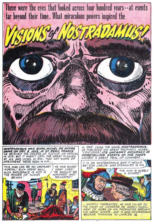
Black Magic #13 (June 1952) “Visions Of Nostradamus”, art by Jack Kirby and Al Eadeh(?)
One story, “Visions Of Nostradamus”, is by an artist that I originally thought might be Al Eadeh but I have not yet done my homework and found a contemporary signed piece by the artist to resolve the issue so I will continue to use a question mark. Ger Apeldoorn, who is much more familiar with Atlas where Eadeh also worked, seems more confident about the attribution. Eadeh(?) is a competent artist but nothing in his work that I have seen suggest the artistic talent shown in the splash. Of course that is not an acceptable reason to question whether he drew the splash (even poorer artists sometimes create a masterpiece) but the brushwork does not look like his either but does look like inking by Jack Kirby. The rather oversize eyes might seem incongruous for Kirby but similarly sized eyes appeared in a Kirby splash from Young Love #25 (September 1951, Chapter 16 of the Art of Romance).
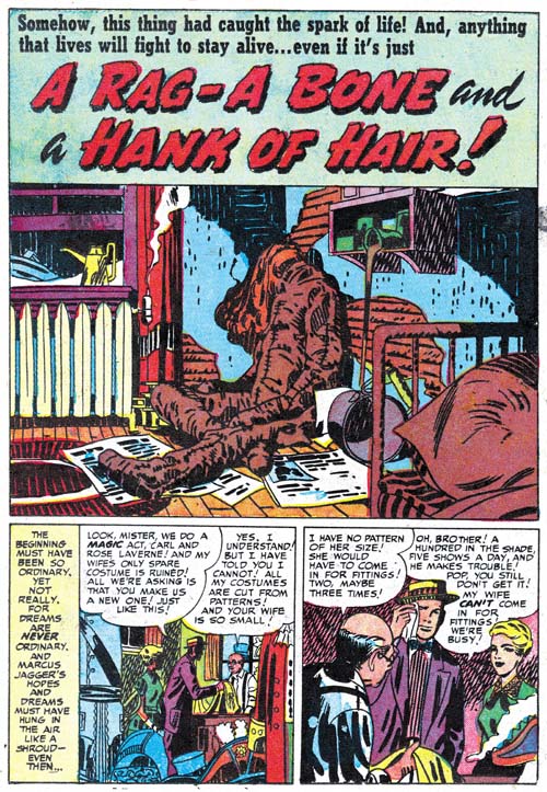
Black Magic #13 (June 1952) “A Rag, a Bone and a Hank of Hair”, art by Jack Kirby and Mort Meskin
Mort Meskin’s style is very different from Kirby’s and normally there is no problem in distinguishing the two. The story for “A Rag, A Bone And A Hank Of Hair” is obviously penciled and inked by Mort and in the past I assumed he did the splash as well. But since there are no figures in the splash, or at least human figures, this was really nothing more than an assumption. But during my review for this post I noticed the arcing of the two shadows on the wall. These are not true abstract arches but they still are a typical feature of the Studio Style inking. Now Meskin was excellent at Studio Style inking but he used that approach when inking Kirby’s pencils and generally not when inking his own work. Then I notice the inking of the oversized rag doll. The brushwork on the dummy is done with a rather blunt brush that is more typical of Kirby than Meskin. There is also a brush technique that I have not discussed before nor included in my Inking Glossary but nonetheless is an often found method used by Kirby (perhaps Joe Simon as well). Notice the simple hatching found on the lower part of the dummy’s arm (somewhat obscured by a white piece of paper). They form a shadow that is a sequence of arcs; what I think of as a scalloped edge shadow. Much of the brushwork in the splash has the sort of loose control that Kirby was so great with, but not all of the inking. The crosshatching on the cupboard is more mechanically arranged than typical of Jack but often found in Mort’s inking as can be seen in the two story panels on the bottom of the page. Also the inking of the pillow in the foreground looks more typical of Meskin particularly where closely spaced nearly parallel brushstrokes are used.
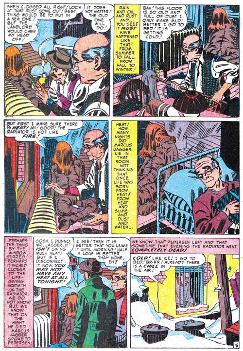
Black Magic #13 (June 1952) “A Rag, a Bone and a Hank of Hair” page 5, art by Mort Meskin
I include a story page as well so Meskin’s method of inking the large rag doll can be seen as well. Notice the brushwork is not as blunt, there are more uses of parallel ink lines, and there are no scalloped edge shadows. Even the hair is inked rather differently than Jack’s splash.
The reader might have noticed that while I have recognized Kirby’s inking, I have not said anything about the drawing. Unfortunately there is little to go on as the dummy is drawn in the same manner in the splash and the story. This might suggest that Meskin drew both but the cover is also based on this story and provides a similarly drawn dummy and there is no question that Kirby drew the cover. The only thing I can point out about the splash is the use of perspective; somehow it seems more consistent with Jack’s work than Mort’s. I fully realize that this is a very vague and subjective description but it is all I have to offer at this time. I do not know if I have convinced anyone else, but I have convinced myself that Jack was largely responsible for the splash panel.
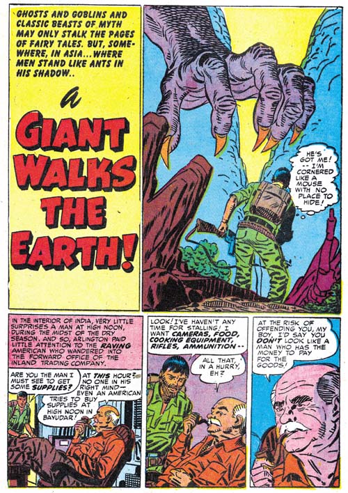
Black Magic #12 (May 1952) “A Giant Walks the Earth”, pencils by Jack Kirby, inks by Mort Meskin and Jack Kirby
Kirby drawn splashes in stories otherwise drawn by other artists are not the norm but are not that unusual either. They are rare enough that I can include all the cases I find in my serial posts. But Kirby splashes are common enough that many chapters (but not all) have examples. However it seems out of the ordinary to find so many Kirby splashes in just three issues because “A Giant Walks the Earth” appears to be another case. Again Kirby’s hand is easiest to spot in the inking. The folds on the human’s pants are typical of Jack’s brushwork; they have simple abstract shapes with no signs of the brush tip. The inking on the giant hand is done with a blunt brush more typical of Jack’s than it is of Mort’s inking. There is crosshatching on the giants forearm but note how less mechanical it is compared to the examples found in “A Rag, a Bone and a Hank of Hair”. However the inking of the foreground rocks all looks like it was done by Meskin. In fact there are some rocks in the story that are inking exactly the same manner.
Mort also clearly inked the story panels of the first page. This provides a good comparison of the two artist’s approach to inking cloth folds. At a glance they may appear the same but instead of the almost puddle like look found in Kirby’s inking, Meskin constructs folds using parallel lines with no attempt to hide the tip of the brush.
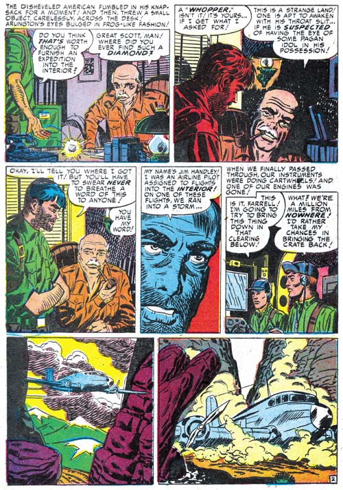
Black Magic #12 (May 1952) “A Giant Walks the Earth” page 2, art by Mort Meskin
Even though Mort is clearly inking the story panels on the splash page the art does not look like his. I provide an image of the second page so that two can be compared. The difference between the two is most obvious in the older man. So if Meskin did not draw the story panels from the first page, who did? I believe Kirby drew these as well. The end result may not look like typical Kirby art because Meskin appears to have inked them with a heavy hand. Normally Mort was quite a good inker of Kirby’s pencils and not so heavy handed but I believe in this case Mort purposely inked the first story panels this way so that they would blend better with the rest of the story.
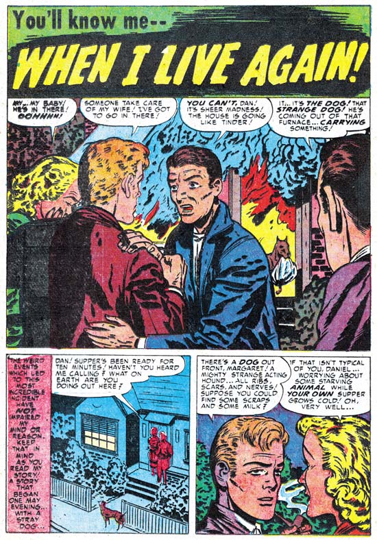
Black Magic #13 (June 1952) “When I Live Again”, art by Bill Draut
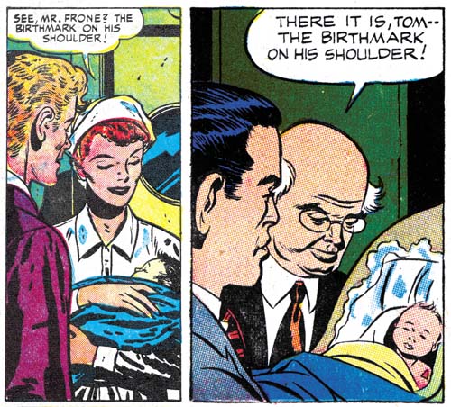
One of Bill Draut’s contributions was “When I Live Again”. Bill does his usual competent job but to be honest I doubt that I would have mentioned it because there is nothing truly unique about it. However when I reviewed I quickly realized that the plot was very familiar. So much so that I did some searching and sure enough found a similar story in Alarming Tales #1 (September 1957, “Logan’s Life”). It is more than similar stories; they were the same plot only the six pages of “When I Live Again” had been reduced to a mere two for “Logan’s Life”. According to every source I have ever seen the art for “Logan’s Life” has always unquestionably been attributed to Jack Kirby.
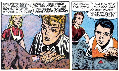
Left Black Magic #13 (June 1952) “When I Live Again”
Right Alarming Tales #1 (September 1957) “Logan’s Life”
The text was re-written but the art for the story in AT #1 has clearly been swiped from Draut’s from BM #13. Of course the art was not a close copy; no one is likely to mistake the AT #1 story as done by Draut. But most of the panels in the AT #1 story were obviously based on panels for BM #13.
Left Black Magic #13 (June 1952) “When I Live Again”
Right Alarming Tales #1 (September 1957) “Logan’s Life”
In fact every panel in “Logan’s Life” from AT #1 was based on one from BM #13 although as can be seen in the above images it is not always so obvious since not only has the panel been recomposed but the people portrayed are sometimes changed as well. These changes might seem superfluous but in fact the in each case the alterations made the alterations the particular panel from Draut’s layout to one like Kirby would use. In the end entire story is a convincing example of Kirby’s art. Of course it must have been convincing because as I said in the past everybody has credit Kirby with the pencils to his story.
Last week I wrote about the Red Raven cover and the Hal Foster panel it was swiped from. I have since searched through all my sources and it would seem that most who were unaware of the swipe attributed the cover to Kirby alone while all those who knew of the swipe credited to Joe Simon either alone or in combination with Jack. (There were a few who gave joint credits to all the art by Simon and Kirby.) I still attribute the Red Raven cover to Jack but in the case of “Logan’s Life” I have changed my mind and now believe it is by Simon. I had detected Joe’s hand in this story but I had previously decided it was due to the Simon being the inker. Now I realize he penciled “Logan’s Life” as well. I base this conclusion not on the fact that the story was swiped but because the similarity to another story Joe swiped for Fighting American (Jumping the Shark). The Fighting American story was swiped from a Kirby drawn Manhunter story so it may not be surprising that everybody had previously attributed it to Jack. But the source for “Logan’s Life” was by Draut and this shows how convincing a job Joe could do at mimicking Jack. Something that should always be kept in mind when trying to determine attributions for work by Simon and Kirby.


There’s an oddity in the last panel of the first page of “A Giant Walks the Earth.” The man’s hand holding the pipe is way too small. That’s particularly the case when one considers it’s closer to us than the face, but even if it were right against the face, it’s only a little over half the size it should be. Very unusual for a master of foreshortening like Kirby.
Yes the hands does seem too small. But if you are saying that Kirby never got his proportions wrong then I am afraid I will have to disagree with you.
Harry, I agree with you regarding the Kirby and Meskin pages. Although I am not as acute as you regarding the inking styles, Meskin’s depth of field felt very compressed during this period, while Kirby’s conveyed a sense of deep space, both in evidence in the splashes.
Steven,
Thanks for explaining exactly what it was about the perspective that I felt but did not understand well enough to put into words. Having read your comment and having gone back to the stories it now seems so clear. That is not to diminish your observation but rather the reverse, it is a trait share by most of the best ideas that they seem so obvious once they have been told.