
Sometime after the demise of Mainline, Simon and Kirby’s attempt at becoming publishers, Joe and Jack’s partnership broke up. Jack returned to being a freelance artist but whenever Joe had some comic to produce Jack would always give a hand, at least for the initial issues. In 1959 Archie Comics asked Joe Simon to produce a couple of superhero comic titles for them. For one of the new titles Joe decided to resurrect an old proposal. Years before Simon along with the artist C. C. Beck and the writer Jack Oleck had created Silver Spider. Oleck wrote some scripts and Beck drew the origin story and it was proposed to Harvey Comics but was then rejected. Joe retrieved the original art and at least one script (which he still has) from Harvey but decided, probably because of the previous rejection, the hero should be changed from the Silver Spider into the Fly. Simon asked his former partner, Jack Kirby, to draw the art for the first issue using the C. C. Beck art as the basis for the origin story. (What happened to the C. C. Beck art is a tale that I will not repeat here, suffice it to say that through no fault of Jack’s the Beck art was never returned to Joe. All Simon has now are large photocopies of the original art. You can see some images of the Silver Spider in Chapter 10 of The End of Simon and Kirby) Kirby was also apt to turn to old ideas and so he based the Fly’s costume on an unused Simon and Kirby creation, the Night Fighter. (It is not pertinent to the theme of this post, but this was not the end of the recycling of the Silver Spider as years later it played a part in the creation of Marvel’s Spider-Man.)

Adventures of the Fly #1 (August 1959) “Come Into My Parlor”, art by Jack Kirby
Enlarged view
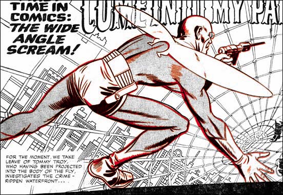
The centerfold of the first issue of The Adventures of the Fly featured a double page splash with the declaration:
NOW FOR THE FIRST TIME IN COMICS: THE WIDE ANGLE SCREAM
This is of course where I have derived the name for this serial post about the Simon and Kirby wide splashes. Since Joe and Jack have been using double page spreads since Captain America #6 (September 1941), this issue of the Fly was hardly the first time for the use of this dramatic opening for a story. But in 1959 comic book readers were young and unlikely to know about the earlier comics.
The Fly splash pages are divided into two sections, the splash proper and the start of the story. At the top and bottom of the splash are two parabolic shaped borders making the image wider at the sides then in the center. The background buildings on the two sides of the splash tilt in different directions. All of this was to give the feeling of a wide angle presentation. But this was all just suggestive as a true wide angle lens would not distort the scene in these manners.
The two adversaries face off from opposites sides of the splash. The Fly seems quite at home on the Spider Spry’s web while it is the criminal cohorts of the Spider that seem to be most encumbered. The scale of the figures makes no literal sense. No realistic perspective would cause the rest of the criminals to be so much smaller then either the Fly or the Spider. The size difference is not due to any problem Kirby had with rendering perspective; he was the master of the illusion of space. Rather Jack has reverted to a pre-Renaissance technique, actually common to a great number of art cultures, were size indicates importance.
Not Jack’s best splash but still superior then most artists of the day could have produced. Some have said this was inked by Kirby but I cannot see Jack’s hand in any of the inking of these Archie comics. I doubt Joe Simon did the inking on the splash either.
Overlay of the figure of the Fly from the cover (red) and the splash (black)
The cover for the first issue of the Fly is basically the same scene as this splash with the composition altered for the vertically oriented space. As I have shown previously, the cover is based on the splash and not the other way around. (See The Fly, A Case Study of Swiping, for further details.) First a stat was made of the splash and then cutup and reorganized for the cover. Then someone, most likely Simon, touched up some of the inking. It was all well done because cover is every bit as good a designed as the splash.