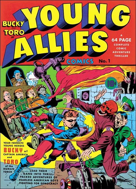
Young Allies #1 (Summer 1941), art by Jack Kirby
Recently there was discussion on one of Yahoo’s comic book lists about the correct attribution for the art for Young Allies #1 and #2. I do not want to get into details of that interchange, although I may disagree with some of the participants they are entitled to their opinions. But I thought I would write a post on Young Allies #1 to explain my position. The cover for Young Allies #2 presents its unique problems so I will discuss it some other time.
There can be no question about Simon and Kirby’s involvement with Young Allies #1. The punch throwing Bucky on the cover is so typical of Kirby that there can be no doubt that he drew the figure. I would go even further and confidently credit Jack with the Red Skull and Hitler as well. Normally that would be enough for me to attribute the entire cover to Jack Kirby; it was not Simon and Kirby typical procedure for Kirby to draw part of a cover then pass it on to someone else to finish it up (there are two exceptions that I know of, the covers for Detective #65 and In Love #1).
Three of the bound Young Allies, those on our left, have enough similarity to other Simon and Kirby creations that I would conclude Jack probably drew them. The soldier firing a pistol is a typical Simon and Kirby motif and although he is a little stiff I would assign him to Jack as well. I do have trouble attributing the last Young Ally, Whitewash, to Jack. While Simon and Kirby produced some stereotypical characters none of them ever went as far as this troubling image. Finally there is Toro. Frankly there is not much in Toro’s depiction that suggests Kirby but then there is little in the Simon and Kirby repertoire to compare Toro with.
To sum up there are parts of the YA #1 cover that clearly were done by Kirby, some parts that might be Jack’s as well, but other parts that may be someone else’s work. I will return to the cover after I have considered the story art as well.
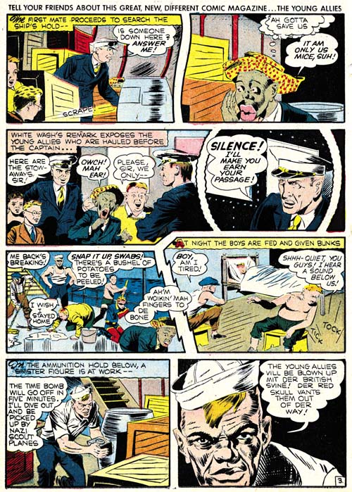
Young Allies #1 (Summer 1942) chapter 3 page 3
The book is one long story with 6 chapters. Each chapter, with the exception of the first, starts with a full pages splash. The first chapter begins with a sort of table of contents in the form of a matrix of reduced versions of the chapter splashes. This format of turning the comic into one long story is a device that Simon and Kirby would return to in Boy Commandos. While some of their later work did not take up the entire book Simon and Kirby did return every so often to long stories requiring multiple chapters. It is clear that different hands were involved in drawing this story. The story art certainly was not drawn by Simon and Kirby. I really have not carefully examined it and so I will not be discussing credits for the story art at this time.
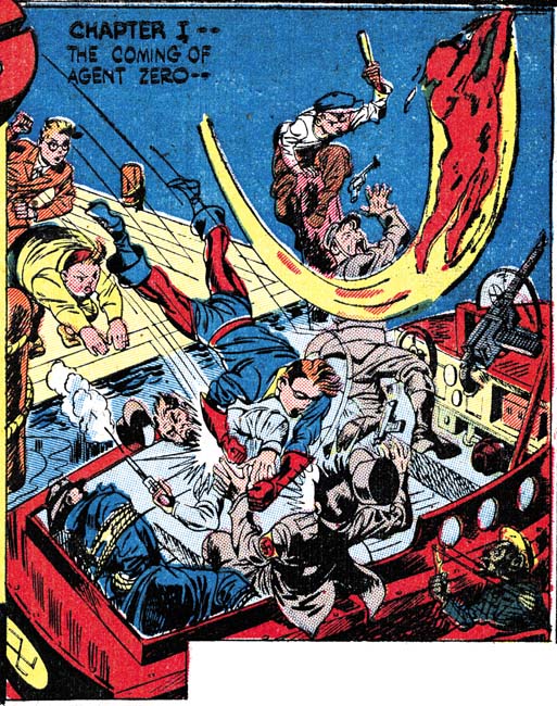
Young Allies #1 (Summer 1941) enlarged Chapter 1 section of the table of contents
Although the first chapter actually starts with a table of contents that table includes an image that may have been the originally intended splash. For the most part everything seems drawn by Kirby. Fists are square in shape as is typical for Kirby. Bucky’s legs have a form often used by Jack. Of course nobody could depict a punch like Jack and this is a good example of a Kirby slugfest. In fact we shall see the attribution of this panel to Jack Kirby is the most secure of all the splashes. There are two troublesome aspects and they are the same ones found in the cover: Whitewash and Toro. Toro is an important part of the composition and the fall of the topmost Nazi soldier makes no sense without him. Yet the figure of Toro is as stiff and uninteresting as his depiction on the cover. Whitewash on the other hand just seems out of place.
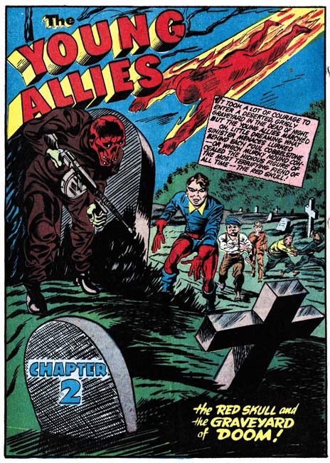
Young Allies #1 (Summer 1941) Chapter 2
Bucky looks like he could have step out of a page from Captain America and I am quite comfortable attributing him to Kirby. The Red Skull is a bit awkward but this is not unusual for Jack’s work at this period. Otherwise the Red Skull looks like Jack’s work. Note how Whitewash is placed in the background. His attempt to escape the graveyard was meant to provide comic relief but his small size hides what would otherwise be his stereotypical facial features. Once again Toro seems stiff and uninteresting but still plays an important part of the composition.
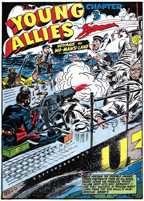
Young Allies #1 (Summer 1941) Chapter 3
I am not sure why anyone would have problem with Chapter 3 being penciled by Jack Kirby; what with square fingertips, Bucky’s wild hair, and the disarrayed posses of the Nazi seamen. This splash more then any of the others is centered on Bucky with all other Young Allies delegated to the background. Toro, with his stiff flight, seems little more then a smaller version of the Toro depicted on the cover.
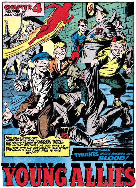
Young Allies #1 (Summer 1941) Chapter 4
Only in the splash for Chapter 4 do we find some decidedly non-Kirby elements. While there are some square fists (a cautionary example to depending on this trait alone when identifying Kirby art) the rest of the hands look very different from Kirby’s usual manner. The pile of Young Allies pinning Hitler lacks the action of typical Kirby art. Even the heavy boy’s readiness to use a hammer on Hitler’s rear end is not typical Simon and Kirby humor. Bucky has not only been placed in the background but now Whitewash gets to be the centerpiece of the splash which makes his stereotypic features all that more repulsive to our modern sensibilities. Toro is given the most dynamic pose of all the splashes or the cover. In short I do not think Kirby had anything to do with this splash, nor for that matter Joe Simon.

Young Allies #1 (Summer 1941) Chapter 5
The low viewing angle, the wide running stance of the Red Skull and the lower of the two Boy Commandoes Young Allies, and the soldier firing his pistol from above all are classic features of Jack Kirby’s art. Also note the Red Skull’s square fists; while I caution against depending on this feature its presence should not be ignored either. There is a crudeness to the art that makes this splash distinctive compared to the other splashes we have examined so far.
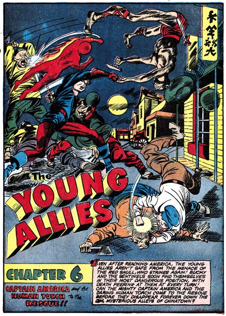
Young Allies #1 (Summer 1941) Chapter 6
Most Simon and Kirby splashes and covers have an emphasis on design that makes me believe that they had been laid out by Joe Simon (see my serial post The Wide Angle Scream). But there are others where the figures are distributed all over the image and interlink with one another like some complicated puzzle. I believe these “all over compositions” are Jack’s alone. The splash for Chapter 6 is an example of this type of composition. Jack really did not try to provide accurate anatomy but he paid careful attention to the underlying form. Kirby might distort the figure but he always did it without “breaking” the structure. It is just that sort of distortion that is found here in the legs found on Bucky and his thrown (and barely clad) opponent. Some of the Young Allies have been excluded from this splash, in particular Whitewash. Toro gets one of his most energetic posses but he still presents a stiff and awkward appearance.
Now that the cover and all the splashes have been presented what can be concluded? As I mentioned above the splash for Chapter 4 does not seem to me to have any significant Simon and Kirby involvement and I will be excluding it from my discussion. Otherwise all the splashes and the cover had Simon and Kirby involvement at some level. Jack Kirby brought to Captain America a dynamic art style that no other artist at that time came close to. That dynamism is found in the cover and all the splashes (again excluding Chapter 4). While Simon and Kirby’s presence seems pretty certain much of the art seems crude compared to what Kirby was penciling in Captain America at the same time. Although Joe may have been involved in some of the inking, I do not think Simon was stepping in to help with the pencils either. Thus one or more other artists are likely to have had a hand in this work as well.
It was probably the combination of the Kirby dynamic action with the crudeness of the drawing that has caused some to use the L word. Yes some are saying Kirby only did the layouts. Frankly I am getting pretty disgusted with the L word when applied to Jack Kirby. Normally when the term layouts implies that one artist would provide very rough or outline drawings with another artist then providing the details. A good example are the layouts that Carl Burgos did for Joe Simon (Carl Burgos does the Fly). When I say that I believe Joe would often provide Jack with a splash or cover layout that is what I am talking about. But my study of Simon and Kirby productions (particularly the romance comics) and Marvel silver age comics convinces me that Jack never did layouts of that type. Unfortunately we no longer have any examples of Kirby “layouts”, that is those left unfinished by another artist. But it is obvious even in the finished product that Kirby provided much more then mere outlines. Kirby “layouts” may have been a little rough but they were tight enough that his hand is still often detectable in the final product. In some places Kirby’s presence would be so strong that Jack must have provided very tight drawing. To call this type of work layouts is completely unfair to Kirby. Frankly I blame Stan Lee for first using this term for some work that Jack did during the 60’s. The only problem is that I have yet to come up with a better term. However it is clear that the proper credit for the pencils for cases like the cover and splashes for Young Allies is that Jack Kirby drew them working with other artists.
As for Young Allies I believe the cover and splashes (still excluding Chapter 4) all were done by Jack Kirby but with some portions tighter then others. Bucky invariably got the best treatment and Toro the roughest. It may sound like heresy but I do not believe that at this time Jack had any idea how to handle a human torch and since it was someone else’s creation little interest in figuring it out. While Kirby would carefully place Toro into the composition he left it the finishing artists to flesh him out and frankly they were not up to the job. As for Whitewash Kirby always seem to place him far in the background of the splashes, or leave him out entirely. I suspect that Jack really was not comfortable with Whitewash and this suggests that his presence in the Young Allies was dictated by someone else.


Harry, As usual an excellent article. I hope no one misses it because moving up the promo for The Best Of Simon and Kirby to the top of the page almost caused me to miss it. I’m a little confused about your comment on Kirby’s layouts. I haven’t seen anything but a few he did for Marvel in the 60’s and those are for the most part more stories than art. It’s true that he did often pencil the splash or a few key panels, but overall they aren’t as complete as what Harvey Kurtzman gave to artists for the E.C. stories. Mike Gartland did an article on Kirby’s Marvel layouts in an issue of TJKC and one was reprinted on page 82 of TJKC #50. Pat Ford
Pat,
I cannot comment about Kirtzman’s layouts, never having seen any examples (EC is not a big interests for me). And yes I forgot about page 82 of TJKC #50, that certainly is an example of an unused Kirby layout. But I still wonder if it is typical of Kirby’s method, perhaps further pages would have shown more detailed portions as well. That certainly is the conclusion from my examinations of Kirby layouts for instance in my serial post The Art of Romance. Examples like Tales of Suspence #74 seems to indicate it was true during the silver age as well. There the splash is so typically Kirby that I doubt that Tusca did little more then ink it. Other story panels indicate that Jack’s layout were probably pretty tight in some cases.
Issue #50 of TJKC does have another example reproduced in a much smaller size which is tighter so it’s an open question as to how tight the layouts were. The other example is on page 40. I wonder if they got less detailed as Kirby became unhappy with being asked to supply them while getting no plot credit?
I remember going nuts trying to figure out the art on this issue from the murky FLASHBACK reprint back in the 1970’s. I finally concluded that Kirby had done the splash pages only. I did NOT catch, as you did, his seeming reluctance to utilize Whitewash or the very real possibility that certain aspects were handled by other h. In the years since–Whitewash aside–YA has become one of my favorite golden age titles!
Hi Harry,
Congrats on the book, hopely my copy will arrive via Amazon soon. I agree with you about definite Kirby artowrk under the finished drawings, the problem is that there are soooo many hands doing the inking at this time. Between Avison, Gabrielle, Shores, Nicholas and whoever else happened by, it’s really difficult comparing pages. I find it interesting that on the interior page from chapter three, page three, that the formatting follows S&K’s Captain America stylings, with the ess shaped and zigzag gutters, and scalloped circular panels. All the little background circular shadows and details fit in perfectly with S&K designed pages. The two boys piggybacking with a disguise seen on the splashpage of chapter 5 is another common Kirby bit. Plus the interior pages are lettered by Ferguson. I think that besides the splashes, that many of the pages were laid out for Nicholas by Joe Simon, or Jack.
Stan
Who has seen the Cosmic Carson story reprinted in Supermen!? Does anyone share my perception of it’s uncanny brilliance? It isn’t just the best looking story in the book, it puts to shame even the great Will Eisner. The level of accomplishment is stunning. The art so beautifully composed and at ease within the panel borders. Most young artists have difficulty sizing their compositions to fit the panels. Kirby was already a master. Not only does this very early example fit complicated even grandiose multi-plane compositions into small panels, those panels are never claustrophobic. They are just the opposite the reader feels that he could walk right into them despite the complexity of fore, middle, and background elements there is still so much negative space left over that they appear light and airy.
Either Kirby swiped every panel in the entire story or the tremendous rate of production he was shortly thereafter cranking out resulted in his artwork through the early Timely period never reaching this level.
Patrick,
Cosmic Carson was certainly a great piece of work, maybe still a little raw but full of that Kirby energy. And yet Jack did little actual comic book work for Fox comics. Victor Fox called himself the King of Comics but there he was with what would turn out to be the greatest comic book artist and Fox mainly used him for Blue Beetle syndication strip where the format was a hinderance to Jack’s talent. I blame that on Fox, not Simon who had just started as the editor because Joe certainly recognized Kirby’s talent and started using Jack for work outside of Fox.
But I am not sure I agree that Jack’s Timely work did not reach the same level. Kirby’s Captain America shoke the industry and rightly so, nobody else was doing anything like it. That is what makes Young Allies such an anomoly.
Stan,
Many hands working on Young Allies and yet that was also true of Captain America with very different results.
I picked that Chapter 3 story page purposely because of all the layout features it uses but the circular panals and zig-zag borders can be found throughout the book. Al Avison would use similar panels but seeing how at this time the non-Cap stories to Captain America did not use the zig-zag borders (but they did use circular panels) I conclude that Avison had not yet picked up that panel technique. So yes I agree with you that Simon and Kirby had their hand in the entire book just that Jack was not doing the drawing.
Harry, My speculation is the Cosmic Carson job being purely Kirby and from a period where he had a light work load benefits from greater attention.
Certainly Kirby was improving all the time and developing into a better artist month by month.
At Timely he took on about 70 pages a month, a huge step up in production.
A musician improves by practicing scales. He might try to play them while practicing at a faster tempo than he is entirely comfortable with. While this is a proven method to develop “chops” the artists growth will fully display itself when he is able to slow down a bit and work at a more comfortable pace.
To me while the Marvel work has a “punk rock”/ “damn the torpedoes, full speed ahead” vitality there are more than occasional weak panels, and the drawings isn’t as careful because it couldn’t be. In addition we are looking at Kirby’s pencils through the veneer of the 1941 version of Diverse Hands. Was this about the time Joe Simon told Kirby to throw away his eraser?
Harry,
An excellent post. I agree pretty much with all your conclusions and have no doubt that Kirby drew these splashes and did not just provide layouts. The Torch figures in Chapters 1 and 3 have poses that prefigure his Johnny Storm figures (especially the pose in chapter 3) and look more Kirby to me than the others, but as you noted, he may not have had a firm grip on the characters look since it wasn’t his.
I forgot to mention the cover. The main figures, including the Torch, all look like Kirby’s to my eye. The Torch’s pose bears similarities to his later HT figure work in the FF. I’m less certain about the kids in the background which may have been added, redrawn or reworked by other hands.