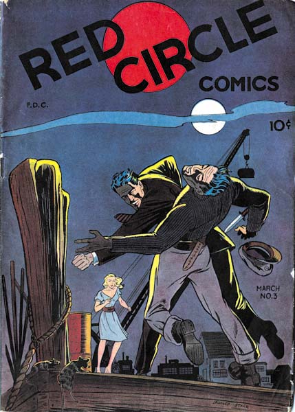
Red Circle #3 (March 1945), art by Leonard Starr
Leonard Starr began his career in 1942 and 1943 doing background art while attending Pratt Art Institute. Afterwards his worked for a variety of comics including Red Circle published by Rural Home Publishing. Red Circle #3 was released in 1945, just four years before Starr’s appearance in Simon and Kirby productions (April 1949). What a difference a few years can make. While I can detect some familiar features in Starr’s earlier art, I doubt I would have identified any of it if the signatures had been absent.
A fight scene dominates the cover for Red Circle #3. A brave man wins with his bare hands against a knife carrying opponent. An exciting cover that is excellently drawn. However in my opinion, a good cover should tell a story. Part of the story is here. The man on the wrong end of the fist had, as indicated by his hat, a maritime profession. This is fitting as the mooring ropes and rats show the locale to be some seedy port. But what is the cause of the conflict? Is it the woman who looks on? She shows an interest but no fear, so a heroic rescue is unlikely. So what does it all means? The art is well done but the story is confusing. Unfortunately the cover has nothing to do with the contents of the comic, so we will find no answer to the question.

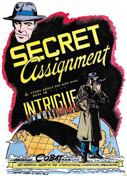
Red Circle #3 (March 1945) “Secret Assignment”, art by Leonard Starr and Frank Bolle
Starr and Bolle provide a better job for the splash of “Secret Assignment”. Anthony Cobat literally casts his shadow over the globe; he is an agent in a fight against international crime. With a briefcase under his arm, a nondescript overcoat and his face shadowed, the image of Cobat is derived from Hollywood; the use of “intrigue” in the title is superfluous.

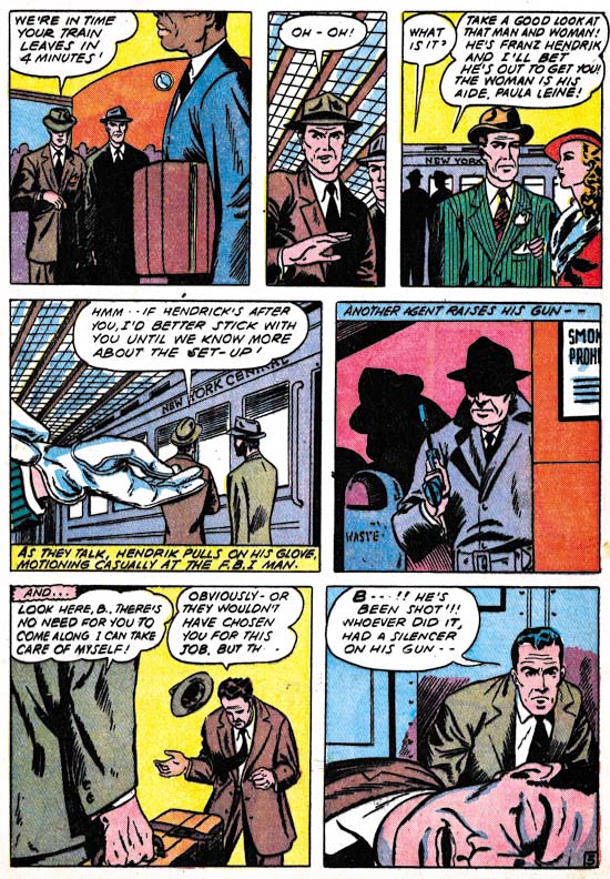
Red Circle #3 (March 1945) “Secret Assignment” page 5, art by Leonard Starr and Frank Bolle
Starr and Bolle also did a great job in the story. Their playing off of fore and backgrounds is well done. For example, the man in the stripped green jacket in the foreground is pointed out as an agent by one of the two men in the background in panel 3. In Panel 4 the foreground is dominated by a pair of gloved hands. These hands could have mistakenly been attributed to some woman except just enough of a sleeve is left to show the same green with stripes. Of course the caption also identifies the owner of the gloves and indicates that there was purpose behind the simple act of putting on gloves. My only complaint to offer about this page can probably be laid at the writer and it is an all too common error. There was really no reason to add the caption “ANOTHER AGENT RAISES HIS GUN” to panel 5, the picture was sufficient and would have been more effective without the caption. Panels without captions or word balloons were rare exceptions during the golden age of comics.
“Secret Assignment” was jointly signed by Leonard Starr and Frank Bolle. Bolle is an artist just a little older then Starr. Like Starr, Bolle’s career has included both comic book and syndication strip work. Since his name follows Leonard’s, Frank may have been the inker. But we have seen that such an interpretation maybe over simplistic for some teams such as Robinson and Meskin, or, for that matter, Simon and Kirby.
For work that Starr did for Simon and Kirby, he showed a preference for a page layout with one or two rows consisting of three, vertically extended, panels. That type of page layout is not found in “Secret Assignment”. However a related layout can be found; one where a panel row is unequally divided into three panels one of which assumes a narrow shape. The effective use of this narrow panel may have made it a forerunner of the vertically extended panels found in Starr’s Simon and Kirby work.

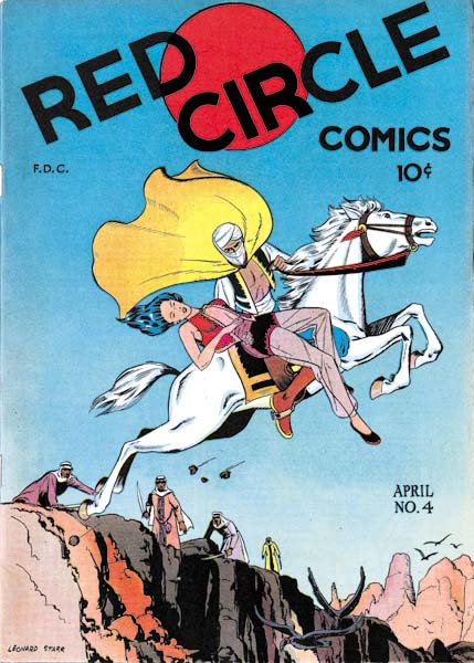
Red Circle #4 (April 1945), art by Leonard Starr
Another nicely drawn cover by Starr with, once again, a confusing story. The woman being carried away seems limp so very likely she has fainted. It is an abduction perhaps from the men in the background who are unable to pursue. A jump over some gorge might be indicated but the vultures flying below suggest a cliff instead. Was the horse magical or was there an unseen but safe landing? Who can tell? Of all the art the woman’s face is the closest to the style Starr would use later for Simon and Kirby.
It would be great to be able to show an image for the story Starr provided inside of Red Circle #4 but I am unable to do so. The interior of my copy is filled with Dorothy Lamour stories. If that was not bad enough, the first one does not even have the splash page. None of this matches what the contents of this issue should be. It looks like a Frankenstein; a combination of the Red Circle #4 cover with an old Dorothy Lamour contents. There is no sign of trimming so I believe this was done years ago. I have heard of publishers who repackaged material for resale, but this seems like an egregious example of that practice. According to the GCD, Fox Comics published a couple of issues of a Dorothy Lamour comic in 1950, but the story titles that GCD provides do not match those in my comic.

