
It has been some time since I posted about Black Magic. The last, and only, blog entry solely about the title was almost three years ago (The Old Black Magic). I hope to begin posting more about it in the near future but today I would like to write about the nine Black Magic reprint comics that DC published between November 1973 and May 1975. These show up frequently on eBay and at comic conventions and generally are still reasonably priced. Given the value placed today on even poor copies of the original Black Magic series the DC reprints may seem like a cost effective alternative. They may be as long as the purchaser is aware of what he is getting.

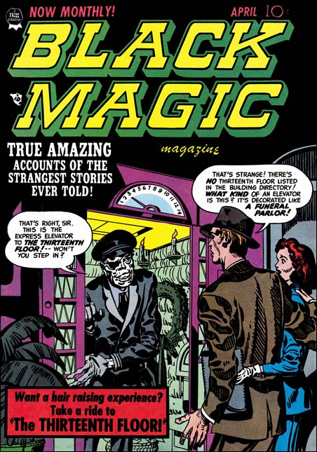
Black Magic #11 (April 1952) by Jack Kirby (on left)
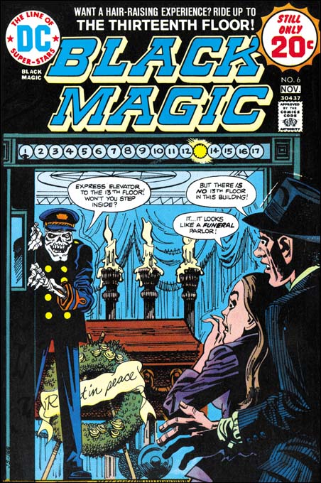
DC Black Magic #6 (November 1974) by Jerry Grandenetti (on right)
Larger image of Black Magic #11
Larger image of DC Black Magic #6
Seven of the covers of the DC reprints were penciled by Jerry Grandenetti and inked by Craig Flessel. Actually my crediting of the inking to Flessel is not based on any study but from conversations with Joe Simon. Joe told me that Craig did a lot of work for him at the time. When I asked what work that was Joe said he used Flessel to do Grandenetti’s inking but he did not identify any work in particular. Most of the covers, like issue #6 shown above were reinterpretations of the covers that were originally done by Jack Kirby. Today it sounds like an odd thing to do but when the reprints were published most readers probably had not seen any of the original Black Magic comics. Three of the coves were original compositions by Grandenetti based on reprinted stories. Frankly Jerry’s reinterpretations are better then his own more fully original covers.

DC Black Magic #4 (July 1974)
One of the covers used for DC’s Black Magic reprints was one never published before. There are at least three versions of this image that Simon and Kirby intended for the first Black Magic cover. I guess in the end they were not satisfied with any of the versions and used a story about an evil doll as the basis for the published cover. The version used for DC issue #4 was altered slightly by the odd inclusion of an upside down lion in the upper left. I really do not know what to make of it. It seems so out of place with Simon’s typical designs and the art does not seem to match Grandenetti’s style either.

DC Black Magic #7 (January 1975)
The other Kirby cover appeared on DC issue #7 but originally on Black Magic #17 (October 1952). It was a great choice it was one of the best from the entire Black Magic series. But look at that woman’s face, that does not look like Kirby! In fact it does not match the original version and looks like the work of Joe Simon.

Black Magic #29 (March 1954) “The Greatest Horror of Them All” page 2, art by Jack Kirby
I have heard it from many people, Kirby did not draw beautiful women. It is a remark that I truly do not understand, at least for the period of the Simon and Kirby collaboration. Granted the lady in the first panel of the image above leaves much to be desired but surely as depicted in panel 4 she would be described as pretty? Even in the last panel where she is overwhelmed by emotions, I would hardly call her unattractive.

DC Black Magic #1 (November 1973) “The Greatest Horror of Them All” page 2, art by Jack Kirby and Joe Simon
Surprisingly Joe Simon shares the same general opinion. In the earlier issues of the DC reprints he replaced Jack’s woman with a creation of his own. Is it truly an improvement? Well the first panel came out better and I leave it up to the reader whether which version of panel 4 is the most attractive. However in the last panel Joe has completely lost the emotion. It is in conveying the emotions of woman that Kirby is truly at his best and that, for me, is why his females are truly beautiful.

“The Angel of Death” panel from page 6, art by Jack Kirby
Black Magic #15 (August 1952) top
DC Black Magic #3 (May 1974) bottom
A careful observer may have noticed that the two pages of “The Greatest Horror of Them All” are not identical even when Joe was not purposely changing the art. There are subtle differences in the inking as well. The art presented in the DC reprints was not made from bleached comic pages. Simon probably knew even then how to remove the color from old comic books. But the bleaching process does not completely remove the color and more importantly the copiers need to provide a quality finish to the process were not yet commonly available in the early ’70s. Instead I believe Joe worked with a technique that I know he used earlier in the Harvey reprints of Fighting American. He re-inked the art on tracing pages over blown up copies the original, but probably bleached, comic book pages. Generally Simon was very careful to trace the original brushstrokes, but sometimes, such as the panel from “The Angel of Death” he did not do so. It may seem surprising that Joe, who had done so much inking over Kirby’s pencils, would have trouble re-inking the reprints, but the use of tracing paper obscures the art in a way that working on the original pencils did not.
Also not that panel from the DC reprint is higher then the original. Oddly this was due to the smaller size of the comics in the ’70s as compared to the ’50s. The size difference is not in the height but in the width of the page. The art in the DC was slightly reduced in size to accommodate the narrower page. To avoid an overly large top and bottom margins some panels were extended in a vertical direction. There in a small strip of art that was not present in the original comics. Expanding the panels was only done in the earlier DC issues. Later the Black Magic title that appeared at the top of the page was replaced with a larger version that was also moved further from the panels. This fixed the problem of the over sized top and bottom margins without the extra work involving in adding the new art to the extended panels.

“The Girl Who Walked on Water” page 6, art by Jack Kirby
The examples I have provided of the re-inking are really the extremes. Most of the art was recreated well enough that only a close examination reveals the differences. But starting in DC issue #6 and completely dominating issues #7 to #9, are some completely heavy handed re-inking. Even without comparison to the original Black Magic stories it is easy to see something is wrong. Look at the inking in the bottom panel from “The Girl Who Walked on Water”; it looks more like a wood cut then the work of a brush. The sudden appearance of this type of inking convinces me that Joe was not the re-inker. He had handed off the work to less skillful hands with rather disastrous results.

“The Clock”, panel from page 6, art by Jack Kirby
Black Magic #2 (December 1950) top
DC Black Magic #7 (January 1975) bottom
It is like watching a train wreck. I just cannot help myself from providing another comparison between the “woodcut” inking and the masterly studio style inking of the original.

Black Magic #32 (September 1954) “Maniac” page 5, art by Jack Kirby
So far I have been describing the art, but were the stories changed when DC reprinted them? There is good reason to expect that they might have been as the original Black Magic was produced before the creation of the Comic Code Authority. In fact one aim of the Comic Code was to eliminate horror comics completely. In this they succeeded and Black Magic was one of the casualties. But after awhile the Code was relaxed slightly and Prize resurrected the Black Magic title in 1957 this time with the help of Joe Simon alone. Although the title was brought back the content could not be, the Comic Code would not allow it. However by the ’70s the Code had been relaxed even further. In fact horror comics were in a period of popularity. It was still tame stuff compared to what was done pre-Code at say EC, but at least it was permissible to have stories about vampires, werewolves and other monsters. It is an indicator about how relaxed the Comic Code had become in the ’70s as well as how comparatively tame the original Black Magic series were in the early ’50s that I have only found a single case of a story changed for the DC reprint. This was the total elimination of page 5 of the story “Maniac” along with some minor modifications to the captions of the next page to accommodate the sudden leap in the story.
So are the DC Black Magic comics a relatively cheap replacement for the much more expensive Prize Comics version? Yes if all you want is a good read. But if you want to study the art closely the reprints are simply not the thing to examine. The best description of the process used in making the reprints is recreation. In discussions about the art recreations in recent Marvel reprints many have pointed back to the technique that Simon used as justification for similar methods used today. This is ironic because while Simon was limited by the primitive technology then available, today we have computers, scanners and quality printing.
I have created a checklist for the DC Black Magic that includes references to the original source. It is available in the sidebar as well.
How to comment on Joe’s paste overs, hmmm, let’s just say I prefer Murphy Anderson’s Pat Ford
Harry,
If you have the two volumes of the cancelled DC Implosion photocopies (which I got at some download site just before it was taken off the air about a year ago, so they are around), you’ll find one or two Grandenetti stories inked by Flessel (credited) which you can use as comparison.
I like the “woodcut” version myself. It may make the work look less like Kirby, but it also gives the art an unnatural quality that seems more appropos for a horror comic to my thinking.
~Scott
Joe, Has also redrawn the head of the man in the page from DC’s Black Magic #1. This goes beyond altering the hair style. Once again Kirby’s expressive face is lost. Pat Ford
I enjoy the commentary and explanations of what was done on the Black Magic reprints. Having quite a few originals in my collection and some of the reprints, I always wondered why the changes and re-inking were necessary. The problems dealing with loss of original art explain a lot. However, I disagree with the assessment that some of the art was changed because the general opinion was Kirby couldn’t draw beautiful women (which I’ll get back to). My belief has always been that the DC editors of the time found some of S&K’s work a little too dated and were afraid it wouldn’t appeal to a broad enough market segment of their readers. As I understand it, this was an ongoing issue at DC during Jack’s tenure there in the 70s, even with his new books. At any rate, it seems obvious to me, especially in the example you show above from BM 29 page 2, that they new artwork was done simply to update the styles, especially hairdo and clothing.
As for the opinion that Kirby couldn’t draw beautiful women, in my humble opinion that’s a load of crappy crap crap (as Bart Simpson would say). Anyone who has seen Jack’s pencils of female faces knows he could not only draw beautiful women, he could draw STUNNINGLY beautiful women. I think one of the most beautiful portraits of a woman ever put to paper with pencil is the one Jack did of Roz – from memory, while overseas!
So how do we explain why some of his women’s faces aren’t that hot? I believe there were three different factors at work here.
First, as an illustrator I know how difficult it can be to draw an attractive face (male or female) in every position that needs to be shown in every panel of a story. With men’s faces, you can get away with an occassional distortion, but it’s more obvious in women’s faces.
Secondly, the final image is really up to the inker, and very often what started as a small distortion in pencil gets magnified when committed to black ink (the softness inherent in pencil lines diminishes imperfections). And let’s face it, comics ain’t fine art, they’re commodity products done on a tight deadline, so there is rarely time to redo artwork.
Finally – and I think this could be the most important point – Kirby was always much more concerned with telling a good and engaging story than in being an “artist” per se. He often used distortion, exagerration, extreme POV and abstraction to convey action, mood and emotion. As a result, not everything looks “pretty” but it sure tells a story. This is something you yourself (Harry) point out in the loss of expression in the last panel of the sample page: prettier face, but no emotion.
This is actually the same argument I use when someone remarks how Kirby couldn’t write dialogue. My assertion has always been that Jack used the same techniques of distortion, abstraction and exagerration in his writing as in his drawing: his dialogue wasn’t intended to mimic real human speech any more than his characters’ elongated limbs and squared-off fingers were intended to illustrate realsitic human physiology. When you start looking at Jack’s work as expressionistic storytelling, it all makes sense.
Keep up the good work!
Bruce,
Thanks for you well thought out comments. I would like to emphasize that I do not share the opinion that Kirby could not draw beautiful women. While much of what you said is true, I am not sure I accept the argument that these “improvements” were done to update styles, that could be done without redrawing the face.
Harry
As and when Titan collect these, can we assume that the “variants” will also be included (as appendices) for completism’s sake and general interest..?
Titan has not discussed with me what the contents of the horror volume would be. But I suspect that since the Black Magic reprints were published by DC that Titan would want to avoid copyright issues and so not include the reworked material.
…Regarding the ” The Greatest Horror ” original and reprints , both the leading man and the woman’s head have been changed !
Joe/DC was/were clearly trying to update their hairstyle/general look .
The man gets this fairly ridiculous Ken doll sideswipe !