

Stuntman #3 (unpublished) “Terror Island”
Enlarged view
Joe Simon and Jack Kirby must have had high expectations for their creation, Stuntman. There exist three double page splashes that were never published, at least not as regular Simon and Kirby productions. Since S&K always placed their wide splashes in the centerfold, this meant that they had already started working for up to Stuntman issue #5. That is until the post-war comic book glut caused the early demise of their new comic books. Joe still has the three splash pages and with their double size art they are really marvelous to behold. However when reduced to the size necessary for use on the Internet they can be difficult to appreciate. Therefore I hope my readers will understand that I felt it necessary to provide my own coloring for use in this blog. I would have like to have used the color version that Joe did for his book “The Comic Book Makers” but so far I have not found it in his collection. The “extra!” strip on the top, the “a Simon-Kirby Production” and the Stuntman title are missing from the art and I provided them from other wide splashes. Glue marks clearly indicated that the “extra!” strip is was present, or something like it. However I did not scan the original art (it is much too large) and the source of the image does not indicate the placement for the “production” (if it was even present) or the title.
Because two of the double splashes are completely inked I am not absolutely sure which was originally meant for Stuntman #3. I choose “Terror Island” to post on first. However this choice was not completely arbitrary. As mentioned above “Terror Island” clearly had an “extra!” along the top a feature that it shares with the double wide splashes for Stuntman #1 and #2. The other completely inked splash did not have this “extra!” strip, the lack of which it shares with the unfinished Stuntman double splash.
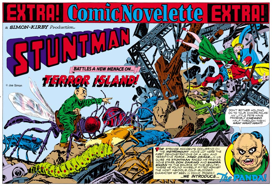
 “Terror Island” introduces a new antagonist, the Panda. Of course Stuntman had faced various opponents in his previous stories but they all were rather generic. None of the earlier villains really stood out and it is clear that none were ever meant to reappear in future Stuntman stories. The Panda seems special and I believe was Simon and Kirby’s first attempt to create Stuntman’s nemesis, the equivalent of the Red Skull for Captain America. Basing a villain on a panda may seem an odd choice, after all what could be more cute and cuddly then a panda, at least in the mind of the public. Sure Jack draws the Panda to look as vicious as possible without loosing his panda look. But the real source for this character is not the bear, but China’s leader Mao Tse-tung (nowadays his name is normally transcribed as Zedong). Today with all the world companies scrambling to get a share of the Chinese market it is easy to forget at that time communist China was a very closed society. As China’s leader and his with description of the U.S. as a “paper tiger” Mao was considered a special menace. Still it is not at all clear whether the Panda really could fulfill the role Joe and Jack were casting him for.
The art for this wide splash marked a new approach. All previous double splashes were actually composed of various different sections. But for the “Terror Island” splash no similar attempt was really made. It is true that there is some introductory text and a round panel portraying the Panda, but this hardly compares to the cast of characters often provided in older double splashes. Yes it is also true that space has been left in the upper left for the titles, but no art is associate with these titles. What we are presented with for the first time is an enactment that dominates the entire splash. But what a scene! It sprawls across the pages from the lower left to the upper right. It is just the sort of chaos that we have seen before in the Boy Commandos wide splash. There is some control over the composition. The Panda and his attacking bug army occupy the left page. All are advancing toward the right where we find Stuntman, Sandra Sylvan and Don Daring amid a mass of falling wreckage. Although the uncolored ink art might be a bit confusing, I am sure Jack (who did the penciling) knew how much the final coloring would help to make it understandable. This splash is one of those that Jack could just let his imagination run wild. Previously when discussing the cover for Adventure #98 I had mentioned how Jack was often inaccurate when drawing animals but nonetheless was very successful in giving them a certain life. This splash provides and example of what I meant. A biologist would shudder and the giant bugs Kirby presents us with. Some of the inaccuracies can be explained by the needs of the subject. The wasp like insect that the Panda is mounted on could never fly with its wings in their present location. But if that beast’s wings were in the correct position the Panda could not mount it. But other errors have no artistic excuse. The legs of the insects and the spider are attached in the most bizarre places. If Jack used a biology book for a reference he obviously did not make any attempt to follow it closely. Regardless of these “errors” these giant bugs have a very menacing life to them.
My personal preferences is for the earlier wide splashes with their greater emphasis on design. But there is just no denying the shear brilliance that radiates from these post war double splashes. When you look at the original art for the “Terror Island” splash there are no signs of hesitation or rework. Jack seemed to have it all figured out in his mind before he put it on the illustration board. But with such a complicated drawing how was he able to do that? It just astonishes me.