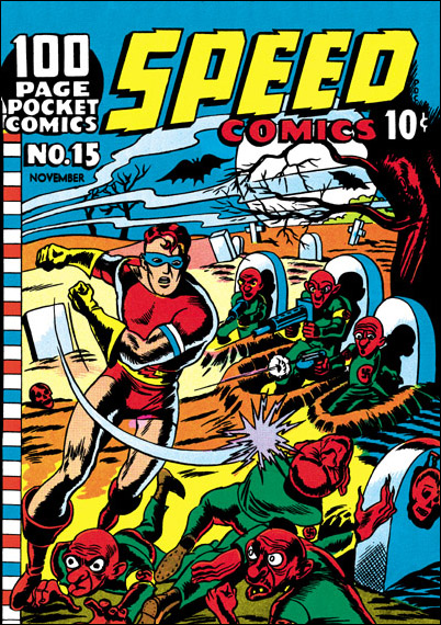
I fear this might be a little like a movie with a long introduction before the plot actually begins. But before I get to blogging about some of my favorite series of covers I want to show one more by Al Avison. This time it is Speed #15 cover date November 1941. This one is unsigned, but the similarity between the hero in it and Speed #14 leaves little doubt that they were done by the same artist. For some reason Shock Gibson has gotten younger and the whole cover somewhat goofier. The Nazi seem more menacing on Speed #14 then these little red men.
Category Archives: 2006/03
Avengers #6, less about margins
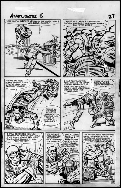
Now a short discussion about Avengers #6 page 20 with cover date July 1964 (inked by Chic Stone). Once again the image I provide has been adjusted for high contrast in Photoshop. This post will be short because unfortunately the page has been trimmed on the sides and the bottom. What little margin notes survived were covered with scribbled pencils. I don’t think it is possible to say who wrote the margins notes.
The most important thing that can be said about this page is what is not seen. There are no erased pencils of text in the balloons. So it appears that Stan Lee has abandoned that working method, perhaps because of the trouble it gave the letterer.
Al Avison on Speed
Some of my favorite covers were done for a not yet popular line of comics; Speed, Pocket, Champ and a few Green Hornet comics. These covers were dated from August 1941 to October 1942. Considering the name of this blog, it should not come as a surprise that they were done by Joe Simon and Jack Kirby. Some were signed, but they were signed as Jon Henri, a pseudonym. But which artist did what? I’ve heard a number of different takes on the answer to that question, and I have my own opinions.
But before I get into that I want to write about a third artist that did some covers for these comics as well. Al Avison was part of the team at Timely producing comics like Captain America. There he work with both Joe and Jack and was obviously very influenced by them. Joe was a friend of Al Harvey who published these comics. Perhaps Joe introduced Avison to Harvey. However they met, there started a long working relationship.
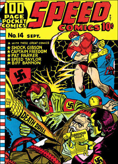
The first cover Avison did for Harvey seems to have been Speed #14 dated September 1941. Fortunately Al signed this cover so it serves as a good reference when trying to sort out the attributions. This was early in his career, so although he tried to use what he learned from working with Simon and Kirby he could not yet pull it off. But he matured quickly so that when Joe and Jack left Timely in a few months, Al became the head artist for Captain America for a while.
Strange Tales indeed, margin notes
I warned you that I would be posting on subjects outside of the Simon & Kirby time period. In this post I want to discuss another great collaboration, that of Stan Lee and Jack Kirby.
While examining some original Kirby art from my collection, Nick Caputo once commented that some of the margin notes were not done by Jack as I had assumed. Some were in Stan Lee’s handwriting. Only after the visit did I realize that I had not taken any notes and was no longer sure exactly which margin notes Nick was referring to. By email Nick kindly agreed to examine scans to help sort it all out. He has also given me permission to quote some of his correspondence here.
When I prepared the scans I decided to make some adjustments in Photoshop to bring out the pencils. I noticed that if I adjusted the contrast really high not only did the margin notes become stronger, but I could also more easily see pencils that had been erased.
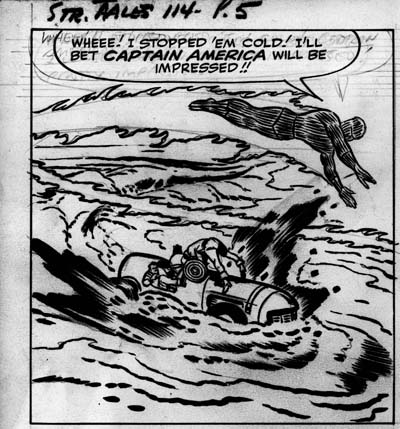
Here I will discuss pages 5 and 21 from Strange Tales #114 which had a cover date of November 1963. Inking was by Dick Ayers and what a great job he did. His brush work is powerful and confident. I don’t think there is any use of white-out to correct any of his inking. These pages are very special to me as I remember how excited I was when the comic came. I was too young to know anything about Cap’s previous appearances, but something about him made me an immediate fan. This despite the fact that in this story he turns out to actually be the Acrobat. For me this, not Avengers #4, has always been the first Silver Age appearance of Cap.
Besides the margin notes, there are erased notes inside the balloons. The balloon notes seem to match the inked version of the text. For example from page 5 panel 1:
Nick commented to me:
A close look at the lettering tells me that its Stan’s writing in the balloons. My guess is Stan put those words in after Kirby penciled the pages but before they were inked. This may have been how Stan worked, perhaps doing away with a script and writing the copy directly on the pages for the letterer to copy…
Unfortunately most of the margin notes on the sides have been trimmed during production. But those on the bottom happily remain. Such as below panel 5 on page 21.
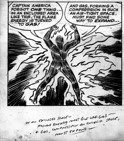
Nick remarked
Yep, that’s Stan’s sloppy handwriting. I can read some of it “In an enclosed space…” changed a bit from the copy, but close enough, making me believe more and more that this was Stan’s shorthand, giving him a rough idea of what he would later dialogue in the word balloons.
In case you have trouble reading the Stan’s sloppy handwriting, I believe the margin notes reads:
In an enclosed space, flame energy must give off gas and gas, compressed in an enclosed space, must expand
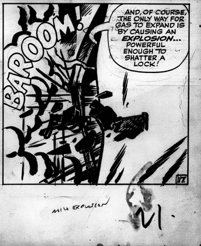
Under panel 6 (see above) on the same page is a note that reads “mild explosion”. I admit I was a bit puzzled by this note now that Nick identified it as from Lee. Why would he have to write that if Kirby had already penciled the panel? I think the answer is that if you imagine what it looked like without the balloon text and the “BAROOM” it probably was not very clear what was going on.
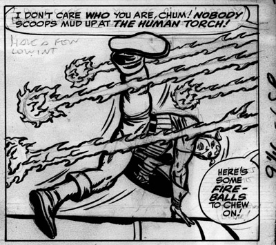
On page 5 panel 4 Stan writes just below the upper balloon. Although I could make the first line of it out, the second line escaped me. But Nick suggested it reads “Have a few low int(ensity)” referring to the fireballs. Probably having written that much, Stan realized that he did not have enough room in the upper balloon. When he added the lower balloon he had already decided to change the text a bit.
I think Nick is correct that for these pages Stan used the margins to rough out his ideas and then use the balloons to write the finalized version. But if this is true, then the Marvel Method was in effect at this time. Why would Stan have to rough out his ideas if Kirby was working from a script? But although the Marvel Method was being used, Jack had not yet developed his habit of writing his own notes in the margins. I can see that the technique Lee used on these pages worked well for him. But I suspect it made life a bit more difficult for the letterer. Although Lee wrote the balloon text in a much more legible manner then the margin notes, it still was only a rough placement. Someone would either have to recopy the text, or the letterer would be faced with problem of inking over the very text he was working from.
Simon & Kirby as editors
Joe Simon and Jack Kirby not only created great art, they produced great comics. They would hire writers to make scripts and artists to illustrate them. Joe and Jack would deliver to a publisher a complete comic ready for the printing. During the process of working on these comics they would improved both the scripts and the art. In the end they were Simon and Kirby comics even when other artist did most of the art for the stories.
I thought I would share some examples of Joe and Jack as editors of other artists. The first is from a “The Case of the Hapless Hackie” a Calamity Jane story by Bill Draut from Boy Explorers #1. Bill was a regular of the S&K studio and I am sure I will talk about him often. The original art, still in Joe Simon’s collection, was done on illustration board. These boards are thick (about 1/8 inch) and were the staple of work done for S&K productions. But the art on the bottom of the splash page of this story was done on bristol that was taped to the illustration board. With the bristol removed you can see the art as it was done by Draut.
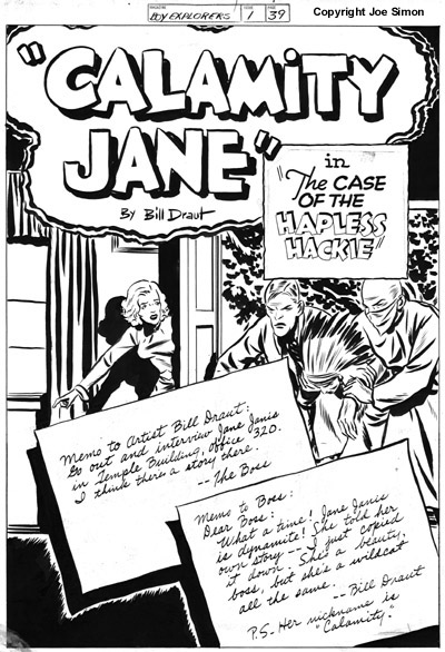
As you can see Bill did a good job and the notes by the editor and the artists was a clever idea. However the notes and the title clutter up the page and leave only a thin strip for the art. I believe for this reason and to modernize the effect, Joe did the overlay showing the editor and artist talking by phone. This is the version that was actually printed.
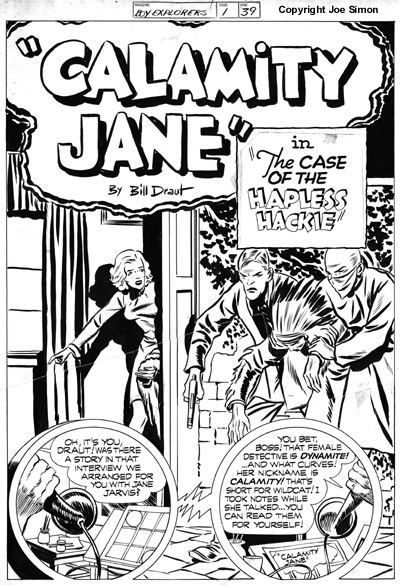
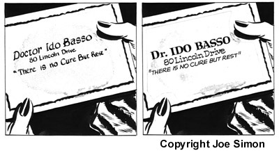
I say Joe did the editing in this case because the art was done in his style. Bill did a good job, but Joe made it much better. That was not the only change done on this page. The story title was done on paper pasted over the illustration board. The paste still holds the paper down tight so I have no idea what change was made. A similar paste job was done on the third panel on page three, but this time the glue has failed and the scan below shows Draut’s (left) and the final (right) version. Frankly this time I do not see the final version as that much of an improvement on Bill’s take.
The Boy Explorers and Stuntman comics did not last long as they were victims of the comic glut and resulting crash at that time. Boy Explorers #2 and Stuntman #3 never reached the news stands. But small (1/4 sized), reduced length, black and white versions were mailed to subscribers. I borrowed Joe’s personal copies for scanning and found this on the top of page 18, the third page of “In This Corner Kid Adonis” by Joe Simon.
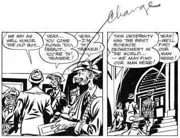
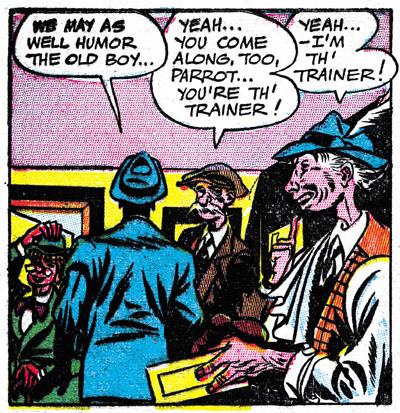
I think that is Simon’s handwriting, so it seems he was not satisfied with the face on the person on the right in the first panel. This particular story was reprinted in Green Hornet #37. This time the person has a very different nose. It seems Joe was not above editing himself.
One casualty of the comic crash was a Vagabond Prince story “Trapped In Wax” by Joe Simon that had been scheduled for the Boy Explorers #2. This particular story did not make it into the small comic sent to subscribers. Perhaps because there were still a few places where the inking had not been completed. In fact this story was never printed until Greg Theakson included it in Stuntman reprint. Below I include a close up of the first panel of page 7 of the story from a xerox in the Joe Simon collection.
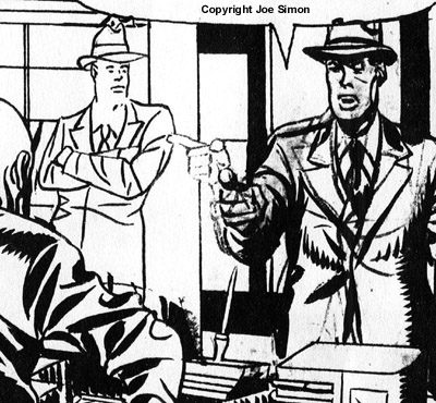
Notice there still remains a ghost of the pointing hand. The final hand was redone in a style that is unmistakenly that of Jack Kirby. The man’s right shoulder has also been adjusted. So here we have Jack stepping in as art editor. Careful examination of Simon & Kirby productions show that it was not unusual for Jack to make this sort of corrections.
Welcome
I’ve decide to jump into the world of blogging. I just couldn’t resist the temptation to muse on my favorate comic artist team, Joe Simon & Jack Kirby. But posting will not be limited to just those two , but also to the S&K studio and the artists that worked for it. Artists like Bill Draut, Mort Meskin, John Prentice, and more. Although focusing on the time of the S&K collaboration, I will also branch out to other time periods.

