
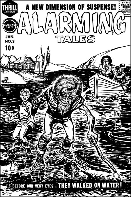
Alarming Tales #3 (January 1958) restored art, by Joe Simon
A recurring theme in my posts is how well Joe Simon could mimic Jack Kirby. This has resulted in a number of pieces that Joe did becoming attributed to Jack. Do not get me wrong, the overwhelming number of the items in the Jack Kirby Checklist are correctly attributed. Still there are a small number of entrees that are wrong and it is important to try to correct those mistakes. I would like to say that my study of Joe Simon’s art has enabled me to spot all the attribution errors that others have made. I would like to say that but it would not be completely true. A case in point is the cover for Alarming Tales #3. I provide an image of the restored line art to this cover above, a color version can be seen in a previous post.
In the past I have followed the Jack Kirby Checklist in saying Kirby did this cover. Not everyone agreed, for one sharp eyed Nick Caputo demurred. I was not completely satisfied with the Kirby attribution because I knew of the existence of another version of the cover art. It seemed to me that a comparison of the two would probably resolve the credit issue. As I hope to show in this post, that has turned out to be the case.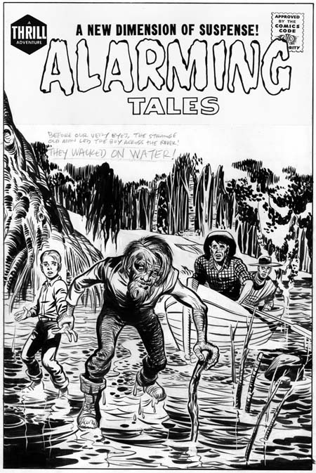
Unused original art for Alarming Tales #3, by Jack Kirby.
I provide an image of the unused version above. A note of caution when comparing the two versions. The unused one is original art and therefore has not been subjected to the blurring and loss of details that are the results of the printing process, all of which the published version has been subjected to. Also the title on the original art is a recent addition. The presence of penciled text indicates the decision to come up with new cover art was made before title stats would have been applied to the original.The derivation of the final cover from the unpublished version is obvious, both have the same cast of characters in about the same positions. The greatest difference is the backgrounds. Not only has the background been completely changed, it has been pushed much further back in the released cover. A closer examination reveals that the people are not identical. The size of the old man has been increased while the relative size of the boy and, even more so, the men in the boat has been reduced. The old man’s head has been enlarged and the position of his left arm has been shifted. The details of all figures have been changed. Curiously the boy’s pants have been given a stripe like those worn by the USPS mail carriers. My original suspicion that reworked stats of the first cover were used to construct the final state was incorrect.I think most readers will agree with me that the original art is more beautiful then the final cover. So why spend the time and effort to replace it? The answer to this riddle is that the purpose of a comic book cover is to entice a viewer to purchase it. To do so it must stand out from the rest of the comics on the rack. The problem with the original version is that the old man is overwhelmed by the background. By simplifying and pushing the other elements back, the old man and his feat of walking on water becomes more obvious and dramatic. It is a question of design taking priority over artistry.

Close-up of the old man by Jack Kirby and the Joe Simon rendition.
Because the compositions of the two versions are so similar, we must look at the details in order to arrive at the correct attributions. Although not a standard part of Kirby’s repertoire, the old man of the first state seems to be not only his pencils but his inking as well. There are subtleties that his copyist is unable or unwilling to capture. Some of the alterations do seem on purpose, in the final state the old man has been made older and more frail. In doing so the published version has lost the quiet dignity and resolve that the original old man possessed.

Close-up of the young boy by Jack Kirby and the Joe Simon version
Personally I do not find much in the final state of the old man to suggest who was responsible. For an answer to that question I turn to a close-up of the young boy. Once again the original version seems to have Kirby’s touch all over it. Some of Jack’s style has been preserved in the published interpretation but purposeful alterations have been made as well. Frankly in Kirby’s hands the boy has been given a somewhat dim witted response to his predicament. The copyist on the other hand has widen the boys eyes, raised his eyebrows and furrowed his forehead. All this gives the boy a more intelligent and surprised reaction to being lead by the old man over water. It is the boy’s eyebrows that convince me that the copyist is Joe Simon. Similar eyebrows crop up often in Joe’s work going back as far as the cover for Champ #19 (June 1942) .
The men in the boat are typical Kirby creations. Unfortunately it is hard to compare the two versions because in the published one they have been reduced in size and their finer features lost by the reproduction process.
I mentioned above that I believe Jack Kirby inked his own pencils for the unused Alarming Tales #1 cover. That is not surprising because AT #1 is a comic where Jack did most of the work, including the inking. When I previously discussed the inking in AT #1 I found some of it similar to the standard Studio style while others were closer to the Austere style. On a whole I felt the material was transitional between those two Kirby inking methods. The inking style exhibited on the unused cover is a bit of an anomaly. It is true that the bow of the boat exhibits what looks like typical picket fence brushwork (see the Inking Glossary). It should be noted that it is unusual for the rails of a picket fence inking to depict literal objects like it does here with the bow edges. A better example of typical Kirby brushwork can be found in the folds of the boy’s shirt. They exhibit the tendency to be flatter then the underlying form that was common for Kirby at this time. The form lines on the tree on the left side of the image also look like Jack’s. But other inking methods used are very unusual for Jack, in particular the form lines on the old man’s pants. I do not recall Kirby ever doing something like that before.
Also unusual about the inking is the abundant use of white-out. Although Kirby was a bold inker his control was so great that he usually had to make few adjustments with white-out. Actually some of the white-out on the unused cover were not mistakes at all. Many of the trees in the background and some of the branches in the water were actually created by white-out. The old man’s hair was done by a combination of standard inking and the use of white-out. But mistakes were corrected, for instance the edges of the drooping fronds left of center on the top were worked over. Some earth lines in the background and a water stain on the upper part of the boat were removed. I am not sure what to make of Jack removing the bottom of the boy’s shoes. Perhaps it was done to indicate that he the lacked the old man’s confidence and so could not tread as lightly over the water surface? A most surprising correction is found in the depiction of the water, much of what now looks white has abundant use of white out. The white-out does not completely hide the underlying inking and judging from their faint markings the water surface was originally much darker.
Despite all the features that are not usually found in Jack Kirby’s inking, I find the combination of boldness and control so characteristic of his work that I am pretty confident to credit him with the inking. The published cover shows Joe Simon equally bold with his use of the brush but without the same nuance of control exhibited by Kirby. It is interesting that Joe made the water surface very dark, just the thing that Jack spent so much effort to remove from his own version.
I love comparing different artists’ versions of the same subject. It is not a question of trying to determine who the better artist is. What I find interesting are the different decisions each artist made and what the reasons for those decisions were.
The environment in the Kirby version is beautifully drawn. Perhaps Simon was concerned that the viewer would think the old man and the boy are wading in the shallows rather than walking on water? In Kirby’s version the boat shows the water’s depth, but since the land is nearby, and since it’s a swamp, you could conclude that where the old man and boy are the ground must be close to the surface.
Luke,
Absolutely, I believe with the new design Simon wanted to make the old man stand out more and make it clearer that he is in fact walking on water.
Kirby’s version is beautifully drawn, every part of it seems to have something to offer the viewer. But like I said in my post, design won out over beauty.
Harry
Hi Harry,
I greatly appreciate your insight into the Simon & Kirby era, and was especially taken with your detailed description of Mort Meskin’s inking style (with examples), which enlightened me w.r.t. some of the Boys’ Ranch stories I had questions about, and also the Western Tales cover. Certain of the late S&K artwork (Alarming Tales, The Fly, etc.) is uneven in a way that the earlier studio art is not, and I’ve always attributed that to an uninspired (IMHO) and inker like parts of The Fly. The unused AT cover looks to me to be inked by the same inker-the boy looks like Tommy Troy, and I wouldn’t attribute the inks to Kirby. The ‘feathering’ on the old man’s deltoid muscle is also something I’ve never associated with Kirby (or Simon/studio ‘S&K’ inks) and is an inking style seen on a number of Harvey comics of the period.
I agree with you about the use of white-out being uncharacteristic, and the ‘reverse’ technique of using white to render the backgrounds and water, I would argue, is definitely not like Kirby, especially when rushed. That technique takes too long. From your blow-up, it also looks like there has been a correction made around the kid’s mouth – again unlike JK to make a mistake like that. I don’t know who the inker is, but it doesn’t look like Kirby inks to me. This does not in any way detract from your very interesting article about the re-drawn cover and the reasons for it.
Regards,
Art
Art,
Good point about the deltoid feathering which, as you pointed out, is not a typical S&K technique. As I originally wrote, I am bothered by the amount of corrections on the piece, and I can verify that the boy’s mouth has received that treatment. I am not as certain as you are that the reverse technique of using white out is more time consuming or necessarily unusual for Kirby. This technique is only effective in certain areas and can only be recognized in original art and not on the printed version. I have seen enough original art that I believed was inked by Jack to say that I think the amount of corrections on this unused cover is unusual for him. But I have not seen enough original Kirby inks to be sure he might not have used the reverse technique if the occasion called for it.
Perhaps I was hasty in attributing the unused cover to Kirby inking but neither do I have a better candidate to propose. Certainly the inking style is even a poorer match for any of the Kirby inkers that I am aware of such as Marvin Stein, Joe Simon or Bill Draut. And I agree with you about the uninspiring inking found in The Fly, so much so that I do not see how any of those inkers could be responsible for this cover. Even if this piece was not inked by Kirby, the inker was certainly a very gifted artist.
Harry
Hi Harry,
Happy New Year!
I agree that this cover (and other Harvey Kirby work of the period) is none of the usual studio suspects. Also that, while I wouldn’t call the inker ‘gifted’ necessarily, he (she?) is at least professional. It’s likely not the ‘Fly’ inker (or inkers), but someone slicker. I’d have to dig out my Harveys and try to find similarities with other examples. I am amazed at the number of (to me) unidentifiable artists from the 40’s/50’s who have been identified to a degree of certainty by people like yourself, since in many cases it’s difficult even to determine that particular stories were done by the same unidentified person.
If Kirby had inked this, IMHO it would look a lot more like late 50’s / early 60’s Kirby, a la Green Arrow. I think for me the defining characteristic of ineffective Kirby inkers is the softening of the Kirby line, which appears in the boy’s and old man’s outlines and the spectators in the boat. They barely look like Kirby, if you know what I mean.
WRT the white-out reverse technique, it’s way slower because white-out is essentially paint, and must be thick to cover black ink and it doesn’t flow like ink so the process is longer and more difficult, especially for fine stuff. (If you don’t believe me, try drawing something with Liquid Paper.) The thick paint is observable in your examples.
Anyhow, thanks for the very interesting comparo.
Regards,
Art
Art,
I am not sure why you feel that Kirby would be inking in a style similar to Green Arrow. He had done some of his best inking a short while before for Atlas and was doing some fine inking for some of his DC horror work.
As for the supposed slower white-out technique, yes white-out has to be thick to be effective. Using it for fine details would take longer. The only problem is that nowhere on this cover could the use of white out be described as fine work. All the use of white out is in very simple more or less straight lines. I have seen a number of different artists use white out to “break” blacks, and that is effectively what was done here.
Harry
Hi Harry,
Sorry for the long pauses between replies. My basic assertion was that I don’t think this is Kirby inking, and I defer to your greater direct knowledge on the subject – I think of Kirby’s inking from the mid-fifties as being Fighting American-ish, c/w the ‘picket fence’ technique and relatively heavily spotted blacks, which someone of Kirby’s skill could place relatively quickly but surely.
I don’t have much in the way of original art from this period, but my point about white-out was that Kirby (to my knowledge) almost never used it because he rarely made ‘mistakes’ like the areas around the kid’s mouth (an obvious correction), and because of his speed wouldn’t likely choose it as a ‘technique’ to employ, because he could do other things more quickly using Kirby shorthand, if you will (i.e. Kirby krackle). Other artists used it, but I don’t recall Kirby using it – again, I am not sure exactly how much Kirby inking I’ve actually seen.
His later (say, 1957) DC horror/SF work, which I’ve mostly seen in printed form, was heavily pen-based, with much less brushwork than FA, Bullseye, Boys’ Ranch, etc.. (hence the ‘Green Arrow’ comment). In any case, this cover looks like none of those styles, nor like the Atlas horror stuff inked by Rule, Ayers, Ditko, etc., which still had more of the qualitative ‘kirbyness’ come through. I wish I could offer an alternative ‘slick’ inker from the period, but except for the Kirby and Williamson stuff, I wasn’t that interested in Harvey comics of the period.
Is it possible that these Alarming Tales covers, which, to me, lack that high dose of ‘kirbyness’ were only layouts (or rough pencils) by Kirby, with finishes by someone else. This particular cover has a relatively detailed background (although that’s primarily evident in the rendering – the river and trees could be indicated in pencil with a few lines). Some others of the period, in more metropolitan settings, had relatively sparse backgrounds compared to other Kirby covers/splashes of the time.
So, to recap, I think what I’m trying to say is that 1) the ‘mistakes’ around the kid’s mouth are atypical, 2) Kirby had evolved into a speed demon and developed many artistic shortcuts, so the reverse white-out technique was uncharacteristic, and 3) to me, this inking doesn’t leave the art looking as ‘kirby-like’ as even his heavier inkers (i.e. Ditko). Therefore I don’t think it’s Kirby inking, but I don’t know who it might be.
Whew! Trying to explain this stuff in writing is way tougher than it looks. Kudos to you for being able to write about it so fluently and clearly. Fun discussing though. BTW do you know who inked any of the various Fly stories and/or Double Life of Pvt. Strong? To me, ‘classic’ ’50’s S&K inking can be found on the double-page Fly splash for ‘Come into My Parlour’, but not so much in the rest of the episodes. Thanks again for the great ‘blog.
Regards,
Art
Art,
I agree, and I had pointed out in my original post, that there are a number of things in the inking that seem unusual for Kirby; the white-out corrections and the brushwork on the old man’s pants in particular. But there are other brushwork that looks like Kirby’s as well; the brushwork on the tree trunk and roots for instance. If there were none of the latter features I would be happy to use comparisons to other Kirby inking from the same period to exclude Kirby. But if you start with Kirby’s Mainline inking and ignore any deviations from it you miss all the inking that Jack did for Atlas, Prize romances and perhaps DC. Kirby adjusted his art all the time, and in particular his inking during 1956 and 1957.
I can see we will not agree on the use of white-out as a fast shortcut. Without having lots of original art it is hard to prove or disprove. But I have personally seen Joe Simon use it and see no reason why Jack would not have as well.
As for the art not looking Kirby-like as compared to heavy handed inkers such as Ditko, I am a little surprised. Even you pointed out how much the boy looked like Tommy Troy from the Fly. Even Joe Simon’s published version of the artwork still looked enough like Kirby to get listed as such in the Jack Kirby Checklist. But when view side by side as in my original post I feel Joe’s hand in the published version comes out, and the unpublished version looks more like Jack.
I do not believe layouts were used in this case. The faces look too Kirby-like for me. Although during this period Jack usually did simple backgrounds as you say, there are examples that contradict that such as found in my post of Kirby inking of his own late Prize romances (see Young Romance #103 “Liars In Love” in Chapter 9 of my serial post “Kirby Inking Kirby”).
Sorry I have no idea who inked the Fly, other then the covers which Joe inked or retouched. The inking in the Fly stories is often unremarkable and I see no evidence of Kirby’s involvment in any of it, including that double page splash.
Harry