
The Comic Journal has recently reviewed Titan’s new trade-back “Fighting American” (Preview: Fighting American). I understand some have already obtained copies of the book but I have yet to see any in the comic book store I use. I do not have a copy but I have had a chance to briefly look at one belonging to Joe Simon. The material included in this trade-back is the same found in the previously released “The Simon and Kirby Superheroes”. So if you already have the Superheroes book you may not feel the need to pick up the “Fighting American” trade-back.
But TCJ’s article is not just a review, it is a preview as well. With Titan’s permission they provide the complete story “Home-Coming Year 3000”). So if you do not have either the Superheroes or the new “Fighting American” books you can see what you are missing.
There is an interesting comment that someone has made to The Comic Journal article. The commenter claims that the art has been touched up and in particular the some of the line art in the book was thicker than in the original comics. I will discuss his claim later in this post but I thought I would use this as an opportunity to discuss a little bit about the restoration of line art that I do for Titan’s Simon and Kirby books.
Readers of my previous posts on the subject of restoration should know that I do not recreate line art (a process that Marvel still continues to use for their reprints of golden age material). However the end result of my restorations is by no means just a scan. I have no problems with describing what I do as “touch ups” only not in the manner that the TCJ commenter uses the term. Frankly the original printing used in these comics was pretty poor. Now as far as I am concerned reprints of just scans is far superior to art recreation however I prefer to try to correct some of the printing flaws.

Close Up of Flaws in the Original Printing
The above image gives an example of the types of printing flaws typically found in gold and silver age comics. Note that the area of solid black is not actually solid or black. Instead there are spots that the ink did not cover at all and even where the black ink is applied it is so thin that the underlying magenta ink can be seen*. Also note how the in the upper right there appears to be two closely spaced horizontal lines. Actually there really was only supposed to be one horizontal line but the printing left ink only on the edges of the original line and failed to reach the center of the line.
When selecting an image for this post I debated with myself whether to use the original scan or after it had been processed with Photoshop to enhance the colors. There appears to be no yellow in the area shown but actually almost all of it had yellow. If the reader looks at the very top of the image and compares it to the left edge you should be able to see the very faint yellow remains. With Photoshop I can bring out the colors better which allows for more accurate color restoration.

Above shows an image of the same area after restoration. The solid black is now truly solid, the center of the horizontal line are filled and similar flaws throughout are corrected. But I am not recreating the line art just doing touch ups.
Some may find the restored version rather glaring. The blacks may now seem a bit too much black. However I am not doing restorations for viewing on a computer monitor. The final product is a printed book and things will look different. The image presented is blown up and in the printed version occupies only a very small area of the page. Further the black will not look quite so black when printed.

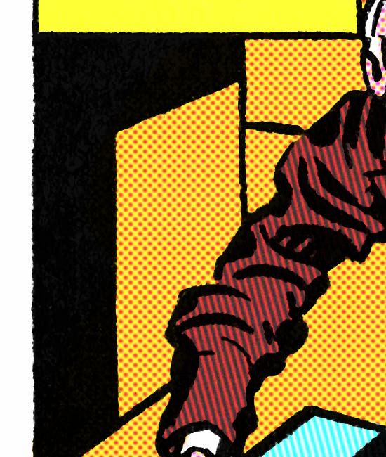
Close up from the Original Comic Version of “Home-Coming Year 3000”
As mentioned earlier, a TCJ commenter claimed that the art lines had been thickened in the restoration. Unfortunately he did not give an specific examples nor have I been able to find any in the story previewed by the Comics Journal. so I can have provided a close-up from the original scan only this time showing it in black and white. Simon and Kirby did not use very fine lines but I selected an area where the lines are as fine as they get in the story.

Close up of the Restored Version of “Home-Coming Year 3000”
Above is the same area after restoration. Note that small flakes of black can be seen attached or nearby the line art. These are printing flaws in the original printing. They maybe a little hard to see in the scan of the original comic because they are obscured by the colored inks that come out as black dots in the unprocessed original scan but look at the area without such dots on the right and you can see the flaws there as well. I do not try to remove every printing flaw only the ones the more serious ones.

Close up of the Restoration Overlaid of the Original Version of “Home-Coming Year 3000”
In the above image I have changed the restored version from black to magenta and overlaid it over the original scan. The restoration was so precise that all that magenta of the restored version could not be seen. Had the lines really been thickened in the restoration the blacks would have been ringed with magenta. To bring out how perfectly it is aligned I purposely erased a strip from the original scan so that the magenta version of the restoration could be seen.
So why did the TCJ commenter claim the lines were thicker in the restored versions? I suspect it is all a matter of perception. The blacks are blacker in the restoration than in the original comic book printing. Blacker lines could give the impression of thicker lines. But I believe the most important reason for the TCJ commenter’s error was due to his comparison of Internet images with the original printing. My restorations are based on scans done at 600 dots per inch. Generally everything from 400 dpi and above have fine enough resolution that the human eye can not detect that the image is actually composed of small dots. Actually most people have trouble seeing it at 300 dpi but at lower resolutions the deterioration of the image quality is easily detected. Computer monitors have very low resolution. Monitors differ in size and resolution but for example my monitor has approximately 85 dots per inch. The resolution is so low that the color in “Home-Coming Year 3000” looks solid when in the original comic the dots used for the coloring are clearly visible. You simply cannot make a good judgment on the thickness of lines based on an Internet image of a full page. Which is why I used close-ups to make the comparison.
To see how inaccurate the restorations was in the previous Fighting American reprint see my post “Simon and Kirby Superheroes”, A Must Buy. For further observations about my restoratios see my Newsarama interview.
footnote:
* Although the magenta plate has shifted toward the left that is not why there is colored ink under the black. This was done on purpose to help mask such registration problems. Had the magenta plate shifted to the right the nearby area would still be color correctly but without the overlap a white band would have appeared bordering black. The extending of colored inks under areas meant for black is called trapping. Today trapping is usually created by computer software but before that photographic processes were often used. However when trapping was done for comic books it was done by hand.


