

Daring Adventures #17 (1964) by Ross Andru and Mike Esposito?
I guess one theme of this post, at least for me, is what was I thinking? When I did my original serial post on the Art of Joe Simon, I stated that I believed Joe did the covers for Daring Adventure #10 to #17. At that time I had only seen (and restored) the cover to DA #15, but Joe had also included DA #16 in his book “The Comic Book Makers”. But I had only seen DA #9, 10, 11, 12, 17 and 18 on GCD. The images they provide are not the highest quality (it would almost seem they have a policy of excluding restored covers). Apparently I could see enough to exclude #9 and 18 from being Joe’s work. But for some reason I thought that #10, 11 and 17 might be, I just cannot remember what that reason was. After I had a chance to restore DA #12 and 16 I posted that I no longer sure that #11 and 17 were by Joe but that I wanted think about it some more (apparently I had already excluded DA #10). Well I thought some more, but I can really find nothing in DA #11 or 17 to suggest that they were Simon’s creations.
I decided to restore DA #17 anyway as I thought it might make an interesting comparison to Joe’s work at that time. Similar comparisons could be made to DA #11. The GCD attributes both of these covers to penciling by Ross Andru and inking by Mike Esposito. I am familiar with Andru’s romance work during the 50’s because some of it appeared in the Prize comics that Simon and Kirby produced. I am not knowledgeable about Andru’s later or superhero work. So I have used the GCD attribution above, with a question mark not because I think it is wrong but because I just do not know enough to make a judgment. In the rest of this post I will assume the pencil artist really was Andru. I would greatly appreciate it if there is anyone reading this who feels they are familiar enough with Ross Andru’s work to give an opinion.

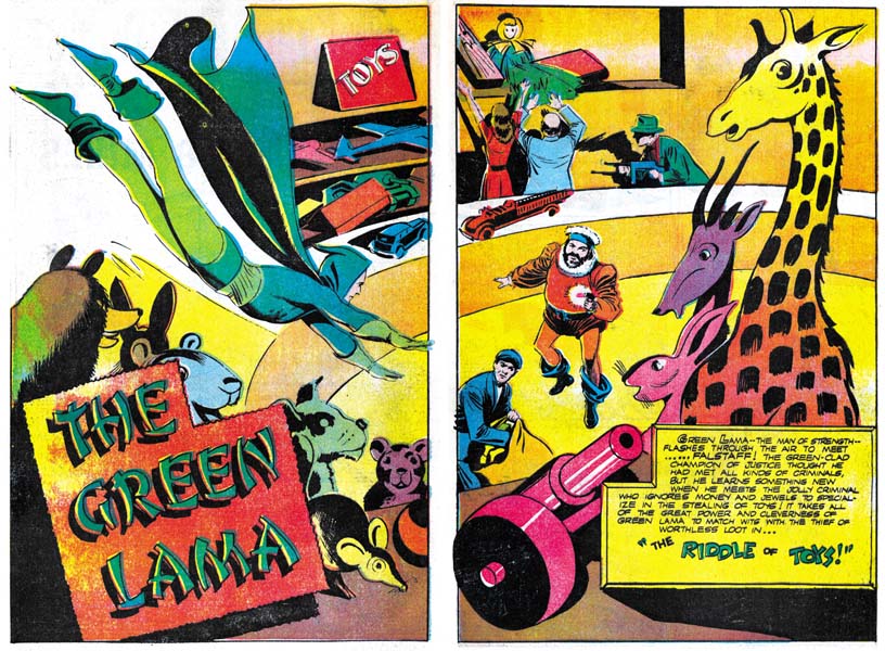
Daring Adventures #17 “Riddle of Toys” (reprint) by Mac Raboy
Larger Image
The first think that strikes one about DA #17 compared to Simon’s DA covers it how good the figure drawing is in DA #17. It is not that Joe is a bad figure artist, it is just that at least here Andru seems so much better. Really nice form and although the anatomy is not completely accurate the short comings really do not distract from overall affect, quite the contrary. It is a bit hard to imagine a real figure under Falstaff’s cloths. The legs are too widely separated and there does not seem to be enough room in the torso for both hips and chests. But to me these are really not truly “errors”. With these sort of distortions Ross has presented a truly marvelous and intimidating villain. Although the cover Falstaff is clearly based on the character for the reprinted story inside the comic, the Andru has created an even better version. That is no small compliment because the story was drawn by Mac Raboy, one of the greatest of the golden age artists. The Green Lama is not quite as impressive but his slimmer figure is appropriate for this particular hero. There is one unfortunate change, the Green Lama’s original hood has been modified to a face mask. That by itself is not so bad, but Ross leaves the back of the hood as a small bump which gives the hero a rather ridiculous look.
Although based on this cover I would believe that Andru was a better figure drawer then Simon, when it comes to the composition or design of the cover the reverse is true. There are some rare exceptions, but in general Joe does an very good job of laying out his covers. In DA #17 notice how all the toys in the background are scattered around the the main characters. Although this “clutter” might be more realistic, it detracts from the antagonists and the story the cover is trying to present. Joe seems much more sensitive to where he places secondary features and he makes sure that the action is well placed. Raboy’s splash shows how this could be done. Notice how the toys almost ring about villains while the Green Lama flies in as if toward a target. With all the toys you would think the image should be cluttered, but with careful arrangement it not only do the toys not detract but actually direct the eye.
As I mentioned above, Falstaff by himself is a well done threatening villain. But the pose adopted by the Green Lama is rather unfortunate. Because of him I always feel the two are dancing rather then about to enter a fight. What is the hero supposed to be doing? Whatever it is meant to be, it just is not properly done. Again this is the sort of mistake that you rarely see Joe Simon fall into.
I’m not 100% certain if this is an Andru pencilled cover or a Mike Esposito cover. Although I see elements of Andru, I don’t get a strong feeling for his style here. Esposito mentioned in an interview recently that he drew a few covers himself, possibly over Andru layouts. This may be one of them.
Nick Caputo