Back in TwoMorrows’ Fall 2008 The Jack Kirby Collector 51, the Museum’s newsletter page included a piece of Kirby art that was gifted to the Museum by Greg Theakston. Soon after that issue was published, I received an email from accomplished comic book art style identifier Nick Caputo, who told me it looked like it was inked by Frank Giacoia, and was from The Mighty Marvel Memory Album 1977 calendar. So, I acquired a copy of the calendar for the Museum. Nick also said that it looked like some of the other art on that piece was inked by John Romita, Sr., which may explain why this cut-out piece was by a different artist.
(Thanks to Richard Kolkman, caretaker of the Jack Kirby Checklist for the inspiration for this post!)
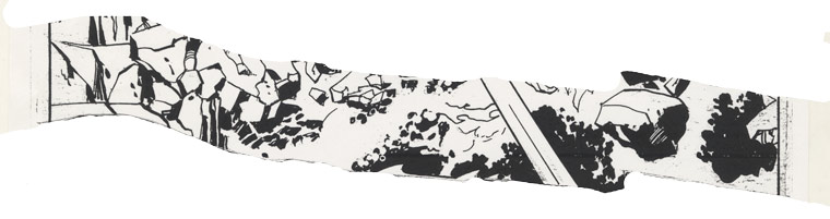
1977 Marvel Memory Album, Captain America original art detail
“In the early Nineties I was an avid consumer of Mondo 2000, a wildly glossy magazine filled with digital eye-candy, day-glo tressed and tattooed models draped in computer gear, and techno-hippie political screeds. The folks who published Mondo 2000 from their communal home in the San Francisco Bay area were inspired by the science-fiction novels of Bruce Sterling and William Gibson, the punk DIY ethic, and the seemingly non-stop advances in computer graphics, virtual reality, and smart drug technology. These people seemed to me, at the time, to be the embodiment of some of the future people I’d read about in comic books.
“I was also beginning my travels in cyberspace and became a member of a San Francisco-based conferencing system called The Well, run by the folks who published the Whole Earth Review. Remember, this was before the World Wide Web was invented; it was the time of dial-up entities like bulletin boards, AOL, Prodigy, Genie, and others. Mondo 2000 soon had its own forum on The Well, where one Well-ite made mention of some of the concepts in The Eternals. Our discussion of Kirby’s work went on—his use of Virtual Reality in OMAC, the bio-engineering of Arnim Zola and the High Evolutionary—and one of the editors posted that his interest was piqued and that perhaps there was an article in it. Eventually Andrew Mayer, a writer and programmer, pitched the article to the editorial tribunal and got an OK. Andrew and I felt this was a great opportunity to meet and interview Kirby, so Andrew made arrangements with the Kirbys to meet at that Summer’s San Diego Comic-Con. It was my first San Diego Con, and I was going to interview the King! Life was good!
“Andrew was well prepared. My thought was that simply keeping the ideas driving Mondo2000 in mind, we’d have a great conversation with Kirby. Andrew asked the right Mondo-like questions, and Jack took it from there! We submitted the article, including some pull quotes, but it wasn’t published. We were told one of the editorial tribunal didn’t really like comics. Go figure—Neil Gaiman and Dave Sim were later featured in the mag.”
A photo of my recently found San Diego Comic-Con ’92 badge
Here’s the audio of the interview, via YouTube:
14 August 1992: The Kirbys’ hotel room
ANDREW MAYER: Mondo’s a lot about technology and a lot about the way people, these days, deal with technology and how it’s changing their lives on a personal level and I think that’s why your work speaks to a lot of people there. In fact, I was reading the Hunger Dogs last night and I was really blown away with the way in that book that you were dealing with issues. You were taking some of the issues you were dealt with earlier and then saying what’s happening now?—what’s changed now?
JACK KIRBY: What’s changed now is that storytelling has changed. Like you said, you talk about technology—we don’t write on pads anymore. We write on computers, we write on word processors. Actually, our language may be crisper and maybe a little more urgent. Maybe we’re just not as leisurely as we used to be.
MAYER: Have you noticed a change in the way people…?
KIRBY: No, it’s not a great change. People remain people through all kinds of technologies. Sure, we had technology, too. We called ’em pencils, and we tried for effects, even with pencils. We tried for halftones. Didn’t we have Ben-day?
RAND HOPPE: Sure. Surprints.
KIRBY: Right. So if you wanted a halftone, it was just a series of dots. Really. If you analyze it and put it under a microscope, you’ve got these dots spread all the way out. Put ’em together and you get a nice halftone. In other words, it isn’t black, it isn’t white, but it’ll look great on pants! (laughter) So yes, I believe we had our own technology, but it was a simple technology.
MAYER: For instance, the Micro-Mark you were talking about in the Hunger Dogs book; Darkseid had come up with this new technology that was going to change…!
KIRBY: Yes, I was trying to stay 30 years ahead. I always try to stay about 30 years ahead doing my stories. In other words, I wouldn’t write a story about things people already knew.
MAYER: I came across something that blew my mind in OMAC where he’s got these goggles on and he’s going into this movie in his dreams. That’s predicting something that they’re coming along with now: Virtual Reality.
KIRBY: Of course, of course—but it’s something which at that period could have been ridiculed. “Those things are never going to happen.”
HOPPE: And here we are.
KIRBY: And here we are. The technology is so simple to us that we readily accept it as part of our lives. I can’t use it as well as you, but it’s your generation that’s grown up with it. So, it lives with you fellows and it’s as natural as anything.
MAYER: Like video games or whatever.
KIRBY: I envy you in a way because you can live a lot more reasonably in a contemporary world than I do.
MAYER: But there’s a lot of issues that you brought up through all the work that you did, where sometimes it makes your life more difficult.
KIRBY: Well, of course it would! Because a lot of people wouldn’t accept what you’re doing. They say, “Well, you must be a daydreamer. Give us facts.” And, of course, the facts would be very simple for that particular day. But somehow they accepted mine, because I took those fantastic facts and put them in a good story. And if the story sold magazines, I was doing my job. My job was to sell magazines.
MAYER: When you were doing those, did you think how you were affecting your audience—what somebody would be thinking about when they were reading them?
KIRBY: Sure! I felt that the audience would feel the same astonishment that I did—astonishment in these particular developments. Now, in my day the subway was a big thing, right? But today we have modes of transportation that outstrip the common subway. We can look forward to techno-tubes and things like that. We can look forward to crossing New York in 45 minutes when it takes us 2 hours now.
MAYER: So you were always looking ahead over the horizon and just pulling that back.
KIRBY: Yes, I always drew a story 30 years ahead—what I considered 30 years ahead.
MAYER: So then, somehow you mixed that in with mythology as well.
KIRBY: Oh, yes I did. I brought mythology into modern times. I brought in Hercules. I brought in Samson.
MAYER: And the New Gods.
KIRBY: Well, the New Gods were a 30 years ahead thing! (laughter) The New Gods was, “What was that mythology all about? There’s gotta be a new mythology!”
MAYER: Reading it even now, it’s exciting.
KIRBY: I was creating a mythology for the ’70s, which the ’70s didn’t have. Not only that, it was acceptable in the fact that it was a battle between father and son.
MAYER: That’s very classic.
KIRBY: It is classic! Show me the son that doesn’t defy the father! (laughter)
MAYER: And then you switch them so they have this urge from the other side.
KIRBY: Right, but they’re always afraid. Both father and son will not accept the final confrontation. A son in the end will never hurt his father—that’s my personal belief—and a father will never hurt his son. I know that I never will. My son can do anything to me that he damn pleases. (laughter) It’s just the way I feel. I can’t hurt my own flesh and blood. I feel that even villains, though totally with problems—totally beset by problems, which they have to contend with; their own character and the things that spring from their character; their issues with other people—they have to contend with that. But, they do it in a totally human way. I was talking earlier with some people about Doctor Doom. Doctor Doom is an evil person, but he’s not always been evil. Doctor Doom was a guy who was a thoroughly respected academician; a highly respected chemist, but through a flaw in his own character, he was a perfectionist. Perfectionists cannot accept imperfection. So what happens to Doctor Doom—who wasn’t even Doctor Doom at the time? He was just a chemist. He gets a cut on his chin! The perfectionist suddenly finds himself imperfect, small as that scar may be. So he can’t live with the rest of humanity. (laughter) He can’t live with himself and the rest of humanity. He knows that every man, woman and child who passes him will know that he has this scar on his chin. So he encases his face in an iron mask.
MAYER: I remember that moment. Because even though it’s going to totally scar his face, the one scar and the whole face doesn’t make any difference to him.
KIRBY: No, it doesn’t make a difference to him. Nobody’s ever going to see that scar—but they do! That scar grows so large that it affects his entire brain, and Doctor Doom becomes the ultimate villain. He’ll do anything to anybody. Why? Because you haven’t got that scar! (laughter) He has! And who do you think you are, not having a scar like that? And that’s the point of Doctor Doom. It’s a totally human viewpoint. It’s an inferiority complex. To a guy who’s superior, can you imagine how devastating that must be?
MAYER: He views himself above but he can’t escape.
KIRBY: And here is a guy who is the ultimate in brains, suddenly finding himself on a level with the ordinary guy. Say the ordinary guy walks around, “Sure I got my arm in a sling! So what?” You know? But if Doctor Doom has his arm in a sling, he’d hide the arm in a jacket! (laughter) Or he’d cut it off! He would do the ultimate thing so he could face the world as he believes he should.
MAYER: I’ve talked with other people about your work, and one thing that comes up is the idea of scale. You have Galactus who is above everybody; or the Celestials.
KIRBY: Yes. Galactus is a true god—a god in the meaning of modern mythology. Not god in a spiritual sense, but a god in a mythology that’s very modern in context. It’s a modern mythology. In other words, what I’m taking is the old religions and transforming them into our contemporary lives so we can accept them. Galactus, of course, is the ultimate figure and still he has a human problem, too! He’s got his son, Orion… or is it Darkseid?
MAYER: He deals with the Silver Surfer.
KIRBY: Right. The Silver Surfer himself was a wonderful surprise to me because I know nothing about surfing. I know nothing about surfers! Then one day I saw it in the paper. There was a guy standing on a wooden plank out in California. I was still in New York at the time, OK? And there’s this guy standing on a wooden plank and he’s riding the wave! And that’s fantastic to me! And I said, “Suppose there was a surfer who surfed the universe?” And of course the Surfer does that. He also has to have, in my estimation, a godlike appearance. And him being all silver gives him the kind of aura that makes him different from ourselves.
MAYER: You keep using the word “cosmic,” and I wanted to know what your definition of the word “cosmic” is.
KIRBY: My definition of the word “cosmic” is “everywhere.” Outside of Earth, we have everywhere. They say there’s nothing out there. I say there’s everything out there. We haven’t got the means or the money to reach it, but it’s out there!
MAYER: There was a science program on physics that was talking about how even if you have an empty thing of space, a particle can come into existence, then meet itself and disappear again. They exist for that moment and then they meet each other and go to zero. That made me think of the way you use the word “cosmic.”
KIRBY: Now the Bible itself never mentions evolution. It never says Man evolved over here on Earth. It just says, “…and then there was Man.” God made Man. And of course, Man suddenly appeared and there he was. I don’t think Man evolved from a monkey. A lot of people don’t believe Man evolved from a monkey. I believe the Bible. It says Man was there, Woman was there. Now, we don’t know how many civilizations there might have been on Earth before ours. Nobody has any idea. I can go to the greatest mind in any college. I can go to any college professor and he wouldn’t be able to tell me how many civilizations there were before ours. My guess is there might have been thirty, forty, a hundred. They might go back hundreds of thousands of years—there might have been civilizations before ours. I believe that Man was present in all of them. Man built them. Monkeys can’t do it. Armadillos can’t do it. (laughter)
MAYER: You had the Celestials come and take the ape creatures and turn them—!
KIRBY: Yes, but the Celestials can do it. The Celestials looked human, didn’t they? They had human form. Underneath those helmets was a human being—a celestial human being, someone godlike in our eyes because of the things he could do that we couldn’t.
MAYER: You would always wrap them in this technology.
KIRBY: I tried to give technology the touch of legend; and in doing so, I’m telling a story. I’m not trying to tell a truth or I’m not trying to tell a fable. I’m trying tell an honest-to-goodness understandable story; a story that you would read and understand and interpret in your own way! If you want to make them human, that’s your prerogative! And I respect that. I’ve always respected my reader. My reader’s most important to me. So, I would present a story as I felt I saw it and say, “How do you see it?”
HOPPE: That’s right. A lot of the essays that you had in your comics probed the reader that way.
KIRBY: I never presented my story as the last word to the reader. I’ve always said to myself, “How would you see it?” And if the reader saw it differently, he has a right to say that and show it.
MAYER: That’s why your stuff has so much influence on people.
KIRBY: It’s because I respect other people. I respect human beings. I’ve seen them in very happy circumstances and I’ve seen them in the dregs, believe me. So, I’ve always loved human beings because they have the capacity to suffer! (laughter) Yes, they do! I’ve tried to make my characters human, whether we consider them evil or we consider them good. Even my heroes had human qualities. My superheroes had human qualities. They would have families to defend. They would have friends to defend. They would respect women. I respect women. I felt I was presenting my views to the reader and saying, “What do you think?” I think that’s an imperative for any writer. In other words, no writer should feel that he has the last word on any subject, because he hasn’t got the capacity! He hasn’t got the capacity—he doesn’t know! I don’t know, I’m guessing as well as you are, except I may be a little more descriptive.
MAYER: In the ’70s you were creating more whole worlds and you were putting more issues into it, more concrete ideas into them than you had before. With the New Gods and the Eternals you were going for these ideas in a lot bigger way.
KIRBY: Well, I did. I felt it was incumbent on me to probe them for myself before I presented them to the reader. What do I think? What do I really think? I’m not a show-off who’s gonna say, “Well, you know, take it or leave it. Take my story or leave it”; I’m not that type. I can only say, “This is how I believe they would act.” I put enough chinks into the story to allow the reader to interpret it his way, because I’ve always respected the reader. He’s the next guy, and I’ve always respected the next guy. Sure, it was a matter of selling magazines. That was a big consideration. I had to sell magazines to make a living. So, I sold the magazines—I told the best stories I could, but I didn’t present my stories as the final word. I didn’t say, “This is the final word,” but that’s how my characters act! (laughter) And that’s all I said. That’s how I see human beings. And of course, you’re entitled to analyze my interpretation, as a reader.
MAYER: That’s happening a lot.
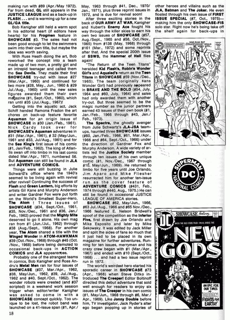
KIRBY: I would get letters of all kinds: “How dare you” letters. (laughter) Oh yeah! And I used to get “You’re great” letters. “You’re a great guy.” And I used to get “You’re a wonderful writer.” I used to get letters “Well, not bad.” It was a variety and you could see it in the letter column that there was a variety of people who interpreted the stories in a variety of ways. It impressed a lot of them. It impressed enough to make good sales, and that’s what I prayed for.
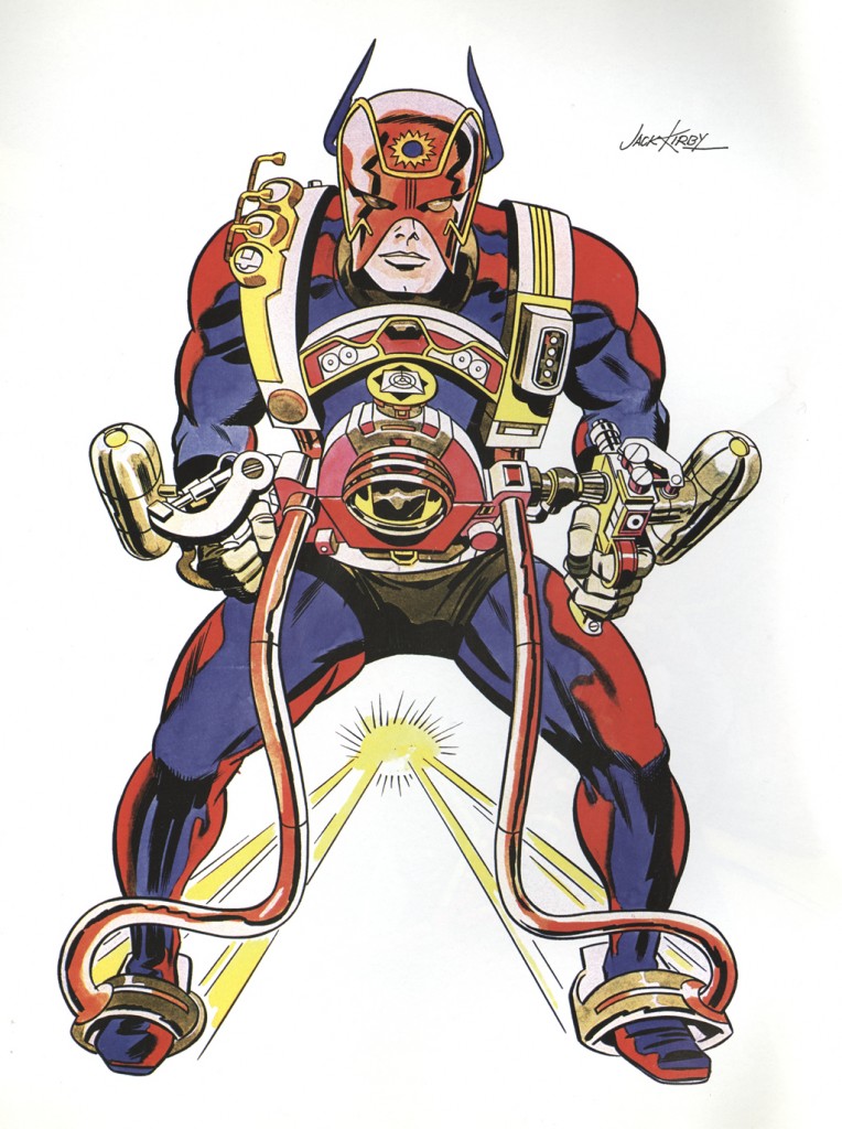
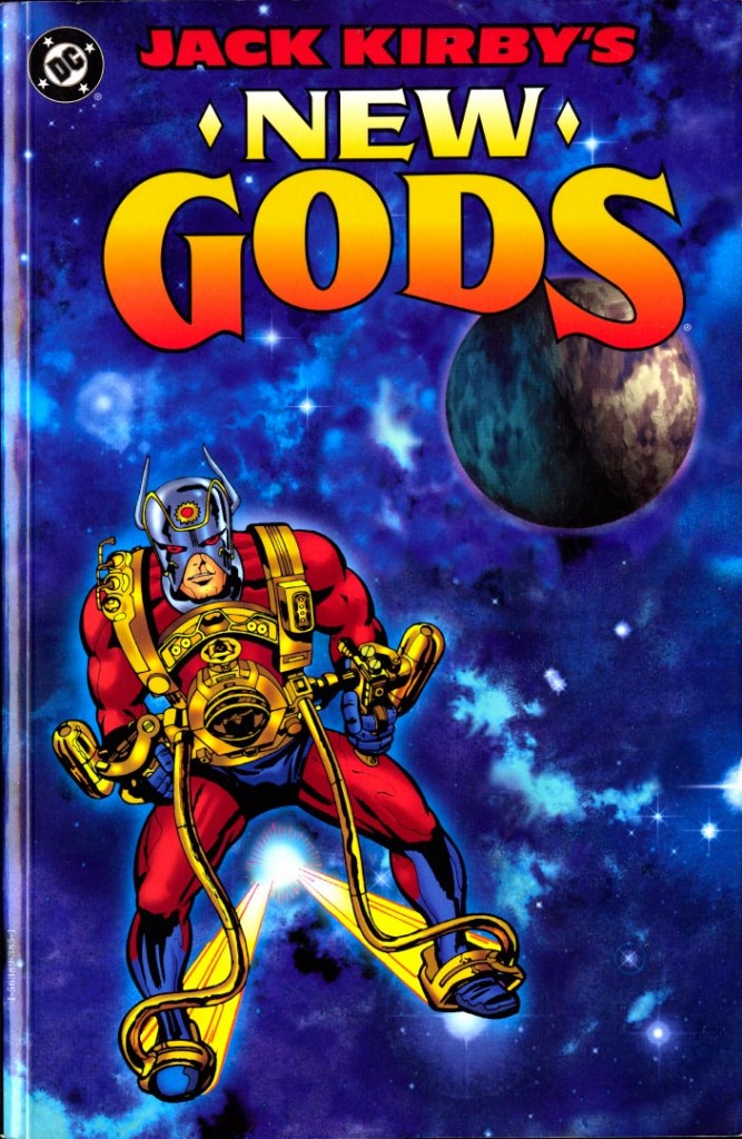
MAYER: Did you do a lot of research for this stuff?
KIRBY: I did research as I was growing up. I know people from the start. I love people. I grew up in a place where people suffered, where people laughed, where people had a good time. It was an extreme period. Everything was felt in an almost bodily way. You couldn’t be subtle. In my neighborhood you couldn’t be subtle. You had to act from your own instincts, and we did. If a guy insulted me, I punched him. And if I insulted him, he punched me. It was a reaction, it was a thing to do. You couldn’t do otherwise. There was nothing else you could do.
MAYER: But the world doesn’t seem quite that way now.
KIRBY: Oh, now I think it’s a lot more sensible, it’s a lot more subtle.
MAYER: People get at each other without having to hit each other.
KIRBY: Yes, of course, you learn that along the way. I grew up like everybody else. I felt that I had begun to tell stories in a more mature way. And there was not only fighting in them—I never left the fighting out—besides the fighting, I had the story develop with more mature reason. Why was there a fight? I had to give a mature reason for it.
MAYER: In OMAC, you’d give a little of the future that you were concocting and then you’d have this presentation.
KIRBY: Listen, let’s face it, the future is a mystery! Wouldn’t you love to know what’s in the future? (laughter) And, of course, the reader would, too. And I’d say, “In the future, this is what’s going to happen!” And the reader says, “In the future! Gee! What does this guy know?” (laughter) And of course, I’d present it as if I really knew—to tell a good story. That was to make the story believable. If you make your characters knowledgeable in your own way, make them share your own knowledge, then you’ll have humanized characters. You’ll have characters who are human beings just like yourself. You have foibles. You have great traits. You have things that will make you candidates for Vice- President. (laughter)
MAYER: That may not be so hard these days. (laughter)
KIRBY: There you go! Like, my ambition was, I wanted to be a crooked politician; because coming from a deprived neighborhood, money meant a lot, so I felt that dirty politicians made a lot of it. I told my mother that I’d be a crooked politician.
MAYER: I think you rose to higher things!
KIRBY: My mother would have none of it.
MAYER: The concept I love is the Uni-Mind; do you remember that from the Eternals? When all the Eternals join together?
KIRBY: Yes.
MAYER: In computers now, people meet over the computer.
KIRBY: That’s what a computer is.
MAYER: The Uni-Mind seemed to be a great symbol of that; of everybody coming together.
KIRBY: And not only that, that computer will someday do it by itself. Because it’ll be on some automatic position, or it might go by itself. I mean, figure it out. If a computer really thinks in its own mechanical way, suppose it really begins to think on its own? Couldn’t that possibly happen? You walk out of the room, and suddenly this thing goes off! And the entire room begins to click.
MAYER: They’re trying to make it happen!
KIRBY: And you come back and the room is changed! (laughter) There are four more lights! The computer likes more lights. The soda you were drinking—the computer likes the soda, so he’s made an opening where the soda is, because the computer has seen you do it and the computer respects you because you’ve run him. You made him.
MAYER: I’m very familiar with this technology and even though I’m more familiar with it, you come out with very simple ways of discussing concepts that really are what people are doing right now. You say that the computer watches what you do and the hottest thing in artificial intelligence now is the computer learns from the input of the user.
KIRBY: Yes, the computer does learn. Where is the end point? Suppose we make the perfect computer? For instance, we can talk into the computer and it types everything out by itself. And the computer in this manner begins to think on its own. Suppose it doesn’t like XXX. You come in and you read this thing—it’s not the thing you gave the computer! You put the paper in and you speak to the computer, and you type out “What’s wrong with this?” and the computer types out “It stinks!” (laughter)
MAYER: It happens now more than you know already!
KIRBY: I don’t know. I just haven’t followed it.
MAYER: You understand it already.
KIRBY: I think there’s a distinct possibility. How far does automation go before you can walk out of this room and this automaton begins to move and think by itself, because it’s built to think?!
MAYER: Do you think it’s good or dangerous?
KIRBY: Sure, it is dangerous! Suppose it closes the door; you can’t get in. (laughter) It wants to be alone! Maybe it doesn’t like you anymore! (laughter)
MAYER: Mister Machine is sort of the end result of that. He’s a machine but he’s suddenly gone so far that he’s dealing with human problems. He’s a human.
KIRBY: Right. Mister Machine is the ultimate machine. He’s a human machine. Ultimately that’s what the machine wants to be.
MAYER: Like Pinocchio, in a way.
KIRBY: Well, the machine knows that we’re responsible for it—that it wouldn’t be there without us. The machine knows that. If it begins to think, “Where would I be if it wasn’t for these guys? I wanna be like them! These guys must know something!” (laughter) It’s not gonna see you as a god because it knows you can get a sniffle, it knows you can twist a finger. The machine knows that. “These guys aren’t perfect. Maybe I’m more perfect than they are. I’ll show these guys something, I’ll test ’em!” And suppose the machine wins the test? So you have that kind of a contest. How far can you go with the computer before the computer begins to start on you? The computer has the possibility of thinking on its own! That possibility exists!
MAYER: That’s what people want them to do!
KIRBY: It’s very real! Suppose a guy walks out of his office and says to his computer, “Don’t forget, I need 25 copies before I get back at two o’clock” and the computer absorbs it.
MAYER: There’s a new handheld gadget coming out now and you write on it “Meet Jack Kirby Friday at noon.” It takes “Jack Kirby”; puts it over there; says, “Friday—this Friday? Noon— twelve o’clock” and puts it in your datebook. And all you’ve written on it is “Meet Jack Friday at noon.”
KIRBY: It’s very possible. I know it’s far out, but it isn’t that far out considering the sophistication of the modern computer.
MAYER: And that’s why I think people are coming back—the stuff you did 20 years ago, suddenly it’s very current.
KIRBY: Oh sure, it is; it’s contemporary. Of course at that time it was very, very far out. If the fellows didn’t like the stories, they could’ve kicked my behind! (laughter)
MAYER: So you told a good story along with it.
KIRBY: I had to sell ’em a good story. That’s what I mean, you have to be a good storyteller, too. Why is the machine doing that? Maybe the machine is lonely. Maybe the machine wants to know what a man does, that makes him smile. The guy’ll sit at the machine and suddenly he’ll think of something and he laughs out loud or he smiles. The machine says, “Why is he doing that? What’s he thinking about that makes him smile? I’ve got to ask him that! I’ve got to ask him that,” because he wants to find out. And suppose the computer starts talking. I mean, reflex action! It’s got a brain, okay? Maybe our brains came into existence because of mere reflex action! We were just creatures walking along, learning our way—I don’t believe that we walked on all fours—we were guys just walking around trying to learn about our own existence, which is what we’re still doing today. And here we have these sophisticated machines who are just being born, who are growing up and suddenly they begin to realize, “What do these guys know that I don’t? I’ve got to ask them!” And suppose you type something on the machine—something that’s very businesslike—and the machine types back “Shit on that! Tell me why you blew your nose!” (laughter) Right?
MAYER: Sure!
KIRBY: The machine wants to know that. Why does this guy take out a handkerchief and blow his nose in it? And you have to tell the machine, “Well, there’s mucus in my nose.” Then the machine begins to understand. It says, “Where does this mucous come from?” And then you say, “Well, it just gathers from your body, and it just comes out from your nose.” And the computer says, “Gee, that’s terribly exciting!” (laughter) And the machine may try to build on its own something like that, because it thinks it’s exciting! I think that’s the point we’re at. We’re building machines that are too damn sophisticated. They’re too damn sophisticated, and they’re on the brink of something that we know nothing about.
MAYER: I think it’s already happening.
KIRBY: I don’t know.
MAYER: I go through periods where sometimes it frightens me and sometimes it inspires me.
KIRBY: Yeah. Suppose you come into the office and the machine begins to type and the typewritten sheet says, “I expected you at 2:30!” (laughter)
MAYER: “Where have you been?”
KIRBY: Yeah, “Where have you been?” (laughter)
MAYER: Well, I don’t want to take up too much more of your time.
KIRBY: Well, it’s been my pleasure. You guys are wonderful. I thank you for your kind interest.
MAYER: I want to say thanks for everything you’ve done. I started reading your stuff when I was very young and I’m writing science fiction and doing stuff now…
KIRBY: Well, you guys are on the brink of all that and you can have a wonderful time with it, OK?
MAYER & HOPPE: OK. Thank you.
KIRBY: All right, take care of yourselves and stay healthy.
I’m inaugurating The Kirby Effect because the Kirby Museum needs a place where Kirby interviews, articles, essays can be placed that don’t necessarily belong on our other venues. For example, I’d posted an article by Alex Jay about Simon & Kirby letterer Howard Ferguson as part of my efforts on the Museum’s Home page blog, and think it would be better either for me to post it here, or, if he were willing, to set Alex up with a writer account here. (No pressure, Alex, just using you as an example!)
I hope that some of you will be interested in participating here, whether through comments, or by answering a call for articles. Yes, if you have a paper, article or media presentation in mind, please contact me at rhoppe@kirbymuseum.org.
In addition to all the personal blogs the Kirby Museum hosts, I’ve just fired up “The Kirby Effect“, which I’ve designated “The Journal of The Jack Kirby Museum”. I hope the The Kirby Effect will be become a rich offering of papers, articles and media presentations. Consider this post the requisite Call For Papers. I have a few things in the works for the Effect already, but they won’t last, so I look forward to hearing from you.
I know, something of an anti-climax. My point is that Jack Kirby drew, John Costanza lettered and Vince Colletta inked the splash page to New Gods 1 without space for the publishing indicia. At least that what two photocopies in the Museum’s archives indicate. So, more than likely, one of Jack Adler’s production people at DC/National did some photostatting and some paste-up to make room.
I recently found a scan of this very splash from my personal copy of New Gods 1, which I had signed by Jack at the Miami-Con in December 1975. So, for kicks, I took that scan, added the missing art, and did a hasty coloring job.
Thanks again, to Greg Theakston!
New Gods 1 splash – before & after
Rand Hoppe’s signed splash before and after (hastily colored)
Here’s a nice souvenir photo of Jack and Roz from Brooklyn’s Coney Island. Joe Simon is there with a date on the left, as is, I assume, Charles Brainard on the right. “The Mayflower”, heh!
I’m assuming that this letter from Charles is referring to the picture above . Could have been thirty years later!
Joe Simon and his date, Roz & Jack Kirby, and Charles Brainard and his date.
Inspired by a visit a few months ago to Pete Von Sholly‘s home where he allowed me to scan his collection for the Museum’s Original Art Digital Archive, here are some pieces related to the cover to the first issue of The New Gods.
First is a piece that Pete saw for sale at Bay Con 1976, but Jack and Roz sold it to someone else (Rod Friggle?). John Morrow published this in his The Jack Kirby Collector 37.
Luckily, Roz said they had another at home that Pete could buy, and here it is.
Orion of the New Gods photocopy of pencil art
Orion Of The New Gods original pencil art
Of course, both of these may be pieces that Jack drew on DC cover board anywhere from 1970 through the purchase date. Anyone have any thoughts?
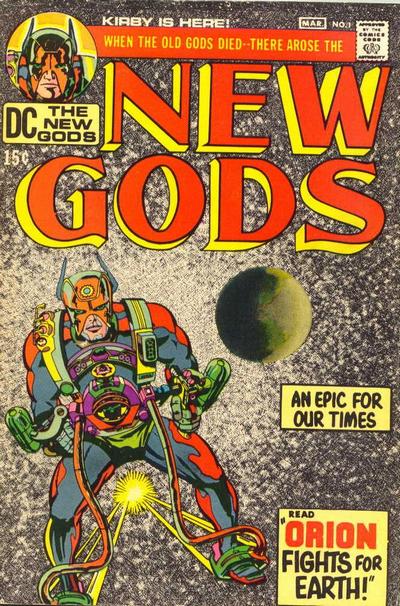
Let’s go back to the original, as published February-March 1971, so an on the stands date might be December 1970. (Scan thanks to Grand Comics Database.)
1971 – The New Gods #1 cover
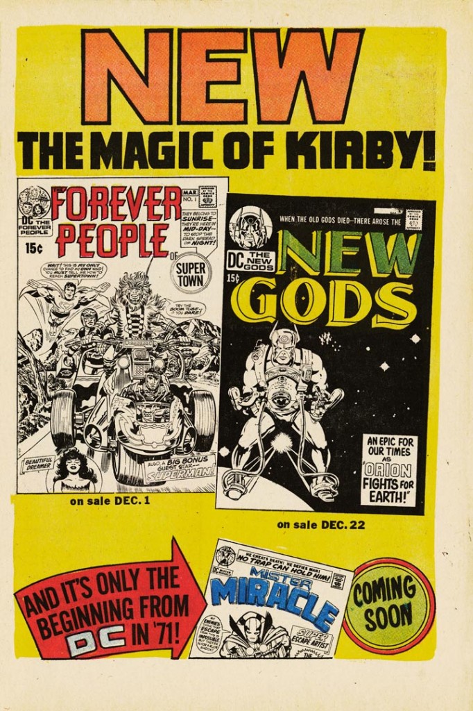
DC promoted the book with a house ad, here scanned from Superman’s Pal, Jimmy Olsen 134, published December 1970.
1970 – Kirby House Ad
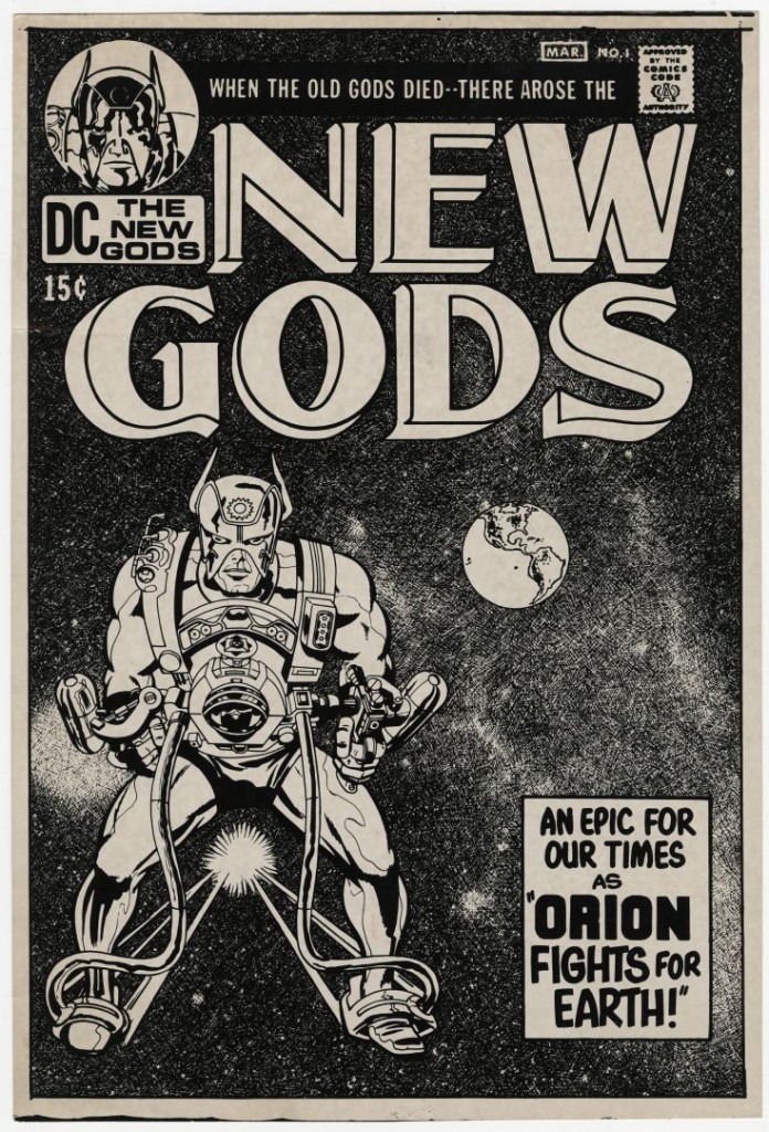
But, see the differences between what was published and the house ad? Well thanks to Greg Theakston’s gift of photostats to the Museum, we have an earlier version of the cover that looks a little more like the house ad.
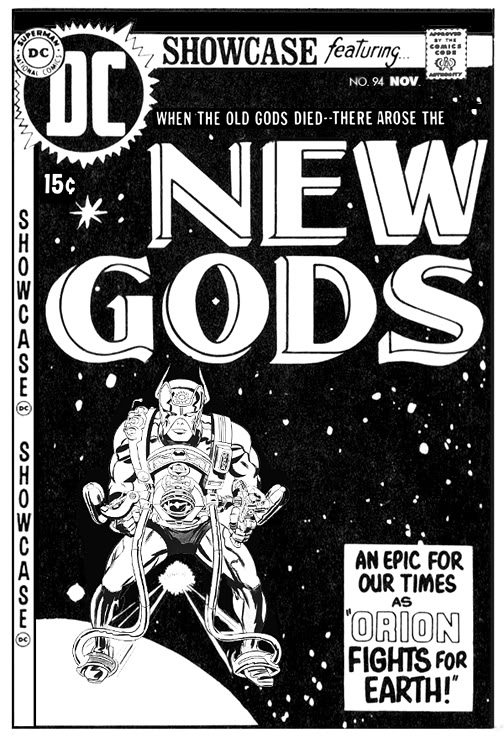
To go all the way back, however, here’s the comp for the cover of the New Gods issue of Showcase (94). Yes, DC originally wanted to introduce what came to be known as Kirby’s Fourth World in Showcase. Image thanks to Robby Reed’s Dial B For Blog!
1964 – The Mighty Thor Battles The Incredible Hulk! – page 10 original art
Writer Glen David Gold, writer/designer Steven Brower and I talked with Bruce who pulled together a fine piece regarding Kirby’s place in our culture considering the success of adaptations of his work in recent years, as well as the increase in value of his original art. The Museum’s efforts, especially the Pop-Up project, were mentioned, as well.
I pulled out a copy of LOOKING AHEAD a few nights ago and reread the Jack Kirby comic, as well as the other material (which you also posted on the excellent website).
Here, as best as I can recall, is the background of the inclusion:
In 1967 or 1968, as a young professor at Wright State University in Fairborn, Ohio, I’d become fascinated with the changes in science fiction since I’d started reading it early in my high school years. It seemed to me to be an important part of contemporary literature, and yet was scorned by Academics. There was, however, a small group of SF fans who were also English professors, and they had a small panel on SF at an Modern Language Association Convention in Chicago, which I attended.
I was taken aback to see that everyone in the room was in his (no hers) 60s or 70s, and all they could see in SF was its slight historical importance. And I was interested in its political, social, cultural importance, as well as its growing stylistic advances and relevance to the changes coming upon us at the end of the 1960s and start of the 1970s. I thought science fiction studies should be taught in college classrooms. Others scoffed.
Nonetheless, a fine editor (William Pullin) at Harcourt Brace agreed with me, and accepted my proposal for my first college textbook/anthology, SCIENCE FICTION: THE FUTURE. To make it “acceptable” by academics, I included what I considered important SF work or SF-oriented work by such as Nathaniel Hawtorne, Isaac Bashevis Singer, Donald Barthelme, Kurt Vonnegut, Jr., E.M. Forster, Kingsley Amis, Arthur Koestler, Susan Sontag, the great contemporary poet Richard Wilbur, and others, placing alongside this work pieces by H.G. Wells, Isaac Asimov, Robert Heinlein, Roger Zelazny, etc.
To our astonishment, the book was a major hit, adopted by schools throughout the nation (and world), taught as a reader in college freshman classrooms and in high school advanced classes, but also used as a book to allow professors to teach SF as an actual genre course (like “Satire” and “Comedy and Tragedy”).
It sold over 100,000 copies and within two years had 28 competing SF college texts.
Its success led my editor to ask for a second anthology along the same line. For this one, however, I didn’t have to be as careful about wining over college professors. With my wife, Lori Allen (then a SF writer; now, a poet writing as L.N. Allen), as co-editor, we were able to take more risks with LOOKING AHEAD.
One of these risks was to include an entire comic book in a college text/anthology.
The background here was that our son, Richard, now a United Methodist Minister in Sayville, Long Island, had become an utterly devoted comic books fan, and especially a fan of Jack Kirby’s work. He convinced my wife to read such comics as “The Forever People” and my wife convinced me to do likewise.
We had become convinced that serious quality literature, the kind beloved by academic journals and stuffy review magazines such as the NY Times Book Review was then, had reached a dead end and needed a good infusion of plot, action, heroism, return to some Romanticism, and the like. We were also convinced that the genre of SF or science fiction was increasingly a MAJOR way of examining the changed consciousness the world was entering (computers just beginning, space travel, modern warfare, youth revolution, sexual revolution, civil rights, gay rights, women’s revolution, and on and on).
The acute change of consciousness of the late 1960s-early 1970s was, we felt, reflected in the changing comics (with both Marvel and DC almost always SF-oriented) and at the time the best representative of these comics was this issue of “The Forever People.” It was particularly notable for its use of irony and humor, its myth-making, and most especially for its humanization of Superman, who realizes he’s actually a minority of one on the planet Earth, longs to return to be with others like him, but decides at the end of the comic that he will sacrifice his own desires for the good of others, for the good of humanity, for the good of the planet. This, of course, was a prevailing new mindset in the late 1960s-early 1970s–one which remains in the “Occupy” and “Green” movements, among many others. Additionally, we loved what looked like an allusion to Robert Heinlein’s very influential novel, STRANGER IN A STRANGE LAND, when Superman realizes that’s what he is!
Myth, religion, importance of popular culture, all were intertwining with the consciousness revolutions.
With the help of William Pullin, we got a reluctant and somewhat mystified DC Comics to allow us to reprint the comic, without charging us too much for reprint fees. And Harcourt’s book designers and printers found a way to reproduce the comic effectively in LOOKING AHEAD’s pages.
So, in our own way, we were maybe partially responsible for breaking the college barriers for science fiction and comics and popular literature as legitimate areas of study by academics and others (I’d also co-edited another genre volume: DETECTIVE FICTION: CRIME AND COMPROMISE, for Harcourt, which made possible other genre studies courses, and later a revised SCIENCE FICTION: THE FUTURE). All sold pretty well. LOOKING AHEAD, as I recall, sold about 50,000 copies. And after the initial shock of having an actual comic in a college classroom, professors grew accustomed to how our literature has changed.
As indeed it has, as you know and certainly the great Jack Kirby sensed deeply.
And the world of literary fiction has certainly changed, I think for the better, and we now get to see such perception altering movies as AVATAR and the STAR WARS movies, and so many important hero-stressing, archetypal movies, using comics as their basis, I long ago lost count. I felt, since the 1950s, that SF was THE form of literature best able to communicate to readers the nature of the world we were entering. This intuition seems to have been born out, sometimes to the extent to my wife and me feeling almost guilty about encouraging so many “pop literature” studies which students may take instead of Shakespeare and Milton and “The Eighteenth Century in Literature.” 🙂 or :-(.
Hope some of this nostalgia may have amused you.
All best wishes and further congratulations and thanks for your work with the Jack Kirby Museum.
Dick
P.S. Lori’s comment, when she checked over the above:
“This was a great age of comics. Saddens me that now comics are read mainly by young adults, not by children, and that there’s so much more action than text that we’re nearing the world of Fahrenheit 451.”
We use cookies to personalise content and ads, to provide social media features and to analyse our traffic. We also share information about your use of our site with our social media, advertising and analytics partners.
Cookies settings
Accept
Decline
Privacy & Cookie policy
Privacy & Cookies policy
Cookies list
Cookie name
Active
Privacy Policy
What information do we collect?
We collect information from you when you register on our site or place an order.
When ordering or registering on our site, as appropriate, you may be asked to enter your: name, e-mail address or mailing address.
What do we use your information for?
Any of the information we collect from you may be used in one of the following ways:
To personalize your experience
(your information helps us to better respond to your individual needs)
To improve our website
(we continually strive to improve our website offerings based on the information and feedback we receive from you)
To improve customer service
(your information helps us to more effectively respond to your customer service requests and support needs)
To process transactions
Your information, whether public or private, will not be sold, exchanged, transferred, or given to any other company for any reason whatsoever, without your consent, other than for the express purpose of delivering the purchased product or service requested.
To administer a contest, promotion, survey or other site feature
To send periodic emails
The email address you provide for order processing, will only be used to send you information and updates pertaining to your order.
How do we protect your information?
We implement a variety of security measures to maintain the safety of your personal information when you place an order or enter, submit, or access your personal information.
We offer the use of a secure server. All supplied sensitive/credit information is transmitted via Secure Socket Layer (SSL) technology and then encrypted into our Payment gateway providers database only to be accessible by those authorized with special access rights to such systems, and are required to?keep the information confidential.
After a transaction, your private information (credit cards, social security numbers, financials, etc.) will not be kept on file for more than 60 days.
Do we use cookies?
Yes (Cookies are small files that a site or its service provider transfers to your computers hard drive through your Web browser (if you allow) that enables the sites or service providers systems to recognize your browser and capture and remember certain information
We use cookies to help us remember and process the items in your shopping cart, understand and save your preferences for future visits, keep track of advertisements and compile aggregate data about site traffic and site interaction so that we can offer better site experiences and tools in the future. We may contract with third-party service providers to assist us in better understanding our site visitors. These service providers are not permitted to use the information collected on our behalf except to help us conduct and improve our business.
If you prefer, you can choose to have your computer warn you each time a cookie is being sent, or you can choose to turn off all cookies via your browser settings. Like most websites, if you turn your cookies off, some of our services may not function properly. However, you can still place orders by contacting customer service.
Google Analytics
We use Google Analytics on our sites for anonymous reporting of site usage and for advertising on the site. If you would like to opt-out of Google Analytics monitoring your behaviour on our sites please use this link (https://tools.google.com/dlpage/gaoptout/)
Do we disclose any information to outside parties?
We do not sell, trade, or otherwise transfer to outside parties your personally identifiable information. This does not include trusted third parties who assist us in operating our website, conducting our business, or servicing you, so long as those parties agree to keep this information confidential. We may also release your information when we believe release is appropriate to comply with the law, enforce our site policies, or protect ours or others rights, property, or safety. However, non-personally identifiable visitor information may be provided to other parties for marketing, advertising, or other uses.
Registration
The minimum information we need to register you is your name, email address and a password. We will ask you more questions for different services, including sales promotions. Unless we say otherwise, you have to answer all the registration questions.
We may also ask some other, voluntary questions during registration for certain services (for example, professional networks) so we can gain a clearer understanding of who you are. This also allows us to personalise services for you.
To assist us in our marketing, in addition to the data that you provide to us if you register, we may also obtain data from trusted third parties to help us understand what you might be interested in. This ‘profiling’ information is produced from a variety of sources, including publicly available data (such as the electoral roll) or from sources such as surveys and polls where you have given your permission for your data to be shared. You can choose not to have such data shared with the Guardian from these sources by logging into your account and changing the settings in the privacy section.
After you have registered, and with your permission, we may send you emails we think may interest you. Newsletters may be personalised based on what you have been reading on theguardian.com. At any time you can decide not to receive these emails and will be able to ‘unsubscribe’.
Logging in using social networking credentials
If you log-in to our sites using a Facebook log-in, you are granting permission to Facebook to share your user details with us. This will include your name, email address, date of birth and location which will then be used to form a Guardian identity. You can also use your picture from Facebook as part of your profile. This will also allow us and Facebook to share your, networks, user ID and any other information you choose to share according to your Facebook account settings. If you remove the Guardian app from your Facebook settings, we will no longer have access to this information.
If you log-in to our sites using a Google log-in, you grant permission to Google to share your user details with us. This will include your name, email address, date of birth, sex and location which we will then use to form a Guardian identity. You may use your picture from Google as part of your profile. This also allows us to share your networks, user ID and any other information you choose to share according to your Google account settings. If you remove the Guardian from your Google settings, we will no longer have access to this information.
If you log-in to our sites using a twitter log-in, we receive your avatar (the small picture that appears next to your tweets) and twitter username.
We are in compliance with the requirements of COPPA (Childrens Online Privacy Protection Act), we do not collect any information from anyone under 13 years of age. Our website, products and services are all directed to people who are at least 13 years old or older.
Updating your personal information
We offer a ‘My details’ page (also known as Dashboard), where you can update your personal information at any time, and change your marketing preferences. You can get to this page from most pages on the site – simply click on the ‘My details’ link at the top of the screen when you are signed in.
Online Privacy Policy Only
This online privacy policy applies only to information collected through our website and not to information collected offline.
Your Consent
By using our site, you consent to our privacy policy.
Changes to our Privacy Policy
If we decide to change our privacy policy, we will post those changes on this page.


")