Lovely Thor pencils

by

Some wonderfully clear stat camera photographs of Kirby’s pencils recently appeared on Tom Kraft’s What If Kirby site. They were all Thor pages from the mid 1960’s. The first displayed here is from the Tales of Asgard feature in Journey Into Mystery #112, the third page of The Coming of Loki. I am often a defender of Vince Colletta’s style on Thor, because of his archaic feathering look, but one look at these pencils shows me just how little of Kirby’s nuanced line Colletta actually reproduces here with any accuracy.

Thor 112 Asgard 1


Compare in particular, the difference in the subtleties of the pencil-sculpted shapes in the legs, both in fabric and sinew to the inked version. Colletta doesn’t even begin to ink the actual pencil line, but blunts and deadens the fluidity of its intent.

The figures in the background suffer most grievously. Given, this is a complex work of art containing multiple figures, but this important feature certainly should have been given the attention that it deserved.

Thor JIM 112 color

The following page below is a wonderful melee of fairly close figures coming together from two directions. The circular composition brings the eye around and around in a spiral as we first see the action on the boundaries and gradually work our way to the center and the leftward thrusting shield.

Thor 112 Asgard

The inked version of the large panel is OK for the most part, although it isn’t as sharp as it could be. However, the second and third panels are an abomination. Look at the subtle shaping and shading of the shadowed figures in panel two, and see how Colletta has totally blacked them out and obscured any of their subtleties. And what the hell has he done to the space above the figures that Kirby has modeled with cloud formations? How can you justify this mass of grotesque crosshatching and solid black that the inker has imposed over a powerful composition.
Colletta’s inked third panel is nearly as bad. In the penciled version. Odin’s figure and the space that he inhabits is a wondrous tableaux in miniature, and could stand on its own as a splash panel for its complex composition of figures in battle. From the archer at its base, to the shaded horseman and dramatic sky it seethes with power.

Thor 112 Loki color

Colletta reduces all of this splendor to dross. Odin’s face, torso and limbs are treated with the contempt of the inker barely following the intent of the line work. The horse is of course almost completely blacked over. The majesty of the sky is scribbled as an incompetent child might do.

What one sees most clearly in these pencils is how the slightest deviation from the precision of Kirby’s line can substantially nullify its force. One sees this even in the case of a fairly faithful inker like Chic Stone or Joe Sinnott. Certainly, there have been instances when Colletta’s pen or brush did justice to Kirby’s pencils. One need only look at the beauty of his brushwork on this Thor #142 page below to see that the man had serious chops. Why is his work then so inconsistent.

1- Thor 142

Perhaps Colletta was giving some of his work to assistants to complete, due to the pressure of deadlines. Still, this is no excuse to have so severely compromised some of the most compelling comics ever produced.

One can only be grateful for pencil copies such as these that Tom has compiled, to know what might have been. Pity there isn’t more out there.

Image 1and 3- pencils from Journey Into Mystery #112  Jack Kirby, Stan Lee

Image 2 and 4- Masterworks reprint from Journey Into Mystery#112, Jack Kirby, Stan Lee, Vince Colletta

Image 5- Thor #142, Jack Kirby, Stan Lee, Vince Colletta

Thanks again to Tom Kraft


Muscular Composition

by

As a ten year old, going to the Saturday matinee neighborhood films in the Bronx of the early 1960’s was always a treat for me. The Hammer horror craze was in full swing as well as a plethora of Sci fi and monster films, and a generous supply of Tarzan and Sword and Sandal movies. The king of the S&S craze was certainly the great Steve Reeves, who was as handsome as a Greek God and sported a symmetrically classical physique that is even today considered to be the prototype for the modern bodybuilder.


Steve Reeves


As a budding artist, interested in sequential action, I was galvanized by Reeves’ lyrical musculature in motion on the screen. I was also inspired to begin training with weights, as were many others such as Arnold Schwarzenegger and Sylvester Stallone, upon viewing Reeves onscreen for the first time.

The Hercules films that Reeves starred in were top box office draws worldwide, and they even spawned a comic book that I was later to discover had been drawn by Marvel superstar artist John Buscema. That artist, who was developing a drawing style obviously inspired by Greco-Roman and Renaissance figure work was nearly perfect for the assignment.

It is interesting to study Buscema’s work at this point in his career. One can easily see that he understood anatomy very well and was comfortable rendering realistic musculature from a variety of angles. Still, his total page design is not consistently strong. If we look at this Hercules page below, the figure in the second panel is not optimally positioned and does not look very forceful while snapping the chain. This is a drawing of a static human back, almost a bodybuilding pose. The drawing is subservient to the muscles rather than to the motion. Kirby would never do that. He would distort or emphasize some aspect of the anatomy to suggest a violent action

Although the melee in the long third panel is well drawn, it could be better arranged in terms of the placement of figures in relationship to one another. The focal point of this panel should be Hercules, but instead the eye goes to the sword wielding soldier or the small figure speaking in the center.

Hercules #4

When Buscema started working for Marvel in the late sixties, it is said that he was encouraged by Stan Lee to draw more like Kirby. Although the King did not spend a great deal of time on perfectly rendered anatomy, he nearly always designed his panels and pages for maximum dynamic tension and release. This tendency would have been what Lee was stressing for all of his artists to emulate. When asked in an interview published in the Jack Kirby Collector #18, what he had learned from Kirby, Buscema replied,

“The layouts, for cryin’ out loud! I copied! Every time I needed a panel, I’d look up at one of his panels and just rearrange it. If you look at some of the early stuff I did – y’know, where Kirby had the explosions with a bunch of guys flying all over the place? I’d swipe them cold!”


Cap shield sweep full

If we study this page above from Sgt. Fury #13, we see an almost scientific precision in the relationship between Kirby’s figures, not only within the space of the panel, but in the movement from panel to panel. Every figure on the page is in its optimal position for the balance of the composition, to propel the action as well as the story. Kirby uses the human body in all its kinetic contortions to move the eye precisely where he wants it to go. Look for example at the panoramic third panel and notice the relationship of the flying figures to the arc of Cap’s swinging shield. It is almost as if they were arranged in specific coordinate points on a spinning wheel.

Conan Buscema

If we then look above at John Buscema’s art on Conan,  we see a great sea change in his compositional abilities. This page from Savage Sword Super Special 1977 is a masterful use of page space by the artist, as he uses various figures and objects to move the eye around. Notice the elbow of the seated cup bearer in the right middle ground of panel one pointing to panel two. Next, see the seated pirate’s hand gesture towards panel three and Conan’s back. That shape mass  picks up the diagonal of the table moving the eye to the fourth panel.

This is a very Kirby-like way to compose a page. Buscema has learned well, and is using the panel’s contents in a much more abstract manner. As a result, has become both a better artist and a more successful storyteller.

Image 1-Steve Reeves, Hercules

Image 2-John Buscema, Hercules, Dell publications 1959

Image 3- Sgt. Fury 13 Jack Kirby, Stan Lee, Dick Ayers

Image 4- Savage Sword of Conan Super Special 1977, John Buscema, Roy Thomas, Alfredo Alcala.

John Buscema quote from The Jack Kirby Collector #18

Thanks to Rod Beck for the Hercules artwork.

Avenging Injustice

by

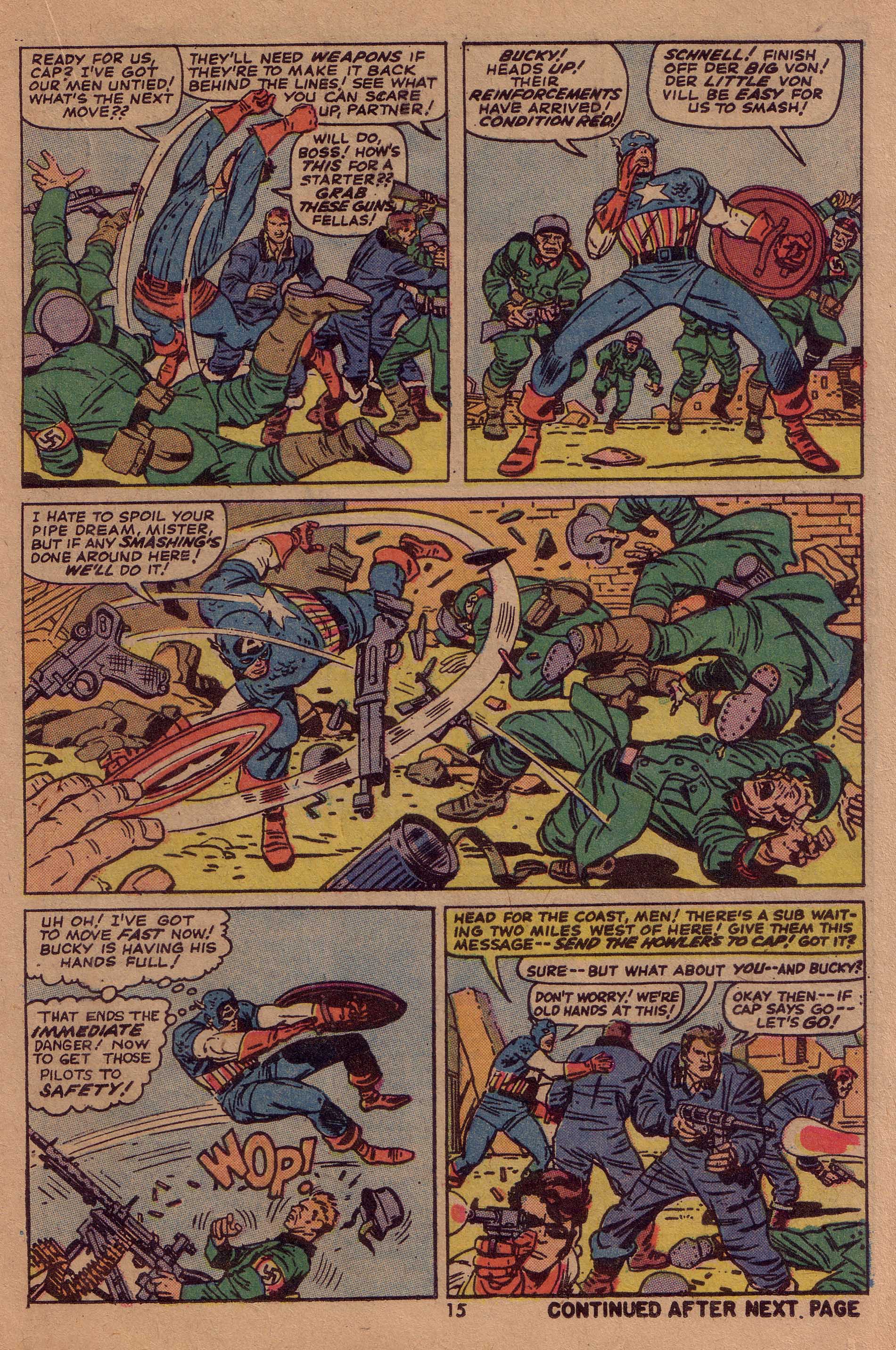
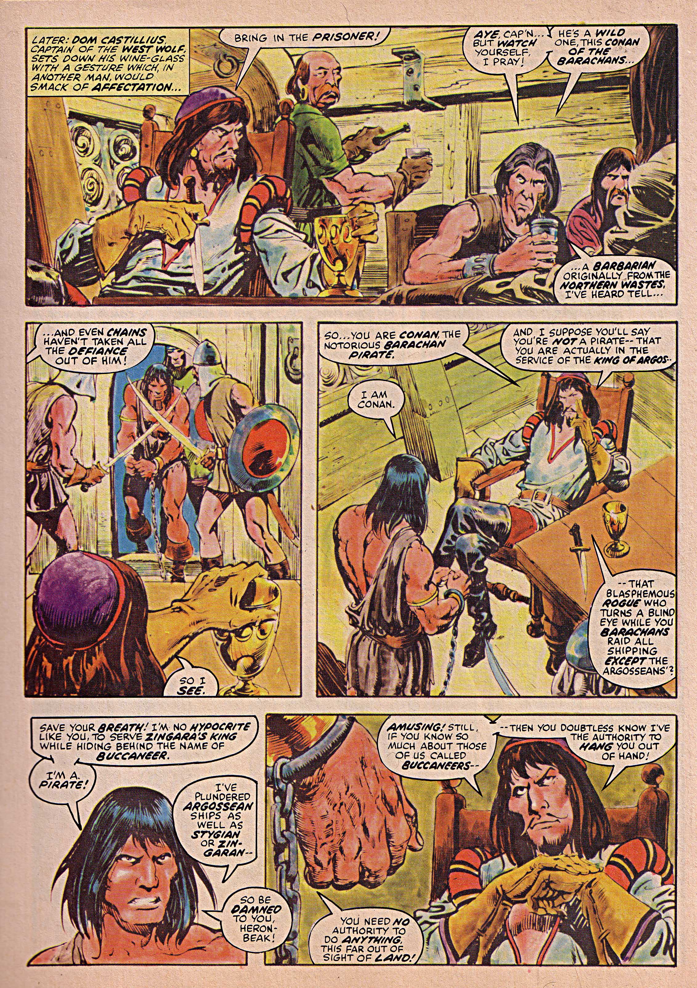
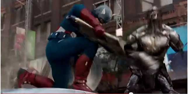
I finally broke down and borrowed the Avengers movie from my local library, so I essentially wasn’t making Marvel/Disney any richer.  After all of the hype about how good the movie was, I was left pretty cold by it. It didn’t suck, but it seemed overrated. The Avengers starts slowly and takes some time to get off the ground.  Much of the early action is dark and murky, taking place at night. The action towards the ending is of a fairly high quality but I have to say that I’m a bit burned out on this sort of thing. My favorite actor in the film is certainly Chris Evans’ Captain America, who projects a certain purity and earnestness that is very appealing. He has a nice bit on top of a car, repelling aliens, which is quite Kirby-esque. (shown below)

Avengers film Cap

The cinematographer often uses the King’s forced perspective trick by having much of the action coming out of the screen and towards the viewer. Robert Downey’s Iron Man is also an amusing characterization and Tom Hiddleston’s Loki is appropriately sinister.

Anyway, it got me thinking about such films in general, particularly those based on characters created and animated by Jack Kirby. The King worked briefly in animation at the start of his career, and his work has always displayed a strong cinematic edge. In a quote from a May, 2008 NY Times editorial, Kirby explained,

“It’s kind of a John Henry concept where you have to compete with the camera, and, of course, you’re bound to lose because your medium is much more limited — it just hasn’t got the scope of the camera.’’

As the article continues, the editorialist, Brent Staples disagrees. “I hate to dispute The King, but I flatly disagree. Even the best of the movies reach moments where the action stops and the characters have to stand still, essentially doing nothing. On film, they often go dead, like so many dolls in a toy store window. In a Kirby comic, even when standing stock still, they would be radiating an intensity that film cannot convey.”

And this is certainly the case if we compare even the best superhero movie with a Kirby comic. Kirby’s mastery is in the ability to find the peak moment of action as well, which is also why one of his panels is often more dynamic than a live action sequence. When one sees for example, a power hitter connect for a home run, there is a moment where that swing is at its most forceful kinetically, but we are seldom ever able to see that fraction of a second. Kirby not only isolates it, he also amplifies it by exaggerating various aspects of human anatomy and perspective. That said, director Joss Whedon does an excellent  job with action sequences in the movie.

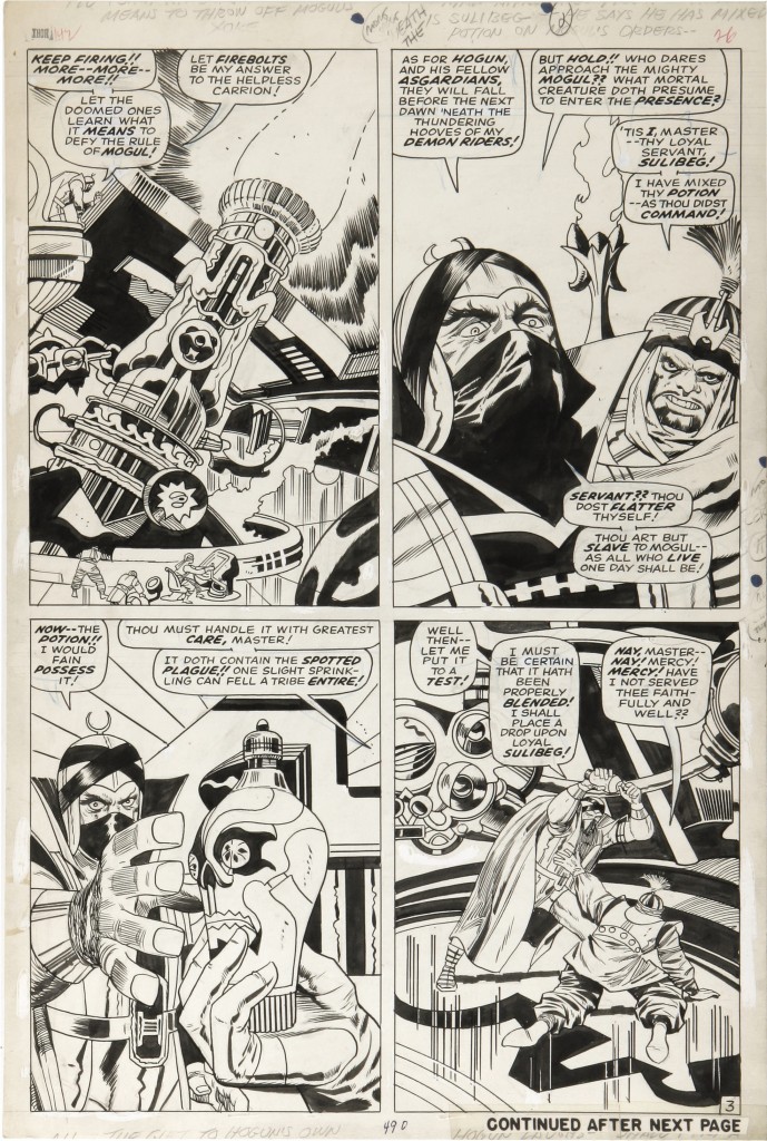
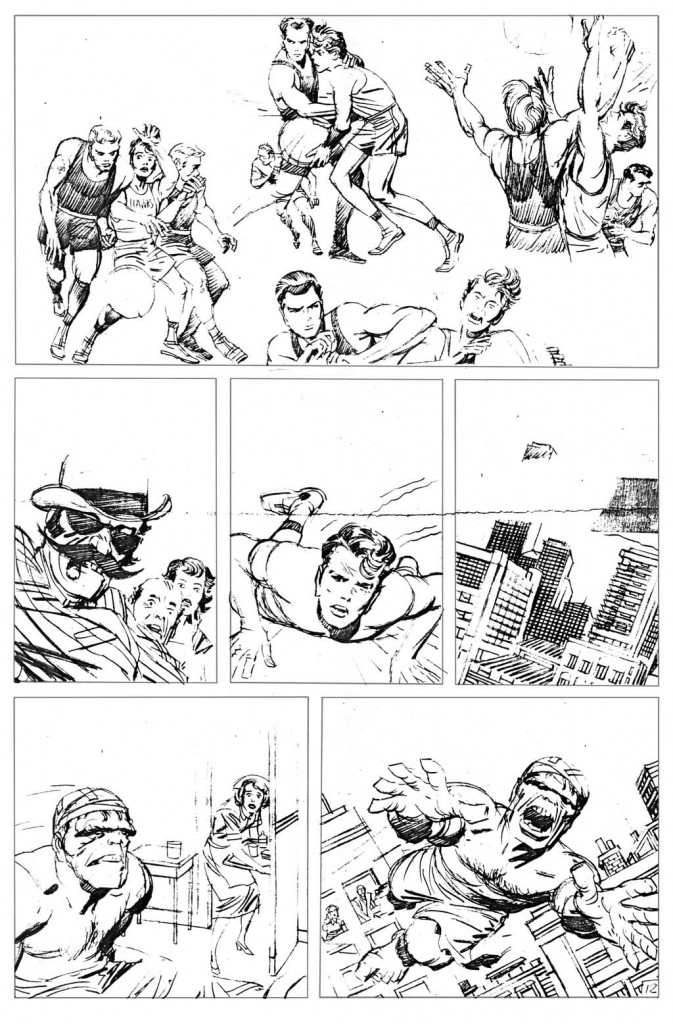
The Avengers film is more or less an updated version of Avengers #1, published in 1963. Basically, the Avengers come together in order to foil a scheme hatched by the insidious Loki. In the film, Loki enlists the aid of some nasty aliens, whereas in the comic he merely manipulates the Hulk and the Avengers into battle with one another, wherein they eventually team up to defeat him. Here, we see page two of the first issue, where Loki tracks the Hulk’s whereabouts as his evil scheme solidifies.

Avengers #1 pg 2

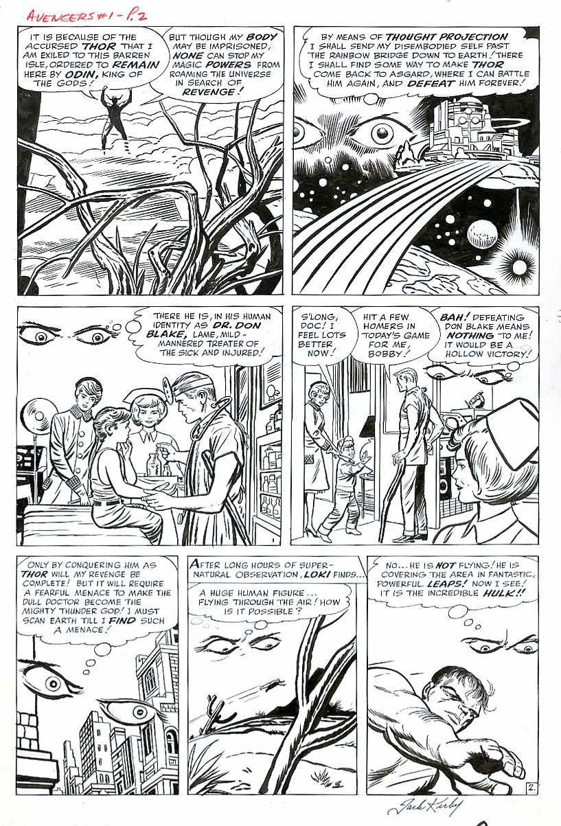
Kirby gives us a fantastic view of Asgard through Loki’s roving eyes, which eventually make their way to earth and finally settle on the airborne Hulk.  Kirby is the comic book equivalent of the consummate film editor as he weaves his story with masterful panel transitions, and I’ve seldom seen a movie that uses space and time so effectively as his comic art does.

Avengers #1 pg14

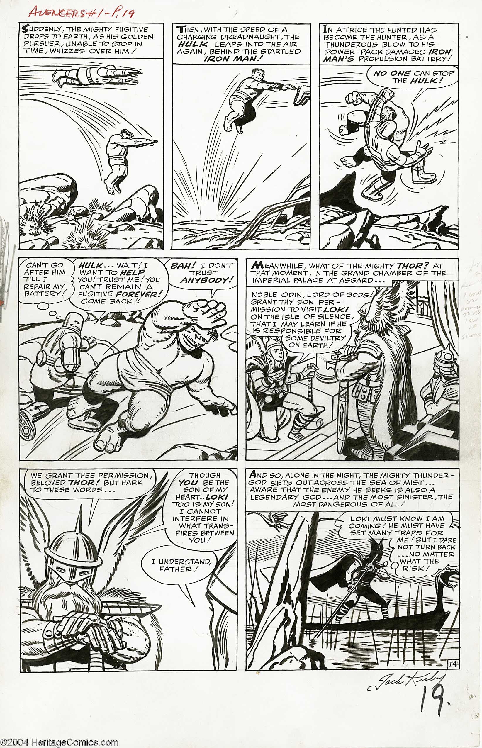
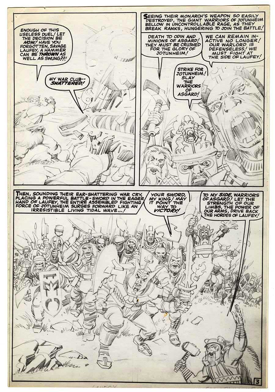
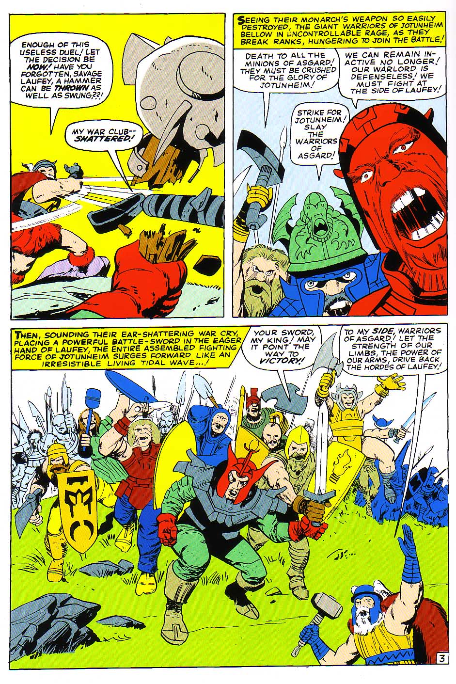
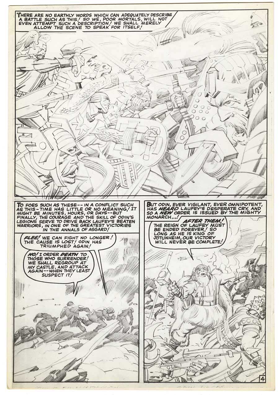
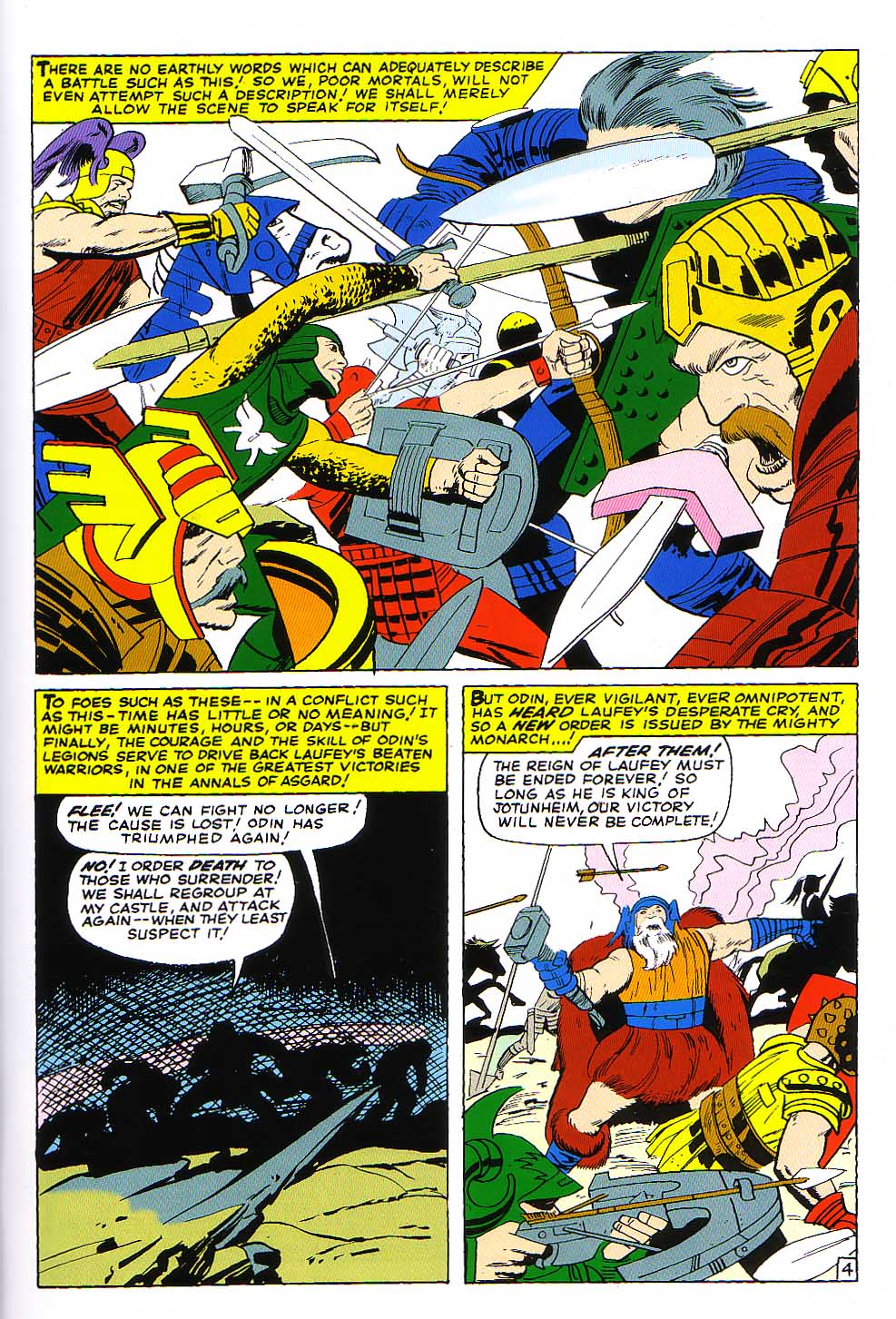
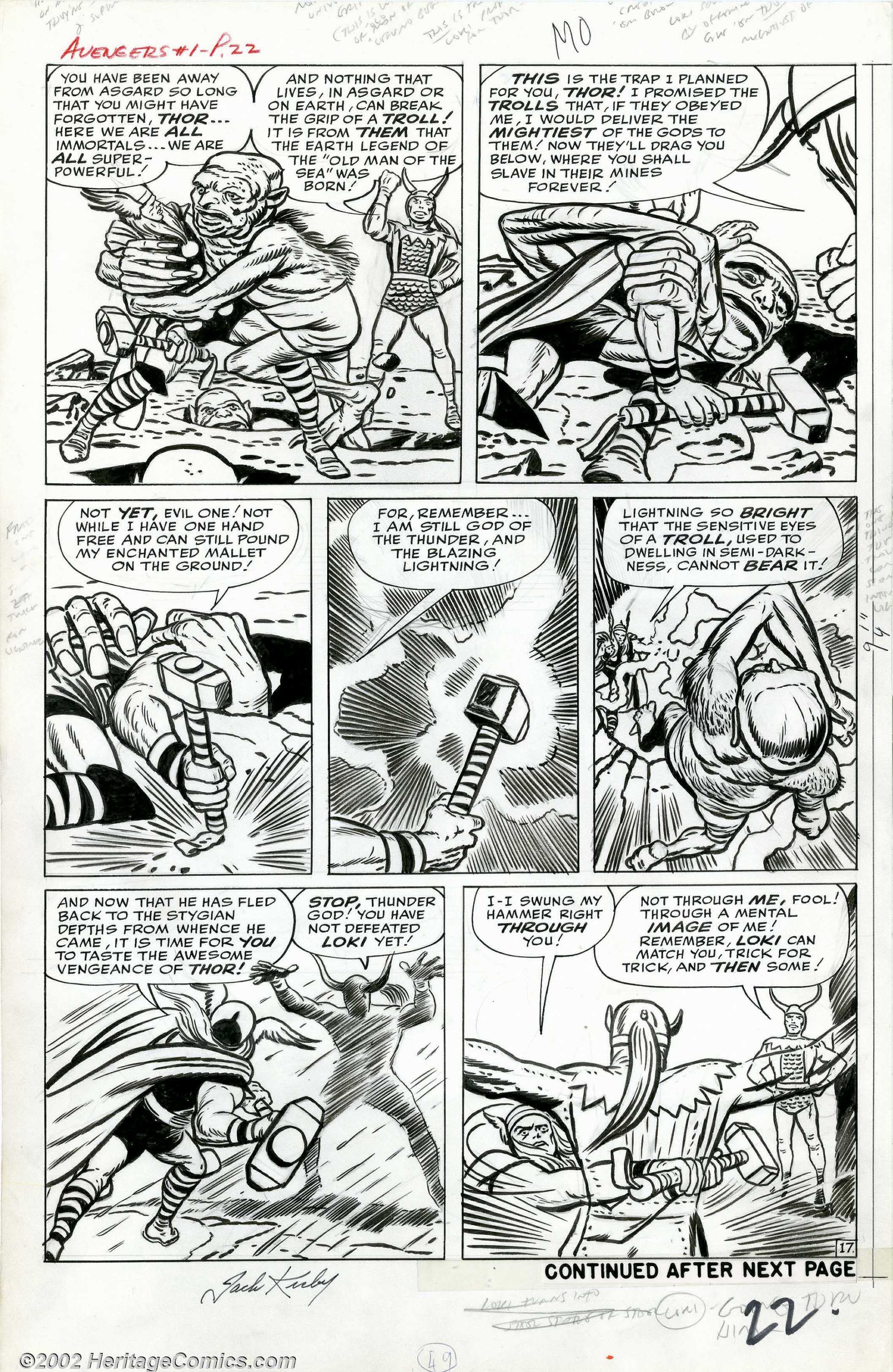
Later on page 14, above we see Iron Man briefly face off against the Hulk and the former is defeated. Notice the cinematic nature of the sequence, where the Hulk’s downward motion trail in panel one moves upward in the second panel. The Hulk then leaps away, snarling his distrust. The scene shifts to Asgard, where Thor seeks out Loki with the aid of his father Odin. The following page below is a wonderment of fantasy action that any filmmaker would be fortunate to match, as Thor wrestles with a demonic Troll, casting him into the depths of a pit.

Avengers #1 pg 17

The original Hulk as presented in his own 1962 comic as well as in the Avengers’ first issue was a fairly intelligent and shrewd character, but also one seething with rage and resentment. He was so belligerent that he was utterly incapable of being part of a team, and he was out of the Avengers by the third issue. As time went by, he became more and more incoherent, eventually becoming similar to the character that we see in the film, essentially a brainless hunk of muscle.

It seems that whenever Kirby was plotting the Hulk, as he did in the 1962 comic and in the first three issues of the Avengers, he made the character intelligent, along the lines of the original Mr. Hyde or Frankenstein’s monster as written by Mary Shelly. As soon as Kirby was no longer plotting the character, the Hulk reverted to a half-witted creature.  Kirby also plotted the Hulk series in Tales to Astonish beginning with issue #68 and shortly thereafter, the character regained his lost intelligence for a time. In the two Hulk films as well as the Avengers movie, the Hulk is a computer generated image or CGI creation, and is presented as a fairly mindless engine of destruction.  I don’t much care for the look or the persona of the movie Hulk. Kirby’s original wily and sinister Hulk is for me a much more compelling and fascinating creature and I would have much preferred to see that character onscreen.

Allow me to digress here. One can draw an interesting parallel between the way the Hulk was treated throughout his comic book and film history and the way that Jack Kirby was perceived and treated by Stan Lee and Marvel over time. Kirby seemed to identify with the Thing and the Hulk, characters who, like him were rough edged and uncouth, possessing robust physical strength and animal vitality. It was easy for some to overlook Kirby’s intellectual and introspective side, as did a Herald Tribune journalist doing a 1966 piece on Marvel when he described Kirby as looking “like the assistant foreman in a girdle factory.” It may be a bit far fetched, but my feeling is that Kirby’s urge to make the Hulk intelligent reflected his own desire to be perceived as someone with a mind to be reckoned with. It is easy to see the Hulk emasculated of intelligence in a similar way that being categorized as merely an artist somewhat emasculated Kirby.

Many people saw Kirby as a sort of idiot savant, who needed Stan Lee to make his ideas coherent. Artists are often seen as being blessed with god given talent, but few people are aware of the amount of work that is required to hone that talent and the intelligence that is necessary to apply it. In the early days of the Comic book field, the businessmen that controlled the purse strings did not generally give artists much respect. Just as physical power is often perceived as being less threatening without a brain to support it, Kirby as merely a tool to interpret Stan Lee’s ideas became less threatening even in an art form dominated by its visuals.

In a 1968 interview in the magazine Castle of Frankenstein, Lee originally stated: “Some artists, such as Jack Kirby, need no plot at all. I mean I’ll just say to Jack, ‘Let’s make the next villain be Dr. Doom’… or I may not even say that. He may tell me. And then he goes home and does it. He’s good at plots. I’m sure he’s a thousand times better than I. He just about makes up the plots for these stories. All I do is a little editing… I may tell him he’s gone too far in one direction or another. Of course, occasionally I’ll give him a plot, but we’re practically both the writers on the things. ”

When in 2009, Kirby’s family attempted to claim the copyrights to characters that Kirby had more than a hand in creating, Marvel/Disney sued them in New York federal court, claiming that the characters had been created as work for hire. Suddenly, Stan Lee was less effusive in his praise for Kirby’s creative abilities. In his May 13, 2010 deposition, Lee explained away the glowing praise and credit that he had given Kirby thusly:

“I tried to write these (The Origins books) —knowing Jack would read them—I tried to make it look as if he and I were doing everything together, to make him (Kirby) feel good. But with something like Galactus it was me who said, “I want to do a demi-god. I want to call him Galactus.”
Jack said it was a wonderful idea, and he drew a wonderful one, and he did a great job on it. But in writing the book (Origins of Marvel Comics) I wanted to make it look as if we did it together. So I said we were both thinking about it, and we came up with Galactus.”

Now, we can clearly see Stan Lee’s margin notes on these Avengers pages. Judging by the account in my last blog entry of Kirby’s delivering some 1962 Hulk pages to Lee, and seeing that some were marked with notes prior to Kirby’s storming out and tearing the pages in half, we can surmise that a similar process has occurred with the Avengers pages as well. That is, Kirby had brought Lee a complete Avengers story to dialog and Lee made notes during his meeting with Kirby for the former’s scripting efficiency. These pages date to more than a year before most comic scholars surmise that the Marvel method went into effect, that being the plotter/artist leaving his own notes in the margin for the scripter to follow. Clearly, at some point it was decided that instead of Kirby coming into the Marvel offices with his plotted artwork for a story conference, it was more efficient to mail the pages with his own notes.

If the evidence shows that Kirby was  plotting stories prior to meeting with Lee, what reason would we have to believe Lee’s testimony that Kirby was not a major part of the creative process. Obviously, we are dealing with a highly volatile issue here, concerning several parties telling very different stories about a process. We can only look at the evidence, and in this case it appears to tell us that Jack Kirby was plotting and delivering ideas and characters, either from the beginning of his tenure at Marvel or certainly very shortly thereafter. Not only does Kirby’s body of work as a comic book professional verify this, the various people that worked with him over the decades confirm the fact that Jack Kirby had been a primary creative force for as long as he worked in comics.

The simple fact is that Disney/Marvel has made and stands to make untold billions from these properties, and they need to recognize and properly compensate Jack Kirby’s estate for his amazing contributions to their empire.

Image 1-Marvel’s The Avengers

All other images from The Avengers #1 Jack Kirby, Stan Lee, Dick Ayers

All scans of original art courtesy of Heritage Comics

Brent Staples quote from New York Times May, 14 2008 The Man Behind Iron Man.

Stan Lee quotes from Castle of Frankenstein 1966 and New York Federal, Court May 13, 2010

Thanks to Patrick Ford and Steven Brower for their assistance.


Margin Notes part 2

by

As time goes by, I find myself more increasingly pondering  how Jack Kirby worked as a writer/artist when he began working for Marvel in the late 1950’s and early 60’s. Conventional wisdom has him working in those early days from scripts by Stan Lee, Larry Lieber and Robert Burns and then only later switching to the more self-propelled Marvel Method, when Stan Lee became to busy to write scripts. Kirby has always insisted that he always wrote his own stories, and others that worked with him through the years generally support his claim that he plotted and wrote most of the stories that he drew.

In an earlier blog post, I suggested that Kirby began working Marvel style in 1965 or thereabouts when he began to put margin notes on his pages as a guide to his scripter, usually Stan Lee. Now I am beginning to reconsider that notion.

1- Thor 142

Here is an example above from Thor #142 from 1967, a period most people consider to be well into the Marvel Method. One can clearly see Kirby’s copious notes in the margins of the page.

Kirby was also doing layouts for other artists prior to and during that period. Here is a rough layout below that the King did for Johnny Romita for 1966’s Daredevil#12, which the latter ended up not using. Romita did however use the bare bones of the plot that Kirby provided along with the layout, as can be seen in the extensive border notes throughout the page margins. Clearly, Stan Lee was already used to relying on Kirby to teach fledgling artists to plot stories for Lee to dialog. Prior to 1966, the process between Lee and Kirby is a bit more hazy.

2-Daredevil Kirby layout


However, one telling piece of evidence is the existence of five Incredible Hulk pages, circa 1962, that would have appeared in issue six of that comic. The story, related by Larry Lieber is that he was waiting outside of Stan Lee’s office at Marvel Comics when Kirby emerged. The King was carrying a handful of comic pages and was visibly upset. He then tore the pages in half and threw them in a trashcan, before storming out. Lieber retrieved the torn pages and saved them, realizing that they were valuable at that moment, if only to him as an admirer of Kirby. Lieber believed that Stan Lee had rejected the pages and that was the reason that Kirby had destroyed them in anger.

Hulk rejected page 9


One of the most interesting aspects of this story is that several of the pages  have what appear to be some notes scribbled by Lee. This suggests that Kirby was in the habit of supplying complete stories to Lee to dialog even as far back as 1962, except that in this case Kirby would bring in the stories personally in order to guide Lee in scripting them. Later on, Kirby would simply mail the completed pages with margin notes, making it unnecessary for him to make the trip into the city. As one can see, some of the remaining pages contain none of Lee’s writing, suggesting that he was in the process of taking notes notes when the disagreement ensued.

4-Hulk page rejected 12

What is also very cool here is that one can very easily see the line where the pages were torn in half. These pages are one of the most compelling pieces of evidence that Kirby was plotting his stories prior to any involvement with Lee, at least as early as 1962, if not even before that period.

item 1-Thor 142, Jack Kirby, Stan Lee, Vince Coletta

Item 2-Daredevil layout Jack Kirby

Items 3-4 penciled Hulk pages by Jack Kirby owned by Larry Lieber

Thanks to Rand Hoppe and Patrick Ford

Overlapping

by

Anyone who has followed my column even briefly has probably recognized that I go on quite regularly about Kirby’s use of Deep Space.  One of the ways the artist creates the illusion of depth is to overlap his figures in a way that accentuates the space between and around them. After all, one can draw all manner of perspective lines, objects and other cues, but unless the figures are arranged just so, the effect will not be optimized.

1-Cap ToS 67

Take for example this page from Tales of Suspense #67 above. The first panel has to be one of my all-time favorite Kirby compositions. There is minimal background information here, but the King creates an incredible deep space scene merely by using the overlapping of figures. The eye enters the panel in the left background knot of wrestling bodies. From that clump, the overlapping central Nazi emerges, his right leg reaching backward, left leg bent and head and torso moving forward and to the right. His support propels Captain America into the focus of the panel. It is Cap’s shield that is the closest shape to us.  This tableau creates an amazing sense of sequential time as well as space. The reader/viewer cannot help but to see the panel unfold as an explosion of motion from left rear past to right present forward, a brilliant exposition of four-dimensional space-time. It is clearly the sequence, size and overlapping of the series of figures that is responsible for this remarkable illusion.

2-ToS #68 pg 2

Above, on page two of the following issue, we are again treated to some of Kirby’s greatest panels of figures interacting to create movement in space/time. The first panel shows Cap flipping a Nazi while Bucky enters stage right with a blazing machine gun. All the figures are approximately the same size, so the positioning of the overlapping is crucial for their clarity and dynamism. For instance, the flipped Nazi is closest to us in panel space and is the first thing that we see as he is being thrown in our faces. The “Wonk” sound effect emphasizes this dynamic by breaking the panel borders

The final panel is positively crammed with figures and very clearly reads from left to right as each small group displays its individual interactions. Although initially appearing chaotic, the scene is actually composed of several distinct confrontations and in this case, Lee’s fairly minimal placement of balloons works harmoniously with Kirby’s sequence of events. The upshot is that despite the crowd, we still perceive Captain America to be the main focus of attention.

3-ToS #68 #pg 3

I include the following page above as a perfect example of when in my opinion Lee’s dialog doesn’t support the visuals and in fact undercuts them completely. This story was crafted by the Marvel method, wherein Kirby is plotting and drawing the story and Lee is adding dialog at a later stage. This segment featuring the Red Skull opens in his office, where his subordinate is informing him that his well-laid plan has failed. The force of the panel in which the Skull is driving his dagger into his desk seems to me a gesture of rage and frustration over the bad news he is receiving. This rage is reinforced by the body language of the subordinate standing frozen at attention to his left.

Instead, Lee’s dialog has the Skull describing a new plot. The Red Skull’s overlapped figure really dominates the panel with his powerful downward motion, and in my opinion Lee’s verbiage is simply not sufficiently dramatic to justify the Skull’s grand gesture with the knife.

I may be over reacting to this, but I think it’s important to note these sorts of discrepancies. Kirby and Lee’s collaboration is usually described as the whole being greater than the sum of its parts, but in this instance it is not. Since Lee has been given credit for writing this story that was initially crafted by Kirby,  in this case, the two authors are actually working at cross purposes.


Image 1- Jack Kirby Stan Lee Tales of Suspense #67

Image 2-Jack Kirby, Stan Lee, Tales of Suspense #68

Image 3-Ibid

Fantastic Voyage

by

For me, one of Kirby’s most visually inventive stories of the 60’s appeared in Fantastic Four #76, with a July 1968 cover date. The story was entitled, “Stranded in Sub-Atomica,” wherein the group followed the Silver Surfer into a microscopic universe. Of course, the FF had been down that road before when they had faced Dr. Doom in issue #16, but this story appeared to take more than a bit of its inspiration from the 1966 Sci-fi film “Fantastic Voyage.” Although the film follows a mission of miniaturized scientists inside a human body, it still focuses on the nature of a microscopic world revealed as the scientists explore their biological universe. In the case of the comic book, Kirby and Lee’s story gave the King license to dream up an incredible series of landscapes that only an artist of his caliber could execute, starting with page four below, wherein they fly their ship into a microscope’s slide and enter a stream of molecules.

FF#76 page 4

This third panel is a fairly simple composition, as the molecules recede before the “micronauts”, giving the frame a wonderful sense of deep space, something that Kirby has mastered after years of presenting dynamic multidimensional compositions on two dimensional surfaces. The panel is a entry into a 60’s era psychedelic dimension of Kirby phantasmagoria. which explodes in our faces on page six  shown below.

FF#76 pg 6

Here, they encounter the Surfer,  exploring the weird new world, zipping deftly around an obstacle course of molecular structures that somewhat resemble tinker toys designed by Bucky Fuller.  There are liberal amounts of Krackle as well, weaving together Kirby’s sub-atomic dream-scape. The Surfer spreads his arms wide like wings, as a free soaring bird would, exulting in the freshly discovered limitless expanse of inner space.

FF#76 pg7

The following page above continues the excitement as the Four attack the Surfer with stun blasts. This is a nice sequence where the latter is knocked from his board in panel one and rights himself immediately in panel two. The sweep of the board in that panel leads the eye to panel three where the Surfer is swooping across a rocky terrain with more masses of molecules suspended in the alien atmosphere. Kirby masterfully repeats the elongated oval shape that comprises the surfboard with the FF’s ship as well.

At some point, the Surfer tires of the conflict and flies off. The second panel of page eleven is a splendid shot of him receding into the distance, his speed and momentum underlined by the artist’s use of molecules on the borders of the panel pointing the direction forward. Kirby then cuts to a neat head-shot framed by energy bolts, just before the Surfer encounters Psycho man. The villain’s ship looms behind the hero like a predatory creature, and the story veers of into another direction.

FF#76 pg 11

This story is yet another clear example that Kirby was always keeping his eyes and his hungry mind open to new ideas. Although obviously not literally a child of the sixties, the King’s vivid and boundless imagination blossomed in that era of mind expansion and blossoming visual and spiritual creativity.

All pages from Fantastic Four #76, Jack Kirby, Stan Lee, Joe Sinnott

Kirby and the City

by

Jack Kirby’s life force was attuned to the rhythms of New York City.  Growing up on the Lower East Side’s Essex Street, the King began to inject the flavor and wild exuberance of that neighborhood as well as the teeming bustle of the greater metropolis into his earliest stories.

One of his most vibrant series, Star Spangled Comics Newsboy Legion was set in Suicide Slum, a fictional version of Kirby’s crowded birthplace.  The Legion was a motley crew of youths. Their protector, the heroic Guardian was a costumed hero whose alter ego was police officer Jim Corrigan.

With the city as its backdrop, the series action exploded throughout the streets, alleys and rooftops of Suicide Slum. In particular, Kirby seemed to exult in dizzying aerial acrobatic conflicts that spanned the gulfs and canyons of Manhattan. Clearly, such action had been inspired by the artist’s vividly remembered inner city experiences. In a Comics Journal #134 interview conducted by Gary Groth, Kirby described some of the more unusual gang fights that he had engaged in as a boy.

“A climb-out fight is where you climb a building. You climb fire escapes. You climb to the top of the building. You fight on the roof, and you fight all the way down again.”


Here above on the cover of Star Spangled Comics #8, we see just such a scene, as members of the Newsboy Legion create a human bridge between buildings with their connected bodies. The skewed angle of the structures and the dynamic leaping form of the Guardian create a tangible sense of vertigo for the viewer.

Twenty odd years later, The Fantastic Four was one of the first comics to be set in New York City as opposed to a generic town such as Superman’s Metropolis. Here, in a large panel from the sixth issue, Kirby gives us incontrovertible evidence that the Four’s Baxter building headquarters was located in Manhattan, before it had been mysteriously levitated above the island.  The perspective slant of the structure again gives as strong sense of vertigo, as our angle of vision plunges us earthward. The genius stroke of placing the formation of jets below gives us scale, as well as a directional indication guide. My eye scans directly from the red A in “Trapped” and across the avenue below it to the first jet, and then up and around to the figures leaning out of the windows.


As the perspective of this  panel  indicated, the direction of The Fantastic Four comic seemed to gradually reach ever higher into the cosmos, culminating in the interstellar sagas of Galactus and the Silver Surfer.

Still, the FF were not above regularly duking it out in the streets of New York, as this page below from FF#74 so aptly shows.


Kirby took great pleasure in destroying huge blocks of New York while the heroes and villains bashed each other through buildings. As in panel five of this sequence, the Thing would often find himself suspended comically above the landscape, like Wiley Coyote just before a fall. This was often an opportunity for Kirby to give us a marvelous perspective shot of the buildings below him.


Above, the cover of this same magazine shows us the culmination of the aforesaid progression towards the cosmic. Our point of view has now risen so high above the city that we can see the Earth’s curvature. For a period of time, Kirby’s concern would be less concerned with the mundane goings on of places like Suicide Slum and more preoccupied with matters of intergalactic import, This was after all the late sixties and many of us were obsessed with Cosmic Consciousness. Eventually, we would all have to return to earth.

Image 1- Star Spangled #8 Jack Kirby Joe Simon

Image 2-Fantastic Four #6 page 16, Marvel Masterworks, Jack Kirby, Stan Lee, Dick Ayers

Image 3-Fantastic Four #74 page 10, Jack Kirby, Stan Lee, Joe Sinnott

Image 4- Fantastic Four #74 cover, Jack Kirby, Stan Lee, Joe Sinnott

Kirby quote from the Comics Journal #134 interview conducted by Gary Groth


Kirby Monster Inkers, Cowboys and Aliens

by

Steve Ditko was one of the first Comic Book artists that caught my attention. I first noticed him in a Charlton comics’  adaptation of the 1961 film Gorgo, which I had enjoyed immeasurably as a nine-year old viewer. My first reaction to Ditko’s work was that it was odd and quirky, but powerful and compelling. Best of all, he got the creature right. A lot of otherwise competent artists have serious problems drawing believable dinosaurs. Ditko however, deftly handled one of the most powerful scenes in the film, as Gorgo first appears on the shores of a small Irish fishing village.

In panel two, Ditko uses hand gestures toward the dominant third panel, where Gorgo is seen as a full frontal figure surrounded by his human attackers. Panel four is particularly effective as we see in it the creature’s profile, as he rears back to avoid the flung torches.

The world at that moment had a fixation with such creatures, both in films and comic books. The company then known as Atlas Comics was making the lion’s share of their sales from monster and supernatural stories, and Steve Ditko and Jack Kirby were both working with Stan Lee to produce them. This would change in the late summer of 1961, with the introduction of The Fantastic Four. Although the magazine focused on a team of superheroes, its origin, rooted in a zeitgeist of monsters cast a long shadow over the book’s progress for many months.

Issue #13 began to take on a more cosmic cast with the introduction of the enigmatic Watcher, a story inked by the aforementioned Steve Ditko. We may notice in the page above, an inking style well suited to the eerie landscapes of Kirby’s intergalactic panoply. Given that, Ditko seems to be having trouble with the Thing’s skin texture throughout the story as seen in fifth panel.

About two years earlier, monsters so pervaded Atlas’ titles, that the editors even inserted them into their fairly successful western titles. Here below is a page from one of my favorite western stories, Kirby and Lee’s Two Gun Kid #58, cover dated February 1961.

In this tall tale, the Kid encounters a huge saurian creature, seemingly out of time. Disappointingly, the beast turns out to be a costumed bison, but the final panel of this page displays a wonderful angle of the faux-reptile. Ably inked by Dick Ayers, Kirby sets up the tableau masterfully, as he shows us the Kid in the preceding panel emerging from a rent in the wood, his body positioned just over the tail of the creature below. The gunfighter’s gesture and pose powerfully accentuate the torque of the monster in the lower panel as it faces the Kid with gaping jaws.

In Rawhide Kid#22, cover dated June 1961, we finally get the real deal, an actual monster in a western setting. While as usual on the run from the law, the Kid takes a dangerous job in Silver mine and is menaced by an underground creature, the Living Totem.

Given the monster’s huge head, Kirby has quite a few opportunities to show the Totem looming, as it does in the first and third panel of page nine. The story is a bit of a rush job, but it does feature some nice scale shots of the creature in comparison to the puny humans that it menaces, as shown below in the splash page of chapter four. Kirby proves that he master of the spatial plane with his contrapuntal arrangement of running figures in relation to the primary focus of the Totem holding the wagon aloft. Pretty cool composition for a publication pretty low on the artistic totem pole.

More inking-Controversy

by

In my last blog entry, I showed an incredible double spread from The Fly #1, which was actually one of the first Kirby comics I had encountered as a child. Probably at about the same time, I started reading Atlas/Marvel’s Kirby drawn monster books. The first of such stories that I saw was Taboo, The Thing From the Murky Swamp, from 1960’s Strange Tales #75.

Shortly thereafter, my friends and I began collecting these comics, and I gradually became aware of the different styles displayed in various stories I was reading that were credited to Kirby as artist. It was then that I also became aware of the practice of dividing the art chores into penciller and inker. Since the most ubiquitous Kirby inker I could identify was Dick Ayers, who was signing most of the stories he worked on, I quickly became familiar with his style.

As time passed, and I collected several earlier Kirby monster stories, I began to notice other distinctive ink hands on several of the other stories, albeit uncredited. One such inker was one who I would later come to know as Christopher Rule, and I remember obtaining a particular comic, Journey Into Mystery #56, and reveling in the profusion of wonderful creatures in this splash panel. What’s notable about this inking style for me is its lushness. Although on the surface it may appear similar to the work of Dick Ayers, in my opinion the line is much slicker and more confident.

This helps particularly well with this composition, propelling a powerful visual flow from the left-most green dinosaur, through the legs of the running man, and then sweeping up his body to the elegant arc of the long necked predator and finally to the title block. Rule was a very strong black spotter, placing extra emphasis on areas like the underside of the fin headed saurian, to give it greater weight and volume.

Another unfamiliar inker appeared in the story titled, The Glob, in Journey Into Mystery #72, which naturally drew my attention as a boy because of the creature’s resemblance to the aforementioned Taboo. What struck me about this inker was the somewhat chipped and woodcut-like quality of his line. The inker in question is George Klein, who would later achieve some notoriety for a particular job that he worked on.

Athough he was also a fairly strong black spotter, Klein’s line is considerably less fluid in comparison with Rule’s. The blotchiness of the texture of the Glob-creature in panels one, three and six appears clumsy and poorly executed. Klein’s rendering of natural textures such as wood and foliage does not compare favorably with Rule’s treatment of similar details.

These comics passed out of my hands within a year or so of obtaining them, but by then, I was head over heels in the grip of a full-blown Fantastic Four obsession. Prior to my encounter with the Fantastic Four, I had seldom seen a comic book that consistently listed inkers and letterers, and this was not until the ninth issue. For whatever reasons Stan Lee chose to do this, comic art historians are indebted to him for it. Henceforth, it was considerably easier to identify the style of an inker, but the identities of several such journeymen who no longer worked for the company were still in question. Which brings us back to George Klein and Christopher Rule.

As the Fantastic Four grew in popularity, and was recognized as a groundbreaking series in Comic’s history, more and more people deemed it worthy of study. It was quickly realized that although Dick Ayers had inked the lion’s share of the early issues, number five and even a few panels of the sixth issue had been inked by fan favorite, Joe Sinnott. It was also fairly quickly determined that Marvel’s then production manager Sol Brodsky had inked issues three and four, but the great mystery emerged; Who had inked issues one and two?

At some point, it was determined that the fairly obscure Christopher Rule had inked several of Kirby’s monster comics, including the King’s first work upon returning to Atlas/Marvel, Strange Worlds #1. I was pleased to learn the name of the inker whose work I had admired back in 1961, and I made a clear mental note of it.

After a good deal of debate amongst Comic’s scholars over the identity of FF#1’s inker, it was decided at some point in the 1980’s that Christopher Rule was a likely candidate. When I heard this, I was skeptical, because in my perceptions, Rule’s lush style didn’t match the choppy quality evidenced in the embellishment of the first and second issues of Fantastic Four.

Then, in fall 2006, in an article from The Jack Kirby Collector #47, Kirby biographer Mark Evanier stated that Klein was almost certainly the inker in question. Evanier mentioned Atlas Comics historian Michael Vassallo as a source of reference material by which he had come to his conclusion.

When I personally questioned him about the matter on his own Timely/Atlas list, Mike Vassallo stated the following: “Mike Lake may have been the earliest person to suggest George Klein” (as the inker of FF#1) Vassallo also mentioned that the chain of events that led to his knowledge of Lake had been published in an issue of The Jack Kirby Quarterly. I tracked that issue down. The article had appeared in number #15 from the fall of 2008. The following is Mike Lake’s edited quote.

I was really, really keen to identify the “Mystery Inker”
(who turned out to be*two* Mystery Inkers), ever since recognizing waaay back that it wasn’t Dick Ayers! It was obvious early on that #3 & 4 were Sol Brodsky but who was the other? It was never an obsession, and surely the Fate of Nations did not rest on the correct answer, but I always felt that Fantastic Four #1 was the most important comic ever.

“Around that time (around 1976) I decided it must be George Klein, just by comparing it to Klein’s contemporary inking of Curt Swan on Superman. There were just some obvious (to me anyway) similarities.”
Mike Lake is co-founder of the Forbidden Planet chain of stores, Titan Books and Titan Distributors.

Here then is page thirteen from the first issue of The Fantastic Four. It’s pretty clear that it’s the same inker here that worked on JIM #72. Klein actually did several Atlas monster stories during the period that FF#1 was released, but he disappeared from the company fairly quickly and it took a pretty sharp eye to determine that the hand on these stories was one that had worked consistently at DC Comics. So let’s give a big hand to Mike Lake for his inking acumen.


Image 1-Journey Into Mystery #56 –Jack Kirby, Christopher Rule, Stan Lee

Image 2- Journey Into Mystery #72-Jack Kirby, George Klein, Stan Lee

Image 3- Fantastic Four #1- Jack Kirby, George Klein, Stan Lee

Mike Lake interview excerpt from The Jack Kirby Quarterly #12

Reply to:

Send


Kirby inks Kirby

by

I’d like to spend a few posts to return to the subject of inking, since for me, the individuality of a line is one of the more interesting aspects of art. Since Kirby was obviously his most faithful inker, I will begin with him. What I love about this page is the artist’s use of diagonals in the room’s structure to give the panel a sense of menace and foreboding.

What’s also interesting about this Kirby inked Captain America #2 splash  is when it is compared  to the two panels below it, which appear to be inked by someone influenced by Will Eisner or his studio.

I’ve blogged extensively on the subject of the hodge-podge that was the first ten issues of Captain America, and this issue in particular has some really beautiful inking,  including some lovely work by Reed Crandall, who worked with Eisner as well. Kirby, however, inked most of the splash panels, and they are nearly always a cut above the remainder of the magazine. In this case, Kirby’s inking is crisp and relatively free of ornamentation, particularly when compared to the cartoonishness and stylization of the second and third panels. Kirby’s black spotting is always notable, and in this panel we also have some quality shading in the masks and the structure of the room.

The second image is a double-page spread from the first issue of The Fly, which like Captain America is another Simon and Kirby production, and possibly the first Kirby work that I was exposed to.

This is just a wonderful circular composition, with the web structure used to tie all of the figures and elements together. Notice if you will, that the center of the web is in the approximate position of the Fly’s hand. It is also pretty much at the center of the entire page, and is used almost as a sort of coordinate map from which all the elements, including the other panels are plotted along. We can imagine the web strands superimposed over the lower panels as well, to tie the entire page together as a composition, something that Kirby clearly excelled in. The only flaw I see are the strange black concave areas at the top and bottom of the upper panel, which I can only assume have been put there to visually suggest the wraparound shape of a movie screen. While I love the extreme width of the panel, I don’t really see this peculiar effect as being necessary and on the contrary, for me it detracts from the perfection of the page.

My last Kirby ink job displayed is the cover of Rawhide Kid #32 above, another example of my earliest exposure to the King, which although several years later than the Fly, still falls into the period of my life when my awareness of Kirby was vague and uninformed.

Kirby again uses the  architecture of the room to accentuate the danger that Kid is in. The eye enters the page on the diagonal window frame and cornice running down from the left edge to Barker, the figure in the maroon suit. His pose and pointed gun bring our awareness to the completely off-balance Kid, who is hemmed in by the bay windowed wall, as well as by the flying arrow, and menaced by the Indians outside and the gunmen within. Kirby’s totally functional inking is perfect for this tableau, most notably in his use of a profusion of tight lines to accentuate the solidity of the window frame that envelopes the Kid. Kirby also leaves just enough blue highlights in the ink-black figure to give it kineticism.

These are just three examples of Kirby’s facility in inking his own work.

Image 1-Captain America #3, Jack Kirby & Joe Simon

Image 2-The Fly #1, Jack Kirby & Joe Simon

Image 3-Rawhide Kid #32 Jack Kirby, Stan Lee