In my last post, I discussed one of the first Kirby comics that changed my view of comic storytelling and essentially how a comic book should be done. This was of course The Incredible Hulk #1 with a cover date of May 1962. I was age nine going on ten. It appears that 1962 was the year that I discovered how awesome Kirby’s storytelling skills were, because that summer I stumbled upon the second comic that sealed my fate as a Kirby convert. This was Rawhide Kid #30 with a cover date of Oct 1960, probably appearing sometime in July.
Rawhide Kid #30 upside

Page four was the thing that settled it for me. First, the intricately constructed second panel with an overhead shot of the Kid surrounded by attackers impressed me with its composition. On that same page was the absurd spectacle of a man getting his pants shot down around his knees. Finally, there was the nonsensical wonderment of panel five, where the Kid, standing on his head blows the heels off the boots of an escaping antagonist.
Rawhide Kid was one of those comic strips where the protagonist invariably found himself outgunned and outnumbered in general. As was often the case, the Kid had to defend himself with his fists as well as his guns against multiple opponents, and Kirby gave the reader many examples of his hero’s ingenuity while doing so.

In the third story of this same issue, the Kid sparks a brawl by riding into town and vainly attempting to mind his own business. Instead, he sets off a battle that can compare favorably in animated wackiness to the best Looney Toons segment.


Rawhide Kid Railtown


Above on page three of the Story “Riot in Railtown”, we see the Kid on the floor, and then jackknifing upward he sends his assailants flying. Next, on page four below we see the ensuing melee particularly well represented in the complex mass of entwined figures in panel two. Then, again hilariously in panel three we see a man’s  slightly bowed but upright figure propelled through a window, accompanied by the wonderful sound effect, “Poinnng!”


Rawhide Kid Railtown 2

This is great stuff, enough to get a ten year old to embark on a lifelong appreciation of the singular artistic excellence of one man, the King of comics.

All images from Rawhide Kid #30
Jack Kirby, Dick Ayers
Text by Stan Lee


The Hulk-My Introduction to Kirby

by

For this summer entry, I am re-editing a post from last fall, because I recently acquired some actual scans from Hulk #1 to use in place of the Masterworks book versions. Since this particular book had such a profound impact on my emerging appreciation of Kirby’s art, I thought that I would re-present the post with some additions and revisions. Crucially, The Masterworks books were re-colored, in an attempt to make the art look more sophisticated, but for me a good portion of the visceral power came from the stark simplicity of the coloration, which was essentially done that way to save money. That crudeness became a part of my vital memory of the initial impact of the comic.

I grew up in the New York City borough of the Bronx during the late 1950’s. The area was relatively placid and featured a quaint array of candy stores and soda fountain shops with racks of comic books. America was gradually emerging from the grip of Cold War paranoia, and much of the cultural zeitgeist was focused on film and literature featuring intergalactic alien invaders and various kinds of monsters ranging from huge Dinosaurs to Zombies, Ghouls and vampires. At Atlas Comics, which would eventually become Marvel, Stan Lee, Jack Kirby and Steve Ditko were churning out stories showcasing Comics Code friendly versions of such creatures, some of which the ten-year old mini-me would purchase in pursuit of amusement.

Hulk #1 lo-rez Kujaw

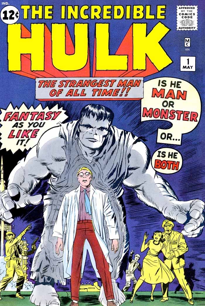
One day, after guzzling an “Egg Cream” at the soda fountain counter, I began perusing the comic book racks. My attention was grabbed by a heavy three dimensional block lettered title reading, The Incredible Hulk. “What the hell was this?” I wondered. Taking the book off the rack, I was captivated by the massive Frankenstein-like creature on the cover, as well as its profusion of word balloons. I was irresistibly compelled to take this comic home. Reading it, I was struck by the drama of the story, which as a developing artist myself, I immediately realized was created by the artist’s pacing. Having read several of this company’s other titles, I was becoming more familiar with  Jack Kirby.

In the first issue of the Hulk, there were several dramatic scenes where the hapless Dr. Bruce Banner, as a result of his exposure to nuclear radiation was transformed by moonlight into a menacing monster possessing inhuman strength.

Hulk 1 pg6

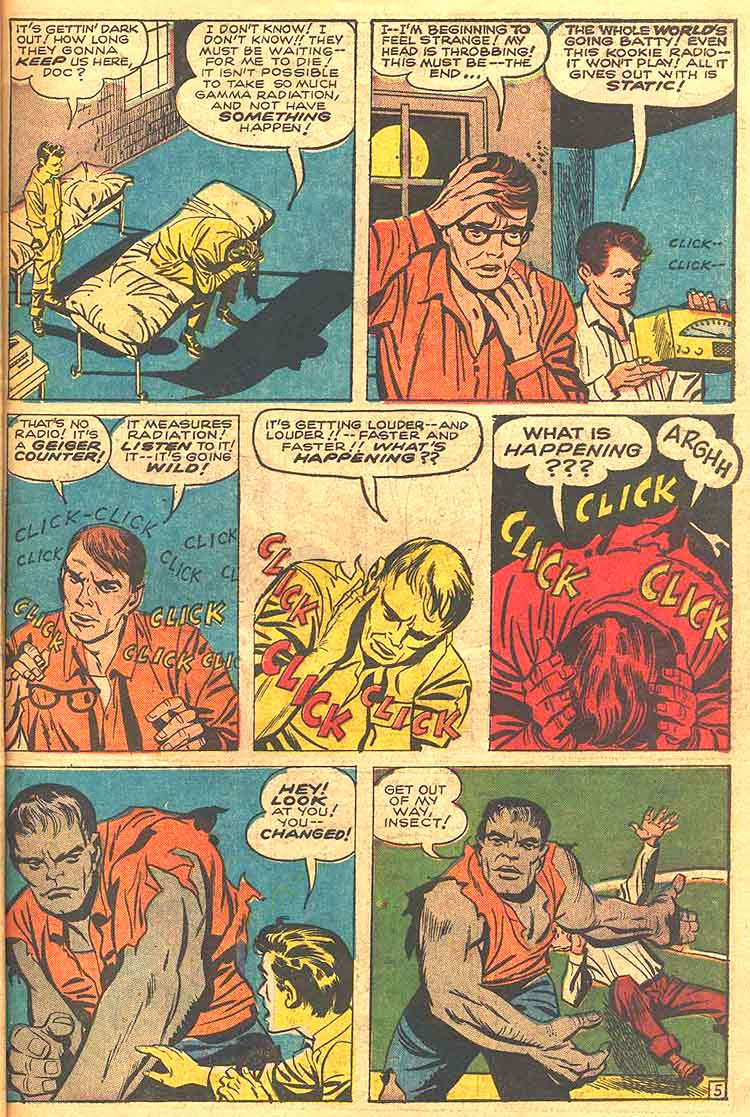
In the first such sequence on page 5 above, we see the disconsolate Banner sitting on a cot with head in hands. As he stands in panel two, we see the full moon juxtaposed behind his head. Next is the middle three-panel transition in the last of which we do not see Banner’s face, so that when he rises to his full height, we are taken aback by his grim gray visage as well as ominous drama of his posture. Kirby is an artist sometimes criticized for his non -strict adherence to the laws of anatomy, but here we see the King as usual using the body’s structure to its best advantage. Emphasizing the character’s menace, Kirby presents the monster’s massive shoulder and arm to the viewer, and then in a follow through motion in the next panel, shows it sweeping the helpless boy aside with that arm.

Transitions mark this particular comic, and Kirby exults in performing them. The book is fraught with the conventions of contemporary horror films, and upon reading it, I recognized that the moon through the window on page five reminded me then of the 1961 Hammer film Curse of the Werewolf, starring the young Oliver Reed, which was then one of my favorite of the genre.

Hulk 1 pg 11

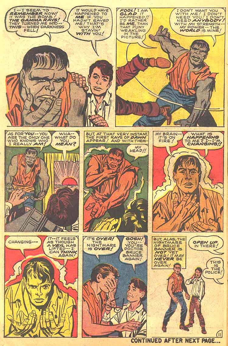
On page 11 above, as the Hulk threatens the teenage Rick Jones, the sun begins to rise and the boy is saved by the creature’s timely return to human form. Observe the change in the position of hands from the third to the sixth panel, as the Hulk first begins to gesture towards Jones who raises his own hands to fend off the creature. The Hulk then reaches up to clutch his own throat and finally in the sixth panel gazes down at his humanized fingers in relief that he is normal again.

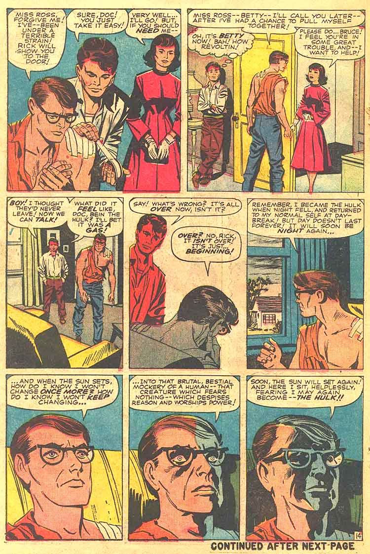
Later in the story, on page 14 we see Banner in the three panel lower tier, horrified by his pending transformation, and the drama of his terror is conveyed by the transition of the shadows on his face as afternoon turns to dusk

Hulk 1 pg 14

Finally, in one of the most dramatic sequences on page 18 below, Banner is driving and we see the transformation solely in a close cropping of his hands in the customary three panels, holding the steering wheel in the first, and then letting go of it. Kirby has always insisted that hands are are crucial tool for conveying emotion and he often uses a close cropped focus solely on them to elicit drama.

Hulk 1 pg 18

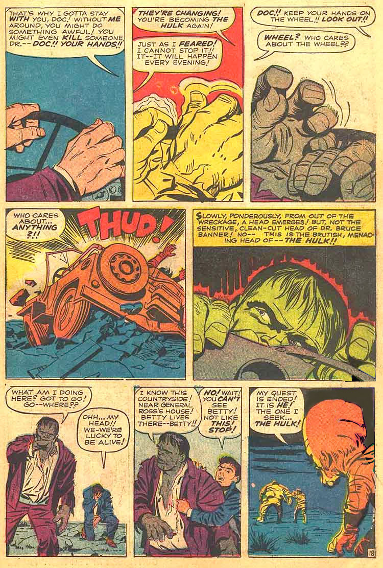
In the third panel, his hands, having released the wheel clench grotesquely and we see only the vehicle crashing in panel four, followed by the wonderfully sinister close-up image of the Hulk’s head and hands rising from the wreckage.

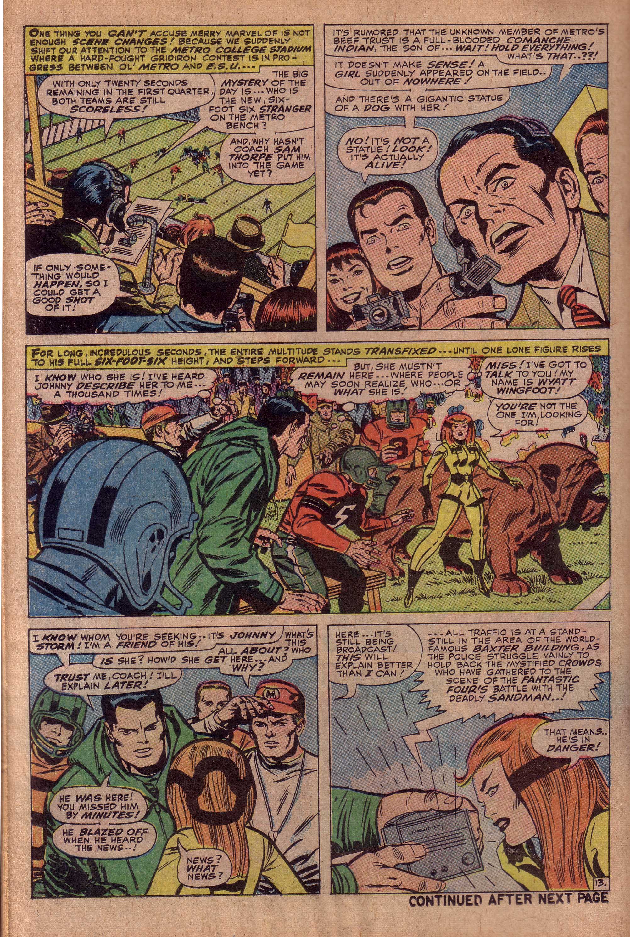
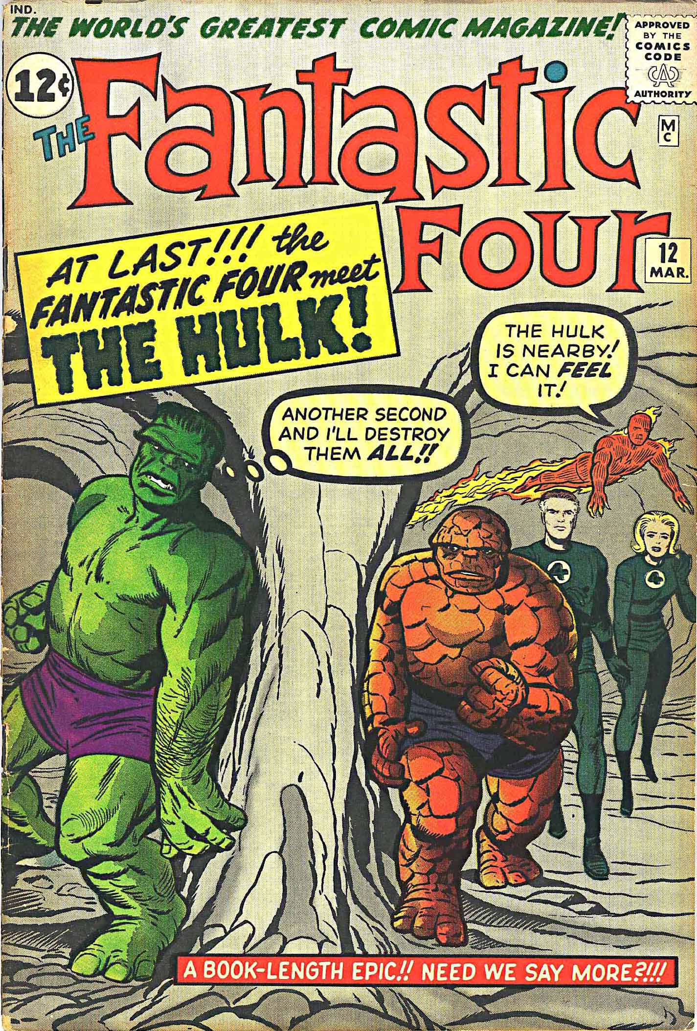
I followed the Hulk through issue #5 and was disappointed that Steve Ditko had taken over the artwork in issue #6. As much as I liked his work I did not feel his style fit the series. Then in that same month I chanced to notice a comic featuring the Hulk as a guest star. The Fantastic Four #12 was the first issue of that comic I’d ever seen. The cover was awesome, foreshadowing drama that unfortunately would not be realized inside the book. We see the Fantastic Four and the Hulk on either side of a foreboding cave formation. The Four are approaching the viewer as the Hulk ominously stands in wait for them. There was a scene like this in the comic, but the result of the confrontation was anti-climactic, not living up to the build-up that the story had created.

Fantastic Four #12 cover


Still, I found the comic irresistible. This was the beginning of a youthful obsession. The Hulk was cancelled with the sixth issue, but it no longer mattered. I was hooked on the Worlds Greatest Comic Magazine and there was no going back. For the next eight years, I simply could not get enough of the Fantastic Four, and Jack Kirby had begun to leave a mark on my psyche that endures powerfully to this day.

Image 1-The Incredible Hulk cover- art-Jack Kirby, dialog-Stan Lee, restoration by Henry Kujawa

Images 2-5 Incredible Hulk #1- Jack Kirby, Paul Reinman, dialog by Stan Lee  Scans courtesy of Rare Comics of Long island

Image 6-Fantastic Four #12-Jack Kirby, Dick Ayers- dialog by Stan Lee


The Red Skull’s Anatomy Lesson

by

The Red Skull is one of comicdom’s most potent villains. Sinister yet vaguely comical, the character was introduced in Captain America’s first issue in 1941 and has endured for more than sixty years. When the Red Skull was reintroduced to 1960’s Marvel readers, the comics code was still in full swing, although waning slightly in power. Still, the Skull had to be re-drawn to diminish his fearsome visage. Jack Kirby made the villain somewhat less frightening by making his fleshless teeth less prominent.

Red Skull Cap 3


When Marvel reprinted 1940’s Captain America episodes in a magazine called Fantasy Masterpieces, it featured two tales from issue #3. The Skull actually appeared in the issue’s first story, but one can only surmise that it was deemed unacceptable. The splash panel from that story, shown above was a grisly scene that would not have passed through code inspection. Not only was the Red Skull’s leering visage prominent, there were also two corpses dressed in our heroes’ costumes hanging by their necks.

Kirb Kin Skull #1

Marvel eventually did print a Red Skull appearance from Captain America #7 and the villain’s face was redrawn awkwardly by someone other than Kirby, which had the comical effect of making him look more like the Red Frog. Here is the wonderful, original version of the splash from the story above. I don’t have a copy of the reprint and after all, it would be a shame to post it instead of this grotesque beauty.

This Captain America/ Red Skull story from Tales of Suspense #81 show’s the fiendish Nazi at the top of his game, having acquired a potent weapon known as the Cosmic Cube. This magnificent Kirby splash page, deftly inked by Frank Giacoia shows Captain America in all his dynamism and the Red Skull in all of his fearsome menace. In this composition, the eye first makes contact with the cube, travels down the Red Skull’s arm and back up and rightward from his head to Cap’s charging figure. Cap’s arm and the force lines bring us back to the Cosmic Cube.

Red Skull tos 81 1

On the following page below, Cap jackknifes into the Skull’s slim, nimble and rubbery body. His trajectory is a perfectly placed triangular wedge that offsets the Skull’s twisted unbalance. The story is from what many consider to be the height of Kirby and Lee’s creative arc. Dated September 1966, the issue would have occurred in the same period that the team was doing the Fantastic Four run from issues 48-60, unquestionably a peak of creative brilliance. Good to see the Red Skull have a piece of that glory. By the way, the Cosmic Cube seems to have made it into the modern film versions of Captain America’s saga. It is known as the Tesseract.

Red Skull tos 81

Captain Victory

by

For this post, I thought I might spend some time on Captain Victory, the title that Kirby created for the Independent company, Pacific Comics. Coming after what many fans believe were Kirby’s peak years, this series has not received much attention, but there is a good deal of wonderment and quality stuff to be seen therein.

Through the seventies, as a result of a boom in science fiction based films such as Star Wars and Close Encounters of the Third Kind, the notion that Earth would be visited by beings from another world was an idea that the King also felt compelled to exploit.  In Kirby’s series, the extra-terrestrials visiting Earth were not nearly as friendly as the cuddly E.T. or the seemingly benevolent aliens from Close Encounters of the Third Kind, and a force of Intergalactic Raiders was deemed necessary to fend them off.

Steve Sherman, Jack Kirby’s assistant during the 1970’s had this to say about the development of Captain Victory.

Capt. Victory was originally written as a screenplay. It was titled “Capt. Victory and the Lightning Lady” and was a science fiction story about a small town USA invaded by aliens. There were hardly any outer space sequences (as I recall). Jack realized that he needed visuals to help market the script, so he began “story boarding” when he had time. When Pacific Comics approached him about doing a book, he felt that using Capt. Victory as a character would be a good idea so he expanded on the story.

CV1p7

Here above on page seven of the title’s first issue we see Captain Victory donning a helmet referred to as a portable command post, so he can defend the ship from attackers. The Captain looks very much like the blonde Nordic god-like heroes we are used to seeing from Kirby, such as Thor, Orion and Ikaris. In fact, we are later to discover that Captain Victory is directly related to the New Gods’ Orion.

CV1p8-9

In this double spread on the following pages above, we see the attacking aliens, known as Insectons breaking through a force field, while Captain Victory defends the bridge. There is that wonderful circular sweep of action as the reader’s eye moves leftward from the Insecton ships to the intricate cannon like shape on the right and then back to the Captain’s blocky muscular helmeted figure just left of center. Based on this composition, it is clear Kirby’s design sense is as strong as it has ever been and his drawing skills are still quite formidable.

CV1p13

On page thirteen above, we see the interior of the Insecton ship and the nefarious Lightning Lady, ruler of the race giving instructions to her minions. The first panel is a classic Kirby environment, as the King weaves the sinuous composition of a high-tech hive-like structure. As is customary, the structural design fully supports and enhances the interplay of figures gesturing, and also enhances the passage of space/time within the panel. The third panel carries on the hive like motif as we see the various creatures in their cells, performing necessary functions to the powering of the ship.

CV1p25-26

Finally, we see the final spread of Captain Victory #1, the Galactic Raiders “Dreadnaught Tiger”. This is a massive spaceship that with its array of lights and hi tech equipment could easily have appeared in the film, Close Encounters of the Third Kind.

The colossal craft faces us in forced perspective, hovering ponderously and taking up most of the two-page panel. This tableau is a fitting ending and a dramatic climax to the story, nearly comparable to our first view of Galactus at the close of Fantastic Four #48.

And so we see the excellence of Kirby’s work in 1981, still capable of thrilling us while giving us a good deal of food for thought.

All images from Captain Victory #1 Jack Kirby, Mike Royer

More About Inbetweening

by


It has been often stated that Jack Kirby briefly worked as an Inbetweener for the Max Fleischer animation studios prior to his comic book career. This suggests that Kirby was able to internalize the concept of sequential frames giving the illusion of motion and use it in his comic book art to make his work more dynamic. The standard for animation is between 12 and 15 frames per second. Obviously, this amount of panels would be excessive in a comic, but over the years, Kirby experimented quite a bit with the degree of continuity, often giving the reader a series of peak action poses in succession.  Even in a comic book, where the panels are all visible, the brain has the ability to fill in the in between frames and give the motion a suggestion of uninterrupted flow.

RK Gunslinger Mad pg2

During the period that he was doing the Rawhide Kid, The King was more likely to give the visual reader a more unbroken sense of continuity to suggest a smooth flow of motion from one panel to the next. Notice the transitions in this series of panels above from Rawhide Kid #28. Kirby first gives us the profile of the gunman on the left and that of the bartender on the right, with the Rawhide Kid in the background. He then zooms in a little so that we only see the drawn gun of the left figure and the bartender’s frightened face, with the Kid’s expression changing to shock. In panel three, the gunfighter is now on the right and the Kid moves into the left position previously occupied by the bartender. If we even notice the reversal, this might break the flow, but we are still capable of making the transition. The Kid then stays in that position, while the camera gradually pulls back to where we see the full figures in an action sequence. The reader’s eye smoothly and easily makes the connections in between the panels, and the sequence is ingeniously fluid and dynamic.

RK Gunslinger Mad pg 3

On the following page above, the sequence in the bar continues apace. There is nothing particularly unique about this story except the telling makes it so. The thing about most of these Rawhide Kid stories is that is all about the pacing, and that is all Kirby’s doing. As the page begins, we see a medium shot of the Kid with figures behind him. His assailant approaches to swing at him, and the camera basically pulls back on the full figure shot of the action, as on the previous page. The continuity in panel two through four is deceptively simple and ingenious as the Kid deftly reaches back and throws his attacker over his shoulders. Kirby particularly enjoys using the full figure of the victim partially obscuring that of the victor, just showing enough of the kid to suggest his action. The triangulation of six guns pointed at the Kid in panel six is also ingenious and deceptively simple.

Again, let me emphasize how much the drama of this story is a result of the way it is broken down into continuity. The plot could simply be described as “Man walks into a bar to order a glass of milk and bunch of gunmen pick a fight with him. He wins.” The story is pantomime. It could almost be as effective devoid of dialog.

As the 1960’s progressed, Kirby used this sort of full sequence continuity less and less. Captain America was one series wherein he enjoyed using what he referred to as “choreography” in depicting fight scenes. This page from Tales of Suspense #81 is an especially dynamic one in which you can see the contrast between The King’s earlier style of using between six and nine panels per page and his later tendency to use three to four larger panels in continuity. This often allows for broader movements and more explosive action.

Cap ToS 81

In the first panel, Cap swings his shield, and the arc motion is picked up by the creature’s blow in panel two. Cap falls back and his extended arm gestures to the third panel below as the creature smashes down with a boulder. In the final panel, Cap thrusts upward, counterattacking.

The earlier Rawhide Kid pages strike me as being slower paced, with a bit of humor and nuance. Kirby is playing with the conventions of the Western, and there is almost a slapstick element present here. In contrast, the Captain America sequence is dead serious and devastatingly powerful.

It is fascinating to see the changes in Kirby’s storytelling methods, as we contrast these two stories, separated by several years. It makes me wonder in particular, what caused Kirby to change his approach in storytelling. Was it something as simple as the nature of the stories being told, or was it something changing in the nature of the world and the artist’s perception of it. These are questions too profound for a column of this nature to tackle.

Image 1-2-Rawhide Kid#28 Jack Kirby, Dick Ayers, Stan Lee

Image 3- Jack Kirby, Frank Giacoia, Stan Lee

Reductionism

by

In my opinion, one of the most unfortunate decisions for the presentation of Jack Kirby’s artwork was the move sometime in 1968 to reduce the size of the board the artist worked on to 10”x15”. Kirby, an artist used to displaying panoramic compositions was forced by the new size constraints to either compress his drawings into smaller panels or resort to using more large panels per page. That is what he did for the most part. In many cases, this was not a problem, particularly when Kirby was inspired to stretch out on full or double page spreads. Many of these were wonderful and memorable. Let us study this phenomenon using a somewhat  entertaining comic, Fantastic Four #80.

Here is a comic that seemingly contains one of Kirby’s minor conceptual fixations, as he and writer Stan Lee had already used the Living Totem concept in Rawhide Kid #22. Although I was initially disdainful of this FF issue, it has become one of my favorites in the later run of the series. The story is kicked off by an appearance by Wyatt Wingfoot, a good example of a proud and yet unpretentious Native American character. Wingfoot is searching for a being from the legends of his tribe, the aforementioned Totem.

As enjoyable as it may be, this is not a scenario that causes Kirby to break a sweat. Just two pages after the splash title, he has already given us another one panel page. This is a fairly silly drawing of Ben and Johnny dancing for joy at the news that they can go on a trip. The King is spinning his wheels here.

FF#80 page 6 Totem

Page six above is also a splash, featuring a fairly dramatic rendering of the titular Totem. It’s a powerful and slick drawing, showing the solidity and weight of the creature but nothing Earth-shaking is going on in the picture. It’s a static pose, full frontal with no foreshortening. Just on a wild guess, I would estimate that this page took Kirby about 45 minutes or less to draw, but I could be mistaken.

Now, Keep in mind that this book was conceived shortly after Kirby reportedly had decided, due to his disagreements with Martin Goodman and Stan Lee not to give Marvel any more exciting new properties. Although Kirby is still delivering a solid book with FF#80, there does seem to be a reduction in enthusiasm and very little flexing of creative muscle on his part.

FF#80 pg12

Throughout the comic, the panel count never exceeds five, with many pages having between three and four panels. This five-panel page twelve above is OK, with the first panel being strongest, a nice composition of Johnny flying towards us in forced perspective with Reed and Johnny following, but the remainder doesn’t do much for me by Kirby standards.

FF80 pg13

This four-panel page 13 above is also fairly strong, but there is a minimum of detail other than “Krackle” and force lines. There is little suggestion of deep space, which certainly saves the artist’s time. The last panel has too much empty space in it for my viewing pleasure.

Page 18 below is for me the best balanced, most successful and most exciting of the book. Panel two is a miniature deep space wonder as the car line of Native Americans move towards us through the canyon. In the third panel, Kirby is using figures and shapes to create a climactic composition. The circular composition swirls with excitement as the Indians circle the Totem, uselessly firing automatic weapons at it.

FF#80 pg18

In the end, it is discovered that the Totem is merely a robot with oil-land grabbing intent, but the actual Totem spirit of Tomazooma does appear in the final panel, proving that the spirit world is potent.

In retrospect, when we read stories like this one, we see a clear indication that the end of Kirby’s run at Marvel was near.

All pages from Fantastic Four #80

Jack Kirby, Stan Lee, Joe Sinnott


Colletta’s Inking Gems

by

As a jack Kirby inker, Vince Colletta has gotten a lot of flak for certain aspects of his craft. Most notable would be his tendencies to simplify Kirby’s elaborate architecture and figure work, black it out or in some cases erase it completely.

I thought that I would display some of Colletta’s better work for this entry. The first example is from Thor#137. For the sake of studying the inking here, it is wonderful to utilize these  original art pages displayed on the Heritage Auction website, which also contain fragments of Kirby’s margin notes, much of which sadly have been trimmed off.

Thor 137

Here above is a panel taking up more than half a page, and Kirby’s composition is one that in my opinion puts him in a league with classic painters like Tiepolo or Velasquez when it comes to the complex arrangement of figures in motion intertwined.

The composition is set up so that the reader’s eye will find its way to Thor’s besieged form in the center. The eye enters at upper left and moves downward and to the right, but each figure is an anatomical marvel of kinetic energy. Mark the warrior with the spear melding with the one with the spiked club and then check out the one suspended upside down in the air in front of Thor. Our hero’s torso is much too long, but we suspend belief for the sake of action.

Colletta’s pen line and brush are sleek and sinuous and his use of black spotting is exceptional. Known mostly for his crow quill pen line, the inker’s facile use of the brush can be admired most notably in the highlights on the armor of the large figure at bottom center. We tend to see Colletta’s brush when there are embellishments like the sheen of armor or more subtle and sinuous strokes of black such as hair and feather.

A H trolls-1

The next sample, seen above is from Thor #139, wherein we witness Ulik the Troll holding Thor’s hammer as a well as a replica of that mighty weapon. Here again, we are treated to some masterful black spotting as well as splendid brushwork in the Troll’s hair and beard. As many of Kirby’s compositions are, this is a very busy panel which we are intended to see in color, but Kirby’s spotting of strong areas of black drawing and Colletta’s professional inking enable our eyes, even at the black and white stage to separate the various shape masses from one another.

A H Thor magicians

Finally, we feast our eyes on a page from Thor #142, which has some of the subtlest uses of black that we are likely to behold. This page showcases Kirby’s ability to be extraordinarily cinematic in his approach to comic storytelling. In the first panel, we see one of Kirby’s wondrous machines, a “firebolt”-projecting device. Look well at the proportions here of the cannon to the minions firing it, and in particular the figure on the balcony in the upper left corner. Kirby has given us a miniature set here, as complex and compositionally perfect as anything that could be constructed for a high budget feature film. The mind boggles at the brain at work here that is capable of such creation.

Panel two gives us an equally cinematic angle for a close-up and showcases Colletta’s beautiful brushwork in Mogul’s headgear and the dark cloth that covers his face. Panel three gives us a dynamic hand in forced perspective as Mogul reaches for the flask held in Sulibeg’s proffered glove. Finally, we cut to the long shot of the two figures in a fanciful setting, another of Kirby’s miraculous exercises in architecture, combining high tech with mythological. Sulibeg cringes while Mogul threatens to dose him with a deadly potion. Here again, we see a nice balance of strong pen line with confident brushwork. The amount of inking on this page alone would overwhelm a less than confident inker, so we must praise Colletta for his sheer tenacity and remember that he was often called on to finish Kirby’s detailed pencils in order to meet a deadline.  Yes, he can be criticized for his faults, but we can also praise him for his strengths and accomplishments.

Image 1- Thor #163, Jack Kirby, plot and art-  Vince Colletta, inks-  Stan Lee, plot and text.

Image 2-Thor #139, Ibid

Image 3- Thor # 142 Ibid


Acrobatic Cap Action, Yet Again

by

Several years ago, I began the Kirby Kinetics blog series with a study of one of Captain America’s fight scenes. The King was often at his best when working with the continuity of the nearly balletic contortions that he would put his star spangled star through. So, I find myself continually returning to this particular subject on a regular basis.

Whenever Kirby was in the mood to draw up a rousing slugfest, he would pit Captain America against an equally strong or acrobatic opponent. In this case, however, the villain in question known as the Tumbler was actually fighting an “Adaptoid”, an artificial being that had taken Caps place. The Tumbler was of course unaware of this and was surprised at how easily he was able to defeat the faux-Cap, but when the genuine article escaped from captivity, he of course kicked the Tumbler’s butt decisively.

Cap Tumbler 1

This twist gave the story a bit more depth than if it had just been a simple one-on one contest. Above on page 2, Kirby gives us his best in move-counter-move continuity, as the Tumbler first decks the Adaptoid-Cap in the second panel, whereupon the imposter Kicks the acrobat into the air in panel three. The agile Tumbler somersaults in panel four and deftly lands in the fifth panel.

The battle continues apace for several pages, while the Tumbler stops to tell us his back story, and we then cut to the actual Captain America in the next room, struggling to escape from his bonds.


Cap Tumbler 2

Page seven above continues with a nice three-panel sequence wherein the Tumbler lifts the fake Cap aloft and tosses him into a wall, which splinters on impact. We see the scene as though we were on the other side of the barrier, watching the helpless figure crashing towards us. (Note the presidential sound effect) As the Tumbler gloats in victory in panel five, we are set up for the real Captain America to explode from behind the shattered wall with a smashing roundhouse right, knocking the Tumbler into our laps.

Cap Tumbler 3

The following page above is notable for the last two panels starting off an exceptionally cinematic example of sequential action. In panel five, the tumbler lands just behind a table, which Cap pins him to the wall with in panel six. On the following page, seen below, the sequence continues as the Tumbler jackknifes backwards, throwing the table at Cap, who ducks and is on his opponent in the second panel.

Cap Tumbler 4

Kirby has choreographed the action with remarkable fluidity, rotating his figures to accentuate the continuity as well as the dynamism. Cap’s left faced crouching position in panel one leads the reader’s eye to his forward leap at the Tumbler in panel two. The reader easily connects the action to panel three as Kirby rotates Cap’s figure to a dramatic combination of three-quarter back shot and profile, as the hero draws back his fist to strike. Kirby completes the sequence with the hero again knocking his opponent towards us and out of the panel.

At this point circa mid 1966, Kirby was at the height of his powers. He was focusing his energy on just three books per month and it showed, in some of the most solid and exciting production of his long career.

All pages from Tales of Suspense #83

Jack Kirby, plot and artwork  Stan Lee plot and script, Dick Ayers inking


More Original Art and Wonderful Pencils

by

A FF Sinnott black-2

With increasing frequency, stat copies of Jack Kirby’s original pencils are appearing, giving those that study his art and storytelling abilities a wonderful opportunity to delve deeper into the King’s creative processes. The original inked page from Fantastic Four #61 shown above first appeared at the Heritage auction site several years ago. Then sometime early in August 2013, a full sized stat of the same page was sold by the same auctioneer, showing the increasing value not only of the original art but also the value of a copy made of the penciled art prior to the inking process.

It is truly amazing to see Kirby’s original pencil art, because despite the attention of an inker as gifted as Joe Sinnott, there is something indescribable in the raw power and force of the King’s line that is wonderful to retain and also to compare with the beauty of the inker’s embellishment.

FF #61 pencils 2

Comparing an inked page to a penciled page is always an interesting and a revealing exercise. Joe Sinnott was one of Jack Kirby’s most popular inkers, known for adding a certain polish to what many considered Kirby’s rough edges. It is true that the inker has a lush style that often compliments Kirby art, but sometimes we see that despite his best intentions, Sinnott either weakens the force of Kirby’s lines or changes their emotional content. Looking at page fourteen of Fantastic Four #61, the former can be seen in the admittedly small figure of the Torch in panel three, where the translation of the inked form loses power in the set of his head on shoulder, in his right hand and in the right leg.

FF #61 pencils detail

This is not particularly a criticism of Sinnott, who is a professional journeyman with a crisp precise pen and brush hand. Among other things, he must certainly be applauded for lovingly inking every brick that Kirby has drawn over a five-year period. It is more to point out how the slightest variation in line quality can change its intent.

Stan Lee, for good reason, loved what Joe Sinnott did to Kirby’s work. The inker had a particularly lovely way of refining the female face, but in some cases that refinement robbed the features of strong emotion. For example, if we look at the penciled Sue Storm’s profile, the expression is frantic, to emphasize her fear for Ben’s safety, whereas the inked version’s face is somewhat neutral.

FF#61 game

The next stat shown above is even more fascinating because it reveals aspects of Jack Kirby and Stan Lee’s working process solely by the margin notes that appear on the page. Above the first panel, we see Kirby’s margin note reading, “At that moment, newsmen cover big game between Metro and Spiderman College”. Just below that, near the left panel margin we see Stan Lee’s notes, reading “John R  P. Parker.” In the second panel, we see the erasure of a man’s head and the initials PP have been scrawled over it, and we then see Lee’s margin note to Spider-Man artist John Romita, “John R add P Parker and MJ”

FF#61 color p13

This combination of notes tells us that Lee and Kirby have planned to include a guest appearance of Spider-Man’s alter ego, Peter Parker, which we can clearly see when we look at the final printed page, since John Romita has indeed drawn Parker and girlfriend Mary Jane in that panel space.

Although we do see subtle and some not so subtle alterations in the translation from pencil to art, we can really have very little to complain about here. These stories are among the very best to have appeared in the history of comics, and the combination of Kirby and Sinnott, despite or perhaps because of the latter’s facial embellishments are something wonderful that will be remembered fondly for generations to come.

All artwork from Fantastic Four #61 produced by Jack Kirby and Joe Sinnott. Plot and text by Jack Kirby and Stan Lee

All original art scans courtesy of Heritage Auctions

Kirby Spreads

by

In issue six of Jack Kirby and Joe Simon’s Captain America, the King began to include a double page splash to open the third story with a bang. This innovation took advantage of a natural spread of relatively flat surface area in the center where the book was stapled, since the third story usually began on the 32nd page of a 64-page comic. Kirby’s avid appreciation for film was probably a motivation here, because he could use the panoramic width of the double page like a wide screen to take full advantage of deep space projection.

Let me pause here to raise an issue that has recently come to my attention. Kirby Museum founder Rand Hoppe and noted art director and author Steven Brower have taken exception to the phrase “Double Page Spread” to connote the use of a full two pages of uninterrupted artwork in a comic book. The two feel that the phrase is redundant.

Brower, “The term in publishing and editorial simply is “spread.” it literally means spread across the gutter.”

An alternative might be to refer to the practice as Double Page Splash, but that also might be confusing, since Splash traditionally means the first large panel of a comic. At any rate, in deference to these two gentlemen, for the course of the article I will refer to the double page spread simply as a spread or double page splash when it applies, and I invite any comment on the matter.  I’m going to skip the spread in Captain America #6, because it is not exceptionally good, and go to issue seven’s “Horror Plays the Scales”. This double splash is an inspired piece of prime Kirby composition.

Kirb Kin Scales #1&2

We first see the violinist on the left with his fiddle and stream of notes bringing the eye to the phantasmagorical circle of grimacing heads that is clearly the focus of the piece. However, no sooner does the eye track to the right, curving around and down it encounters the flying figure of Captain America, his hand gesturing to Bucky in the chair and to the knife wielding man whose elbow leads us back to the circle of heads. This of course brings us back to the fiddler’s left foot and to the panels composed of musical notes that open the actual story.

Kirb Kin Black Witch 1&2

The double page splash in Issue #8 above featured one of the most amazing pieces of fantasy art that it’s been my pleasure to view. Obviously, the first thing we see is the wonderfully hideous fanged witch, whose gesture takes us directly to the lithe, muscular figure of Captain America. The page is crowded with delightfully creepy creatures writhing about, and they all serve to tie the circular composition together. The ghost knight and the blue demon to the right of the witch serve to emphasize the thrust of the witch’s claw, and the slithering green serpent above the words “Captain America” keeps the eye moving around. Even the skull candle-holder, as a solid oval shape further anchors the drawing by giving it more balance. One almost misses the inset second panel to the far right, but had it not been there, Kirby would need to substitute another shape for the sake of balance.

Stuntman spread

Above, we have an opportunity to study a work in progress by Kirby. This is an 1946 unpublished Stuntman double page splash, which has been partially inked by Kirby. Other than the obvious fact that he occupies the center of the panel, there are several techniques used to make the Stuntman the center of attention. The position of the whip wielding adversary as well as the swordsman on his right both bring the reader’s eye to the hero, but the fact that the whip man is not fully inked lessons his power as an indicator. For this very reason, it is instructive to see Kirby’s technique of first inking the outline prior to spotting blacks and adding shadows and highlights. The artist knows that the more solid lines and spotted blacks he adds later will serve to make the eye go to precisely where he wishes it.

A Kirb Kin Fawkes

Let us move on to a double page splash above from a story called “Burned At The Stake,” from the March 1947 issue of Headline Comics #23. This is Kirby’s account of the story of British traitor, Guy Fawkes who in 1570 was part of a conspiracy to assassinate King James I. We see a splendid double page splash here with a group of soldiers rushing Fawkes, their direction and momentum creating the focus on him and also creating the drama of the page. The backs of the soldiers create a sort of pyramid, the apex of which is the torch wielding Fawkes. The eye climbs up the backs of the ascending soldiers, just as they climb up to reach the villain.

Demon spread

The final spread featured is from Demon #10. This is particularly interesting to me because it depicts the deep space of a theater, but instead of showing the depth from the entrance of the theater to backstage, the projection is diagonally across from stage left to stage right. So we see deep space from a portion of the seated audience as well as the wings and backstage, as the Demon stalks the width of the boards. Because of this juxtaposition with the audience, they are not separated from the stage in the usual way and take on a different relationship with what appears on it. This to me is one of Kirby’s most compelling panels for that reason.

There are so many amazing Kirby spreads to choose from. I feel that I’ve barely scratched the surface.

Image 1-Captain America #7 Jack Kirby, Joe Simon, Pencils and inks by Jack Kirby

Image 2-Captain America #8 Jack Kirby, Joe Simon, Pencils and inks by Jack Kirby

Image 3-Unused incomplete original art from Stuntman 1946, Jack Kirby, Joe Simon, Pencils and inks by Jack Kirby

Image 4- Headline Comics #23 Jack Kirby, Joe Simon, pencils and inks by Jack Kirby

Image 5- Demon #10 Jack Kirby, pencils by Jack Kirby, inks- Mike Royer