In issue six of Jack Kirby and Joe Simon’s Captain America, the King began to include a double page splash to open the third story with a bang. This innovation took advantage of a natural spread of relatively flat surface area in the center where the book was stapled, since the third story usually began on the 32nd page of a 64-page comic. Kirby’s avid appreciation for film was probably a motivation here, because he could use the panoramic width of the double page like a wide screen to take full advantage of deep space projection.
Let me pause here to raise an issue that has recently come to my attention. Kirby Museum founder Rand Hoppe and noted art director and author Steven Brower have taken exception to the phrase “Double Page Spread” to connote the use of a full two pages of uninterrupted artwork in a comic book. The two feel that the phrase is redundant.
Brower, “The term in publishing and editorial simply is “spread.” it literally means spread across the gutter.”
An alternative might be to refer to the practice as Double Page Splash, but that also might be confusing, since Splash traditionally means the first large panel of a comic. At any rate, in deference to these two gentlemen, for the course of the article I will refer to the double page spread simply as a spread or double page splash when it applies, and I invite any comment on the matter. I’m going to skip the spread in Captain America #6, because it is not exceptionally good, and go to issue seven’s “Horror Plays the Scales”. This double splash is an inspired piece of prime Kirby composition.
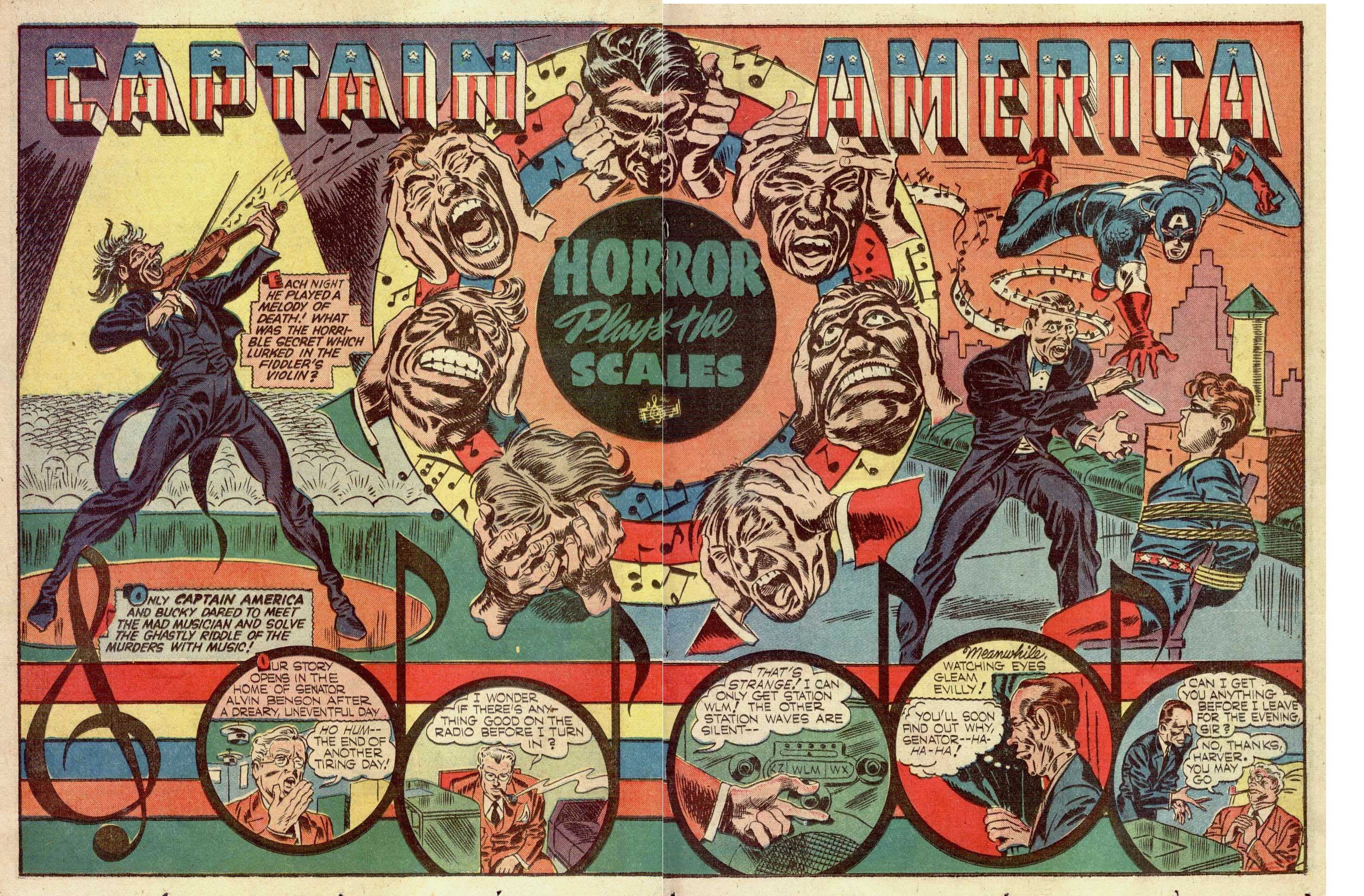
We first see the violinist on the left with his fiddle and stream of notes bringing the eye to the phantasmagorical circle of grimacing heads that is clearly the focus of the piece. However, no sooner does the eye track to the right, curving around and down it encounters the flying figure of Captain America, his hand gesturing to Bucky in the chair and to the knife wielding man whose elbow leads us back to the circle of heads. This of course brings us back to the fiddler’s left foot and to the panels composed of musical notes that open the actual story.
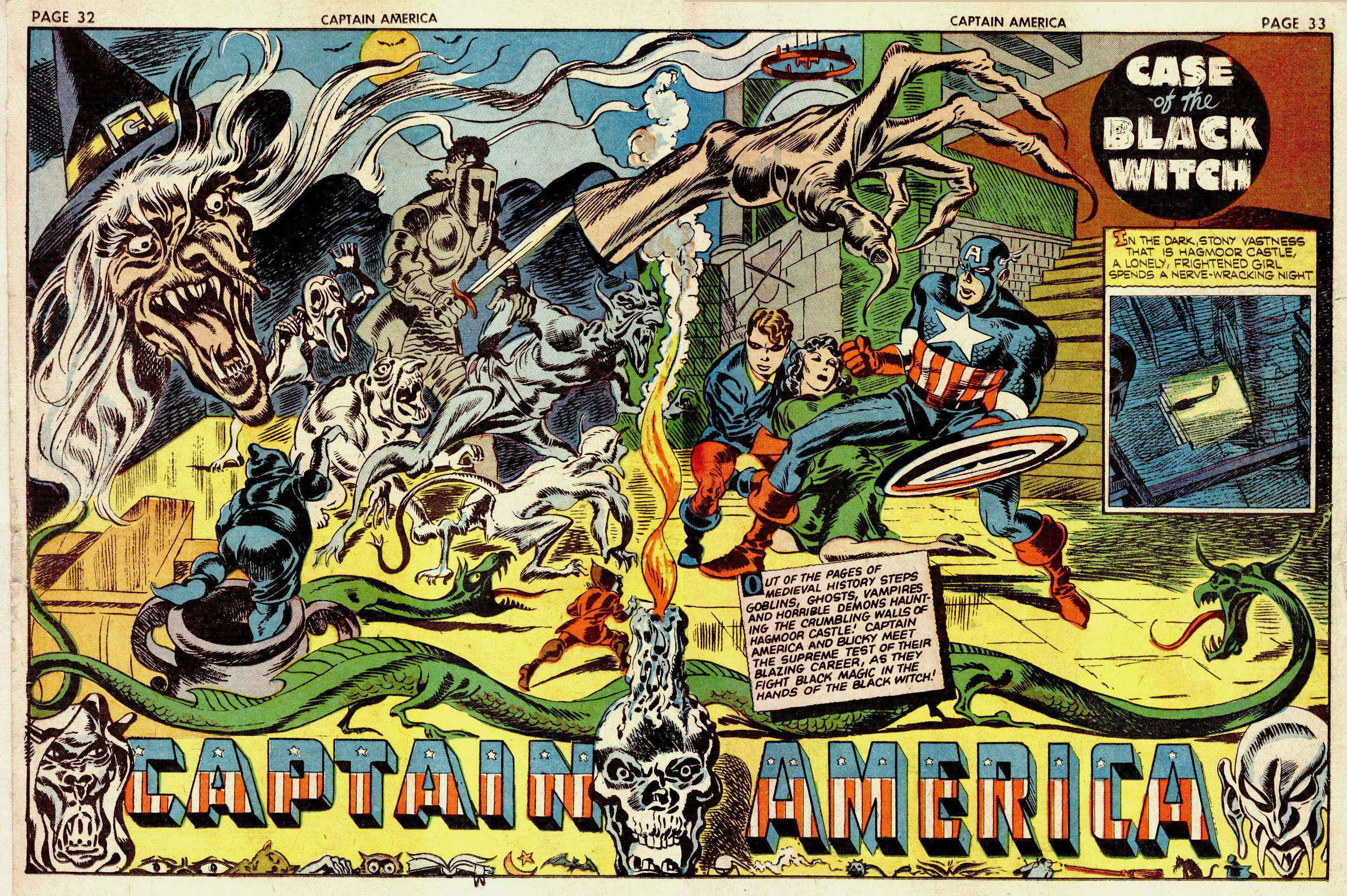
The double page splash in Issue #8 above featured one of the most amazing pieces of fantasy art that it’s been my pleasure to view. Obviously, the first thing we see is the wonderfully hideous fanged witch, whose gesture takes us directly to the lithe, muscular figure of Captain America. The page is crowded with delightfully creepy creatures writhing about, and they all serve to tie the circular composition together. The ghost knight and the blue demon to the right of the witch serve to emphasize the thrust of the witch’s claw, and the slithering green serpent above the words “Captain America” keeps the eye moving around. Even the skull candle-holder, as a solid oval shape further anchors the drawing by giving it more balance. One almost misses the inset second panel to the far right, but had it not been there, Kirby would need to substitute another shape for the sake of balance.
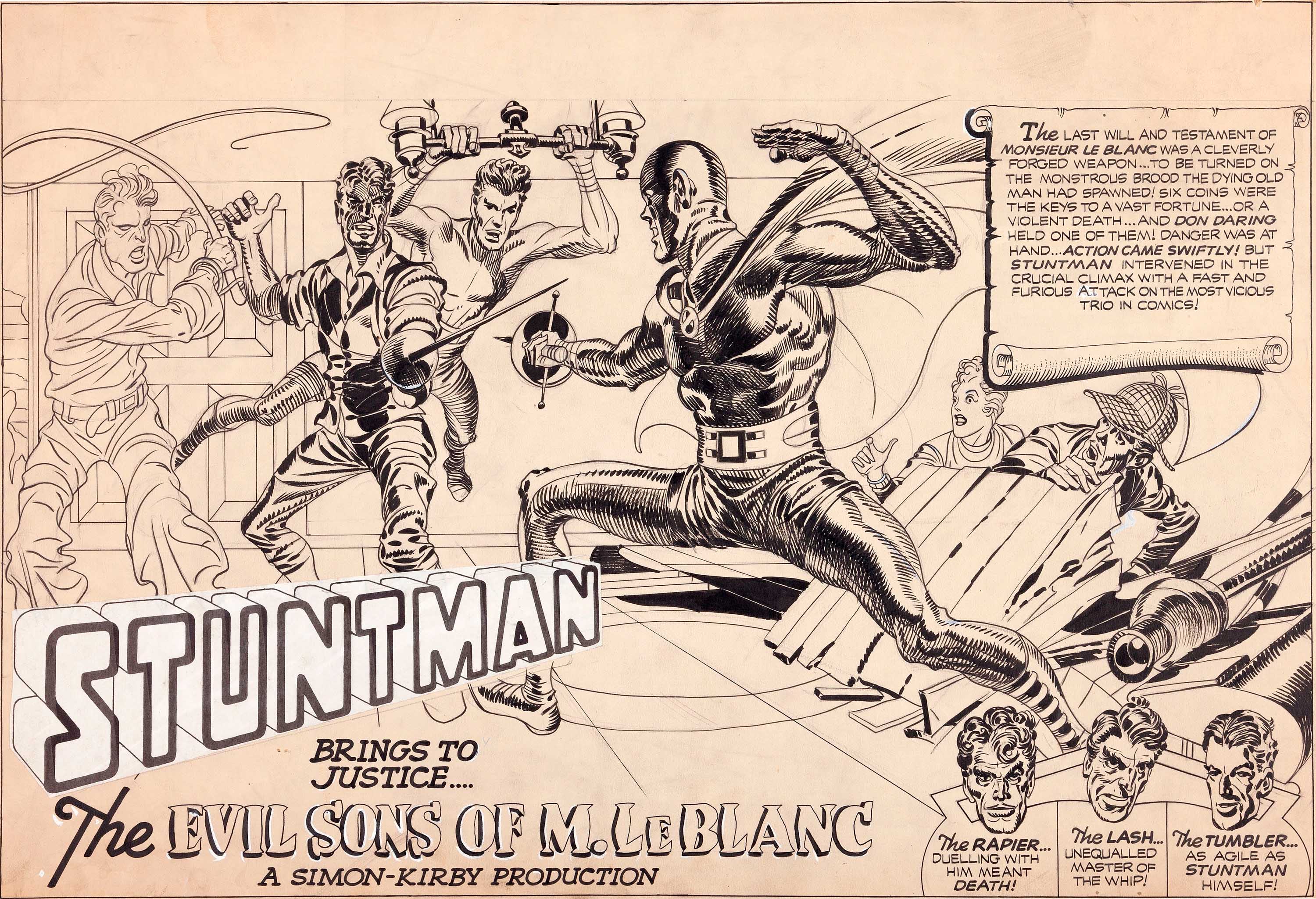
Above, we have an opportunity to study a work in progress by Kirby. This is an 1946 unpublished Stuntman double page splash, which has been partially inked by Kirby. Other than the obvious fact that he occupies the center of the panel, there are several techniques used to make the Stuntman the center of attention. The position of the whip wielding adversary as well as the swordsman on his right both bring the reader’s eye to the hero, but the fact that the whip man is not fully inked lessons his power as an indicator. For this very reason, it is instructive to see Kirby’s technique of first inking the outline prior to spotting blacks and adding shadows and highlights. The artist knows that the more solid lines and spotted blacks he adds later will serve to make the eye go to precisely where he wishes it.
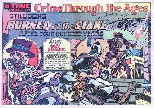
Let us move on to a double page splash above from a story called “Burned At The Stake,” from the March 1947 issue of Headline Comics #23. This is Kirby’s account of the story of British traitor, Guy Fawkes who in 1570 was part of a conspiracy to assassinate King James I. We see a splendid double page splash here with a group of soldiers rushing Fawkes, their direction and momentum creating the focus on him and also creating the drama of the page. The backs of the soldiers create a sort of pyramid, the apex of which is the torch wielding Fawkes. The eye climbs up the backs of the ascending soldiers, just as they climb up to reach the villain.
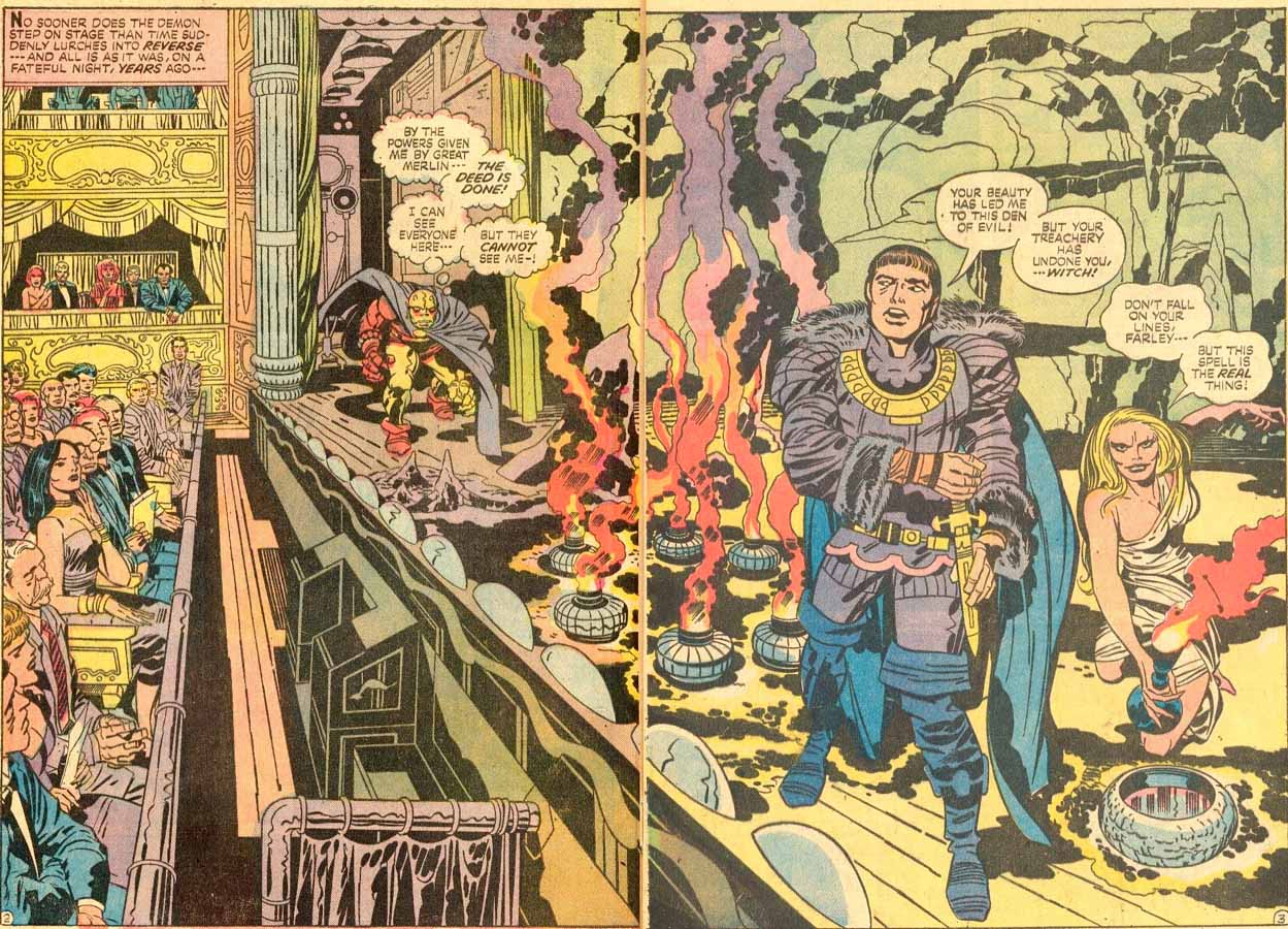
The final spread featured is from Demon #10. This is particularly interesting to me because it depicts the deep space of a theater, but instead of showing the depth from the entrance of the theater to backstage, the projection is diagonally across from stage left to stage right. So we see deep space from a portion of the seated audience as well as the wings and backstage, as the Demon stalks the width of the boards. Because of this juxtaposition with the audience, they are not separated from the stage in the usual way and take on a different relationship with what appears on it. This to me is one of Kirby’s most compelling panels for that reason.
There are so many amazing Kirby spreads to choose from. I feel that I’ve barely scratched the surface.
Image 1-Captain America #7 Jack Kirby, Joe Simon, Pencils and inks by Jack Kirby
Image 2-Captain America #8 Jack Kirby, Joe Simon, Pencils and inks by Jack Kirby
Image 3-Unused incomplete original art from Stuntman 1946, Jack Kirby, Joe Simon, Pencils and inks by Jack Kirby
Image 4- Headline Comics #23 Jack Kirby, Joe Simon, pencils and inks by Jack Kirby
Image 5- Demon #10 Jack Kirby, pencils by Jack Kirby, inks- Mike Royer