What information do we collect?
We collect information from you when you register on our site or place an order.
When ordering or registering on our site, as appropriate, you may be asked to enter your: name, e-mail address or mailing address.
What do we use your information for?
Any of the information we collect from you may be used in one of the following ways:
To personalize your experience
(your information helps us to better respond to your individual needs)
To improve our website
(we continually strive to improve our website offerings based on the information and feedback we receive from you)
To improve customer service
(your information helps us to more effectively respond to your customer service requests and support needs)
To process transactions
Your information, whether public or private, will not be sold, exchanged, transferred, or given to any other company for any reason whatsoever, without your consent, other than for the express purpose of delivering the purchased product or service requested.
To administer a contest, promotion, survey or other site feature
To send periodic emails
The email address you provide for order processing, will only be used to send you information and updates pertaining to your order.
How do we protect your information?
We implement a variety of security measures to maintain the safety of your personal information when you place an order or enter, submit, or access your personal information.
We offer the use of a secure server. All supplied sensitive/credit information is transmitted via Secure Socket Layer (SSL) technology and then encrypted into our Payment gateway providers database only to be accessible by those authorized with special access rights to such systems, and are required to?keep the information confidential.
After a transaction, your private information (credit cards, social security numbers, financials, etc.) will not be kept on file for more than 60 days.
Do we use cookies?
Yes (Cookies are small files that a site or its service provider transfers to your computers hard drive through your Web browser (if you allow) that enables the sites or service providers systems to recognize your browser and capture and remember certain information
We use cookies to help us remember and process the items in your shopping cart, understand and save your preferences for future visits, keep track of advertisements and compile aggregate data about site traffic and site interaction so that we can offer better site experiences and tools in the future. We may contract with third-party service providers to assist us in better understanding our site visitors. These service providers are not permitted to use the information collected on our behalf except to help us conduct and improve our business.
If you prefer, you can choose to have your computer warn you each time a cookie is being sent, or you can choose to turn off all cookies via your browser settings. Like most websites, if you turn your cookies off, some of our services may not function properly. However, you can still place orders by contacting customer service.
Google Analytics
We use Google Analytics on our sites for anonymous reporting of site usage and for advertising on the site. If you would like to opt-out of Google Analytics monitoring your behaviour on our sites please use this link (
https://tools.google.com/dlpage/gaoptout/)
Do we disclose any information to outside parties?
We do not sell, trade, or otherwise transfer to outside parties your personally identifiable information. This does not include trusted third parties who assist us in operating our website, conducting our business, or servicing you, so long as those parties agree to keep this information confidential. We may also release your information when we believe release is appropriate to comply with the law, enforce our site policies, or protect ours or others rights, property, or safety. However, non-personally identifiable visitor information may be provided to other parties for marketing, advertising, or other uses.
Registration
The minimum information we need to register you is your name, email address and a password. We will ask you more questions for different services, including sales promotions. Unless we say otherwise, you have to answer all the registration questions.
We may also ask some other, voluntary questions during registration for certain services (for example, professional networks) so we can gain a clearer understanding of who you are. This also allows us to personalise services for you.
To assist us in our marketing, in addition to the data that you provide to us if you register, we may also obtain data from trusted third parties to help us understand what you might be interested in. This ‘profiling’ information is produced from a variety of sources, including publicly available data (such as the electoral roll) or from sources such as surveys and polls where you have given your permission for your data to be shared. You can choose not to have such data shared with the Guardian from these sources by logging into your account and changing the settings in the privacy section.
After you have registered, and with your permission, we may send you emails we think may interest you. Newsletters may be personalised based on what you have been reading on theguardian.com. At any time you can decide not to receive these emails and will be able to ‘unsubscribe’.
Logging in using social networking credentials
If you log-in to our sites using a Facebook log-in, you are granting permission to Facebook to share your user details with us. This will include your name, email address, date of birth and location which will then be used to form a Guardian identity. You can also use your picture from Facebook as part of your profile. This will also allow us and Facebook to share your, networks, user ID and any other information you choose to share according to your Facebook account settings. If you remove the Guardian app from your Facebook settings, we will no longer have access to this information.
If you log-in to our sites using a Google log-in, you grant permission to Google to share your user details with us. This will include your name, email address, date of birth, sex and location which we will then use to form a Guardian identity. You may use your picture from Google as part of your profile. This also allows us to share your networks, user ID and any other information you choose to share according to your Google account settings. If you remove the Guardian from your Google settings, we will no longer have access to this information.
If you log-in to our sites using a twitter log-in, we receive your avatar (the small picture that appears next to your tweets) and twitter username.
Children’s Online Privacy Protection Act Compliance
We are in compliance with the requirements of COPPA (Childrens Online Privacy Protection Act), we do not collect any information from anyone under 13 years of age. Our website, products and services are all directed to people who are at least 13 years old or older.
Updating your personal information
We offer a ‘My details’ page (also known as Dashboard), where you can update your personal information at any time, and change your marketing preferences. You can get to this page from most pages on the site – simply click on the ‘My details’ link at the top of the screen when you are signed in.
Online Privacy Policy Only
This online privacy policy applies only to information collected through our website and not to information collected offline.
Your Consent
By using our site, you consent to our privacy policy.
Changes to our Privacy Policy
If we decide to change our privacy policy, we will post those changes on this page.
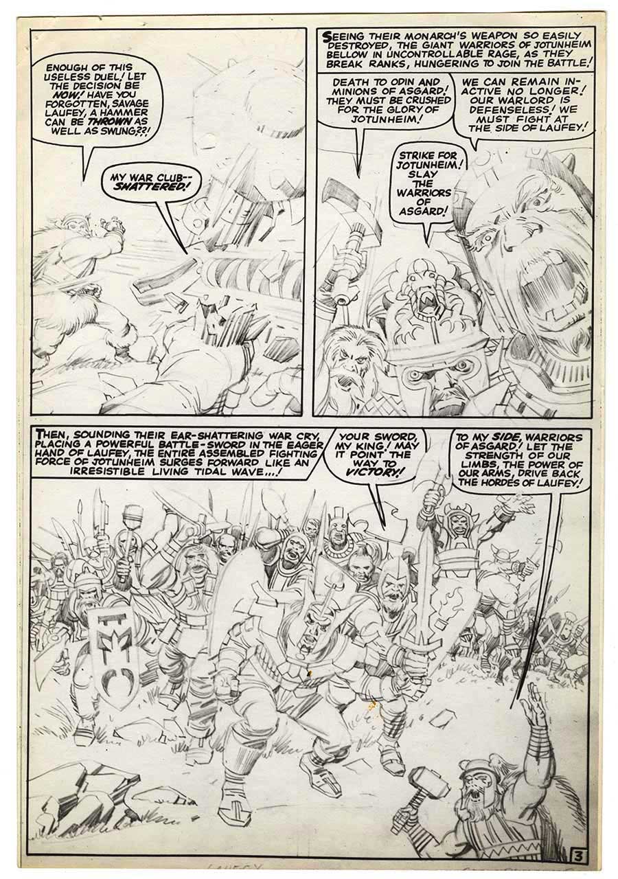
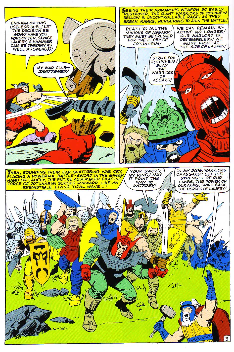
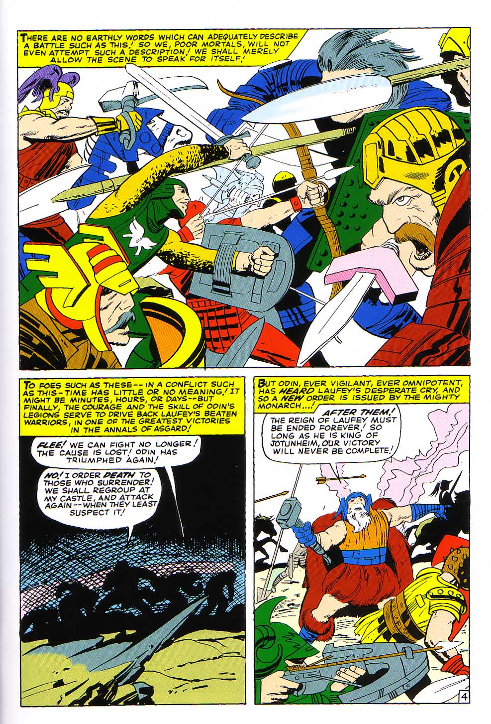

Do you have a copy of the inks, or the published page to compare to the pencils?
Sorry, I’m having difficulties with sizing my images. I will take down this unfinished post until I get it together. Then I will compare published pages and lambaste Colletta for shoddy inking
Thanks for posting the pencils and finished pages. When Colletta was good, he was GOOD. But he also produced a lot of subpar-looking stuff. I wouldn’t completely fault him because it’s not that he was a bad inker, it’s that he was a FAST inker. He was a guy they could count on in a crunch to delivered inked pages. I’ve heard stories of him inking entire books in a weekend. These Thor pages look really rushed, but at the same time I’ve seen Journey Into Mystery pages inked by him where the rendering would give Wally Wood a run for his money. So while the quality severely decreased the quicker he had to work, he was also the one whose task it was to get the books up to date and out on time to save the company money. And in an industry based on periodic media, meeting a deadline was more important than delivering high art.
Nice column, Norris. I was half expecting you to reverse your statement of defense by the end of it. I am unable to look at the finished product myself, and have a hard enough time with the pencils. Needless to say my favourite issue is 144, the one that’s fully available in pencil pages (plus a rejected cover with and without excellent Mike Royer inks). That too has its problems for me, however, because even before Vinnie sucked the life out of the pencils, Stan always did likewise for Kirby’s writing.
Ian Miller, your examples of Colletta’s deadline-meeting prowess sound suspiciously like they were borrowed from the biography of Jack, the master of turning work in on time. It’s heartbreaking to hear the suggestion that Vinnie’s speed was ever needed on Kirby’s books to meet a deadline. Fifty years on, I have the luxury of determining for myself the difference between high art and hackwork, and choosing not to surround myself with the latter. To paraphrase Metron, in that truth, you met a deadline, and forever lost a reader.
There’s a theory that particularly bad Colletta might be the work of assistants, but isn’t it equally plausible that the rare instances of passable Colletta would be the work of assistants?
Your instructive site has hit a great spot in me as a young tween these issues just seemed to be a strange amalgam of fine and a special comic and story art all its own. I find the inker’s simplification to be rather like a drummer’s or bassist’s job to support and suit the story or melody. Kirby’s art is amazing (did you notice batman in the top page crowd panel?) Look at the verbiage and the height and kind of action and I suspect it’s less a matter of speed – I see no errors at all – than of a conductor’s expression. It’s quite an opportunity to see the pencils after all these years…!