War and Supermen

by


There is certainly no question that the first comic book superhero was Superman. What is also certain is the fact that Jerry Siegel and Joe Shuster based their revolutionary new character on several existing prototypes, one of which was Hugo Danner, the protagonist in Author Phillip Wylie’s novel Gladiator.

His scientist father inoculates Hugo Danner’s mother with a serum that gives their child super strength, and the novel essentially tells the story of Danner’s tribulations in dealing with his powers. Almost from birth, Danner is feared and mistrusted for his strange inhuman abilities. Danner enlists in the army during World War I, and is initially quite enthusiastic in his role as a devastating killing machine, until he begins to see the horror and futility of war itself. After the war is over, Danner resolves to use his powers to change the world for what he sees as the better. He pays a call on a corrupt politician named Melcher, who is funded by the armaments industry, in an effort to prevent Melcher from passing a bill to finance the war machine. Danner threatens the politician thusly:

“Remember this Melcher, No one on Earth is like me- and I will get you if you fail to stop. I’ll come for you if you squeal about this- and I leave it to you to imagine what will happen. You’re all done for, you cheap swindlers. And I am Doom!”

What is most interesting about this exchange is that it is strikingly similar to a sequence in Action Comics #1, featuring the first appearance of Superman. Herein, the Man of Steel uncovers the nefarious dealings of a Washington lobbyist, whose policies favor America getting involved in the European conflict. Superman takes him for a sky ride in order to intimidate him.
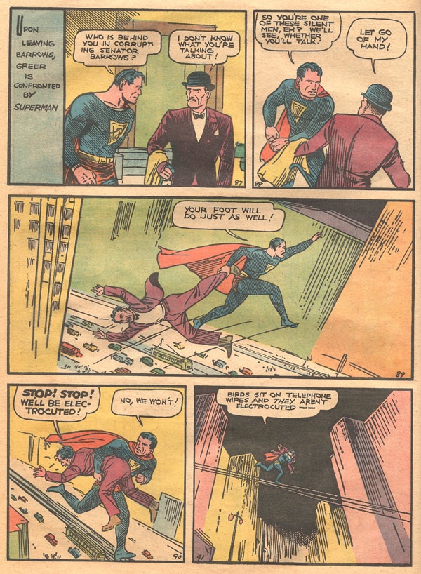
What is extraordinary to contemplate is the fact that this comic was published in 1938, a period when it was still possible to view an impending war in Europe from an anti-war isolationist perspective. Compare this segment to the fervor of Captain America, a scant three years later.

Phillip Wylie’s story takes place during and after World War I, which was deemed so horrific a conflict that many were resolved to put an end to war entirely. As a result, the public’s response was slow to censure Adolph Hitler’s brutality. Even when Simon & Kirby introduced Captain America in December 1940, depicting the hero delivering a right cross to Adolph, many people reacted unfavorably to the obvious political statement of violent anti-fascism. This was exactly one year prior to the attack on Pearl Harbor in 1941, but events were proceeding apace in Europe as first Poland and then France fell before the Blitzkrieg. In the United States, a Nazi organization called the German American Bund was established to promote a favorable reaction to Nazism. In issue five of Captain America Comics, the hero deals with Bund spies and saboteurs who threaten the security of the nation.
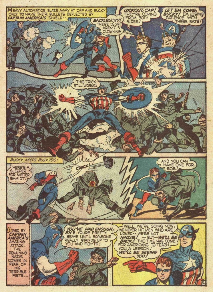
The third panel on this page is a fantastic display of Kirby Kinetics, as Cap sweeps his arms back to deck a dozen Nazis. Each Nazi figure in the panel is carefully rendered to accentuate the impact of Cap’s action. Flailing Nazi arms and legs follow the trajectory of Cap’s arms and the impact starburst emanating from them.

In my estimation, the fourth panel has Cap in a spectacularly contorted yet elegant pose, which few other artists could have pulled off. The right leg is extended to the rear, while the foreshortened torso twists to the left, following the swing of Cap’s right cross. The cocked left arm sheathed in red gauntlet gives the pose extra dynamism.

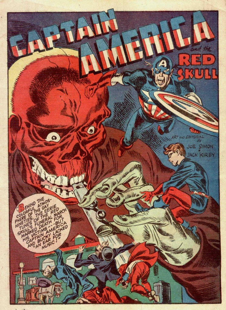
Captain America epitomized the chauvinism of pre-war American military might embodying righteousness. Simon and Kirby gave him an army of fiendish villains to counter his wholesomeness, led by the ghoulish Red Skull, shown here looming threatening in this splash panel from Captain America #7. Here is another great example of the Big O composition, as the eye moves from the Skull’s dome across Cap’s shoulders , down his shield to Bucky and the figures below him and then back up the pipe to the Skull’s leering visage.
One had to wonder what would have generally been the fate of the superhero if war had not broken out in earnest, considering the fate of most of these characters when the conflict had ceased. Captain America quickly became an anachronism in a post-war world that increasingly looked askance at super-patriotism. Superman endured, but was often reduced to combating absurd villains like Mr. Mxyzptlk and the Bizarros. Kirby with Stan Lee revived Captain America in the mid- sixties, but the character still labored under a cloud of self-doubt and insecurity in a world that was coming to terms with issues of U.S. imperialism surrounding the Vietnam War.

Kirby, as a veteran who was a part of the American invasion of Nazi occupied France, and had seen the horrors of war first hand, continued to deal in his work with the ambivalence towards violence in the human heart. In his seminal series, The New Gods, Kirby shows us the torment of Izaya, a warrior devastated by the climactic struggles in his world, and the patriarch’s ultimate rejection of war.
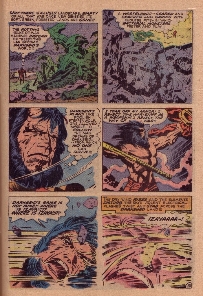
This is of course, a pivotal moment in the saga of Kirby’s Fourth World, because it is when Izaya is free of the rage of war that he is able to connect with the rejuvenating power of the Source and find his destiny in his identity as Highfather. The issue is one of Kirby’s most powerful statements and continues to resonate to this day. How indeed doea a human being resolve the conflict in his or her soul?


Image 1-Action Comics #1 Jerry Siegel and Joe Shuster

Thanks to Dusty Miller for image

Image 2-Captain America #5 Joe Simon and Jack Kirby

Image 3-Captain America #7 Joe Simon and Jack Kirby

Image 4- New Gods #7 Jack Kirby, Mike Royer

The Black Spot Revisited

by


Several years ago, I posted a blog on one of my favorite Kirby-drawn characters, the Rawhide Kid. Issue #30 of that magazine was certainly one of the first Kirby comics that caught my attention. It was at a Bronx summer camp that I came across the battered copy of the comic that sparked my artistic imagination. I found Kirby’s rendering of the western hero in action both amazing and amusing. The contortions that the artist put the Kid through galvanized me to draw in a similar fashion.

As I stated in the earlier blog entry: “The lithe black silhouette of the Rawhide Kid inspired Kirby to really explore the limits of kinetic continuity. The positioning of the Kid’s negative shape was like an anchor for the eye, a naturally spotted black to give contrast and motion to the figure.”

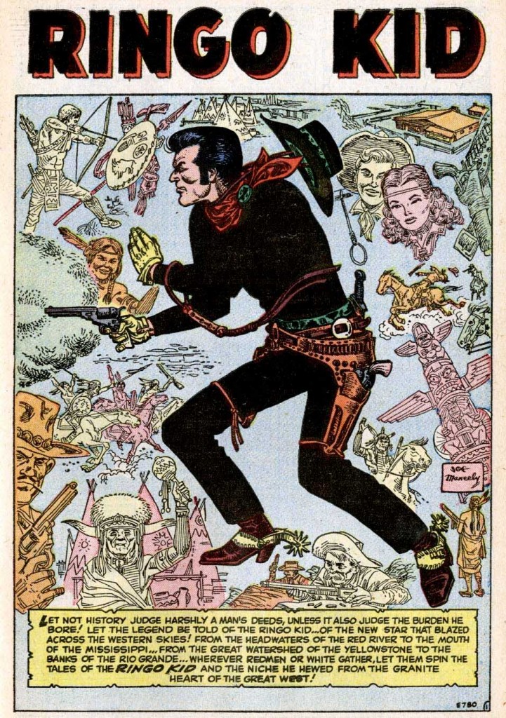
Recently, reading through the 18th issue of the fanzine Alter Ego, I came across an interview with Marvel colorist and artist, Stan Goldberg, mentioning that he had been impressed by artist Fred Kida’s depiction of Atlas comics western hero, The Ringo Kid. Goldberg noted that; “He was dressed in black. Normally, some other artist would use white to show the crease and folds in the costume, but Fred did it all in black. He made that character jump right off the page,”

I contacted Atlas Comics authority, Mike Vassallo, requesting some information about Kida’s work. Mike informed me that it was not Kida, but artist Joe Maneely who had innovated the Ringo Kid’s black costume.

During the late 1940’s, as sales continued to plummet, Martin Goodman’s Timely Comics began using the Atlas logo as their masthead. Joe Maneely was Atlas’ writer/editor Stan Lee’s star artist through the mid 1950’s, drawing a wide range of characters, including the Black Knight, The Yellow Claw and the aforementioned Ringo Kid. Maneely died in a tragic commuter train accident in 1958, a few years before Atlas would convert to the name Marvel Comics and achieve the astounding success that it did.

Here is Maneely’s early depiction of the Ringo Kid, that comic art historian, Jim Vadeboncoeur was kind enough to supply me with.

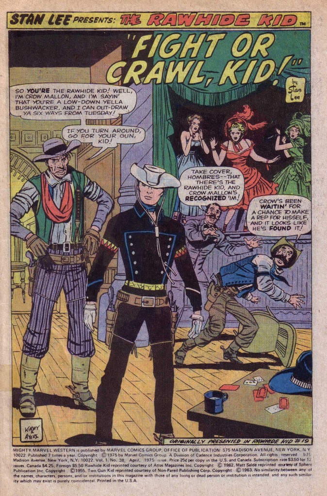
Notice the solid black costume, contrasted with the lighter outline treatment of the other drawings in the montage of figures and elements. This is clearly the model, which would inspire succeeding Ringo Kid artist Fred Kida, and later be the template for Kirby’s Rawhide Kid character design, shown here from RK#19.

In this splash panel, Kirby uses the central foreground image of the Kid in nearly stark black silhouette, with a minimum of red, yellow and cyan blue trim. In contrast to the Ringo Kid’s black hat, Kirby gives his hero a white hat, emphasizing the importance of the head. This panel is a beautiful example of a deep space composition. In mid-ground behind the Kid are the gunfighter on the left and the cowering figures on the right, who further emphasize the hero’s prominence by their postures. The spotted black of the Kid contrasts with the black of the stage to the right containing the smaller background figures of the girls. This composition is yet another version of the Big O, in terms of the figures relationship to each other. The first figure you see is that of Crow Mallon, whose left elbow points to the Kid’s right shoulder. The eye follows the Kid’s black left arm to the cowering cowboy in the blue vest and then upward to the girl in green and around again to Mallon.

What happens on this page however is that the black of the stage mirrors the black of the hero’s costume, focusing the eye even more fixedly on the Kid’s figure. The blacks are beautifully balanced here. Although this page is inked by Dick Ayers, I am convinced that because of the importance of the costume’s effect on the composition, Kirby is spotting his blacks in pencil for the inker to follow.

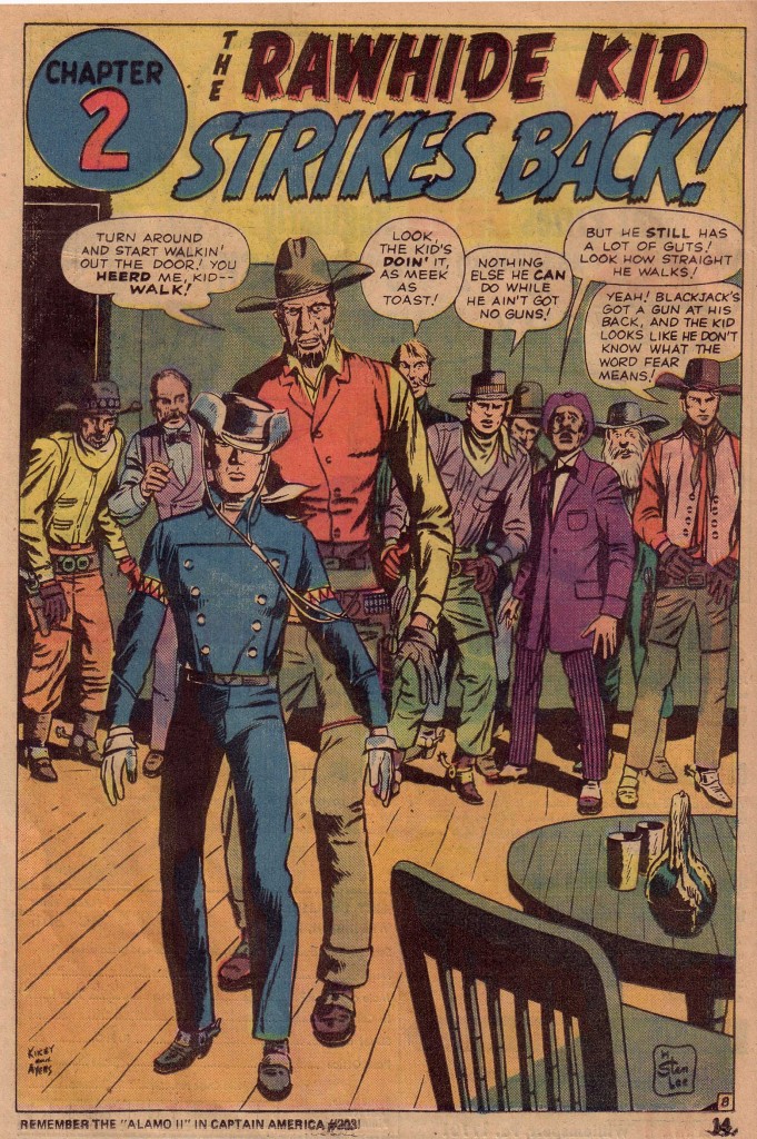
In the following issue, #20, it appears that Kirby is providing less than complete pencils with desultory attention to details such as backgrounds. In chapter 2 of the Blackjack Bordon story, Kirby gives us a splash panel that is somewhat similar to the own shown above, but the differences are telling.

The first thing we notice is that the Kid’s costume is not solid black but only partially shaded and colored blue.  The figure is strangely off center, is drawn less skillfully, and the lighter rendering makes it appear weaker as well. There are few instances of strong spotted blacks and those that exist are less logically placed. There is little background to speak of other than a portion of a door and the indication of a room that a line of figures behind Bordon and the Kid inhabit. The next issue is also not as strong as the first three of the series, with what appears to be more instances of looser penciling. Perhaps Kirby’s workload for those months was heavier than usual.

By issue #22, Kirby appears to return to giving the inker more complete pencils to follow, but in my opinion he does not realize the series’ full potential until issue # 28. Something then happens when Kirby begins to seriously play with the Rawhide Kid’s figure in a way that I have seldom seen done before or since in an action comic book.

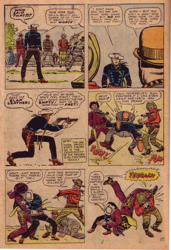
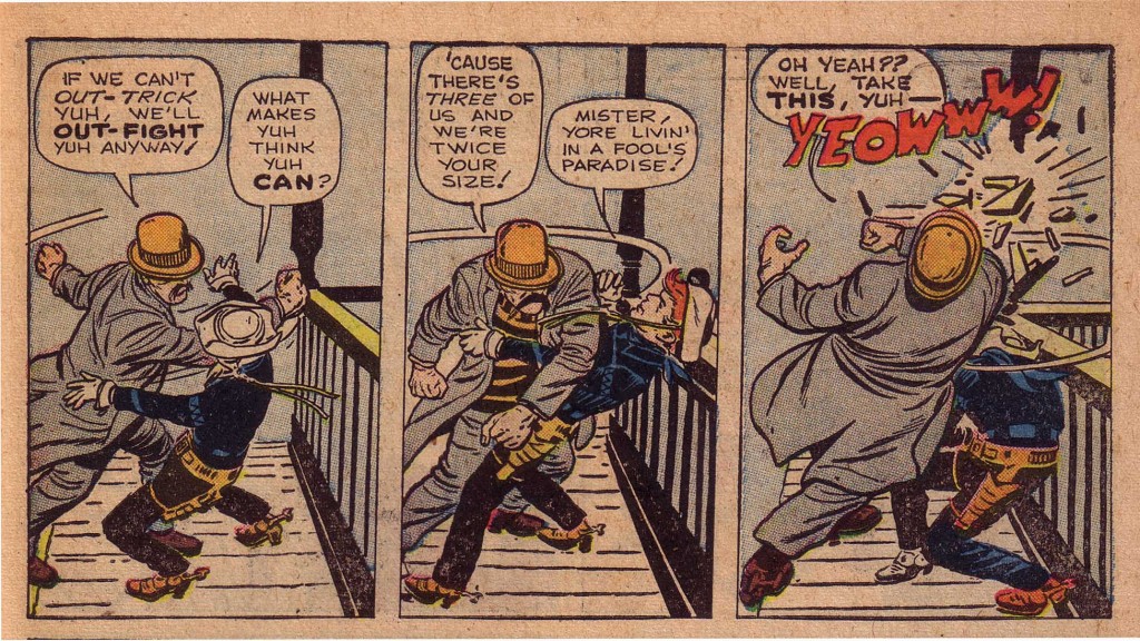
This sequence of panels from issue #32 is certainly one of my all time favorites, as the Kid confronts three devious assailants. The reader easily follows the black silhouette across and down the page to the last two panels where the Kid leans into the purple figure and tosses him over his shoulder. What follows is a fantastic example of action-to-action continuity, as the thug in the orange bowler hat, in the course of three panels swings and misses with the Kid ducking under the blows.

This 32nd issue of Rawhide Kid was on the newsstands in November 1962. Kirby must have hit his stride as an action/fantasy artist-writer during that period, producing with Stan Lee in that month, Fantastic Four #11, Journey Into Mystery #88 featuring Thor, Incredible Hulk #5, Tales to Astonish #40 featuring Ant Man and Strange Tales #105 featuring the Human Torch. The following month Kirby dropped art chores on the Incredible Hulk as well as The Rawhide Kid.  The workload was clearly getting too heavy.

It was truly the end of an era, but also the beginning of a fertile period of creativity for Kirby and Lee, whose next several years of output would change the face of comics. Although that period would be rightfully hailed for the wonderment it produced, the period that saw Kirby explore action with the ink-black figure of the Rawhide Kid will always hold a special place in my personal artistic development.


Image 1-Ringo Kid #1 Joe Maneely, Stan Lee

Image 2-Rawhide Kid #19 Jack Kirby, Stan Lee

Image 3-Rawhide Kid #20 Jack Kirby, Stan Lee

Image 4-5 Rawhide Kid #32 Jack Kirby, Stan Lee

Special thanks to Michael Vassallo and Jim Vadeboncoeur for information and scans.

Golden Age Captain Returns

by

With Captain America finally coming to the silver screen and being given the respectful treatment that he is due, including an origin set in the 1940’s, it seems apt to discuss the Captain as he was actually drawn and inked during that period. One of the best things about the film was the way that Cap was presented. Actor Chris Evans does a great job at being humble and wholesome, which is the way the character should be. “I’m just a kid from Brooklyn!” he says, when the Red Skull asks him what makes him so special.

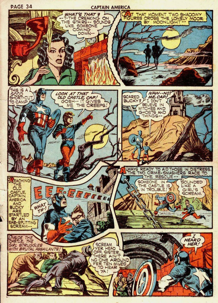
Secondly, and perhaps even more crucial, because  the scenes were shot for 3D viewing, the action comes from the inside of the screen out. This is of course perfect for a project based on a Kirby comic, because that’s what the King did best. The idea was always to keep the action coming in your face. Scenes like the runaway train, motorcycle chases and any fight scene always had that momentum. Circular tunnels or a sequence of girders were often used compositionally in a way to accentuate the perspective so that the feeling of acceleration outwards was present; something that Kirby often did with his comics. An early example of this is in the last panel of the page below from Captain America #8 circa 1941, where Kirby uses the arches of the castle’s ceiling to suggest a depth of field from which figures emerge.

When Jack Kirby and Joe Simon presented Captain America to the world, Kirby was far too busy to do much more than the splash pages for the stories and generally rough drawings for the main body of the stories. The duo employed a stable of competent artists to finish and finally ink their production pieces. Two of the most competent artists thus employed were Al Avison and Syd Shores. This particular page, reprinted as a faint background image behind a photograph was my first exposure to golden age Kirby. The image was used in a 1964 issue of Screen Thrills Illustrated, showcasing the Captain America movie serial. I was fascinated by the vague artwork below the photo of the screen Cap who was pointing his incongruous revolver at some target outside the frame. It seemed like a window into a mist shrouded past that I couldn’t quite reach.

Most of the drawing here was clearly done by Kirby, but the inking was by Al Avison, who took over penciling chores from Kirby when S&K left Marvel. In the late 1960’s, Syd Shores returned to Marvel to ink Kirby’s Captain America. Shores had inked Kirby in 1941, Avison in 1942, and took over the pencilling  chores from him in Captain America #20. Shores adopted some of Avison’s stylistic quirks such as the latter’s uniquely bulbous rendering of kneecaps. Shores’ 1960’s work was so clearly retro that it stood out markedly from Kirby’s more conventional inkers, such as Chic Stone and Frank Giacoia. Recently, Rand Hoppe posted a series of Kirby’s Captain America pages inked by Shores, along with the original pencils to allow for a fascinating comparison. Few inkers have been allowed the degree of latitude that Shores has here. He had obviously been told that the retro 1940’s feel of the style was desirable and he pulled no punches with his embellishments.

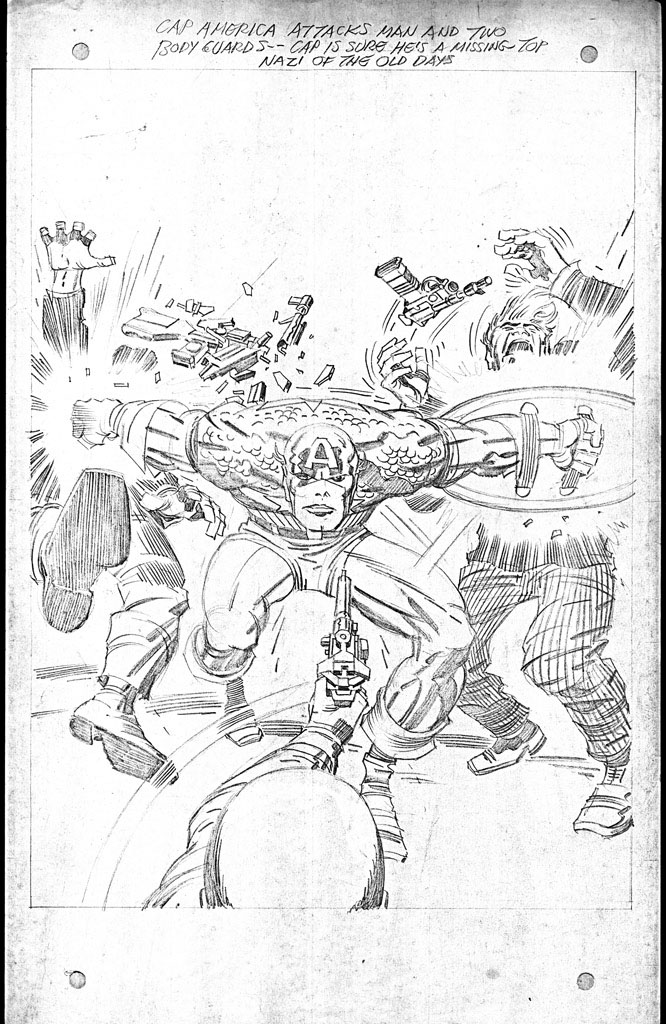
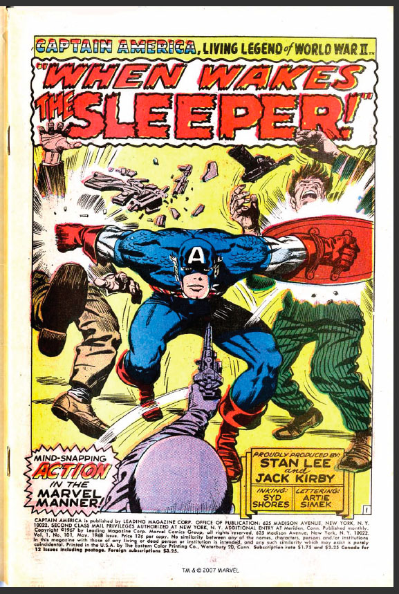
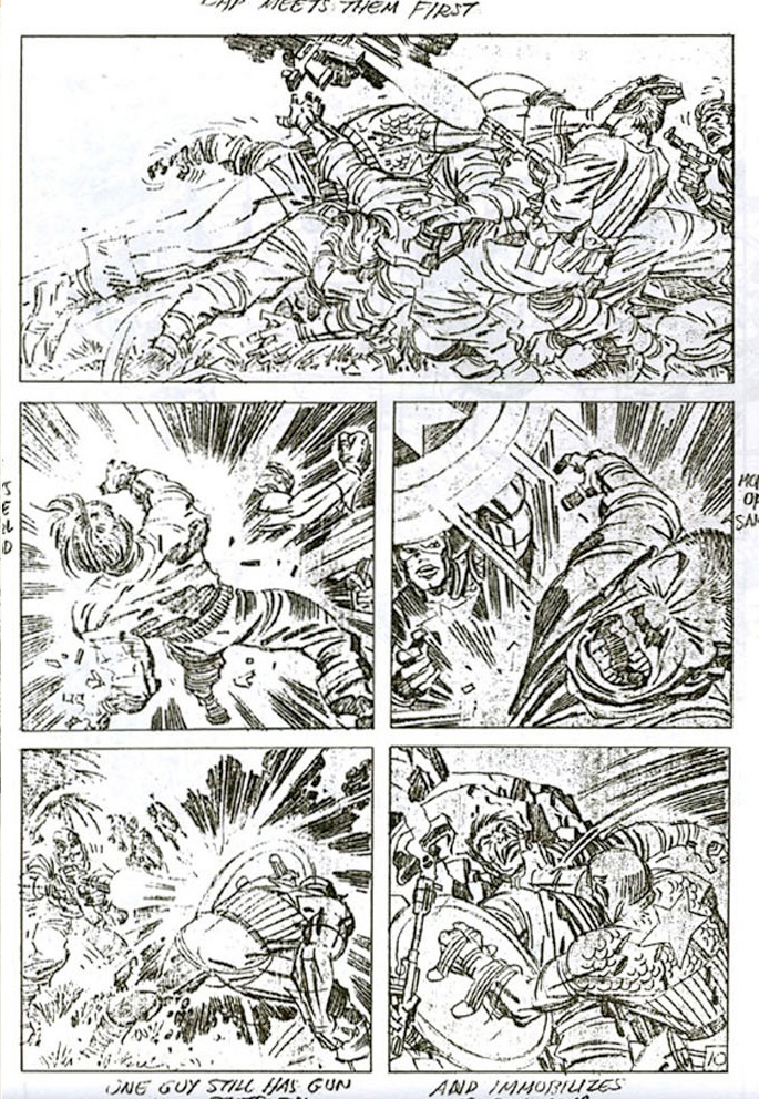
First, observe the original pencils of this opening splash page above, as Captain America explodes forward, bashing opponents with his shield and the sweep of his right arm. Kirby’s pencils are tight. He spots his blacks and leaves very little room for interpretation, unless one chooses to deliberately ignore his line’s intent.

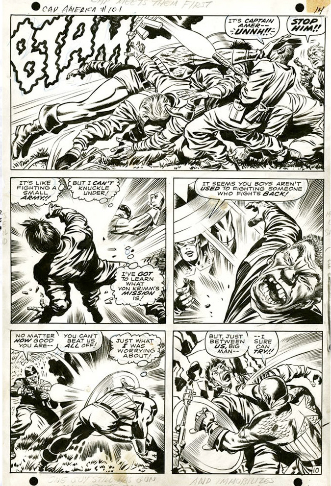
The first thing we notice is that Shores alters Cap’s face, making it rounder, yet also more elongated and somewhat devoid of the grim purpose in the expression in Kirby’s pencils. The face very much resembles the way Shores drew and inked Captain America in the 1940’s. As many inkers have a tendency to do, Shores rounds out the angles of Kirby’s art. This is readily apparent in Cap’s right kneecap, which is actually a signature of Shores’ style. This was as I mentioned earlier a trait that he seems to have picked up from his period of inking Al Avison on Captain America.

We can also notice a very nice feathering technique around Cap’s musculature and the fact that Shores’ shadows are heavier, such as the total blacking out of the area of Cap’s groin and upper left thigh. Shores also rounds the hands of the assailants, giving them nails and making them more anatomically accurate. The raised right hand of the thug on the left is particularly nice.

On this flat out action sequence below, we can observe many more interesting details. If we look at the pencils, we see that Kirby has done a fair share of black spotting, but his lines are not extremely tight. It is a nearly complete pencil job, but it suggests that certain areas may need finish.

The first inked panel is gorgeous, as Captain America slams into a gang of soldiers. Shores does a nice job punching up the crease lines in the various uniforms. Panel two is a different story, as in my opinion the inker goes a trifle to heavy on the blacks. This is perhaps Shores’ most pronounced weakness, and in many instances it is his unawareness of how the art will eventually reproduce that is a problem. For example, the adversary that is being hit by Cap’s shield in panel three is inked beautifully, with fine delicate feathering on his contorted face.

The problem is that when this line-work is reduced and colored for the printed comic, it has a tendency to become blurred.  Shores also has a tendency to make the villains’ faces even more grotesque. The shield struck soldier in panel three almost looks like a stereotypical caricature of an Asian rather than a Nazi.

What makes this third panel so wonderful compositionally is that the curve of Cap’s shield picks up the sweep of the force lines in panel two, making the blow’s impact more powerful.

Panel four works well, but five is again a bit heavy on detail. Shores adds some unnecessary blacks to Cap’s shoulders and botches the strong black spotting that Kirby has placed in the rocks behind the Nazi’s shoulder.

Through the years, I’ve observed that reactions to Syd Shores’ inking of Kirby vary widely. Some enjoy the retro flavor of his style, while others find it heavy handed and intrusive. I for one enjoy the opportunity to see Kirby rendered by someone that gives his work that flavor of a bygone golden age. Whatever problems I have with Shores’ technique are offset by my enjoyment of his unique style

Image 1-Captain America #8  Joe Simon and Jack Kirby

Image 2- Captain America #101, pencils Jack Kirby

Image 3-Captain America #101 inked and colored, Jack Kirby, Stan Lee, Syd Shores

Image 4-Captain America #101, pencils, Jack Kirby

Image 5-Captain America #101, inked, Jack Kirby, Stan Lee, Syd Shores

Supernatural Origins and Transformations

by

Like many comic book artists, Jack Kirby was fascinated by supernatural power. Of course much of this preoccupation would derive from the comic reading market that demanded heroes with super powers.  Kirby was fascinated by science fact as well as science fiction, and would scour both in search of ideas. Early in his career, Kirby, with Joe Simon would develop characters that possessed extraordinary attributes, such as Blue Bolt and the Vision. Blue Bolt possessed powers that were related to ideas on the forefront of the science of atomic energy in the late 1930’s, while the Vision’s powers were pure magic.

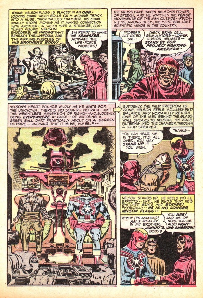
Left to his own devices, Kirby would often tend to focus more on heroes who were naturally strong and acrobatic. Even Captain America, who received Professor Reinstein’s super serum, was essentially just an exceptional athlete. In 1954, Simon & Kirby’s Crestwood publications introduced Fighting American. The character had a fairly unique origin, in that his soul had been transferred from his own body into that of his revitalized brother. Although not unusual for a comic book character, the idea of the transference of a life force still conjured notions of a supernatural world somewhat resembling existing esoteric religious beliefs.

When called upon to depict such an occurrence, few artists could surpass Kirby in his ability to make such wonders believable and vividly hyper-real. The machine that Kirby constructed is also strikingly believable. The master was always capable of designing a contraption that looked like it did the job in question. The text was also evocative, describing Nelson Flagg’s life force as a ball darting about the screen that he is watching, as he reincarnates.

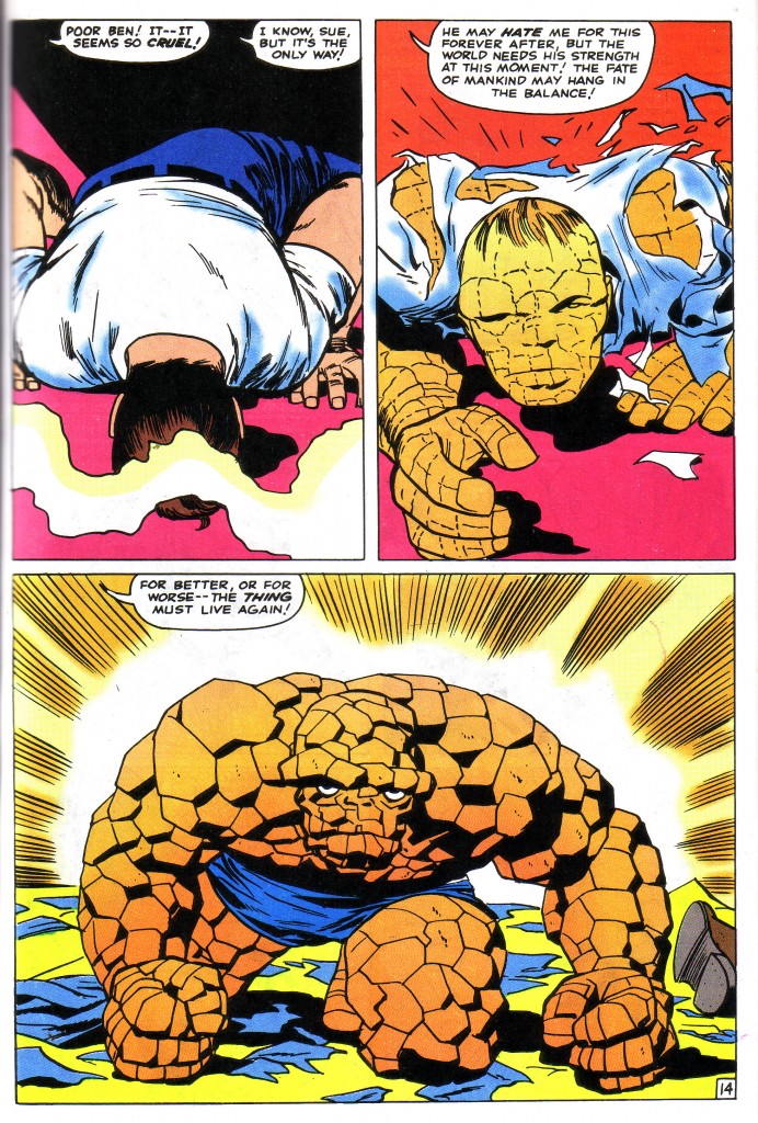
Throughout his lifetime, Kirby created several characters whose souls would switch bodies, or whose bodies would simply transform. This transformation was usually accompanied by a wonderful visual display of cosmic forces at work. When he began his historic stint at Marvel, The Fantastic Four’s character, The Thing was an immediate hit, with his propensity to change unpredictably from human to creature and back again. This page from Fantastic Four #40 is arguably one of Kirby’s most powerful and moving examples of this metamorphosis. What is most striking here is the situation in which Reed Richards feels compelled to transform Ben Grimm seemingly against his will. One can see the resentment and weary resignation in the Thing’s expression as he rises from the floor.This is a wonderful three panel sequence that elucidates human nature is a way that only a genius like Kirby can. After Reed’s ray strikes him, Ben falls to the floor. As he begins to rise in panel two, he no longer appears to be a sentient being, but a sort of mindless primordial reptilian entity from the dawn of time. His right hand is moving forward mechanically and gesturing just above the level of the Thing’s head in panel three, focusing the reader’s eye on that grim visage.

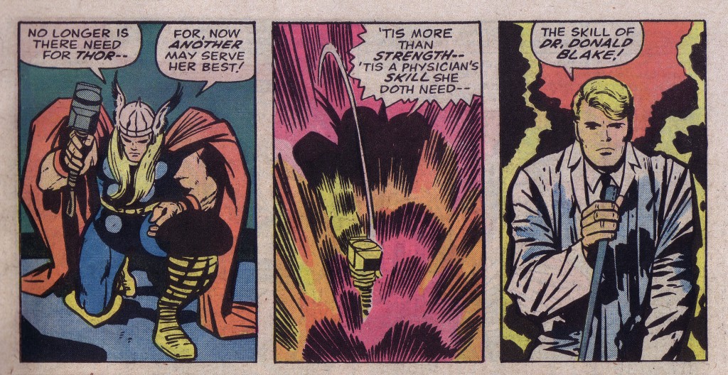
The most cosmic transformation should be that from man to god, or in reverse. Kirby explored such concepts numerous times over the years, beginning in the 1940’s, and continuing into the 80’s. Thor’s Hammer was a particular fixation for the artist. He used it twice at National and then at Marvel most famously. When Kirby did Thor in the sixties, he and Lee explored the idea of the object of the hammer transforming both itself and its owner. This sequence in Thor #154 is one of the nicest examples of this transition.

The three-panel sequence generally seems to be Kirby’s choice to most effectively depict transformation. While not the most dynamic series of figures, there is a nice subtle forward movement here beginning with Thor kneeling. As he strikes down with his hammer, the resulting explosion in panel two pushes Blake’s right hand holding the cane towards us in panel three to emphasize the change.

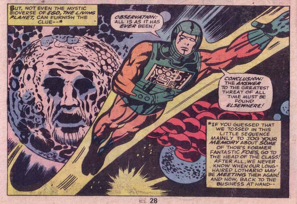
Thor’s series featured one of the most inventive of transformative beings, which I discussed in an earlier blog on cosmic energy. Ego the Living Planet was able to re-incorporate as a bi-pedal hominid or any number of other manifestations. Here is a fantastic drawing of him from Thor #155.

This particular panel dynamically depicts the character known as the Recorder in a signature Kirby pose with left hand extended, zooming up and outwards from the living planet. The planet and figure are surrounded by a fantastic interstellar environment of organic and intergalactic matter which give substance to and tie together the various compositional elements.

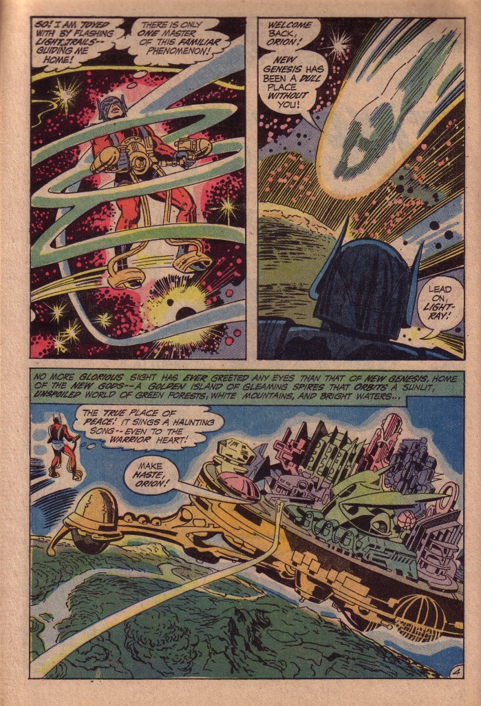
When Kirby left Marvel for National yet again, part of his new body of work was another exploration of Godhood. This time the gods emerged full-blown, without need of transformation. There were in fact several races of them, co-existing beyond the earthly sphere. Shown here, Orion and Lightray represented the Cosmic Clear light of the Source. Here, encircled by bands of energy, which guide him, Orion returns to his home planet.

Having explored various magnificent depictions of a world fit for gods in Thor with his designs for Asgard, Kirby gives us a new twist here. It is a city that floats above a more pristine world below.

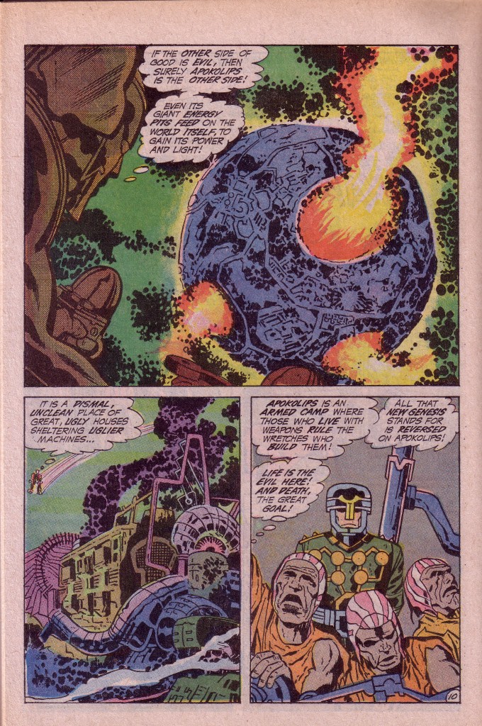
The energetic opposite of New Genesis is the dread planet known as Apokolips, which represents the dark aspect of the Source. In the first issue of New Gods, we discover that Orion is somehow connected to Apokolips and its ominous ruler, Darkseid. Contacted by the Source, the sentient energy that binds the universe together, Orion returns to the fire-pitted gulag planet Apokolips on a mission of discovery. Here we see a dark and ominous series of images, as the planet’s baleful inhabitants transform its very life force into the energy to sustain them.

This is a powerful series of three panels yet again, which begins with a long shot of the planet from Orion’s point of view, and then moves in closer as we see the grim structures that make up the surface of Apokolips. Finally we zoom in on a close-up of the pathetic wretches toiling hopelessly.

This story in New Gods #1 is surely the base of the pinnacle that became Kirby’s magnum opus. Strange that Kirby’s Fourth World is often dismissed as being poorly written and conceived in comparison to his work with Marvel, when this series is arguably one of the most influential when it comes to its impact on popular culture. In Kirby’ depiction of the metamorphosis of the world of the old gods into the new, he has sown seeds that continue to bear fruit, far beyond the plagiarism that it has engendered and spawning reinterpretations into the evolving intricacies of the DC Universe.


Image 1- Fighting American #1, Joe Simon & Jack Kirby

Image 2- Fantastic Four #40, Jack Kirby, Stan Lee

Image 3- Thor #154 Jack Kirby, Stan Lee, Vince Colletta

Image 4-Thor #155 Jack Kirby, Stan Lee, Vince Colletta

Image 5-6 New Gods #1 Jack Kirby, Vince Colletta

Some Changes Made

by

One of the most entertaining comic book stories I’ve ever read appeared in Fantastic Four #92, entitled “Ben Grimm, Killer”. It was a tale in which The Thing was trapped on a shape-shifting alien Skrull planet, where the inhabitants were pretending for some strange reason that they were living in a depression era Chicago run by Hollywood style gangsters. This gave Kirby a chance to feature some of his most bizarre and colorful versions of mob kingpins as well as scores of intergalactic monstrosities.

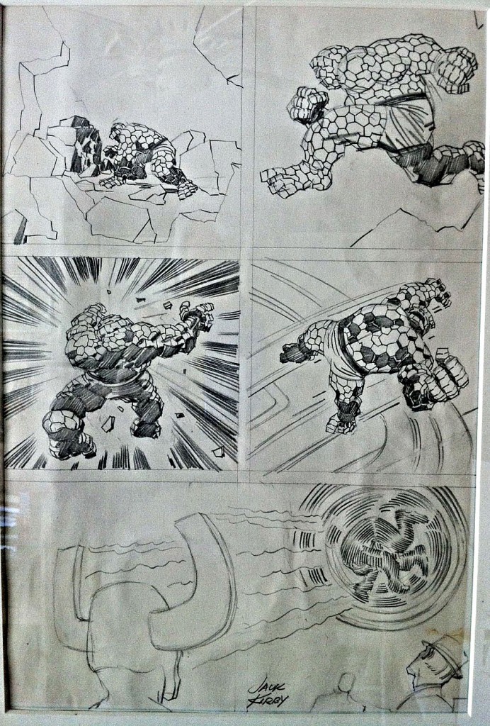
One of the posters on the Jack Kirby discussion group, John Coyne recently presented  an original Kirby penciled page to the group. Kirby had discarded the page for some reason, and John was asking if anyone knew for which issue it had been done. Another poster, Glenn Edwards identified the source of the page as being from the story, “Ben Grimm, Killer.” As John was kind enough to allow me to feature the page here, this is a wonderful opportunity to compare the discarded page to the published version and peer into the inner recesses of Kirby’s creative process.

Initially, what strikes me most about this page, without comparing it to anything, is that it is composed mostly of middle-ground shots of the Thing, first standing, then running and finally being struck by some sort of force. The camera then cuts to a foreground shot of a helmeted character spinning someone in the air above several onlookers. The sequence is well drawn, but not particularly exciting, mostly because of the fact that the Thing is alone in most of the panels, approximately the same size and it is not clear what sort of threat he is facing until the final panel, where it is not even clear that it is him spinning.

Kirby was known to vary the size and angle of his figures from panel to panel, generally because it created more drama. Unless he was doing an action-to-action sequence, specifically emphasizing continuity of movement, the artist would usually follow a close-up with a medium or long shot.

Based on the design of the helmeted figure. Glenn quickly deduced that this was a minor character called Magno-Man, whom the Thing was briefly pitted against in FF#92.  Then, after I initially submitted this blog entry, I received communications from Craig M. and Greg T., both suggesting that the discarded  page was designed to fall between pages 4 and 5.  If we look at the quality of the published sequence,  we see why Kirby has made the decision to discard the penciled page.

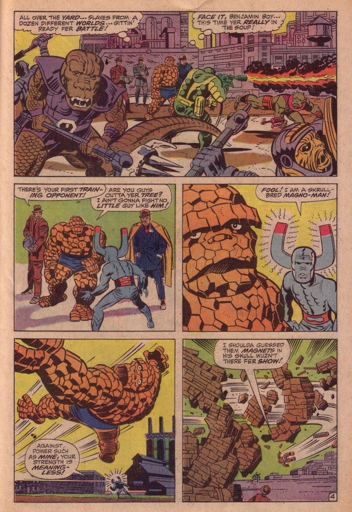
In the first panel,  we see the Thing  surrounded by a group of threatening aliens in an urban landscape. The head of the saurian creature on the left is at the same level as the central background figure of the Thing, and the straight edge of a concrete structure brings our eye from the creature directly to the orange hero. The creature’s tail and the barrel of a weapon bring us down to an overhead medium shot of the Thing facing Magno-Man in panel two.

Next we see a close-up of the Thing’s head, with Magno-Man smaller on the right. This is followed by a larger mid-ground shot of the Thing propelled diagonally and rightward through the air, and finally we see his tiny figure crashing through a brick wall and swerving off into the distance. Compared to the relative sameness of the panels in the penciled page, Kirby has given us masterful sequence, composed of a variety of contrapuntally sized figures and objects.

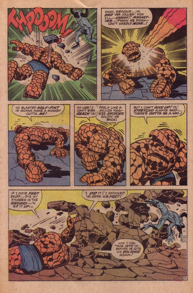
Kirby knows, as the cliché goes that variety is the spice of life. Observe the composition of the following page, as the Thing counters Magno-Man’s attack.

Panels two through four show us similar mid-ground shots, but they are action- to-action frames, showing close continuity as the Thing pushes his way through Magno-Man’s force field. Panel three’s Thing is slightly smaller than that of panel two, but the hero’s figure then gets progressively larger and becomes a close-up in panel five. Panel six switches to a medium-long shot as the Thing rips up the pavement to topple Magno-Man.

Here again, Kirby’s creative process is in the Zone, unlike the uninspired work that he has done in the rejected pencil page. Unfocussed there, he is now fully aware that the visual choices he is making are the optimal ones for kinetic storytelling.

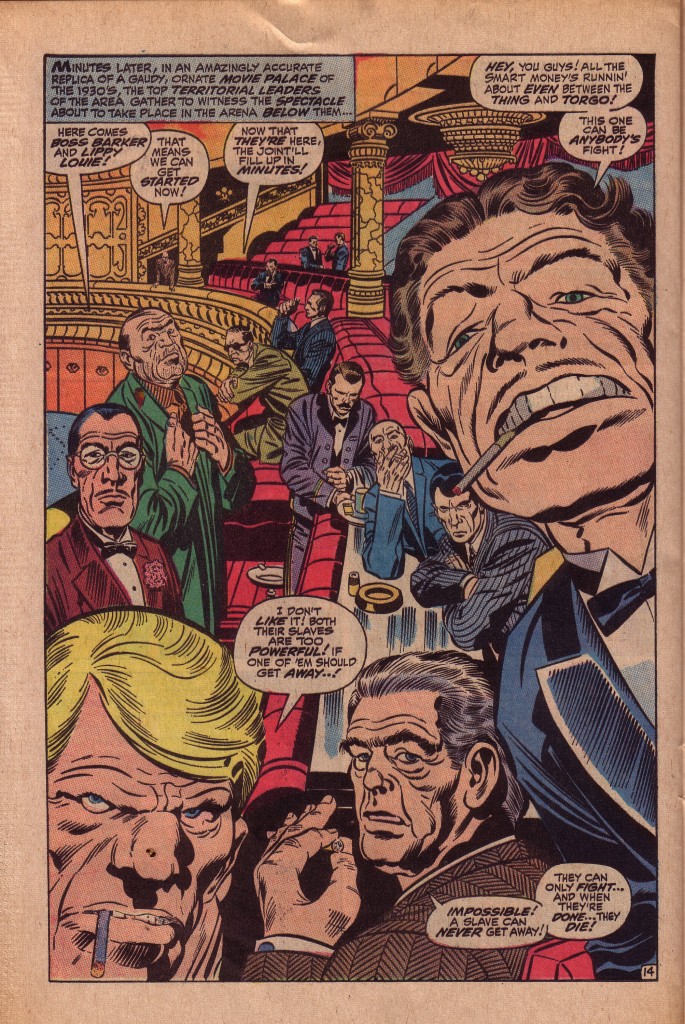
For me, the bravura page is this single panel wonder set in the mobster arena, as the Skrull gangsters leer in anticipation of the brutal games they’ve arranged.

The sweep of the lavish balcony carries the viewer’s eye through a succession of figures that grow in proportion as they eventually become grimacing close-up portraits of debauched greed and sneering evil.

Kirby uses the curved balcony as a space-time continuum, a compositional trick that he has mastered. The figures speak more or less in the order of their size and arrangement on the balcony. Interestingly, because of a second circular composition created by the gangster’s heads, the most prominent gangster, placed in the upper right speaks before the smaller heads to his left.

So we see that while the King is capable of occasionally faltering, we also see here is that he is also capable of recovering, shifting gears and regrouping. In this case, Kirby has nearly completed a page and realizing that it is not up to his standards, he has taken the time and effort to completely re-conceive the sequence. This illustrates the care and consideration that the man obviously puts into his work.


Image -1 Jack Kirby original art owned by John Coyne

All other images from Fantastic Four #92, Jack Kirby, Stan Lee, Joe Sinnott

Thanks to John Coyne and Glenn Edwards for their insights and contributions.

The Power and the Pathos

by

When Jack Kirby’s Fourth World epic began to falter, the King  considered less ambitious, more commercial projects to spark his career. Kirby used the film Planet of the Apes as a jumping off point for the series Kamandi, the Last Boy on Earth, populating his post apocalyptic world with a plethora of sentient animals and a human race composed predominantly of inarticulate brutes. While Planet of the Apes was a fairly serious scathing indictment of the folly of mankind’s penchant for war and its potential consequences, Kamandi was in comparison a lighthearted romp that still managed to satirize the inhumanity of seemingly intelligent sentient beings vying for ascendency on planet Earth.

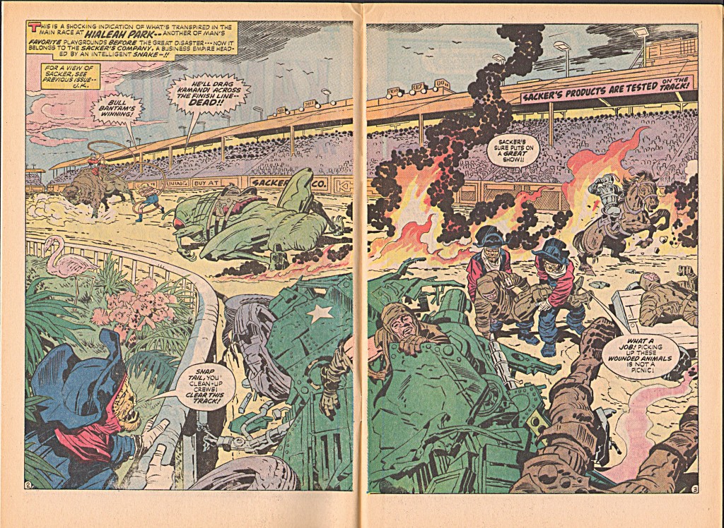
One of the most memorable episodes in the series climaxes in issue #14. Kamandi, a teenage boy captured by anthropomorphic leopards is forced to engage in a life and death race against a brutal human Bull rider. Kamandi’s mount is Kliklak, a giant cricket with which he has developed a strong emotional bond. This is an explosive action filled comic, which uses space in Kirby’s typically expressive panoramic way.  This wonderful spread is a shot of the racetrack at Hialeah following a savage race.

The broad left to right sweep of the stadium roof is broken by the smoldering flames, which draw the viewer’s eye to the wrecked vehicle and then to the huge cricket. The leopards carrying the body also allow the eye to move around and back to the leopard holding the railing on the left. The sense of space and movement in this spread is truly astounding. It is another of Kirby’s space/time continuums that he does so well, giving the cinematic illusion of the passage of time in a single still frame.

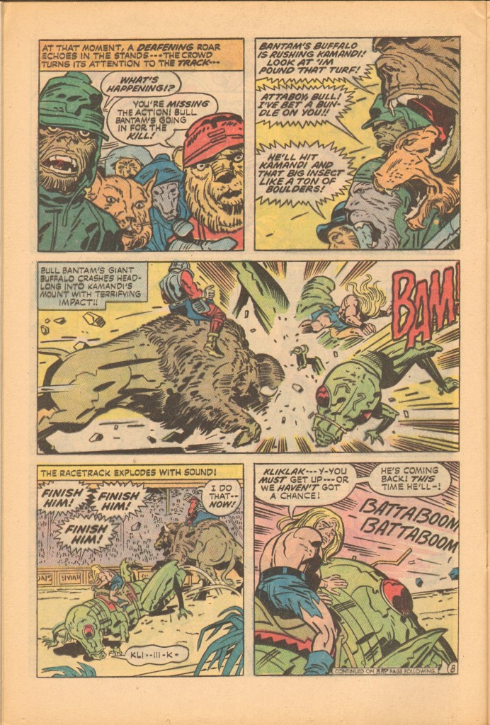
On page eight, the thuggish Bull Bantam and his buffalo charge at Kamandi and Kliklak with devastating effect, as shown in the horizontal third panel.

The screaming, gaping jaws of the various creatures in panel two connect visually with the impact lines emanating from the buffalo’s battering ram of a head in the long panel below it. The blood-thirsty savagery of the bestial spectators presages the savagry of Bull Bantam’s attack.

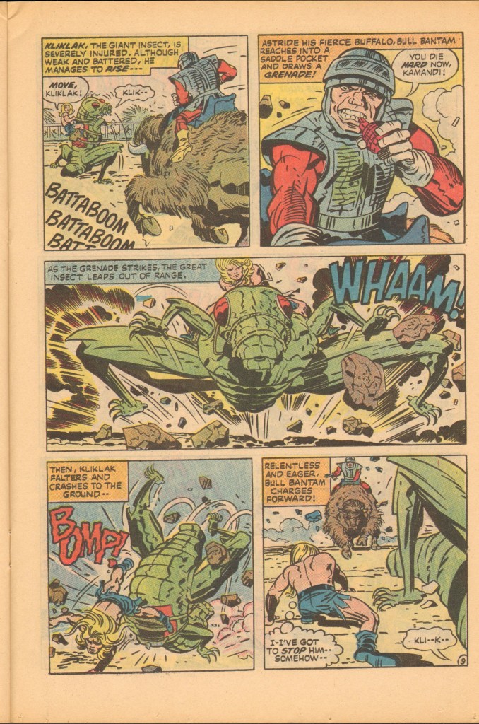
This is to me one of the most pathos filled moments in a comic book, as we see the wounded insect staggering helplessly, attempting to recover from his injuries

Charging Kamandi, the bison rider throws a grenade, and in another wide middle panel, the giant cricket leaps towards the viewer and away from the deadly explosion.

The King always makes the most of depicting any form of force or expended energy, and in this case, the concussive clouds and force lines behind Kliklak propel him at us with maximum velocity. The insect’s hyper extended legs add to the dynamism of the panel, as does the arc of the WHAM sound effect. Kliklak lands in a heap, mortally wounded.

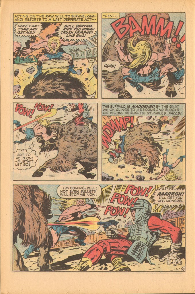
In a bravura panel, Kamandi leaps directly onto the head of the charging buffalo.  Any normal attempt to draw this moment realistically would almost certainly not be as effective as Kirby’s expressive exaggeration. He is at the height of his powers and confidant enough to wing it. The skewed anatomy in this drawing doesn’t detract from its power and directness. Kirby and Kamandi are literally grabbing the bull by the horns.

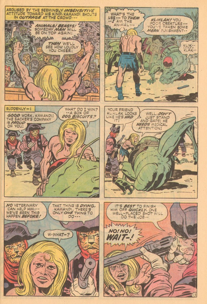
Kamandi dispatches Bull Bantam in a fight sequence that I’ve already lovingly described in a previous blog post. (See Rawhide Kid, The Black Spot)  Kirby is playing with themes here, combining a classic Western rodeo with a racetrack setting.  As the classic cowardly bully, Bull Bantam gets his comeuppance. Kamandi then turns to the crowd and admonishes them for their callous brutality.

The suffering of his insect friend devastates Kamandi, and his pain and rage are palpable. When one of the leopards is about to put Kliklak out of his misery, Kamandi intervenes. He chooses to end the suffering of the pathetic creature himself.

For those who are critical of Kirby’s story-telling abilities and characterization skills, I present this poignant fragment. Kirby has given us an insect, a creature whose only form of communication is body language and the sounds it emits. It is remarkable that we are capable of caring more for this strange animal than for most of the vapid, overly dramatic and self-absorbed super-heroes that currently inhabit the various comic book universes.  This is what sets Kirby apart.

Long live the King.

All images from Kamandi #14 Jack Kirby and Mike Royer.

Thanks to Mike Hill for his scans

Kirby’s Creatures

by


Recently, John Butler, one of the posters on the Kirby Museum list sent me some scans from his personal collection of original art. Jack Kirby drew these pages during what is generally referred to as the Atlas pre-hero Monster period between 1959 and 61. A year or so before Kirby and Lee released the Fantastic Four, the two creators were producing stories featuring various supernatural creatures, more or less in step with a market that favored such monstrosities.

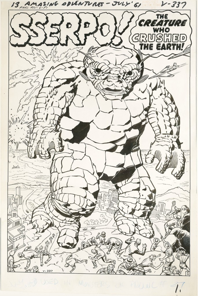
One of John’s pages starred a scaly monster called Sserpo who appeared in Amazing Adventures #6. Because of its skin texture, Sserpo somewhat resembled the Thing, and therefore, some may consider him a visual prototype for that hero. Seeing Sserpo reminded me of how popular saurian creatures were back when Kirby was doing these sorts of stories. Like most boys of that period, I always had a fondness for such beasties, and Kirby certainly had a magical way with them.

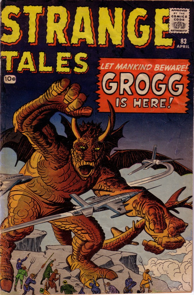
Kirby also excelled at drawing dragon-like creatures, Fin Fang Foom, introduced in Strange Tales #89 was certainly the best well known of such dragons. What many fans don’t realize is that a similar beast known as Grogg was featured previously in Strange Tales #83. Grogg and Fin Fang Foom appear to come from similar stock, and in the earlier story, Grogg is shown as one of a species of such mythical reptiles that invaded China centuries ago.

For me, Strange Tales #83 is one of Kirby’s most powerful and effective monster covers. The viewer’s eye moves from the creature’s raised right arm, down across its face and to his left hand thrusting to the right to seize the jet. The motion of the dragon’s tail swoops up towards the left arm and back to the focal point of the creature’s face, which the jets on the left and right also point to. Grogg’s left claw is huge in forced perspective, reaching out to grab and pull us into the book.

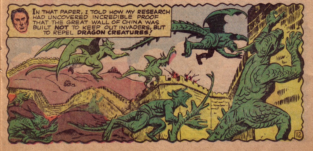
Towards the end of the story there is a two-panel sequence that is an example of Kirby at his most inventive. In a way, it is a shame that the panels are not seen on the same page. In fact, the pages are not even placed next to one another in the printed comic. The first panel is at the bottom of page twelve, so there is a strong notion that Kirby designed it knowing what was to follow at the top of the next page. In the first panel, the dragons are swarming towards the great wall, and the undulating shape of the turreted structure emphasizes their motion. The dragon farthest to the right is climbing upward, bringing the eye to the next panel, which is at the top of the following page.

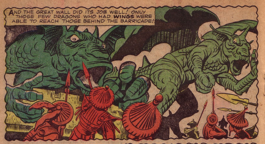
In the following panel, the dragons surge over the wall. Kirby has the dragon on the left looming; mouth agape in a most frightful manner, while the one on the right has cleared the wall, again underlining the power of their rightward trajectory.

When Kirby and Lee made the move from monsters to superheroes by introducing The Fantastic Four, the team covered their bases by not only having monsters as adversaries in the first several issues, but also featuring the monstrous Thing and the brutish Hulk as heroes. Kirby would continue the use of dragons and other saurian creatures in his stories throughout his career. In the seventies, he brought us Devil Dinosaur, a creation that met with mixed reaction. Regardless of one’s opinion of that series, I doubt if anyone would disagree that this two-page spread from issue #4 is a stunning piece of artwork.

The power and dynamism of this page is obvious. It is a vivid hallucinogenic tableau that explodes in the subconscious like a primordial archetype of ancestral terror. Although largely representational, the drawing is also abstract in its use of shape and design, which is true of much of Kirby’s work. With its liberal use of the eye motif, the picture is surreal more than realistic. The eyes are looking out at us, but they also serve as windows into the inner mindscape.

This page has been singled out for another reason. During an interview with Glen David Gold, comic’s creator, Will Eisner made a somewhat dismissive comment about Kirby.  The words are Gold’s.

“Eisner mentioned he was uncomfortable calling Kirby someone with heavy artistic intent. I paraphrase, but Eisner felt Jack was mostly
concerned with hitting his page count, telling good stories, and
keeping his family fed. Not pursuing some aesthetic ideal — to seek
that motive in Kirby’s work was, he suggested, misguided. I happened to be holding the original artwork to the Devil Dinosaur #4 double-splash, which I turned around and showed Eisner — who took a moment, and said something uncharacteristic: “Okay, I might be wrong.”
— Glen David Gold, _Masters of American Comics_, 2005, reprinted in TJKC 50

It is interesting to me that someone like Eisner would have such an opinion about Kirby, but equally interesting is that this one powerful image could change his mind so quickly. There are many notions about what the nature of true art is. Critics and historians with elitist agendas concoct most of these notions. Authorities such as those might be unlikely to call Kirby’s work “fine art.” As an artist myself, I would not hesitate to do so.


Visual 1- Amazing Adventures #6 Jack Kirby, Stan Lee, George Klein

Visual 2- Strange Tales #83, Jack Kirby, Stan Lee, Dick Ayers

Visual 3-4 Ibid

Visual 5-Devil Dinosaur #4 Jack Kirby, Mike Royer
Quote from Gold, Glen David. “Lo, From the Demon Shall Come – the Public
Dreamer!!!” Masters of American Comics. 2005. Page 261.

Explosive

by

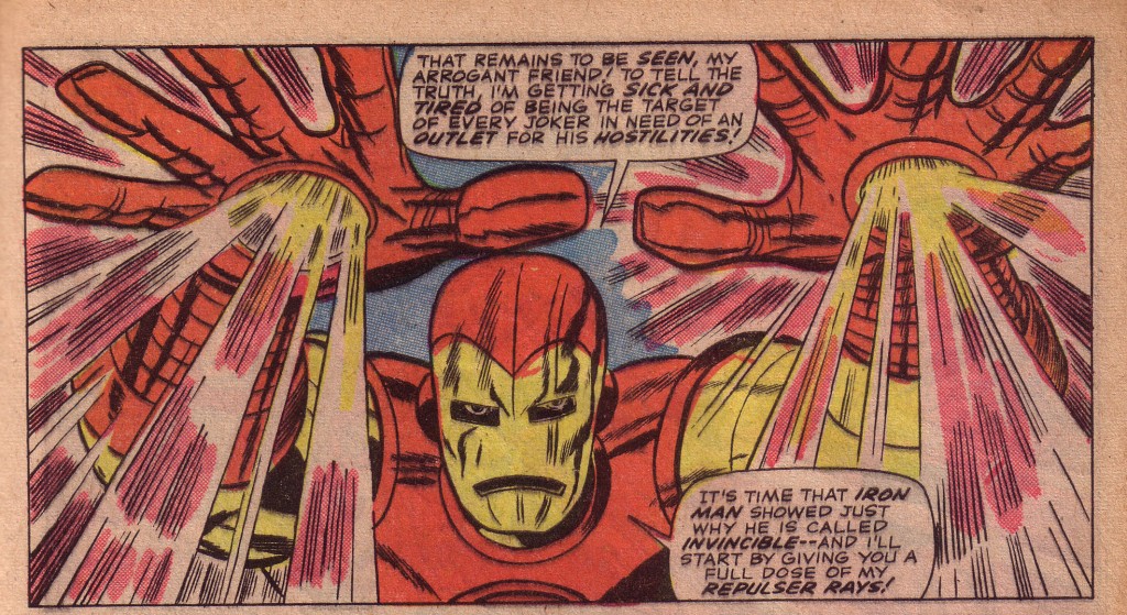
One of the most explosive high energy comic books that I’ve ever seen reportedly came about when Jack Kirby was asked to fill in for ailing artist Gene Colan. Indeed, the first few pages of the Sub-Mariner story in Tales to Astonish #82 are drawn by Colan in his lively and finely etched illustrative style, but when Kirby takes over on the third page, it is as if the stopper is blown clean off the bottle. Although veteran Kirby inker, Dick Ayers gives the story a beautifully subtle embellishment, using more delicate line work than usual to tie the disparity of styles together, the contrast is still a bit jarring. Colan’s last panel on page two shows Iron Man at bottom left delivering an uppercut to the Sub-Mariner. Iron Man’s right arm tentatively leads the reader’s eye to the right and the top of the next page, where Kirby obligingly gives us his opening salvo, a staggering blast from Iron Man’s repulser rays.
Kirby’s signature use of outstretched palms thrust forward in forced perspective announces his sudden presence in no uncertain terms. We can’t know if Kirby has seen the preceding page, but the ever professional artist aligns the trajectory of the rays coming from Iron Man’s right hand with the visual sweep of the composition in the page on the opposite  left bottom panel, giving the story greater continuity.

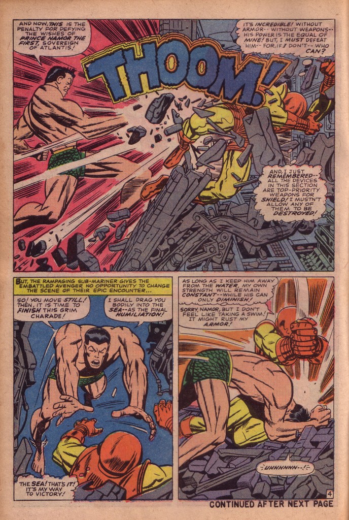
Kirby’s first page is relatively subdued, seemingly in consideration of the abrupt artistic switch. His panels are smaller and do not overawe. It is on page four, his second page that Kirby floors Iron Man and us with a devastating blow from Namor.

The Sub-Mariner’s right bicep bulges with  pent-up energy. The lines that slash down his triceps to the crook of his elbow join those lines that shoot up his forearm and end in a blinding white impact explosion. Kirby renders force in his most expressive manner with lines that emphasize the power and direction of Namor’s blow, as well as those that reinforce its impact. The perfectly placed “Thoom” sound effect slams Iron Man to the wall at the right of the panel, and the smashed machinery below his figure rams him upward, as well as directing the eye downward to Namor’s leaping figure in panel two.

The fight continues apace. Namor rips a huge electro-magnetic projection device from its moorings, firing powerful bolts of energy at his foe. Iron Man hurls himself at the Sub-Mariner, smashing the piece of equipment to bits. Kirby is utilizing spacious three panel pages to showcase his action sequences, and the first panel is always the most dynamic.

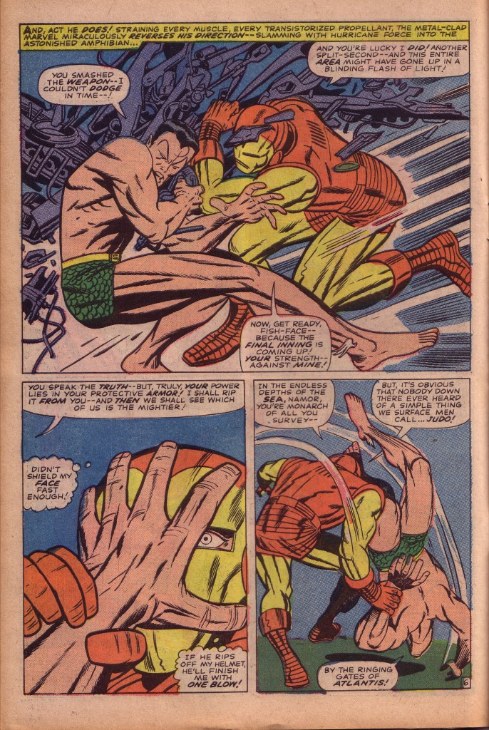
Here on page 6 , the figures relationships to each other are extraordinarily complex and wonderful to behold. Apparently reversing the standard left to right orientation, Kirby shows us Iron Man crashing into Namor from the right side. The reason for this is that it emphasizes The Sub-Mariner’s attitude. Namor’s pose in this panel is completely defensive. He is crossing his arms, turning his head away and shutting his eyes to protect himself from both the impact and the flying shards of steel. To repeat, although the movement seemingly originates in Iron Man rushing from the right, the composition is actually the Big-O, one that we have discussed previously. That means that the eye is continually moving in a circle, and Kirby creates focal points for the eye to linger on before moving. Namor’s jackknifed body is a wedge from which all the energy of the panel is emitted. The apex of that force is Namor’s gluteus, from where the visual bolts of the explosion emanate. Entering the panel at the upper left, the eye drops like a plum line down the Sub-Mariner’s back to his butt, and the spotted slashes of black of Namor’s abdomen, forearms and thigh muscles blast outward and to the right. Even Namor’s splayed fingers emphasize this fanning out explosive thrust. The curve of Iron Man’s back brings us back around to Namor again in the circular motion that characterizes the Big-O.

Ingeniously, Kirby repeats the splayed hand motif in the second panel, which reinforces the panel above it. The curve of the fingers also creates an arc to the motion of the judo maneuver in the third panel.

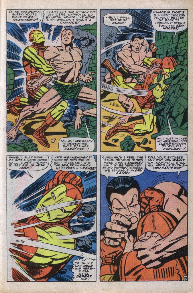
This issue is a titanic slug-fest and is filled with astounding action moments. Before the fight breaks off, there is one more sequence I’d like to spotlight. Here on page #10, Iron Man seizes Namor, apparently locking his arms and rendering him helpless. The Sub-Mariner easily frees himself.

In the first panel, Namor’s left leg protrudes towards the second frame. What Kirby draws here is physiologically impossible, but makes perfect compositional sense. The sea monarch’s left hand and the upper and lower portions of that leg emphasize the sweeping motion of the second panel as Namor whips Iron Man around, smashing him face first into a wall. Again, legs play a major compositional role, as Iron Man’s left foot brings our roving eye to the third panel below left. The battle ends abruptly in a stalemate, as the Sub-Mariner suddenly quits the field in pursuit of another enemy.

This issue is a one of a kind Kirby action wonder, which I can’t say enough about, so I leave off here. Nobody does this sort of thing better than the King.

All samples from Tales to Astonish #82, Stan Lee, Jack Kirby, Dick Ayers

The Power of Line

by

One of the first things we notice when studying Kirby’s work is the power of his line. Whether you like his art or not, very seldom do you see anything superfluous in a Kirby drawing. The line is the essence of force and energy and Kirby’s is nearly always direct and to the point. As a result of the discovery of a hidden cache of stats that  Kirby made of his original pencils, we are able to witness the extraordinary boldness of his original line, unaffected by an inker’s style. Note the dynamic slashes that render the muscles in Thor’s arm in the second panel. Even when considering Kirby’s most faithful inkers such as Mike Royer, it is obvious that the line quality is altered by brush or pen.

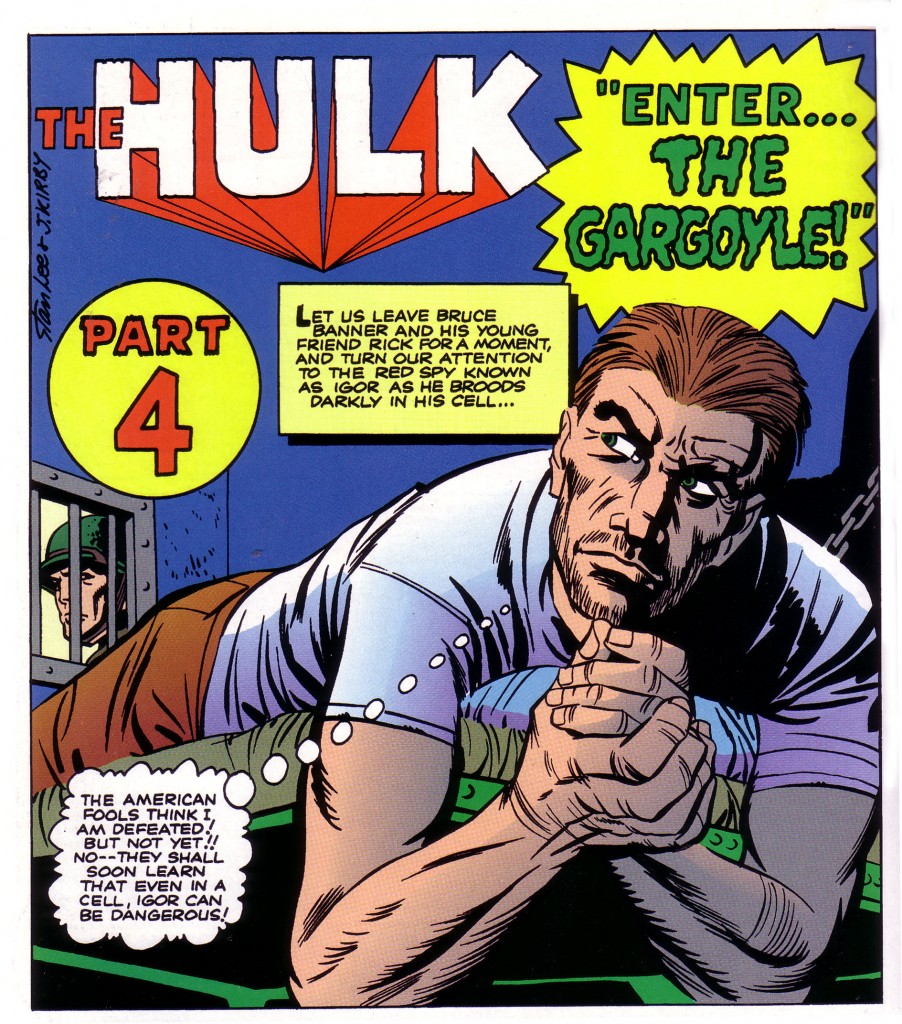
The name Jack Kirby usually conjures images of explosive action, and it is true that few artists have handled the figure in motion so well. The amazing thing about the King is that even when in repose, his figures have an unusual vitality. In the panel below, the spy Igor is merely reclining on his bunk, but Kirby’s forceful line and foreshortening give the figure a sense of looming menace. In this instance inker Paul Reinman’s confident brushwork and strong black spotting accentuate the panel’s drama. Reinman’s inking of Kirby is not always so satisfactory, but here, in the first issue of the Incredible Hulk, the inker does a beautiful job.

This is a deceptively simple panel, with the figure predominating. A portion of a bunk bed, a small section of barred window and wall, and the semi obscured face of a guard give us a total sense of a cramped prison cell and its sinister prisoner. Kirby’s genius is clearly evident in conveying an environment and implying its ominous mood with brilliant economy.

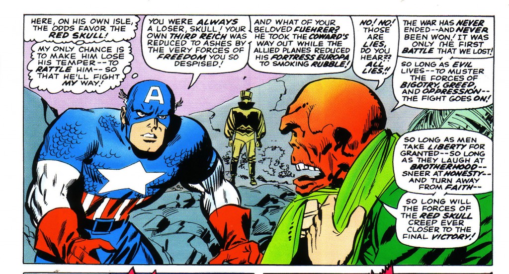
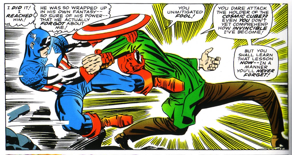
It is difficult to overstate the point that great deal of responsibility falls on the inker to interpret the artist’s pencils. Some inkers work hard to be as faithful as possible to the original art they are rendering. Others willfully impose their style and are often expected to do so. Several inkers tend to assert their personalities with a profusion of fancy line work. One such artist is Barry Windsor Smith, whose style is reminiscent of the mid 19th century Pre-Raphaelite painters. Smith’s art is quite striking and decorative. He has incorporated a good deal of the power of Kirby’s dynamism into his own stuff, and it is a compelling combination of styles. Smith has even occasionally inked Kirby, and the result is nice, but peculiar. Smith’s brushwork seems a bit too ornate. Still, it is beautifully done, even though it has a good deal of the inker’s personal flair.Once one is accustomed to a particular inker’s style, it is easy to see how it affects the penciler in question. For example, artist, Don Heck has built a successful career with a beautifully illustrative style, which relies heavily on finely etched lines. He has inked Kirby on several occasions, but he is least successful in my opinion when he attempts to feather Kirby’s bold stroke.Notice the detail throughout the drawing of scratchy and brittle line work. Cap’s left bicep and forearm and the Red Skull’s profile lack the solidity and forcefulness generally evident in Kirby’s pencils.  Contrast the scratchiness of line with the drawing below, which is inked by Frank Giacoia, one of Kirby’s more forceful inkers and a powerful black spotter.

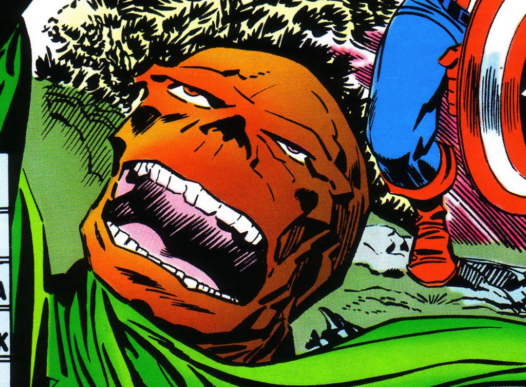
Where Heck’s line makes Kirby’s musculature look puffy and ponderous, Giacoia’s renders Captain America’s figure in bold, self-assured slashes of his brush.  There is no feeling of hesitancy in the interaction between the two antagonists. Granted, this is a more dynamic drawing, but that doesn’t entirely explain the difference. The proof is to be found in the Skull.  In comparison to Heck’s ineffectual rubbery mask look, Giacoia’s inking of the Red Skull’s leering visage is a masterful execution of bold rendering. One gets a sensation of jagged bone instead of putty in the deeply etched protuberances. One can also see a marked difference in the way the two artists ink the Skull’s scarf, with Giacoia again more effective.

In all fairness to Don heck, he has had occasion to ink Kirby beautifully, as in the series of presentation drawings that the King made for the New Gods. I am merely using Heck as an example of what I see as a mismatch of styles. As I’ve stressed several times, the slightest alteration in the line’s quality can render the line less effective, and Kirby is most powerful when one follows the power of his line as faithfully as possible.

1-Thor pencils by Jack Kirby, text Stan Lee

2-The Incredible Hulk #1 Jack Kirby, Stan Lee, Marvel Masterworks

3-Captain America’s Bi-Centennial Battles, Jack Kirby, Stan lee

4-Tales of Suspense #80 Jack Kirby, Stan Lee, Marvel Masterworks Captain America volume 1

5-Tales of Suspense #81 Jack Kirby, Stan Lee, Marvel Masterworks Captain America volume 1

6-Ibid

Spatial Relationships

by

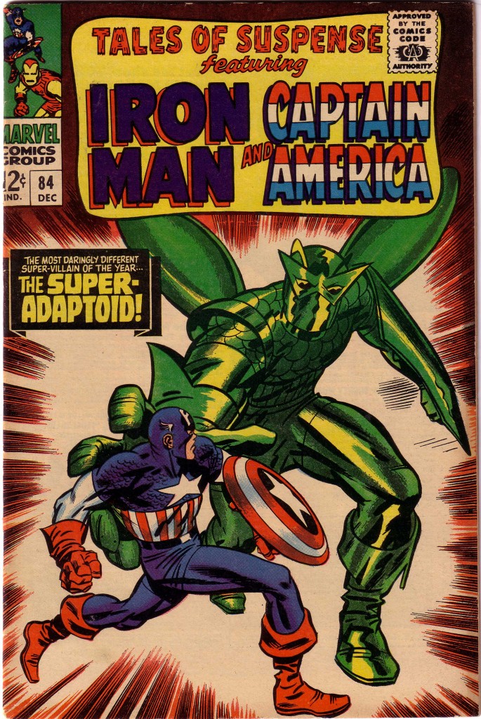
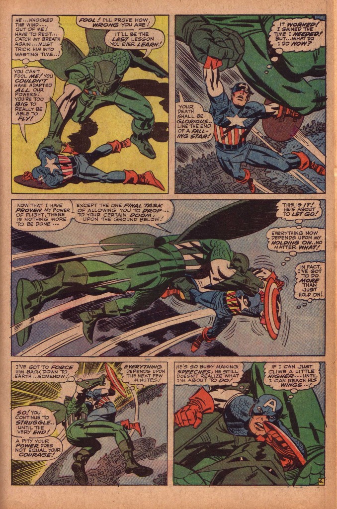
In dealing with Jack Kirby’s artwork, one of the things that I continually stress is his facility for placing his figures in optimal spatial relationship to one another. It is one thing do draw a dynamic, well-proportioned figure, but entirely another to place it in composition with a background or with another figure. Tales of Suspense #84, featuring Captain America is a comic book that is full of wonderful examples of this. If we start with the cover, we see Cap facing off against the Super Adaptoid.  Actually, I probably should not use the words face off, considering that most of the hero’s body is turned, in Kirby’s best dynamic torque positioning away from the Adaptoid.

This essential technique is what supplies the dynamism in the piece. If we revisit the theories of artist and teacher/lecturer Burne Hogarth discussing volume structure in three dimensions, we will see that he focuses primarily on two shape masses in the figure to stress dynamism. These are the masses of the rib barrel and the pelvic wedge. What Kirby does better than nearly everyone is to stress the contrapuntal movements of those shapes, combined with the positions of the head and limbs. On this Tales of Suspense cover, Captain America’s pelvis and legs are in profile moving to the right and his rib barrel is twisting forward towards us, while his face and shield on left arm are turning towards his foe. Without the Adaptoid figure, Cap could be perceived as simply running right ward, but in relation to his foe, he seems to be defending himself while possibly preparing to deliver a right cross.

In contrast, the Adaptoid is unquestionably moving menacingly towards Captain America, with his immense right hand preparing to envelop the hero. Nearly all of the shapes of his massive body are framing, blocking and overwhelming Captain America. In doing so, the Adaptoid’s shape is also bringing the eye on Captain America as the focus of the composition.

Inside the book, the story accelerates to climax in a fantastic battle in the sky, as the Adaptoid sweeps Cap up and carries him high aloft. Kirby emphasizes the size of the Adaptoid and Cap’s apparent helplessness thousands of feet in the air. Cap is dwarfed in the second panel by the Adaptoid’s huge fist and leg as he is dangled above the Manhattan skyline. In the third panel, the monster’s foreshortened foot and calf burst from the left of the panel as he drives Captain America across the width of the page.

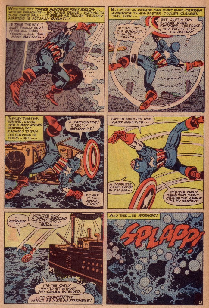
This conflict is a set up for what I feel is one of Kirby’s bravura sequential moments. If Kirby’s strength is the relationship of figure to figure, he is equally strong in his placement of the figures in relation to the background, which in this case is the earth far below. When the battle concludes, Captain America must survive a fall from a prodigious height.

In the first panel of this page below, we see him falling towards a waterfront area of the city. The angle of his body, including the exaggerated size of his right arm and leg brings the eye to the spotted black of Cap’s shield, which gives the figure weight and gives us a sense that he is dropping quickly. The shield’s circular shape is repeated in the circles on the ground below, which also give the figure a more downward trajectory. Cap’s right hand and his shield are gesturing towards the area of water on the right, which as we see in the next panel is the object of his attention as he attempts to maneuver over it.

Panels two and three are similar in that we see Captain America’s back as he falls, but in the third panel, the ship that was previously in the distance is suddenly looming dangerously. What I’m stressing here, which may appear self-evident is that the size and spatial arrangement of the elements of the panel’s compositions are crucial to their effectiveness. Apparently simple decisions that Kirby makes from moment to moment show us the genius of his thinking processes.

Kirby’s cityscapes as well as his fantastic machinery all serve a vital purpose in upping the ante of his dynamic storytelling. Something as seemingly minor as the positions of the docks protruding into the water are indicators that reinforce the tension of the composition.

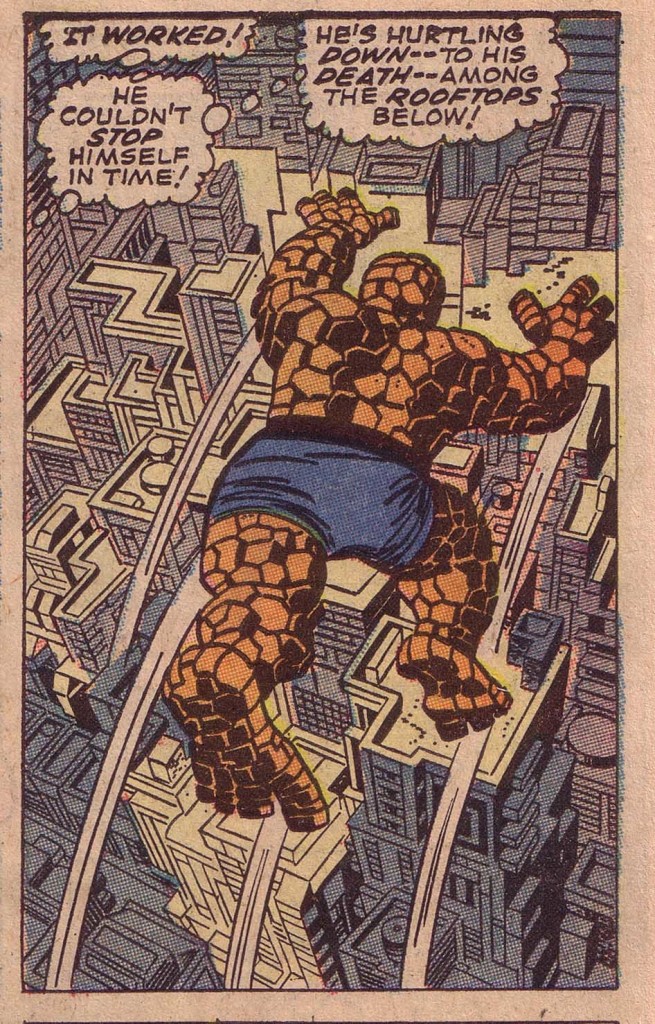
I will finish here with another of my favorite examples of a figure whose intent in the composition is completely determined by the background elements. In this panel from Fantastic Four#69, the Thing has leaped from a building and is seemingly suspended, spread-eagled over the canyons of New York. It is almost comical, in the way that Warner Brothers cartoons often have a character running several feet off a cliff before he falls.

It is the beautifully sculpted perspective of the buildings below the Thing that insist that his suspension is only temporary, and he will quickly fall. Even the artfully positioned black spotting on the Thing’s right side leads the eye down to the shadows on the right side of the building which travel to the bottom right side of the panel.

The amazing thing is that this is just a relatively small panel in the context of the story, and yet Kirby goes to the trouble of creating this incredible deep space cityscape background. That is what sets the King apart from the herd.

Image 1-3 Tales of Suspense #84, Jack Kirby, Stan Lee

Image 4- Fantastic Four #69, Jack Kirby, Stan Lee