Cosmic Kirby

by

If I had to come up with of two words that embodied the sixties, they would be ‘Cosmic Consciousness’. Kirby and Lee’s Fantastic Four, conceived in 1961 at the dawn of the space race, certainly shared in that zeitgeist, but actually ended up in the forefront of the Cosmic movement. The Fantastic Four began their adventures by attempting to journey into space, but, altered by Cosmic Rays they brought space back to earth with them. The team continued to explore intergalactic sci-fi themes in its early years. An intriguing character known as the Watcher was introduced. This benevolent huge headed creature was from a race of beings that could only observe and not interfere. Kirby and Lee toyed with various conventionally villainous bug eyed aliens before bringing us a creature that was so far off the scope of power that he was like unto a god.

Galactus, monstrous consumer of planets was so awesome that the cover announcing his appearance did not even feature him. The cover of Fantastic Four #48, dated May, 1966, showed the shock and awe of our heroes as the Watcher pointed upwards at approaching doom. We could only imagine what could inspire such trepidation.

The story begins in the completion of the previous issue’s tale, as the FF attempt to return to normal life after their encounter with the Inhumans in their Great Refuge. This is not to be. The doorway to weirdness has opened and there is no going back. A small panel at the bottom left of page 7 opens a window to the vista of the infinite cosmos. This is followed by our first view of the Silver Surfer as he zooms towards earth. The camera does not linger. It changes Point of View again to another observer, as the speed trail of the Surfer’s board leads our eye to the nefarious Skrulls who are watching the herald’s approach with dread.

1

Continue reading

The Ink Factor

by

In an earlier blog, I discussed the influence that Wallace Wood as an inker might have had on Kirby’s artwork. I suggested that Wood’s powerful style could have caused Kirby to rethink his approach to drawing and influence him in subtle ways that might have been more harmonious to the pairing. While it is interesting to speculate on these matters, it is certainly a revelation to study the different qualities of various inkers on Kirby’s pencils through his career.

Kirby inked his own pencils frequently early on, and throughout his career.

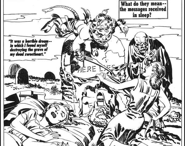
He generally preferred to use a brush, and his line quality varied from a precise fine stroke to bolder swatches of black. Here in the 1953 unpublished cover of “Strange World of Your Dreams,” we can see that Kirby was arguably his own best inker.

1

When he began working for Marvel, Kirby’s page output was too great to spare the time for his personal inking touch. As a result, we have a wide variety of stylistic interpretations of Kirby’s line by other inkers over time. Fortunately, we also have many samples of his pencils, so we can determine who was more or less faithful in their rendering and who weakened or perhaps in some cases reinforced the King’s artistic intention.

Continue reading

Twilight of the King?

by

Whenever the art of Jack Kirby is discussed, someone will inevitably mention that sometime during the mid to late seventies, his artistic abilities went into steady decline, continuing until his death. It is reasonable to have this opinion and one can certainly point to examples of Kirby’s later art that don’t seem to compare favorably to the work of his prime. I contend however that much of his later work, such as the Silver Star miniseries is infused with an energy and a perspective that more than compensates for any perceived deterioration of artistic technique.

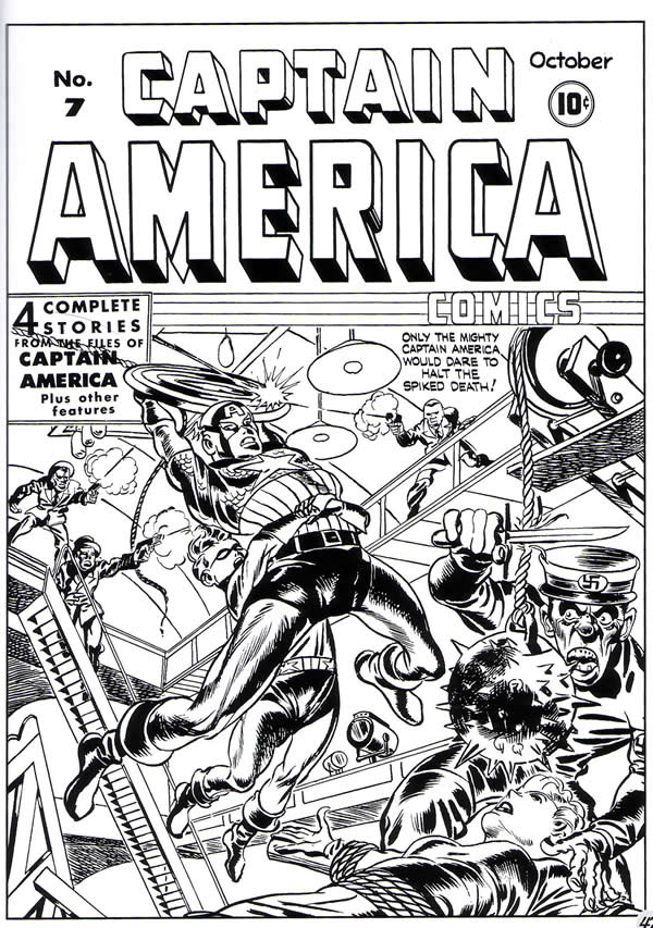
First, let us view an early example of Kirby’s work from the Simon and Kirby run of Captain America, the cover of issue #7. I chose this particular cover because it contains a variation of a pose that Kirby would revisit throughout his career. Cap is swinging across the length of a large space, with his pelvis thrust fore ward and his torso arched. His arms are stretching back holding a rope and his legs are also bent backward to accentuate the arch.

1-pose

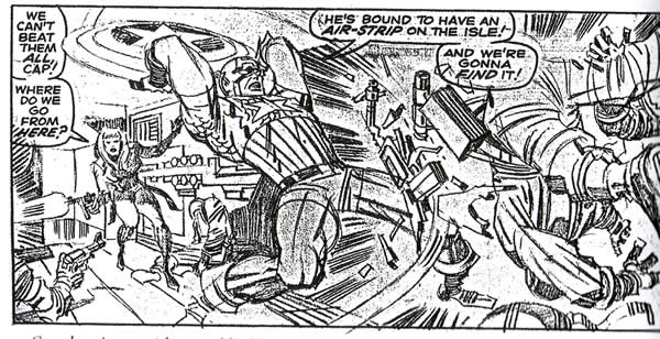
Something very similar to this pose occurs nearly twenty five years later, appearing in Marvel Comics Captain America #103. Note that in the first example, Kirby’s rendering of Cap’s physique is probably one of the closest to an anatomically correct figure that he will ever draw. Cap’s quadriceps muscles for example are more or less where they should be. In the later example, Kirby is drawing far more expressionistically.

2

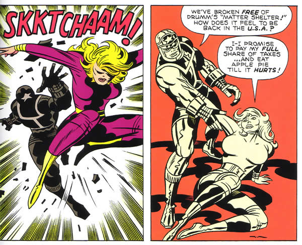
Rather than employing literal renderings of specific muscles, Kirby uses powerful pencil slashes that suggest force and strength. Many Kirby aficionados consider this period to be the height of his creative powers. Kirby would continue in this direction, moving further into the area of abstraction. He would seemingly grow less concerned with the depiction of actual reality and focus on storytelling and raw energy. That pose turns up again in issue #2 of Silver Star and here, Kirby seems even less concerned with anatomical correctness while focusing on the force of the movement.

3

This particular comic from the 80’s may appear uneven at first glance, but it’s full of extraordinary moments of unleashed Kirby energy. The King is moving at breakneck speed here, and seems unfettered by any constraints, either artistic or literary. He is still using special arrangement masterfully, in terms of his visual cues, but his style has become even looser and more expressionistic.

This page is very close to Kirby at his prime. There is little indication of any loss of ability, but there are instances throughout the book where Kirby’s spatial perception feels a bit skewed.

If we look at the face and figure of Norma in this lower right panel it certainly could be said to be distorted. It is if Kirby is no longer concerned with conventional anatomy at all. He has moved into abstract expressionism full speed ahead. As his character Galactus does, Kirby has miraculously converted everything into pure energy.

4

Other pages are thoroughly splendid examples of Kirby still apparently at his peak in page composition. His sense of deep space is sometimes cramped and in many cases he dispenses with backgrounds entirely, but the movement is explosive and the continuity is superb. This page below has a wonderful elastic quality about it. It is almost as if Kirby is reverting to his training with the Max Fleischer animation studio.

5

This page in particular made me realize that I was essentially judging Kirby’s later work by my own obsession with his earlier efforts. 1960’s Kirby had been such a strong influence on my formative years, that any deviation from the familiar seemed to me to be a letdown. Even the gradual movement towards abstraction of his seventies art was a shock. This Silver Star page, with its extraordinarily flexible action figures forced me to view its innovation with a fresh perspective.

Putting the art work aside for a moment, let us discuss the nature of the plot behind this series. The story begins with the entrance of an entrancing girl named Tracy, who sings and cavorts with the hero in a fantasy landscape. In fact, the world is an elaborate construction by Silver Star, who is capable of manipulating the atomic structure of reality. Sadly, the girl is trapped in stasis, a sort of limbo.

The character of Tracy is quickly abandoned, as the story races towards a conclusion of wholesale riot and mayhem. The culmination is the appearance of the Angel of Death. This story feels to me as if it is very personal to Kirby. It is imbued with a great deal of passion and reflection on the state of society.

Silver Star is a reflection on the Vietnam debacle, but it appears in the early eighties. This is the post-punk landscape, and Vietnam is viewed from the new wave perspective, as it was in such films as Apocalypse Now and the Deer Hunter. Silver Star even makes what could be taken as an oblique reference to a sequence in the latter film by stating that, ‘this same guy was around in Vietnam, ‘playing Russian Roulette with our lives’.

Is Kirby at age sixty five sensing his own mortality as he serves up this horrific nightmare vision of impending doom? Seldom before has the artist so completely depicted such appalling and unrelenting carnage. Kirby’s finale is an inferno of biblical proportions as the flame breathing airborne demon scorches the earth.

The visual storyteller deals with the dreams and fantasies of the collective unconscious. Thus, Kirby’s hand is a conduit, directly from his subconscious to the page and the horrors that he draws here feel as though they are things that the artist has actually witnessed.

6

This is the battle scarred inner landscape of someone who has seen war at first hand. There appears to be little room for hope in this scenario, and we as readers and spectators cannot avert our eyes from the horror. Yet, somehow Kirby turns away from the abyss before all is lost. The Dark Angel cannot fulfill his mission of destruction. He sees his own face in the multitudes that he seeks to destroy, due to an illusion caused by Silver Star.

In the words of Kirby scholar, Greg Theakson, Kirby is, “Scrapper who can wrestle against all odds, angel of death included.” The apocalypse is averted this time. Silver Star levitates, rising like one resurrected. As he poses like Christ with his arms outstretched, he asks the question, “Can a man survive himself?”

In terms of artistic greatness, Kirby has certainly done so.

1 – Captain America#7, cover. Art, Jack Kirby, from “The Comic Book Makers”, Joe Simon and Jim Simon
2 – Captain America #103 pencils, Jack Kirby, dialog Stan Lee, Jack Kirby Collector #7
3 – Silver Star #2 Jack Kirby art and story, Silver Star Volume #1 Image Comics
4 – Silver Star #6 Jack Kirby art and story, Silver Star Volume #1 Image Comics
5 – Silver Star #5 Jack Kirby art and story, Ibid
6 – Silver Star #6 cover, Ibid

More Deep Space

by

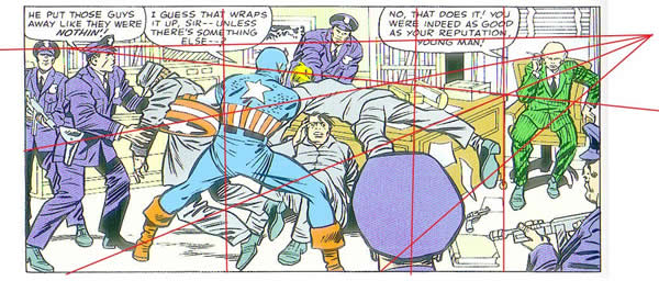
In this forum, I’d like to spend a bit more time discussing deep space. This term, as we have seen, refers to the use of structural elements in a composition that create the illusion of three dimensions on a two dimensional surface. The most significant tool for achieving this illusion is perspective. Most commonly, the artist draws a horizon line or vanishing point and arranges his figures along receding lines called orthogonals that converge at the vanishing point. An example of this would be a set of train tracks that appears to join at the distant horizon. In this Captain America panel, the orthogonals are the planes of the desk, which meet at the horizon line which is just above Cap’s head.

Kirby uses the figures on the left to lead the eye to Captain America.

1

Cap’s right shoulder directs the eye to the figure draped over the desk, whose position emphasizes the edge of the desk leading to the seated figure of the warden at extreme right who is the panel’s focal point. Kirby also uses the size of the overlapping figures to create the illusion of deep space.

Continue reading

Sgt. Fury 13 Ultimate Kinetics

by

This blog is about the comic book that I feel, from cover to cover is possibly the ultimate collection of examples of Kirby Kinetics.

By this, I mean that Kirby has outdone himself in this particular issue to present us with a tour de force of dynamic storytelling. Not only are his figures exploding with kinetic energy, they are placed for the most part in complex compositions of deep space perspective. In nearly every panel there are multiple planes, consisting of background, mid ground and foreground, and Kirby uses elements through out the space in support of his figures to make them come alive.

Deep space perspective is a subject that artist, Burne Hogarth has discussed in his Dynamic Anatomy and Figure Drawing volumes. Kirby had internalized and utilized these concepts in his works decades ago. The figure should be designed as a three dimensional shape /mass moving in the confines of panel space, which must be arranged convincingly in order to be believable.

1

Hogarth states that the position of the torso is of primary importance in the dynamism of the figure in space. The torso is composed of the rib barrel and the pelvis, which can move in contrapuntal directions in relation to each other. The upper and lower portions of the torso, moving in opposition, can create more dynamism in the figure. Wherever there are joints in the body, there is an opportunity to depict more contrapuntal movement. The pivot points of the shoulder and elbow, for instance, can create elliptical arcs of motion that increase dynamism.

Continue reading

Dynamic Chemistry

by

Fantastic Four #4 was probably the first comic book that actually opened my mind to the possibilities of the comic art medium. I’d picked up on the series with issue #12, and was instantly hooked on the self proclaimed Worlds Greatest Comic Magazine. I began searching around for back issues and was lucky enough to have a good friend loan me issue #4. As wonderful as they are, there is something slightly rushed and desultory about the first two issues of this series. Perhaps the innovation of costumes in the third issue started to get Kirby jazzed, but in FF#4, with the re-introduction of Timely’s second Golden Age star, the Sub-Mariner, Kirby really begins to hit his stride.

The story begins powerfully, with three members of the team arguing about the disappearance of the fourth. Reed is chastising Ben about the latter’s jealousy over Johnny’s exploits in the previous chapter. It is Ben’s bad attitude that has caused the Torch to quit the group. By now it is clear that it is the Thing’s brooding resentment over his condition that provides the dynamic chemistry that sets this series apart. It is also clear that this is not a simple tale of good guys vs. bad guys and that Kirby and Lee are dealing with serious issues of emotional turmoil and the dynamics of relationships within a family, such as parental authority and sibling rivalry. The members of this team are obviously a surrogate family, working out their problems, and the plot is merely what Alfred Hitchcock would call the McGuffin, a device to set the characters in motion.

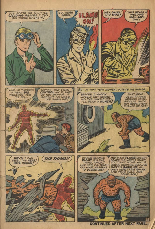
The three go in search of the Torch, who is hiding out in a local garage with his sport’s car pals. Kirby is clearly beginning to stretch out with the Fantastic Four as a sequential story teller now. He is using more of a full palette of continuity techniques herein.
1

In his unparalleled study of the genre, Understanding Comics, author Scott McCloud describes various transitional techniques used in sequential art. Generally, the most common of these in western comics is subject to subject, an example of which would be the last four panels of page five in FF#4 above, wherein the artist’s point of view is confined to the same general scene, but is moving from the subject of the Torch to the subject of the Thing. However, the upper tier of panels is a different story. This sequence would be best described as moment to moment or action to action, a technique that Kirby excelled at, which makes sense considering his early training in animation. Here in three continuous action panels, the Torch is shown igniting his finger and welding an auto part.

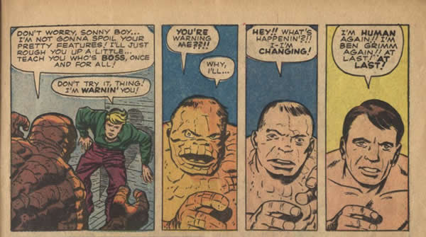
Two pages later, the same technique is used showing the Thing, who has just cornered Johnny in said garage, suddenly changing in a four panel sequence back to Ben Grimm. If there is any confusion about the editing techniques I am describing, one simply needs to think of a cameraman, choosing either to maintain the position of his camera and shooting a scene in a continuous sequence, or cutting away from a shot to another shot or another aspect of the same shot.

One can easily see that drawing sequential art often offers similar challenges to storytelling as does filmmaking in it’s arrangement of sequences.
2

The Torch eludes the Thing and goes even deeper undercover. It is at this point that this episode begins to delve into the murky waters of mythology as it is related to the human psyche. The Torch’s next stop is the Bowery, a stone’s throw from Kirby’s own lower east side roots and in the artist own recollection, a virtual urban heart of darkness. In two amazing panels, Kirby establishes mood and setting, as Johnny is seen walking down a forlorn street and stopping in front of a fleabag hotel.

In panel two of this page in particular, Kirby sets a scene of a street of desolation with the placement of the shabbily dressed figures loitering on the sidewalk. The age and decrepitude of the run- down buildings is indicated by the wrought iron stanchions on the stairway and that of the post that the seated figure is leaning against.

3

This small panel is a beautifully composed deep space scene, with multiple visual cues to suggest that Johnny is enveloped by the misery that surrounds him.

Johnny’s thought balloon refers to the street’s inhabitants as “human derelicts”, an obvious nautical reference to abandoned ships. While reading an old comic book in his hotel bed, Johnny is introduced to the derelict of the ancient (Sub) Mariner, bearded and incoherent

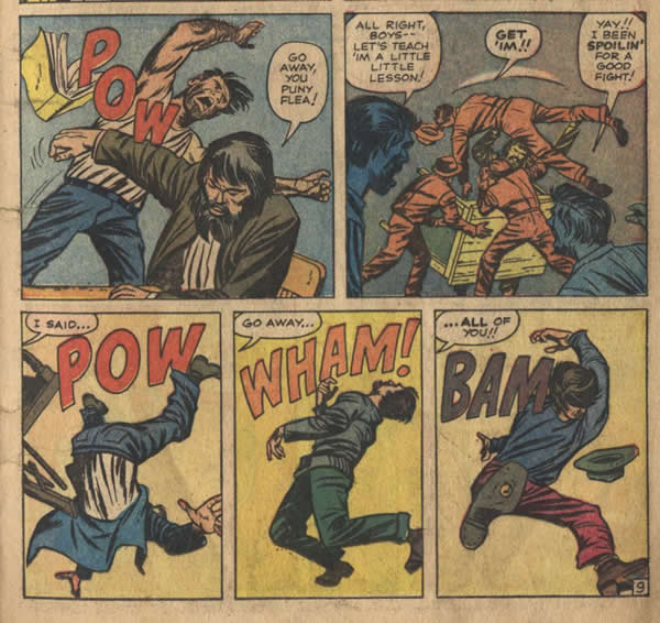
When the ill mannered vagrants bait the befuddled Namor, Kirby reveals the hero’s awesome power in an unforgettable sequence. Although the continuity of this tier of three panels suggests that it is an action to action sequence, it is actually an unusual example of subject to subject artwork. One does not see Namor’s initial action as he assaults the men, only their reaction as they are tossed away like so many broken toys.
4

As a boy of eleven, I was completely mesmerized by the way these tumbling figures were rendered, particularly in the first panel where the man is going heels over head and the third figure whose shoe sole is coming towards us. The panels serve as a perfect triptych of continuity of gesture. The leg and hand of the first figure lead us into an almost hieroglyphic series of balletic commotion.

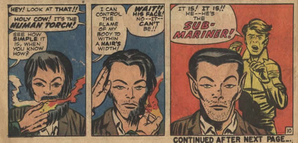
Johnny breaks up the ruckus, and in a dramatic moment to moment sequence reminiscent of the earlier welding scene, he shaves Namor’s beard and reveals the face of the Sub-Mariner.
5

Next, by throwing Namor into what is presumably the East River, (the subconscious) Johnny restores the Sub-Mariner’s identity. The light of the Torch has descended into Hades to retrieve the fallen aquatic hero. Thus does the Golden Age Dynamic Chemistry of fire and water re-assert its self. With this action, the Silver Age is truly born. (Two years later, Namor completes the circle by releasing the frozen Captain America.)

Prince Namor next swims to an outpost of his former undersea kingdom, only to discover that mankind’s nuclear program has destroyed much of his civilization and driven off his subjects. The Sub-Mariner vows to exact vengeance on humanity by unleashing a monstrous Atlas era Kirby creature, a huge leviathan of a four legged whale called Giganto.

To atone for his sin of anger, the Thing must descend into the mythical belly of the beast, in an effort to destroy the monster, which is clearly another hero’s journey into the underworld and the realm of the subconscious.

What is wonderful about the first dozen or so issues of the Fantastic Four is the division of the stories into chapters, giving Kirby the opportunity to flex his artistic muscles in three quarter page panels. Thus, in this issue, there is the spectacular tableau of the opening of chapter five, showing Ben trudging through a cavernous hell within the bowels of the great creature, with a massive bomb strapped to his back. The page is beautifully drawn, with dramatic shadows, illuminated by the flashlight that the Thing is carrying. In the lower left corner is a strange organic shape suggesting viscera of some sort. The page is well colored in lurid violets and reds that add drama to the scene.
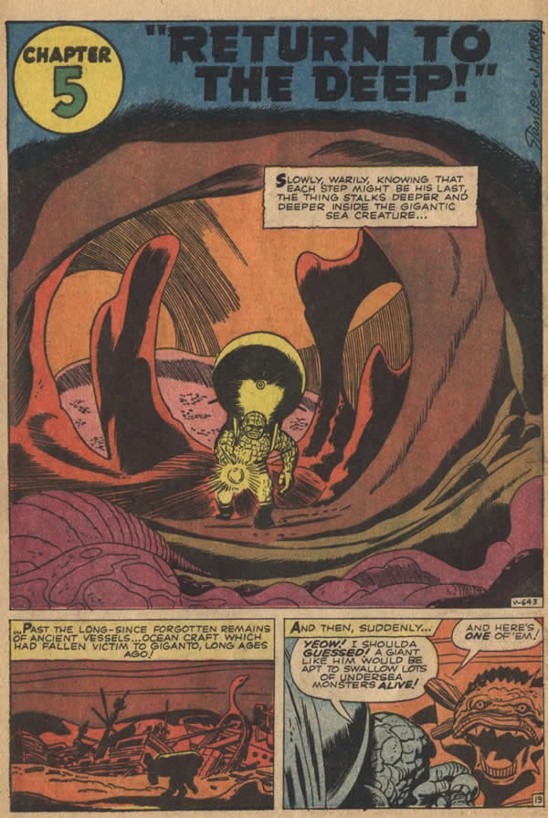
6

Ben successfully dispatches Giganto and returns to the land of the living. The Four again confront the defiant Sub-Mariner, who threatens to summon even more creatures with his trumpet, but the horn is suddenly snatched away by the Invisible Girl.

When he chases her down, Namor is smitten with love for Sue Storm. It is here that Namor resumes his career as more than just an antagonist to the Fantastic Four.
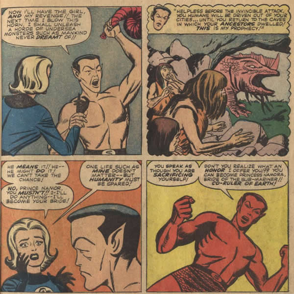
7

Considered to be the comics first true anti-hero, the Sub-Mariner has always been a complex and conflicted character, half aquatic, half human, arrogant, charismatic and imperious. If the F.F are elementals, with the Human Torch as fire, the Thing as earth, the Invisible Girl as air and Mr. Fantastic’s flexibility representing the liquidity of water, then Namor, as ocean monarch is an obvious rival for Reed Richards in a love triangle for Sue’s affections. Although introduced as a villain in F.F.#4, Namor is a wild card who over several years will continually be played as either friend or foe. In the final scene, his love for Sue is initially rejected, although when Namor next appears in a later issue, it seems that the fickle nature of Susan Storm has begun to warm to the notion of a tryst with the undersea prince.

In the conclusion of this story however, Namor rants and raves on about destroying mankind with a plague of undersea creatures, whereupon quick thinking by the Torch provides a solution in the creation of a tornado which deposits the Sub-Mariner and his dead whale back in the ocean.

Namor, while spewing a torrent of curses in the general direction of the surface, wisely decides to remain below. It is obvious that such a powerful and enigmatic character will be seen again soon.

This issue essentially initiated the Marvel Age trend of including new and old characters in multiple crossover appearances in other issues of the company’s titles.

Namor, as prince of Atlantis is the first in a series of astounding beings who hail from another world that exists within our own. His example would soon be followed by Kirby’s creation of such alternative super societies as the Inhumans in their Great refuge. Over time, Kirby would continue to explore the theme of various parallel universes that exist alongside or around us.

As the Atlas Comics website states of Kirby, “He is the unquestioned king of invention; not just characters, but devices, stories, races and worlds.”

Although Kirby didn’t invent the Sub Mariner or his sunken realm of Atlantis, this singular fourth issue of the Fantastic Four is truly the beginning of the King’s use of Dynamic Chemistry in the Marvel Universe, with his vivid imagination spawning legions of amazing characters whose worlds intersected with our own.

All images from Fantastic Four #4
Story and art by Stan Lee and Jack Kirby

Fine Development

by

Following the work of the King over his nearly half century reign brings us fascinating insights about the development of his style and of the art form itself. No artist can develop in a vacuum, and when one discovers influences along the way it is always a thrill. Kirby often mentions newspaper strip artists like Alex Raymond as inspiration, but as beautiful as Raymond’s work is, it has a studio staged, posed and slightly static look about it. Kirby’s best work is more cinematic and one longs to see examples of prior comic art that had his sort of kinetics.

Jack Kirby began to hit his stride when he and Joe Simon began working for Martin Goodman’s Timely Comics, and Captain America was the team’s first smash hit. Befitting the hero’s athletic skill, Kirby drew him as a sleek, muscular contortionist. Cap’s body moved in ways that defied gravity and conventional anatomy. If one looks at this page from Captain America #2, one sees something quite different from the thicker, blockier figures that the artist drew later in his career. Look at the red, white and blue figure arching over the telephone wires or at his long legged stride, running in the lower left panel.

I’ve chosen this particular sequence not only for its expression of dynamic physicality but also for its inking style, the delicate precision brush work of Reed Crandall, whose work shows the influence of another artist that also had a profound impact on Jack Kirby.

1 - Crandall inks

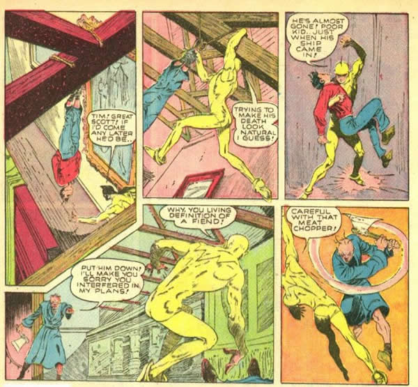
The following page is that of artist Lou Fine, who came to prominence working in the Eisner-Iger studio in 1938. This sample is from the 1940 series, the Ray. If one compares the two pages, it seems clear that Kirby and Crandall are taking pains give their Captain America story a distinctly Lou Fine-esque feeling.

2 - The Ray

Continue reading

Rawhide Kid – The Black Spot

by

In the introduction to the first Marvel Masterworks edition of the Rawhide Kid, Stan Lee suggested that the Kid was a superhero prototype. When the series debuted about a year before the first issue of the Fantastic Four, it seemed that Kirby and Lee were indeed getting in the zone. Compared to the run of the mill Western heroes, the smoldering young Kid certainly felt like a superhero in his skin tight, ink black outfit. He was supernaturally fast on the draw and a real scrapper in a fight. Next to Kirby’s steely eyed six footers, the Rawhide Kid was a bantamweight, a wiry little black leopard.

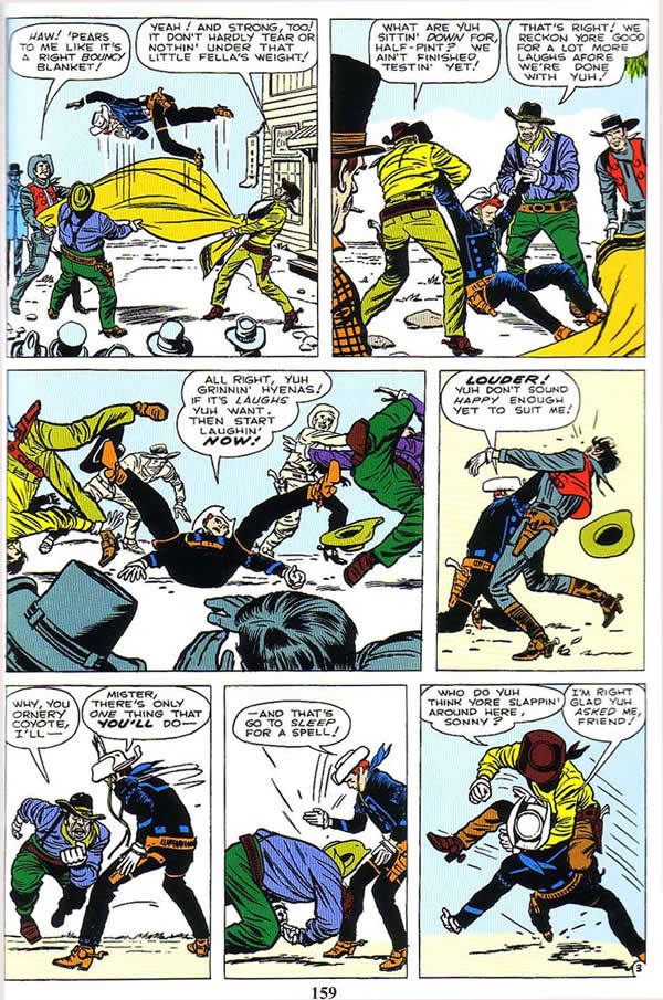
As he did with the good Captain, Kirby put the Kid through his paces, pitting him in brawls against multiple foes twice his size. Throughout his career, Kirby’s fight scenes had always taken advantage of the sequential continuity of panels on a comic book page, using a certain degree of follow through motion from one frame to the next. The lithe black silhouette of the Rawhide Kid inspired Kirby to really explore the limits of kinetic continuity. The positioning of the Kid’s negative shape was like an anchor for the eye, a naturally spotted black to give contrast and motion.

Black spotting is by some considered to be a mysterious art trick and is often not well understood. In reality it is a reasonably simple concept. It is essentially about the contrast between light and dark. A black shape or dark shadow placed behind or next to another object will push that object fore ward or better define it. In this case, it is the Kid’s black costume that makes him the focus of attention when he is strategically positioned in relation to other figures. This page from Rawhide Kid #32 is one of the best composed of the series run.

1- Rawhide Kid 32

Continue reading

Kirby+Wood=Evolution

by

Some time around 1954, work in the field of comic books began to grow scarce, even for the formerly lucrative team of Joe Simon and Jack Kirby. When Simon became an editor for Harvey Publications, the dynamic duo went their separate ways. Kirby struggled to find work, approaching the newspaper syndicates with proposals for strips. In 1956, he returned to work for National Periodicals, developing such ideas as Green Arrow and Challengers of the Unknown.

At some point following the breakup of the team, Jack Kirby’s style began to undergo a series of gradual changes that would alter the look of his figures and the design of his pages. Kirby’s heroes had always possessed a lithe sinewy and somewhat elongated musculature. Beginning somewhere in the mid to late fifties, Kirby’s artwork began to bulk up and to take on a more architecturally geometric quality. Coincidentally around this time, Kirby’s pencils were coupled with the embellishment of an inker of extraordinary skill who was a legendary draftsman in his own right.This was the remarkable Wallace Wood, who had honed his skills with EC Comic’s groundbreaking storytelling. Continue reading

Captain America

by

Kinetics is the science of motion, and Jack Kirby’s art exemplified motion. Kirby’s work exploded out of the panels and raced at breakneck speed from page to scintillating page. A consummate storyteller, Kirby evolved an illustrative process that is unmatched in graphic art and the exploration of that process is the subject of this blog.

In 1964, Marvel Comics reintroduced Joe Simon and Jack Kirby’s Captain America to the world. The character was first brought back as a sort of teaser, appearing with the Human Torch in Strange Tales, but he was an imposter. Captain America was being impersonated by a criminal known as the Acrobat, and the focus was on his amazing agility.

The real deal returned from suspended animation in Avengers #4 and Kirby’s artwork again stressed the amazing gravity defying athletic feats the Captain was capable of. The immediate appeal of this particular hero was that he was obviously a mortal man with no super powers, although later we did learn that he was chemically enhanced. Apparently, Cap had developed the majority of his strength and agility through sheer will power and persistence. When Captain America was finally given his own series in Tales of Suspense #59, Jack Kirby presented us with a run of issues featuring some of the most amazing fight sequences ever seen in comics. Kirby described his approach in an interview.

“When I was a very young boy, I used to wait for three guys to pass and figure out how to beat them up. How does one guy fight three? I would do it in ‘Captain America.’ How does one guy fight ten guys? And that’s how it came out in that story. That was an element in ‘Captain America’ I felt everyone would connect with. They’d seen it in movies, felt it in their own bodies and in their own brains. Many entertained those thoughts and of course never have done anything about them.” 1

Kirby kicked of the new series showing just how well Cap would fare against such a challenge, as Captain America faced one team of villains after another in the succeeding issues.The first issue featured a gang of thugs invading the Avengers mansion when Cap is on duty. The gang leader assumes that because Captain America has no super powers he will be a pushover. This is the setup for us as well as them, because Kirby proves how wrong they are. He demonstrates just how formidable a highly trained human being can be and how exciting the spectacle can be when it is rendered by him.


[G2:16588]

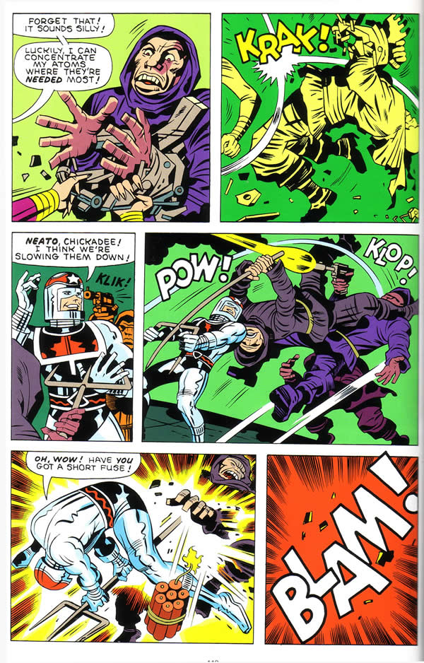
As the mob first attacks in the first panel of page four, Captain America springs instantly into action, his body moving diagonally towards the right edge of the panel. His trajectory matches the movement of his figure in panel two, as he maneuvers a serving cart, racing in a downward angle to the left towards his appearance in panel three. The third panel is an amazingly complex arrangement of figures in the deep space perspective of a room. This is Kirby at his best, using the positioning of Cap’s multiple foes to best advantage. All the figures are in motion and function for the kinetic effectiveness of the panel. The three thugs in the left corner of the panel anchor Cap’s dynamic pose as he flings his shield at the armored man. The shield’s downward slanting trajectory directs the eye to the supine figure firing the pistol. The gun shot brings the reader’s eye across to page left, but the eye stops at Cap’s extended right leg and travels down to panel four.

Several of the pages in this series have a five panel arrangement with a full tier third panel. All of these shots utilize deep space perspective and multiple figures to emphasize Captain America’s hyper-extended leaping figure.

[G2:16591]

Notice that in this panel, Kirby constructs a 3D universe using the specific arrangement of Cap’s antagonists as he leaps the length of the panel. The purple clad figures create depth by their size and placement. The lines where the wall joins the ceiling serve as coordinates that show Captain America moving further into the room. This sort of attention to detail, although apparently simple in its execution, goes a long way in emphasizing dynamism.

Through the next four issues of Tales of Suspense, Kirby utilized a similar format, pitting Cap against several teams of gangsters and assassins. For example, on this page in issue #61, Cap is pinned down by two foes. With a dazzling action to action sequence of acrobatic leverage, our hero turns the tables on his assailants by neatly flipping them up and tossing them away.

[G2:16594]

Kirby’s drawings convincingly depict the weight of Cap’s attackers as they pile on top of him. The massive back of the man on the right balances Cap’s seemingly impotent flailing legs. The same attacker’s leg directs the eye to the right and the beginning of the circular motion of the two men being turned upside down. Cap’s rearing figure moves the eye to the focus of the third panel. The “Whap!” sound effect accentuates the impact of the men Cap has tossed across the length of the full tier image.

These stories in issues #59 to #62 are a wonderful lead in for the hero’s origin in issue #63. They showcase Captain America’s legendary skills in an extraordinary way. In each story, Cap’s foes would swarm over him, attempting to overpower him with sheer force of numbers. Kirby’s ingenious compositions always convincingly showcased the ingenuity of the Star Spangled hero as he maneuvered his way over, under, around and through them, as if they were tackle dummies, props and straw men. One minute they would have our hero hog tied like this.

[G2:16603]

One second later he would explode and break free. There was just no stopping Captain America, or his creator, the irrepressible Jack Kirby.

[G2:16606]

Citations:
1 – VIOLA, Ken. “Jack Kirby, The Master of Comic Book Art.” The Collected Jack Kirby Collector Volume One. Ed. John MORROW. Raleigh, NC, USA: TwoMorrows Advertising, 1997. 130-135.

2 – KIRBY, Jack & LEE, Stan (story), Kirby (pencil art), Lee, (script), STONE, Chic (ink art), ROSEN, Sam (lettering), unk. (color). “Captain America”. Marvel Masterworks: Captain America, Volume One (2003), Marvel Comics Group: 35.

3 – Ibid. p 37.

4 – Ibid. SIMEK, Artie (lettering). “Break-out in Cell Block 10!”. 56.

5 – Ibid. “The Army of Assassins Strikes!”. 67.