In an earlier blog, I discussed the influence that Wallace Wood as an inker might have had on Kirby’s artwork. I suggested that Wood’s powerful style could have caused Kirby to rethink his approach to drawing and influence him in subtle ways that might have been more harmonious to the pairing. While it is interesting to speculate on these matters, it is certainly a revelation to study the different qualities of various inkers on Kirby’s pencils through his career.
Kirby inked his own pencils frequently early on, and throughout his career.
He generally preferred to use a brush, and his line quality varied from a precise fine stroke to bolder swatches of black. Here in the 1953 unpublished cover of “Strange World of Your Dreams,” we can see that Kirby was arguably his own best inker.

1
When he began working for Marvel, Kirby’s page output was too great to spare the time for his personal inking touch. As a result, we have a wide variety of stylistic interpretations of Kirby’s line by other inkers over time. Fortunately, we also have many samples of his pencils, so we can determine who was more or less faithful in their rendering and who weakened or perhaps in some cases reinforced the King’s artistic intention.
One of the most notable examples of an inker interpreting Kirby’s pencils to their detriment is that of Vince Colletta. The series that Colletta inked most successfully was Thor, a book that had a mythological quality that was enhanced by the inker’s style, which relied heavily on feathering lines drawn with a crow quill pen. Such lines gave the artwork a sort of archaic feeling which complimented the subject matter. However, many of Kirby’s own lines tend to be bold slashes of black that are often weakened by this kind of feathering. If you look at the penciled version of the creature, Mangog to the left, you will see the boldness of Kirby’s lines in the forearms.

2
Colletta’s feathered pen lines are effective for shading purposes, but because he ignores Kirby’s lines, the resulting shapes appear thicker and blunter. Colletta also removes the knob on the creature’s elbow and for some reason, obscures the characteristic horns on Mangog’s forehead with falling stones.
The inker then proceeds to remove the definition strokes from the right arm of the warrior on the left, blacking it in and making it appear more bulbous.
If we next study the panels below, containing the two versions of the Mangog figure holding the pillar, you’ll notice that Colletta has softened Kirby’s powerful jagged pencil lines in the arms and legs to near impotency. You may also notice that Colletta has completely left out the figure in the far lower left as well as the figure second to the right of the panel. Both of these figures function as signposts pointing to Mangog, and their removal weakens the composition.
The adornment of the tower on the left has also been simplified.

3
Colletta has been justly criticized for this sort of thing and there are numerous examples of it to be found if one is given the opportunity to compare pencils to inks. What is evident is that even the slightest variation in line quality can alter the composition is subtle ways. Let us move on.
If we acknowledge the fact that it is virtually impossible to accurately trace another person’s line without affecting it, we can see that in most cases the inker willfully changes and reinterprets what he or she feels requires embellishment. In the case of Jack Kirby, this approach is usually completely unnecessary and often questionable.
An interesting case study is a portion of a Fantastic Four page containing a drawing of the Thing. When Kirby originated this character in 1961, the Thing was drawn very much as a lump of clay, but gradually became more defined as the series progressed. At the time that this page was published, it appeared that Kirby was still drawing the Thing in a more or less lumpy manner, but the existing pencils of this page reveal something entirely different.

4
The inked panel to the left shows the Thing as we were accustomed to seeing him. The pencils to the right show the Thing as Kirby had apparently been drawing him for some time, but that we would not see until another inker took over the series. This means that Dick Ayers, one of Kirby’s strongest and most dynamic inkers had been reinterpreting the three dimensional brick- like, shaded character that Kirby was drawing, by softening the squared off edges and changing the lighting and black spotting of the original pencils.
One cannot help but wonder why.
At any rate, Kirby claimed that he seldom ever looked at the completed artwork and did not see the changes that inkers were making.
The inker to follow Ayers on the Fantastic Four in issue #21, was George Roussos, who had been inking Kirby beautifully on and off since the days of the Simon and Kirby studio. Roussos’ inking of Kirby from the 1960’s often leaves much to be desired. Although he is a strong black spotter, his pen line is thin and brittle. What is significant about Roussos is that he is the first to render the Thing as Kirby has actually drawn him, as shown in the first panel below of the Thing holding the bundle of phones.
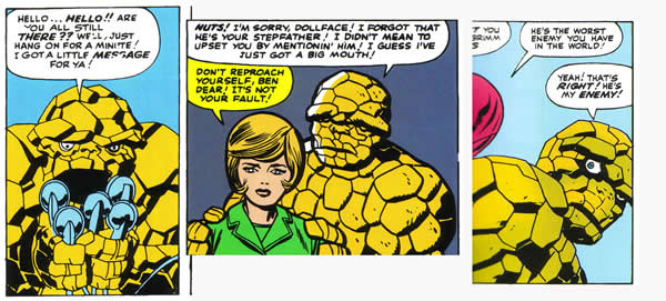
Perhaps this task is too laborious and time consuming, because after a few issues, Roussos backs off and inks the Thing with less precision. By issue #28, Chic Stone takes over as inker, and despite the beauty of much of his work, his embellishment of the Thing tends to lose even more shaded detail, as shown in the middle panel. Stone tended to take a good deal of care on rendering faces, but his outline is sometimes overly heavy and similar in quality to that of a wood block print.
Say then what you will about Colletta, but when he takes over the inking chores in FF#40, the Thing is shown with laboriously rendered brickwork intact as seen in the panel on the right. The issue prior to Colletta’s run on the FF was #39, the one that contained the Daredevil figures inked by Wallace Wood. The remainder of this issue is inked by Frank Giacoia, who attempts to match Wood’s solid line and strongly spotted blacks. Perhaps Colletta continued to ink the Thing in this way for the sake of continuity.
As the Marvel line attained greater success, the company’s management decided that they could afford to hire inkers that could do justice to Kirby’s art on their flagship title, and the long reign of Joe Sinnott on the Fantastic Four began. The new inker brought polish, prestige and a majestic quality to the series, but although Sinnott’s work is wonderful, it was still far from faithful to Kirby. Sinnott was encouraged to beautify Kirby’s raw power, giving it an illustrative quality suitable to the awesome cosmic subject matter that the Fantastic Four was embracing.

6
If we compare inks to pencils in this panel, we see that Sinnott has completely altered the faces of Reed and Sue, changing their expressions. In doing so, he has softened the angularity of Reed’s jaw line and sculpted the shape of his hair, as well as changing the shape of Sue’s eyes and mouth. Sinnott admitted that his favorite artist as a youth was Alex Raymond, and consequently he gave his characters Alex Raymond-like ears.
Over time, Sinnott began to believe that he was doing an injustice to Kirby with so much re working of his art, and the inker would attempt to be more faithful to the King’s pencils. Sinnott also believed that Kirby was influenced by the way the inker rendered his pencils, particularly in details such as surface texture and the complexity of backgrounds. Sinnott feels that Kirby gave greater emphasis to these elements when he noticed the care that the inker was taking with them. It does seem to be the case that the beauty and complexity of Kirby’s backgrounds and the attention to the detail of surfaces such as wood, metal and stone has increased markedly. It is unlikely that this is merely as a result of the inking. Kirby seemed to be putting more work into his pages and Sinnott feels that his approach to rendering had a major impact in this case.
Shortly after Kirby left Marvel to work at DC Comics, he found an inker that would strive to be as accurate as possible in his interpretation.
Mike Royer would often profess astonishment at the unwillingness of inkers to simply ink the lines that Kirby had drawn and not attempt to reinterpret them.
Royer was committed to the idea that it was his job to ink what was there, and nothing more. As a result, we have, with Royer’s hand, the closest approximation of what Kirby’s pencils intended. Nearly all of the examples that we have of Kirby inking his own pencils date back to a period in which the King was working in a fairly realistic style. Royer is inking Kirby during his wildest and most successfully expressionistic period, the height of which was arguably the New Gods.

7
In these panels, Kirby is drawing explosions of naked energy, something that he excelled at and exulted in. No camera or team of special visual effects has ever been able to match Kirby in the depiction of this kind of force, despite the fact that film has the advantage of motion. Kirby is depicting a multi dimensional display of breakneck speed and carnage with only the benefit of two dimensional lines on paper, and Royer’s brush and pen are completely supportive. Matching line for line and black for spotted black, Royer stays as close as humanly possible to the source. This is as good as it gets.
Opinions vary as to whose rendering of Kirby’s pencils was the best. Some prefer the adjustments and embellishments that Wood and Sinnott made. Some love the archaic quality of Colletta’s etched quill line, despite the omissions that the inker was guilty of. Regardless of your preference, one may conclude that the power of the King shone through, no matter who was inking him.
1 – Kirby, Jack
unpublished cover Strange World of Your Dreams
2 – Kirby, Jack- Lee, Stan – Colletta, Vince
Thor #157- pencils from Jack Kirby Collector#3. Color panel from Thor Marvel Treasury Edition Vol-1 no-10
3 – Ibid
4 – Kirby, Jack – Lee, Stan – Ayers, Dick
Fantastic Four #15, Jack Kirby Collector #33
5 – Kirby, Jack – Lee, Stan – Roussos, George – Stone, Chic – Colletta, Vince
panel from Fantastic Four #22 – Fantastic Four Omnibus, panel from Fantastic Four #28 – Fantastic Four Omnibus, panel from Fantastic Four#41 – Marvel Masterworks #25
6 – Kirby, Jack – Lee, Stan
Fantastic Four #49 pencils – Marvel Visionaries, Jack Kirby, Color panel from Marvel Treasury Edition, The Fabulous Fantastic Four
7 – Kirby, Jack
New Gods#6- pencils Jack Kirby Collector #24
Fantastic article!!! I’ve been waiting for an introspection on Kirby’s inkers. This is a great look at the various embellishers and their effects on Mr. Kirby’s work.
Vince Argondezzi
This comes up when you request Kriby inks his own. Gracias. I highly recommend going to a pencil of you early drawings from your mother’s collection. Inking that, and xerox . The differences are distantly related to the original, in order to bring the thing into focus, you include objects, things. Ultimately Joe Sinnot makes my day every time I spring for a beat up seven dollar FF. ANd remember, that Kriby’s daughter gets to retire after all was said and done on the money from the settlement. Inking is generative and musical according to my logic, showing the colorists where to go. And thank god for Marie Severin ya know ? Perfections is a lost cause, Kirby made Swamp ‘Thing” possible, but where is what he admired most about his art work, the group of five fellows, their presence maintained on the page, honestly it was in the Secret wars cross overs, the company’s attempt to screw the Kirby family, and where ? Ranxerox is two people, where is the ensemble cast / I want to know. That will answer this question, I think it is in the Romita jR’s Eternals, and he saw the ink jobs that we all did, right ?