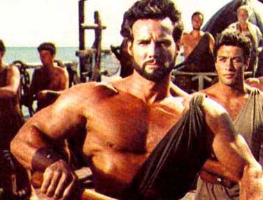
As a ten year old, going to the Saturday matinee neighborhood films in the Bronx of the early 1960’s was always a treat for me. The Hammer horror craze was in full swing as well as a plethora of Sci fi and monster films, and a generous supply of Tarzan and Sword and Sandal movies. The king of the S&S craze was certainly the great Steve Reeves, who was as handsome as a Greek God and sported a symmetrically classical physique that is even today considered to be the prototype for the modern bodybuilder.
As a budding artist, interested in sequential action, I was galvanized by Reeves’ lyrical musculature in motion on the screen. I was also inspired to begin training with weights, as were many others such as Arnold Schwarzenegger and Sylvester Stallone, upon viewing Reeves onscreen for the first time.
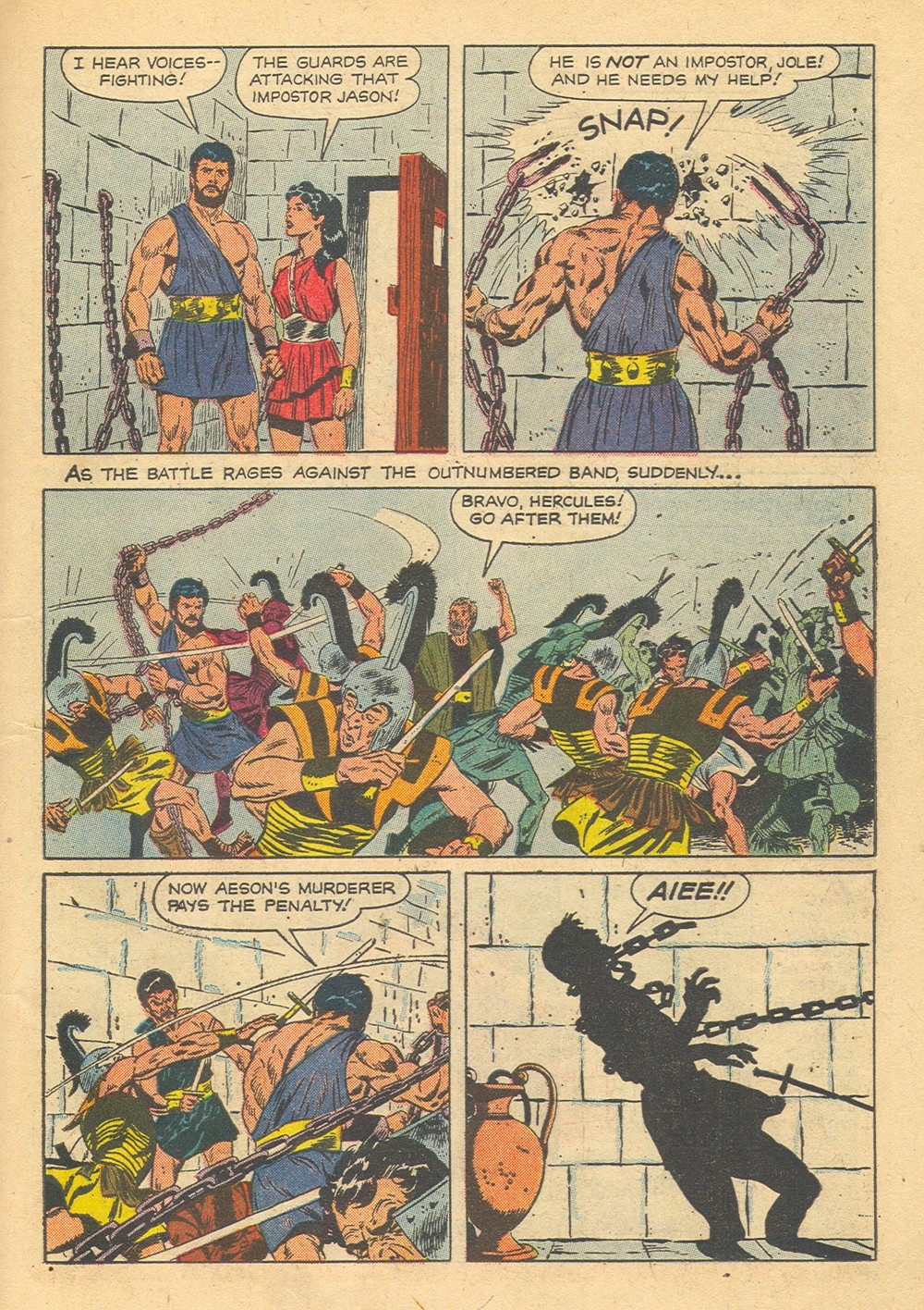
The Hercules films that Reeves starred in were top box office draws worldwide, and they even spawned a comic book that I was later to discover had been drawn by Marvel superstar artist John Buscema. That artist, who was developing a drawing style obviously inspired by Greco-Roman and Renaissance figure work was nearly perfect for the assignment.
It is interesting to study Buscema’s work at this point in his career. One can easily see that he understood anatomy very well and was comfortable rendering realistic musculature from a variety of angles. Still, his total page design is not consistently strong. If we look at this Hercules page below, the figure in the second panel is not optimally positioned and does not look very forceful while snapping the chain. This is a drawing of a static human back, almost a bodybuilding pose. The drawing is subservient to the muscles rather than to the motion. Kirby would never do that. He would distort or emphasize some aspect of the anatomy to suggest a violent action
Although the melee in the long third panel is well drawn, it could be better arranged in terms of the placement of figures in relationship to one another. The focal point of this panel should be Hercules, but instead the eye goes to the sword wielding soldier or the small figure speaking in the center.
When Buscema started working for Marvel in the late sixties, it is said that he was encouraged by Stan Lee to draw more like Kirby. Although the King did not spend a great deal of time on perfectly rendered anatomy, he nearly always designed his panels and pages for maximum dynamic tension and release. This tendency would have been what Lee was stressing for all of his artists to emulate. When asked in an interview published in the Jack Kirby Collector #18, what he had learned from Kirby, Buscema replied,
“The layouts, for cryin’ out loud! I copied! Every time I needed a panel, I’d look up at one of his panels and just rearrange it. If you look at some of the early stuff I did – y’know, where Kirby had the explosions with a bunch of guys flying all over the place? I’d swipe them cold!”
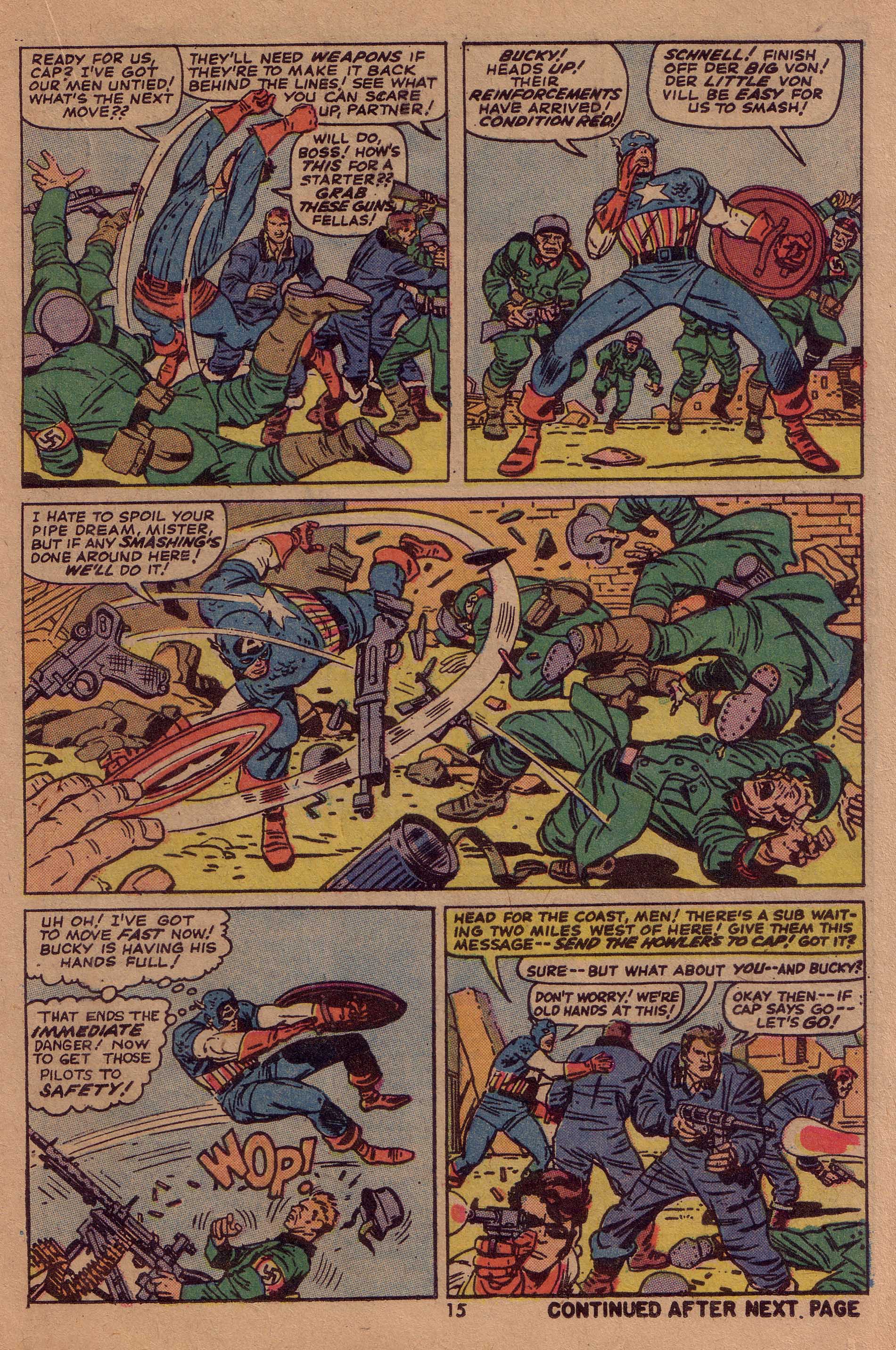
If we study this page above from Sgt. Fury #13, we see an almost scientific precision in the relationship between Kirby’s figures, not only within the space of the panel, but in the movement from panel to panel. Every figure on the page is in its optimal position for the balance of the composition, to propel the action as well as the story. Kirby uses the human body in all its kinetic contortions to move the eye precisely where he wants it to go. Look for example at the panoramic third panel and notice the relationship of the flying figures to the arc of Cap’s swinging shield. It is almost as if they were arranged in specific coordinate points on a spinning wheel.
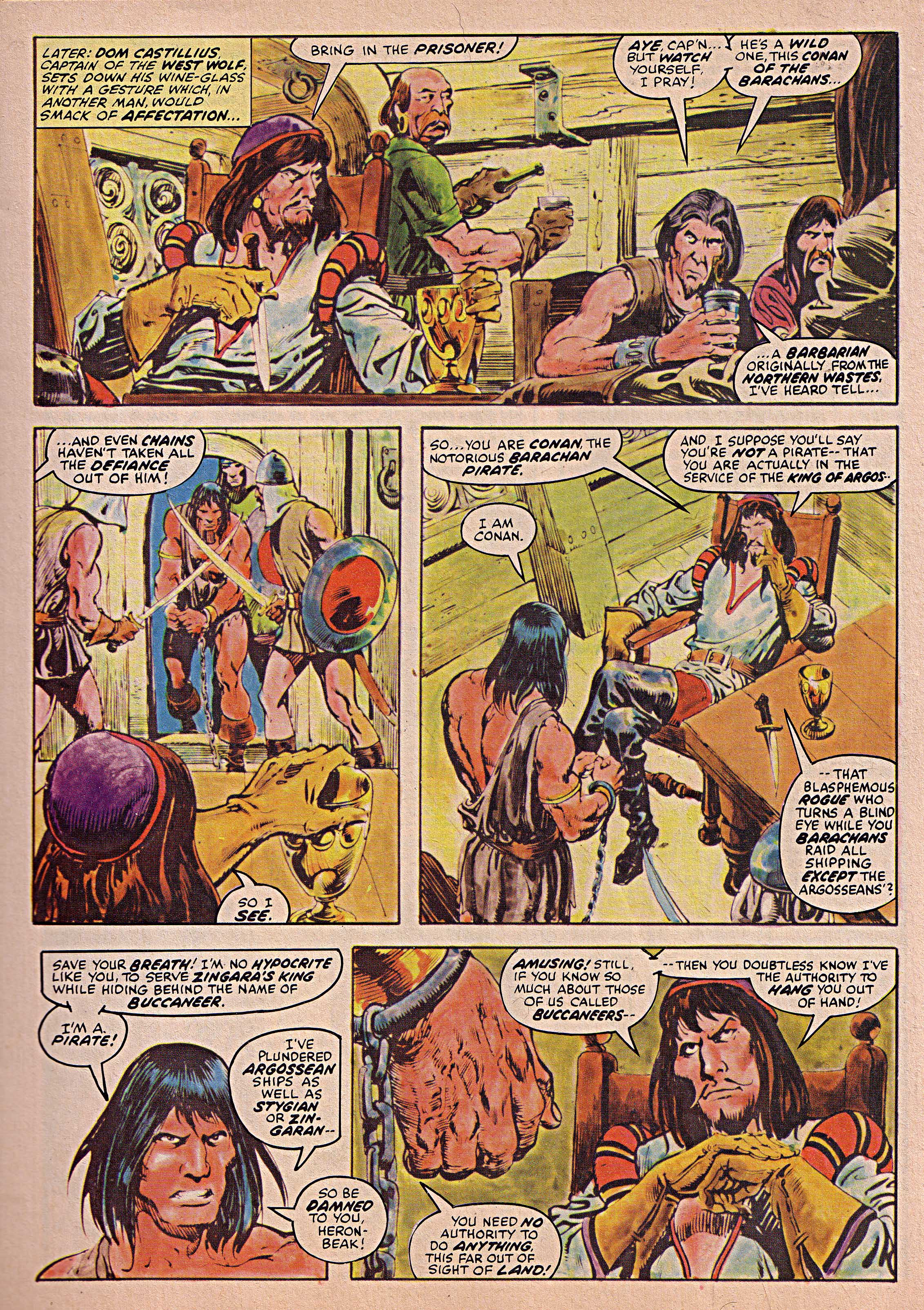
If we then look above at John Buscema’s art on Conan, we see a great sea change in his compositional abilities. This page from Savage Sword Super Special 1977 is a masterful use of page space by the artist, as he uses various figures and objects to move the eye around. Notice the elbow of the seated cup bearer in the right middle ground of panel one pointing to panel two. Next, see the seated pirate’s hand gesture towards panel three and Conan’s back. That shape mass picks up the diagonal of the table moving the eye to the fourth panel.
This is a very Kirby-like way to compose a page. Buscema has learned well, and is using the panel’s contents in a much more abstract manner. As a result, has become both a better artist and a more successful storyteller.
Image 1-Steve Reeves, Hercules
Image 2-John Buscema, Hercules, Dell publications 1959
Image 3- Sgt. Fury 13 Jack Kirby, Stan Lee, Dick Ayers
Image 4- Savage Sword of Conan Super Special 1977, John Buscema, Roy Thomas, Alfredo Alcala.
John Buscema quote from The Jack Kirby Collector #18
Thanks to Rod Beck for the Hercules artwork.


Pingback: Comic-Zeichenkunst: Warum Jack Kirby schwer zu tuschen war – endoplast.de