Techno-active

by

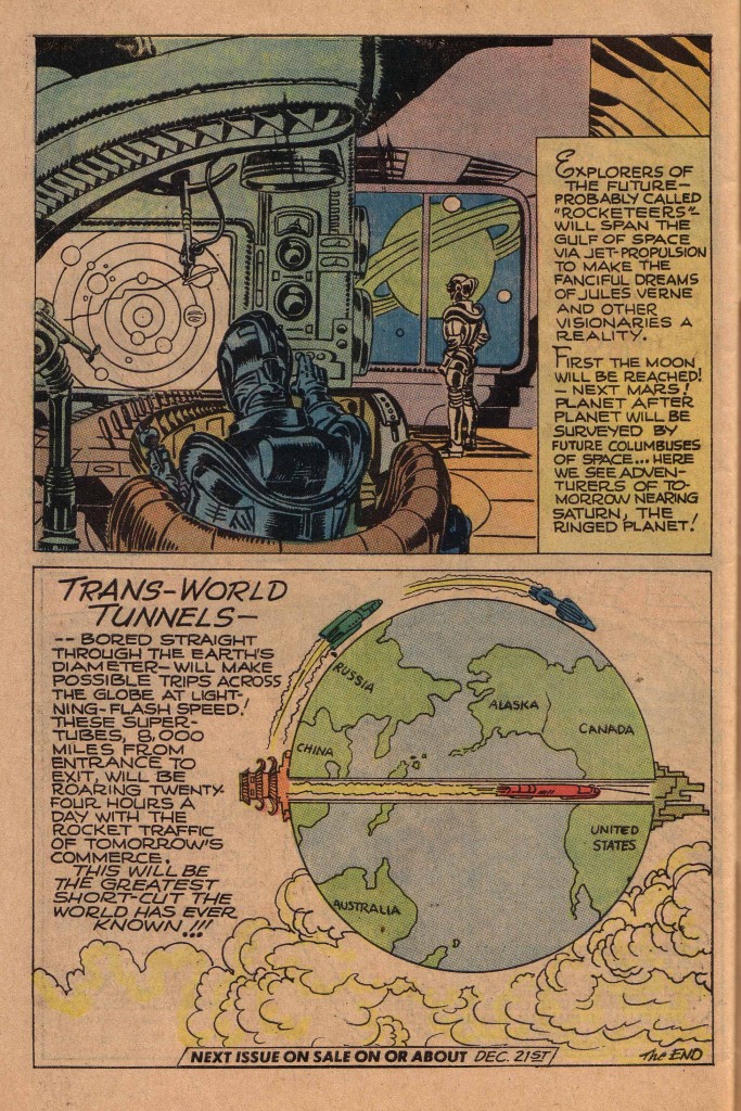
Like many of his peers in the early years of the Comic Book industry,  Jack Kirby was fascinated by technology. He was also a fan of the emerging arena of science fiction and fantasy film and literature that were akin to it.  Here is a page from a publication called Real Fact Comics, produced by Kirby and Joe Simon circa 1946.  This is clearly an attempt to merge science fact and fiction in imaginative speculation on future intergalactic technology.


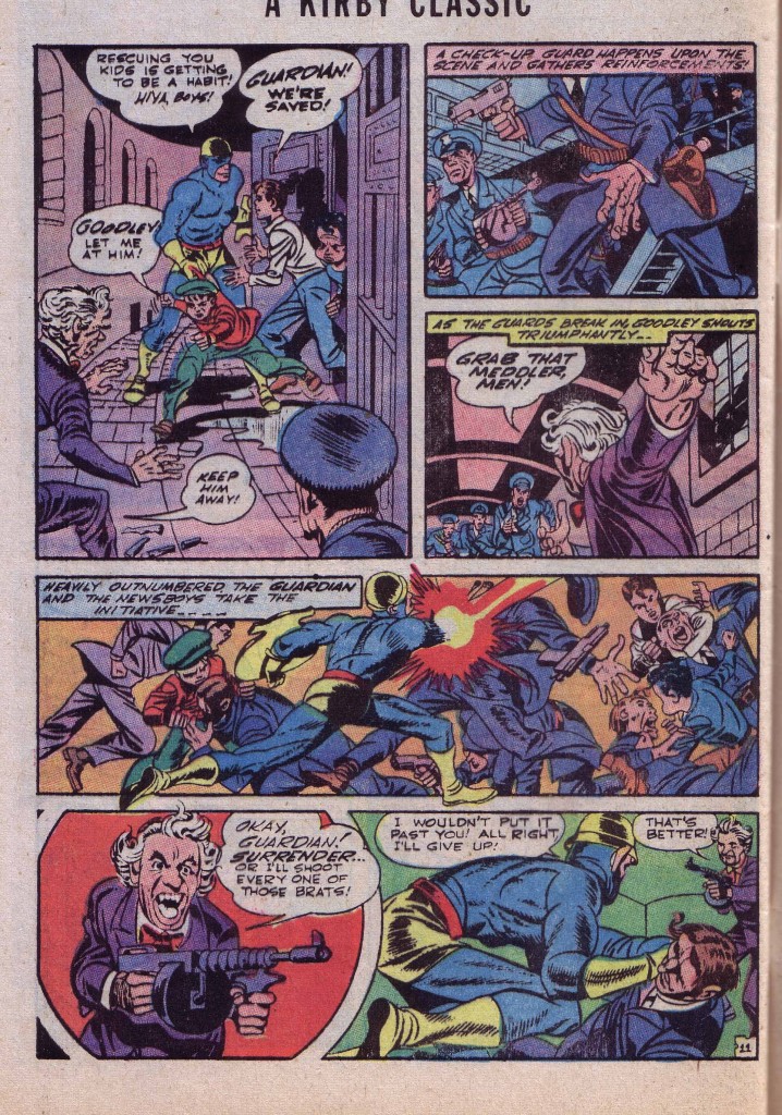
If we look at the style of drawing in which Kirby was working during this period, we see that he is hewing fairly close to a naturalistic, albeit dynamic style. A page from an earlier Newsboy Legion strip shows the artist drawing musculature pretty organically, rendering bone and sinew in an somewhat accurate though stylized manner. Details such as pectoral and deltoid muscles are in the correct position and although they are used in the  compositionally optimal Kirby fashion, they look more or less as they ought to.


What we may notice in panels one through three is that Kirby is using the structural details of the rooms to emphasize the dynamism of the compositions, something that he would do more and more effectively as his career progressed. For example, in panel one, Kirby uses the circular sweep of the floor and walls to emphasize the forward and diagonal propulsion of the action figures.

For more detailed examples of this, see my posts on Architecture.

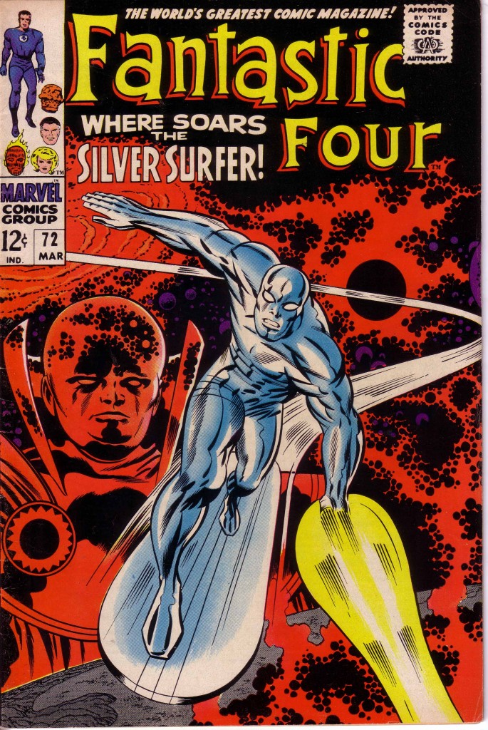
As his career moved into the sixties, a singular change occurred in the way Kirby drew the figure. Kirby began to increasingly render musculature with a signature squiggly stroke that became so identifiably Kirby that it became known as “Kirby Squiggles.” This stylistic affectation had the effect of making his figures somewhat less organic and apparently more technologically futuristic. Such a style was perfect for the space traveling Silver Surfer, who was surely a harbinger of things to come when he first appeared early in 1966.  The Surfer’s cosmic environment reinforced Kirby’s preoccupation with futuristic technology. This profusion of squiggles often coincided with the generous use of Kirby Krackle during this period, as seen on this cover of Fantastic Four #72.


The King seemed to be possessed with a fascination for glistening chrome-finished machinery that pulsed with energy and appeared to proliferate like inorganic vegetation.

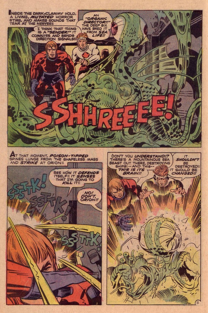
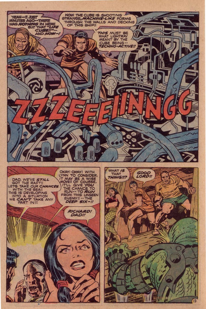
One of the most outstanding stories Kirby produced shortly after leaving Marvel Comics was The Glory Boat, from New Gods #6. At a pivotal point in the narrative, the heroes Orion and Lightray discover a horrific creature in the hold of a misshapen wooden boat. Instead of destroying it, Lightray decides that it should be changed into something else.


The creature is a slithering green monstrosity, with slimy tendrils protruding in multiple directions, symbolic of demonic nature gone mad. Strangely, Kirby in the gradual transition in his art to a less organic depiction of life gives us an encapsulation of his newer paradigm, by having Lightray transform the hideous “Caller” thing into a glistening apparatus, somewhat resembling an automobile engine.


As the earlier incarnation of the creature is a mass of protruding tendrils, the new form is in the words of one of the characters, “shooting strange machine-like forms through the walls and decking of this ship.”

Lightray describes the process that he had affected as “techno-active.” This is indeed a good description of the artistic evolutionary process that Kirby has undergone. If we look at his earliest work, we can see that the very preoccupation with technology that started in his youth has over a thirty year period also made the artist Techno-active.


Image 1- Real Fact Comics Jack Kirby, Joe Simon 1946 reprinted in Jimmy Olsen #145

Image 2-Newsboy Legion, Jack Kirby, Joe Simon, reprinted in Jimmy Olsen #145

Image 3-Fantastic Four #72 cover, Jack Kirby, Stan Lee, Joe Sinnott

Image 4- New Gods #6, Jack Kirby, Mike Royer

Image 5-Ibid

Spatial Relationships part two, Scale

by

One of my earliest posts dealt with the artistic collaboration between Jack Kirby and Wallace Wood. In the article, I used a quote by Bill Mason from a Comic’s Journal article, describing Wood’s approach to spatial arrangement in his artwork.

“The young Wood taught himself how to draw in a dashing, boldly exaggerated style which he gradually refined by adjusting the spatial relationships in his drawing, through an extremely laborious process of point to point navigation from one solid object to another.”
When we look at the work of most exceptional artists, we see the way that singular person deals with intervals of space and time. This sort of thing relates to music as well, because we appreciate the intervals that a musician uses to compose a piece. Kirby’s work obviously can also be viewed from the perspective of intervals, as we can see the way he, like Wood has the viewer navigate from one object to another.
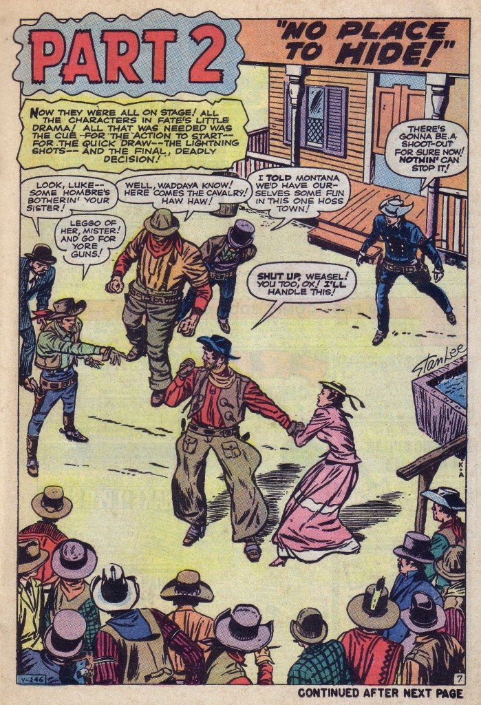
Here’s a page from Rawhide Kid #23 that is an aerial view of a street, with various figures arranged on its stage. The figures are clearly placed in a fashion that enables them to speak their lines most effectively in a particular order to emphasize the story point.


The figure in the bowler on the far left speaks first, followed by the man in the gray vest pointing. Although he points to the main figure, Montana Joe, our eyes still follow the diagonal of his stance up to the man in the red scarf and gray-green hat and the man in the top hat, before descending to Joe. We then see the girl in the red dress, and finally the Kid. The figures on the bottom and the structure of the saloon frame the scene and also keep the eye moving in a circle. It is a brilliantly composed page and the position of each figure is crucial to the scene’s effectiveness. By a combination of intuition, intelligence and hard work, Kirby can make these decisions of judgment nearly instantaneously. Notice also that all of the figures are pretty much of equal size, which is why it is even more important for the figures to be optimally positioned.

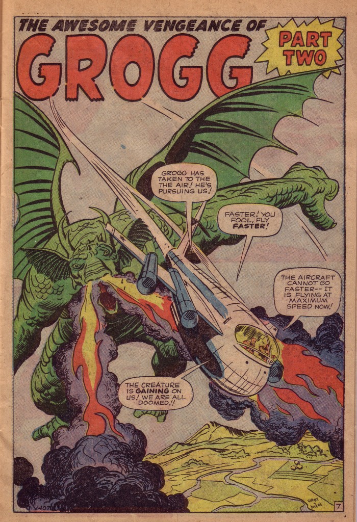
Next, we look at story from roughly the same period. It is Grogg, from Strange Tales#83, and as one of Kirby’s giant monster stories, scale, the relative size of the compositional elements is now a crucial factor. The panel contains two large objects flying over the earth’s surface. The creature, Grogg is the largest object and is surging forward in pursuit of a jet that whizzes towards us like a bullet.


Kirby makes magic with the downward sweep of the dragon’s huge wing bone. That series of opposing curves takes the eye directly to the creature’s fire spouting snout. The nostril blaze gives the jet extra propulsion as it streaks diagonally to the right of our vantage point. The aircraft is just large enough to look imposing as it comes at us, but small enough to be dwarfed by the monster. Scale is the vital issue here, and the relative size of the objects, as well as their distance from the earth’s curvature are optimal.

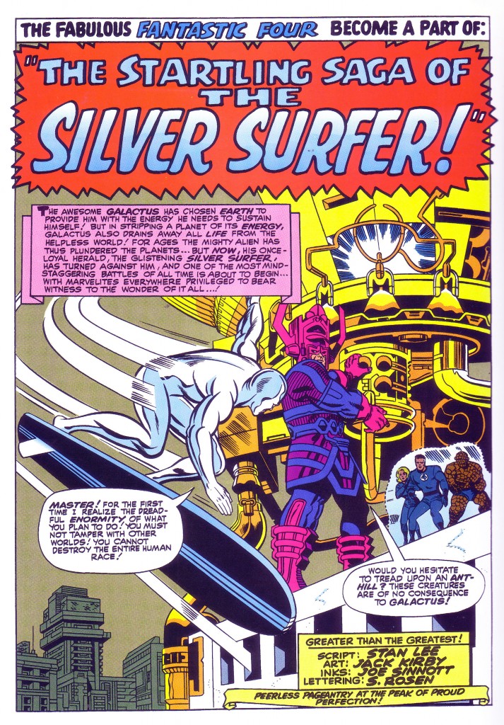
Our final example is a page from one of the most memorable moments in comic book history. It is within the splash panel of Fantastic Four #50, as the heroes are confronted by the awesome power of Galactus that we see one of the most profoundly marvelous images in the annals of sci-fi illustration.

We first see the Silver Surfer swooping into the frame as Galactus stands atop the Baxter building. In the panel, Galactus and the Surfer are roughly the same size, although in comic book reality Galactus towers above the humanoid figure.


It is the spatial relationships and relative sizes of the various elements that make up the composition which give the illusion that Kirby has striven to convey, suggesting the awesome scale of Galactus as compared to the Surfer, and to the Fantastic Four who stand on the buildings edge as well.

The massive cylindrical tower that Galactus is accessing creates much of the illusion of relative size. The buildings in the distance also frame the shot and give it depth and a greater sense of proportion.  Kirby has drawn upon years of experience to bring us a tableau that conveys a sense of tension based on the varying degrees of power and powerlessness between antagonists, and he has done this by using the spatial relationships and scales of the participants in the panel.This is yet another reason why he is the King.

Image 1-Rawhide Kid #23 Jack Kirby, Stan Lee, Dick Ayers

Image 2- Strange Tales #83 Jack Kirby, Stan Lee, Dick Ayers

Image 3-Fantastic Four #50 Jack Kirby, Stan Lee, Joe Sinnott

Golden and Silver

by

One of the cool things that happened during the so-called Silver Age of Comics was Jack Kirby and Stan Lee’s effort to link the Golden Age Captain America to the character that had been revived in 1964. This was done by presenting some of Cap’s World War II adventures, a few of which were actual recreations of stories printed in the 1940’s. This makes it possible to study Kirby’s evolving approach to plotting and laying out a specific script, over a twenty-five year time span.

Following a fairly faithful adaptation in Tales of Suspense #63 of the hero’s origin from Captain America #1, the second story of that historic issue was then adapted in Tales to Astonish #64.

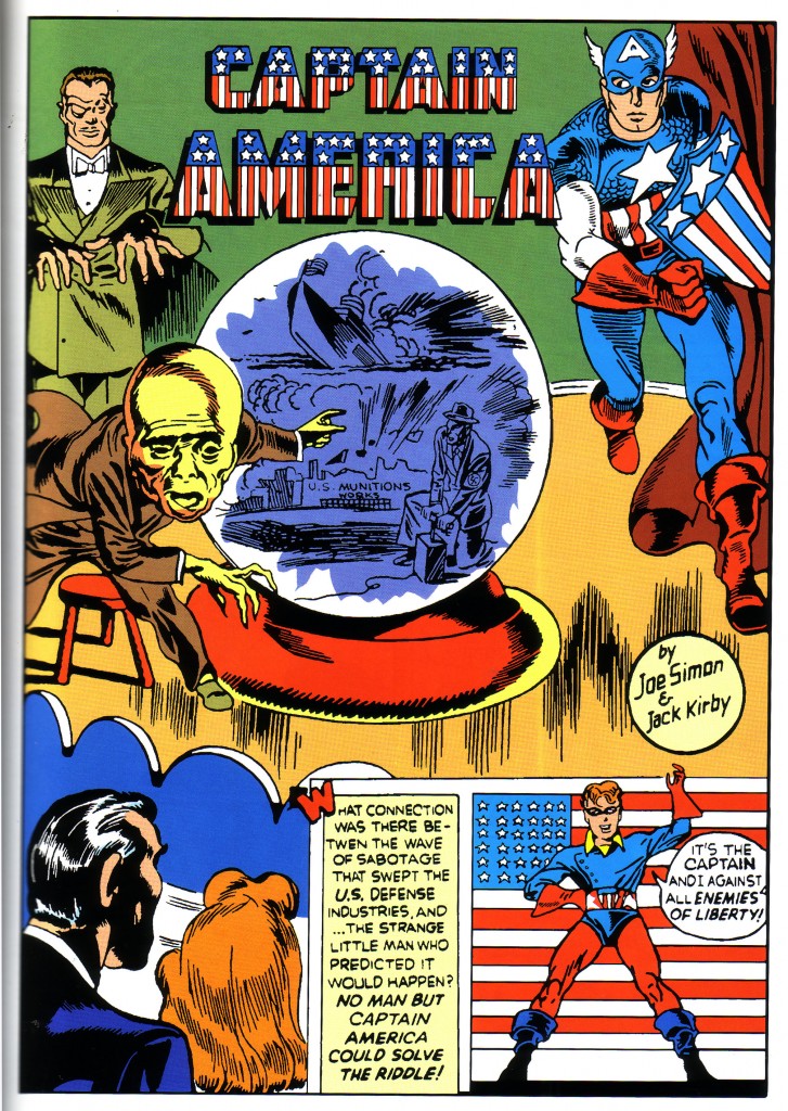
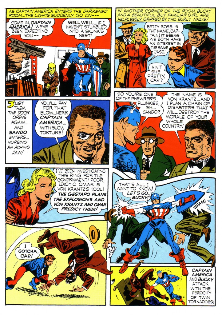
The team of Joe Simon and Jack Kirby originally presented the story featuring villains Sando and Omar. Since Captain America’s first issue was done in a rush to meet a deadline, Kirby as primary artist would generally do a complete pencil drawing of only the splash panel and usually ink it as well. Then Kirby and/or Joe Simon would do rough layouts on the rest of the story, which would in many cases be completed by a secondary team of artists and inkers.


The splash panel is fairly strong, showing Kirby’s early use of a circular composition. It begins as the eye enters the page on the left with the gesturing monocle wearing figure of Sando, whose hands point to the huge yellow head of Omar. That figure’s claw like hand leads our eye to the base of the crystal sphere and up to the figure of Captain America, and then the top of the sphere and the logo type take us back to Sando. Eventually, our gaze drops to the couple in the audience and onward to the second panel.

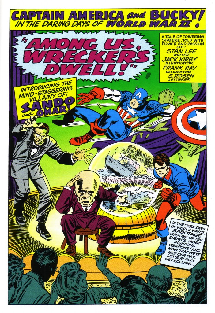
It is a nice solidly drawn and inked page, but it is positively static in comparison to the 1965 version below.


This page also leads us into the action with a gesturing Sando, but he is a full-blown dynamic Kirby body, with forced perspective hands outstretched in contrapuntal directions. The crouching Omar is the page’s most stationary figure, still pointing to a smaller sphere and a darting Bucky, whose angled position leads us to Captain America. It is here that the startling difference of twenty-five years experience is most apparent. Instead of running rather mildly in place on the rightward edge of the page, Cap’s pose is the center of the action and his elongated arch weaves the page’s kinetic rhythm together. The frieze of audience figures on the bottom border also reinforces the circular direction of the composition.

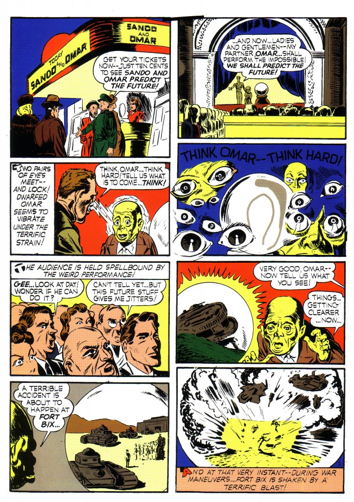
Page two of the golden age version was probably at best roughly laid out by Kirby, and gives us the sketchiest approximation of realistic detail.


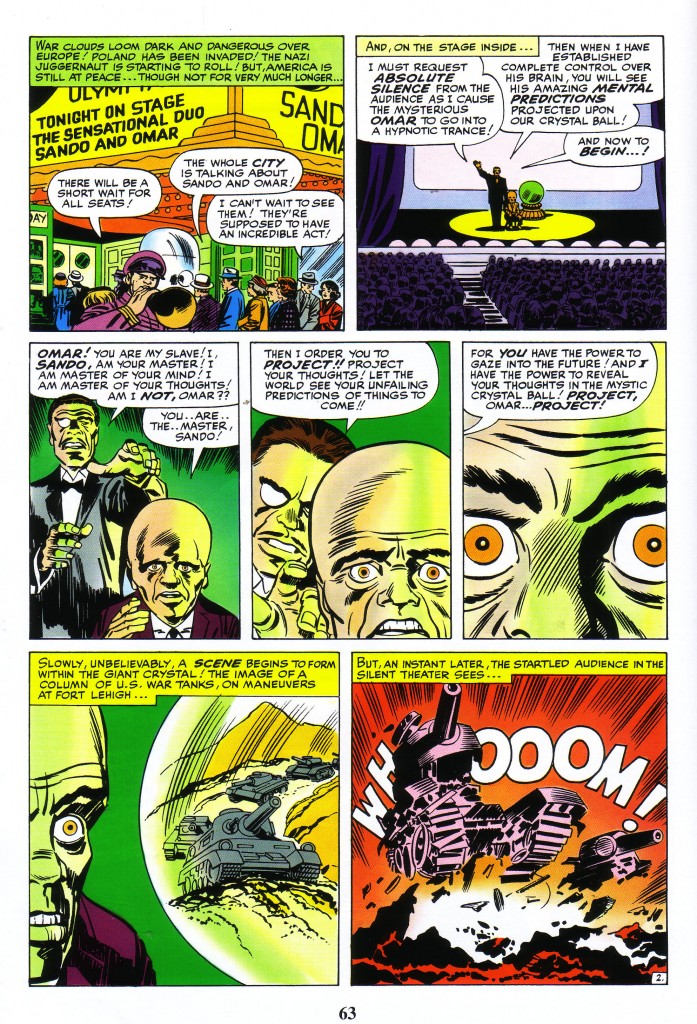
Joe Simon and inker, Al Liederman, probably did most of the finished drawing above. The structure of the theater and such objects as tanks and weaponry are desultory at best. Still, Kirby clearly later uses the crudely executed page as a jumping off point for his reenactment. Like the 1941 version, panel one of the newer page below is an exterior shot of the theater and panel two also mimics the original by showing the audience and the stage.


Kirby next shows Sando and Omar together, but as the camera pans in, we see the older page’s floating eye motif reinterpreted as a gradual enlargement to a looming close up of Omar’s eyes. Next we see the crystal globe mirror the circle of the iris, revealing a beautifully drawn tank, which explodes in burst of energy in the final panel.

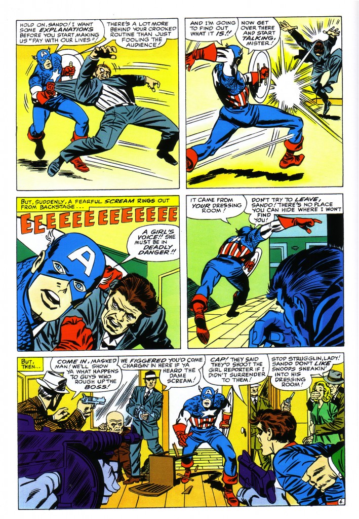
At this point, Kirby dispenses with following the continuity of the old comic and finds a new rhythm. He only returns to the source for an occasional panel. A notable comparison occurs on page six of both issues. The frame in question is the first on the page in the Golden Age story and last in the 1965 version. The older panel is almost certainly drawn and at least partially inked by Kirby, and is so small as to escape scrutiny, were it not so similar to what Kirby does in later years.


On the left edge of panel one above, we see an automatic pistol pointing diagonally at Captain America, who has just entered the room at stage right. There is a nod to some sort of faux perspective and vanishing point created by various articles of furniture and such to add drama.

Apparently, Kirby saw something here worth elaborating on. In Tales of Suspense #64, in panel five below he gives us a full tier bottom panel of practically the same tableau, but he works it in subtle new ways.


In this case, a Tommy gun reinforces the pointing automatic, and a third gunman stands where only Omar previously stood. Cap and the open door are now dead center, with Bucky to his right as well as another gunman forcing the eye to focus on the star-spangled hero. The boards of the floor, not visible in the older panel are also used to reinforce the drama of Cap’s dilemma.

Thus did the King show his genius, with his attention to detail, finding something to explore and exploit in a fairly unremarkable panel from a previous generation.


Image 1-Captain America #1, Jack Kirby and Joe Simon, Marvel Masterworks Golden Age Captain America Volume one

Image 2-Tales of Suspense #64 Jack Kirby, Stan Lee, Frank Giacoia, Marvel Masterworks Captain America Volume one

Image 3- Captain America #1, Jack Kirby and Joe Simon, Marvel Masterworks Golden Age Captain America Volume one

Image 4- Tales of Suspense #64 Jack Kirby, Stan Lee, Frank Giacoia, Marvel Masterworks Captain America Volume one

Image 5- Captain America #1, Jack Kirby and Joe Simon, Marvel Masterworks Golden Age Captain America Volume one

Image 6- Tales of Suspense #64 Jack Kirby, Stan Lee, Frank Giacoia, Marvel Masterworks Captain America Volume one


Thor vs. the Hulk

by
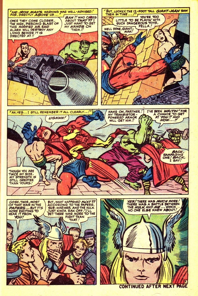
Journey Into Mystery #112, with an epic battle between Thor and the Hulk has some of my favorite Kirby Kinetic moments. The slug fest is a carry over from Avengers #3, and is a elaboration by Thor as he tells a group of youths the story when they ask which of the two combatants is stronger.
The second panel of the page below has long been a favorite of mine because of the unusual angle. Its primary function is to draw the reader’s eye to the third panel, but it excels alone as a brilliant and unusual composition.
Most artists would probably employ a more conventional approach, that being to have the base of the panel as the floor in the picture. In other words, Giant Man would be reaching straight up at Namor. Kirby gives us a skewed but less static picture frame, and it works beautifully for the overall page composition. Thus, he has Giant Man reaching diagonally up at Namor, who is also positioned on the diagonal of the wall. These planes are offset by the diagonal of the elaborate piece of machinery in the lower right corner.
Giant Man’s pose brings the eye down to his much beleaguered figure in the panoramic third panel. The angle of his body and the legs of Iron Man bring the reader’s eye to the right hand of the panel, wherein Thor and the Hulk are engaged in combat
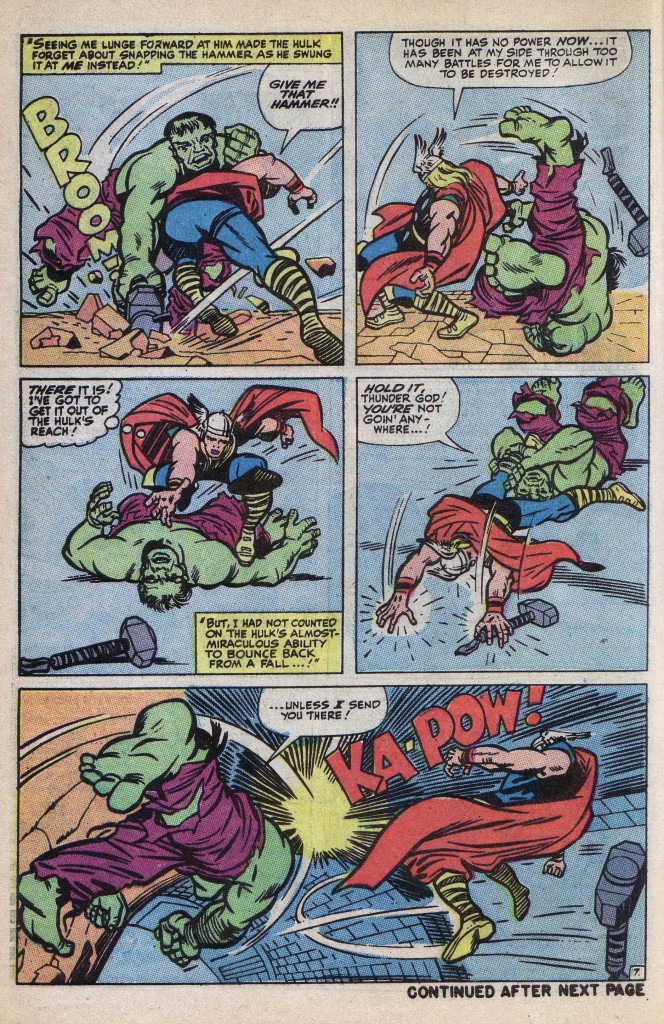
This story was drawn during a period when Kirby was doing art chores on more than half a dozen titles, and although it is drawn lovingly, it is a bit skimpy on backgrounds. Page seven is a beautiful sequence, but is not as well planned as Many of Kirby’s best.
There is too much dead space in panels three and four, but panel five is a stand-out. Kirby uses the huge foot and foreshortened right leg of the Hulk to offset his sweeping right cross, and the artist also employs the circular shape of the tunnel and Thor’s flung rag doll figure to accentuate the power of the blow. Also, clearly the diagonal force lines emanating from the blow are very effectively augmented by the diagonal lines that suggest the shape of the tunnel
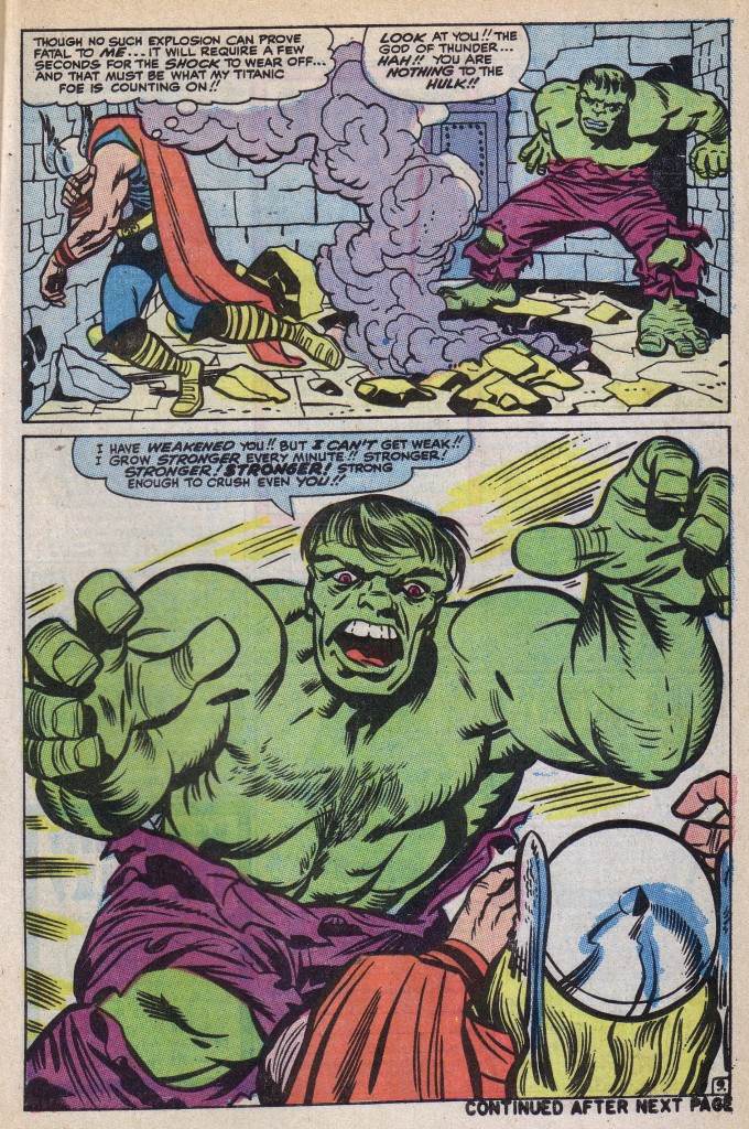
The final page is one of Kirby’s most awesome studies in sheer ferocity. In the first panel, Thor is near collapse, stunned by an explosion, as the Hulk crouches, gloating and preparing to spring.
The bottom panel gives us a masterful example of looming horror. The monstrous Hulk’s facial expression is fierce enough, but it is his massive arms and ponderous hands that visually pin Thor to the bottom right corner of the panel. It is the left to right sweep of right hand to head to descending left elbow that squashes Thor into a cowering heap.
Let me take a moment to mention an outstanding inking job by Chic Stone in this particular panel, where the powerful lines of chest and abdominal muscles of the Hulk are wonderfully rendered by the inker.
This singular panel so impressed itself upon me when it first appeared, that I am surprised that I waited so long to showcase it. Such is the sheer magnitude of Kirby’s work that this sequence would only occur to me at this point in time.
Image 1-Journey Into Mystery#112 Jack Kirby, Stan Lee, Chic Stone
Image 2 Journey Into Mystery#112 Jack Kirby, Stan Lee, Chic Stone
Image 3- Journey Into Mystery#112 Jack Kirby, Stan Lee, Chic Stone
All images from reprint in Marvel Tales #25

Vectors

by

First, allow me to apologize for this post. I regret that I am forced to use images already in my library, because my scanning equipment is temporarily disabled. Therefore, the post may not be up to my standards, but I will do my best with what I have on hand.

I’d like to discuss the concept of vectors here. As defined by blogger Jesse Hamm, Vectors are invisible lines that chart the paths our eyes will likely take through a picture. This is certainly not a new concept for this series. It is only a new term for me to use that is direct and appropriate while analyzing Jack Kirby’s work. The King’s use of vectors is one of the essential factors that makes his work so powerful. In many cases, Kirby will use vectors moving in harmony and opposition to create drama.

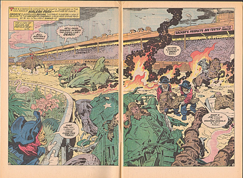
If for example we study this Kamandi spread, we notice the diagonal vector of the stadium roof which sweeps the eye from left to right. This vector also supports the shapes of Bull Bantam, Kamandi and Klik-Klak.


Working in tandem with the diagonal, the curved vector if the railing on the lower left reinforces the shape of the demolished tank in the foreground, as well as the movement of the leopards carrying the injured racers off the field. Vectors work hand in hand with lattices to break up the composition three-dimensionally and emphasize aspects that the artist wants to feature prominently.

The vectors created by large horizontal and vertical shapes are fairly obvious and easy to detect. What might not be as apparent are the smaller vectors created by lesser shapes throughout the composition.

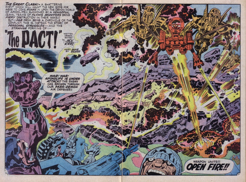
For instance, as well as the obvious vector of the diagonal mass of machinery from left to right on the New Gods page above, we also have the vector of the massive raised arm on the left, the cannon at bottom center, and the various weapon blasts emanating from the flying figures. In fact, an accomplished artist like Kirby uses nearly every gesture or object in his composition to further dramatize his art, and even more important the intent of his story. There is little in this picture that is not deliberately posed and counter-posed for dramatic effect, from the seemingly random position of an arm to a flying shard of debris.

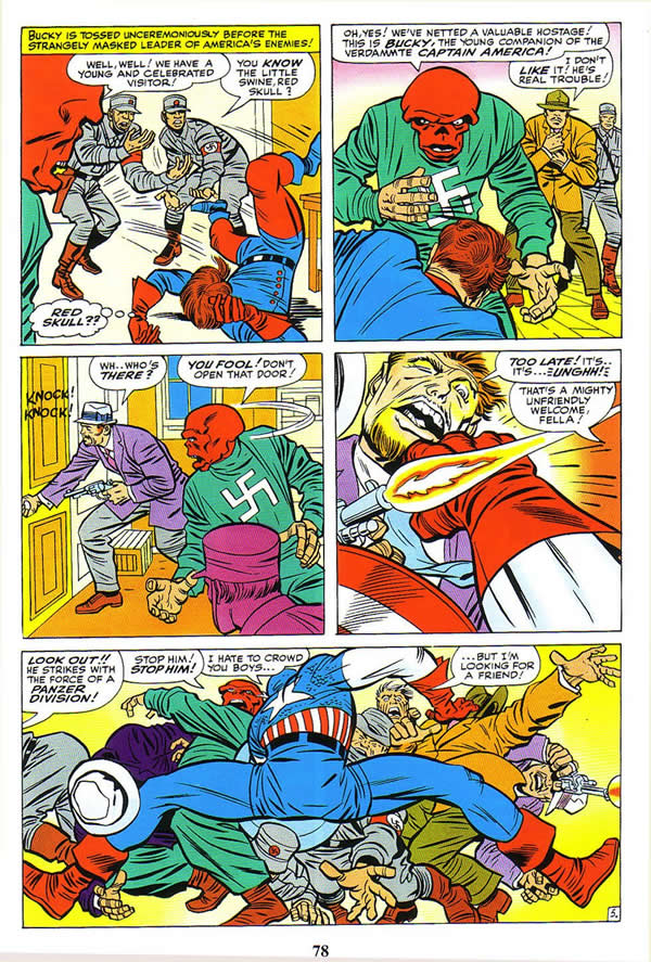
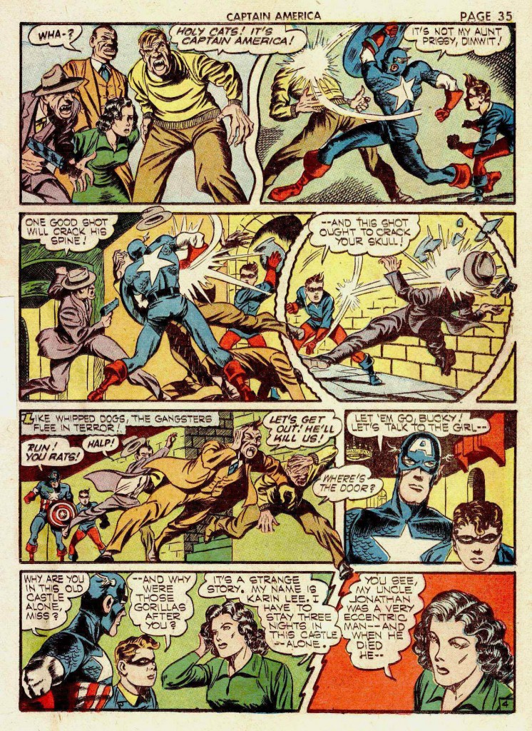
Finally, we can clearly see how Kirby uses vectors in the service of continuity, which is something that I have emphasized from the beginning of this series. The King uses various vectors as pointers from panel to panel, as in the case of Bucky’s tossed figure indicating the motion to the second panel. We next see the triangular vector of Bucky’s back, moving our eye to the third panel.

The dance of movement continues with the vector of the Skull’s gesture towards panel four, which is picked up by the pistol blasting in that panel. Cap’s arm and shield bring us down to the wonderfully splayed figures in the final panel.

With Kirby, it’s all about movement in the service of the story, and vectors help to keep us moving.

Image 1- Kamandi  Jack Kirby, Mike Royer

Image 2- New Gods #7 Jack Kirby, Mike Royer

Image 3-Tales of Suspense #65 Jack Kirby, Stan Lee, Chic Stone


Anatomy and Power.

by

Jack Kirby’s work is sometimes criticized or dismissed for being unrealistic. Kirby has stated in so many words that he doesn’t particularly value realistic drawing if it doesn’t advance the story line, but let’s examine the evidence. In my opinion, throughout his life, Kirby has created a set of visual symbols based on the structural foundation of reality, which although they are abstractions actually possess a power greater than strict reality has.

One of the first things I see when I study Kirby’s work is that it is firmly grounded in three-dimensional reality. What I mean by this is that Kirby’s compositions are logically placed inside the picture frame and that he uses something akin to basic anatomy and perspective to propel his narratives. In my last post, More Latticework, I discussed this in relation to the compositions that Kirby crafted.

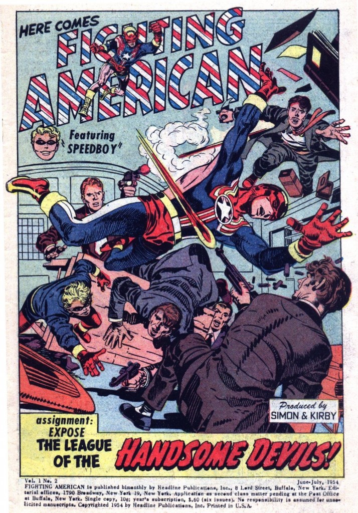
Kirby, like Picasso carefully studied and pretty much mastered realism years before he embarked on his forays into hyper-exaggeration and abstraction. As he developed through the forties and fifties, the King maintained a fairly consistent style for drawing his figures that was based soundly in anatomical structure, even though he would also employ dramatic effects like forced perspective as seen in this Fighting American splash from issue #2.


If we look at the musculature of the hero, we can see that his anatomical structure is fairly accurate. Hands are not nearly as squared off as Kirby would later make them, body parts are well in proportion to a normal athletic figure, and details like biceps, deltoid and lattisimus dorsi muscles and bones like FA’s right elbow are all in the correct positions. Kirby is also using the lines on the wall as orthogonals to suggest perspective and increase the forward thrust of the hero.

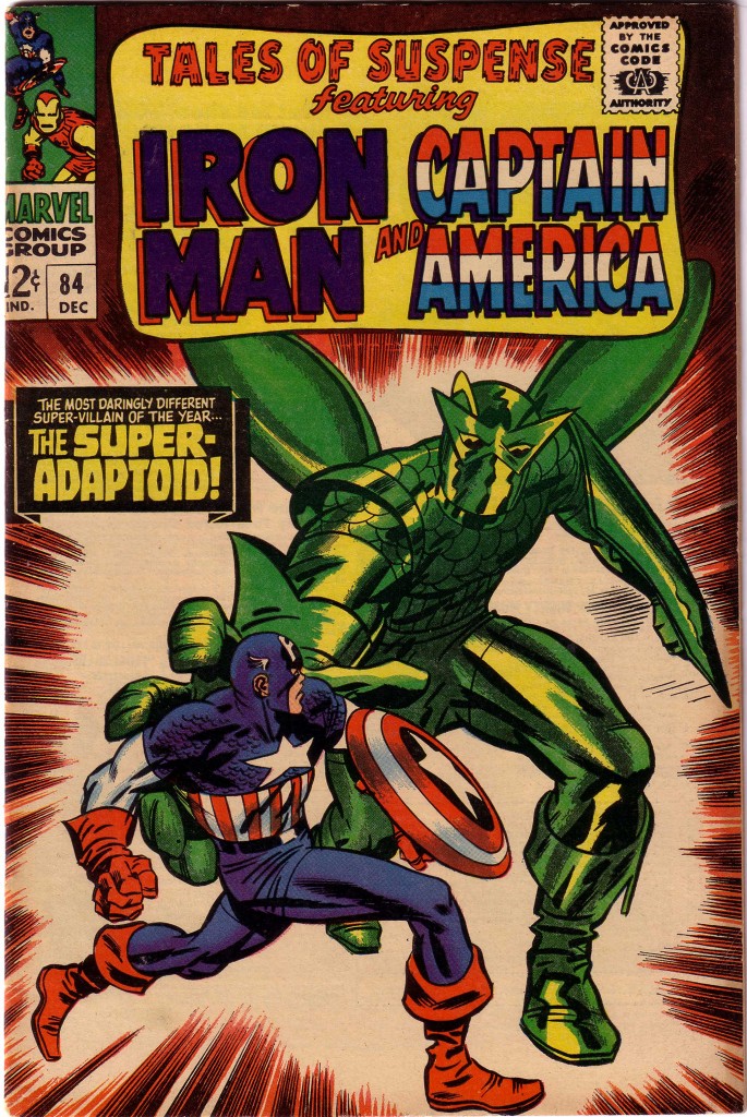
Sometime in the mid-sixties, Kirby’s style began to grow more abstract, as he seemed to be reaching for a way to depict worlds beyond that which a normal human being could conceive. The artist began to arrange the space of his page to encompass the infinite, and even the depiction of the corporal body began to morph, Specifically, Kirby’s notion of the heroic began the inspire him to develop a new graphic language of symbols. Here on this Tales of Suspense #84 cover, Kirby has basically dispensed with the strict shaping of specific muscles, rendering Captain America with bold slashes of black to emphasize the dynamism of his figure. What is more, he has accentuated the sense of fearsome mass by radically exaggerating the foreshortening and size of the Adaptoid’s arm and hand in a bravura use of forced perspective.


Still, we can clearly see that Kirby understands the structure of the human body and uses the counter motions of hips, shoulder girdle, head, arms and legs to give us the maximum of tension through the torque of Cap’s figure.

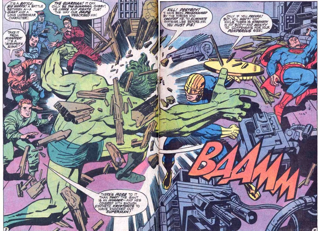
By the time Kirby left Marvel to work for National Periodicals, his style had become even more abstract. Here in this two page spread from Jimmy Olson #136, we see how Vince Coletta’s somewhat restrained inking keeps Kirby’s art a bit more old school in style, but the melee is still wild and wonderful. Kirby uses the giant green Olson creature’s back, arms and legs to sweep the eye around in a circle, but the monster’s back muscles are a mere suggestion of actual anatomy.


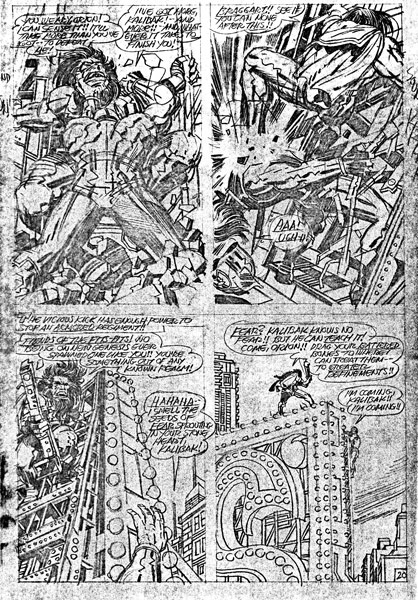
When Kirby acquired Mike Royer as his inker, the latter’s rendering of the Kings pencils showed the world the closest version of what he was striving towards. We can see it even more clearly in this bold unrestrained original art for New Gods #8 where the pencil line is fully exposed.


There is precious little strict reality here, but these pencil drawings supply enough raw power to light up the actual city skyline depicted here.

NWB

Image 1- Fighting American #2,  Jack Kirby and Joe Simon

Image 2-Tales of Suspense #84, Jack Kirby, Stan Lee, Frank Giacoia

Image 3- Jimmy Olson #136, Jack Kirby, Vince Colletta

Image 4- New Gods #8, Jack Kirby

More Latticework

by

When Kirby was working for Marvel/Atlas in the early sixties, he was already in the habit of breaking up and breaking down the pacing of the story into chapters. He had been using this method on the monster stories that he and Lee were producing since he’d resumed working for the company, and it seemed to work well for the dramatic pacing of the new superhero comic as well. Kirby had always enjoyed working large, and the more spacious chapter panels allowed him to put several of these per story. The larger canvas allowed him to indulge his penchant for grand compositions, particularly those that permitted him to employ spatial arrangements that used geometric shapes to create lattices. Detractors sometimes dismiss Kirby’s work as unrealistic, but I contend that it is hyper-real because of its artistic grounding in three-dimensional reality. Many of those modern artists who are lauded for their photo-realistic approaches would do well to study Kirby’s capabilities in that area, which are so often lacking in their own stunning but often lifeless work. It’s one thing to do a beautiful, anatomically correct superhero figure, but if that figure is devoid of background elements or is positioned poorly in its panel, the storytelling will suffer, and the figure may appear static and posed.

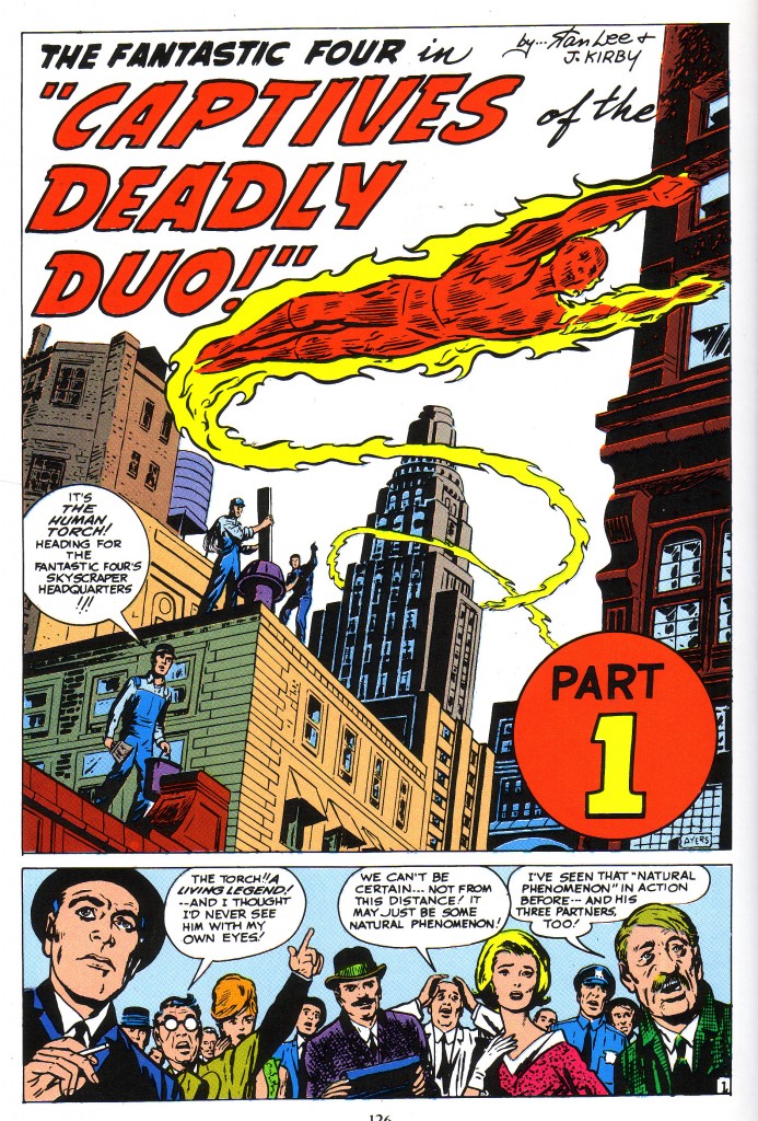
The lattice, as I’ve explained previously, is a division of space. Imagine a three dimensional grid into which each section the artist places objects in the most advantageous positioning for the dramatic structure of a composition. If we look at this splash panel for FF#6, we get a powerful sense of what it would feel like being at the effect of a Human Torch Fly-by, with the strong illusion of three dimensions provided by lattices that the artist has imposed by the structure of the panel. When I say constructed, I mean that Kirby has broken up the space, primarily using the shapes of buildings throughout the rear, middle distance and foreground of the panel.

Initially, the viewer’s eye travels down the diagonal edge of the lettering before it locks onto the hexagonal building on the left, and its shape starts the swooping motion in the piece. Here we see a really clear example of latticework in the composition of the page.

If we look to the lower right, we see the dark corner of a building just to the left of the Red Part 1 Circle. If we view that shape as the rearmost lattice, we can then imagine the tall spire formed building that the Torch has circled as the next closest lattice, which is created by its more or less rectangular shape.

If we follow that building’s diagonal lower section, we come to the third nearest lattice, the tan brick-faced structure with four windows that the workmen are standing on the edge of. The nearest workman and the red brick roof he is standing on is the next closest, and the face of the building that the Torch has just curved in front of creates the final lattice.

Thus, we get the sense that the Torch has traveled, swooping through the three dimensional space of five separate lattices to arrive in his position on the page. This is a truly wonderful panel, to set off a remarkable visual and narrative story.

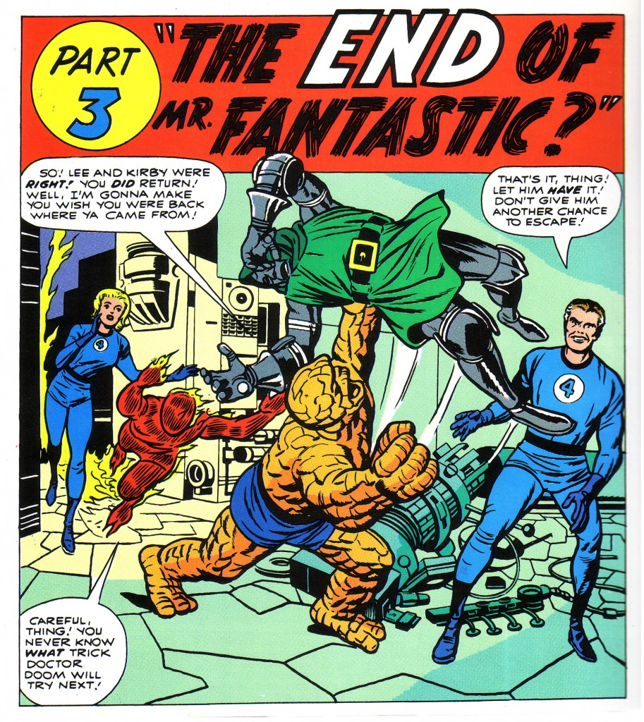
Sometimes Kirby creates lattices with very little backgound elements at all. In the case of this FF#10 chapter splash, he has done most what he needs to suggest with the positions of the figures and some geometric shapes on the floor. Kirby’s mastery of the simulation of deep space within a comic book panel enables him to suggest a great deal with very little.

In this panel from FF#10, we can look at the Torch and Sue occupying the rear lattice bounded by the machine and conveniently traced on the floor by the divison of tlles from yellow to green. The Thing and Dr. Doom occupy another lattice bounded by the edge of the piece of equipment on the floor near Ben’s foot, and Mr. Fantastic occupies a lattice to the right rear of the Thing. Again, this is not to suggest that Kirby has mathematically plotted these geometric spaces to position his figures. he is almost certainly working intuitively at breakneck speed and is not plotting absolutely correct geometric divisions. However, a less accomplished artist might carefully construct a page in a more precise fashion and be quite successful.

The beauty of this technique is that various figure’s limbs will regularly overlap into another’s lattice in the deep space projection simulation of the panel, just as they do in reality.

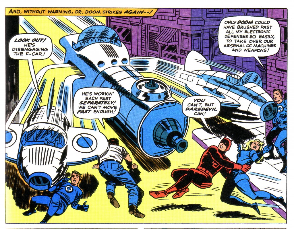
In our final example, we see a flying ship, the Fantasticar, zooming approximately midway in the height of the panel, thereby establishing a powerful horizontal lattice that reinforces the positioning of the figures. The diagonal/vertical shape of the building on the right anchors the ship in four dimensions as well as establishing spaces for the figures to occupy.

Each section of the three pronged ship carves out a section of panel for the individual figures to inhabit. On the left, Johnny Storm has fallen to the ground to avoid the section of car poised above him. Ben occupies the space just to his right and under the large central section which defines the lattice that Daredevil and Sue Storm also occupy. Reed clings to the edge of the lattice formed by the building.

Few artists, realist or otherwise would be capable of composing a panel this complex and ambitious. Kirby through years of experience does this sort of thing with an amazing combination of intuition and intelligence.

Image 1- Fantastic Four #6, Jack Kirby, Stan Lee, Marvel Masterworks FF volume 2

Image 2- Fantastic Four #10, Jack Kirby, Stan Lee, Marvel Masterworks edition

Image 3-Fantastic Four #39, Jack Kirby, Stan Lee, The Villainy of Doctor Doom

As an aside, I’ve been doing a blog on Captain America’s Golden Age inkers. If anyone is interested in this topic, they can check in at this address.

http://kirbysgoldenagecaptain.wordpress.com

Simon and Kirby’s Captain America

by

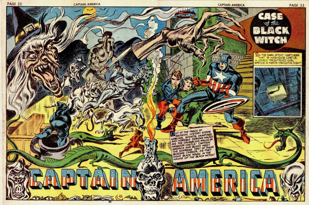
Over the years, I find myself continually returning to a subject that has fascinated me since I was twelve, when I saw my first sample of Golden Age Captain America, ostensibly drawn by the creative team of Joe Simon and Jack Kirby. The artwork had been used as a faded backdrop for a photograph of the version of Captain America that had appeared in the 1944 Republic Pictures film serial. The photo- montage was from an article in a 1964 issue of Screen Thrills Illustrated, a magazine devoted to old action-adventure films and serials, which featured an article about  the on-screen Captain America.

The star-spangled hero was suddenly hot again because Marvel Comic’s Stan Lee and Cap’s original co-creator/artist, Jack Kirby, had just revived him. I of course had been fascinated with Kirby’s work since I’d seen his Rawhide Kid art around 1961, at nine years old. I did not hear of Joe Simon until the day I read that issue of Screen Thrills Illustrated. It took me several years to realize that Kirby and Simon not only worked together, but also had a stable of artists to assist them. On the 1940’s Captain America #1-10 pages, the mix of these artists is so jumbled across the pages that it has stumped many an expert art spotter in determining who did what.

The team of Simon and Kirby featured Jack as the primary artist/writer, while Simon did writing, some layouts, some drawing and inking but primarily functioned in an editorial capacity. It is fairly certain that Kirby always penciled and also inked the majority of the splash pages, which graduated to double page spreads on some stories by issue #8.

This page above is one half of the two-page spread featured in Screen Thrills, and is from a story called “The Black Witch” in Captain America #8. As mentioned, the Simon & Kirby team worked only on the first ten issues of the series, before moving to DC Comics for a more lucrative creator deal.

My early teenage attempts at collecting Golden Age comic art first led me to a copy of Captain America #17, with the splash page of the lead story bearing the blurb, “Drawn by Al Avison.” It was my early familiarity with this particular artist that allowed me recognize Avison’s hand in the Black Witch story as a member of Simon and Kirby’s studio. Unfortunately, as a boy I cut up the Cap #17 issue and assembled a collage with its various panels, including a portion of the cover. Perhaps in this case it’s not so unfortunate, because I saved the collage, whereas it would have long since disposed of the actual comic during my turbulent teenage years.

So we can compare the two pages, knowing that Avison was either drawing with Kirby on the Black Witch story, or tightening up Kirby layouts. At any rate, we have a clear sense of Avison’s style as distinct from the artwork on the Black Witch splash spread below, which in my opinion was drawn and inked by Jack Kirby.

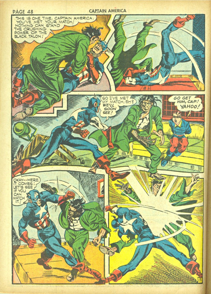
Avison’s art in Cap #17 seems nearly as confident as that of Kirby on the earlier issues. When S&K left the series, Avison was put on Captain America as the main artist, and he appears to have learned well from his tutelage with the King. His first forays starting with issue #11 weren’t particularly impressive, but he began to radically improve by around issue #13 and continued strongly on the book until Captain America #19. The question in my mind is what exactly did Avison contribute to the pages he is credited as working on with Simon and Kirby? For instance, in this story below from Cap#9, “The Black Talon,” Avison is credited with Kirby as penciler and the inker as listed as George Klein and Unknown.

I had initially assumed that Avison was the inker here, because his stamp on the artwork is so strong, and it seems unlikely that he initially drew much of the figures in this sequence. At this stage of his career, Avison simply didn’t have the artistic chops to do such complex work. This action displays the anatomical proficiency of Kirby, particularly with its use of intricate three-quarter back shots, elongated musculature and foreshortening. Even the use of objects such as the sofa and table in panel 3 show a sophisticated understanding of deep space composition that Avison’s early work does not display.

However, the character’s facial features, and structural finishes such as distinctive kneecaps tell me that Avison is involved somehow. If he did not ink the story, then I imagine that he tightened up Kirby’s fairly intricate pencils prior to Kiein’s inking.

These matters, seemingly so unimportant continue to interest me to the degree that I am considering having a blog devoted to exploring the questions involved. I would invite various professional or simply interested laymen to give their opinion until the issues are resolved to a reasonable degree.

Image 1-Captain America #8 Jack Kirby, Joe Simon, Al Avison

Image 2-Captain America #17 Al Avison

Image 3-Captain America #8 Jack Kirby, Joe Simon

Image 4-Captain America #9 Jack Kirby, Joe Simon, Al Avison

The Foster Aspect

by


After more than a dozen issues, Jack Kirby and Stan Lee began to give us a back-story to The Mighty Thor in their Tales of Asgard series, beginning in Journey Into Mystery #97. Up to that point, Thor had been pitted against fairly common foes, such as Communist warlords and gangsters, with the occasional appearance of his arch nemesis, Loki. With the inception of Tales of Asgard, Thor, Loki, their father Odin and a vast pantheon of Norse gods and goddesses would emerge. Initially, Kirby’s pencils on the series were embellished by whatever artist was currently assigned to ink him, but starting with Journey Into Mystery #106, the job was given to Vince Colletta.

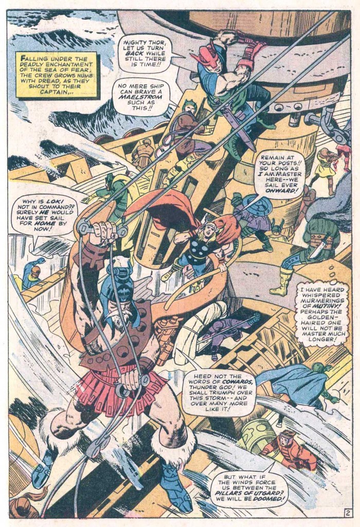
This particular inker has rightfully taken a good deal of flak for not only erasing portions of Kirby’s pencils, but also rushing through his work and employing hack assistants to complete work on tight deadlines. In the case of his work on Tales of Asgard, Colletta’s style fit Kirby’s work and the flavor of the series to a T. Scanning this full-page panorama from Journey Into Mystery #121, one sees the brilliant compositional mind of Kirby at work once again.

The block of text on the left brings the eye to the curved shape of the observation tower and the figure hanging from it. The eye then moves down the support beam to the massive, majestic suspended warrior taking up the lower left quarter of the page, but the diagonal near his knee draws the eye back upward to the right, where it encounters another curved shape which brings us back to the relatively small figure of Thor. What is amazing is that despite all the action on the page, because of multiple visual cues we always end up with Thor as the focal point.

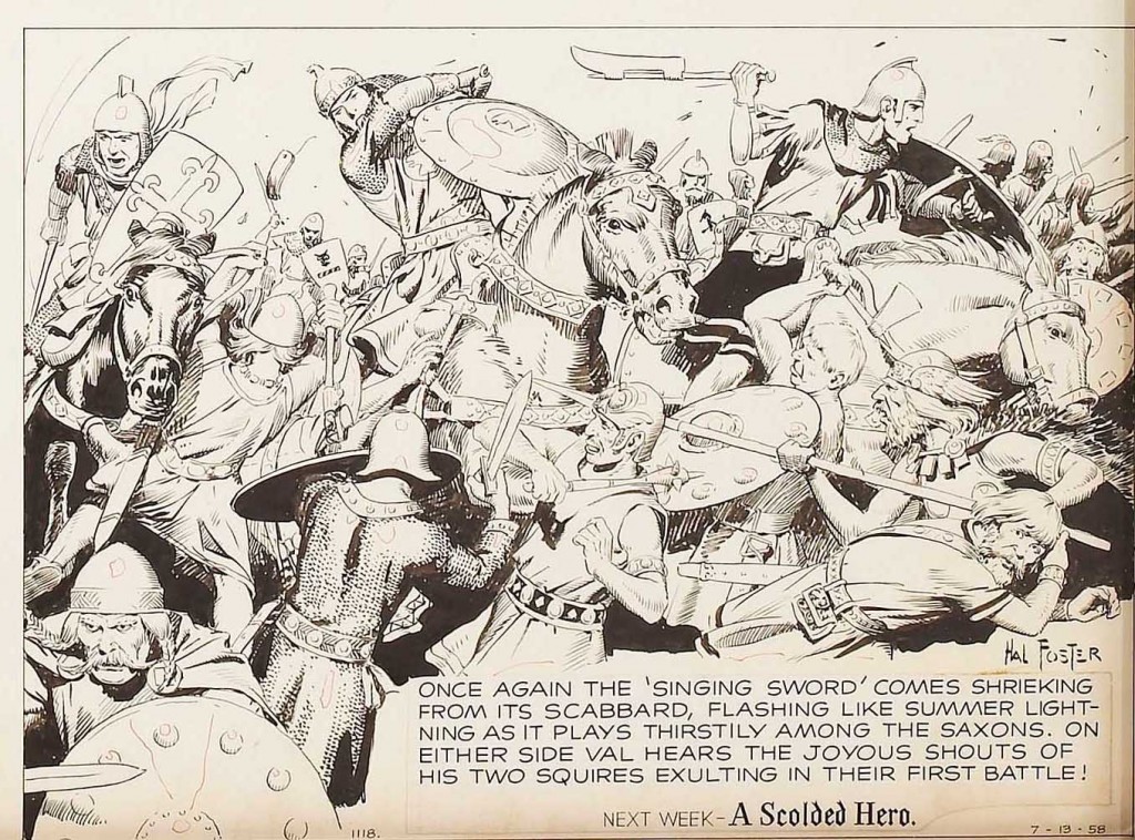
Looking at this drawing, I cannot help but think of Hal Foster, an artist that Kirby has mentioned as one of his main influences. Foster’s Tarzan comic strip revolutionized the use of the dynamic figure, and was used as a model for scores of artists to polish their anatomical drawing skills. However, it was the creator/artist’s full page Prince Valiant Sunday strip beginning in 1937 that Kirby was channeling in his treatment of Tales of Asgard.

At first glance, in comparison to Kirby, Foster’s work may seem a trifle precious, in the sense of being overly refined, but beneath the surface there is a robustness to be found. There is also a strong sense of composition in Foster’s use of figures in deep space that Kirby would have certainly appreciated. What is most striking is the beauty of the archaic world that Foster has conjured with his incredible attention to detail. In Prince Valiant, Foster took great liberties with the contrasting cultures that surrounded his hero, combining various periods of English history to invent his own version of the age of King Arthur. It is this atmosphere of the mixture of medieval British nobility and chivalry, combined with the rough hewn cultures of Vikings and Saxons that Kirby adapts for his Tales of Asgard, and which Lee further embellishes with faux Shakespearean dialog.

We see in this panel drawn by Foster that as with Kirby’s work, there is a great deal of complexity in the relationship of the figures to one another.

We can easily recognize the Big O here. The viewer’s eye enters the panel on the left with the first horseman. His scarf and shield bring us to the second warrior, whose raised arm points us to the third soldier’s  battle ax. His curved shield brings us further  rightward and down to the horse’s nose and then around to the wing helmeted Norseman with the lance that, points us back left to the central foot soldiers to complete the circle.

It is difficult to know whether it was Foster’s influence that pointed Kirby in this  direction, but we can clearly see similarities in the King’s approach to scenes involving figures in deep space compositions.

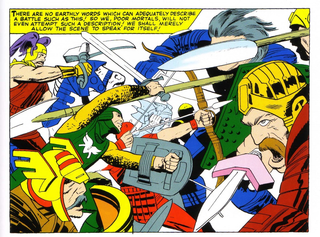
In this panel below from Journey Into Mystery #112, we see a wonderfully complex interplay of foreground and background figures locked in battle.

We first notice the warrior on the left wielding an beak shaped ax, which leads our eye rightward to the arm of the gray haired swordsman. We follow the curve of his shoulders to the gold helmeted figure, where the triangular hilt guard on his dagger moves our eye to the shield of the chain mailed figure and further right to the wing helmeted head in profile on the left. It is this sort of complex and interwoven melee that Foster and Kirby are both masters of.

Again, there are clear stylistic differences between the work of Jack Kirby and Hal Foster, but we can clearly see here that the King has borrowed from his elder both in technique and historical flavor.


Image 1- Journey Into Mystery #121, Jack Kirby, Stan Lee, Vince Colletta

Image 2- Prince Valiant page, July 13, 1958

Image 3- Journey Into Mystery #112, Jack Kirby, Stan Lee, Vince Colletta  from Thor Masterworks

Up on the Roof

by

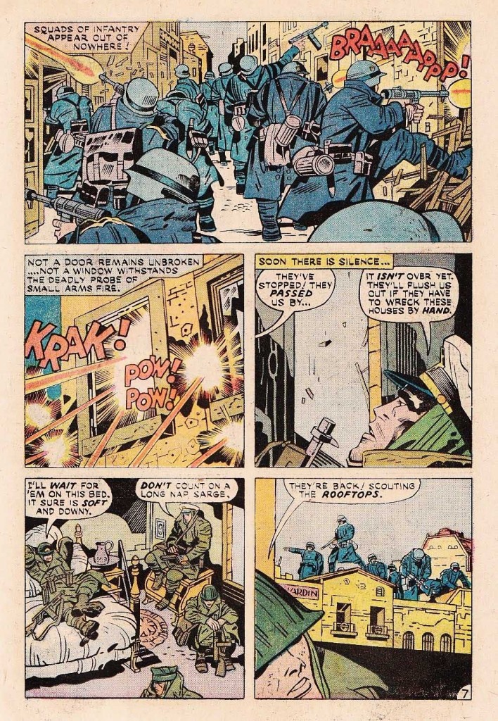
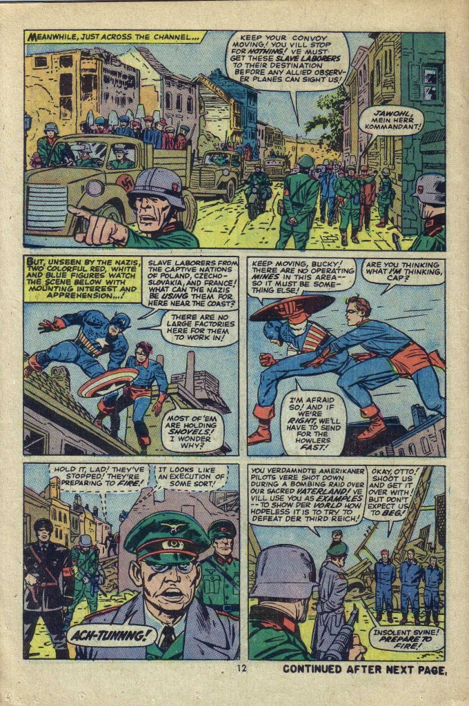
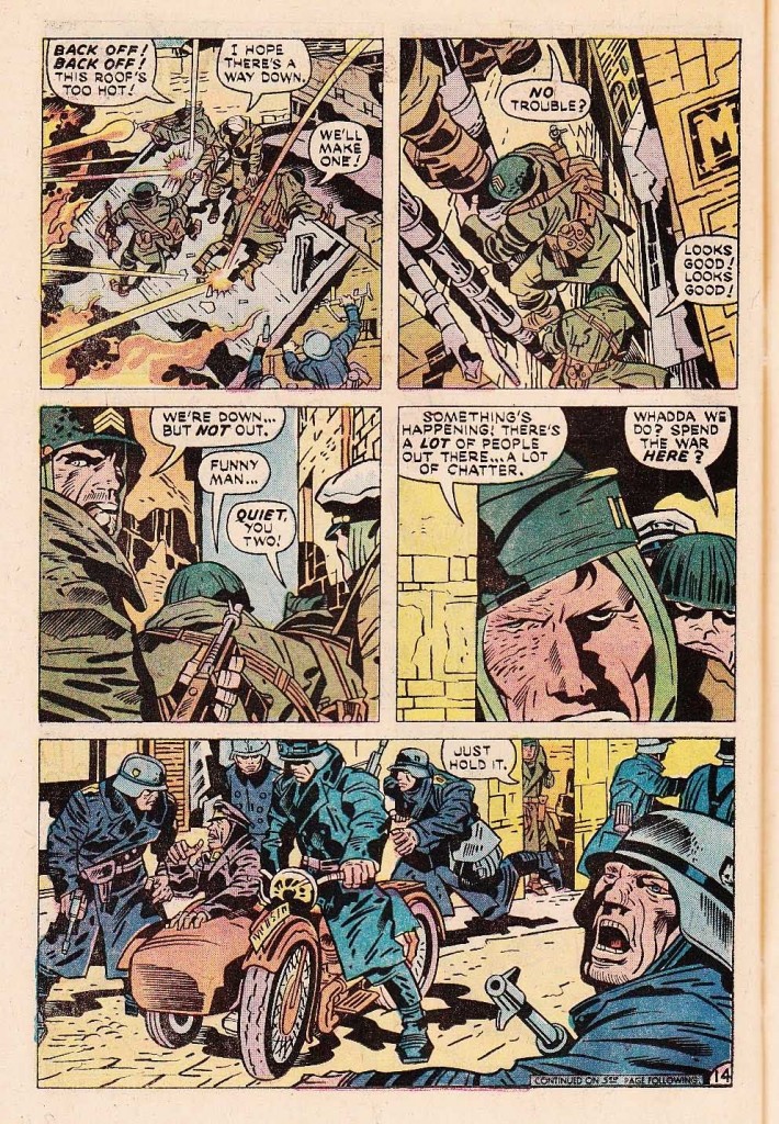
In the mid 1970’s, Jack Kirby was working at DC comics, doing his best to find a secure place for himself after the cancellation of his Fourth World epic. One of the projects that he took on was a WWII based series called The Losers, published in Our Fighting Forces. A critically acclaimed story in this run was, “A Small Place in Hell”, appearing in Our Fighting Forces #152. After studying the comic along with reviewer Mike Kidson’s excellent analysis, something in the story’s layout jogged my memory. Where had I seen this before? Then it came to me. The setting of “A Small Place In Hell’ reminded me of one of my all time favorite comics, Sgt. Fury #13, featuring Captain America.

What struck me most forcefully was the compositional use of the surrounding building’s rooftops, as the Nazi soldiers in both stories move through the respective towns. Throughout his career, Kirby has used architecture to emphasize the movement of his narrative as well as the action of his figures. These two particular stories, as well as being gripping war stories are standouts in this method.

In the first panel on the Losers page, we see the Nazis moving deeper into the panel from left to right, following the angle of the rooftops above. Kirby’s composition has the soldiers massing towards the horizon line, until they reach the center of the panel, and then the positioning of the figures moves the eye outward and to the right as the figures come towards us, breaking down doors and firing machine guns. It is another example of a deceptively simple composition giving us a dynamic sequence of events in space/time. Notice that we do not see the Nazi firing on the right until our eye enters the deep space of the panel and moves back outwards. It is the break in the central roof structure that stops the eye going further inward and initiates the movement of the figures back out again.

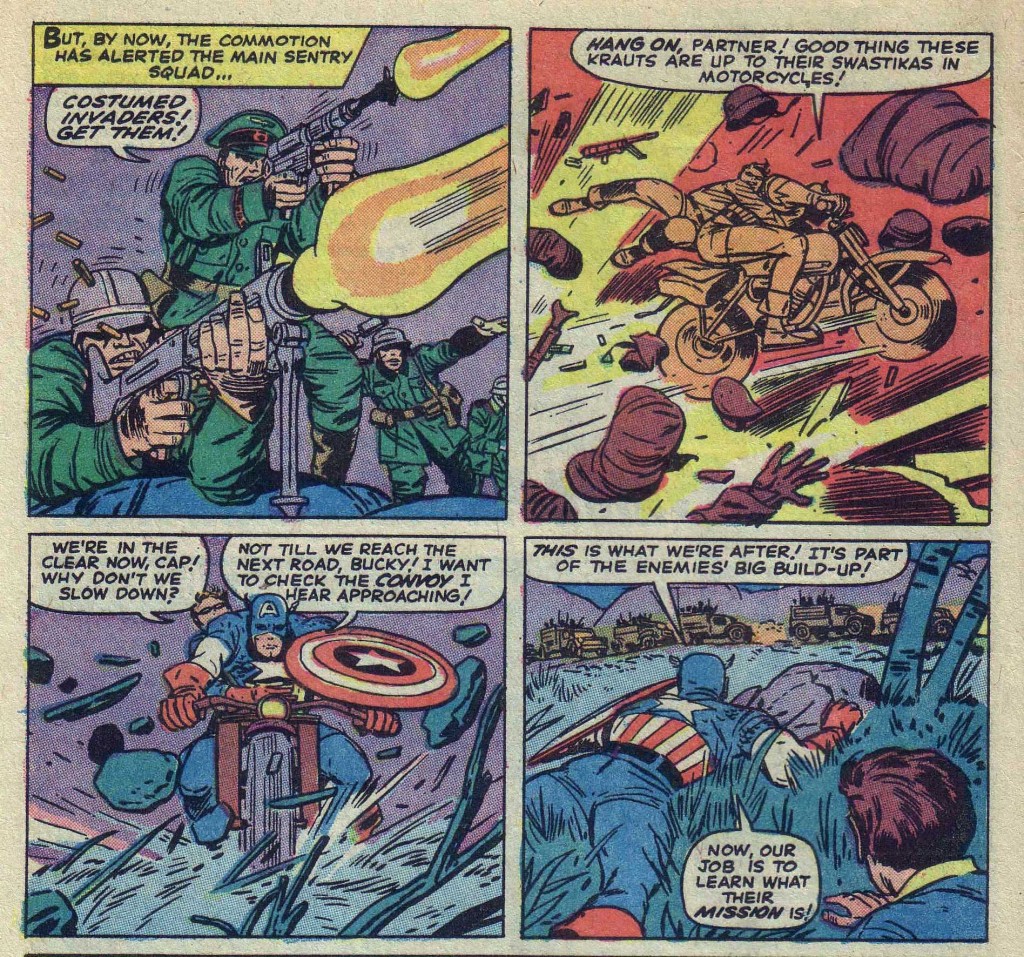
In the top Sgt. Fury panel above, a similar thing is taking place. We see the Nazis coming up the street and our eye is drawn back down the row of buildings until it reaches the central blue structure. The building’s wall drops like a plumb line to the figure on the motorcycle, which moves the eye back out to the right foreground.

On this same page, Captain America and Bucky are first seen perched on a rooftop. They maneuver over the roofs as they stalk their prey, the Nazi executioners. On the Fighting Forces page below, the Losers are also using the shelter of the roofs as they move from building to building attempting to evade the Nazis that occupy the town. I love the second panel in which they are climbing down the drainpipe to reach the ground. There is a strong sense of vertigo, as Kirby uses the downward diagonal progression of figures here. Kirby uses the diagonal both here and in the second panel of the Fury page to give us this feeling of precariousness.

Another of the dynamics that make these two stories similar is the profusion of heavy machinery, obviously prevalent in a wartime scenario. The last panel on the Losers page below displays one of Kirby’s favorite action props, the motorcycle, complete with sidecar. Here the motorcycle is stationary, although its positioning surrounded by the soldiers give us a sense that it may take off at any moment.

In the Sgt. Fury/ Captain America page, we see the motorcycle in motion, indeed in flight. Kirby uses all of his formidable skills to show us a clear difference here from the stationary bike on the Losers page, because in this case Cap’s cycle is visually propelled not only by the explosion to the left of it but also by the gun burst in the preceding panel. Next we see the motorcycle headed directly toward us. In this case, because Kirby cannot use horizontal or diagonal speed lines to show motion, he masterfully gives us the illusion of forward motion by the profusion of objects flung upwards by the bike’s wheels, as well as the impact lines projecting from the ground.

As this is a war comic book, we can enjoy Kirby’s aptitude in building up tension and releasing it explosively. On the Cap page, the release is the explosive escape of the cycle riders. On the Losers page it is the confrontation that ensues when the Nazis find the American outfit on the rooftop.

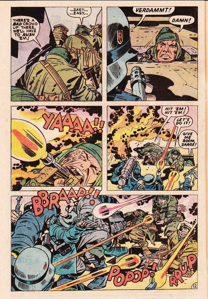
The Losers have spent several pages hiding from their adversaries, and when they are finally discovered, the conflict is monumental in the singular Kirby fashion. It is as searing as the flame-thrower in Johhny Cloud’s face in panel three on the page below.

Panel five is a classic Kirby pile up of figures, and to my mind a very powerful if peculiar arrangement of figures. One of the Losers, wearing a pack of some kind appears to be slamming into a group of Nazis, but it is nearly impossible to make out whom or even what it actually is.

The figure in question in not completely rendered and contains details which don’t quite make sense. The area of the pack above the machine gun burst doesn’t quite connect with the lower portion, and it appears even perhaps that the pack has been thrown, except for the fact that there is a leg drawn below it.

This is something that one occasionally notices with later Kirby work. The artist style is clearly becoming more abstract and expressionist. He is so overtaken with the enthusiasm of presenting us with a dynamic composition that he often dispenses with reality as being superfluous to his artistic intention.

At any rate, it is always fascinating for me when I find something in Kirby’s work that recalls some other aspect or period in his long history of excellence.


Images 1, 3 and 5   Jack Kirby, D. Bruce Berry, The Losers,

Our Fighting Forces #152

Images 2 and 4 -Jack Kirby, Stan Lee, Dick Ayers. Sgt. Fury #13