
by Greg Theakston
- Originally published in Amazing Heroes 100 by Fantagraphics in 1986.
- © 1986 Greg Theakston. All rights reserved.
- Thanks to Greg for allowing the Kirby Museum to post his article.
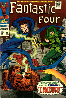
Cover, Fantastic Four 65. 08/1967
Unlike the secret of a magic trick, knowing how Kirby “does it” doesn’t spoil the fun, it only adds to the awe. Using his own set of mirrors, wires, and trap doors, Kirby entertains the reader, making you see only what he wants you to see. The show looks spontaneous, but it’s really the culmination of years of practice and experimentation.
Drawing a comic book page is like answering a thousand questions. The artist asks himself, “How shall I break this page into pictures?”, “How big should this eyelash be?” It’s an endless conga-line of problems. To make the job easier and more efficient, Kirby came up with his own set of rules that cover most of these drawing problems. The bulk of his work is based on the variations of these answers. I’ll cover some of the most important concepts later, but first, let’s consider what drawing comics is all about.
People tend to believe that the artist is “blessed” with the ability to be so talented. To the non-artist, the idea of being able to transcribe a picture from “nowhere” borders on magic or witchcraft. Because the casual viewer cannot duplicate the task, they assume it is because there is something missing from their overall mental stock rather than it being an undeveloped ability. Kind of like being a loser in some cosmic talent lottery. “Hey, Buddy, where were you when they were passing out the understanding of structure, perspective, and color theory?” You wouldn’t pick up a trumpet cold and expect to play like Harry James. The same applies to drawing. The ability to draw and illustrate are learned skills. Many of today’s artists have learned to draw but have yet to learn how to effectively illustrate a story, the comics’ principal function. Only practice and study will expand the artist’s book of answers. In turn, the questions posed by the comic book pages tumble like dominoes, one answer inevitably affecting the others. If there has to be a “best” comic book formula, it belongs to Kirby. It works well on romance as it does on horror, war, or western stories. As a formula for super-hero books, it can’t be matched. Men like Wallace Wood, Gil Kane, Joe Kubert, and Steve Ditko not only agree that this approach is a superior one, they’ve all integrated it into their own work.
Circle surrounds the teacher. Fantastic Four 66. 09/1967
Many of the rules Jack applies to his work are solidly founded in the art of illustration. His principle aim is to tell you a story in a picture. Using symbols and action, he gets his points across quickly and clearly. The amount of line work used never gets in the way of what he is trying to say. Jack knows that if the line is only beautiful, rather than beautiful and functional, the reader will study its beauty rather than use it as a piece of information in the bigger picture. Without a sound structure, no amount of rendering can save a drawing.
The line work in any Kirby drawing serves two functions. The first is to inform you with the picture’s story. For example, Orion and Kalibak fighting. The lines deliver the message from Kirby’s brain: two figures in combat. This reaches us on an intellectual level. The second function is to address the subconscious. Subtle use of line weight, texture, and direction cause the reader to react to the art on an emotional level. The weight and direction of Orion’s arm muscles whipping down on Kalibak’s stark face, up Kalibak’s slash-muscled arms, to the screaming Orion, moving your eye in an endless circular pattern, the endless battle between the half-brothers.
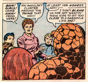
Circle surrounds the Thing. FF 66.
The line work says, “The Inhumans moving through the jungle.” The composition says, “Black Bolt is our leader because no other figure is taller than he is.” Good storytelling uses hundreds of such devices to affect you, the reader. The artist helps you, the reader, understand his story, more often than not, using symbols you may not consciously be aware of. The artist must understand “symbology” to tell an effective tale.
Comic book work is more than just drawing things. The highest form of comic art is the one that functions in perfect puzzle pieces. Working in unison, its parts move you through the story with attention to the message the drawings deliver, rather than the drawing itself.
Kirby has always wanted to convey a message. He started to draw because it gave him greater control in telling his stories, not because he liked drawing super-heroes fighting. Before a single hair is penciled, before any shadow is filled in, before the background appears, the Kirby page tells a clear story. The basic structure of the figures and props tells us all we need to know. The rest is secondary information added as decoration. How the soldier’s boot shines at the top and is caked with mud below is unimportant if the soldier is getting blown up. If the figure has a static pose but beautifully rendered boots then the illustration is a pretty failure. If you’re looking at the textures, you’ve forgotten the story. This has yet to happen in a Kirby comic. In an effort to clarify the soldier in mid-air, Jack clearly silhouettes the shape and makes it move away from the explosion. The clear silhouette aids the eye in collecting information, and Jack always keeps this in mind. Kirby weapons are always clear silhouettes, too. The rifle is a soldier’s symbol, and if it’s hidden behind or camouflaged in his shape, the reader is distracted from the story while trying to to puzzle it out. Worse, they still miss the symbol altogether. If the story is unclear, the reader usually skips ahead in the comic. Nothing must be left to chance. Hundreds of such obscurities have a cumulative effect on the reader, locking out their total understanding and enjoyment of the story. In extreme cases, the whole book becomes inaccessible.
Circle surrounds Ronan. FF 65.
Kirby knows that making the reader’s eye move from left to right is vital to good comics. Unless there is a sound reason, Jack always moves the eye left to right; not allowing you to dwell over the drawing for long. This is not to say that all of his panels work this way, but if there is ever an option, the rule applies. As with “obscurities”, dozens of mental “beachheads” blocking the flow have a devastating effect on the reader’s subconscious ability to enjoy the story.
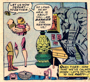
Some panel compositions cause your eye to zig-zag; some lock you into a circular pattern (like the cover to Fantastic Four 65). The “Big O” is one of his most durable compositions. Sometimes Jack uses the circle to surround the point of interest.
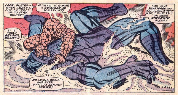
The Thing and the Sentry. Fantastic Four 64. 07/1967
Beginning with a “Big O,” Jack places objects along the outer and/or inner edge, directing the flow of the eye. An amazing example of directional composition is found in the first panel of page eleven of “The Sentry Sinister!”, first published in Fantastic Four 64. The Thing is the focal point of the panel. The robot and the Thing act as the “Big O,” moving along the Thing’s arm, around the Thing’s arms and legs, and back to the Thing. At the same time, the robots arms and legs point towards the Thing, leading you back to his shape. Blast marks add action and also point back to the Thing. Rings in the sand behind the robots head keep us out of the panel’s lower left-hand corner. This drawing is as perfect as they come; it’s dynamic, functional, tells a clear story, and always brings the eye back to the Thing’s head. This is the type of work that made Marvel Comics of the ’60s so great. The effect worked then, and it works now. Good panel design is effective no matter how many times it’s viewed.

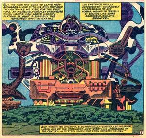
Machinery hallway. Fantastic Four 66. 09/1967
Kirby also uses background objects and props to direct your attention. Be it rocks, machinery, or simply lines on the floor, Jack never misses a chance to lead your eye to the thing that he wants you to see. Without being obvious, he forces your eye along the shapes.
With the superstructure of the drawing established, Jack begins to decorate the drawing. The most common means of doing this is the use of repeating shapes. The human eye enjoys repetitive patterns, and their use will always dress-up a shot. This makes fantastic machinery triply effective as scientific props, as decorative designs, and as tools to direct the eye.
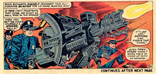
Blaster with tube and base. FF 65.
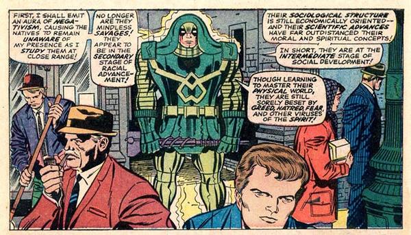
All Kirby machines begin with two or three large shapes arranged to simply convey the object’s meaning. A laser cannon starts with a tube and a base. If it’s a transporter, a screen large enough to pass a human figure is prominent. Any communication device will have an exterior antenna and a pseudo speaker; both being symbols associated with verbal contact. A modern device might not have either, but the old fashioned symbols convey the message better. I’ve seen Kirby put a “safety” on a six-shooter where none exists simply to put his point across. The uninformed viewer expects to see a safety, and Jack uses the error to his advantage, using a gun symbol where, in reality, there is none.

Transporter with human-scaled screen. FF 67.
Next, Jack decorates the object with smaller secondary forms and harmonious patterns. The final step is to embellish it with small shaped patterns that suggest a feeling. For instance, an evil machine may have lots of sharp edges and hard designs. It might also be very dark (with lots of blacks). On the other hand, a benevolent machine is smooth, with rounded edges and light in color. Frequently, human features can be detected in the structure. Every Kirby machine has its own “visual personality,” a limited set of features. Monochromatic design work is one of Kirby’s specialties.
“The Beehive” with human features. FF 66.
Once the major structures and decorations of the panel are established, Kirby begins to “spot blacks.” Devilishly simple, this concept continues to elude many artists. On the other hand, I’ve never seen it properly explained. The idea is that a black spot placed behind an object will push it forward and silhouette the shape. It is also used to frame items of importance. Small shapes will jump with clarity when a large black area is behind them. The reverse is true, too; a black object will separate from a white background.
Spotted black separating objects. FF 64.
Top “black spotters” include Alex Toth, Milton Caniff, Wallace Wood, Berni Wrightson and Noel Sickles. Noel would pencil his drawing, and then go straight to filling in areas of black with a brush. When he couldn’t find any more places to spot the blacks, he would outline all the remaining shapes with a pen (the opposite of standard methods of inking). This broke the panel into shapes representing the idea, rather than lines. This goes back to the idea of the clear silhouette. The more creative the artist can be with texture and placement of the black, the greater his ability to manipulate the reader.
The only place a black should not be spotted is behind another black. As an example, let’s take a running figure and put in a black door frame behind him to make the figure easy to see. The lighting calls for the bottom half of the black of the leg. This causes the leg to have the illusion that it’s half as thick as its mate. Therefore, a thin white line, or “phantom line” is placed to re-establish the form. Many artists scoff at this technique, claiming that it doesn’t appear in reality, so why would it appear in a comic? Such artists would be better served producing clear images rather than obscured drawings shackled by “reality”. Unfortunately, the “phantom line” has become stigmatized with the reputation of being a comic book device, and, therefore, undesirable in “good art.” Kirby’s first concern is with clarity, and the “phantom line” helps provide it.

Phantom lines near head and armpit. FF 66.
Another formula used to direct the eye is to treat the focal point of the picture of as the light source. The shadows thrown by the surrounding objects will point at the focal point, leading your eye to it. While some are solid black, many of the shadows in Kirby’s drawings are made up of a series of thick hatch marks. It’s a kind of “half-shadow” that is a shadow lightened by a second light source. On a figure with heavy shadows, it also helps to break up large areas of black. Chic Stone was very good at catching this and using it to his advantage.
Variety is another important part of Kirby’s approach. The point-of-view is always varied to keep the story from becoming monotonous. A good example is the close-up view of heads in any Kirby comic book. If you cut them out and placed them side-by-side, they would all be different. Jack isn’t satisfied to rely on a stock set of drawings. The same thing applies to Jack’s figures and compositions. The work never has a sameness about it and always has an interesting point-of-view.
The main reason Kirby has successfully endured in the comics business for over 50 years is because he never let himself get bored. In turn, we were entertained for decades. For Kirby, it always had to be different; if he had done it before, he didn’t want to do it again. This is the main reason he only created two super-heroes between 1943 and 1961. The first, Fighting American, doesn’t really count because it was really a superhero parody. The other, The Fly, was never intended to be a steady account. Kirby pitched in on the first two issues more out of nostalgia than interest in the character.
Phantom line where leg overlaps spear. FF 65.
Upon return from the Second World War, Kirby had begun to experiment with the comics medium. With Joe Simon, Kirby created romance comics, did horror in Black Magic, westerns in Boys’ Ranch and Bullseye, funny animals in Earl the Rich Rabbit and Lockjaw the Alligator, humor in From Here to Insanity and Fighting American, experimented with Win-A-Prize and Captain 3-D, and space age adventure with the very human Challengers of the Unknown. The “Big Monsters” books at Marvel were fun for the first 20 or 30 stories. Jack told me, “Doing all those monster stories was hard. It was a real effort keeping the work interesting.” When it seemed like nothing else would work, the Fantastic Four were born. The reason they have no costumes in the first issue is due to Kirby’s effort to try to do something different. During the ’60s, the Marvel Comics Group was the testing ground for some of Jack wildest concepts. A large part of the success of the company is due to Jack’s experimentation.
Over the years, Kirby’s efforts to reach beyond the mundane confronted him with extremely difficult drawing problems. “No matter how tough the problem,” he advises, “never let it lick you. Stick with it and make it work.”
To help illustrate some of my points, I’ve chosen page four from “The Sentry Sinister!”, first published in Fantastic Four 64, as my subject. The last panel on page four shows the Thing winding up a pitch in front of a map.
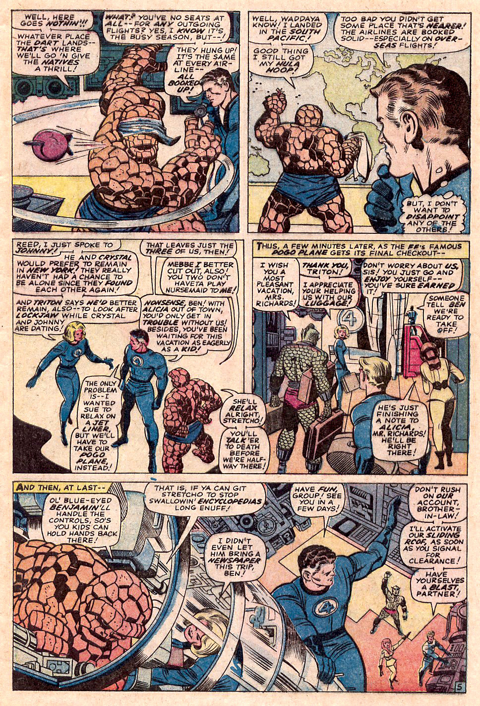
Page 5. FF 64.
Panel 1. This big circular composition really gives us the impression of movement. The eye enters the panel at the balloon and exits at the curve of motion. The dart is a clear Recognition Point (RP) and the eye stops momentarily and collects information. The Thing’s arm and the motion line lead us back to the Thing’s blindfolded head (RP). The blindfold and the dart (RP) are symbols of chance. The sweep continues. The reader ends the panel with Reed’s head. The machines only serve to accent the sweep of the arm to act as a laboratory backdrop. They shouldn’t be noticed, and aren’t.
Panel 2. The Thing is seen pointing to a map (RP). The place he is pointing to is far outside the United States (RP). In fact, it’s an island in the Pacific. The action takes place on the same level as Reed’s position in the last panel, so Kirby’s camera opened up-close, moved to the back of the panel, smoothly across the panel borders, and forward again to the close-up of Reed Richards. The hand is added to make Reed appear thoughtful. Jack uses hands whenever he can to add emotion.
Panel 3. This shot is further back to reveal Sue Storm entering the scene. All action and symbols stop for story purposes. Here the picture takes second place to the words. The balloons never cross and the characters speak in the same order in which they were drawn.
Panel 4. As we enter the frame, we see Triton burdened with luggage (RP), a clear visual indication of a trip. The eye moves to Sue, who is pointed out with the help of the circle behind her head. Moving to the right, our eye stops at the edge of the ship, and this edge forces us to look down at Johnny (also with luggage). Then, it’s back to Crystal, up the ladder railing (as though you are going up it yourself), to the figure of Reed, who appears so small, a kernel of popcorn would hide him. Still, we can’t help but end up at this tiny spot each time the panel is viewed.
Panel 5. We see the Thing thrust into the immediate foreground and clearly inside the ship. The circular bands, creating both perspective and the shape of the ship, and shine marks all lead the eye down. Next, we see Sue, who is now smiling, indicating that this is pleasure, not business. The edge of the ship, and the machine over it, lead us to Reed who is waving goodbye (RP). The reader continues back along the heavy line on the right side of Richards. As we hit the elbow, we see Triton waving back (RP). Crystal is waving, too, but our eye stops on Johnny, unable to move off the page because the machine he is at stops us. Reed and the figure of Triton are framed “emotionally” by the box design on the floor. All the machines lead our eyes to the tiny figures.
When read quickly, the page seems fairly simple, but taking into account all of the things I’ve pointed out (and a few I didn’t), it becomes a very complex work. I estimate Kirby’s total page count at somewhere around 30,000. That means that this was about page 24,000. Practice apparently does make perfect.
Stan Lee used to tell his artists, “Draw like Kirby!” He didn’t mean, “Draw square fingernails and shine marks”; he meant, “Take the same dramatic approach as Jack.” Lee recognized the fact that Kirby had developed an almost perfect comic book formula. These days, few editors stress the use of Jack’s technique, and I believe the business suffers for that. Jack Kirby “wrote the book” on comics, but it seems nobody wants to “go by the book” any more.
A Look at Technique…
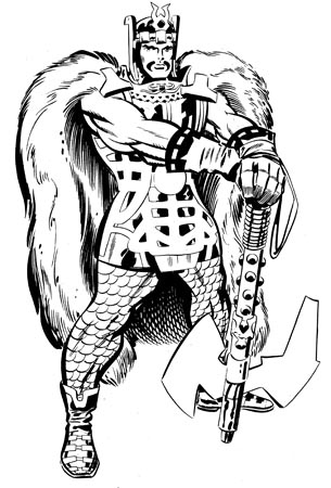
Heimdall. Kirby inked by Don Heck.
Jack pencilled and Don Heck inked this drawing in the late ’60s. Heck here provides an object lesson in how to finish Jack’s work effectively.
As a basic rule, the inking is broken into three strokes:
- Holding lines – Heavy lines that define the overall shape, with accents to move the eye and, at the same time, strengthen the form. To see the holding lines, squint at this drawing.
- Decorative lines – medium lines that define secondary shapes on a major form or lines that decorate the major form.
- Detail work – Fine line-work used on important intricate forms. Also used as textures.
What amazes me is the weight of the “holding lines” on the legs, hip, and cape. How many of today’s inkers/artists would dare to use such a line? It’s heavy but not crude, and it also manipulates our eye back to the head. The blacks are spotted in the cape and really push the figure forward. Rather than black spots, Heck has given the shadows a fur texture. All the fur work leads your eye to warrior’s head.
The shadow work on the right leg is very strong, and adds extra support to the lower leg. Well-spotted blacks within give an object strength and support.
The composition is the “big O,” helped by the cape, stripes on shoes, outer ax blade, strap, and up to the head.


Kirby was a storytelling genius. A master illustrator. Innovative creator. A titan of cosmic energy.
His ‘30,000’ pages…his Chronos steps through the Gold, Silver and Bronze ages defy gravity.
The ‘classic’ run on FF. Avengers. Cap. Thor. Creating the FF. Hulk. Cap. Thor. Iron Man. The Avengers. X-Men. Silver Surfer. Inhumans. (and some part, I’d argue, he had a hand in bringing the germ of the Spider Man idea to fruition. Initially based on the ‘Fly’ I’d guess. But out went the web gun and ‘handsome Kirby Parker’ and Stan passed it over to Steve. Fair enough.) Then you had his work at DC. Then back to Marvel. The Eternals. Black Panther.
A monumental legacy.
Jack ‘King’ Kirby’s dynamic art is as alive and fresh today as when he first created it. His depictions of the cosmos particularly inspire me. No other artist’s work has ever set-off such a chain-reaction of wonder, bewilderment, fascination and awe in me as his does. Thank you so much, Jack.