As a jack Kirby inker, Vince Colletta has gotten a lot of flak for certain aspects of his craft. Most notable would be his tendencies to simplify Kirby’s elaborate architecture and figure work, black it out or in some cases erase it completely.
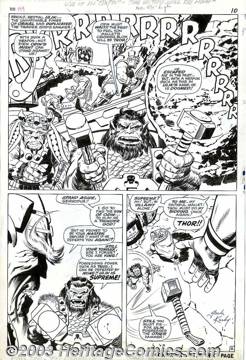
I thought that I would display some of Colletta’s better work for this entry. The first example is from Thor#137. For the sake of studying the inking here, it is wonderful to utilize these original art pages displayed on the Heritage Auction website, which also contain fragments of Kirby’s margin notes, much of which sadly have been trimmed off.
Here above is a panel taking up more than half a page, and Kirby’s composition is one that in my opinion puts him in a league with classic painters like Tiepolo or Velasquez when it comes to the complex arrangement of figures in motion intertwined.
The composition is set up so that the reader’s eye will find its way to Thor’s besieged form in the center. The eye enters at upper left and moves downward and to the right, but each figure is an anatomical marvel of kinetic energy. Mark the warrior with the spear melding with the one with the spiked club and then check out the one suspended upside down in the air in front of Thor. Our hero’s torso is much too long, but we suspend belief for the sake of action.
Colletta’s pen line and brush are sleek and sinuous and his use of black spotting is exceptional. Known mostly for his crow quill pen line, the inker’s facile use of the brush can be admired most notably in the highlights on the armor of the large figure at bottom center. We tend to see Colletta’s brush when there are embellishments like the sheen of armor or more subtle and sinuous strokes of black such as hair and feather.
The next sample, seen above is from Thor #139, wherein we witness Ulik the Troll holding Thor’s hammer as a well as a replica of that mighty weapon. Here again, we are treated to some masterful black spotting as well as splendid brushwork in the Troll’s hair and beard. As many of Kirby’s compositions are, this is a very busy panel which we are intended to see in color, but Kirby’s spotting of strong areas of black drawing and Colletta’s professional inking enable our eyes, even at the black and white stage to separate the various shape masses from one another.
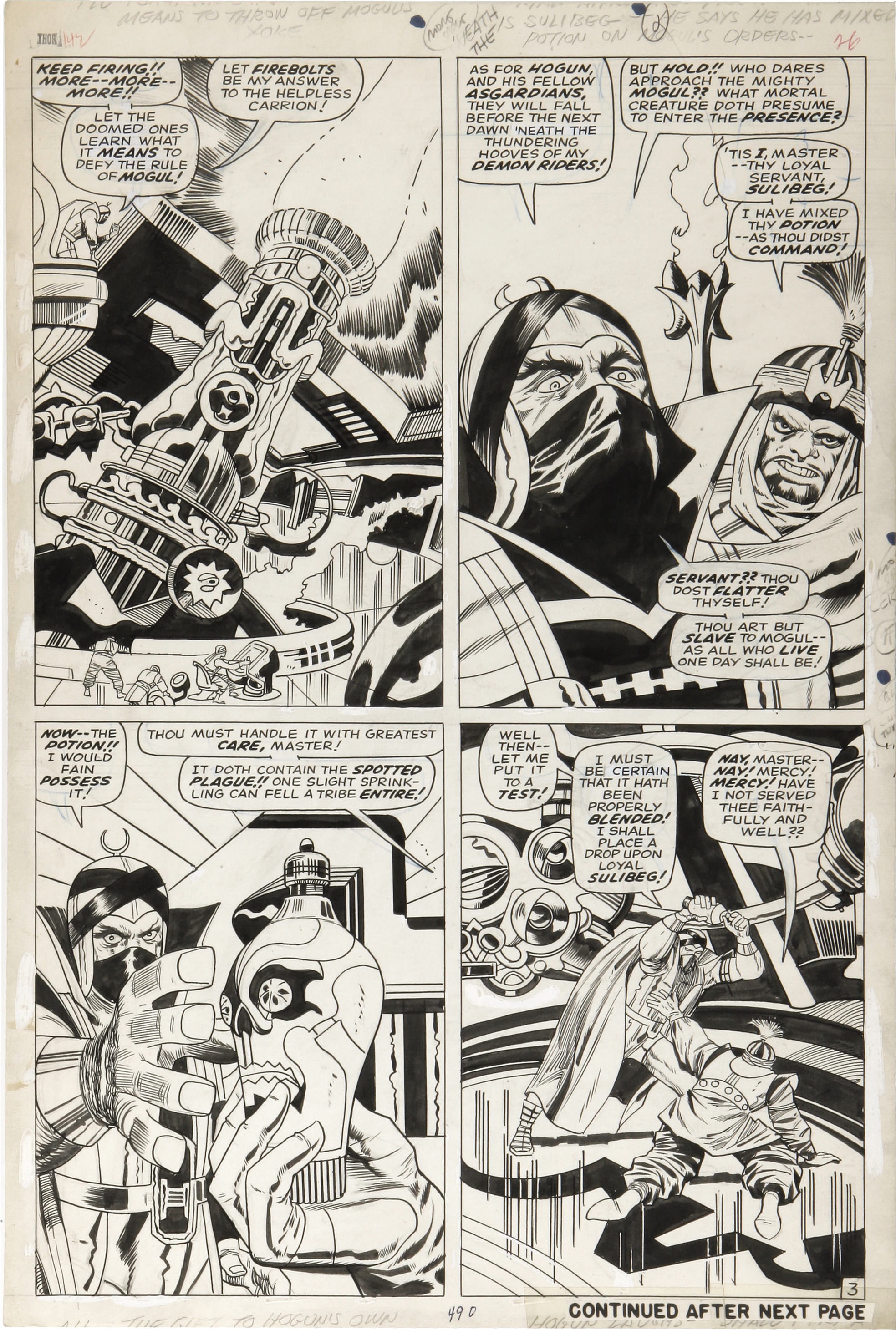
Finally, we feast our eyes on a page from Thor #142, which has some of the subtlest uses of black that we are likely to behold. This page showcases Kirby’s ability to be extraordinarily cinematic in his approach to comic storytelling. In the first panel, we see one of Kirby’s wondrous machines, a “firebolt”-projecting device. Look well at the proportions here of the cannon to the minions firing it, and in particular the figure on the balcony in the upper left corner. Kirby has given us a miniature set here, as complex and compositionally perfect as anything that could be constructed for a high budget feature film. The mind boggles at the brain at work here that is capable of such creation.
Panel two gives us an equally cinematic angle for a close-up and showcases Colletta’s beautiful brushwork in Mogul’s headgear and the dark cloth that covers his face. Panel three gives us a dynamic hand in forced perspective as Mogul reaches for the flask held in Sulibeg’s proffered glove. Finally, we cut to the long shot of the two figures in a fanciful setting, another of Kirby’s miraculous exercises in architecture, combining high tech with mythological. Sulibeg cringes while Mogul threatens to dose him with a deadly potion. Here again, we see a nice balance of strong pen line with confident brushwork. The amount of inking on this page alone would overwhelm a less than confident inker, so we must praise Colletta for his sheer tenacity and remember that he was often called on to finish Kirby’s detailed pencils in order to meet a deadline. Yes, he can be criticized for his faults, but we can also praise him for his strengths and accomplishments.
Image 1- Thor #163, Jack Kirby, plot and art- Vince Colletta, inks- Stan Lee, plot and text.
Image 2-Thor #139, Ibid
Image 3- Thor # 142 Ibid


Many thanks for the even approach to a misunderstood & talented inker.
Colletta had a ‘fine art’ approach that many cannot understand.
whoops – I misspelled Vince “The Prince’s” last name in my first comment – please correct and thanks again, these are great images!
Thor was a good book for Colletta, as opposed to FF which was a horrible match. I actually preferred his inks on the Fourth World books over Royer. Maybe it just eased the transition to DC
It’s sad that Colletta gets such a bad rap, because he was capable of some amazing work. If you ever get the chance to see any of the Kirby Thor pages he inked in person you’ll definitely see that he had some great chops. His feathering and fine linework took Kirby’s art in a more refined direction that you never really saw other inkers take advantage of.
And on top of all that, Colletta was FAST. Comics are released on tight schedules, and a missed deadline will result in the company losing money. Many times in the production of a book things would fall behind, and guys like Colletta would be called in to ink the book quickly and get it done on time. Unfortunately the quality suffers when an inking job is rushed, but when you find out that he may have had to ink an entire book in a few days (I’ve heard stories of him inking an entire book over a weekend) you realize how good he was for having to work under such pressure. Unfortunately the general public doesn’t care about the drama behind the scenes, so they see a Colletta story that may have been done in less than a week and they’ll just dismiss it as being crap.
And it didn’t stop with Colletta – Around 2002 Igor Kordey was asked to do a fill-in on Grant Morrison’s New X-Men, which had fallen way behind schedule. He penciled (And inked!) #120 in about 10 days, and he was given a bunch of assignments on books that were running late since he proved he could deliver his work fast. In one month he had to draw 4 books, an almost superhuman feat, but since this was his first foray into American comics it was what everyone judged him by. He’s a great illustrator overall, but his first impressions were rush jobs and that damaged his reputation with American fans.