Anyone who has followed my column even briefly has probably recognized that I go on quite regularly about Kirby’s use of Deep Space. One of the ways the artist creates the illusion of depth is to overlap his figures in a way that accentuates the space between and around them. After all, one can draw all manner of perspective lines, objects and other cues, but unless the figures are arranged just so, the effect will not be optimized.
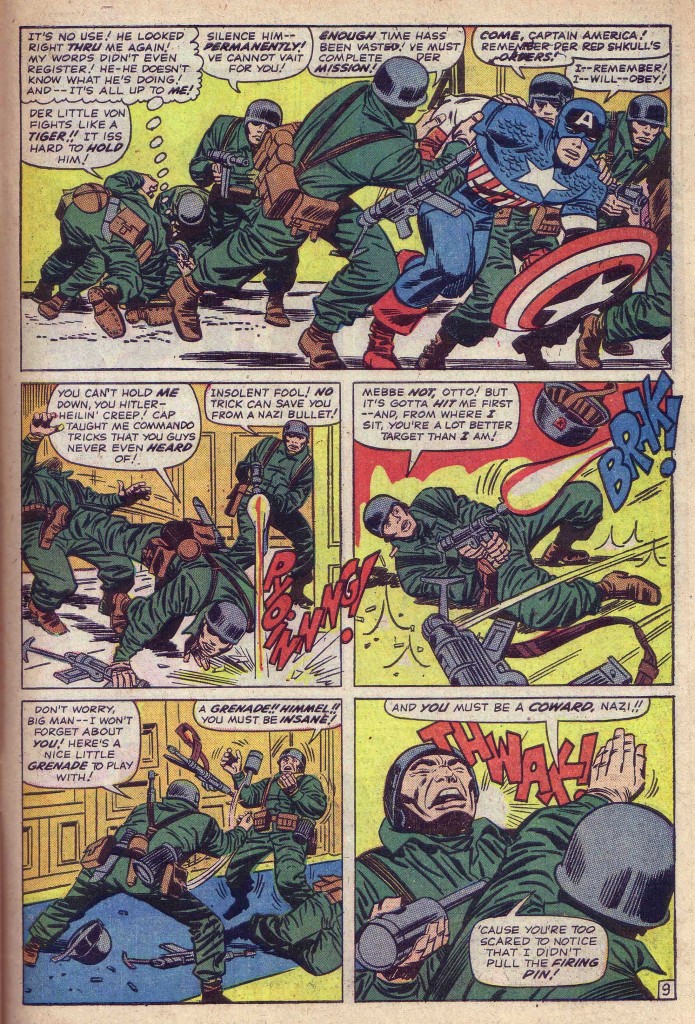
Take for example this page from Tales of Suspense #67 above. The first panel has to be one of my all-time favorite Kirby compositions. There is minimal background information here, but the King creates an incredible deep space scene merely by using the overlapping of figures. The eye enters the panel in the left background knot of wrestling bodies. From that clump, the overlapping central Nazi emerges, his right leg reaching backward, left leg bent and head and torso moving forward and to the right. His support propels Captain America into the focus of the panel. It is Cap’s shield that is the closest shape to us. This tableau creates an amazing sense of sequential time as well as space. The reader/viewer cannot help but to see the panel unfold as an explosion of motion from left rear past to right present forward, a brilliant exposition of four-dimensional space-time. It is clearly the sequence, size and overlapping of the series of figures that is responsible for this remarkable illusion.
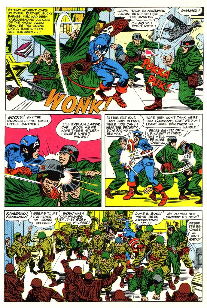
Above, on page two of the following issue, we are again treated to some of Kirby’s greatest panels of figures interacting to create movement in space/time. The first panel shows Cap flipping a Nazi while Bucky enters stage right with a blazing machine gun. All the figures are approximately the same size, so the positioning of the overlapping is crucial for their clarity and dynamism. For instance, the flipped Nazi is closest to us in panel space and is the first thing that we see as he is being thrown in our faces. The “Wonk” sound effect emphasizes this dynamic by breaking the panel borders
The final panel is positively crammed with figures and very clearly reads from left to right as each small group displays its individual interactions. Although initially appearing chaotic, the scene is actually composed of several distinct confrontations and in this case, Lee’s fairly minimal placement of balloons works harmoniously with Kirby’s sequence of events. The upshot is that despite the crowd, we still perceive Captain America to be the main focus of attention.
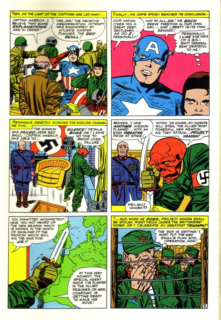
I include the following page above as a perfect example of when in my opinion Lee’s dialog doesn’t support the visuals and in fact undercuts them completely. This story was crafted by the Marvel method, wherein Kirby is plotting and drawing the story and Lee is adding dialog at a later stage. This segment featuring the Red Skull opens in his office, where his subordinate is informing him that his well-laid plan has failed. The force of the panel in which the Skull is driving his dagger into his desk seems to me a gesture of rage and frustration over the bad news he is receiving. This rage is reinforced by the body language of the subordinate standing frozen at attention to his left.
Instead, Lee’s dialog has the Skull describing a new plot. The Red Skull’s overlapped figure really dominates the panel with his powerful downward motion, and in my opinion Lee’s verbiage is simply not sufficiently dramatic to justify the Skull’s grand gesture with the knife.
I may be over reacting to this, but I think it’s important to note these sorts of discrepancies. Kirby and Lee’s collaboration is usually described as the whole being greater than the sum of its parts, but in this instance it is not. Since Lee has been given credit for writing this story that was initially crafted by Kirby, in this case, the two authors are actually working at cross purposes.
Image 1- Jack Kirby Stan Lee Tales of Suspense #67
Image 2-Jack Kirby, Stan Lee, Tales of Suspense #68
Image 3-Ibid


