One of my earliest posts dealt with the artistic collaboration between Jack Kirby and Wallace Wood. In the article, I used a quote by Bill Mason from a Comic’s Journal article, describing Wood’s approach to spatial arrangement in his artwork.
“The young Wood taught himself how to draw in a dashing, boldly exaggerated style which he gradually refined by adjusting the spatial relationships in his drawing, through an extremely laborious process of point to point navigation from one solid object to another.”
When we look at the work of most exceptional artists, we see the way that singular person deals with intervals of space and time. This sort of thing relates to music as well, because we appreciate the intervals that a musician uses to compose a piece. Kirby’s work obviously can also be viewed from the perspective of intervals, as we can see the way he, like Wood has the viewer navigate from one object to another.
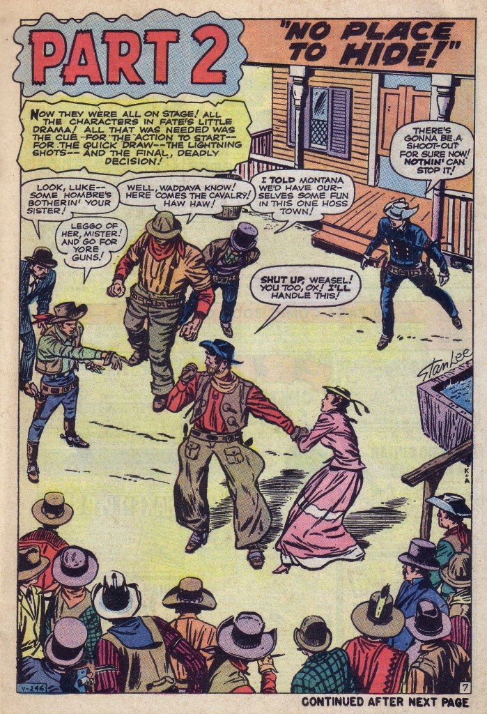
Here’s a page from Rawhide Kid #23 that is an aerial view of a street, with various figures arranged on its stage. The figures are clearly placed in a fashion that enables them to speak their lines most effectively in a particular order to emphasize the story point.
The figure in the bowler on the far left speaks first, followed by the man in the gray vest pointing. Although he points to the main figure, Montana Joe, our eyes still follow the diagonal of his stance up to the man in the red scarf and gray-green hat and the man in the top hat, before descending to Joe. We then see the girl in the red dress, and finally the Kid. The figures on the bottom and the structure of the saloon frame the scene and also keep the eye moving in a circle. It is a brilliantly composed page and the position of each figure is crucial to the scene’s effectiveness. By a combination of intuition, intelligence and hard work, Kirby can make these decisions of judgment nearly instantaneously. Notice also that all of the figures are pretty much of equal size, which is why it is even more important for the figures to be optimally positioned.
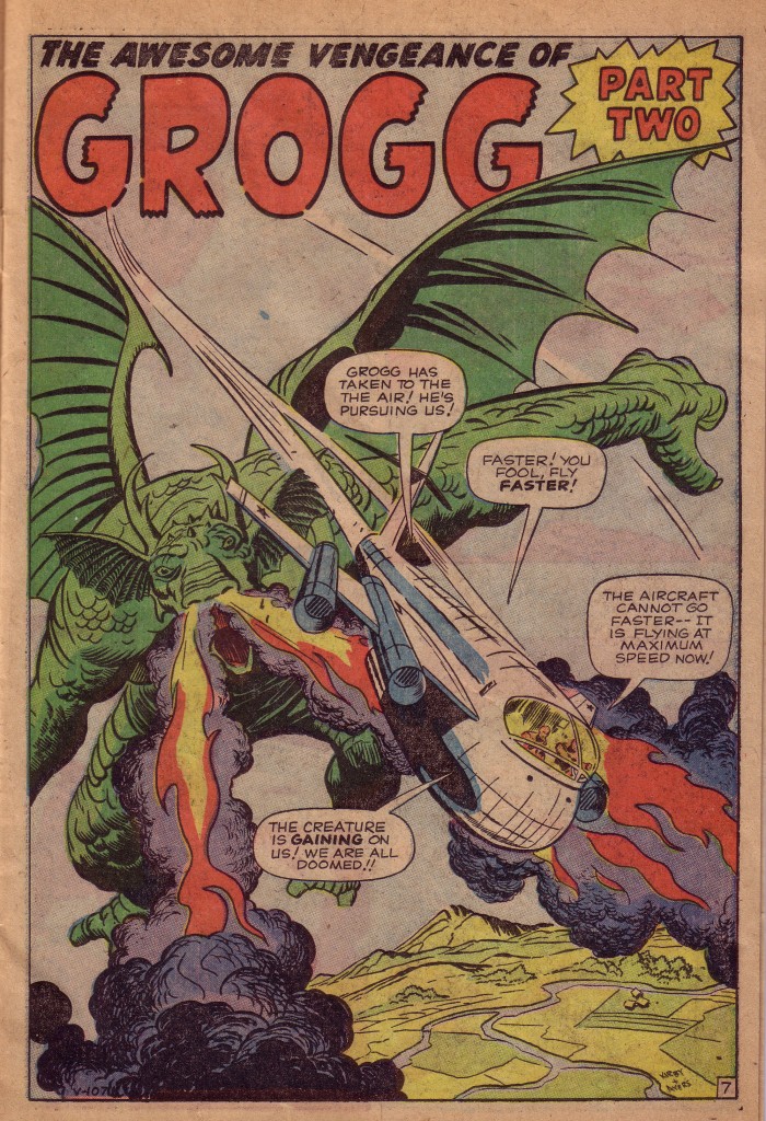
Next, we look at story from roughly the same period. It is Grogg, from Strange Tales#83, and as one of Kirby’s giant monster stories, scale, the relative size of the compositional elements is now a crucial factor. The panel contains two large objects flying over the earth’s surface. The creature, Grogg is the largest object and is surging forward in pursuit of a jet that whizzes towards us like a bullet.
Kirby makes magic with the downward sweep of the dragon’s huge wing bone. That series of opposing curves takes the eye directly to the creature’s fire spouting snout. The nostril blaze gives the jet extra propulsion as it streaks diagonally to the right of our vantage point. The aircraft is just large enough to look imposing as it comes at us, but small enough to be dwarfed by the monster. Scale is the vital issue here, and the relative size of the objects, as well as their distance from the earth’s curvature are optimal.
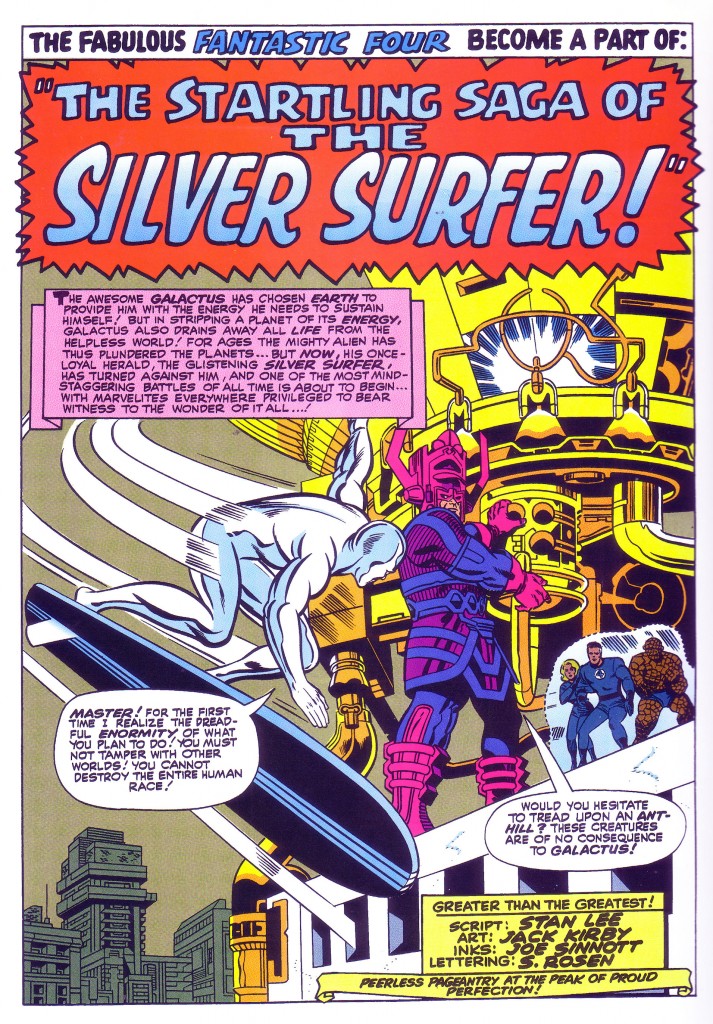
Our final example is a page from one of the most memorable moments in comic book history. It is within the splash panel of Fantastic Four #50, as the heroes are confronted by the awesome power of Galactus that we see one of the most profoundly marvelous images in the annals of sci-fi illustration.
We first see the Silver Surfer swooping into the frame as Galactus stands atop the Baxter building. In the panel, Galactus and the Surfer are roughly the same size, although in comic book reality Galactus towers above the humanoid figure.
It is the spatial relationships and relative sizes of the various elements that make up the composition which give the illusion that Kirby has striven to convey, suggesting the awesome scale of Galactus as compared to the Surfer, and to the Fantastic Four who stand on the buildings edge as well.
The massive cylindrical tower that Galactus is accessing creates much of the illusion of relative size. The buildings in the distance also frame the shot and give it depth and a greater sense of proportion. Kirby has drawn upon years of experience to bring us a tableau that conveys a sense of tension based on the varying degrees of power and powerlessness between antagonists, and he has done this by using the spatial relationships and scales of the participants in the panel.This is yet another reason why he is the King.
Image 1-Rawhide Kid #23 Jack Kirby, Stan Lee, Dick Ayers
Image 2- Strange Tales #83 Jack Kirby, Stan Lee, Dick Ayers
Image 3-Fantastic Four #50 Jack Kirby, Stan Lee, Joe Sinnott


Pingback: In case you missed it… a new Kirby Kinetics post from Norris Burroughs | The Kirby Effect
I leave a response when I appreciate a post on a site or I have something to
add to the conversation. Usually it’s caused by the sincerness communicated in the article I looked at. And after this article Spatial Relationships part two, Scale | Kirby Kinetics. I was moved enough to drop a comment 😉 I do have 2 questions for you if it’s okay.
Could it be just me or do a few of the responses appear
as if they are written by brain dead individuals?
😛 And, if you are writing at other social sites, I’d like to follow you. Would you make a list the complete urls of your social pages like your twitter feed, Facebook page or linkedin profile?
I’m not sure I’ve noticed any comments by brain-dead individuals. I do appreciate most of the comments I’ve received on this site. At any rate, this is the only blog that I’m currently doing. I also write a similar column for the publication The Jack Kirby Collector.
I’ve also just published a memoir/biography entitled MY Madonna about that girl and the music scene of the 70’s and 80’s. It’s available on Amazon.com. see link below.
http://www.amazon.com/MY-MADONNA-Intimate-Friendship-ebook/dp/B009QUMAE4