One of the cool things that happened during the so-called Silver Age of Comics was Jack Kirby and Stan Lee’s effort to link the Golden Age Captain America to the character that had been revived in 1964. This was done by presenting some of Cap’s World War II adventures, a few of which were actual recreations of stories printed in the 1940’s. This makes it possible to study Kirby’s evolving approach to plotting and laying out a specific script, over a twenty-five year time span.
Following a fairly faithful adaptation in Tales of Suspense #63 of the hero’s origin from Captain America #1, the second story of that historic issue was then adapted in Tales to Astonish #64.
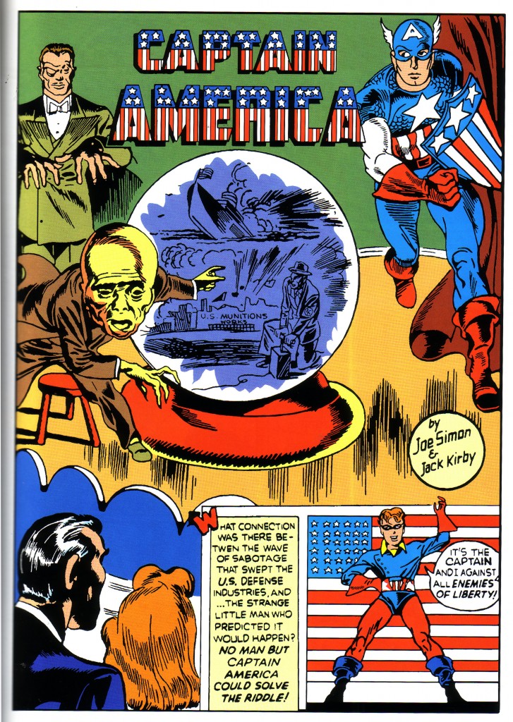
The team of Joe Simon and Jack Kirby originally presented the story featuring villains Sando and Omar. Since Captain America’s first issue was done in a rush to meet a deadline, Kirby as primary artist would generally do a complete pencil drawing of only the splash panel and usually ink it as well. Then Kirby and/or Joe Simon would do rough layouts on the rest of the story, which would in many cases be completed by a secondary team of artists and inkers.
The splash panel is fairly strong, showing Kirby’s early use of a circular composition. It begins as the eye enters the page on the left with the gesturing monocle wearing figure of Sando, whose hands point to the huge yellow head of Omar. That figure’s claw like hand leads our eye to the base of the crystal sphere and up to the figure of Captain America, and then the top of the sphere and the logo type take us back to Sando. Eventually, our gaze drops to the couple in the audience and onward to the second panel.
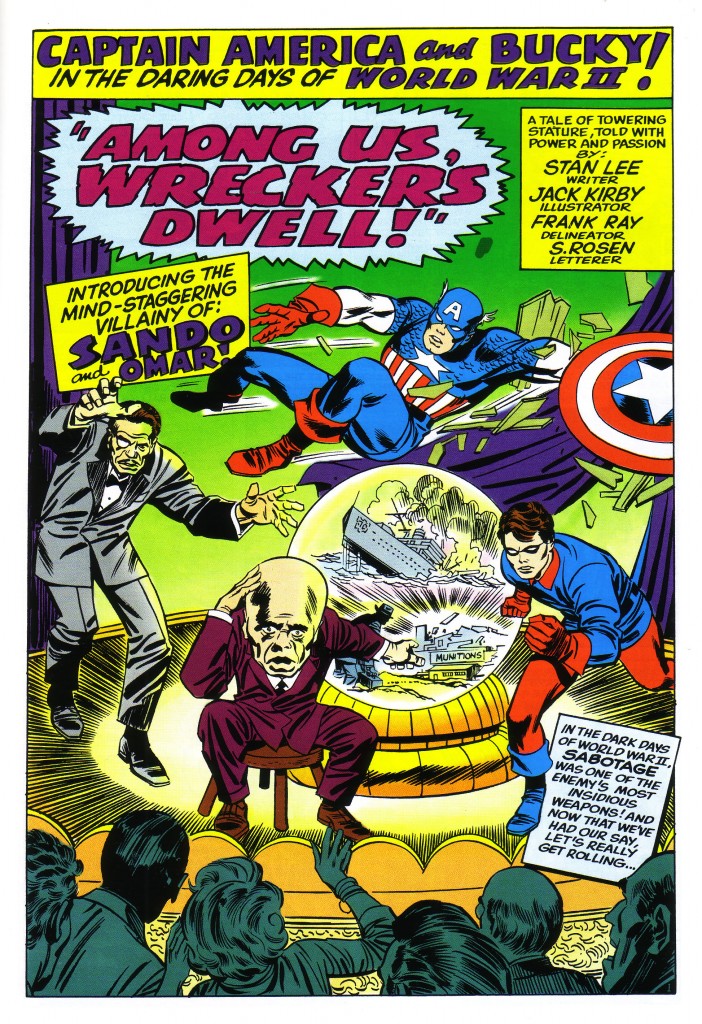
It is a nice solidly drawn and inked page, but it is positively static in comparison to the 1965 version below.
This page also leads us into the action with a gesturing Sando, but he is a full-blown dynamic Kirby body, with forced perspective hands outstretched in contrapuntal directions. The crouching Omar is the page’s most stationary figure, still pointing to a smaller sphere and a darting Bucky, whose angled position leads us to Captain America. It is here that the startling difference of twenty-five years experience is most apparent. Instead of running rather mildly in place on the rightward edge of the page, Cap’s pose is the center of the action and his elongated arch weaves the page’s kinetic rhythm together. The frieze of audience figures on the bottom border also reinforces the circular direction of the composition.
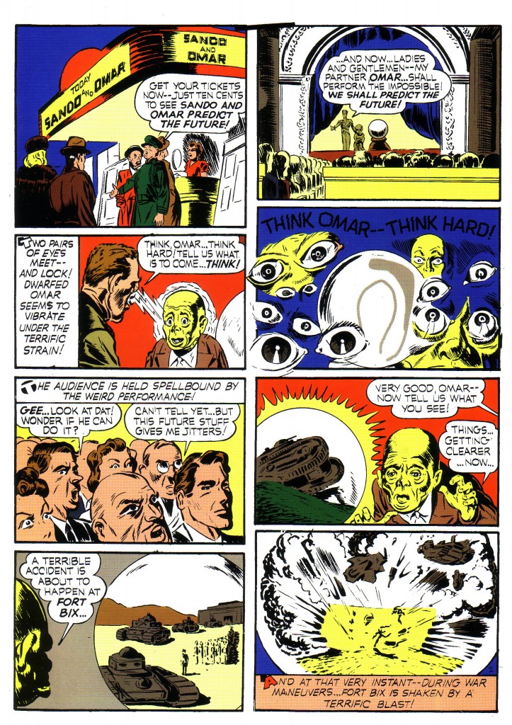
Page two of the golden age version was probably at best roughly laid out by Kirby, and gives us the sketchiest approximation of realistic detail.
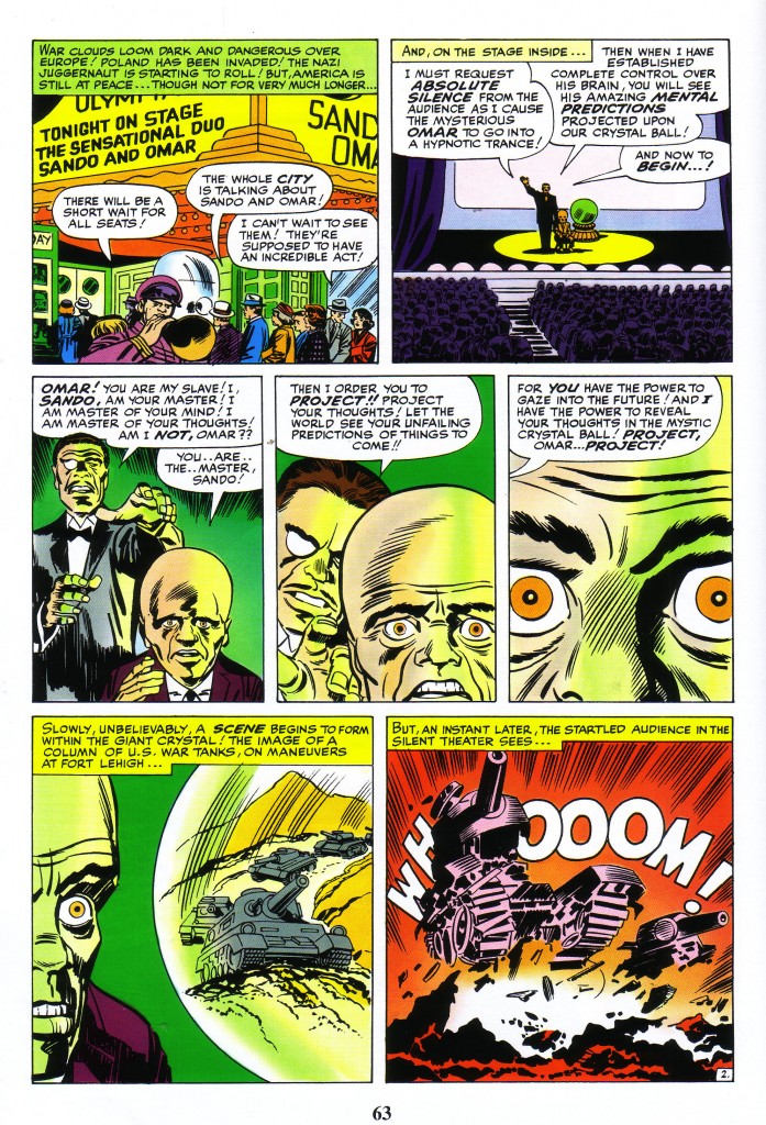
Joe Simon and inker, Al Liederman, probably did most of the finished drawing above. The structure of the theater and such objects as tanks and weaponry are desultory at best. Still, Kirby clearly later uses the crudely executed page as a jumping off point for his reenactment. Like the 1941 version, panel one of the newer page below is an exterior shot of the theater and panel two also mimics the original by showing the audience and the stage.
Kirby next shows Sando and Omar together, but as the camera pans in, we see the older page’s floating eye motif reinterpreted as a gradual enlargement to a looming close up of Omar’s eyes. Next we see the crystal globe mirror the circle of the iris, revealing a beautifully drawn tank, which explodes in burst of energy in the final panel.
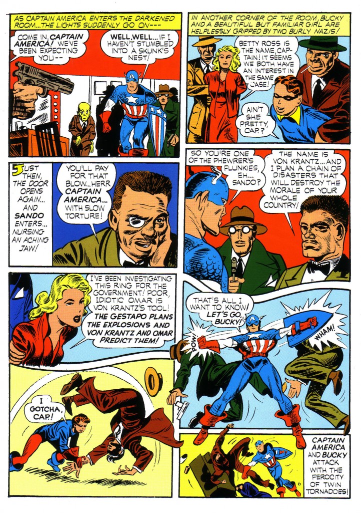
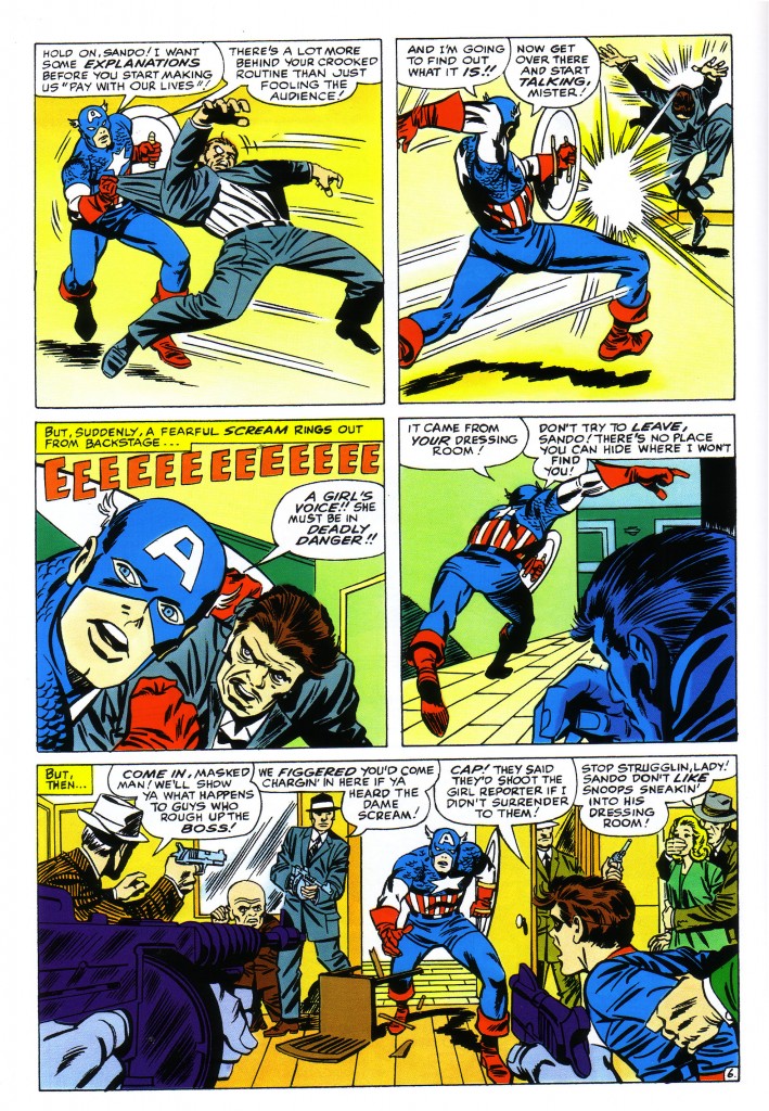
At this point, Kirby dispenses with following the continuity of the old comic and finds a new rhythm. He only returns to the source for an occasional panel. A notable comparison occurs on page six of both issues. The frame in question is the first on the page in the Golden Age story and last in the 1965 version. The older panel is almost certainly drawn and at least partially inked by Kirby, and is so small as to escape scrutiny, were it not so similar to what Kirby does in later years.
On the left edge of panel one above, we see an automatic pistol pointing diagonally at Captain America, who has just entered the room at stage right. There is a nod to some sort of faux perspective and vanishing point created by various articles of furniture and such to add drama.
Apparently, Kirby saw something here worth elaborating on. In Tales of Suspense #64, in panel five below he gives us a full tier bottom panel of practically the same tableau, but he works it in subtle new ways.
In this case, a Tommy gun reinforces the pointing automatic, and a third gunman stands where only Omar previously stood. Cap and the open door are now dead center, with Bucky to his right as well as another gunman forcing the eye to focus on the star-spangled hero. The boards of the floor, not visible in the older panel are also used to reinforce the drama of Cap’s dilemma.
Thus did the King show his genius, with his attention to detail, finding something to explore and exploit in a fairly unremarkable panel from a previous generation.
Image 1-Captain America #1, Jack Kirby and Joe Simon, Marvel Masterworks Golden Age Captain America Volume one
Image 2-Tales of Suspense #64 Jack Kirby, Stan Lee, Frank Giacoia, Marvel Masterworks Captain America Volume one
Image 3- Captain America #1, Jack Kirby and Joe Simon, Marvel Masterworks Golden Age Captain America Volume one
Image 4- Tales of Suspense #64 Jack Kirby, Stan Lee, Frank Giacoia, Marvel Masterworks Captain America Volume one
Image 5- Captain America #1, Jack Kirby and Joe Simon, Marvel Masterworks Golden Age Captain America Volume one
Image 6- Tales of Suspense #64 Jack Kirby, Stan Lee, Frank Giacoia, Marvel Masterworks Captain America Volume one


