Jack Kirby’s work is sometimes criticized or dismissed for being unrealistic. Kirby has stated in so many words that he doesn’t particularly value realistic drawing if it doesn’t advance the story line, but let’s examine the evidence. In my opinion, throughout his life, Kirby has created a set of visual symbols based on the structural foundation of reality, which although they are abstractions actually possess a power greater than strict reality has.
One of the first things I see when I study Kirby’s work is that it is firmly grounded in three-dimensional reality. What I mean by this is that Kirby’s compositions are logically placed inside the picture frame and that he uses something akin to basic anatomy and perspective to propel his narratives. In my last post, More Latticework, I discussed this in relation to the compositions that Kirby crafted.
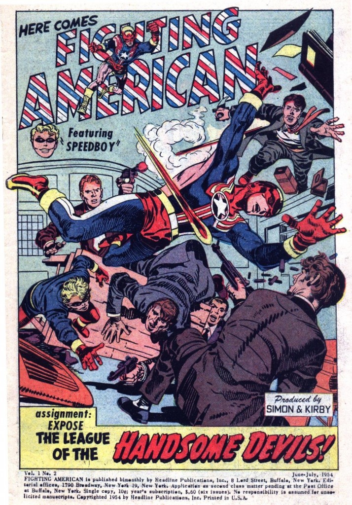
Kirby, like Picasso carefully studied and pretty much mastered realism years before he embarked on his forays into hyper-exaggeration and abstraction. As he developed through the forties and fifties, the King maintained a fairly consistent style for drawing his figures that was based soundly in anatomical structure, even though he would also employ dramatic effects like forced perspective as seen in this Fighting American splash from issue #2.
If we look at the musculature of the hero, we can see that his anatomical structure is fairly accurate. Hands are not nearly as squared off as Kirby would later make them, body parts are well in proportion to a normal athletic figure, and details like biceps, deltoid and lattisimus dorsi muscles and bones like FA’s right elbow are all in the correct positions. Kirby is also using the lines on the wall as orthogonals to suggest perspective and increase the forward thrust of the hero.
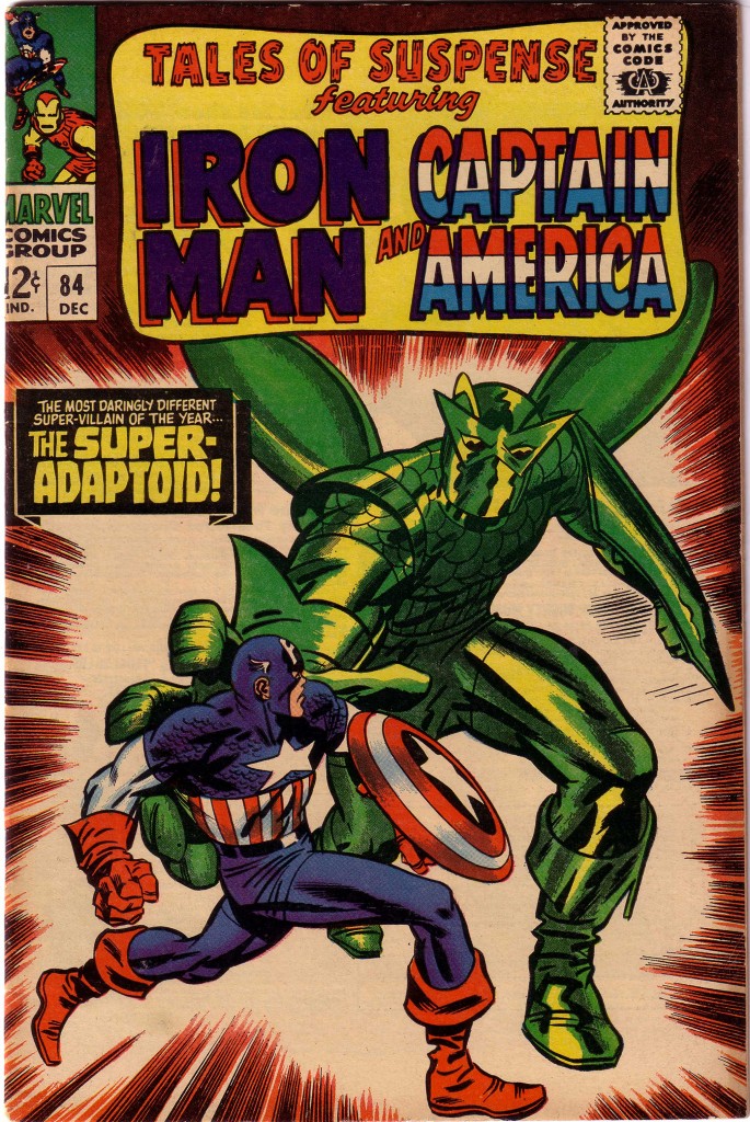
Sometime in the mid-sixties, Kirby’s style began to grow more abstract, as he seemed to be reaching for a way to depict worlds beyond that which a normal human being could conceive. The artist began to arrange the space of his page to encompass the infinite, and even the depiction of the corporal body began to morph, Specifically, Kirby’s notion of the heroic began the inspire him to develop a new graphic language of symbols. Here on this Tales of Suspense #84 cover, Kirby has basically dispensed with the strict shaping of specific muscles, rendering Captain America with bold slashes of black to emphasize the dynamism of his figure. What is more, he has accentuated the sense of fearsome mass by radically exaggerating the foreshortening and size of the Adaptoid’s arm and hand in a bravura use of forced perspective.
Still, we can clearly see that Kirby understands the structure of the human body and uses the counter motions of hips, shoulder girdle, head, arms and legs to give us the maximum of tension through the torque of Cap’s figure.
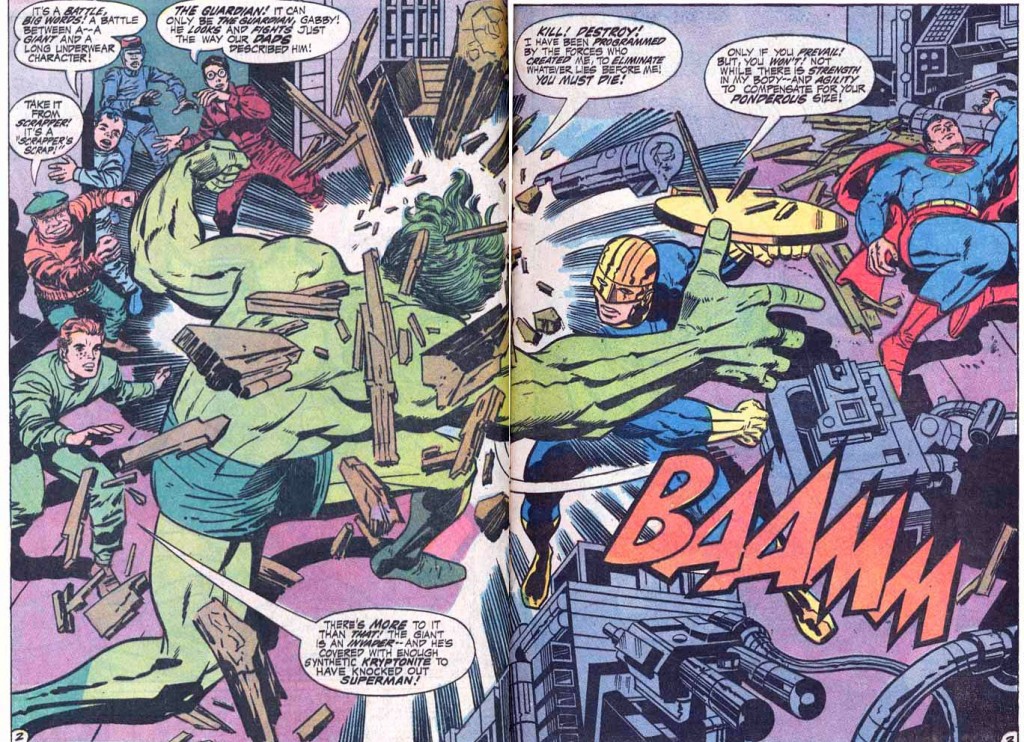
By the time Kirby left Marvel to work for National Periodicals, his style had become even more abstract. Here in this two page spread from Jimmy Olson #136, we see how Vince Coletta’s somewhat restrained inking keeps Kirby’s art a bit more old school in style, but the melee is still wild and wonderful. Kirby uses the giant green Olson creature’s back, arms and legs to sweep the eye around in a circle, but the monster’s back muscles are a mere suggestion of actual anatomy.
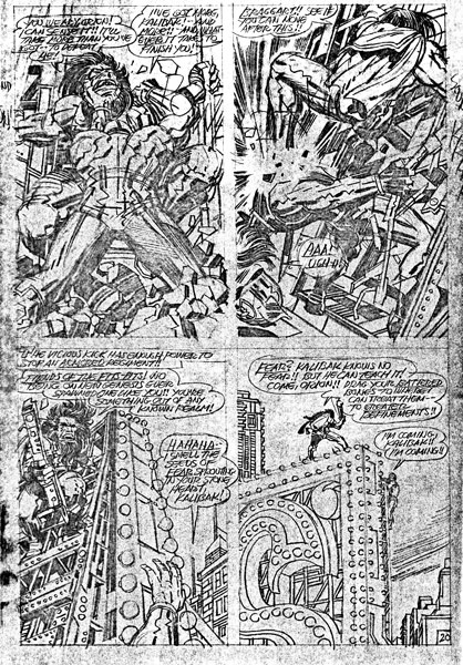
When Kirby acquired Mike Royer as his inker, the latter’s rendering of the Kings pencils showed the world the closest version of what he was striving towards. We can see it even more clearly in this bold unrestrained original art for New Gods #8 where the pencil line is fully exposed.
There is precious little strict reality here, but these pencil drawings supply enough raw power to light up the actual city skyline depicted here.
NWB
Image 1- Fighting American #2, Jack Kirby and Joe Simon
Image 2-Tales of Suspense #84, Jack Kirby, Stan Lee, Frank Giacoia
Image 3- Jimmy Olson #136, Jack Kirby, Vince Colletta
Image 4- New Gods #8, Jack Kirby


