When Kirby was working for Marvel/Atlas in the early sixties, he was already in the habit of breaking up and breaking down the pacing of the story into chapters. He had been using this method on the monster stories that he and Lee were producing since he’d resumed working for the company, and it seemed to work well for the dramatic pacing of the new superhero comic as well. Kirby had always enjoyed working large, and the more spacious chapter panels allowed him to put several of these per story. The larger canvas allowed him to indulge his penchant for grand compositions, particularly those that permitted him to employ spatial arrangements that used geometric shapes to create lattices. Detractors sometimes dismiss Kirby’s work as unrealistic, but I contend that it is hyper-real because of its artistic grounding in three-dimensional reality. Many of those modern artists who are lauded for their photo-realistic approaches would do well to study Kirby’s capabilities in that area, which are so often lacking in their own stunning but often lifeless work. It’s one thing to do a beautiful, anatomically correct superhero figure, but if that figure is devoid of background elements or is positioned poorly in its panel, the storytelling will suffer, and the figure may appear static and posed.
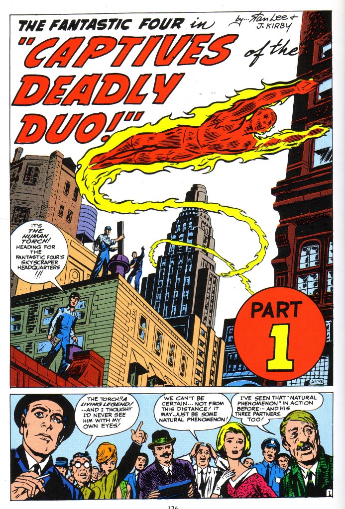
The lattice, as I’ve explained previously, is a division of space. Imagine a three dimensional grid into which each section the artist places objects in the most advantageous positioning for the dramatic structure of a composition. If we look at this splash panel for FF#6, we get a powerful sense of what it would feel like being at the effect of a Human Torch Fly-by, with the strong illusion of three dimensions provided by lattices that the artist has imposed by the structure of the panel. When I say constructed, I mean that Kirby has broken up the space, primarily using the shapes of buildings throughout the rear, middle distance and foreground of the panel.
Initially, the viewer’s eye travels down the diagonal edge of the lettering before it locks onto the hexagonal building on the left, and its shape starts the swooping motion in the piece. Here we see a really clear example of latticework in the composition of the page.
If we look to the lower right, we see the dark corner of a building just to the left of the Red Part 1 Circle. If we view that shape as the rearmost lattice, we can then imagine the tall spire formed building that the Torch has circled as the next closest lattice, which is created by its more or less rectangular shape.
If we follow that building’s diagonal lower section, we come to the third nearest lattice, the tan brick-faced structure with four windows that the workmen are standing on the edge of. The nearest workman and the red brick roof he is standing on is the next closest, and the face of the building that the Torch has just curved in front of creates the final lattice.
Thus, we get the sense that the Torch has traveled, swooping through the three dimensional space of five separate lattices to arrive in his position on the page. This is a truly wonderful panel, to set off a remarkable visual and narrative story.
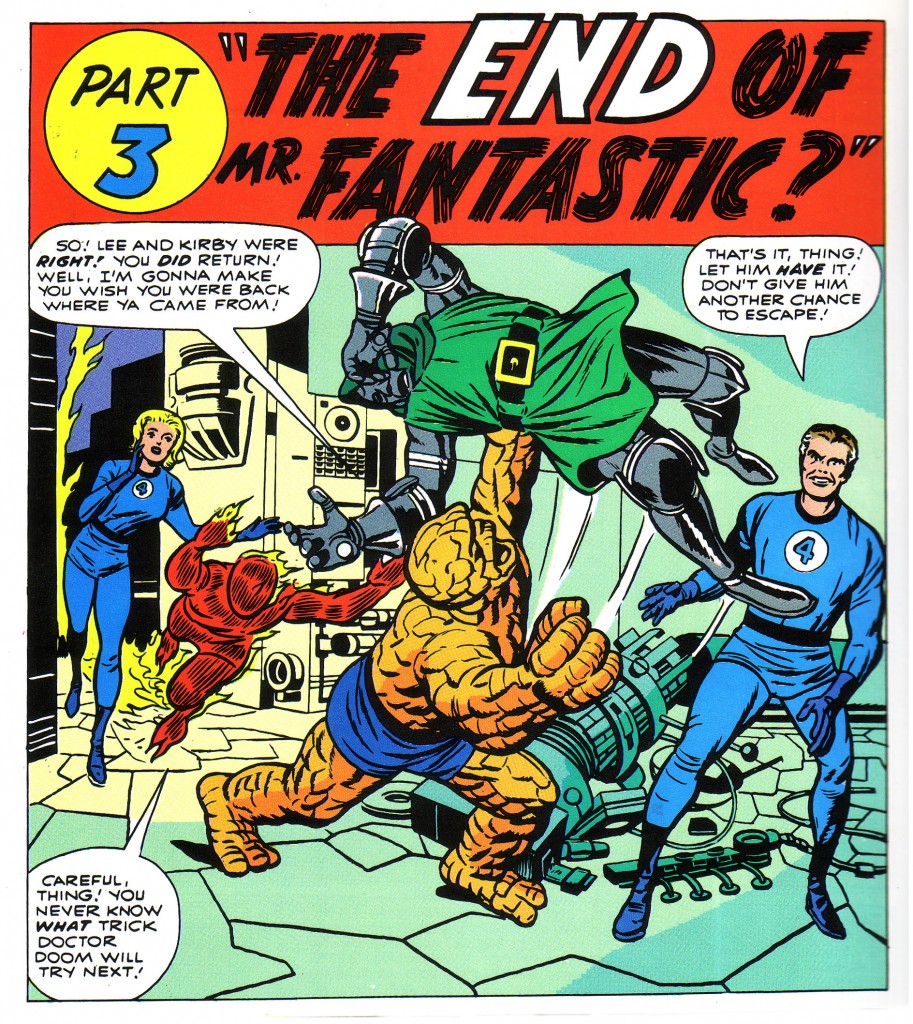
Sometimes Kirby creates lattices with very little backgound elements at all. In the case of this FF#10 chapter splash, he has done most what he needs to suggest with the positions of the figures and some geometric shapes on the floor. Kirby’s mastery of the simulation of deep space within a comic book panel enables him to suggest a great deal with very little.
In this panel from FF#10, we can look at the Torch and Sue occupying the rear lattice bounded by the machine and conveniently traced on the floor by the divison of tlles from yellow to green. The Thing and Dr. Doom occupy another lattice bounded by the edge of the piece of equipment on the floor near Ben’s foot, and Mr. Fantastic occupies a lattice to the right rear of the Thing. Again, this is not to suggest that Kirby has mathematically plotted these geometric spaces to position his figures. he is almost certainly working intuitively at breakneck speed and is not plotting absolutely correct geometric divisions. However, a less accomplished artist might carefully construct a page in a more precise fashion and be quite successful.
The beauty of this technique is that various figure’s limbs will regularly overlap into another’s lattice in the deep space projection simulation of the panel, just as they do in reality.
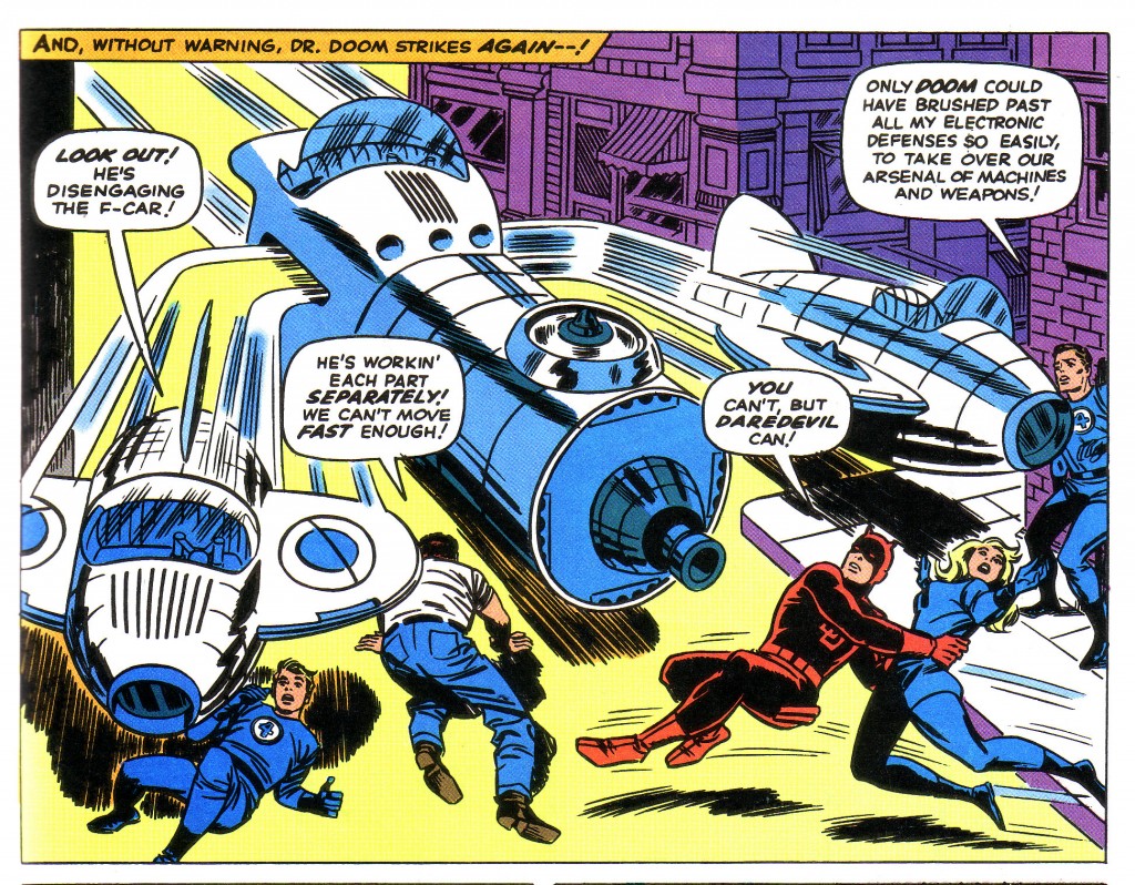
In our final example, we see a flying ship, the Fantasticar, zooming approximately midway in the height of the panel, thereby establishing a powerful horizontal lattice that reinforces the positioning of the figures. The diagonal/vertical shape of the building on the right anchors the ship in four dimensions as well as establishing spaces for the figures to occupy.
Each section of the three pronged ship carves out a section of panel for the individual figures to inhabit. On the left, Johnny Storm has fallen to the ground to avoid the section of car poised above him. Ben occupies the space just to his right and under the large central section which defines the lattice that Daredevil and Sue Storm also occupy. Reed clings to the edge of the lattice formed by the building.
Few artists, realist or otherwise would be capable of composing a panel this complex and ambitious. Kirby through years of experience does this sort of thing with an amazing combination of intuition and intelligence.
Image 1- Fantastic Four #6, Jack Kirby, Stan Lee, Marvel Masterworks FF volume 2
Image 2- Fantastic Four #10, Jack Kirby, Stan Lee, Marvel Masterworks edition
Image 3-Fantastic Four #39, Jack Kirby, Stan Lee, The Villainy of Doctor Doom
As an aside, I’ve been doing a blog on Captain America’s Golden Age inkers. If anyone is interested in this topic, they can check in at this address.


Thanks a lot for taking the time to describe the terminlogy to the learners!
Thanks, I really appreciate your interest in the things that interest me.
I enjoy your wp web template, where did you get a hold of it?
It’s basic WordPress.
NB