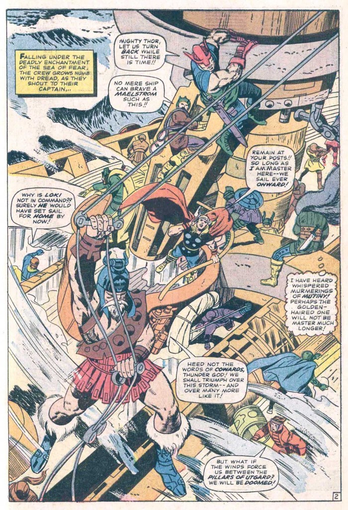
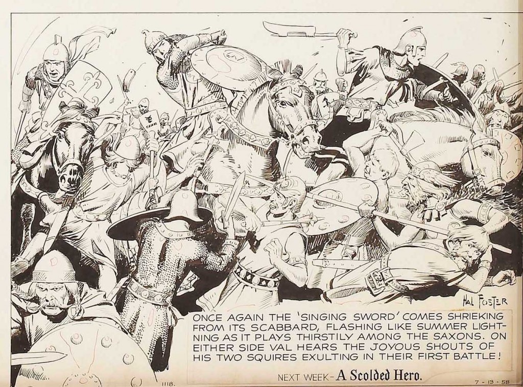
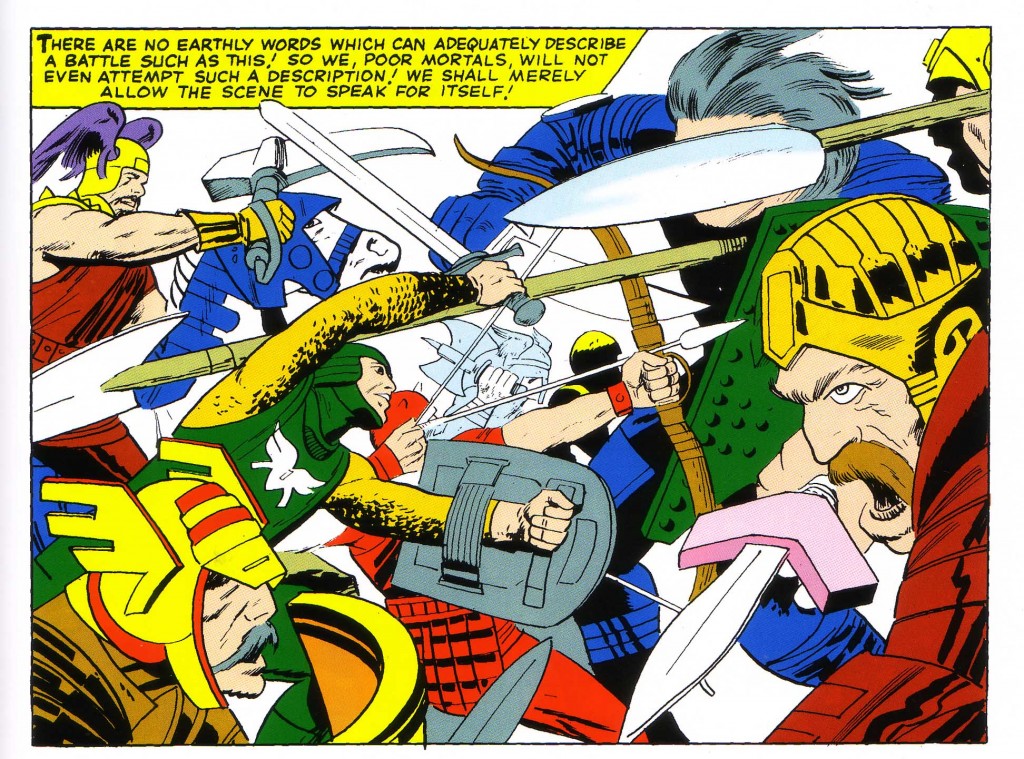
Over the years, I find myself continually returning to a subject that has fascinated me since I was twelve, when I saw my first sample of Golden Age Captain America, ostensibly drawn by the creative team of Joe Simon and Jack Kirby. The artwork had been used as a faded backdrop for a photograph of the version of Captain America that had appeared in the 1944 Republic Pictures film serial. The photo- montage was from an article in a 1964 issue of Screen Thrills Illustrated, a magazine devoted to old action-adventure films and serials, which featured an article about the on-screen Captain America.
The star-spangled hero was suddenly hot again because Marvel Comic’s Stan Lee and Cap’s original co-creator/artist, Jack Kirby, had just revived him. I of course had been fascinated with Kirby’s work since I’d seen his Rawhide Kid art around 1961, at nine years old. I did not hear of Joe Simon until the day I read that issue of Screen Thrills Illustrated. It took me several years to realize that Kirby and Simon not only worked together, but also had a stable of artists to assist them. On the 1940’s Captain America #1-10 pages, the mix of these artists is so jumbled across the pages that it has stumped many an expert art spotter in determining who did what.
The team of Simon and Kirby featured Jack as the primary artist/writer, while Simon did writing, some layouts, some drawing and inking but primarily functioned in an editorial capacity. It is fairly certain that Kirby always penciled and also inked the majority of the splash pages, which graduated to double page spreads on some stories by issue #8.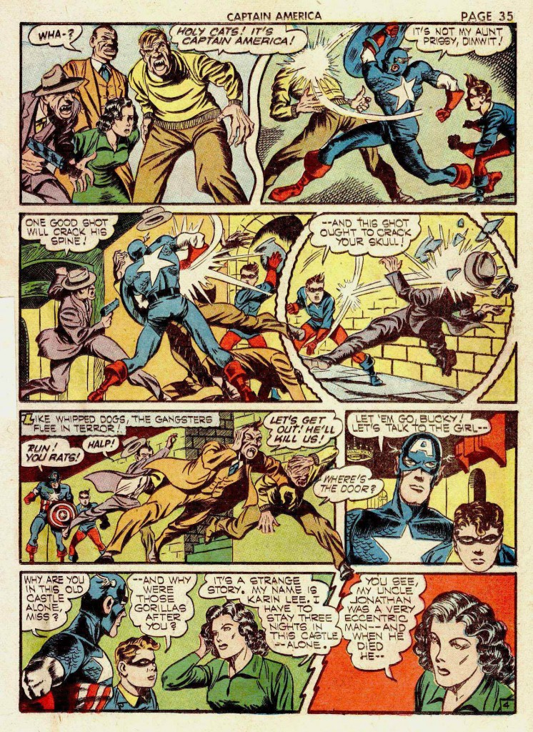
This page above is one half of the two-page spread featured in Screen Thrills, and is from a story called “The Black Witch” in Captain America #8. As mentioned, the Simon & Kirby team worked only on the first ten issues of the series, before moving to DC Comics for a more lucrative creator deal.
My early teenage attempts at collecting Golden Age comic art first led me to a copy of Captain America #17, with the splash page of the lead story bearing the blurb, “Drawn by Al Avison.” It was my early familiarity with this particular artist that allowed me recognize Avison’s hand in the Black Witch story as a member of Simon and Kirby’s studio. Unfortunately, as a boy I cut up the Cap #17 issue and assembled a collage with its various panels, including a portion of the cover. Perhaps in this case it’s not so unfortunate, because I saved the collage, whereas it would have long since disposed of the actual comic during my turbulent teenage years.
So we can compare the two pages, knowing that Avison was either drawing with Kirby on the Black Witch story, or tightening up Kirby layouts. At any rate, we have a clear sense of Avison’s style as distinct from the artwork on the Black Witch splash spread below, which in my opinion was drawn and inked by Jack Kirby.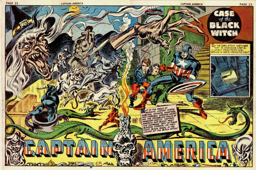
Avison’s art in Cap #17 seems nearly as confident as that of Kirby on the earlier issues. When S&K left the series, Avison was put on Captain America as the main artist, and he appears to have learned well from his tutelage with the King. His first forays starting with issue #11 weren’t particularly impressive, but he began to radically improve by around issue #13 and continued strongly on the book until Captain America #19. The question in my mind is what exactly did Avison contribute to the pages he is credited as working on with Simon and Kirby? For instance, in this story below from Cap#9, “The Black Talon,” Avison is credited with Kirby as penciler and the inker as listed as George Klein and Unknown.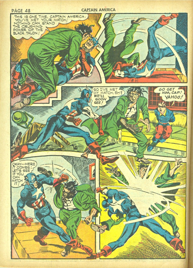
I had initially assumed that Avison was the inker here, because his stamp on the artwork is so strong, and it seems unlikely that he initially drew much of the figures in this sequence. At this stage of his career, Avison simply didn’t have the artistic chops to do such complex work. This action displays the anatomical proficiency of Kirby, particularly with its use of intricate three-quarter back shots, elongated musculature and foreshortening. Even the use of objects such as the sofa and table in panel 3 show a sophisticated understanding of deep space composition that Avison’s early work does not display.
However, the character’s facial features, and structural finishes such as distinctive kneecaps tell me that Avison is involved somehow. If he did not ink the story, then I imagine that he tightened up Kirby’s fairly intricate pencils prior to Kiein’s inking.
These matters, seemingly so unimportant continue to interest me to the degree that I am considering having a blog devoted to exploring the questions involved. I would invite various professional or simply interested laymen to give their opinion until the issues are resolved to a reasonable degree.
Image 1-Captain America #8 Jack Kirby, Joe Simon, Al Avison
Image 2-Captain America #17 Al Avison
Image 3-Captain America #8 Jack Kirby, Joe Simon
Image 4-Captain America #9 Jack Kirby, Joe Simon, Al Avison


