In the mid 1970’s, Jack Kirby was working at DC comics, doing his best to find a secure place for himself after the cancellation of his Fourth World epic. One of the projects that he took on was a WWII based series called The Losers, published in Our Fighting Forces. A critically acclaimed story in this run was, “A Small Place in Hell”, appearing in Our Fighting Forces #152. After studying the comic along with reviewer Mike Kidson’s excellent analysis, something in the story’s layout jogged my memory. Where had I seen this before? Then it came to me. The setting of “A Small Place In Hell’ reminded me of one of my all time favorite comics, Sgt. Fury #13, featuring Captain America.
What struck me most forcefully was the compositional use of the surrounding building’s rooftops, as the Nazi soldiers in both stories move through the respective towns. Throughout his career, Kirby has used architecture to emphasize the movement of his narrative as well as the action of his figures. These two particular stories, as well as being gripping war stories are standouts in this method. 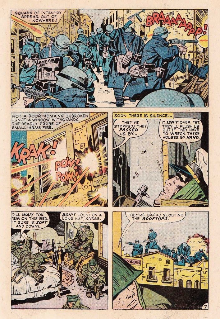
In the first panel on the Losers page, we see the Nazis moving deeper into the panel from left to right, following the angle of the rooftops above. Kirby’s composition has the soldiers massing towards the horizon line, until they reach the center of the panel, and then the positioning of the figures moves the eye outward and to the right as the figures come towards us, breaking down doors and firing machine guns. It is another example of a deceptively simple composition giving us a dynamic sequence of events in space/time. Notice that we do not see the Nazi firing on the right until our eye enters the deep space of the panel and moves back outwards. It is the break in the central roof structure that stops the eye going further inward and initiates the movement of the figures back out again.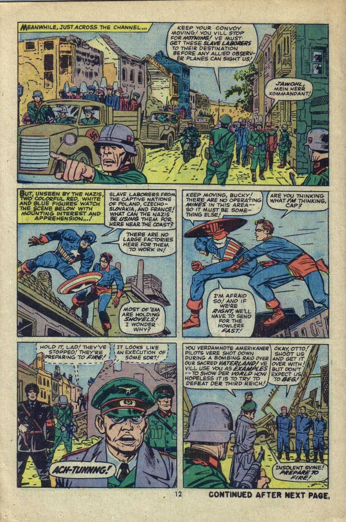
In the top Sgt. Fury panel above, a similar thing is taking place. We see the Nazis coming up the street and our eye is drawn back down the row of buildings until it reaches the central blue structure. The building’s wall drops like a plumb line to the figure on the motorcycle, which moves the eye back out to the right foreground.
On this same page, Captain America and Bucky are first seen perched on a rooftop. They maneuver over the roofs as they stalk their prey, the Nazi executioners. On the Fighting Forces page below, the Losers are also using the shelter of the roofs as they move from building to building attempting to evade the Nazis that occupy the town. I love the second panel in which they are climbing down the drainpipe to reach the ground. There is a strong sense of vertigo, as Kirby uses the downward diagonal progression of figures here. Kirby uses the diagonal both here and in the second panel of the Fury page to give us this feeling of precariousness.
Another of the dynamics that make these two stories similar is the profusion of heavy machinery, obviously prevalent in a wartime scenario. The last panel on the Losers page below displays one of Kirby’s favorite action props, the motorcycle, complete with sidecar. Here the motorcycle is stationary, although its positioning surrounded by the soldiers give us a sense that it may take off at any moment.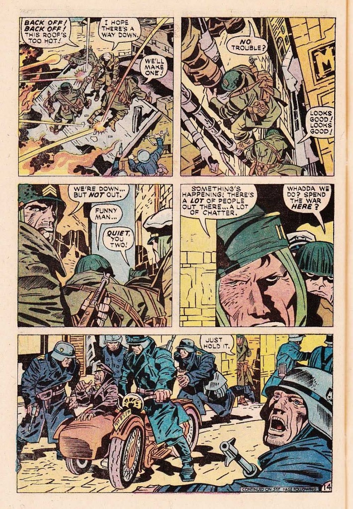
In the Sgt. Fury/ Captain America page, we see the motorcycle in motion, indeed in flight. Kirby uses all of his formidable skills to show us a clear difference here from the stationary bike on the Losers page, because in this case Cap’s cycle is visually propelled not only by the explosion to the left of it but also by the gun burst in the preceding panel. Next we see the motorcycle headed directly toward us. In this case, because Kirby cannot use horizontal or diagonal speed lines to show motion, he masterfully gives us the illusion of forward motion by the profusion of objects flung upwards by the bike’s wheels, as well as the impact lines projecting from the ground.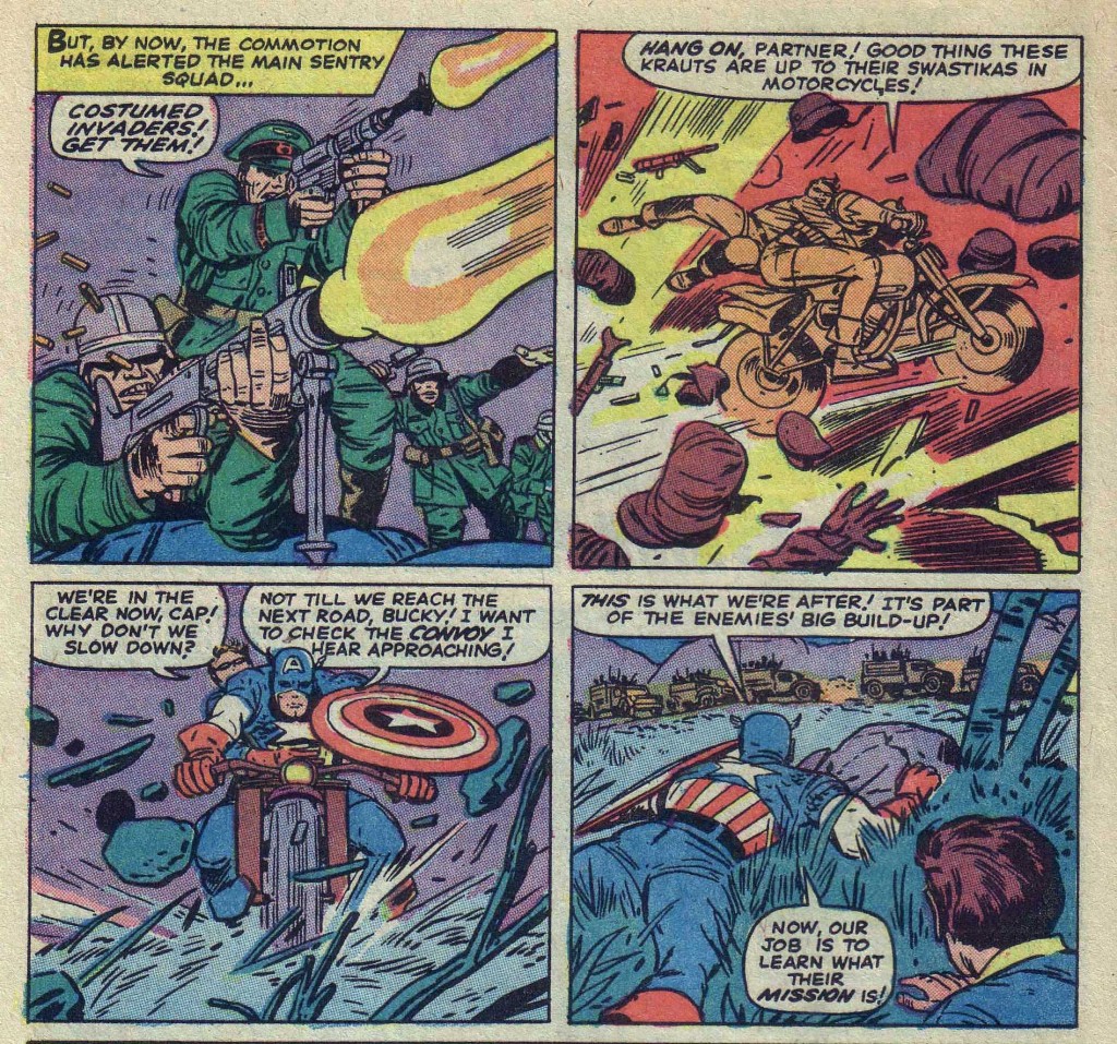
As this is a war comic book, we can enjoy Kirby’s aptitude in building up tension and releasing it explosively. On the Cap page, the release is the explosive escape of the cycle riders. On the Losers page it is the confrontation that ensues when the Nazis find the American outfit on the rooftop.
The Losers have spent several pages hiding from their adversaries, and when they are finally discovered, the conflict is monumental in the singular Kirby fashion. It is as searing as the flame-thrower in Johhny Cloud’s face in panel three on the page below.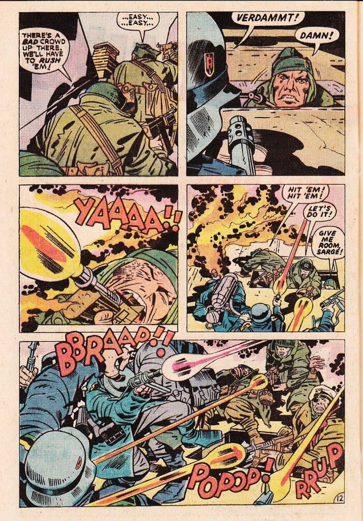
Panel five is a classic Kirby pile up of figures, and to my mind a very powerful if peculiar arrangement of figures. One of the Losers, wearing a pack of some kind appears to be slamming into a group of Nazis, but it is nearly impossible to make out whom or even what it actually is.
The figure in question in not completely rendered and contains details which don’t quite make sense. The area of the pack above the machine gun burst doesn’t quite connect with the lower portion, and it appears even perhaps that the pack has been thrown, except for the fact that there is a leg drawn below it.
This is something that one occasionally notices with later Kirby work. The artist style is clearly becoming more abstract and expressionist. He is so overtaken with the enthusiasm of presenting us with a dynamic composition that he often dispenses with reality as being superfluous to his artistic intention.
At any rate, it is always fascinating for me when I find something in Kirby’s work that recalls some other aspect or period in his long history of excellence.
Images 1, 3 and 5 Jack Kirby, D. Bruce Berry, The Losers,
Our Fighting Forces #152
Images 2 and 4 -Jack Kirby, Stan Lee, Dick Ayers. Sgt. Fury #13


Thanks, Norris. The SGT. FURY/CAP story has long been a fave of mine.
AAAAAAAUGH!!! Anyone who might not like Mike Royer oughta take a look at this.
About 2/3rds of the way thru thr 4W, Kirby’s art in some comics began to be more
“cartoony”. But Kirby-Royer NEVER looked like this, even at its most cartoony.
Sure enough, D. Bruce Berry. WHO THE F*** was this guy? This is AWFUL!!! I
kept thinking, it’s a DC WAR book, couldn’t they have gotten JOE KUBERT or RUSS
HEATH or somebody to ink it? Geez.
What did happen to Royer, anyway? I know he had a steady gig inking Russ Manning
on TARZAN (my all-time favorite comics version of the character), but did he get
on it at the time he dropped off of inking Kirby? I mean, I’m sure Royer’s
inking would have loked better than this stuff.
Hell– VINCE COLLETTA would have looked better than this stuff. (And I will
argue that point against anyone! Heeheehee)
Meanwhile… and I hate to nit-pick… but there’s this WEIRD proportion thing
that crops up again. I know, with Jack, the storytelling is MORE important than
any attention to realism. But there’s 2 panels, one interior, one exterior. In
the interior, you can see the size of the soldiers compared to the windows. But
in the exterior, where the Nazis are scrambling over the rooftop, they’re like
TWICE the size they should be compared to those windows!
On another page, the Nazis on that motorcyle and sidecar are ALSO much bigger
than they should be compared to the bike. The one on the bike makes it look
like a mini-bike, and the passenger reminds me of a John Forte spaceship where
there physically is NO ROOM for legs (or rocket engines– heehee). I know, it’s
silly, but when it’s THAT far “off”, it becomes distracting, EVEN to me.
I’m not that interested in how the panel compositions “lead” the eye, because I
either never think about that stuff, or if I ever do it, I figure it comes out
by INSTINCT. I believe Kirby did it by INSTINCT. He didn’t have time to think
about it.
“How did it feel?”
“Let me think…”
“SLAP!!!”
“DON’T think. FEEEEEEL. It is like a finger pointing the way to the moon…
DON’T concentrate on the finger, or you will miss all that heavenly glory.”
But I am curious. That one instance where there’s a BLUE building in the middle
of the page. Is it possible this was done deliberately for the reason you state?
Stan Goldberg would have likely been the colorist, not Kirby. (PROBABLY, Stan G.
colored damn near everything in the early 60’s.) It does look odd, one dark blue
building among all the other lighter-toned buildings. Why would it be like that
unless it was deliberate for some reason, perhaps the one you stated?
Henry
(coloring a Gray Morrow page today)
Thanks for you comments, Master Bruce.
FYI, I was using a scan from a high quality reprint of Sgt. Fury #13 here. The original building was a sort of beige color. The blue recoloring definitely works better compositionally. but I think the edge of the building still causes the eye to descends to the cyclist in the original.