Several years ago, I posted a blog on one of my favorite Kirby-drawn characters, the Rawhide Kid. Issue #30 of that magazine was certainly one of the first Kirby comics that caught my attention. It was at a Bronx summer camp that I came across the battered copy of the comic that sparked my artistic imagination. I found Kirby’s rendering of the western hero in action both amazing and amusing. The contortions that the artist put the Kid through galvanized me to draw in a similar fashion.
As I stated in the earlier blog entry: “The lithe black silhouette of the Rawhide Kid inspired Kirby to really explore the limits of kinetic continuity. The positioning of the Kid’s negative shape was like an anchor for the eye, a naturally spotted black to give contrast and motion to the figure.”
Recently, reading through the 18th issue of the fanzine Alter Ego, I came across an interview with Marvel colorist and artist, Stan Goldberg, mentioning that he had been impressed by artist Fred Kida’s depiction of Atlas comics western hero, The Ringo Kid. Goldberg noted that; “He was dressed in black. Normally, some other artist would use white to show the crease and folds in the costume, but Fred did it all in black. He made that character jump right off the page,”
I contacted Atlas Comics authority, Mike Vassallo, requesting some information about Kida’s work. Mike informed me that it was not Kida, but artist Joe Maneely who had innovated the Ringo Kid’s black costume.
During the late 1940’s, as sales continued to plummet, Martin Goodman’s Timely Comics began using the Atlas logo as their masthead. Joe Maneely was Atlas’ writer/editor Stan Lee’s star artist through the mid 1950’s, drawing a wide range of characters, including the Black Knight, The Yellow Claw and the aforementioned Ringo Kid. Maneely died in a tragic commuter train accident in 1958, a few years before Atlas would convert to the name Marvel Comics and achieve the astounding success that it did.
Here is Maneely’s early depiction of the Ringo Kid, that comic art historian, Jim Vadeboncoeur was kind enough to supply me with.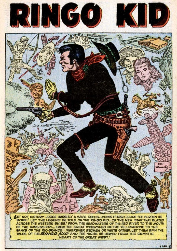
Notice the solid black costume, contrasted with the lighter outline treatment of the other drawings in the montage of figures and elements. This is clearly the model, which would inspire succeeding Ringo Kid artist Fred Kida, and later be the template for Kirby’s Rawhide Kid character design, shown here from RK#19.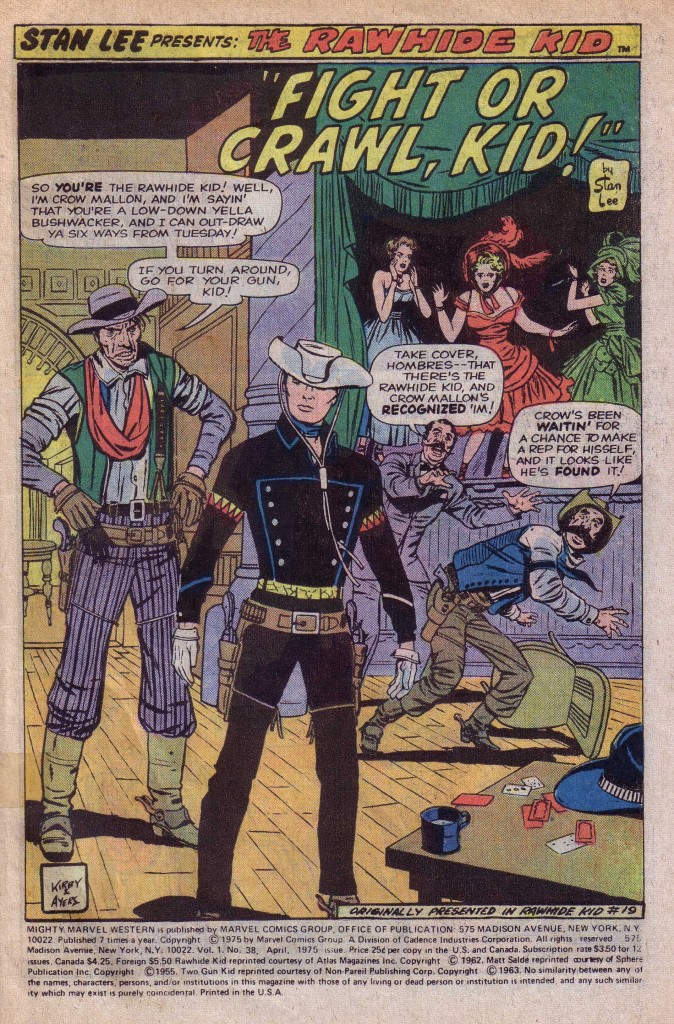
In this splash panel, Kirby uses the central foreground image of the Kid in nearly stark black silhouette, with a minimum of red, yellow and cyan blue trim. In contrast to the Ringo Kid’s black hat, Kirby gives his hero a white hat, emphasizing the importance of the head. This panel is a beautiful example of a deep space composition. In mid-ground behind the Kid are the gunfighter on the left and the cowering figures on the right, who further emphasize the hero’s prominence by their postures. The spotted black of the Kid contrasts with the black of the stage to the right containing the smaller background figures of the girls. This composition is yet another version of the Big O, in terms of the figures relationship to each other. The first figure you see is that of Crow Mallon, whose left elbow points to the Kid’s right shoulder. The eye follows the Kid’s black left arm to the cowering cowboy in the blue vest and then upward to the girl in green and around again to Mallon.
What happens on this page however is that the black of the stage mirrors the black of the hero’s costume, focusing the eye even more fixedly on the Kid’s figure. The blacks are beautifully balanced here. Although this page is inked by Dick Ayers, I am convinced that because of the importance of the costume’s effect on the composition, Kirby is spotting his blacks in pencil for the inker to follow.
In the following issue, #20, it appears that Kirby is providing less than complete pencils with desultory attention to details such as backgrounds. In chapter 2 of the Blackjack Bordon story, Kirby gives us a splash panel that is somewhat similar to the own shown above, but the differences are telling. 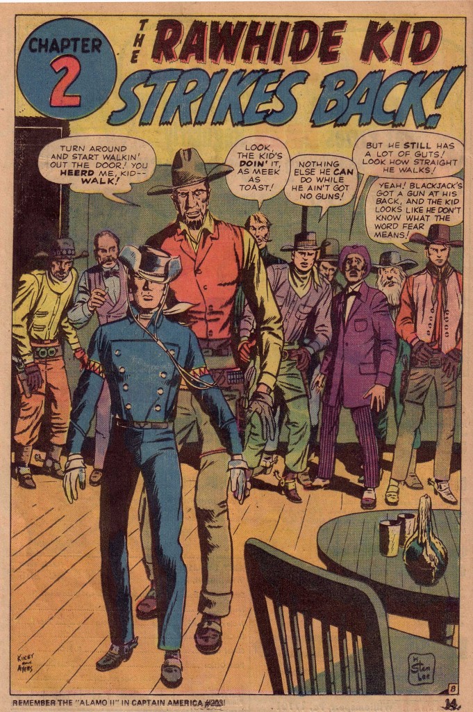
The first thing we notice is that the Kid’s costume is not solid black but only partially shaded and colored blue. The figure is strangely off center, is drawn less skillfully, and the lighter rendering makes it appear weaker as well. There are few instances of strong spotted blacks and those that exist are less logically placed. There is little background to speak of other than a portion of a door and the indication of a room that a line of figures behind Bordon and the Kid inhabit. The next issue is also not as strong as the first three of the series, with what appears to be more instances of looser penciling. Perhaps Kirby’s workload for those months was heavier than usual.
By issue #22, Kirby appears to return to giving the inker more complete pencils to follow, but in my opinion he does not realize the series’ full potential until issue # 28. Something then happens when Kirby begins to seriously play with the Rawhide Kid’s figure in a way that I have seldom seen done before or since in an action comic book.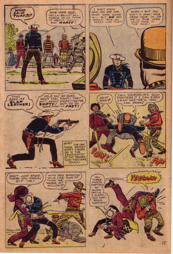
This sequence of panels from issue #32 is certainly one of my all time favorites, as the Kid confronts three devious assailants. The reader easily follows the black silhouette across and down the page to the last two panels where the Kid leans into the purple figure and tosses him over his shoulder. What follows is a fantastic example of action-to-action continuity, as the thug in the orange bowler hat, in the course of three panels swings and misses with the Kid ducking under the blows.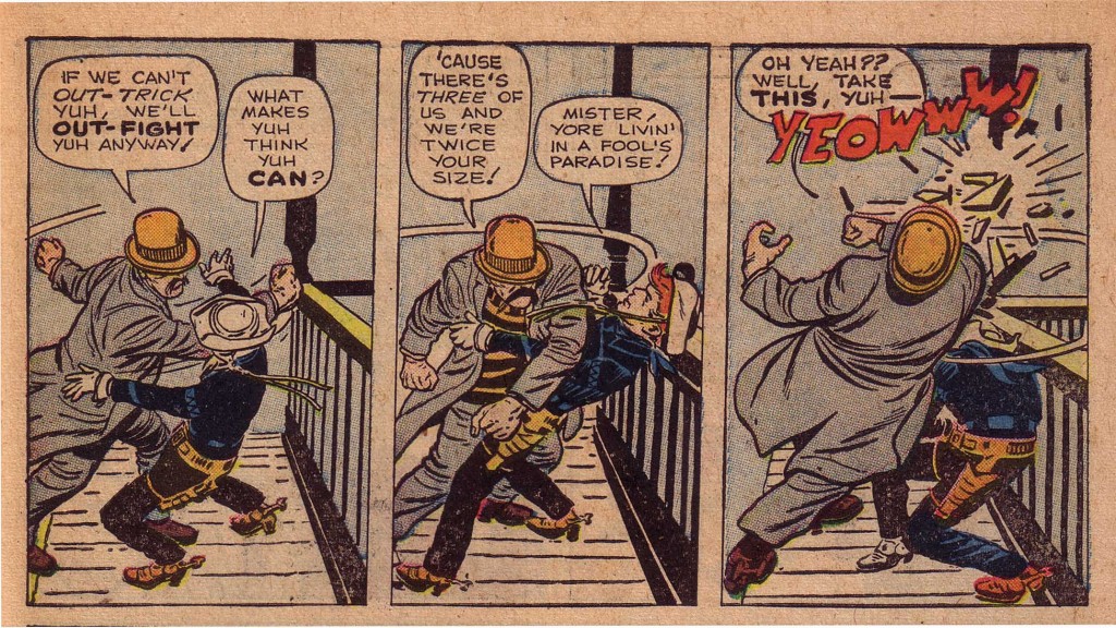
This 32nd issue of Rawhide Kid was on the newsstands in November 1962. Kirby must have hit his stride as an action/fantasy artist-writer during that period, producing with Stan Lee in that month, Fantastic Four #11, Journey Into Mystery #88 featuring Thor, Incredible Hulk #5, Tales to Astonish #40 featuring Ant Man and Strange Tales #105 featuring the Human Torch. The following month Kirby dropped art chores on the Incredible Hulk as well as The Rawhide Kid. The workload was clearly getting too heavy.
It was truly the end of an era, but also the beginning of a fertile period of creativity for Kirby and Lee, whose next several years of output would change the face of comics. Although that period would be rightfully hailed for the wonderment it produced, the period that saw Kirby explore action with the ink-black figure of the Rawhide Kid will always hold a special place in my personal artistic development.
Image 1-Ringo Kid #1 Joe Maneely, Stan Lee
Image 2-Rawhide Kid #19 Jack Kirby, Stan Lee
Image 3-Rawhide Kid #20 Jack Kirby, Stan Lee
Image 4-5 Rawhide Kid #32 Jack Kirby, Stan Lee
Special thanks to Michael Vassallo and Jim Vadeboncoeur for information and scans.


Hey Norris,
Did my comment on this post come through? FYI: I went ahead and emailed Dick the question. Not sure if he will reply but I’ll let you know if he does.
R-
Oops I guess my comment a few days ago didn’t make it. In a nutsell I said I think that second Kid figure from RK #20 might not be by Jack. Looks totally different from that dynamic Kid in RK #19. Might be a paste-up or something Lee had Dick Ayers redraw and ink. I emailed Dick and asked if he remebered anything about it. I’ll let you know if I hear from him.
Best,
R-
Oops, guess my comment didn’t come through before. In a nutshell I said I think that figure of the Kid from the RK # 20 splash might not be by Jack. It’s not as dynamic and disitictive as the Kirby Kid in the RK # 19 page. Maybe it’s a paste-up or Lee had Ayers redraw the figure and ink it. I emailed Dick and asked if he remembers anything about that page. He might, he might not. I’ll let you know if he responds.
– Rob Steibel
You write really interesting, the topics are great. I like this theme. For how long have you been blogging? How much time do you spend on it? I hope that I can use some of your opinions on my site. Yours, Ann
I’ve been blogging for several years now. I’d be happy to discuss this and other matters with you. What is your site?