With Captain America finally coming to the silver screen and being given the respectful treatment that he is due, including an origin set in the 1940’s, it seems apt to discuss the Captain as he was actually drawn and inked during that period. One of the best things about the film was the way that Cap was presented. Actor Chris Evans does a great job at being humble and wholesome, which is the way the character should be. “I’m just a kid from Brooklyn!” he says, when the Red Skull asks him what makes him so special.
Secondly, and perhaps even more crucial, because the scenes were shot for 3D viewing, the action comes from the inside of the screen out. This is of course perfect for a project based on a Kirby comic, because that’s what the King did best. The idea was always to keep the action coming in your face. Scenes like the runaway train, motorcycle chases and any fight scene always had that momentum. Circular tunnels or a sequence of girders were often used compositionally in a way to accentuate the perspective so that the feeling of acceleration outwards was present; something that Kirby often did with his comics. An early example of this is in the last panel of the page below from Captain America #8 circa 1941, where Kirby uses the arches of the castle’s ceiling to suggest a depth of field from which figures emerge. 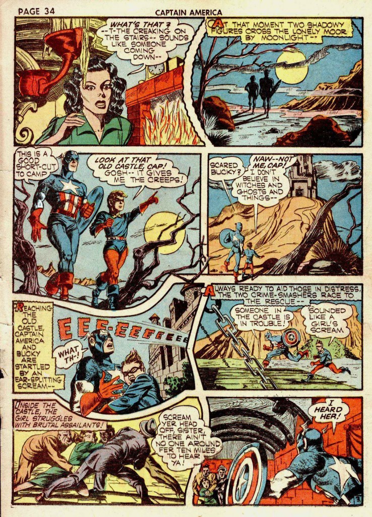
When Jack Kirby and Joe Simon presented Captain America to the world, Kirby was far too busy to do much more than the splash pages for the stories and generally rough drawings for the main body of the stories. The duo employed a stable of competent artists to finish and finally ink their production pieces. Two of the most competent artists thus employed were Al Avison and Syd Shores. This particular page, reprinted as a faint background image behind a photograph was my first exposure to golden age Kirby. The image was used in a 1964 issue of Screen Thrills Illustrated, showcasing the Captain America movie serial. I was fascinated by the vague artwork below the photo of the screen Cap who was pointing his incongruous revolver at some target outside the frame. It seemed like a window into a mist shrouded past that I couldn’t quite reach.
Most of the drawing here was clearly done by Kirby, but the inking was by Al Avison, who took over penciling chores from Kirby when S&K left Marvel. In the late 1960’s, Syd Shores returned to Marvel to ink Kirby’s Captain America. Shores had inked Kirby in 1941, Avison in 1942, and took over the pencilling chores from him in Captain America #20. Shores adopted some of Avison’s stylistic quirks such as the latter’s uniquely bulbous rendering of kneecaps. Shores’ 1960’s work was so clearly retro that it stood out markedly from Kirby’s more conventional inkers, such as Chic Stone and Frank Giacoia. Recently, Rand Hoppe posted a series of Kirby’s Captain America pages inked by Shores, along with the original pencils to allow for a fascinating comparison. Few inkers have been allowed the degree of latitude that Shores has here. He had obviously been told that the retro 1940’s feel of the style was desirable and he pulled no punches with his embellishments.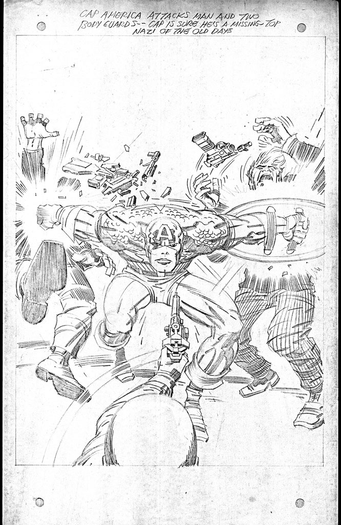
First, observe the original pencils of this opening splash page above, as Captain America explodes forward, bashing opponents with his shield and the sweep of his right arm. Kirby’s pencils are tight. He spots his blacks and leaves very little room for interpretation, unless one chooses to deliberately ignore his line’s intent.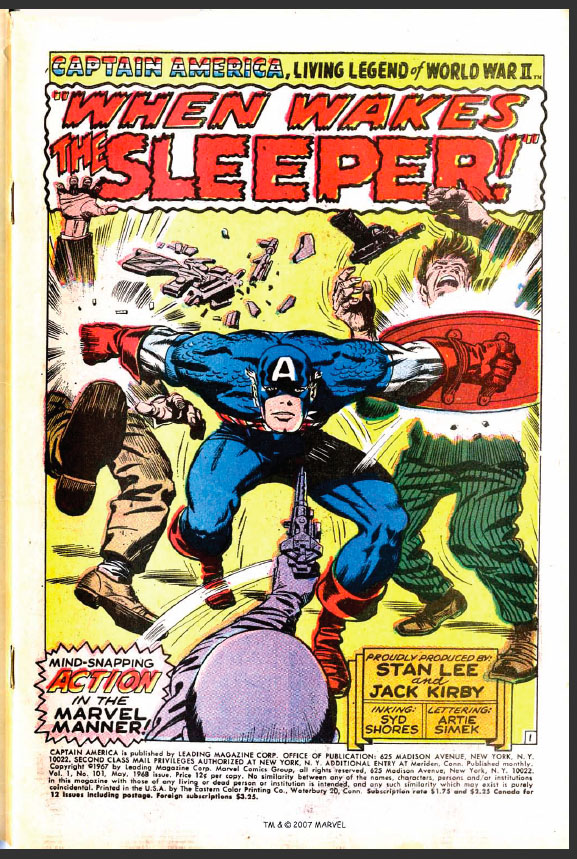
The first thing we notice is that Shores alters Cap’s face, making it rounder, yet also more elongated and somewhat devoid of the grim purpose in the expression in Kirby’s pencils. The face very much resembles the way Shores drew and inked Captain America in the 1940’s. As many inkers have a tendency to do, Shores rounds out the angles of Kirby’s art. This is readily apparent in Cap’s right kneecap, which is actually a signature of Shores’ style. This was as I mentioned earlier a trait that he seems to have picked up from his period of inking Al Avison on Captain America.
We can also notice a very nice feathering technique around Cap’s musculature and the fact that Shores’ shadows are heavier, such as the total blacking out of the area of Cap’s groin and upper left thigh. Shores also rounds the hands of the assailants, giving them nails and making them more anatomically accurate. The raised right hand of the thug on the left is particularly nice.
On this flat out action sequence below, we can observe many more interesting details. If we look at the pencils, we see that Kirby has done a fair share of black spotting, but his lines are not extremely tight. It is a nearly complete pencil job, but it suggests that certain areas may need finish. 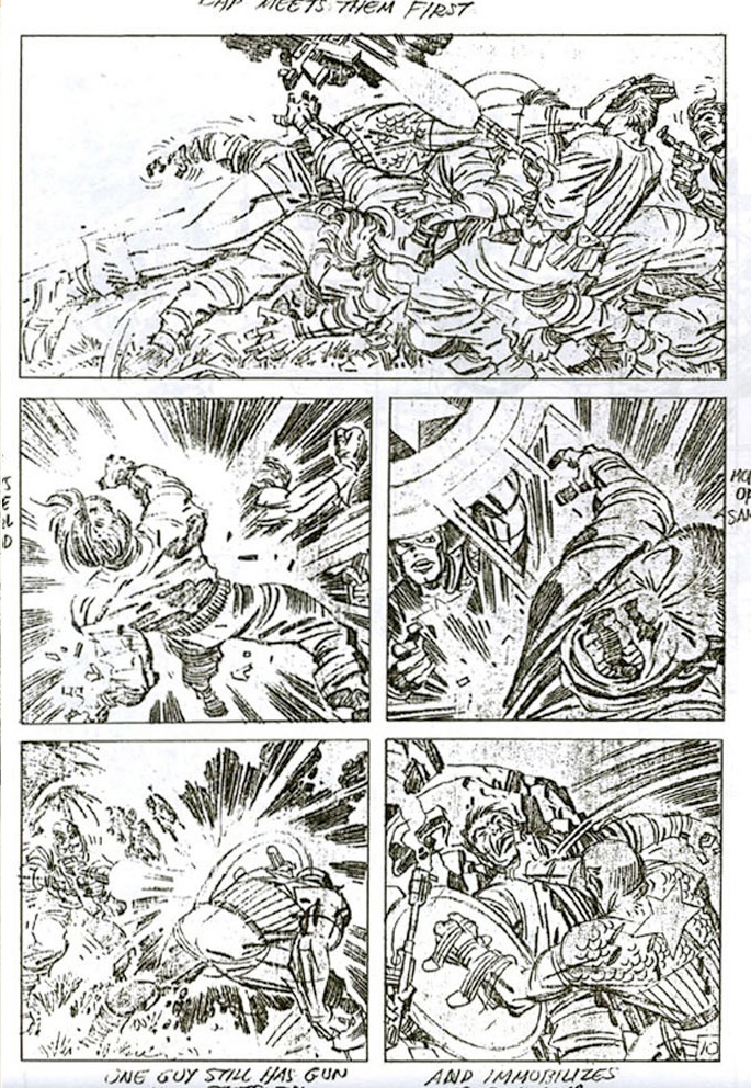
The first inked panel is gorgeous, as Captain America slams into a gang of soldiers. Shores does a nice job punching up the crease lines in the various uniforms. Panel two is a different story, as in my opinion the inker goes a trifle to heavy on the blacks. This is perhaps Shores’ most pronounced weakness, and in many instances it is his unawareness of how the art will eventually reproduce that is a problem. For example, the adversary that is being hit by Cap’s shield in panel three is inked beautifully, with fine delicate feathering on his contorted face. 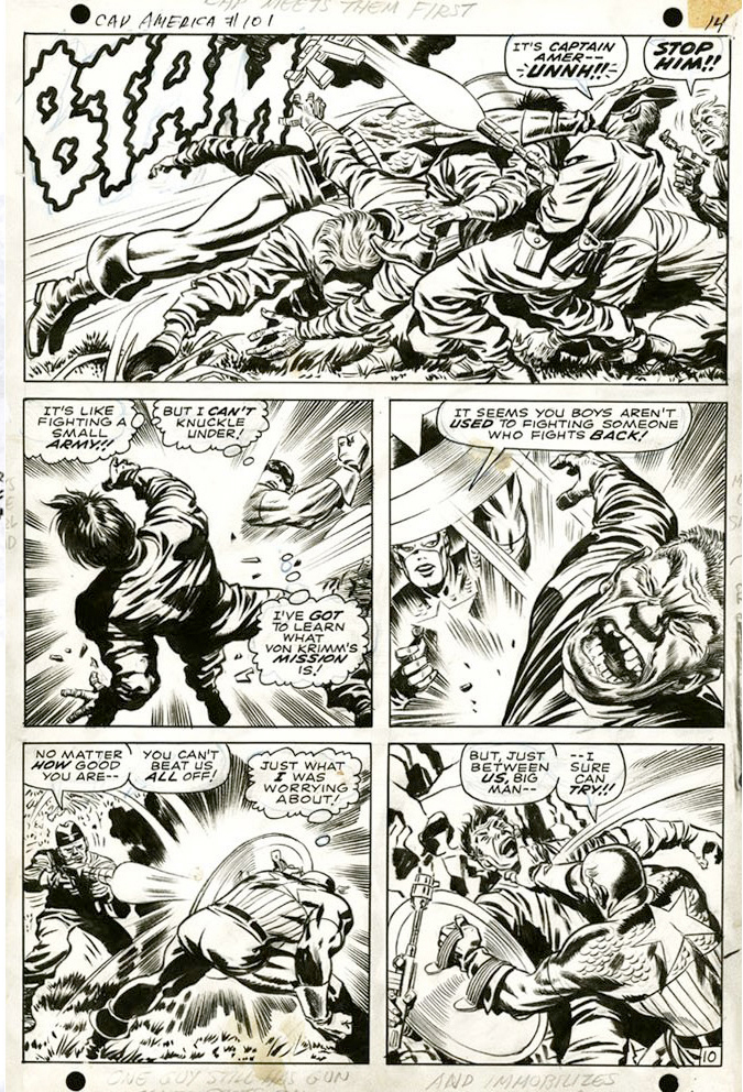
The problem is that when this line-work is reduced and colored for the printed comic, it has a tendency to become blurred. Shores also has a tendency to make the villains’ faces even more grotesque. The shield struck soldier in panel three almost looks like a stereotypical caricature of an Asian rather than a Nazi.
What makes this third panel so wonderful compositionally is that the curve of Cap’s shield picks up the sweep of the force lines in panel two, making the blow’s impact more powerful.
Panel four works well, but five is again a bit heavy on detail. Shores adds some unnecessary blacks to Cap’s shoulders and botches the strong black spotting that Kirby has placed in the rocks behind the Nazi’s shoulder.
Through the years, I’ve observed that reactions to Syd Shores’ inking of Kirby vary widely. Some enjoy the retro flavor of his style, while others find it heavy handed and intrusive. I for one enjoy the opportunity to see Kirby rendered by someone that gives his work that flavor of a bygone golden age. Whatever problems I have with Shores’ technique are offset by my enjoyment of his unique style
Image 1-Captain America #8 Joe Simon and Jack Kirby
Image 2- Captain America #101, pencils Jack Kirby
Image 3-Captain America #101 inked and colored, Jack Kirby, Stan Lee, Syd Shores
Image 4-Captain America #101, pencils, Jack Kirby
Image 5-Captain America #101, inked, Jack Kirby, Stan Lee, Syd Shores


I’ve always felt that Shores’ inking really ruined Kirby’s art — and this was some great Kirby art, too. If you’re going to revise the pencils that much, and add “fine feathering” to Kirby pencils, you better be Bill Everett, Wally Wood, Neal Adams, or someone equally good. And how can an inker not be aware of how the art will reproduce?! But it’s interesting to hear another point of view, and learn a bit about where he was coming from.
Interesting to imagine that an inker as experienced as Shores would not realize how his art would reproduce. As I’ve said, I enjoyed his style to some degree, but agree that it was over the top.