One of the most entertaining comic book stories I’ve ever read appeared in Fantastic Four #92, entitled “Ben Grimm, Killer”. It was a tale in which The Thing was trapped on a shape-shifting alien Skrull planet, where the inhabitants were pretending for some strange reason that they were living in a depression era Chicago run by Hollywood style gangsters. This gave Kirby a chance to feature some of his most bizarre and colorful versions of mob kingpins as well as scores of intergalactic monstrosities.
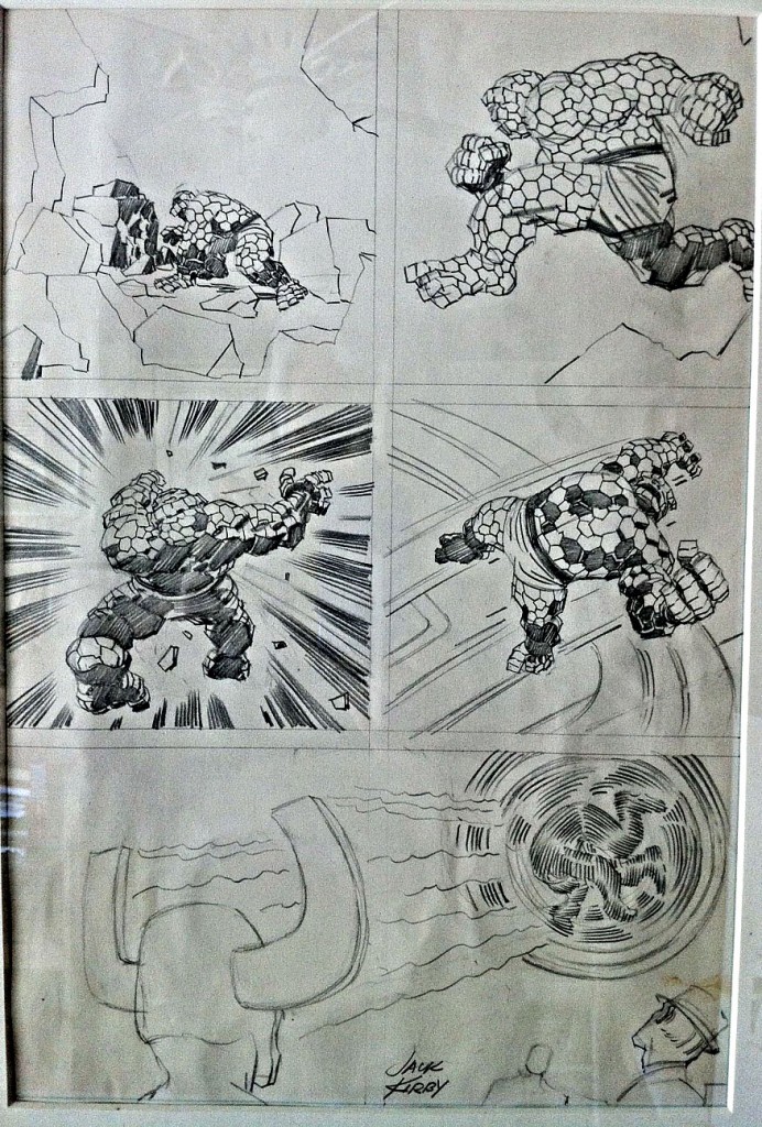
One of the posters on the Jack Kirby discussion group, John Coyne recently presented an original Kirby penciled page to the group. Kirby had discarded the page for some reason, and John was asking if anyone knew for which issue it had been done. Another poster, Glenn Edwards identified the source of the page as being from the story, “Ben Grimm, Killer.” As John was kind enough to allow me to feature the page here, this is a wonderful opportunity to compare the discarded page to the published version and peer into the inner recesses of Kirby’s creative process.
Initially, what strikes me most about this page, without comparing it to anything, is that it is composed mostly of middle-ground shots of the Thing, first standing, then running and finally being struck by some sort of force. The camera then cuts to a foreground shot of a helmeted character spinning someone in the air above several onlookers. The sequence is well drawn, but not particularly exciting, mostly because of the fact that the Thing is alone in most of the panels, approximately the same size and it is not clear what sort of threat he is facing until the final panel, where it is not even clear that it is him spinning.
Kirby was known to vary the size and angle of his figures from panel to panel, generally because it created more drama. Unless he was doing an action-to-action sequence, specifically emphasizing continuity of movement, the artist would usually follow a close-up with a medium or long shot.
Based on the design of the helmeted figure. Glenn quickly deduced that this was a minor character called Magno-Man, whom the Thing was briefly pitted against in FF#92. Then, after I initially submitted this blog entry, I received communications from Craig M. and Greg T., both suggesting that the discarded page was designed to fall between pages 4 and 5. If we look at the quality of the published sequence, we see why Kirby has made the decision to discard the penciled page.
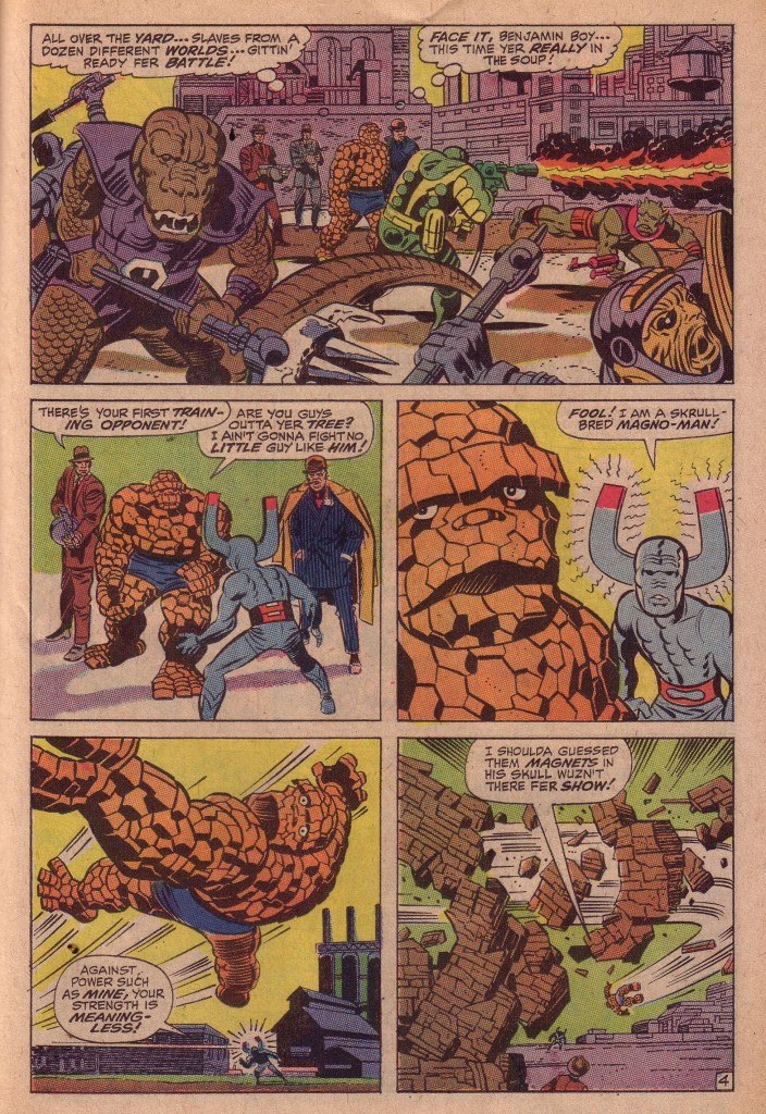
In the first panel, we see the Thing surrounded by a group of threatening aliens in an urban landscape. The head of the saurian creature on the left is at the same level as the central background figure of the Thing, and the straight edge of a concrete structure brings our eye from the creature directly to the orange hero. The creature’s tail and the barrel of a weapon bring us down to an overhead medium shot of the Thing facing Magno-Man in panel two.
Next we see a close-up of the Thing’s head, with Magno-Man smaller on the right. This is followed by a larger mid-ground shot of the Thing propelled diagonally and rightward through the air, and finally we see his tiny figure crashing through a brick wall and swerving off into the distance. Compared to the relative sameness of the panels in the penciled page, Kirby has given us masterful sequence, composed of a variety of contrapuntally sized figures and objects.
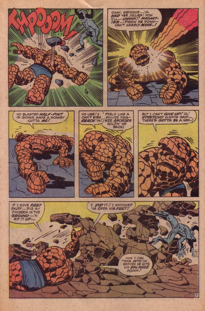
Kirby knows, as the cliché goes that variety is the spice of life. Observe the composition of the following page, as the Thing counters Magno-Man’s attack.
Panels two through four show us similar mid-ground shots, but they are action- to-action frames, showing close continuity as the Thing pushes his way through Magno-Man’s force field. Panel three’s Thing is slightly smaller than that of panel two, but the hero’s figure then gets progressively larger and becomes a close-up in panel five. Panel six switches to a medium-long shot as the Thing rips up the pavement to topple Magno-Man.
Here again, Kirby’s creative process is in the Zone, unlike the uninspired work that he has done in the rejected pencil page. Unfocussed there, he is now fully aware that the visual choices he is making are the optimal ones for kinetic storytelling.
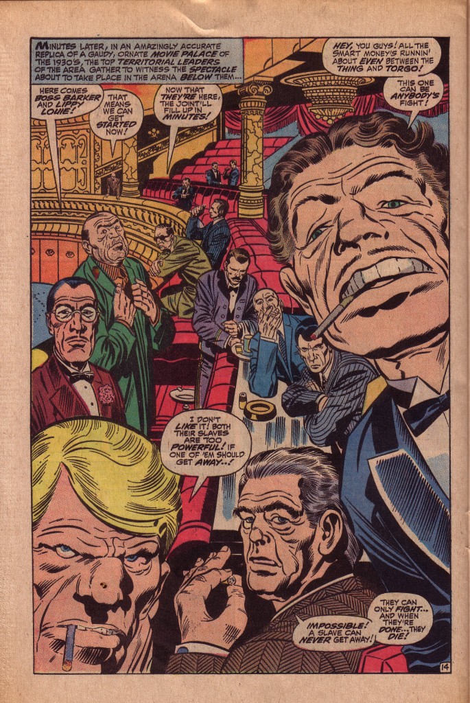
For me, the bravura page is this single panel wonder set in the mobster arena, as the Skrull gangsters leer in anticipation of the brutal games they’ve arranged.
The sweep of the lavish balcony carries the viewer’s eye through a succession of figures that grow in proportion as they eventually become grimacing close-up portraits of debauched greed and sneering evil.
Kirby uses the curved balcony as a space-time continuum, a compositional trick that he has mastered. The figures speak more or less in the order of their size and arrangement on the balcony. Interestingly, because of a second circular composition created by the gangster’s heads, the most prominent gangster, placed in the upper right speaks before the smaller heads to his left.
So we see that while the King is capable of occasionally faltering, we also see here is that he is also capable of recovering, shifting gears and regrouping. In this case, Kirby has nearly completed a page and realizing that it is not up to his standards, he has taken the time and effort to completely re-conceive the sequence. This illustrates the care and consideration that the man obviously puts into his work.
Image -1 Jack Kirby original art owned by John Coyne
All other images from Fantastic Four #92, Jack Kirby, Stan Lee, Joe Sinnott
Thanks to John Coyne and Glenn Edwards for their insights and contributions.

