One of the first things we notice when studying Kirby’s work is the power of his line. Whether you like his art or not, very seldom do you see anything superfluous in a Kirby drawing. The line is the essence of force and energy and Kirby’s is nearly always direct and to the point. As a result of the discovery of a hidden cache of stats that Kirby made of his original pencils, we are able to witness the extraordinary boldness of his original line, unaffected by an inker’s style. Note the dynamic slashes that render the muscles in Thor’s arm in the second panel. Even when considering Kirby’s most faithful inkers such as Mike Royer, it is obvious that the line quality is altered by brush or pen.
The name Jack Kirby usually conjures images of explosive action, and it is true that few artists have handled the figure in motion so well. The amazing thing about the King is that even when in repose, his figures have an unusual vitality. In the panel below, the spy Igor is merely reclining on his bunk, but Kirby’s forceful line and foreshortening give the figure a sense of looming menace. In this instance inker Paul Reinman’s confident brushwork and strong black spotting accentuate the panel’s drama. Reinman’s inking of Kirby is not always so satisfactory, but here, in the first issue of the Incredible Hulk, the inker does a beautiful job.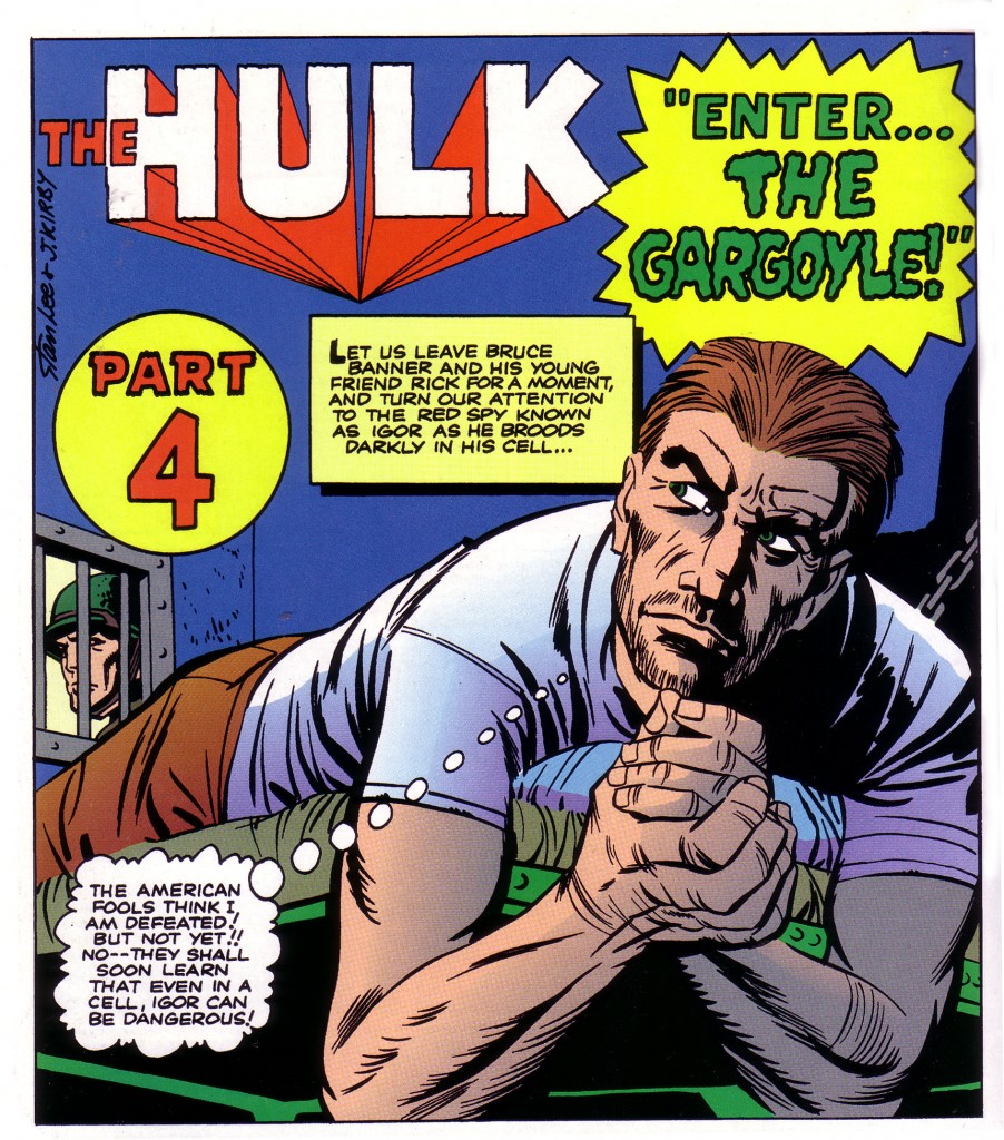
This is a deceptively simple panel, with the figure predominating. A portion of a bunk bed, a small section of barred window and wall, and the semi obscured face of a guard give us a total sense of a cramped prison cell and its sinister prisoner. Kirby’s genius is clearly evident in conveying an environment and implying its ominous mood with brilliant economy.
It is difficult to overstate the point that great deal of responsibility falls on the inker to interpret the artist’s pencils. Some inkers work hard to be as faithful as possible to the original art they are rendering. Others willfully impose their style and are often expected to do so. Several inkers tend to assert their personalities with a profusion of fancy line work. One such artist is Barry Windsor Smith, whose style is reminiscent of the mid 19th century Pre-Raphaelite painters. Smith’s art is quite striking and decorative. He has incorporated a good deal of the power of Kirby’s dynamism into his own stuff, and it is a compelling combination of styles. Smith has even occasionally inked Kirby, and the result is nice, but peculiar. Smith’s brushwork seems a bit too ornate. Still, it is beautifully done, even though it has a good deal of the inker’s personal flair.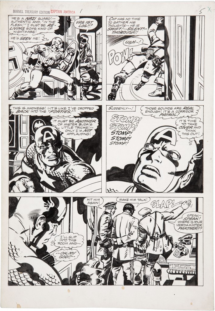 Once one is accustomed to a particular inker’s style, it is easy to see how it affects the penciler in question. For example, artist, Don Heck has built a successful career with a beautifully illustrative style, which relies heavily on finely etched lines. He has inked Kirby on several occasions, but he is least successful in my opinion when he attempts to feather Kirby’s bold stroke.
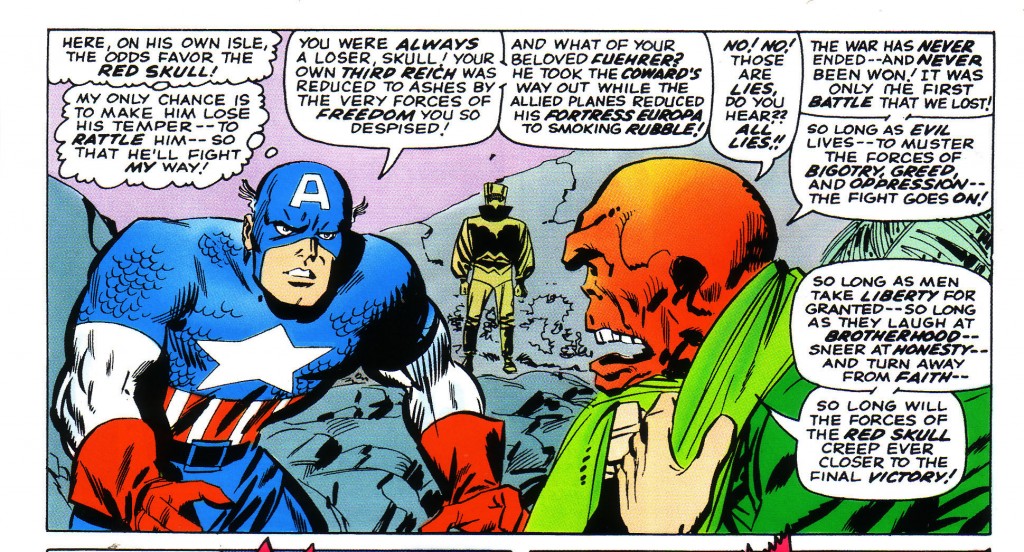 Notice the detail throughout the drawing of scratchy and brittle line work. Cap’s left bicep and forearm and the Red Skull’s profile lack the solidity and forcefulness generally evident in Kirby’s pencils. Contrast the scratchiness of line with the drawing below, which is inked by Frank Giacoia, one of Kirby’s more forceful inkers and a powerful black spotter.
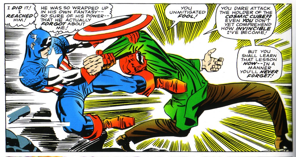
Where Heck’s line makes Kirby’s musculature look puffy and ponderous, Giacoia’s renders Captain America’s figure in bold, self-assured slashes of his brush. There is no feeling of hesitancy in the interaction between the two antagonists. Granted, this is a more dynamic drawing, but that doesn’t entirely explain the difference. The proof is to be found in the Skull. In comparison to Heck’s ineffectual rubbery mask look, Giacoia’s inking of the Red Skull’s leering visage is a masterful execution of bold rendering. One gets a sensation of jagged bone instead of putty in the deeply etched protuberances. One can also see a marked difference in the way the two artists ink the Skull’s scarf, with Giacoia again more effective.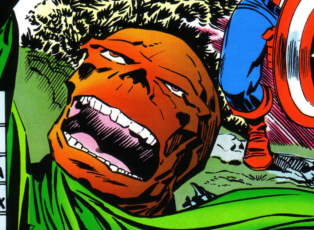
In all fairness to Don heck, he has had occasion to ink Kirby beautifully, as in the series of presentation drawings that the King made for the New Gods. I am merely using Heck as an example of what I see as a mismatch of styles. As I’ve stressed several times, the slightest alteration in the line’s quality can render the line less effective, and Kirby is most powerful when one follows the power of his line as faithfully as possible.
1-Thor pencils by Jack Kirby, text Stan Lee
2-The Incredible Hulk #1 Jack Kirby, Stan Lee, Marvel Masterworks
3-Captain America’s Bi-Centennial Battles, Jack Kirby, Stan lee
4-Tales of Suspense #80 Jack Kirby, Stan Lee, Marvel Masterworks Captain America volume 1
5-Tales of Suspense #81 Jack Kirby, Stan Lee, Marvel Masterworks Captain America volume 1
6-Ibid

