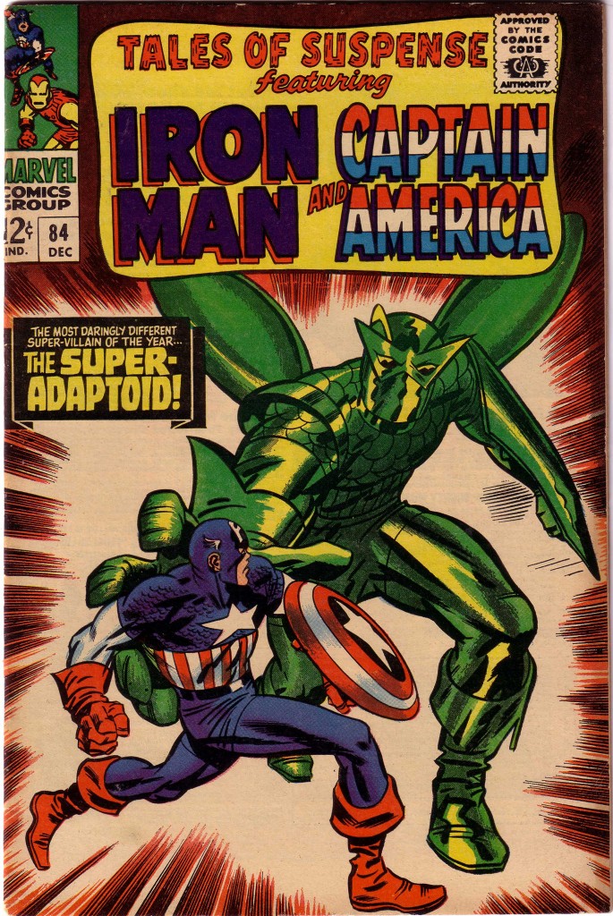
In dealing with Jack Kirby’s artwork, one of the things that I continually stress is his facility for placing his figures in optimal spatial relationship to one another. It is one thing do draw a dynamic, well-proportioned figure, but entirely another to place it in composition with a background or with another figure. Tales of Suspense #84, featuring Captain America is a comic book that is full of wonderful examples of this. If we start with the cover, we see Cap facing off against the Super Adaptoid. Actually, I probably should not use the words face off, considering that most of the hero’s body is turned, in Kirby’s best dynamic torque positioning away from the Adaptoid.
This essential technique is what supplies the dynamism in the piece. If we revisit the theories of artist and teacher/lecturer Burne Hogarth discussing volume structure in three dimensions, we will see that he focuses primarily on two shape masses in the figure to stress dynamism. These are the masses of the rib barrel and the pelvic wedge. What Kirby does better than nearly everyone is to stress the contrapuntal movements of those shapes, combined with the positions of the head and limbs. On this Tales of Suspense cover, Captain America’s pelvis and legs are in profile moving to the right and his rib barrel is twisting forward towards us, while his face and shield on left arm are turning towards his foe. Without the Adaptoid figure, Cap could be perceived as simply running right ward, but in relation to his foe, he seems to be defending himself while possibly preparing to deliver a right cross.
In contrast, the Adaptoid is unquestionably moving menacingly towards Captain America, with his immense right hand preparing to envelop the hero. Nearly all of the shapes of his massive body are framing, blocking and overwhelming Captain America. In doing so, the Adaptoid’s shape is also bringing the eye on Captain America as the focus of the composition.
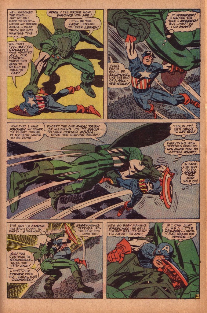
Inside the book, the story accelerates to climax in a fantastic battle in the sky, as the Adaptoid sweeps Cap up and carries him high aloft. Kirby emphasizes the size of the Adaptoid and Cap’s apparent helplessness thousands of feet in the air. Cap is dwarfed in the second panel by the Adaptoid’s huge fist and leg as he is dangled above the Manhattan skyline. In the third panel, the monster’s foreshortened foot and calf burst from the left of the panel as he drives Captain America across the width of the page.
This conflict is a set up for what I feel is one of Kirby’s bravura sequential moments. If Kirby’s strength is the relationship of figure to figure, he is equally strong in his placement of the figures in relation to the background, which in this case is the earth far below. When the battle concludes, Captain America must survive a fall from a prodigious height.
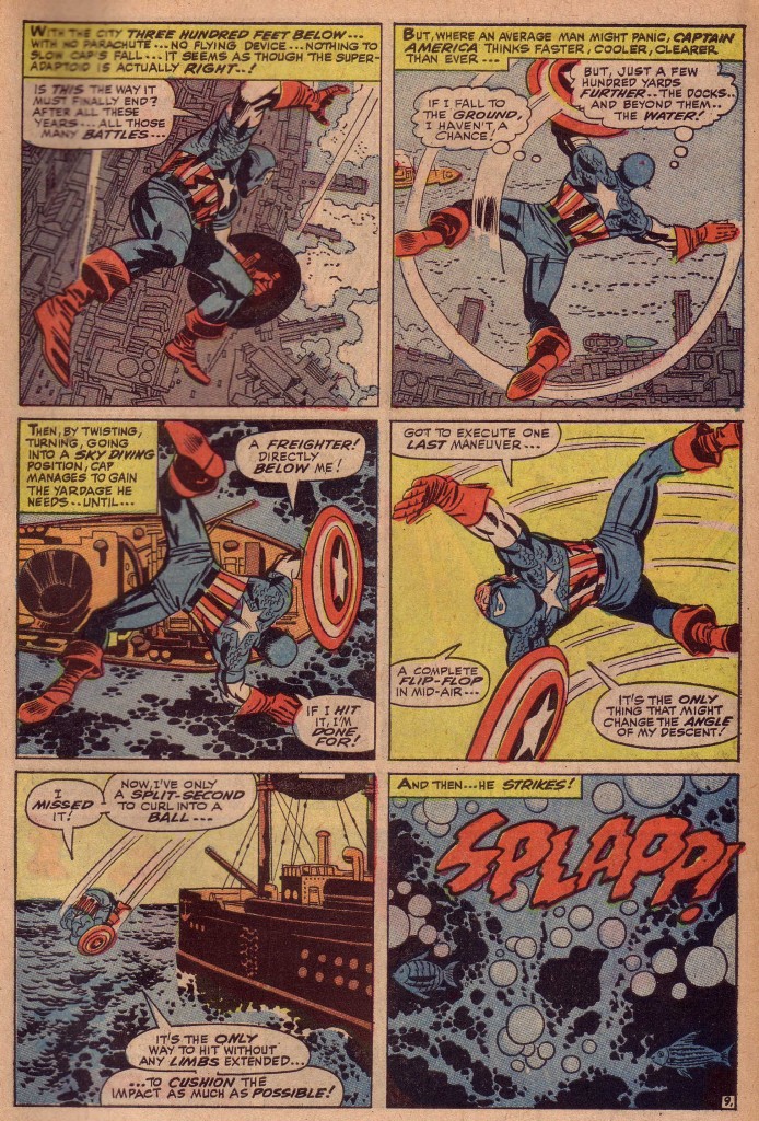
In the first panel of this page below, we see him falling towards a waterfront area of the city. The angle of his body, including the exaggerated size of his right arm and leg brings the eye to the spotted black of Cap’s shield, which gives the figure weight and gives us a sense that he is dropping quickly. The shield’s circular shape is repeated in the circles on the ground below, which also give the figure a more downward trajectory. Cap’s right hand and his shield are gesturing towards the area of water on the right, which as we see in the next panel is the object of his attention as he attempts to maneuver over it.
Panels two and three are similar in that we see Captain America’s back as he falls, but in the third panel, the ship that was previously in the distance is suddenly looming dangerously. What I’m stressing here, which may appear self-evident is that the size and spatial arrangement of the elements of the panel’s compositions are crucial to their effectiveness. Apparently simple decisions that Kirby makes from moment to moment show us the genius of his thinking processes.
Kirby’s cityscapes as well as his fantastic machinery all serve a vital purpose in upping the ante of his dynamic storytelling. Something as seemingly minor as the positions of the docks protruding into the water are indicators that reinforce the tension of the composition.
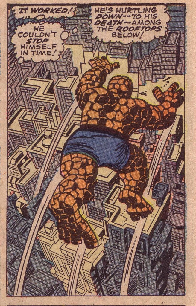
I will finish here with another of my favorite examples of a figure whose intent in the composition is completely determined by the background elements. In this panel from Fantastic Four#69, the Thing has leaped from a building and is seemingly suspended, spread-eagled over the canyons of New York. It is almost comical, in the way that Warner Brothers cartoons often have a character running several feet off a cliff before he falls.
It is the beautifully sculpted perspective of the buildings below the Thing that insist that his suspension is only temporary, and he will quickly fall. Even the artfully positioned black spotting on the Thing’s right side leads the eye down to the shadows on the right side of the building which travel to the bottom right side of the panel.
The amazing thing is that this is just a relatively small panel in the context of the story, and yet Kirby goes to the trouble of creating this incredible deep space cityscape background. That is what sets the King apart from the herd.
Image 1-3 Tales of Suspense #84, Jack Kirby, Stan Lee
Image 4- Fantastic Four #69, Jack Kirby, Stan Lee

