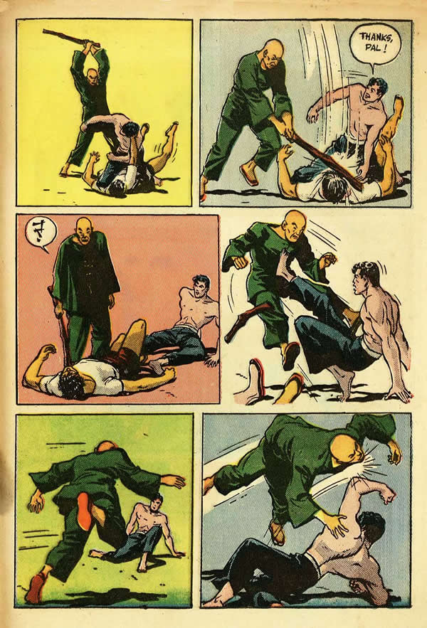
When discussing his influences, Jack Kirby often spoke about Milton Caniff as an artist who had a significant effect on his development. Knowing only a bit of Caniff’s style, I never really saw the influence, until Kirby list member Glen Story posted a page from Terry and the Pirates that had a particular approach to the sequencing of a fight scene.
Seldom do we see this sort of thing in a comic book or strip, possibly because it is a luxury for an artist to devote so much panel story space to something as seemingly frivolous as a fight. There must be a strong desire on the part of the artist to create something cinematic in the way of action, and what could be more exciting than a good rousing slugfest.
In the first panel, the Asian attacker comes at Terry with a club raised overhead. In the second panel, the camera or artist’s point of view remains the same with a slight zoom in for the downward striking action that Terry avoids. It is only in the fourth panel that the camera position changes slightly to Terry’s back as he kicks his assailant. In the fifth panel, the POV shifts again to the Asian’s rear as his runs towards Terry, and finally in the sixth panel it moves behind Terry as he delivers a smashing left to his attacker’s jaw.
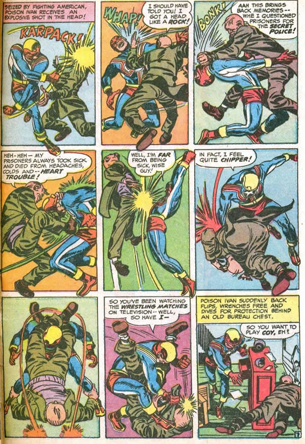
Kirby, seemingly influenced by Caniff, would take this cinematic sequential storytelling technique to heights un-scaled by any other draftsman in or out of comics. I’m sure that there are earlier examples of him doing so, but this page from Fighting American #3 is one of the first that I am aware of that takes this sort of continuity about as far as it can go.
Kirby barely changes his point of view in this action to action sequence, except in order to lead the eye through the series of panels. He starts with a framing that will enable us to see the full length of his figures, going from left to right as is customary in reading comics. Fighting American strikes the Russian who rears back, as his angle and the corona of the blow lead us to panel two, where the figures are turned slightly so that the Russian’s back is to us. In the third panel, the Russian is striking downwards and to the left in order to lead our eye to panel four. Notice that in that panel, the POV reverses to the other side of the action, so that the Russian can kick Fighting American to the right. Our hero doubles over and his position accentuates the arch of the Russian’s body in the fifth panel as he is lifted into the air by Fighting American’s two fisted punch. The downward blow in panel six by Fighting American sets us up for the next medium shot from the front, as the villain tries to capture the hero in a leg lock. Fighting American eludes the hold and smashes down and to the right to end the fight sequence.
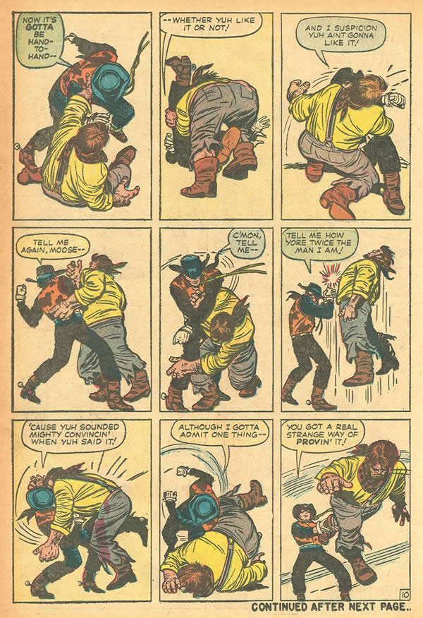
When Kirby returned to Timely/Marvel in 1959, he went to work on several Westerns, including a revamped Rawhide Kid. Here, he seemed to enjoy putting the Kid through his paces in a series of fight scenes that strongly resembled this Fighting American page. I covered the subject partially in an earlier blog, (Rawhide Kid, the Black spot) but this page from Two Gun Kid #-62 tops them all in Kinetic wonderment.
Kirby holds the camera position throughout this nine panel bout. One obvious aspect of this encounter is the superior bulk of the Kid’s opponent, and Kirby uses this discrepancy to great effect. In the second panel, Moose appears to overwhelm the Kid with his mass, almost completely obscuring him, but in the next panel, the Kid beats him back with a right.
What is amazing about this panel is that all we see of the Kid is his fist, a portion of his hat and his left leg. The effectiveness of this composition relies on the reaction of Moose’s body driven back by the force of the blow. The juxtaposition of limbs and torso delineates the action completely.
Again, this is a fantastic example of what Scott McCloud refers to as an Action to Action sequence in his book, Understanding Comics. Each panel is nearly a follow through of the action depicted in the previous shot, and it flows as kinetically as a live action film.
Again, Kirby uses medium shots of the full figures of the opponents, and utilizes the predominance of black in the Kid’s costume to support the structure of the compositions.
Notice how in panels four and seven, the solid black of the Kid’s legs anchors the ponderous weight of Moose Morgan. Although smaller of frame, the Kid’s black shape dominates nearly every panel as he punishes his foe in this uneven contest. As with the Fighting American page, Kirby omits any background features in order to showcase the action.
These pages clearly show why Kirby’s work is often described as cinematic, and how he may have emulated this style of sequential storytelling used by Milton Caniff.
1 – Milton Caniff, Terry and the Pirates 1936
2 – Joe Simon and Jack Kirby, Fighting American #3 scan provided by Allen Smith
3 – Jack Kirby and Stan Lee, Two Gun Kid #62


This technique became less common in Jack’s pencilling as I think it was difficult to find dialogue to populate the panels. You rearly see this type of thing in Marvel books, though Kirby would returnto this technique for dialogue in his later years.