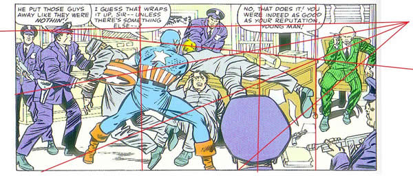
In this forum, I’d like to spend a bit more time discussing deep space. This term, as we have seen, refers to the use of structural elements in a composition that create the illusion of three dimensions on a two dimensional surface. The most significant tool for achieving this illusion is perspective. Most commonly, the artist draws a horizon line or vanishing point and arranges his figures along receding lines called orthogonals that converge at the vanishing point. An example of this would be a set of train tracks that appears to join at the distant horizon. In this Captain America panel, the orthogonals are the planes of the desk, which meet at the horizon line which is just above Cap’s head.
Kirby uses the figures on the left to lead the eye to Captain America.
Cap’s right shoulder directs the eye to the figure draped over the desk, whose position emphasizes the edge of the desk leading to the seated figure of the warden at extreme right who is the panel’s focal point. Kirby also uses the size of the overlapping figures to create the illusion of deep space.
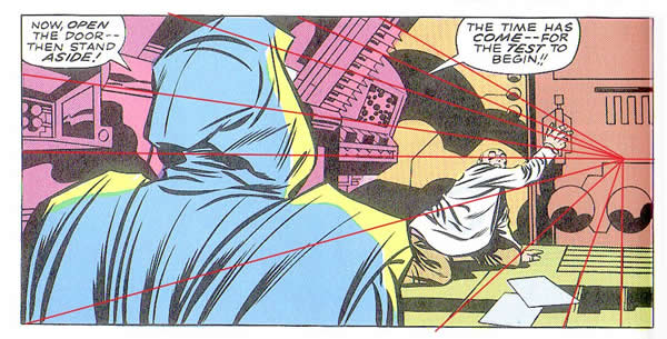
This technique is extremely effective when setting mood for some of the simplest panel compositions. For instance, this panel of Dr. Doom menacing a subordinate clearly creates a claustrophobic techno space. The orthogonals of the equipment hem the cowering figure in completely. Kirby is not a stickler for precision when it comes to perspective. Often the orthogonal lines to his vanishing point don’t line up perfectly. He gives us just enough of a suggestion to create the illusion of space. Just as he doesn’t rely too heavily on anatomical correctness in his figures to the detriment of their dynamism, he also never lets perspective overrule the impact of his drawings. For example, in the case of this particular drawing, the orthogonals do not converge on the cowering figure at the right, but the effect is still successful because the shapes of the machinery at the vanishing point lead the eye back to the figure.
Linear perspective in painting was essentially invented in 1413 by Filippo Brunelleschi. As the Renaissance unfolded, various artists refined the techniques he’d introduced. The complex compositions included elements in the fore ground, middle ground and background, and their spatial relationships to one another were determined with minute precision.
Deep space is also often discussed in relation to film. In its infancy, the art of film making was closely aligned to stagecraft, in that shots were framed very much in the limited way that a stage is presented to its audience. Viewed as a panorama, the stage is set in such a way that the actor’s positions are blocked out to prevent them from overlapping each other, enabling them to be seen by the theatergoers. Gradually, cinematographers acquired camera lenses that permitted them to keep background and foreground elements in focus simultaneously. As a result, one could film actors at greater distances from one another as well as including background elements.
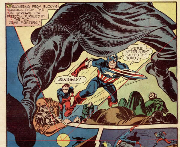
Early comic books usually used simplistic middle ground shots with very little experimentation. Kirby, an avid filmgoer who studied movies for artistic techniques as well as inspiration, began to incorporate what he had seen and internalized into his earliest work. He began to design his panels for maximum impact as in this large panel from Captain America #7, circa 1942. The extreme foreground figure of the Black Toad has virtually leaped out of the page and into your face. The orthogonal lines of the room lead backward accentuating the momentum of the forwardly mobile pose of Captain America. Bucky runs behind, pushing Cap forward and the supine figures draped below give him further momentum. The fact that the vanishing point is well below the panel border also gives Cap even more upward thrust.
Kirby is rightfully famous for this sort of forced perspective. Generally, the more he utilized background and foreground elements to create a three dimensional space, the more successful was his use of forced perspective.
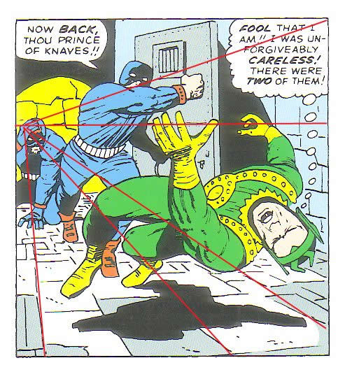
In this panel from Journey Into Mystery #118, Loki is being buffeted across the length of his cell by an Asgardian prison guard. His position between the horizon line and the orthogonals of the floor insures that he is moving fore ward and outward with maximum force.
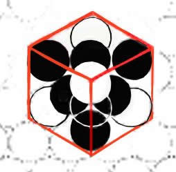
Something else to notice in this panel is that Kirby has created a sort of three dimensional grid, using the stones on the walls and floors, which create coordinate points from floor to ceiling in panel space. This is a good way of breaking up space into intervals called lattices so that the figures and objects seem optimally placed in the panel. A lattice is a mathematical physics term referring to a regular, periodic configuration of points, particles or objects throughout an area or space.
If we look at this diagram, we can see how the spheres in the cube occupy the space. The area that each sphere takes up is a lattice. Similarly, we can break up Loki’s cell into a series of coordinate points from wall to wall and ceiling to floor that create a sort of framework. We can see how the choices that Kirby makes in the placement of even minor portions of his figures and objects within the framework may impact the entire drawing.
This degree of compositional precision goes a long way in creating realistic, dynamic deep space compositions.
By using the planes, curves and edges of objects, Kirby can create a ballet of swirling kinetic energy that focus the eye precisely where he wants it to go.
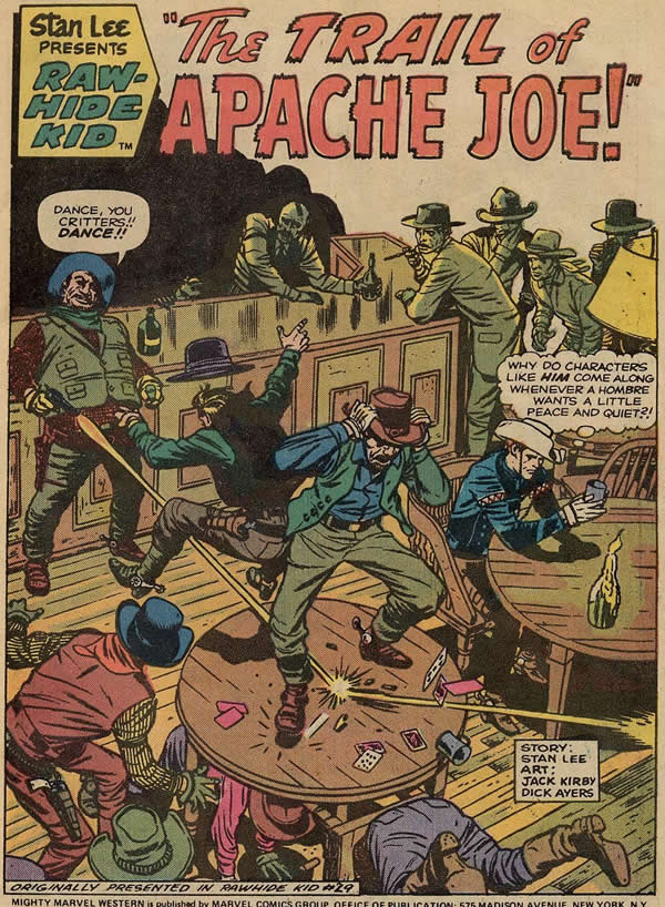
For instance, look at the amazing intricacy of this Rawhide Kid panel, and how the eye will always rest on the Kid, who is, as usual trying hard to avoid the chaos that always seems to find him.
When the eye enters the panel, it sees the spotted black shadow accentuating the shape of the bar. The bar is made up of panels which suggest virtual lattice shapes that break up the space. The figure of Apache Joe firing his pistol is framed by the panels of the bar, as are the figures dancing on the table. In fact, all horizontal and vertical lines created by furniture and floor boards create lattices that visually enclose the figures. Even the circular table shapes make up more lattices that define the dimensions of the panel.
These lattices support the figures, giving them more depth and solidity than they would have without the background. We can see, as in many similar Rawhide Kid splash panels, the Kid is enveloped in his own space, his own lattice by the circular table and curved chair, but the encroaching violence of the other figures will soon disturb his solitude. This is the sort of multi leveled compositional structure that makes Kirby’s best work a four dimensional space time continuum. We can literally see a time lapse in the panel, from the firing of Joe’s gun to the reactions of the dancing figures, to the Kid musing in the chair and finally to the observers at the bar whose positions bring the eye back to the Kid.
This is deep space Kirby at his best.
1 – Tales of Suspense #62 Jack Kirby & Stan Lee Marvel Masterworks Captain America vol 1
2 – Fantastic Four #85 Jack Kirby & Stan Lee The Villainy of Doctor Doom
3 – Captain America #6 Joe Simon & Jack Kirby
4 – Journey Into Mystery#118 Jack Kirby & Stan Lee Marvel Masterworks Thor
6 – Rawhide Kid #29 Jack Kirby & Stan Lee


