This blog is about the comic book that I feel, from cover to cover is possibly the ultimate collection of examples of Kirby Kinetics.
By this, I mean that Kirby has outdone himself in this particular issue to present us with a tour de force of dynamic storytelling. Not only are his figures exploding with kinetic energy, they are placed for the most part in complex compositions of deep space perspective. In nearly every panel there are multiple planes, consisting of background, mid ground and foreground, and Kirby uses elements through out the space in support of his figures to make them come alive.
Deep space perspective is a subject that artist, Burne Hogarth has discussed in his Dynamic Anatomy and Figure Drawing volumes. Kirby had internalized and utilized these concepts in his works decades ago. The figure should be designed as a three dimensional shape /mass moving in the confines of panel space, which must be arranged convincingly in order to be believable.
Hogarth states that the position of the torso is of primary importance in the dynamism of the figure in space. The torso is composed of the rib barrel and the pelvis, which can move in contrapuntal directions in relation to each other. The upper and lower portions of the torso, moving in opposition, can create more dynamism in the figure. Wherever there are joints in the body, there is an opportunity to depict more contrapuntal movement. The pivot points of the shoulder and elbow, for instance, can create elliptical arcs of motion that increase dynamism.
Kirby, even more than Hogarth, was a master of this, particularly when he would also utilize a counter movement of the head. Look at this Picture of Captain America on the cover of Sgt. #13. Notice how the left side of the rib barrel is twisted forward, with the right arm moving back, while the pelvis is turned fore ward. The left leg is slightly back and to the right while the right leg is moving fore ward. The left arm and the shield are thrusting out of the upper right edge. Even the head is turned slightly and tilted to the left. The counter point arrangement of the figure creates extreme dynamic tension. With this figure placed in the foreground of the page, it appears to be leaping out of the canvas at you. Although this composition doesn’t depict a particularly deep space due to the relative scarcity of background elements, the positions of the figures of Bucky and the Howlers do give the Cap figure greater fore ward momentum.
After this explosive cover, the book starts slowly, with Fury and his girlfriend watching a newsreel in a theater. The film gives us a brief glimpse of Captain America and Bucky in action in order to set the stage for their appearance, before Fury and his girl repair to a local pub for a cup of tea and a run in with Fury’s nemesis Bull McGiveney and a certain Private Steve Rogers.
This scene, at the Pig and Whistle pub is one of the most well balanced panels that I’ve ever seen. It’s not chock full of explosive dynamic Kirby action, but is very effective in establishing a setting for a pivotal moment in the story. Sgt. Bull McGiveney enters the pub on the left and his sloping left shoulder leads the eye to the pipe smoking figure in blue, then down the white hat of the sailor to finally rest on the seated figure of Pvt. Rogers, drinking coffee. Rogers’ right arm and the edge of the white table then lead us to the tea sipping Sgt. Fury. The circular composition continues to lead the eye around and back to the left to Pamela Hawley and back to Pvt. Rogers. His unassuming, self absorbed pose is the focus of the composition.
As the story progresses, those who are unaware soon discover that Pvt. Rogers is in reality Captain America, who with his young partner, Bucky make their way across the English channel to what appears to be Nazi occupied France, where they proceed to interrupt a German firing squad. This top panel on page ten is remarkable for its sense of motion.
When Kirby designed this panel, he knew that in order to place figures in space with the illusion of depth, a depth plane must be created, and the arrangement of the figures can be optimized by their size and special relationship to each other. Hogarth speaks of using the mechanics of a grid system to create a depth plane. Kirby often used a grid or the suggestion of one in projecting figures in deep space. See the way the figures are positioned on the plane, with Cap in the background at the left edge of the horizon line as he flings his shield at the Nazi’s hand. The perspective lines on the ground accentuate the depth of the panel and the force of the shield’s impact as it moves into the foreground, caroming off the outstretched hand in a circular arc, out and back into the frame, striking the next to nearest Nazi.
The special arrangement of the figures is near perfect, minimizing dead space. If you changed the position of any of the figures even slightly, it would render the composition less dynamic. This is one the most effective pieces of artwork that I’ve ever seen. Notice the extended hand of the shield struck figure gesturing to Bucky, whose right cross leads the eye from Nazi to airborne Nazi.
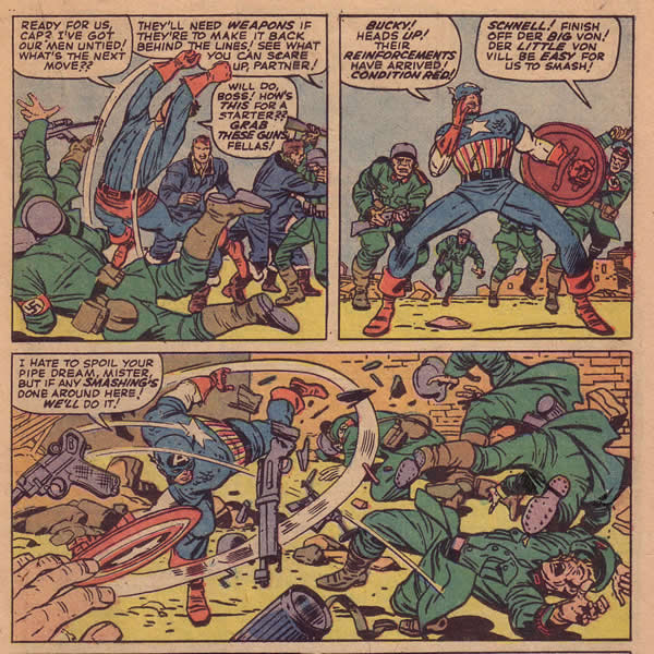
For the next two pages, Cap and Bucky lay waste to multitudes of soldiers, climaxing in this amazing sweep of Cap’s shield, knocking Nazi’s down like ten pins.
Again, here is an astonishing example of the effectiveness of figure and object placement and the positioning of limbs for maximum dynamism. Captain America’s body is extended about as far as it can be in several directions and each limb is maximizing his kinetic energy. The direction of his shielded left arm counterbalances his left leg, and his arms and legs are points on the circle of the shield’s sweep line, as is the motion line that propels the Nazi at lower right. The flying Nazis are, as usual, strategically positioned in that circular composition that Kirby uses so often and so effectively in order to lead the viewers eye to where he wishes it to go. If the eye enters the panel with the highlighted word, smashing, it follows the white sweep line around, from which all the flying figures radiate. The ingenious use of the hand in the lower left corner keeps the eye from following the sweep line and Cap’s shield out of the panel.
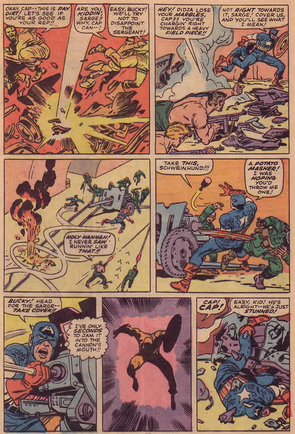
As the story proceeds apace, we find Cap and the Howlers in a secret Nazi tunnel being constructed for a cross channel invasion. The tunnel is the perfect setting for the mayhem that ensues as Captain America, Bucky and the Howlers attempt to sabotage it. As they commandeer a railroad car, the group is fired upon with a Nazi field piece. The first panel on page twenty opens just as their car has been hit and they jump to safety. Cap and Bucky’s figures are cut off leaping towards panel two, as the eye is led to their running forms in that panel. Cap and Bucky’s legs bring the eye down to Fury’s prone figure and into panel three.
The lower left corner of Panel two acts as an arrow, pointing directly towards the action in panel three, a diagonal shot of Cap and Bucky running toward the howitzer. In the left corner is a small explosion from the Cannon’s shot that the eye focuses on as a spotted black shape that frames the action and keeps it moving to the right. I have to digress here and say that Kirby’s Sgt. Fury had some of the best explosions in any comic and this particular book is no exception
Several diagonal lines and running motion trails lead the eye to panel four, as Cap’s figure is framed by the howitzer and two Nazis, one of which flings a grenade at him. Cap’s extended left leg leads the eye to panel five as he jams the grenade into the muzzle of the field piece. This action and the cannon’s structure bring us to the flash of an explosion in panel six which propel Cap forward. The angle of his shield and the explosive force lines point to Captain America’s wounded and somewhat askew form in the final panel.
In the end, Captain America and the Howlers succeed in destroying the tunnel. The climax is an explosion using one of Kirby’s photo collages.
Composing this particular story really spurred Kirby on to produce a truly wonderful comic book. It is chock full of artistic miracles. Every time I look at it I see something new and amazing. Even the deceptively simple silhouette of Captain America being blown towards you by the force of the explosion is a remarkable piece of artwork, which no one else could have done as expressively or so effectively.
In this landmark book, Kirby seems to have reached back in time to his wartime experience, coupling it with his passion for Captain America’s athletic brilliance to produce a lasting tribute to the period that was so crucial to his development as an artist and as a man.
All images from Special Marvel Edition#11 reprinting Sgt. Fury#13
Story and Art by Stan Lee and Jack Kirby


Norris, I remember this comic so well from my childhood. The images you describe and explain made deep impressions on me then that remain to this day. Great explanation. I am reading Sean Howe’s book and getting depressed. The dismal description’s of the working conditions at Marvel makes me wonder how such great art came out of it. There is no explanation of Kirby’s process; it is as if these great works just magically happenned. Keep up your great work. Excelsior!
Thanks Philip,
Coming from you, this means a great deal to me. It’s unfortunate that some of our illusions have to be shattered, but we did grow up in a period when there was a good deal of really great stuff being produced that will continue to nurture and inspire us.
Such a great story, especially when read in the context of the “collaboration” that began with FF #1. I must have read it for the first time when the Essential version came out, but it’s quite obvious in the Love & War volume. The Battlefield and Battle stories are fully Kirby. On Fury, however, between the “scripting” and the Roussos inks on the issues (just before Kirby won his release from the title) are just drudgery. Sgt Fury #13 joins FF #6 and Hulk #1 as somehow transcending the scheme to separate Kirby from his writing pay that had the side effect of butchering his work.
I ‘m surprised how few people hold this book in high regard. It really is a labor of love and quite unlike anything else on the scene at the time. I guess one has to know what one is looking at.