Following the work of the King over his nearly half century reign brings us fascinating insights about the development of his style and of the art form itself. No artist can develop in a vacuum, and when one discovers influences along the way it is always a thrill. Kirby often mentions newspaper strip artists like Alex Raymond as inspiration, but as beautiful as Raymond’s work is, it has a studio staged, posed and slightly static look about it. Kirby’s best work is more cinematic and one longs to see examples of prior comic art that had his sort of kinetics.
Jack Kirby began to hit his stride when he and Joe Simon began working for Martin Goodman’s Timely Comics, and Captain America was the team’s first smash hit. Befitting the hero’s athletic skill, Kirby drew him as a sleek, muscular contortionist. Cap’s body moved in ways that defied gravity and conventional anatomy. If one looks at this page from Captain America #2, one sees something quite different from the thicker, blockier figures that the artist drew later in his career. Look at the red, white and blue figure arching over the telephone wires or at his long legged stride, running in the lower left panel.
I’ve chosen this particular sequence not only for its expression of dynamic physicality but also for its inking style, the delicate precision brush work of Reed Crandall, whose work shows the influence of another artist that also had a profound impact on Jack Kirby.
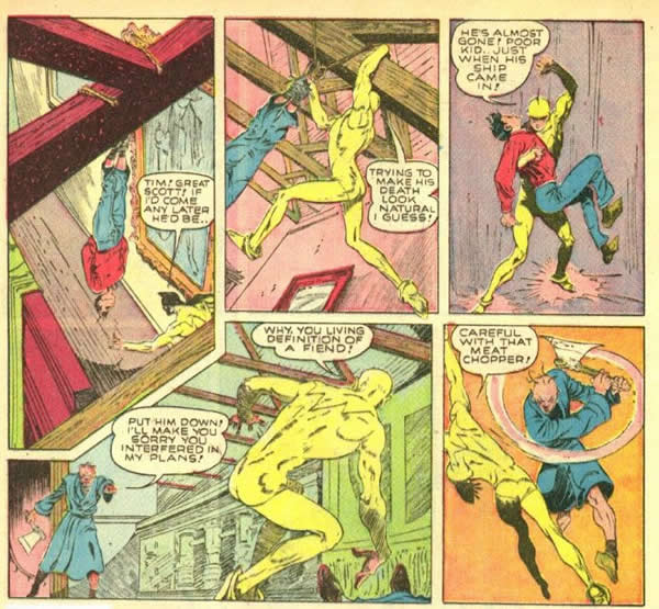
The following page is that of artist Lou Fine, who came to prominence working in the Eisner-Iger studio in 1938. This sample is from the 1940 series, the Ray. If one compares the two pages, it seems clear that Kirby and Crandall are taking pains give their Captain America story a distinctly Lou Fine-esque feeling.
Fine seems to specialize in a style of figure work that accentuates agility and lithe muscularity. It also stresses the contrapuntal torque of the body that Kirby was to master as his career developed.
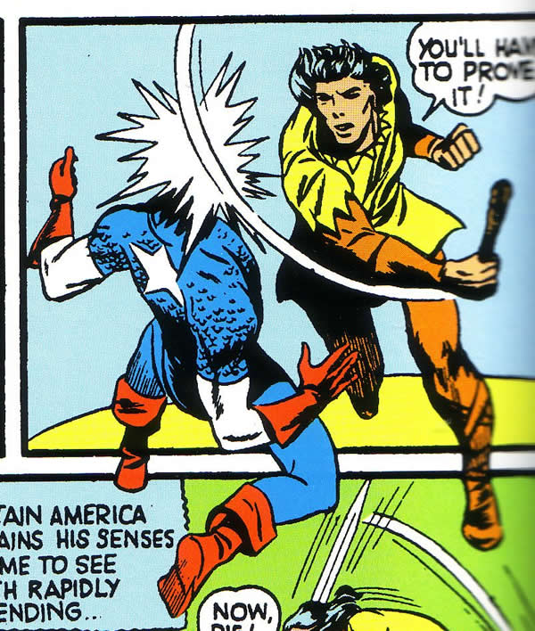
Observe the torso of the Ray in the fourth panel, twisting up from the floor and to the left. Then compare the fifth panel with the Ray dodging an ax to the smaller inset of Captain America, on the receiving end of a head shot from a medieval dress-clad villain. If not a direct swipe, the S&K pose bears a striking resemblance to Fine’s original.
Fine’s best work also optimizes the use of the page as a total composition. If we look again at the Ray page above, we can see his strengths as a designer in the way the page is composed. Horizontal, vertical and diagonal shapes all work together to make the page cohesive. Panel four is particularly effective in using the diagonal perspective of the room to accentuate the deep space dynamism of the composition. This was something that Kirby would learn to do with maximum efficiency.
Joe Simon has stated that Fine was his favorite artist and a favorite of Kirby as well, and it shows on these Captain America pages. Kirby seems to have made a detailed study of Fine’s figure work and incorporated aspects of it into his own distinctive style.
Kirby maintained his penchant for lithe muscular figures through the years that he worked with Joe Simon and only after leaving his long time partner did the King’s style begin to bulk up. Once separate from Simon and his studio cohorts, Kirby seemed to strike out in a new direction, influenced and supported by such inkers and collaborators as Wally Wood and Dick Ayers.
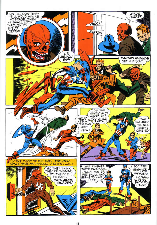
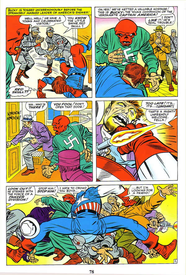
It is most instructive to compare a page from a story in Captain America #1 that Kirby decided to revisit nearly twenty five years later in Tales of Suspense #65.
In the golden age version, Kirby utilizes the long limbed figure almost exclusively, and they all occupy a similar middle ground position, but in the sixties rendition, this particular exaggeration is only used in the last panel to suggest the extreme dynamic tension of Cap’s body as he holds several adversaries at bay.
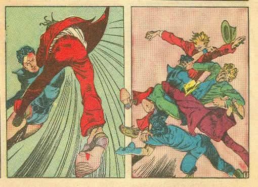
Kirby has assimilated Fine’s extreme long limbed figure work into his artistic vocabulary, but as a mature artist, he uses it sparingly and selectively. He adopts a more extreme three dimensional style with fore shortening used at least as often as lengthening to delineate action. Note the hand of the Nazi thrusting out of the panel under Cap’s right leg, as well as the orange clad arm in the upper right corner reaching fore ward. Although this appears at first glance to be a Kirby innovation, there are examples of Fine doing this sort of thing in his Golden Age work, as in this Black Condor panel on the left.
This technique of having the somewhat foreshortened leg protruding from the lower right of the panel is something that Kirby adopts and takes to the next level of dynamism.
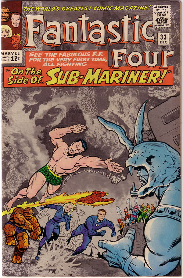
Kirby does not really begin to exploit this technique to maximum effect until the early to mid sixties. The artist had always used hand gestures for dramatic emphasis, such as characters pointing emphatically, but suddenly, all manner of limbs are thrust in your face in the most alarming way. Figures such as this of the Sub-Mariner, become hyper kinetic wonders of propulsion.
Like all great innovators, Kirby has adopted an idea and taken it several steps beyond. Kirby has taken aspects of Lou Fine’s approach and internalized them, bringing our perceptions of a two dimensional newsprint page to a multi-dimensional artistic space-time continuum of our imagination.
.
1 – Simon, Joe, Kirby, Jack,(art and story) Captain America #2 The Ageless Orientals Who wouldn’t Die, Marvel Masterworks Golden Age Captain America volume 1 pg #73
2 – Fine, Lou, The Ray, Smash Comics #20 pg10. Scan from Golden Age Comics website.
3 -Simon, Joe, Kirby, Jack (art and story) Captain America #3 The Hunchback of Hollywood and the Movie Murder, Marvel Masterworks Golden Age Captain America volume 1 pg#166
4 – Simon, Joe, Kirby, Jack (art and story) Captain America#1 Riddle of the Red Skull, Marvel Masterworks Golden Age Captain America volume1 pg#36
5 – Lee, Stan, Kirby, Jack (story, art) Tales of Suspense #65 The Red Skull Strikes, Marvel Masterworks, Captain America volume 1 pg#74
6 – Fine, Lou, (art), The Black Condor, Crack Comics #11, Scan from Golden Age Comics website
7 – Lee, Stan, Kirby, Jack (story, art) Fantastic Four #33 cover


Great examples and comparisons. I think the difference between Fine’s action scenes and Kirby’s is that Fine’s look like carefully rehearsed choreography, balletic and posed, while Jack’s explode off the page.
I’m amazed at how good and groundbreaking Lou Fine’s work really is. the use of foreshortening and understanding of anatomy predates Neal Adams by decades. As much I like Jack Kirby, I don’t think he could render these elements as proficiently as Lou Fine. Lou Fine is one of the best. Given the quality of his work, it’s a real shame he quit doing comics.