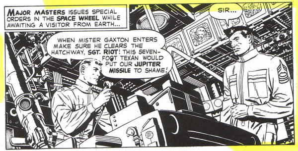
One of the most striking things one notices after studying Kirby’s work over time is his use of interior and most dramatically architectural shapes to give greater power to his compositions. Kirby used this method fairly early on, but he was focusing most of his attention on figures, and the backgrounds that he used to amplify the motion of his characters were generally given short shrift. Still, the use of the room’s interior here does provide more dynamic energy to Cap and Bucky’s scuffle with the gangsters. When Bucky throws the vase, Kirby uses a simple one point perspective treatment of bricks to give the panel more impact.
As Kirby’s skill as an artist developed, he incorporated more and more complex background elements into his compositions and these became more significant aspects of his designs. As I have stated in a previous blog, I believe that the inking provided by a draftsman as outstanding as Wallace Wood had a major effect on Kirby’s desire and ability to create three dimensional backgrounds that would bring greater force and- to his drawings. One can see how the structures surrounding the figures in this panel add drama and substance to the narrative.
As time passed, Kirby grew more daring, until sometime in the mid sixties, he seemed to reach a point where the creation of vast areas of space was a primary goal. This development seemed to coincide with his cosmic period, where he would depict land and space-scapes that would boggle the mind. Growing up in New York, Kirby had always had an affinity for the metropolitan megaliths that surrounded him. With the advent of the Fantastic Four, whose Baxter Building headquarters were located in the heart of town, Kirby brought his treatment of skyscrapers to the level of masterworks.
When he introduced Galactus, Kirby had to devise a method to convey to us the massive scale of the godlike being and the speed and agility of his herald, the Silver Surfer. This touched off an explosion in the use of background elements and of buildings in particular to amplify the power of Kirby’s drawings.
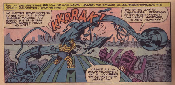
Here for example is a wonderful panel, showing the Thing perched on top of the Baxter Building, destroying the device of the gigantic Galactus, who looks on in anger. The skyline and design of the buildings below give this relatively small panel a fantastic sense of panoramic space.
One immediately thinks of King Kong while looking at this drawing.
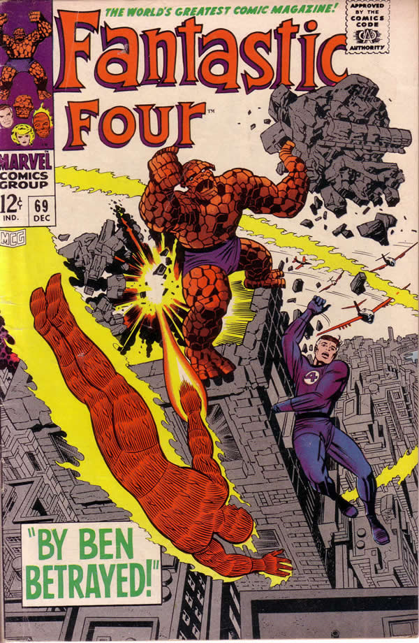
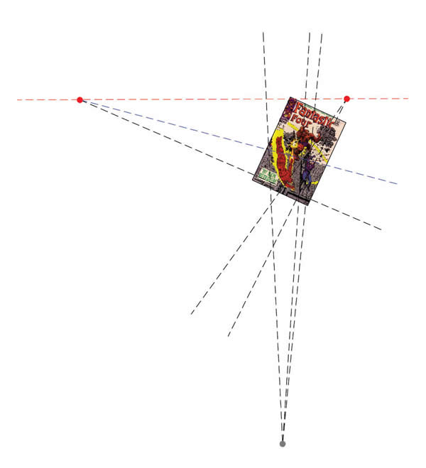
The image of a gigantic ape a top the Empire State building was one that obviously had a profound effect on Kirby as well as many other artists. Kirby paid homage to Kong big time in issue #69 of the Fantastic Four. The cover is one of his most dramatic, with a composition that uses figures moving in a sort of architectural framework. One of the things we notice first is the strange scale of the figures. In proportion to the buildings, they are far too large, creating that towering King Kong effect. Then too, the angle of the drawing gives us a sense of extreme vertigo, as if the building were swaying in a quake.
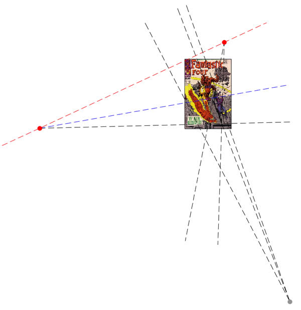
Architect and Kirby aficionado, Jack Fetterman makes an interesting point about this cover. He states that, “Of particular interest, as seen in the first image, the horizon as Jack indicates as a distant skyline, is not in line with the constructed perspective, but in line with the rotated dynamic one. (below) This subtle gesture reinforces his representation as being realistic when in truth it is fantastic.”
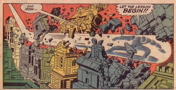
If we return to the Silver Surfer, whose aerial abilities allowed Kirby to present an amazing array of dizzying spectacles, we can see how the artist again uses the structure of buildings to show us high speed acceleration in its most dynamic presentation.
This row of buildings is as lovingly drawn as anything else Kirby does. The blacks are spotted for maximum effect to show the mass and density of the stone buildings as the Silver Surfer plows through them, scattering brick and mortar like shrapnel. Notice how the block of masonry in the upper right corner is thrust at us, giving the figure even more force and propulsion. Let me state here that inker, Joe Sinnott’s powerful and meticulous inking of Kirby’s drawings in this case totally supports the artist’s pencils.
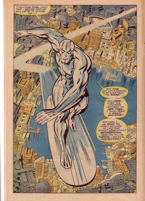
If I could choose a single image that showcases Kirby’s mastery of deep space, combined with architectural structure it would be this panel of the Surfer below, soaring high above the canyons of Manhattan.
Kirby only approximates the correct perspectives here, bending the rules to suit his vision. The various horizontal, vertical and diagonal shapes create a multiplicity of spatial lattices. The torque of the figure, with its varying positioning of arms, legs, head and torso is situated within a multi-dimensional grid that accentuates its kinetics. The wall of buildings facing the body of water are pushing the Surfer fore ward. This effect is accentuated by the somewhat pentagonal shape behind the Surfer’s head. The row of buildings that border the water on the left optimize the thrust as do the tiny shapes of the docks. Even the speed trail sweeping behind the surfboard creates a separate level and a dimension that divides the space and positions the figure optimally within it.
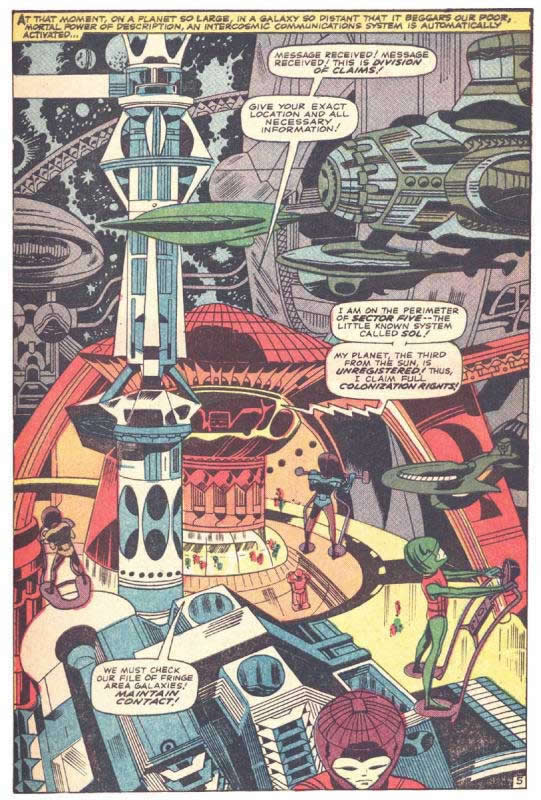
In most of these cases, Kirby is creating a fairly accurate New York cityscape, albeit exaggerated. Some of his most amazing compositions included structures that could only exist in the fertile imagination of a creative genius. Our final piece is taken from the pages of Thor #131. This is the planet Rigel, home of intergalactic colonizers whose technology surpasses our own.
As usual, Kirby outdoes himself with the presentation of a space that staggers the senses with sweeping causeways, towering spires and futuristic machinery of unimaginable function. The creatures that people this bizarre cityscape are no less strangely designed, as they weave their way through the hive like maze with personal hover crafts. Notice how the eye enters the page at the white bar at the upper left, travels to the blue tower and straight down, where it encounters the red dome. A supporting arm behind the dome curves further down to the figures on the right.
The curved shapes constantly keep the eye moving throughout the spectacle of this amazing panel. It is plain to see that Kirby loved to play with a vast diversity of shapes to entertain us with his unique brand of bravura storytelling.
1 – Joe Simon and Jack Kirby, Captain America #8
2 – Jack Kirby, Dave Wood, Wallace Wood, The Complete Sky Masters, Pure Imagination
3 – Jack Kirby, Stan Lee, Fantastic Four#49, Marvel Treasury Edition #2
4 – Jack Kirby, Fantastic four #69 cover
5 – Ibid
6 – Ibid
7 – Jack Kirby, Stan Lee, Fantastic Four #72
8 – Ibid
9 – Jack Kirby, Stan Lee, Thor #131


Pingback: Tweets that mention Kirby Architecture | Kirby Kinetics -- Topsy.com
I was just blown away by his mastery of how he handled certain scenes and knew what to do with them (Fantastic Four 69), and the way he delineaded the Silver Surfer’s ascent from New York(8). It was just like the feeling I was leaving in a plane and looking backwards as I was leaving the NYC skyline. It was that breathtaking.
Thanks for commenting Donald,
As you can see by my recent post, I can’t get enough of those Kirby aerial scenes either.
on (8) One of the greatest single pages in comic book history. The Surfer started off as an anti-villain! Love that and he seems always the most dangerous to me at this point in the game! The composition is perfect. As you read from top to bottom time passes via the city’s perspective, and do I really need to mention how the swoosh of the board snaps at the edge of the frame and back? Passing first behind the arm to give clarity of depth for a nice easy-read foreground, middle, back? Thank you so much for these great articles! Long Live the King!