

828 Bloomfield Street
Hoboken, New Jersey, USA
+201.963.4383
rycomms@rycomms.com
"A People Thing"
An Examination Of Jack Kirby's "The Losers" Story In Our Fighting Forces #152 - Part 1
by & © 1998 Mike Kidson (Posted to Kirby-L at the end of June 1998)
INTRODUCTION"The Losers" was a team series created by Robert Kanigher for the DC war title OUR FIGHTING FORCES by the simple expedient of assembling four characters who had once had their own series but were now "in limbo". Captain Johnny Cloud was a Navajo Indian and air ace whose solo exploits had appeared in ALL-AMERICAN MEN OF WAR # 82 - 115; the two man team of Gunner and Sarge had first appeared in # 67 of the same title before transferring to OUR FIGHTING FORCES for a fifty issue run, #45 - 94; Navy man Captain Storm had starred in 18 issues of his own title. Kanigher had put them together as a "special task force" representing each branch of the U.S. services in OUR FIGHTING FORCES #123- their adventures were drawn occasionally by Sam Glanzman but mostly by John Severin up until #150, in the autumn of 1974, when Jack Kirby took over as writer, artist and editor. For Kirby to work on a series created by other hands was extremely unusual. In fact, he was extremely reluctant to do so. So why did he take on a war comic, a genre with which he had not worked since he created the SGT. FURY AND HIS HOWLING COMMANDOS series for Marvel, and a series created by Kanigher, between whom and Kirby little love was lost? Kirby Lister Mark Evanier has explained that the primary reason was contractual: Kirby was required to produce 15 pages per week and, with KAMANDI being by 1974 the sole survivor of the series created by Kirby for DC during the early 1970s, another series had to be found for him to work on. Kirby was hardly short of new ideas himself , as is attested toby the Atlas, Manhunter and Dingbats "try-outs" he produced for FIRST ISSUE SPECIAL in 1975: however, it seems all too likely that by this time publisher Carmine Infantino had lost faith in Kirby's ability to devise a successful series (SEE FOOTNOTE 1) and much preferred the idea of letting him workout his contract on an extant, low selling book. Distasteful as the assignment must have been for Kirby, he was never less than a consummate professional. Mark Evanier has suggested that Kirby may well have done very little background research on the characters which had been handed to him (SEE FOOTNOTE 2), but he certainly seems to have considered the nature of "The Losers" and found no difficulty in adapting it into the kind of war comic that he wanted to write. His first issue, #151, was a fine if not particularly spectacular piece of work: his second was perhaps one of the best single issue stories of his career. The following essay is an attempt to explain just what makes that story so good by analysing in detail exactly how Kirby used his mastery of the medium to compose it. If you haven't already read OUR FIGHTING FORCES #152, I strongly recommend that you do so before proceeding any further! THE COVER |
|
|
Placing the logos, Code stamp and other info on a solid black bar rather than bleeding the cover drawing around it, Kirby left himself with an almost square space which he filled with an appropriately symmetrical composition (SEE FOOTNOTE 3). In the background is a bullet-pocked wall, in the centre of which is a window through which the heads and arms of all four "Losers" are jammed. Lining the top and bottom of the picture are the limbs and weapons of Nazi soldiers: from the window, Sarge and Captain Cloud are, respectively, aiming a rifle and tossing a grenade at the enemy above, while Gunner and Captain Storm are firing out and down at the enemy below, their firing angles adding depth to the composition by indicating that the enemy below is in fact facing the window from across a street. The purity of the composition is perhaps slightly spoiled by a caption, containing the story title ("A Small Place In Hell"), wedged in at one side: on the other hand, Kirby ensured that the caption was placed in an area of "dead space", so that it does not in any way detract from the impact of the picture - and if it was removed there would be a need to replace it with something. |
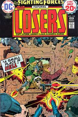 Our Fighting Forces Volume 21 Number 152. December-January 1974-1975. Published by & © 1974 National Periodical Publications, Inc. a.k.a DC Comics. |
|
But in any case, the caption is not without purpose. It may intrude on the aesthetic purity of the composition, but it plays an important role in adding sequentiality to it. As described so far, the placement of Nazis above, Losers in the centre and Nazis below might suggest that the composition is static: in fact, it is designed to lead the reader's eye across it and over the page into the comic. The caption is placed at the left hand side, where, assuming that we follow the customary Western procedure of scanning print media from left to right, it is the first thing we notice and thus compels us to move across the composition horizontally while conducting a secondary, vertical scan rather than prioritising the vertical scan. Furthermore, the placement of the caption initiates a horizontal sequence by determining the positioning of the Losers within the window frame. The four figures are arranged at angles so as to emphasize the corners of the window frame as much as its sides, a powerfully tense arrangement in which: a/ Gunner, his head halfway up the left hand side of the window, fires from its lower left corner towards the lower left corner of the composition; b/ Storm's head and shoulders appear above the centre of the window ledge, firing almost horizontally towards the right hand side of the cover; c/ Cloud's head appears halfway up the right hand side of the window, his arm protruding and hand open, movement lines indicating that he has just tossed a grenade directly towards the top right hand corner of the composition; d/ Sarge is positioned above the others, his head protruding towards the top left hand corner of the window but looking and aiming towards the top *right* hand corner of the composition. It is the positioning of Sarge which is the crucial sequential element. If the composition was to be absolutely symmetrical and static he should be facing the other way, aiming towards the top *left* of the composition: in that way the four figures would be leading the eye in four different directions, rendering the composition an absolutely static one which the eye would have no choice but to scan from the centre, radiating in all directions outwards. But if Kirby had made that choice he would necessarily have been removing any possibility of "dead space" in the picture, leaving no room for that caption: by "reversing" Sarge's positioning he has made three of the four Losers draw the eye from right to left, building upon the left to right sequence initiated by the caption and creating not just a splendid piece of art but a splendid piece of *comics* art, imbued with a tremendous sense of movement which strains against, and ultimately triumphs over, the inherently static tendencies of its symmetrical premise. Everything I've read about Kirby's working methods suggests that he was unlikely to have sat down and coldly planned out such a composition - it seems that these matters were instinctive with him, that by dint of natural ability honed by years of practice he was able to construct intensely dynamic images without too much conscious thought. This may be one particular aspect of his genius: the ability to create without too much deliberation a complex, powerful composition which provides plenty of material for consideration and analysis. I've concentrated on structural analysis of the composition - but, what, if anything, does the composition mean? What does it tell us? I don't want to go too deeply into this, since I think what it does is encapsulate the tone of the story which begins over the page. However, I will say that it absolutely concentrates the readers' attention on the central figures of the story, humanising them while opposing them with a literally faceless Enemy (SEE FOOTNOTE 4) it creates a picture of a literally impossible situation (in reality, The Losers as depicted here are a moment away from death, no doubt about it) which of itself establishes a narrative sequentiality forcing the reader to turn the page to find out how they escape (in other words, it does exactly the job a comic cover should do); an it creates a terrific sense of tension and isolation which, as we'll see if I get any further with this analysis, permeates the whole issue from beginning to end. In short, for once this is a book which you really can judge by its cover. I think that if I could ever own the piece of Kirby art of my choice, I'd want it to be this one. SETTING UP THE STORYOnce the cover has pulled the reader inside the comic, a vertical tour de force immediately meets the eyes. Stripping in the "Losers" logo, complete with cameo heads by John Severin, vertically down the right hand side of the page, Kirby filled the remaining three quarters of the page with a vertical tier of four panels which, not wasting a word or gesture, set the scene for the story.Panel 1/ A group of dog faces huddles in a trench, a single "WHAM" effect and an impact blur explaining one soldier's cryptic comment about "more mail" coming in from "that town". Panel 2/ Having established that the soldiers are being shelled from a town, Kirby wastes no more space on sound effects: a soldier's huddled position, hands holding his helmet to his head, provides all the visual emphasis needed to convey the impact ofthe shelling. Panel 3 completes a curve and close-up sequence which has been building since the first panel. The grim, weathered profile of a soldier to the left of the first panel was panned around to become a frontal shot taking up half of the second panel - Panel 3 is one of those Kirby trademark "eyes only" panels. There the sequence breaks, as Kirby cuts in Panel 4 to a shot of the Losers moving warily into the outskirts of the town, terse dialogue indicating that the team is puzzled: why is gunfire coming from a town taken weeks before? The question posed is the hook to get us to turn the page once more... "Close-up", "pan", "cut" - movie terms often adopted to describe comics. But this time I'm not just lifting from the vocabulary of one medium to describe another - Kirby was unmistakably making movies here. The dynamic of the sequence is cinematic, combining smooth panning with the jump cuts implied by panel borders to establish mood and flow. And the dialogue is truly theatrical: stripped of exposition or decoration it combines with the pictures to create a grim mood, a sense of isolation from any reality other than that of the battlefield. It also provides a clear introduction to a fairly complex setup. Kirby's writing may remain the subject of controversy, but who else could have achieved this concision and economy? Kanigher's self-consciously "gritty" and melodramatic narrations, Kurtzman's hammering, repetitive narrative captions, Lee's cheery, almost schoolboyish characterisations - all are good in their way, but in just this one page Kirby established a sense of the hardness and horror of war with the kind of writing which was to make Frank Miller famous a few years down the line. |
|
 |
|
|
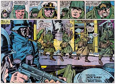
The cover draws strength from the tension between a stable vertical construction and an irresistible horizontal tendency. Page 1 leaves out the horizontal movement, rotates the eye instead around and down four vertical tiers. Pages 2 and 3, a variation on the almost patent Kirby double page splash, switch back to the horizontal and play an extraordinarily clever game with it... Two games, actually: one with the dialogue, one with the layout, both playing off against each other. Page 1 ended with a shot of the Losers grouped outside the town - Cloud in the foreground, Storm braced against a tree behind him, Gunner crouching warily a step behind and Sarge bringing up the rear -and a question: why was there artillery fire in this supposedly liberated town? On pages 2 and 3 the double splash is truncated by a tier of four "talking heads" panels running along the top of the pages, in which that question is obliquely answered: the group must have been dropped off by a truck driver at the wrong town. The logical next question, how a driver could have mistaken a town on the front line for one within occupied territory, is glossed over with a joke playing on the team's name - of course that's what happened, these guys are losers, right? But it's not what Kirby's writing here, chuckle-inducing as it is, that knocks me out. It's the way he lays it out. Maintaining the ordering of the group presented at the foot of page1, he runs through the group two at a time in that tier of panels atop pages 2 and 3... *BACKWARDS*!! Panel 1 shows Cloud with Storm behind him, panel 2 Storm with Gunner behind him, panel 3 Gunner with Sarge behind him, and the sequence ends with a closeup on Sarge. The positioning of the heads, the background one to the left of each panel and the foreground to the right, establishes left to right sequentiality, as does the *content* of the dialogue - but the flow of conversation runs in reverse, a typically daring solution to the problem of how to make "talking heads" not just mobile but interestingly so. Kirby also injects a daring solution to a possible problem posed by the expectation that the left hand page should be fully scanned before moving to the right hand one: although the splash drawing extending the lower section of the two pages militates against that expectation, he ensures that the top tier is read as a single horizontal strip by making the third panel of the tier slightly inset, *widening* the neutral space between panels in order to stress that the third panel is not in fact the starting point for a scan of page 3. As a formal device this matches the reversal of the flow of conversation perfectly: where a wider border between panels might normally be taken to mean a discontinuity, here it clearly indicates a continuity. By no means for the first time, Kirby was inverting the mechanics of the medium here! The end of that top tier is a break in the narrative, marked by a scene setting caption at the top left hand corner of the splash drawing: but Kirby smooths over the transition inverting the previous flow of conversation: where Sarge had the last word in a flow of conversation running backwards down the line, now he "continues" a flow running forwards, commenting that he's seen a movement, that the group should keep moving but look for cover. Gunner passes the word forward to Storm, who passes it to Cloud, who tersely comments - that dry Kirby humour again! - "I heard him." Thus the dialogue now plays its common role of keeping the eye moving smoothly from left to right across the splash, which is itself a powerful but otherwise static composition showing the Losers in a line along a street while, in the foreground, armed Nazis lurk massively within a ruined building. In a final bit of layout trickery, the flow of dialogue is both horizontal and diagonal, bookended by the caption in the top left of the splash on page 2 and the credits placed in the bottom right corner of page 3: this is matched by a diagonal tendency in the splash layout, in which the Losers appear set inside a window frame behind which lurk the Nazis, one at full length on the left of the splash and just the helmet visible of one crouching at the right. I may just be proving that a picture can speak a thousand words, but I think the proof is worth it: these two pages flow so easily and naturally that it's easy to miss the awesome mastery of the comics page with which Kirby ensured that ease and naturalness! And, since page 3 bears the credits, I want to put in a good, if rather backhanded, word for D. Bruce Berry's contribution as well. I'm not much of a fan of Berry's inking, finding it reasonably faithful, competent but often tending to make Kirby's pencils seem a little flat: in this story, where Kirby pulls out the visual stops throughout, they serve the absolutely admirable purpose of not getting in the way at all. SKIRMISHSUDDENLY...!!! Dramatic punctuation, no less, kicks off the fourth page - the implied pause of the ellipse followed by the explosion of exclamation marks mirroring the tension of the splash panel on pages 2 and 3, the Nazis waiting in ambush... and leading us into the action of page 4 panel 1, in which Kirby switches from an objective viewpoint to a point somewhere between the Losers and their ambushers, leaping from cover in a flurry of sound effects and blazing machine pistols!!! That first panel stretches across the top of the page. The rest is taken up by a neat square of four panels in which Kirby sets up a "comicbook" feat of skill and heroism then quietly debunks it. In response to the Nazi hail of lead, a single shot is fire, hitting a grenade slung in one of the Nazis' belts: in the next panel the results of the grenade's explosion are seen. These two panels, if taken out of context, would barely make any sense whatsoever - panel 2 is a close up on the bullet hitting the grenade, framed by the elbow and part of the Nazi's belt and a fraction of the back of another Nazi, panel 3 contains a sound effect, a white-yellow blur, a blue blur in the shape of a pair of tumbling, jackbooted legs, a Nazi helmet flying loose, some speed lines and some flying wood and rubble. Panel 3,in particular, looks like nothing on earth - but taken in context it tells us everything we need to know. Once again, Kirby demonstrates an important truth: the importance of drawing in comics is to maintain a strong narrative, and that does not necessarily require that every panel of a comic should make sense taken alone. The flow of the narrative, the way in which that flow links together disparate elements so that the eye can immediately decode them -these are what matter. Panel 4 returns us to the Losers in the aftermath of the skirmish, showing us Sarge's head, forearm and gun muzzle protruding from behind a bit of cover as Sarge crows exultantly over his brilliant shot. But this is not a comic about derring-do, as Kirby sharply reminds us by bringing the moment back down to earth in panel 5: as the other three members of the team slowly emerge from cover, Gunner casually remarks that it was just a lucky shot, nothing more. These, we are reminded, are just ordinary guys, caught up in a war and doing their best to survive unscathed, both mentally and physically. No-one argues with Gunner: even Losers can be lucky sometimes, and that's all that has happened. And with that the prologue to the story ends. The first two pages of adverts provide a breathing space before the real action begins... The first four pages have set the scene: the Losers, on a three day pass, have lived up to their name by accidentally entering a Nazi-occupied town which is about to be attacked by a U.S. Army column. In the hands of another artist, something like the latter part of the previous sentence might have appeared as a caption, introducing a story filled with dialogue-based characterisation. But this is the work of Jack Kirby - moreover, it's what Kirby Lister Colin Stuart has described as "perhaps one of the best stand-alone stories of Kirby's career", an assessment with which I heartily agree. What Kirby appears to have been doing here is to take the "war comics" genre as being read, that is, as having rules or conventions understood by the readers and thus not needing to be restated. Whether or not that is the case, he was almost certainly experimenting here: visually, each page presents a battery of narrative techniques, spurred on by terse, minimalist dialogue which serves to draw the reader deep into an intense, almost claustrophobic setup - a study, perhaps, in both physical and mental survival in conditions of extreme peril and isolation. |
|
