1955 was a tough time for comics in general. Simon and Kirby’s own publishing company, Mainline, failed with the last comics cover dated April 1955. The remaining issues of Mainline, the work for which was probably already completed, would be published by Charlton (well known for their low payment). The amount of work Joe and Jack did for Prize Comics would also see cutbacks. The only titles that Simon and Kirby did for Prize would by Young Romance, Young Love and Young Brides. But Young Brides and Young Love would both be cancelled (respectively November and December 1956). It was also in November 1956 that Jack Kirby would be doing work first for Marvel and later DC. It is not clear exactly when, but sometime during this time line the Simon and Kirby bullpen was disbanded. Simon and Kirby would continue to be listed as the editors for Young Romance until 1960 when Joe would be declared the sole editor. Various work would be done by Joe and Jack for Harvey and later Archie Comics but none of that successful enough to reestablish the Simon and Kirby studio. However their later collaboration was done, it was not like the earlier team work.
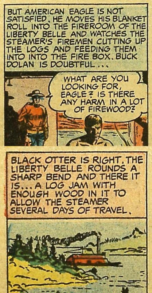
Prize Comics Western #118 (July 1956) “Liberty Belle” by Ben Oda
Previous to 1956 lettering for Simon and Kirby was done by both Ben Oda and Howard Ferguson (?). But Young Love #68 (cover dated December 1955) would be the last Simon and Kirby comic with lettering by Ben. That was not, however, the last lettering Oda would do for Prize Comics. Oda would continue to do lettering for those Prize titles with other editors; Headline, Justice Traps the Guilty, Prize Comics Western and later All For Love. He would do so until cover date October 1957. We can only speculate why Oda stopped working for Simon and Kirby but a falling out of some kind seems likely. Prize cancelled Headline and Prize Comics Western with September 1956 being the last issues. So perhaps there just not enough work from Prize to make it worth Oda’s efforts.
I no longer have access to any of the comics with Oda lettering from this period so I have provided some examples taken from the Digital Comic Museum. This is not much of a problem because Ben Oda’s lettering has not undergone much of a change from when we examined him in the last chapter.
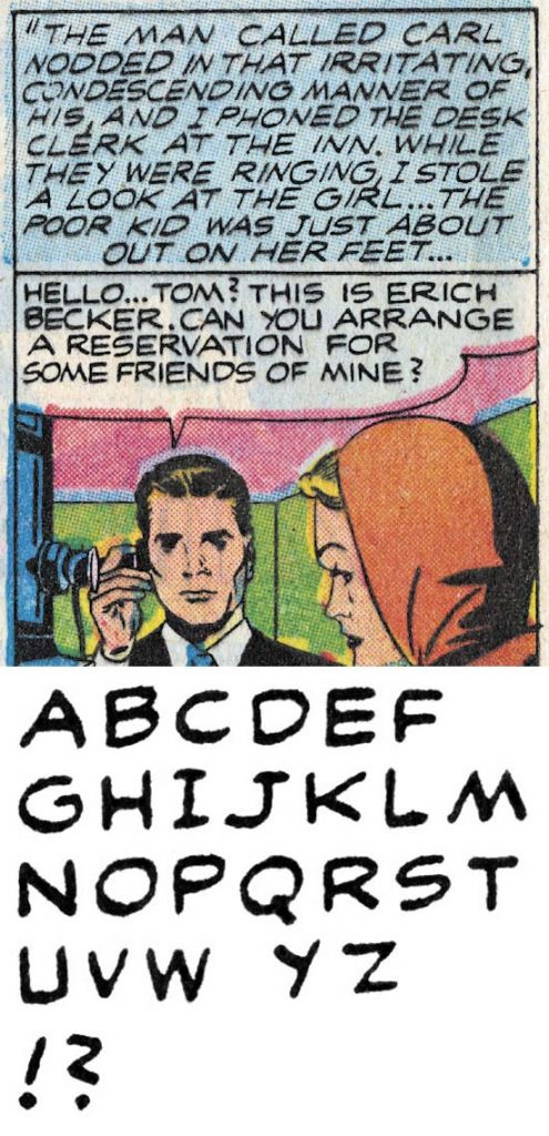
Young Romance #83 (June 1956) “Dancing Doll” by Howard Ferguson?
Howard Ferguson(?) continued to do lettering for Simon and Kirby but never end up lettering any of the Prize titles with other editors. Ferguson would even letter Simon and Kirby work that was published by Harvey. The last published lettering by Howard Ferguson(?) would be in Alarming Tales #4 (March 1958). However even if I am correct in crediting Ferguson (or at least the letterer I have questionably refer to him) Harvey Comics has been repeated shown to publish inventoried work long after it was actually created. Excluding cancelled titles, Simon and Kirby ran for Prize a much more tight operation without keeping work as inventory. The last work I credit to Ferguson appeared in Young Romance #90 (cover dated October 1957).
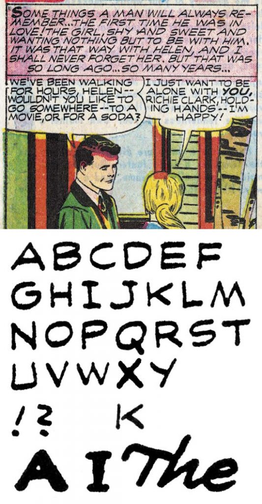
Young Romance #83 (June 1956) “Only You” by Howard Ferguson?
Starting in comics cover dated June 1956, Ferguson(?) would start to provide simple drop caps to his captions. This would become a regular feature until much later. Other than the drop caps, the lettering is identical to those without drop caps so I am confident that both were done by the same letterer.
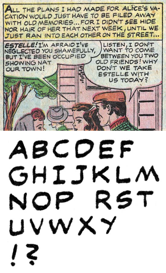
Young Romance #90 (October 1957) “Girl In the Middle” by Howard Ferguson?
I just wanted to close my discussion of Howard Ferguson(?) with an example of the last work for Prize that I credit to him. As can be see above, not much has changed.
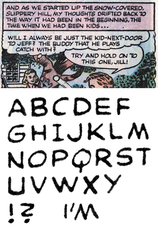
Young Romance #86 (March 1957) “His Heart Was Blind” by Toobie
Ferguson(?) was the go to guy for Simon and Kirby during the time discussed in this chapter. But even before Ferguson’s disappearance, Joe and Jack would turn to one I nick-named Toobie. Toobie letters rather like Ben Oda, even with a ‘Z’ shape question mark and ‘J’ without a topping serif. However Toobie’s ‘J’ has a more strongly curved lower portion. There are serifs on first person singular ‘I’ except when used in a contraction.
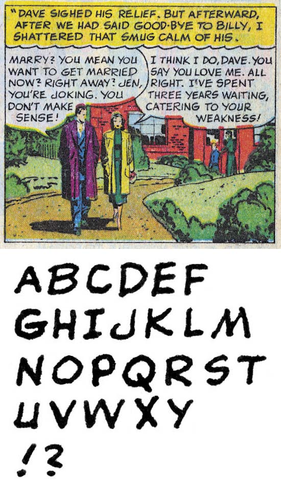
Young Love #71 (June 1956) “Love Me Or Leave Me” by Bill Draut
Bill Draut would return to lettering his own art one last time in “Love Me Or Leave Me”. Despite the fact that the last time we saw Bill lettering was in 1947, not much has changed. The ‘J’ still has Draut’s characteristic hock and the question mark still has the shape of a ‘2’. Not much later Bill would stop doing work for Simon and Kirby (in Young Love #73 December 1956) as well as the other Prize titles that were under other editors (in Justice Traps the Guilty #84 December 1956).
With both Ferguson(?) and Oda no longer appearing in the Prize work produced by Simon and Kirby, Joe and Jack would turn to a number of different letters. Each would appear to letter for a relatively short time and then disappear never to return. I saw little to be gained by analyzing each of them particularly since I would never be able to provide a real name to any of them. But I was curious about those who lettered art that Jack Kirby drew. Did they letter other artists besides Jack? Did their lettering appear in any of the art Jack did early in his return to Marvel and DC?
The answer to the first question (did they letter other artists besides Jack) would indicate how they were assigned. If they only lettered Kirby, than Jack was probably responsible for giving them the work. If they lettered other artists, than whoever was assigning the work for Young Romance was responsible (which probably was Joe). The short answer is all the Kirby letterers would also letter other artists.
The second question (did their lettering appear in any of the art Jack did early in his return to Marvel and DC) had the potential to answer a bigger question. There has been some speculation that some of work early in Kirby’s return to Marvel or DC was actually done by Simon and Kirby in some cases originally meant for Harvey. Actually in the case of Challengers of the Unknown it is more than just speculation as both Joe and Jack have said that was the case. Any early Marvel or DC work by Jack with any of these letterers would strongly indicate that art would supplied to Marvel or DC in largely completed form and therefore almost certainly Simon and Kirby creations. Unfortunately the short answer to this question is no. However while this does not offer evidence that the pieces in questions were Simon and Kirby creations it does not prove the reverse, that they were not done by Simon and Kirby. Just that any Simon and Kirby products delivered to Marvel or DC were not in a completed form.
I fear there will not be much interest in this serial post to as it has been up to this point, but I suspect there will be very less interest in my investigation into these particular unknown letterers. For any of those readers who have managed to make this far, but lack a desire to pursue a study of these marginal individuals, feel free to stop reading this chapter here. You may want to return to read my final chapter which mercifully will be short.
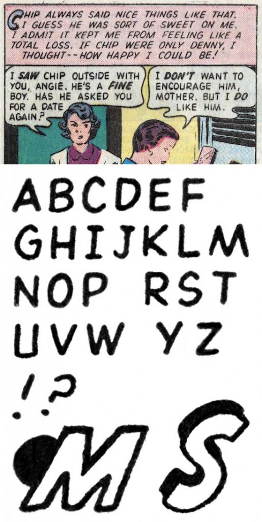
Young Romance #91 (December 1957) “The Waiting Game” by Slim
Slim’s lettering is narrower than most of the letterers we previously looked at, this is most obvious in his ‘O’ which is higher than wide. His ‘J’ has a small serif and the lower portion is short but strongly curved. The question mark is pretty much how I was taught, a curved portion like a reversed ‘C’ and a straight lower stroke. Shadow and geometric drop caps are used in captions.
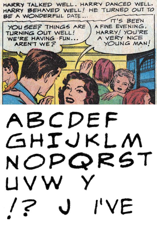
Young Romance #95 (August 1958) “Listening To Love” by Albert
Albert’s lettering is a bit variable but tends to be a bit wide. This is particularly noticeable in ‘O’ and ‘Q’. ‘J’ lacks a topping serif and has a distinctive hock. Perhaps the most unique letter is Albert’s ‘G’ which can be quite angular. Question marks have a ‘S’ shape but with the lower curve much smaller than the upper one.
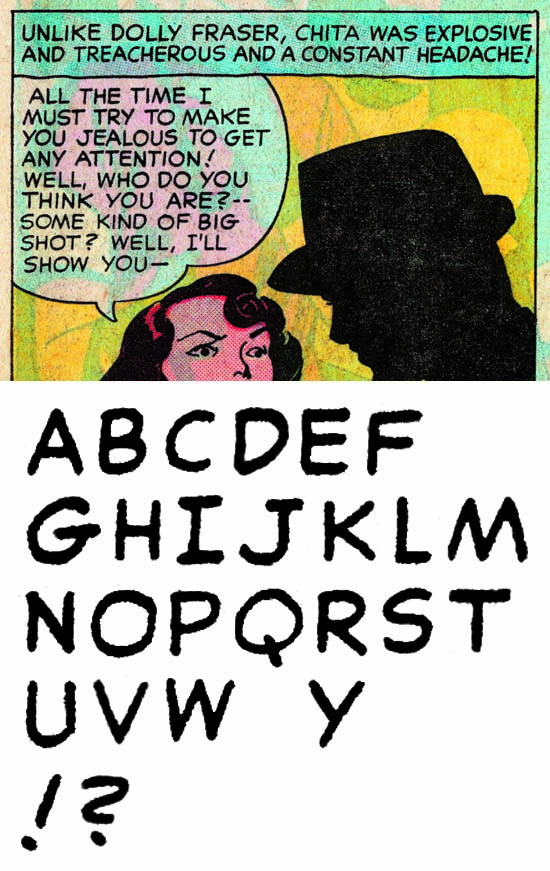
Young Romance #97 (December 1958) “Hearts and Flowers” by Steve
Steve has a more professional look to his lettering. The serif on the top of ‘J’ distinguishes him from Oda and the lower portion tends to be slightly more curved than either Oda or Ferguson. The horizontal bar of ‘G’ extends slightly to the right to form a small serif. Perhaps most important is the ‘S’ shape to the question mark with the upper and lower portions more, but not completely, equal.
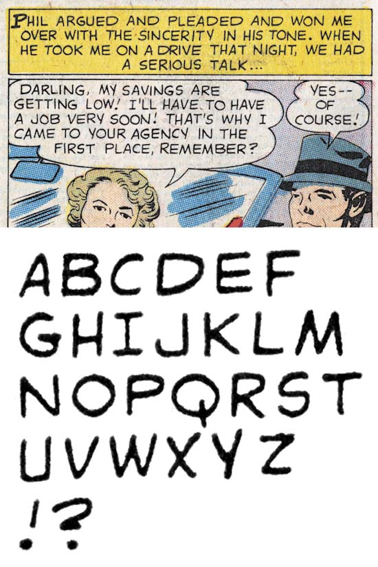
Young Romance #99 (April 1959) “Man Wanted” by Doug
Doug has a wide ‘D’ and ‘P’, but a generally circular ‘O’. The ‘J’ lacks a topping serif, a wide lower portion that ends in a well developed up turn. The question mark has a shape sort of like a ‘2’ but with the lower horizontal bar short and so close the the upper curve that it is easily missed. Captions can have simple drop caps.
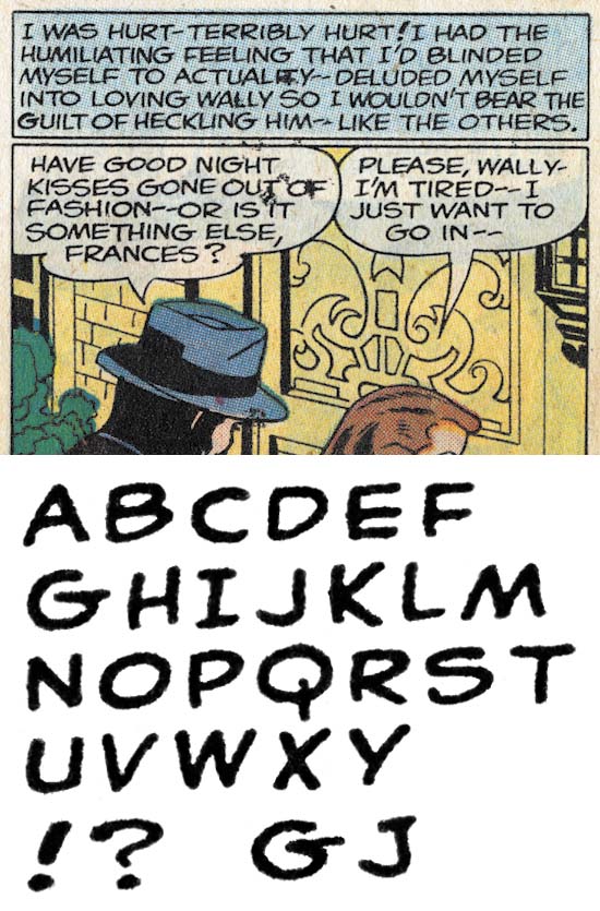
Young Romance #103 (December 1959) “The Man For Me” by Phillip
Finally we come to Phillip. Actually Phillip is quite like Oda with the obvious exception of his question mark which is not at all like a ‘Z’. Most ‘J’ lack a serif but Phillip is not consistent and some times adds one. The horizontal stroke of ‘G’ forms a small serif to the right.
Lettering S&K Chapter 1 The Beginning
Lettering S&K Chapter 2 Timely, DC and the War
Lettering S&K Chapter 3 Return from the War
Lettering S&K Chapter 4 The Oda Monopoly
Lettering S&K Chapter 5 Mainline and the Studio End
Lettering S&K Chapter 7 Conclusion
Lettering Checklists:
Alias
Draut, Bill
Ferguson, Howard
Kirby, Jack
Oda, Ben
Simon, Joe


“Slim” looks like Artie Simek to my eyes. The ornate initial letter in captions was one of his trademarks. I believe he lettered a bit of Jack’s work for DC in the late 1950s, just after the Atlas implosion. Since he had otherwise been with Timely/Marvel for three decades, he was likely looking for work from whomever to tide him over.
Haydn, thanks for the suggestion, I will have to check Artie Simek out some time.
https://comicscommentary.blogspot.com/2012/07/artie-simeks-post-implosion-work.html
has a few samples of Simek’s work from the late 1950s, The page from “Batman’s Roman Holiday” (Batman #112, December 1957) cited in that article most closely resembles the panel by “Slim” above–especially the italicized captions, and the initial large letters for captions. The wide “M” is a distinguishing feature as well.
At a glance at least some of the pages you provided as examples of Artie Simek look like Slim. However I would caution about using drop caps alone as identifying features since as can be seen in my serial post a number of letterers adopted them. But as I said previously I do plan to take a careful look.
“Doug” reminds me of Joe Letterese–though the earliest work I can find where he gets a lettering credit is Inferior Five #1. This is from early 1967, ten years after the sample panel in this article, so there are a few subtle differences. His unusually wide D’s are a distinguishing feature, though.