
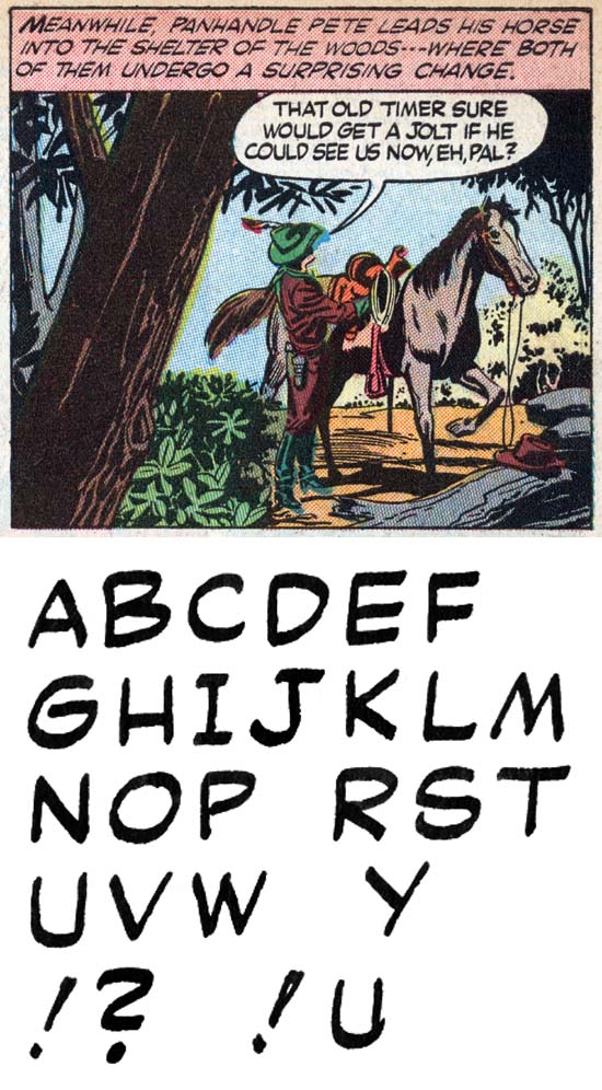
Bullseye #1 (August 1954) “Bullseye, the Man” by Howard Ferguson?
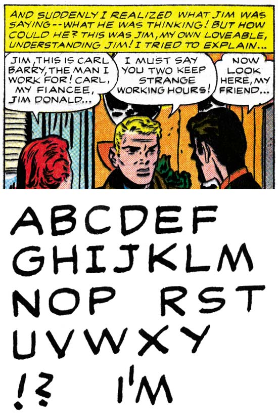
Simon and Kirby would launch their own publishing company, Mainline, with Bullseye #1 cover dated August 1954. It is around this time that Ben Oda starts to loose his monopoly on lettering. Chief among the new letterers is one with a style remarkably similar to Oda’s but also similar to Howard Ferguson. I might have credit Oda for the Bullseye lettering if not for some of the work that followed. I certainly would have credited Bullseye and what follows to Ferguson if it include the more advance drop caps or banner captions. Simple drop caps are found in the Bullseye story pages but they are only slightly larger than the rest of the lettering and easily overlooked. There was one work signed by Ferguson where he did not use drop caps or banner captions (Romantic Love #1 September 1949) but such none ornamented lettering was unusual for Howard. In the end I have decided to questionably credit these works to Ferguson.
Bullseye lettering includes exclamation points that are slightly angular. I have not seen Ferguson do this before and he would drop it in the future work for Simon and Kirby. ‘C’ shows a very small downturn reminiscent of the serif Ferguson used to supply. But this trait is not consistently shown in Bullseye and would disappear in the future. The question mark is quite similar to that done by Oda but just not quite so angular. The most distinctive trait would be the serif added to the top of ‘J’. Ferguson would consistently supply that serif, Oda would be just as consistent in not using the serif.
Young Romance #73 (September 1954) “Girl from the Old Country” by Ben Oda
As I previously said, Ferguson and Oda lettering are very similar. But note the more angular question mark, very like a ‘Z’ and ‘J’ without a serif.
Initially Oda would remain the dominant letterer. For August until December of 1954 Oda would letter 588 pages to Ferguson 111 pages. But in 1955 Ferguson would dominate with 778 pages of lettering to Oda’s 655.
Young Romance #74 (November 1954) “A Holiday For Love” by Marty
In the last chapter I wrote about Marty doing the lettering for an unidentified artist working largely on the “Good Manners” filler. April 1954 would be the last month that particular artist would be found in a Simon and Kirby production. April was also the first month that work by Art Gates would start appearing. While most of the work that Gates did for Joe and Jack were fillers, he also do one longer piece for Young Romance and three longer stories for Foxhole. All this work by Gates would be lettered by Marty and Marty would not letter any other artist other than the one who did “Good Manners”. All together there are 48 features lettered by Marty and no reason why Simon and Kirby would assigned all those features to be lettered by that one letterer. It seems to be the most satisfactory explanation was that this work was purchased by Simon and Kirby from an agent, who may or may not have been the letterer.
Marty’s lettering on a whole has not changed much from what we examined in the previous chapter. The biggest change is he has abandon the vertical lower arm to ‘Y’ to go for one that is an extension of the upper right stroke. ‘M’ normally now has sloping outer arms but occasionally Marty would drop back to the vertical ones he used earlier. Balloons are now usually standard lettering while captions are in italics. The use of drop caps has continued but they are now usually elaborate or outline drop caps.
Young Romance #75 (December 1954) “Personal Secretary” by Mikeross
Seven romance features appeared in the Prize romance titles; three penciled by Ross Andru and one by Pete Morisi. I had previously discussed how this was work sold to Simon and Kirby when Ross Andru and Mike Esposito’s self owned publishing company failed (Art of Romance, Chapter 28, A Glut of Artists). All the art was lettered by the same letterer who I have nick-named Mikeross. This does not suggest that either Andru or Esposito did the lettering, just that their company employed the same individual for all of it.
Mikeross uses angular exclamation points and ‘S’ shape for question marks. ‘J’ as a serif on the top and a well curved bottom. The lettering tends to be horizontally narrower. Simple drop caps would be used.
In Love #4 (March 1955) “Wolf Bait” by Howard Ferguson?
Ferguson’s(?) question mark developed more of a downward slant to the upper and lower arms making them more distinguishable from those done by Oda. Of course Howard’s ‘J’ continue to have a serif on the top. Captions are generally done in italics while balloons remain standard lettering. Oddly the first person singular lacks serifs when used in a contraction.
Justice Traps the Guilty #75 (June 1955) “Tragic Circle” by Ben Oda
Oda lettering remains very similar to Ferguson but the upper and lower arm of his question marks remain horizontal or with a little upward tilt. Standard lettering is used in captions.
Lettering S&K Chapter 1 The Beginning
Lettering S&K Chapter 2 Timely, DC and the War
Lettering S&K Chapter 3 Return from the War
Lettering S&K Chapter 4 The Oda Monopoly
Lettering S&K Chapter 6 Post Studio
Lettering S&K Chapter 7 Conclusion
Lettering Checklists:
Alias
Draut, Bill
Ferguson, Howard
Kirby, Jack
Oda, Ben
Simon, Joe
Pingback: Lettering S&K Chapter 1 The Beginning | Simon and Kirby
Pingback: Lettering S&K Chapter 2 Timely, DC and the War | Simon and Kirby
Pingback: Lettering S&K Chapter 3 Return from the War | Simon and Kirby