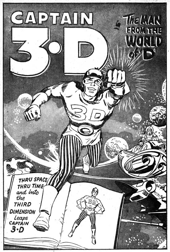
I have decided to examine Simon and Kirby’s most neglected superhero, Captain 3D. So set your computer to 3D viewing. What your computer does not have the 3D view feature? Oh well, I can see most of you have not upgraded to the latest Pear computer. In that case through the magic of Photoshop I will convert scans of the Captain 3D #1 comic to restore the line art. Seriously I have never been a fan of 3D comics feeling that it is largely a gimmick where too much is lost (color) with too little gained. Besides I find it an annoyance to have to wear special glasses just to read a comic.
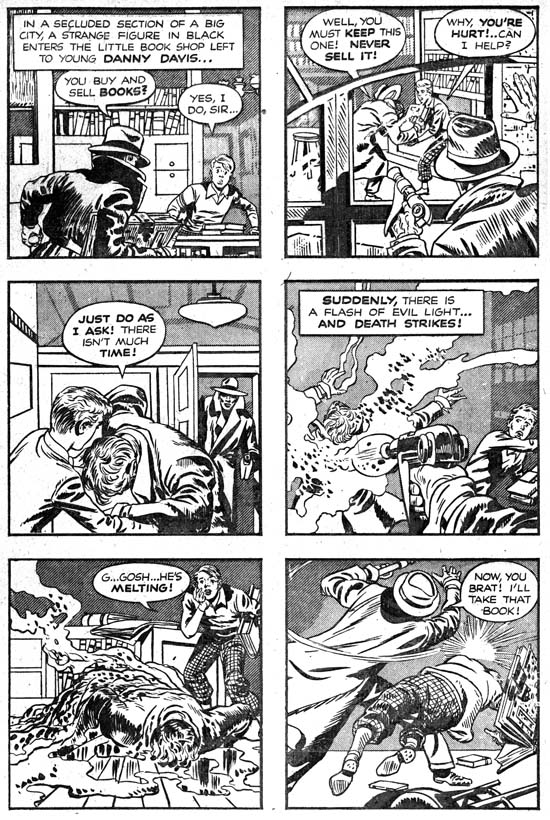
By their very nature, superheroes require a suspension of critical judgment in order to be enjoyed. I think the barrier is even higher in the case of Captain 3D due to link between the comic’s 3D gimmick and the hero’s jumping out of a book when viewed with special glasses. Along with the ability to come out of the book when needed, Captain 3D has a power pack that allows him to fly. Otherwise Cap, and he is referred to by that nickname, does not seem to have any special powers or strengths. Captain 3D’s main adversaries are the cat people. The cat people had in the past killed the rest of Cap’s people and now want to enslave mankind as well. Normally Cat people look no different from the rest of the population but when viewed with the same 3D glasses that release Captain 3D from the book, the cat people show their feline features. However Cap also fights more everyday criminals as well. Like many superhero comics of that time, Captain 3D has a young sidekick named Danny, the guardian of the book of D.

Captain 3D (December 1953) “The Man from the World of D” page 11 panel 4, pencils by Jack Kirby, inks by Mort Meskin
There is little doubt that Jack Kirby penciled all of Captain 3D #1. Perhaps more then any other comic book artist, Kirby has worked on supplying the extra dimension to comic’s flat plane. He has done so starting perhaps from his days at Timely until the very end of his career. I am not sure how he felt about 3D comics but he came to them already knowing how the images should be composed. Joe Simon’s comments about this can be found in his book “The Comic Book Makers”. There Joe’s basic premise is that the images should project out of the comic, not into. The actual art found in Captain 3D confirms Joe’s observation; there are only a few panels that project into the page. One of them is very effective despite breaking this rule; it is a composition that would be repeated years later in the comic book Battle. Late in life Jack would adopt a style where perspective would be exaggerated to such an extent as to appear unnatural. This style is exemplified by a pose the Kirby would use often where the hero jumps toward the user with one arm held straight and fist closed. Captain 3D has the earliest example of the pose that I am aware off, although without the extraordinary exaggerated perspective. After Captain 3D the pose would not be repeated for many years, but obviously it was not forgotten.
In his book Joe Simon describes Al Harvey requesting Simon and Kirby to produce a 3D book. Neither Joe, Jack nor any of the artists working for them had any experience with making such a comic before. An outside artist had come to Harvey saying he figured how to make 3D comics himself and offered to show Harvey’s people how. Harvey wanted the comic done quickly in order to cash in to what looked like a lucrative craze. As an incentive Harvey offered special rates but I sometimes wonder if Simon and Kirby had every turned down a job because they were too busy.
Joe says the Captain 3D book was created by him, Jack, Mort Meskin, Steve Ditko and “other key artists” working for the S&K studio. As I said above Jack Kirby was responsible for all the pencils. The inking is another question. Frequently the inking has been attributed to Steve Ditko by comic art dealers. Not long ago I saw one offering a page from Captain 3D as created by Steve Ditko, never even mentioning Jack Kirby’s involvement! Determining inking attributions for the Simon and Kirby studio is fraught with difficulties as inking credits were never provided. So comparison of inking methods with that used by different artists on their own work is the only technique that can provide help. There is the added difficulty in a case like Captain 3D when a number of different artists were involved on the same project. If that was not enough, the acetate used to create the 3D effect was a very unforgiving and unfamiliar material for the artists to ink on. Brush control that the artists normally exhibited cannot be expected to show up in the Captain 3D inking. Therefore it would be the risky, to say the least, to try to sort it all out. So naturally I cannot resist.
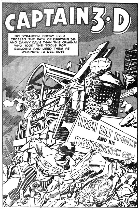
Captain 3D (December 1953) “Iron Hat McGinty and His Destruction Gang”, pencils by Jack Kirby, inks by Mort Meskin
The inker easiest to spot is Mort Meskin. I have previously discussed Mort’s inking techniques. Despite the problems acetate presented many of those techniques can be found in Captain 3D. Here the inking technique that seems to stand out the most is Meskin’s manner of doing picket fence brushwork (for explanations of some of my terms please see the Inking Glossary). Although picket fence crosshatching was part of the S&K Studio style, Mort’s can usually be distinguished by “rails” that are lines of strong but even strength, almost like wires laid down on the page. Even the “pickets” tend to be more mechanical then those by S&K. I have found picket fence brushwork in 13 pages all but 2 of which look like Meskin’s work. Mort also had a way of depicting clothing folds with multiple long parallel, sometimes overlapping, brush strokes. Perhaps because of the difficulties acetate presented, I have found this Meskin brushwork only on 4 pages. Meskin had a special way of drawing and inking eyes and eyebrows. He modified it when inking Kirby’s pencils but it sometimes still retains enough of his personal touch so that it can be recognized. In Captain 3D I found 9 pages with Meskin’s eyes. Mort occasionally would place on one side of a form a wider then normal line that also served as a sort of shadow. There is one page that has this Meskin technique. I came to notice that Meskin sometimes gave a sinuous shadow to Cap’s helmet; this can be found in 6 pages. All together I attribute 11 out of 32 pages to Mort Meskin. For those interested these are “The Man from the World of D” pages 5 and 8 to 11; “The Living Dolls” pages 2, 3 and 10; “Iron Hat McGinty and His Destruction Gang” pages 1 and 9; a figure of Captain 3D in an advertisement at the end of the book.
Captain 3D (December 1953) “The Man from the World of D” page 10 panel 2, pencils by Jack Kirby, inks by Mort Meskin
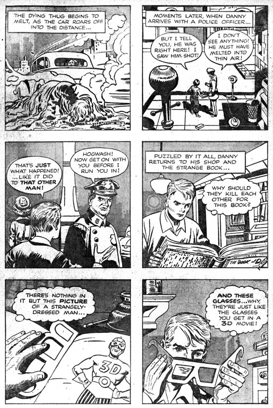
Mort Meskin did an outstanding job on the splash page for “Iron Hat McGinty and His Destruction Gang”. However for me the tour de force of the entire book is page 10 of the “The Man from the World of D”. You can tell Mort was struggling with the acetate surface but he still managed to create a masterpiece in the bottom, almost splash-like panel. I believe there is a reason Mort put so much effort here, this is probably the most powerful image that Simon and Kirby had every produced. I am not referring here to the graphic qualities of the image but to its subject matter. Simon and Kirby never went the extremes such as could be found in EC comics. That is not to say they avoided violence; guns, knives, whips and other weapons can be found but S&K usually refrained from making the use of these devices so obvious. The only exception to this seems to be found earlier in the Captain America art where one time they even went so far as to depict the hanging of a fake Captain America and Bucky. Even then we only see a back view of their dead bodies.
Captain 3D (December 1953) “The Living Dolls” page 7, pencils and inks by Jack Kirby
The next most easy to spot inker in Captain 3D is Jack Kirby himself. Jack’s involvement to the inking should not be too much of a surprise. After all it was a rush job and Jack would finish pencils before all the inking had been completed and so would be expected to join in. What is surprising is the inking technique he adopts for Captain 3D. Kirby does not use the Studio inking brushwork that was ubiquitous of his inking at that time. Instead Jack works in a style remarkably like the Severe style that would not appear in his inking for several years hence. I think Kirby used this style because it allowed him to work more quickly and it overcame some of the difficult problems presented by inking on acetate. Missing from the Kirby inked pages are techniques like picket fence crosshatching or drop strings. Part of the Severe style is a technique of inking a clothing fold with simple elongated ovals or tapers sometimes attached to a thin line giving it the appearance of a narrow stem ending in a long leaf. This brushwork is found on two pages I attribute to Jack but only in a single panel of one of them suggesting that there Kirby was retouching another inker’s page. Kirby was an excellent inker which gave him an advantage in interpreting some of the nuances of his own pencils. The acetate undoubtedly made it difficult for Jack to achieve such subtleties. Nonetheless I feel I have detected nuances in the treatment of eyes and eyebrows that look like Kirby’s hand. Although Kirby’s brush can be confidently detected Jack did not ink much of Captain 3D. There is not much to go on but the two small heads found in the introduction look like Kirby to me. More certainly Kirby’s inking are panel 1 of page 7 of “The Man from the World of D”, page 7 of “The Living Dolls”, and page 5 of “Iron Hat McGinty and His Destruction Gang”. There are some other possible candidates that I will discuss below.
Captain 3D (December 1953) “The Man from the World of D” page 4, pencils by Jack Kirby, inks by Joe Simon
I have not yet presented to my readers a thorough examination of the inking techniques used by Joe Simon. Joe presents a particular problem in determining inking attributions. My normal methodology is to examine the inking of art penciled by the artist to find clues on how that artist might in turn ink Kirby’s pencils. Unfortunately Simon did not pencil much art during his collaboration with Kirby. Further Joe has shown himself in the past as adept at mimicking other artists’ styles. While at Fox Joe did such a great job that even experts have missed his signature on some of the covers and attributed the art to Lou Fine. Joe has also mimicked Kirby’s pencils and there is no reason to believe he would not also try to do so with Jack’s inks. Therefore what I present below should only be viewed as a preliminary assessment. Joe Simon’s brushwork was coarser then Kirby’s and in particular his clothing folds did not have the same almost puddled appearance as those Jack used in this comic. In Captain 3D 6 of the pages have a coarser brushwork that looks like Simon’s to me. Like Meskin, Simon has a way of doing eyes that can sometimes show through when inking Kirby’s pencils; 3 pages look like they have Simon’s eyes. I previously mentioned that in Captain 3D picket fence crosshatching was used by Meskin but not by Kirby. There are 2 pages that have picket fence brushwork that do not appear to be Mort’s. I feel that they were done by Simon, but it is possible that this could be misleading due to the difficulty of inking on acetate. Both Simon and Kirby used shoulder blots and these can be found among the pages I attribute to Simon. Shoulder blots do not appear on any of the pages I have credited to Meskin but they do on one that assigned to another artist to be discussed below. All total I credit Joe Simon with inking 8 pages of Captain 3D. For those interested these pages are “The Man from the World of D” pages 3 and 4; “The Living Dolls” page 2; “Iron Hat McGinty and His Destruction Gang” pages 2 to 4, 6 and 8. Keeping in mind the problems about distinguishing Simon from Kirby and the difficulties presented by working on acetate it is quite possible that some of the pages I have attributed to Simon might actually been done by Kirby. Particularly suspicious are the number of Simon pages found in the last story. Assuming that was the last story actually penciled it is just where we might expect the greatest inking contribution by Kirby.
Captain 3D (December 1953) “The Man from the World of D” page 2, pencils by Jack Kirby, inks by Steve Ditko
Those keeping tally would realize that there are still a number of pages in Captain 3D that were not done by Meskin, Kirby or Simon. I believe most of them were done by the same artist. I credit them to Steve Ditko but frankly this also is very provisional. Since I have not done a careful review of Steve Ditko’s earliest efforts I really do not have a lot of inking traits to rely on. The most distinguishing feature of his inking, at least compared to Simon and Kirby studio artists, is his reliance on a pen for most of his spotting. Some fine pen work does show up in Captain 3D. However there are often brush spotting on the same pages sometimes covering over some of the pen lines. Some of this may be Ditko’s own efforts but some of it looks like Joe Simon going over and strengthening Steve’s work. The presence of a shoulder blot on one of these pages supports that suggestion. The lower part of the man’s jacket in the last panel of the page 2 of “The Man from the World of D” shows a type of feathering that I have never seen before in work produced by Simon and Kirby or artists that worked for them. Ditko also seems to have his unique touch in his way of doing eyes that shows up in Kirby’s pencils. I notice that Ditko had his own way of inking Captain 3D’s helmet. Ditko would create two simple bands or when the top band was near the peak it would be formed into a small semicircular field. All in all I assign 8 pages to Ditko; “The Man from the World of D” pages 2, 6 and 7; “The Living Dolls” pages 5, 6, 8 and 9; “Iron Hat McGinty and His Destruction Gang” page 7.
Captain 3D (December 1953) “The Living Dolls” page 4, pencils by Jack Kirby, inks by unidentified artist
I am concerned that since I do not yet have a good handle on Ditko’s inking style, especially on acetate, that perhaps some of the pages assigned to him may actually been done by some other artist. There is one page (page 4 of “The Living Dolls”) that I simple am not comfortable to assigning to any of the artists that I have discussed so far. I feel this indicates there was at least one other artist inking Captain 3D but I have no idea who he was.
Captain 3D (December 1953) “The Man from the World of D”, pencils by Jack Kirby, inks by Mort Meskin
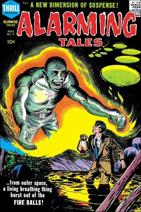
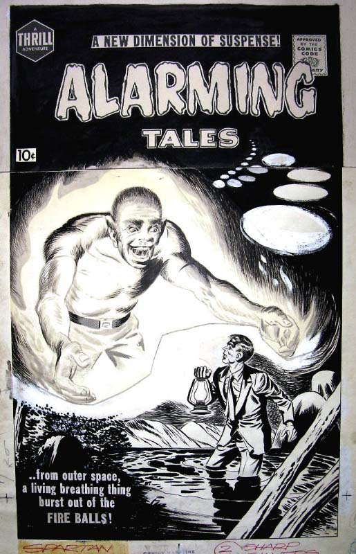
I have saved for last a short discussion about the cover. The art for the cover was also used as the splash page for “The Man from the World of D”. Therefore it would have been done on acetate in order to achieve the 3D effect. It must have been a difficult task to ink on acetate carefully enough so that it could also be used for the cover. Perhaps because of that spotting is very minimal. It appears to have been done with either a pen or a fine brush. This might suggest Ditko inking but I feel it was actually done by Meskin. Meskin did not do much fine inking in the other interior art but some does show up particularly on splash pages where greater effort was made as for example the first page of “Iron Hat McGinty and His Destruction Gang”. The method used to spot the muscular forms on the cover does appear similar that used in the splash. Captain 3D on the cover also has eyes that suggest Meskin’s personal style. There are not much clothing folds but some on the upper torso are made using close parallel lines like those Meskin prefers. Finally Captain 3D’s helmet has a sinuous curve to the shadow; a device similar to what Mort used in the interior art.
The final breakdown is 12 pages inked by Meskin, 8 pages by Simon, 7 2/3 pages by Ditko, 3 1/3 pages by Kirby, and 1 by an unidentified inker. This is a little misleading because one of the pages attributed to Kirby consists only of two small heads and one of the pages credited to Meskin is an advertisement with only a single figure of Captain 3D.
In my next post I hope to discuss Captain 3D #2.