I last discussed Kirby inking for Prize in Chapter 3 (stories) and Chapter 4 (covers). Both chapters only covered 1956 with the first appearance of the Austere inking style. During that year Kirby was doing almost all the penciling for all three Prize romance titles (Young Romance, Young Love and Young Brides). At the end of 1956 Prize comics had a shake up; Young Love and Young Brides were cancelled. Young Romance remained and a new title, All For Love appeared. Simon and Kirby continued to be listed as the editors for Young Romance but All For Love was edited by Joe Genalo. Young Romance was just not the same comic. Gone were such stalwarts of the S&K studio such as Bill Draut, Mort Meskin or John Prentice. Most of the artists that did appear in YR were simply not as talented. This leads me to the conclusion that the pay scale for art had dropped and YR could not attract the same skill level.
Normally I would be picking up with Prize where I left off, that is with 1957. Although Jack provided art for Young Romance during 1957 he did not ink his own work that year. Kirby resumed inking some of his work for YR early in 1958. At this point in time Jack was no longer inking what he did for Atlas, at least as far as the work I have looked at. What inking by Jack for DC that we have examined (unfortunately an inadequate number) was done in the Austere manner, with or without pen spotting. Jack’s last job for Harvey with his own inks (Alarming Tales #3) was done just before he had resumed inking some of his Prize art. That particular piece was done in typical Austere style with some pen spotting.
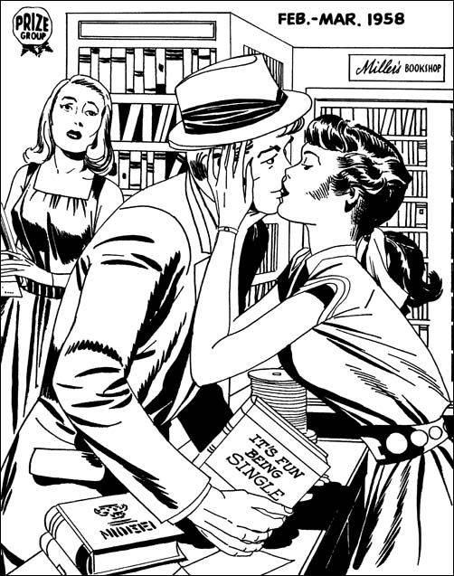
Young Romance #92 (February 1958) pencils and inks by Jack Kirby
Considering the date it not surprising to find this cover as inked in the Austere manner. An overall lightness and simple cloth folds that cluster at the shoulder and the elbow. There is one hold over from the older Studio style, the drop sting near the man’s elbow. That drop string is however made from individual drops overlapping one another to produce a sort of toothed line. This sort of brush work has been observed in other Austere inking as the preferred drop string rendition. There is one type of spotting that should be noted. It has a long history of use but I have not given note of it in my previous chapters. I think of it as shingle lines; the use of parallel lines where each is offset slightly from the others. Good examples can be found on the dress of the woman on our right. In this case I want to point out the two sets of shingle spotting just above her waste. What is special about them is that they were done using a pen. All other spotting on the page was done using a brush although some of the simple folds are done with a pen as well. Still there is nothing like the pen work we have seen on some of Jack’s inking for DC or Atlas.
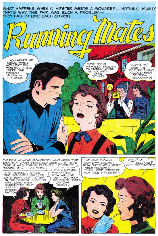
Young Romance #92 (February 1958) “Running Mates” page 1, pencils and inks by Jack Kirby
This story from the same issue is also done in the Austere manner. Is that a shoulder blot on the young man or a special feature to his shirt? I am not sure but it is certainly unusual. The man in the splash provides a better example then the cover of simple folds inked with a pen. It would appear that Kirby (or assistant) inked the outlines and folds with a pen. Those that Jack wanted to augment would be gone over with a brush. Kirby would sometimes skip brushing over some lines and so leave the penned lined unchanged.
Generally Jack would use simple spatulate shapes for some of the cloth folds. But not always as sometimes longer and narrower folds are called for as in this splash. However other pages from this story provide examples of simple spatulate folds.
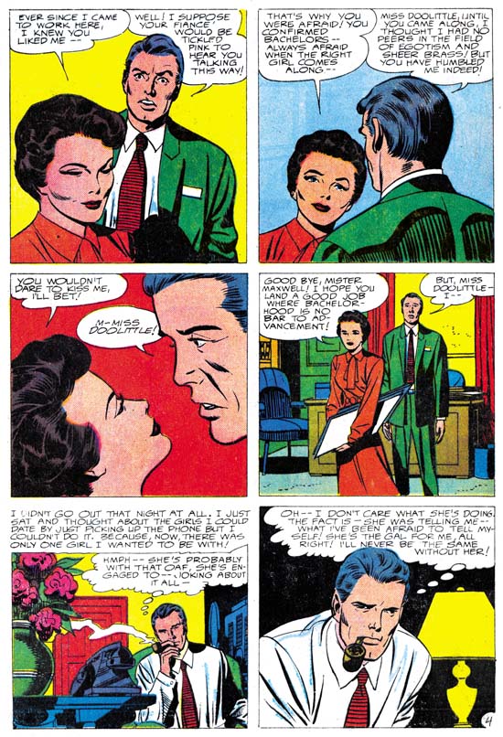
Young Romance #92 (February 1958) “The Happy Bachelor” page 4, pencils by Jack Kirby, inks by unidentified artist
I can understand some mistaking the inker for this story to be Jack himself. There are things that resemble shoulder blots. Here however they seem restricted to one side and denote a shadow. There are also some brush work that look like picket fences. I am less bothered about that lower rails are not provided then by the form of the pickets in the second panel. These pickets are bowed as well as having ends that are narrower then the middle parts. These are traits I have not found in Kirby. Of course picket fences were abandoned when the full Austere style was adopted. The thing that really bothers me about this inking are the very narrow and long folds such as found in the last panel. We saw examples of narrow folds in “Running Mates” but that story also included panels with typical spatulate shaped folds. The rest of the pages in “The Happy Bachelor” continue with the same sharp folds.
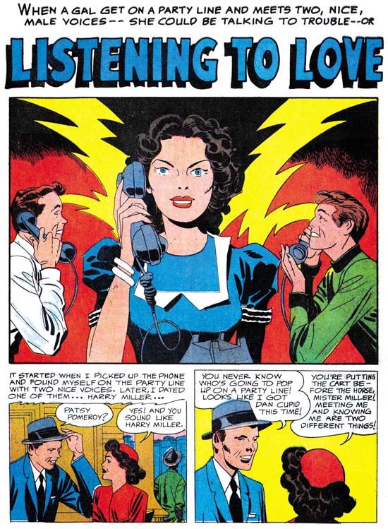
Young Romance #95 (August 1958) “Listening To Love” page 1, pencils and inks by Jack Kirby
Another good example of Kirby’s Austere inking. Spatulate shapes for folds, some folds left as simple penned lines, some black areas flooded with ink, and negative folds on the lady’s arms. One unusual feature is the use of pen crosshatching to make a transition from the upper black area to the lower light zone. I have not commented about this before but one of the unique characteristics of these late Prize version of the Austere inking is how rarely a pen is used for any spotting. But we know Jack’s inking for DC at this time has examples similar examples of pen use so we should not be too surprise of the pen use here.
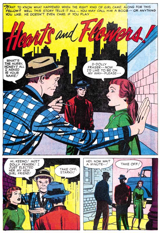
Young Romance #97 (December 1958) “Hearts And Flowers” page 1, pencils and inks by Jack Kirby
Note how abstract Kirby has become in features such as the eyes. Jack has even done away with fingernails on the man in the splash panel. The way that Jack inks seems to have affected his drawing as well.
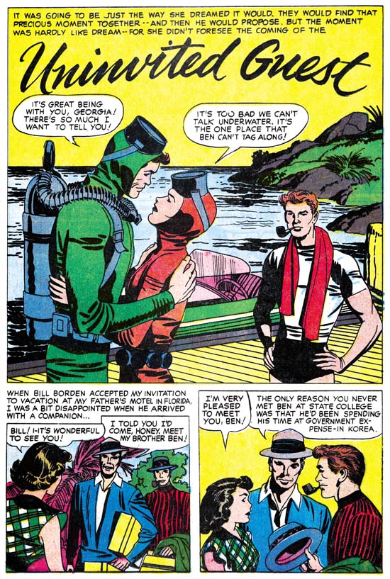
Young Romance #97 (December 1958) “Uninvited Guest” page 1, pencils and inks by Jack Kirby
At this point there is not a lot to add in terms of the Austere style. So I just want to provide some further examples from Young Romance. But do note in all these images how Jack’s Austere brushwork almost looks like it was done without a brush. This was not always true. For example in the Studio style Kirby would often make use of dry brush, where the brush does not have much ink so that as it goes across the paper the ink is left in discontinuous streaks and spots. You pretty much never see dry brush in the Austere style. You also see a limited use of the brush tip in the Austere style. You will see it in some of the long and sharp cloth folds. But most other brushwork looks like the ink was poured on. I am not sure whether Jack was using a blunt brush for much of the work or using techniques like the Chinese painters used where they “hide” the tip by starting a stroke in one direction for a short distance before reversing back over itself.
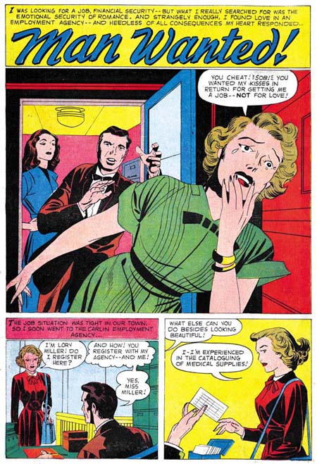
Young Romance #99 (April 1959) “Man Wanted” page 1, pencils and inks by Jack Kirby
Another example of the stylized eyes and eyelids that Kirby was doing during his Austere period.
I realize Kirby was famous for all the action he used for his superhero genre work. But look what a dynamic splash this is! Neither punches nor incredible superpowers but still an exciting page.
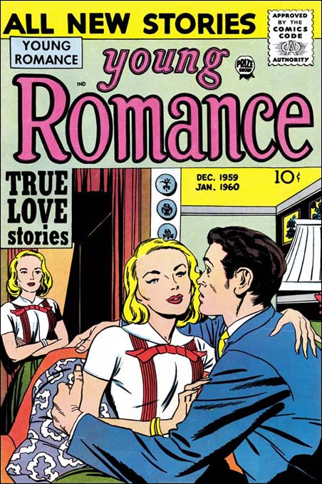
Young Romance #103 (December 1959) pencils and inks by Jack Kirby
Jack was no longer inking his own Atlas work since early 1957. The last inking for Harvey was early 1958. His last DC work was in June of 1959. So the work Jack did for Young Romance was the last that he would more or less regularly ink. Kirby did a great inking jobs right up to the end of 1959.
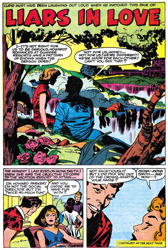
Young Romance #103 (December 1959) “Liars In Love” page 1, pencils and inks by Jack Kirby
Although I name Jack’s “late” inking style Austere that should not interpreted that all Jack’s inking at that time was simple and light. More effort would be used if the occasion called for it. This splash is a case in point. But even with all the spotting done you still get the overall feel of something done simpler then with the S&K Studio style.
EPILOG
One of the things that originally drew me to Simon and Kirby’s art was their Studio inking style. Bold yet sensitive. However Kirby would discard some of the things that made the Style so bold, in particularly picket fence brush work, when he evolved the Studio into the Austere style. Despite the loss of so much of what I love, the later inking is every bit as beautiful in its own way. It was no accident that the Austere style came into being during 1956. That was the year that Jack was doing pretty much all the art for the three Prize romance titles. With all that work it is not surprising that Jack would look for ways to speed up the process of producing his art. Many artists when faced with difficult schedules will cut corners to the determent of their final product. Not Jack Kirby. Jack did not just discard time consuming brush work, he modified what the inking he continued to use to make up for what he discarded. The Austere style may have been quicker, but Jack would not let his art deteriorate to achieve that.
This is the final chapter to this serial post. Next week I will provide a checklist of Kirby inking Kirby for the period I have delt with in “Jack Kirby’s Austere Inking”. Also a glossary of the inking terminology I have used. Of course since this post dealt with the final years of the Simon and Kirby collaboration, there is a lot more to be said about Kirby’s inking in previous years. But I am not ready to tackle that yet. Before then I want to discuss some of the other inkers of Kirby’s pencils. If you want to spot Jack’s inking you have to understand how other artists would ink. I will not be posting on that right away but look forward to (or dread) it in the future.
Jack Kirby’s Austere Inking, Chapter 1, Introduction
Jack Kirby’s Austere Inking, Chapter 2, Mainline
Jack Kirby’s Austere Inking, Chapter 3, A Lot of Romance
Jack Kirby’s Austere Inking, Chapter 4, Prize Covers
Jack Kirby’s Austere Inking, Chapter 5, Harvey
Jack Kirby’s Austere Inking, Chapter 6, Atlas
Jack Kirby’s Austere Inking, Chapter 7, DC
Jack Kirby’s Austere Inking, Chapter 8, More Harvey
Jack Kirby’s Austere Inking, A Checklist and a Glossary
other post with Kirby inking Kirby:
Strange Tale Indeed
Battleground, Jack Kirby’s Return to Atlas
Captain 3D


Running Mates also features another kirby give-away which I do not recall you mentioning… the way he drew the cracks between bricks (Kirby Kracks?). It is as if he decided very early on in his career that the cracks between bricks didn’ look the way almost everyone else draws them. Most artists draw bricks by dividing them into rectangles with a ruler. Kirby always drew them by hand and scraggilly (if that’s a word). A sure way of identifying his hand in either drawing or inking a story. he does it here as well… whic makes the black dotted roof higher up in the same drawing more peculiar. I have never seen Kirby doing anything like that. I don’t doubt for a second he inked this page, but on the roof he tried something new – maybe to set it apart from the bricked wall?
Ger,
Interesting observation about Kirby’s method of depicting bricks. As for the black dotting of the bricks on the background building it is something on a smaller scale similar to something I have seen Bill Draut do. However I do not see any other signs of Draut’s involvement in the inking. So like you I accept this as Kirby trying something new, perhaps having seen Draut do something similar in the past.
Harry
Harry,
I’ve absolutely enjoyed all these postings about Kirby’s inking techniques and seeing all this “new” Kirby art. I had some of these on my want list and would love to purchase all the Kirby inked issues! So much work that is unpublished and rarely seen, and much of it very good.
Nick Caputo
Nick,
I hope by next weekend, and if not sometime soon, to have a complete list of Kirby inking Kirby for the same period I covered in the serial post, that is from Mainline on.
Harry
I’ve been working on a list of covers I believe Kirby inked in the early days of Marvel over the past few years. Coinciding with the information and examples here, I may be able to prepare a “definitive” list, since I now have more to go on regarding Kirby’s stylistic inking traits. This, coupled with my eye toward spotting inkers and art styles (especially of the Marvel era), may lead to some conclusions that you might want to discuss here someday. If you would I’d be glad to share any information and theories I have.
Nick Caputo